Time Series Line
Time series line charts display data points in chronological order, using a line to connect the points to demonstrate trends, patterns, and changes over time, such as tracking market data.
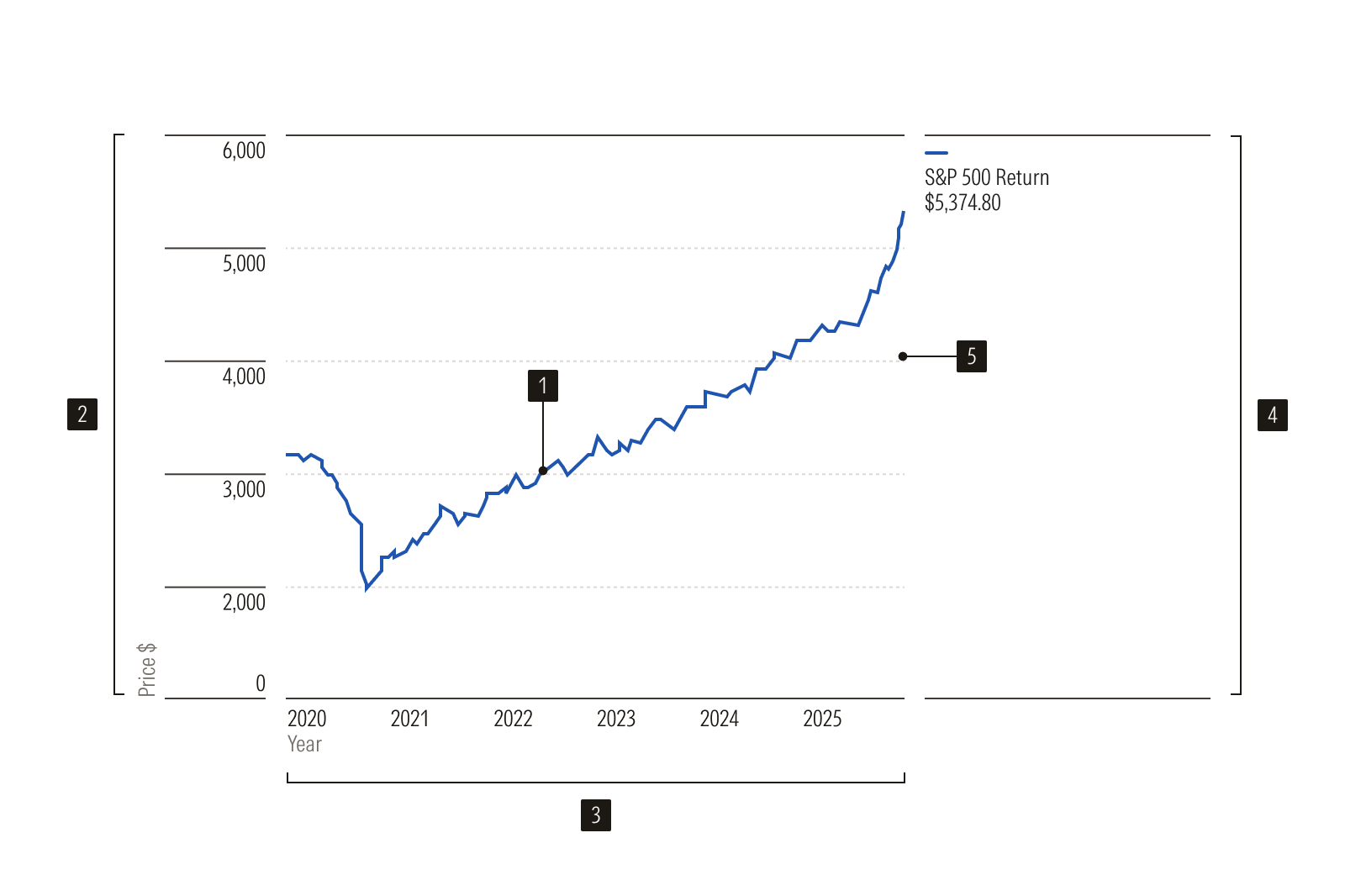
- Time series line plot a line chart displaying data over time
- Y-Axis vertical axis, often numerical
- X-Axis horizontal axis, displaying time intervals
- Legend key explaining line categories
- Gridlines lines aiding value reading
Usage
When to Use
- Representing information over time, where there are multiple values within each X-Axis interval.
- Comparing multiple sets of information over time, where there are multiple values within each X-Axis interval.
When Not to Use
- Displaying data that is tied to a single value per X-Axis interval, i.e., rolling return. Instead, use a line chart.
- Representing information that is intended for comparison, but not for comparing trends over time. Instead, use a vertical bar chart.