Accessibility
Built-in accessibility features aren't always enough to ensure that charts are entirely understandable by users with different impairments. While there's no “one-size-fits-all” approach to accessible data visualization, teams and creators should choose the methods most appropriate for the data they are presenting to their audiences.
Simplify
Always consider how a chart that layers many dimensions of data impacts the experience of our end user. Will the chart still be understandable for someone who is not familiar with the data? Is it important for the chart to convey a point at a glance?
Often, complex charts can be more easily understood when they are displayed as multiple charts, each telling a simpler story. Consider if your data could be grouped or bucketed in a different manner.
Use when
- You find yourself needing more than four or five colors to create a chart.
- Your chart is too complex to view on a small screen.
- Your chart is too complex to summarize in one or two sentences.
For example, consider the chart below which plots industry revenues by sector and year. We can make several observations:
- Overall industry revenues have recovered to pre-pandemic levels following a sharp drop in 2020.
- Sector F has seen dramatic growth since 2019, largely at the expense of other sectors.
- Overall the industry has consolidated since 2019, with two sectors accounting for roughly 70% of revenues in 2023.
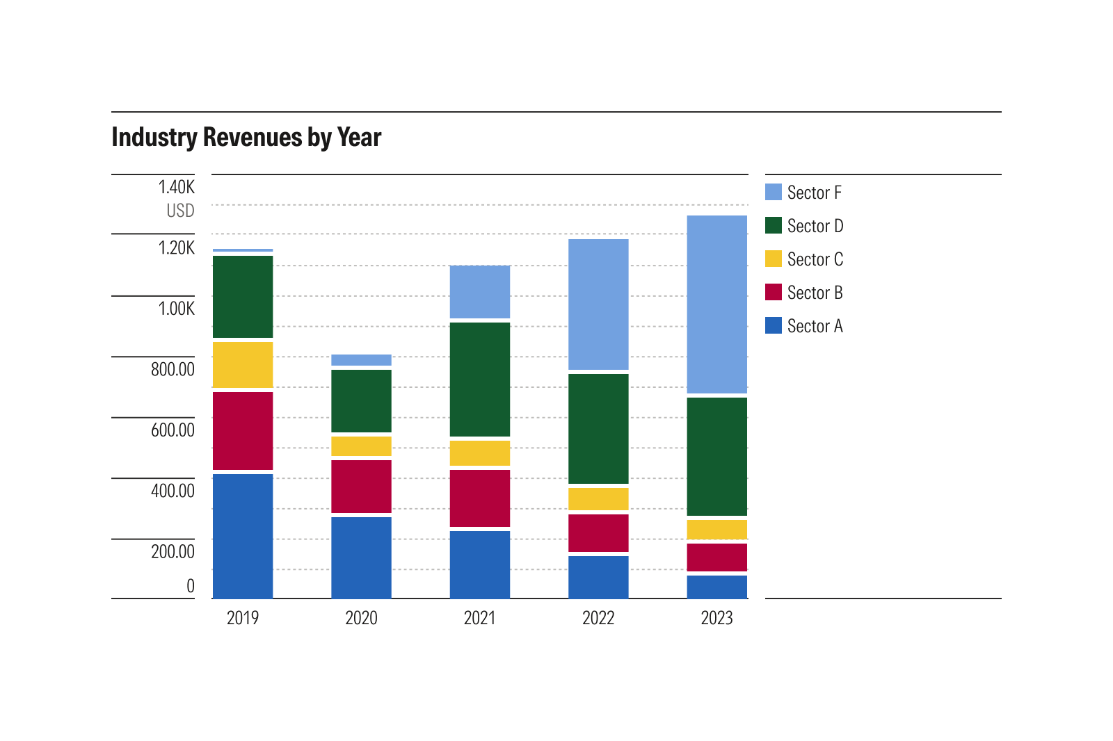
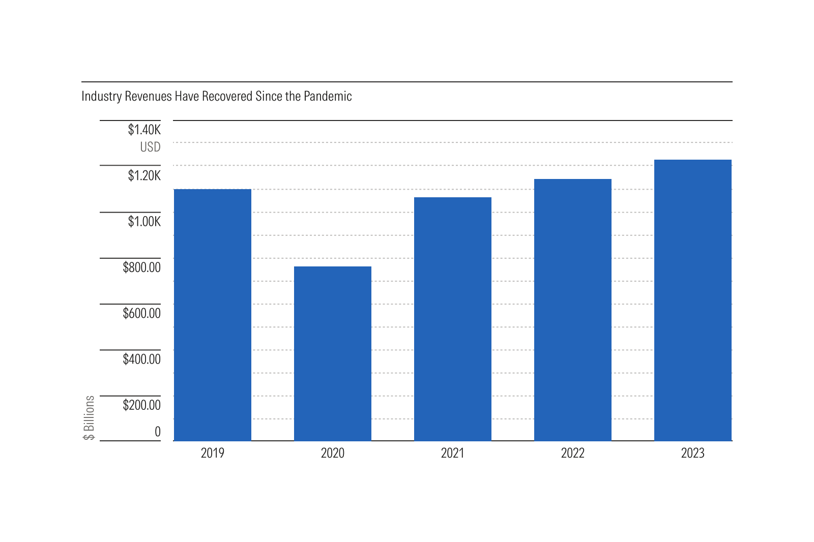
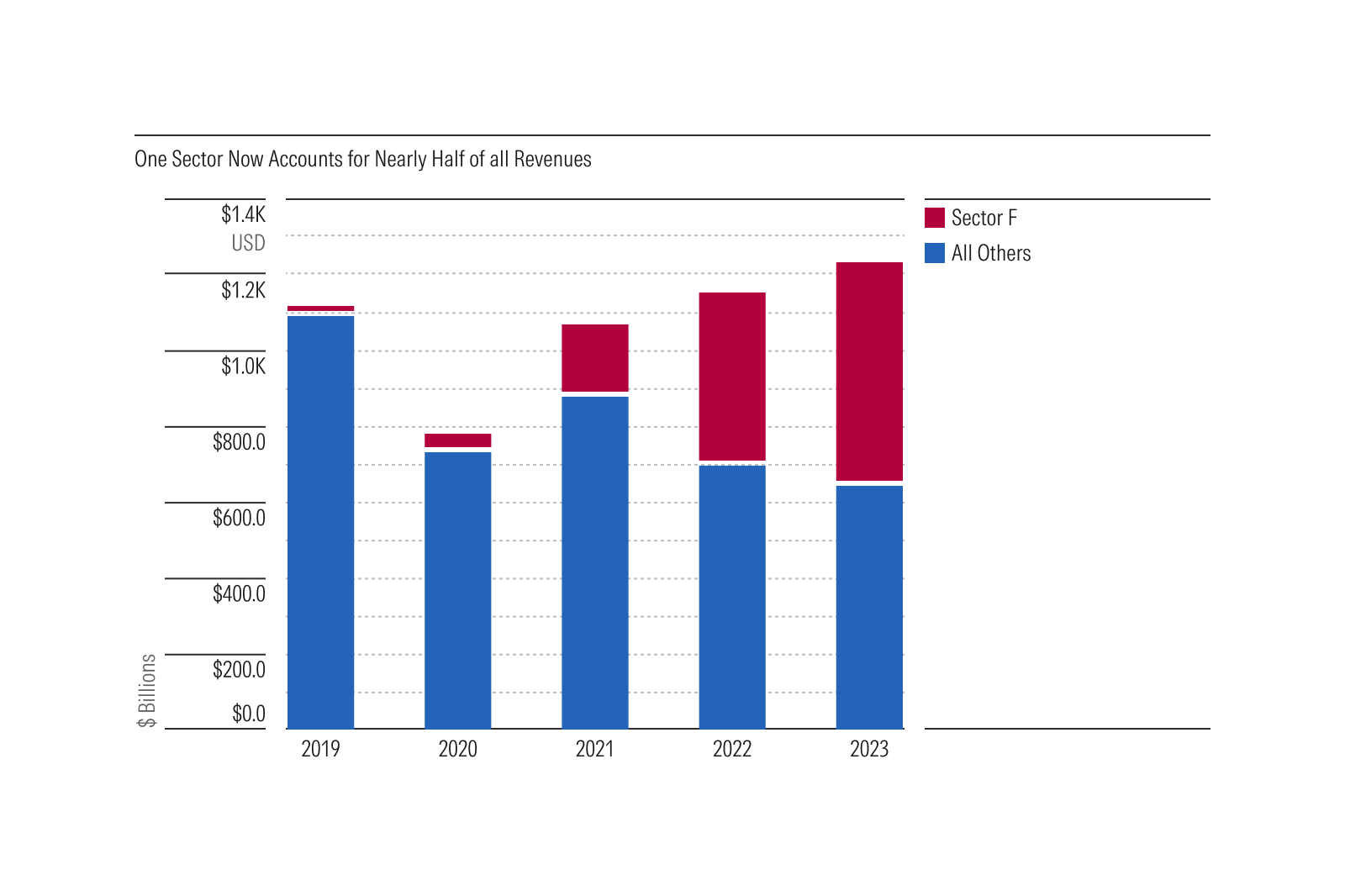
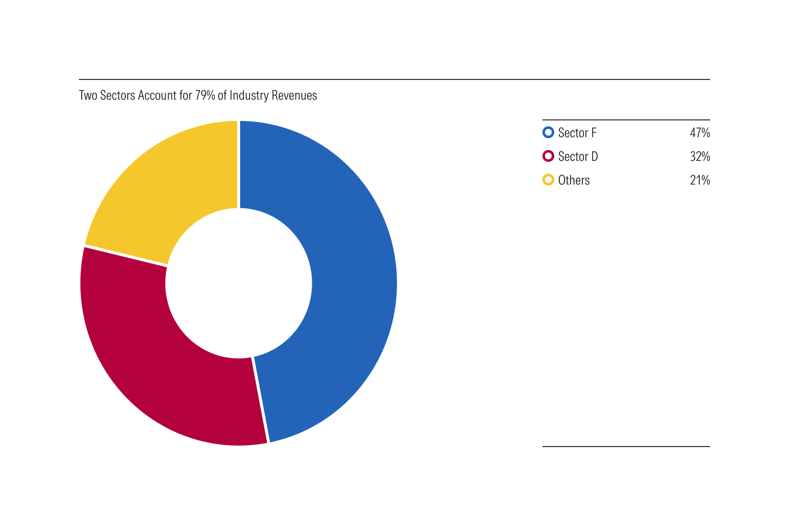
The chart above conveys a lot of information. But with so many dimensions, it puts the burden on the reader to decide what is important. By simplifying, we can tell a more compelling story:
- To highlight the overall revenue trend, use a simple bar chart.
- To focus on a specific sector, that sector can be plotted relative to all others.
- To emphasize industry consolidation, use a donut plot.
Each of these simplified examples can be summarized in one or two sentences, making them accessible to visually impaired users through a screen reader. Just as important, these charts are easy for anyone to understand. This includes people who are tired, people who forgot their reading glasses, or anyone who happens to be reading on a small screen while riding on a crowded train.
Color
When creating charts that use color as an affordance—for example, to distinguish data series in a bar, line, or scatterplot—teams should provide alternative affordances in addition to color. Alternatives might include a data table, written description, or any of the other options listed in this section. However, be aware that an approach relying on color alone may not be accessible to all users.
Table Alternative
Providing a table version of the same data allows users on a screen reader to browse more easily. Tables are easily navigable when built with semantic native HTML that screen readers understand.
Tables may also be easier to view for those with low vision or cognitive impairments and can be zoomed in easily. Additionally, some users prefer consuming data as a table rather than a chart.
Use when:
- The size of the dataset results in a table that is no more than 20-30 rows.
Avoid when:
- The size of the dataset results in a data table with more than 30 rows, like time-series data spanning multiple years. Instead, provide a written description summarizing the chart data for screen readers.
Written Description
Write a description of the story a chart tells for screen readers. This summary should cover the key points of the chart without delving too deeply into details. For example, it could describe the trend of a stock over many years and call out specific noteworthy events during that time.
A chart summary may also be beneficial to sighted users. Consider using your chart description as text on-screen to introduce and contextualize a data visualization.
Use when
The size of the chart’s dataset is very large and cannot be comfortably displayed or navigated in a table.
Annotations
Use static annotations to add text-based content on top of a chart, which can replace the need for hover flags and other more complex interactions. For example, instead of using a hover flag, a bar chart could include values above the plots, so the exact value of each bar is easily understood.
When creating annotations, always test the contrast of the text against the background and ensure it meets or exceeds the required 4.5:1 contrast ratio.
What Chart Elements Handle
To help product teams meet our accessibility requirements, Chart Elements include many built-in accessibility features.
Text Color Contrast
All text colors used in Chart Elements have been tested to ensure they meet or exceed the 4.5:1 contrast requirement defined by WCAG 1.4.3: Contrast (Minimum) when used against a white background.
Gaps Between Adjacent Plots
Chart Elements include built in 3px gaps between all adjacent plots—like a stacked bar—ensuring that the delineation between plots is easily distinguishable by users with color blindness or low vision.
The gaps increase contrast by ensuring that chart colors are always contrasted against the color of the gap, rather than the colors of the adjacent plots.
Support for Pattern Fills
All chart element plots include support for pattern fills, allowing texture to be used to ensure plots are easily differentiated by users with color blindness or low vision.
Support for Screen Zooming
All chart elements have been tested to ensure they can be screen zoomed to a minimum of 200%, in accordance with WCAG 1.4.4: Resize text.
What Product Teams Handle
Since they are delivered as composable and modular pieces, Chart Elements do not communicate with one another automatically. As a result, more complex accessible behaviors like keyboard control must be implemented by product teams as they are creating charts.
Additionally, since a chart is contextual to the data it represents, things like data table alternatives and accessible descriptions are also the responsibility of the implementing team.
Chart Elements do not include:
- Automated data table alternatives
- Accessible labels and descriptions
- Keyboard control
However, we provide features to support these interactions, as well as many reference examples that include these features in our chart examples on CodePen.