Area
Area charts visualize changes in quantity across time or another variable. For example, choose an area chart to show how the value of holdings have changed in the past year. Stacked area charts demonstrate part-to-whole relationships.
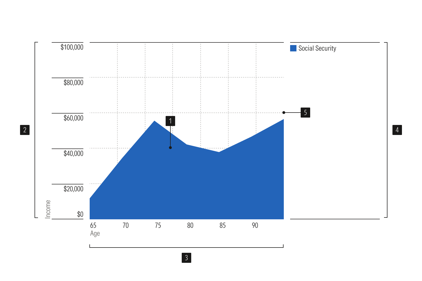
- Area plot is the data display area.
- Y-axis vertical axis, uses a linear or log scale.
- X-axis horizontal axis, uses a linear or time scale.
- Legend identifies each data series.
- Gridlines lines to help read values accurately.
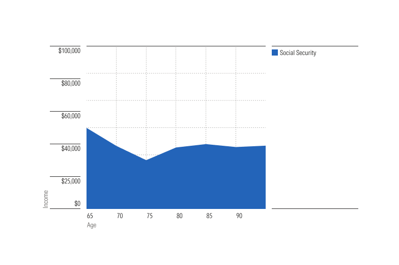
Simple area charts plot a single data series, emphasizing changes in quantity over time or some other variable.
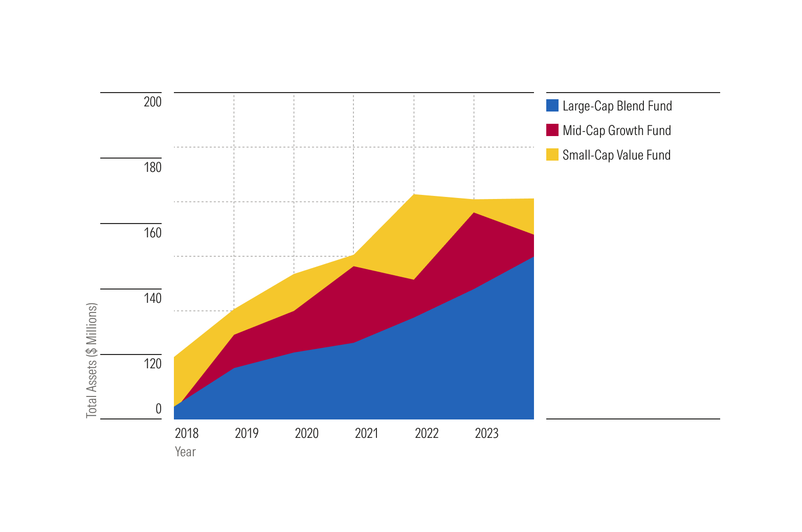
Stacked area charts illustrate how multiple data series contribute to the total. For example, they can display how an investment category shapes a portfolio's value over time. The top line’s height represents the total when all categories are combined.
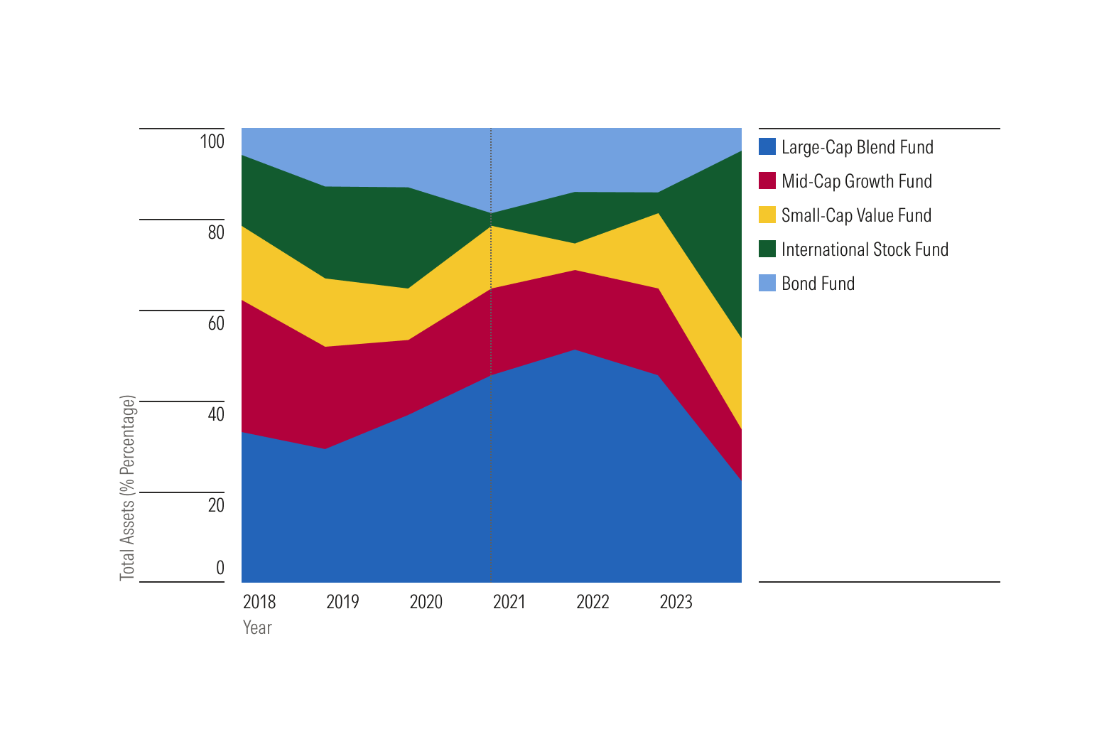
100% stacked area charts show each category’s percentage of the total, making the total height always 100%.
Usage
Use when:
- Summarizing total quantities or percentages across time or some other variable. If showing how the value of holdings has changed in the past year, use an area chart. If showing how the price of a given security has changed in the past year, use a line chart instead.
- Creating sparklines or other small visualizations where you want the change in quantity to be legible even at small sizes.
- Demonstrating how parts contribute to a whole; for example, how stocks, bonds, and other investment types contribute to the value of a portfolio over time.
Avoid when:
- Differences in values are small. Instead, use a line plot.
- Comparing multiple series side-by-side on the same plot. Instead use a line plot to avoid "stacking" each series on top of the other.
- Comparing how values differ across a range of categories. Instead use a bar plot horizontal or bar plot vertical.