Responsive Design
Best Practices
Responsive design keeps data visualizations clear as available space and data density change, including how chart elements respond to those shifts.
Protect Meaning
As space becomes constrained, preserve the elements required to understand the chart’s intended use case or story. The element needing the most space depends on the chart type, data, and user task. Adapt supporting or redundant elements first without removing the context required to interpret the visualization.
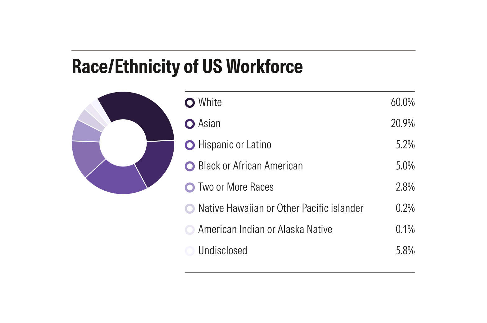
Depending on the chart type, some elements may be allocated more space than others and not impact the interpretation of the data.
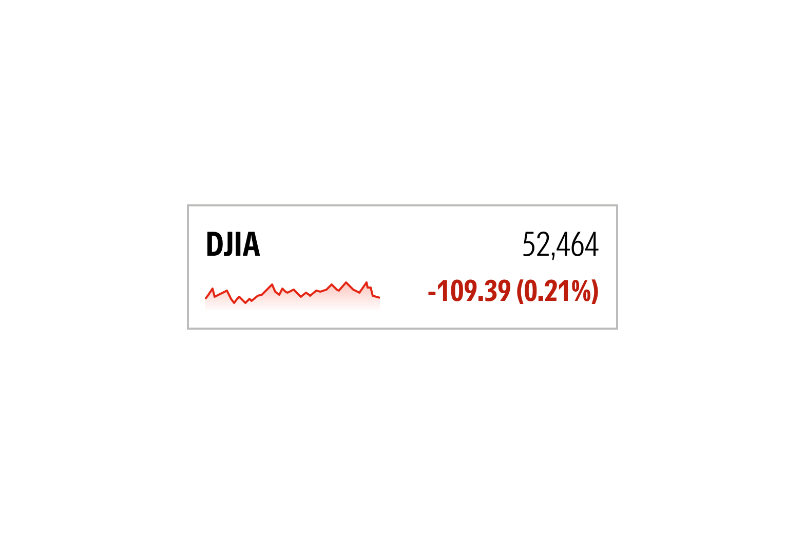
For some charts, like a sparkline chart, elements may even be removed entirely depending on the use case.
Adapt Representation
When a visualization becomes too dense to convey information meaningfully at smaller sizes, use a representation better suited to the available space, such as another chart type or a data table.
Preserve Clarity
Never allow axis ticks or labels to overlap, or chart elements to be unintentionally clipped at supported sizes. Adapt density, wrapping, truncation, position or layout before readability breaks. Our chart elements work responsively in a way that preserves a readable, interpretable chart.