Grids

The layout grid provides a 12-column, responsive, mobile-first grid system.


Responsive and Mobile First

The layout grid includes five breakpoints—Default (0px), S (640px), M (768px), L (1024px), and XL (>1440px)—to configure your layout across viewport widths. A mobile-first approach means that you start with the smallest breakpoint first and configure what changes as viewport width increases.
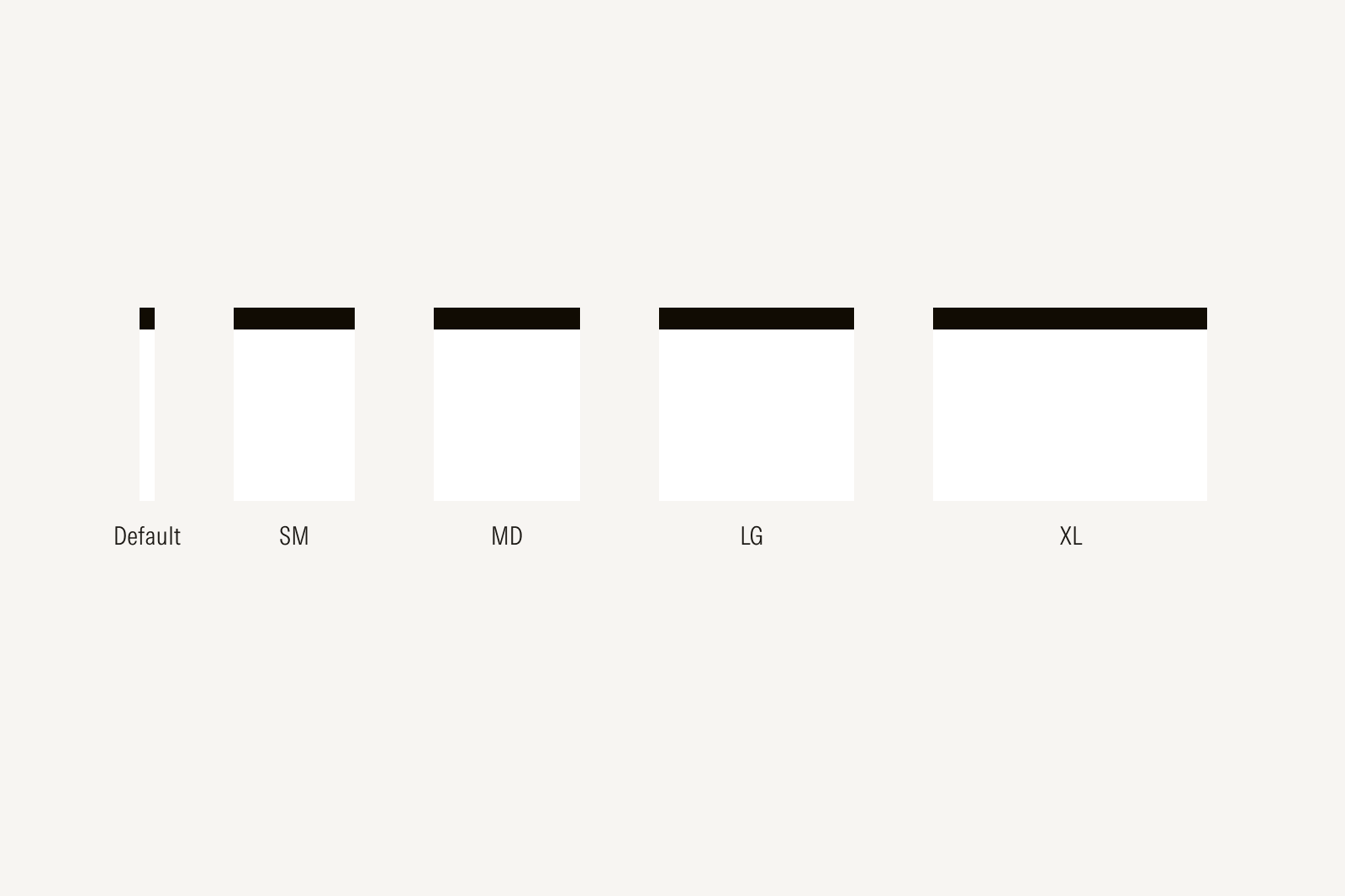
overview of breakpoints

Default: 0px

This breakpoint is visible from 0px to 639px.

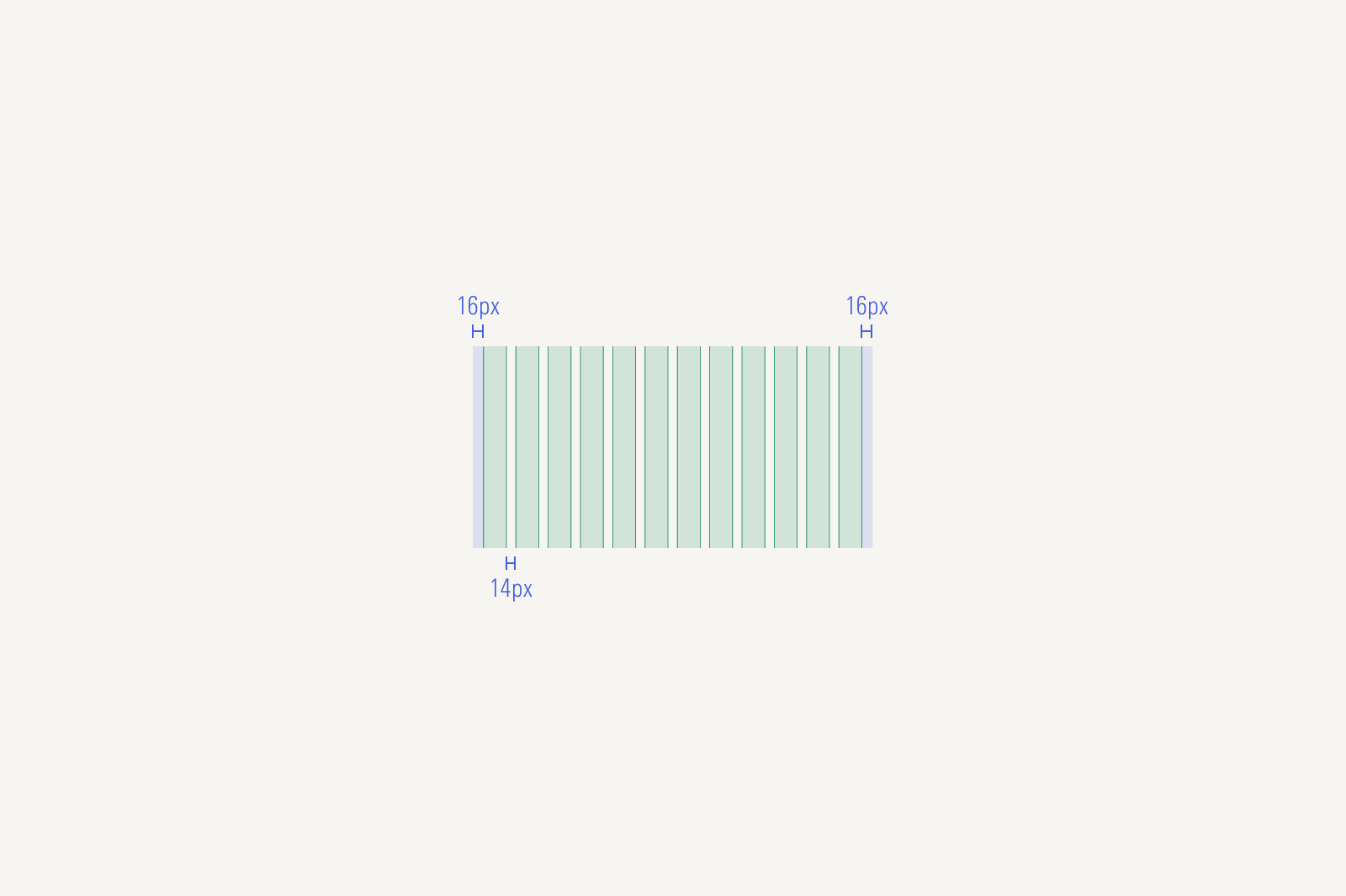
Default Breakpoint Grid and column system
12 columns | 14px gutter | 16px outer margin

SM: 640px

This breakpoint is visible from 640px to 767px.

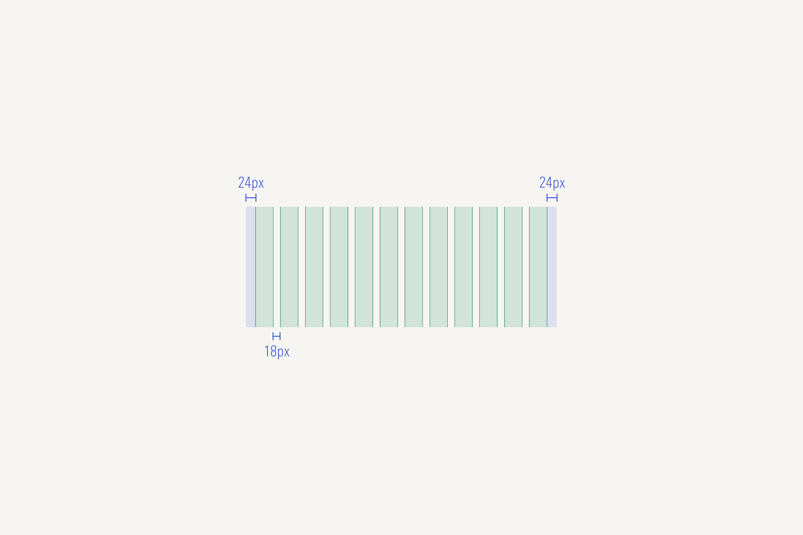
SM Breakpoint Grid and column system
12 columns | 18px gutter | 24px outer margin

MD: 768px

This breakpoint is visible from 768px to 1023px.

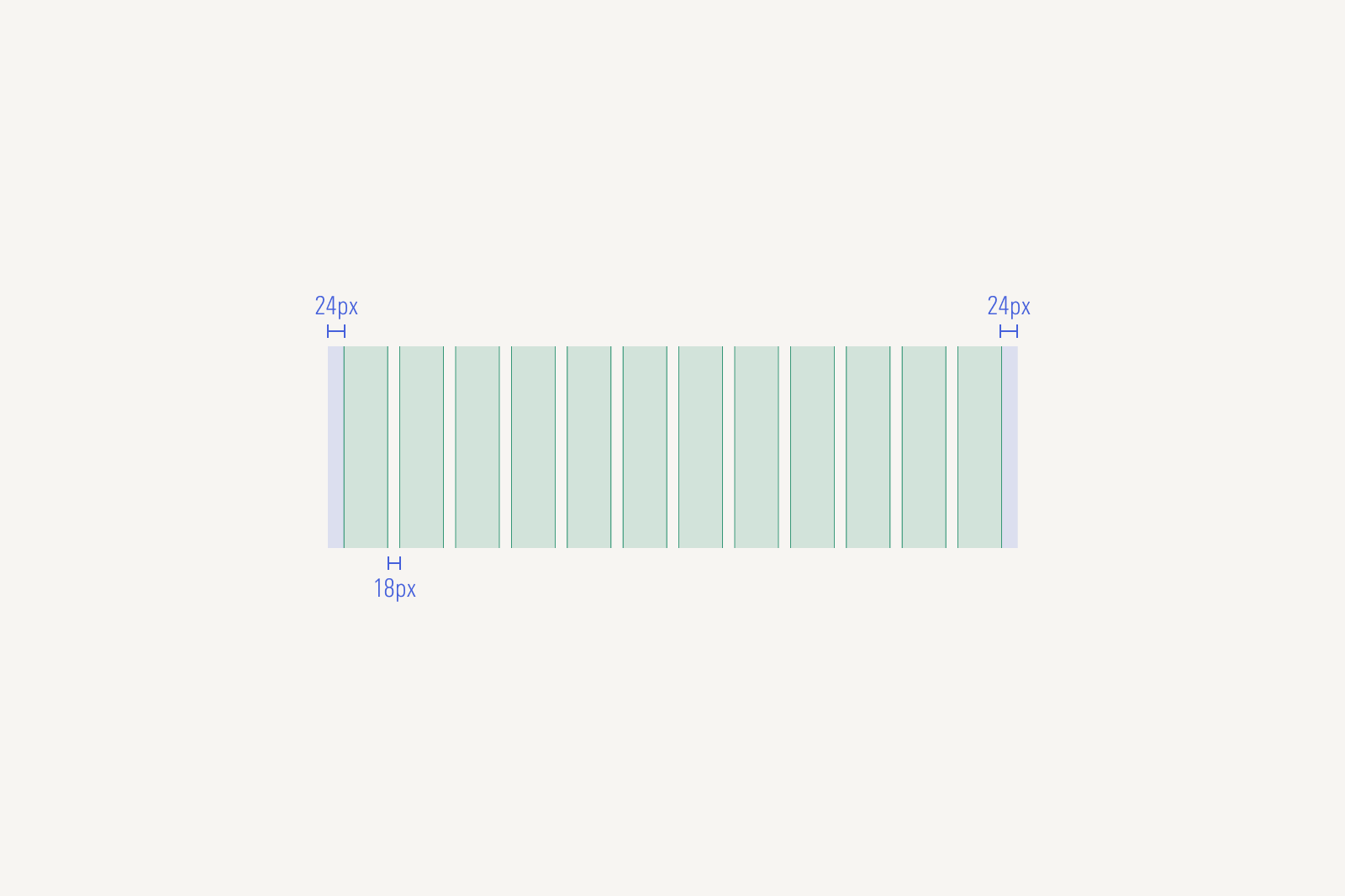
MD Breakpoint Grid and column system
12 columns | 18px gutter | 24px outer margin

LG: 1440px

This breakpoint is visible from 1024px to 1440px.

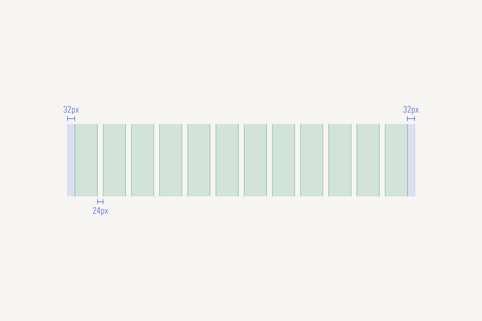
KG breakpoint Grid and column system
12 columns | 24px gutter | 32px outer margin

XL: >1440px

This breakpoint is visible >1440px. Beyond 1440px the UI will remain in the LG grid, outer margin will increase and full bleed elements will adjust their width alongside the viewports (this will be exemplified on each page template.).

24px gutter | 32px outer margin