Product Illustration
Product illustrations help tell a clear, purposeful story about key product capabilities and features. They distill the product experience to its essential visual elements, simplifying complex flows and keeping users focused on concepts to highlight the benefits of the product.

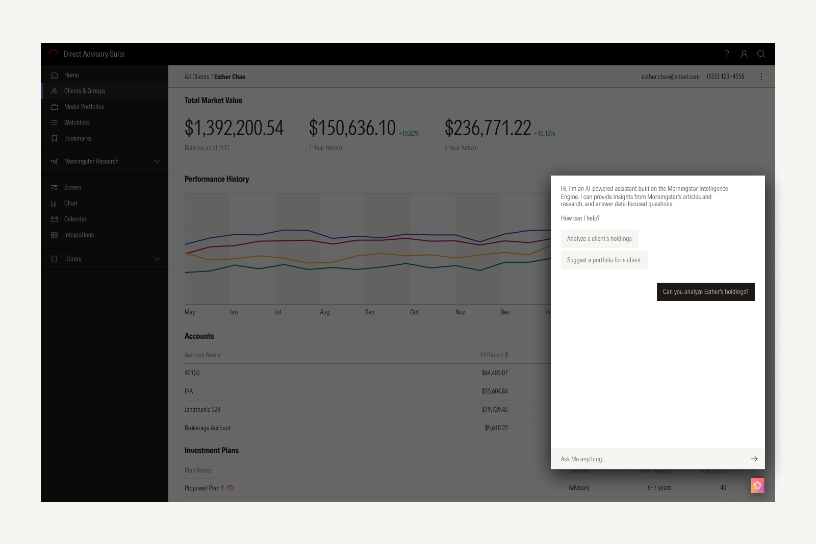

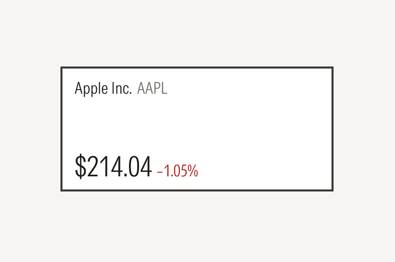
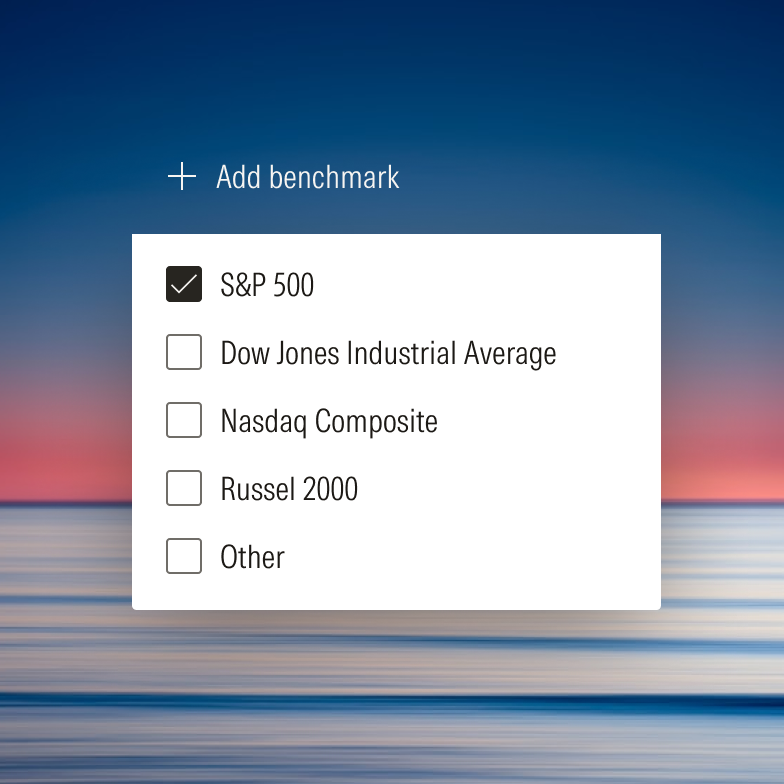
Single panels, modals, or content areas focus on a distinct capability without distraction from the surrounding interface.
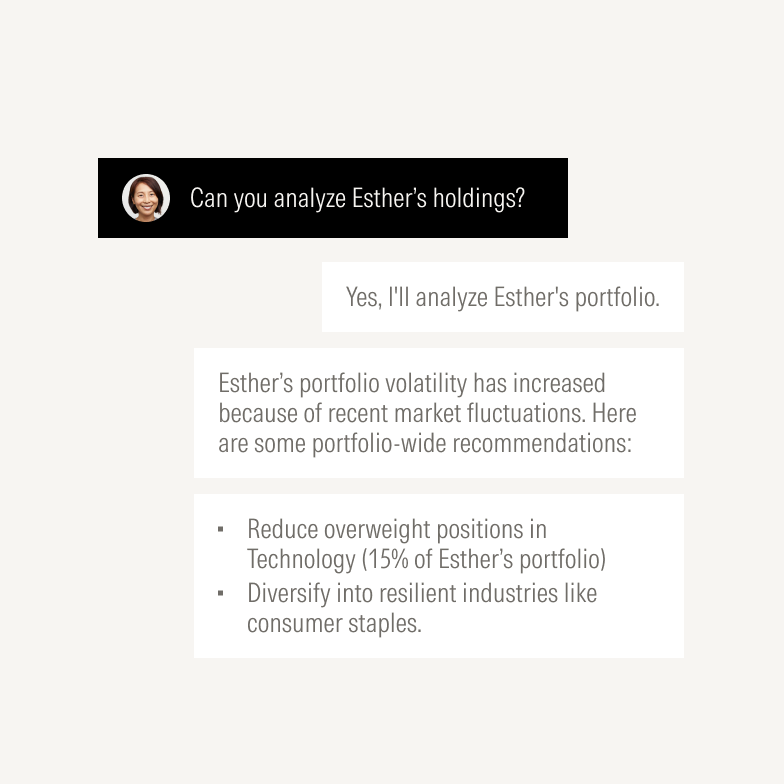
Isolating components and UI elements helps highlight a single feature.

Live demos let users experience features via simple microinteractions, offering engagement beyond a static image.
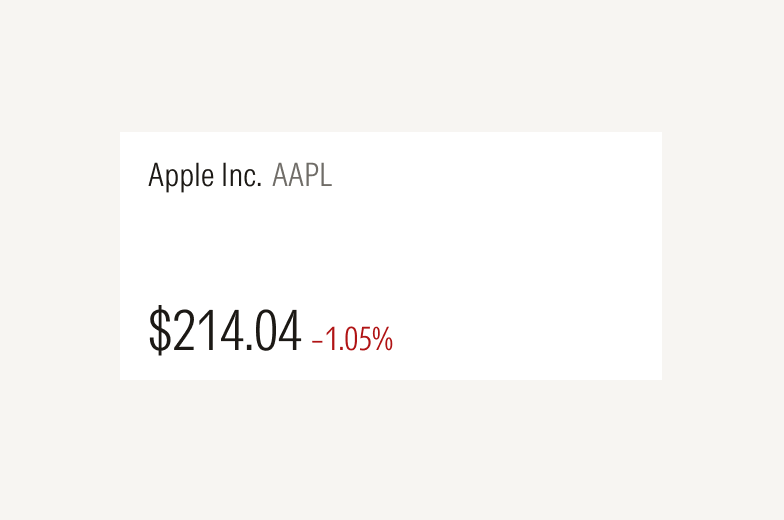
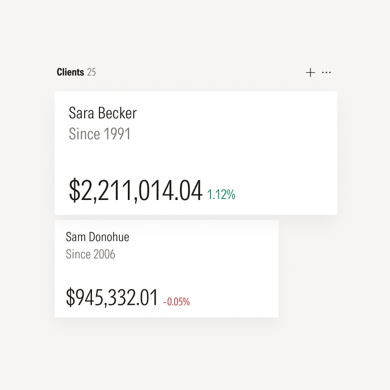
In most cases, color contrast alone is enough to visually distinguish a component from its surface.
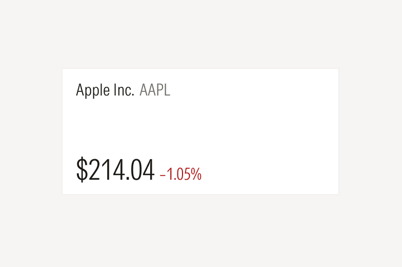
Consider adding a subtle, thin border to better define the edge of a component against its surface when the color contrast is low.
Don’t add thick or bold borders for decorative effect.
Corner Radius

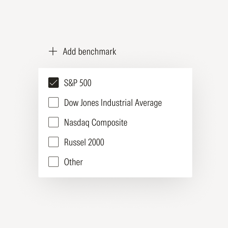
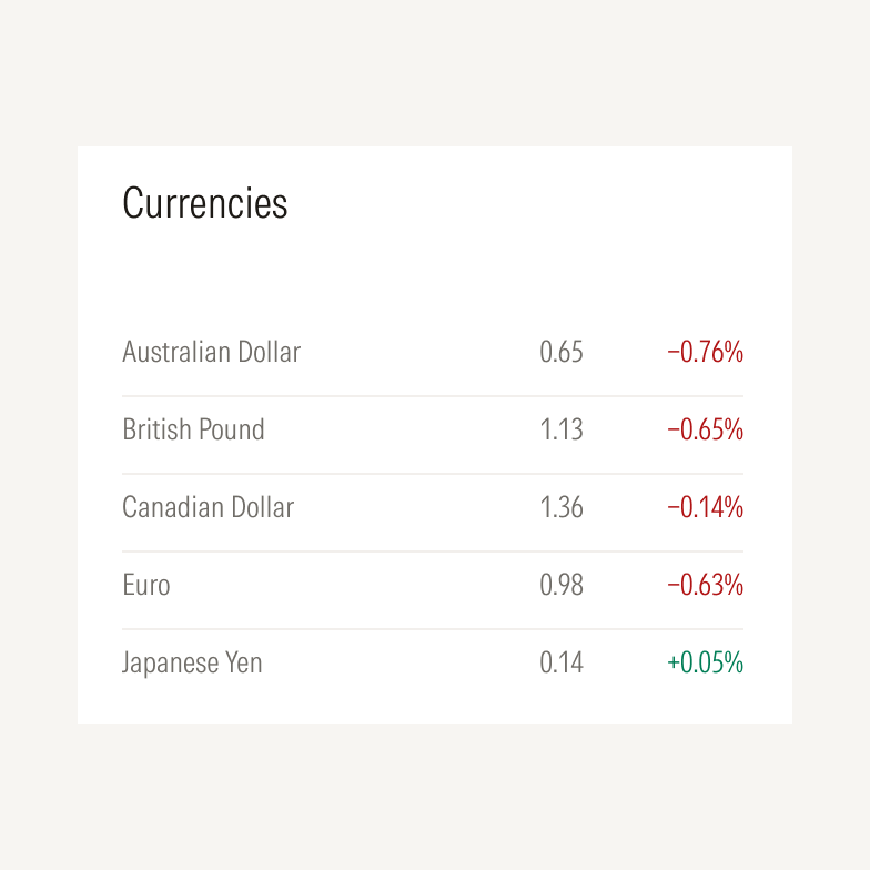
Preserve the square component corners in illustrations.

Avoid rounding corners for decorative effect.

A subtle drop shadow can elevate key components, like buttons, to draw focus to a specific feature or capability.

Don’t add unnecessary or harsh drop shadows.
Scale
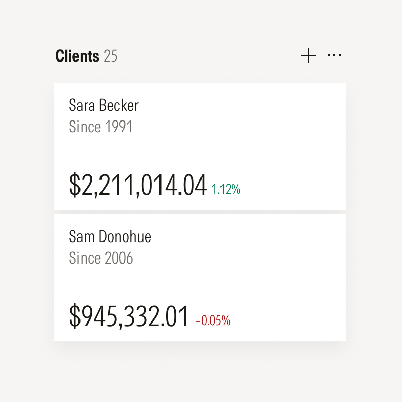
Components are typically shown at scale with each other.
Avoid multiple scale shifts that result in too many variations of text sizes, stroke weights, or shadow styles.
Background
Illustrations are typically placed on neutral or solid backgrounds.
Illustrations may be placed on top of photographs for a more visually expressive style. For guidance on choosing photos, see Photography.
Component Abstraction
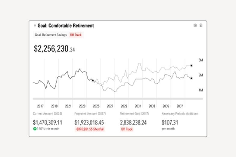
Adjust size and spacing as needed for a cleaner visual representation of the component. Abstract the text to support quick recognition and ensure any fund examples are evergreen and non-identifiable.
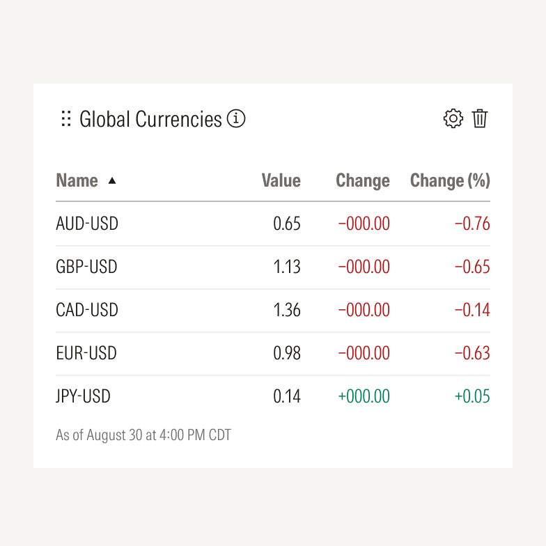
Don’t leave unnecessary UI elements that otherwise distract or aren’t critical to understanding what a component does. Simplify terms for readability.
Content Abstraction
Show only essential text to maintain users’ focus, keeping content evergreen so as not to date the illustration.

Consider using skeleton states sparingly to represent or obscure non-essential text.

Avoid abstracting the text so much that the illustration becomes hard to read or understand.
Cropping

Components are typically illustrated in full and in their default state.
Mindfully crop an illustration to draw attention to a particular detail or behavior of a component.

Avoid cluttered or unrelated environmental photography that distracts from the product itself or detracts from the story being told.

Avoid showing hands unless they help highlight key product features.

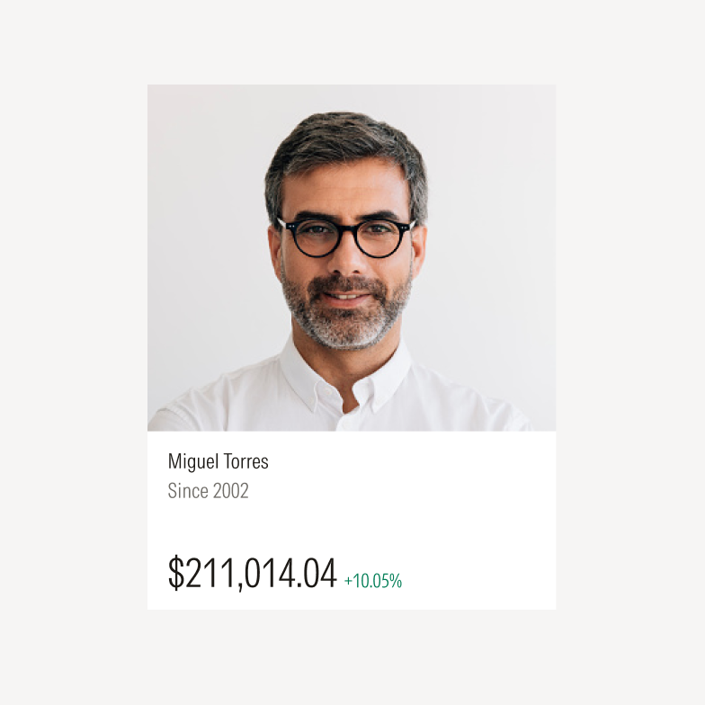
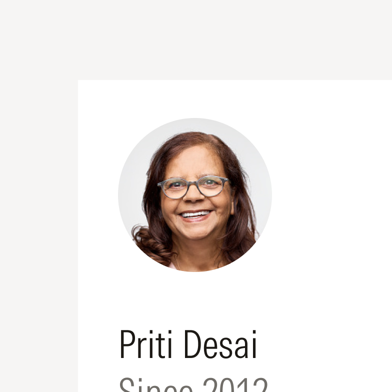
Replace confidential details with realistic placeholder content, such as generic portfolio or fund names. Avoid using actual names or client information to avoid the appearance of endorsement.
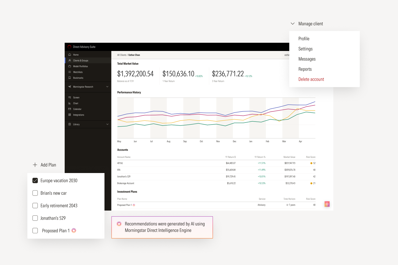
Don’t use screenshots for product illustrations; they don’t scale and often need UI to be cleaned up. Does this section need to go in the illustration section? If you can’t do this, what should you do?
Resources
Morningstar color styles, visual effects, and annotation elements are available in Figma. For components and other UI elements, see Product System.
Device-specific UI kits for Apple and Android are available via Apple Developer and Figma, respectively.