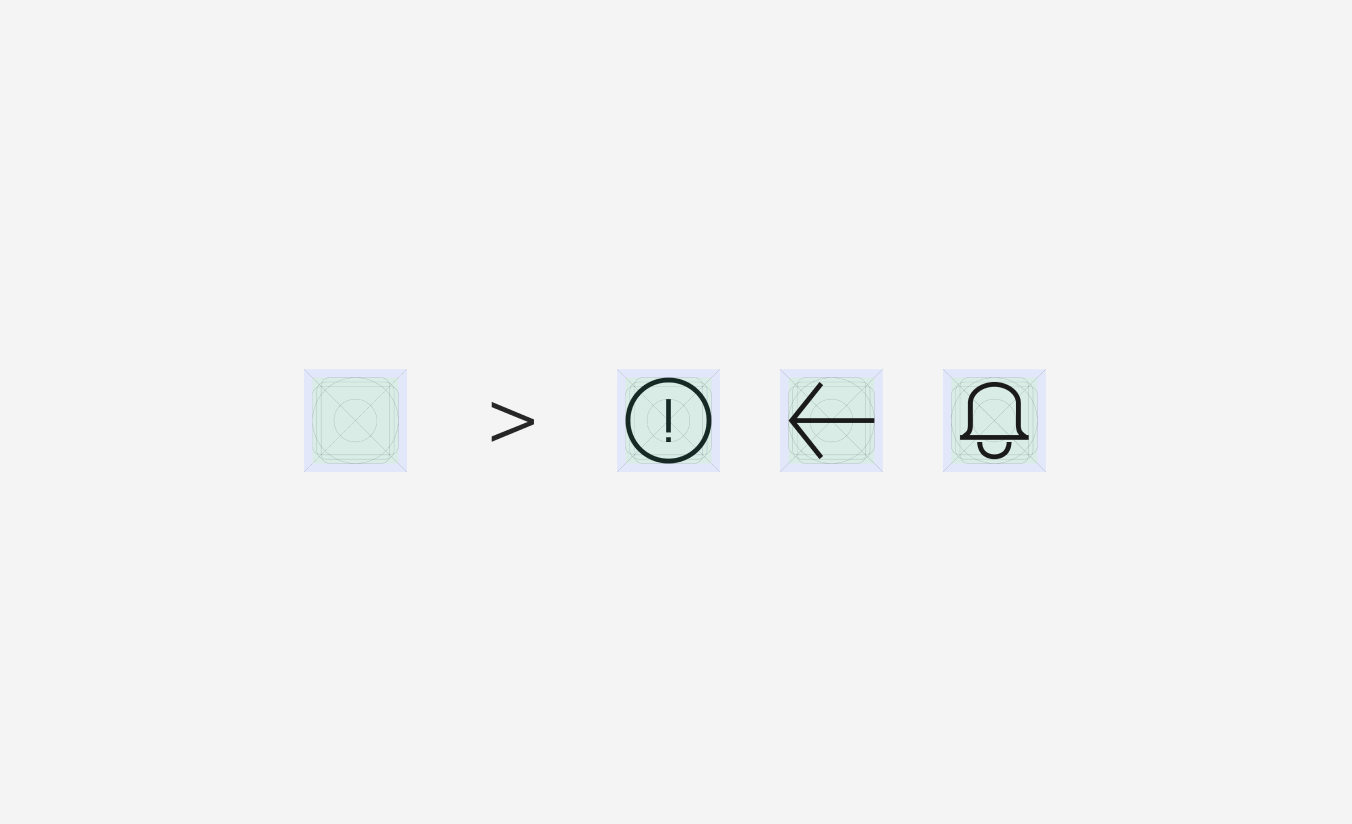
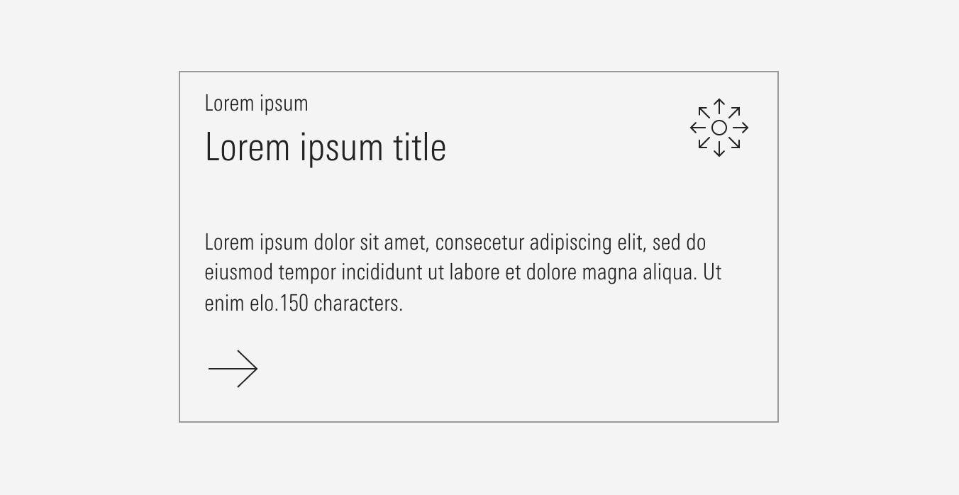
Icons
The marketing website icon library consists of customized outline icons with sharp corners. Icons can be used in four sizes and should be used throughout the site to represent actions, concepts, or specific objects.
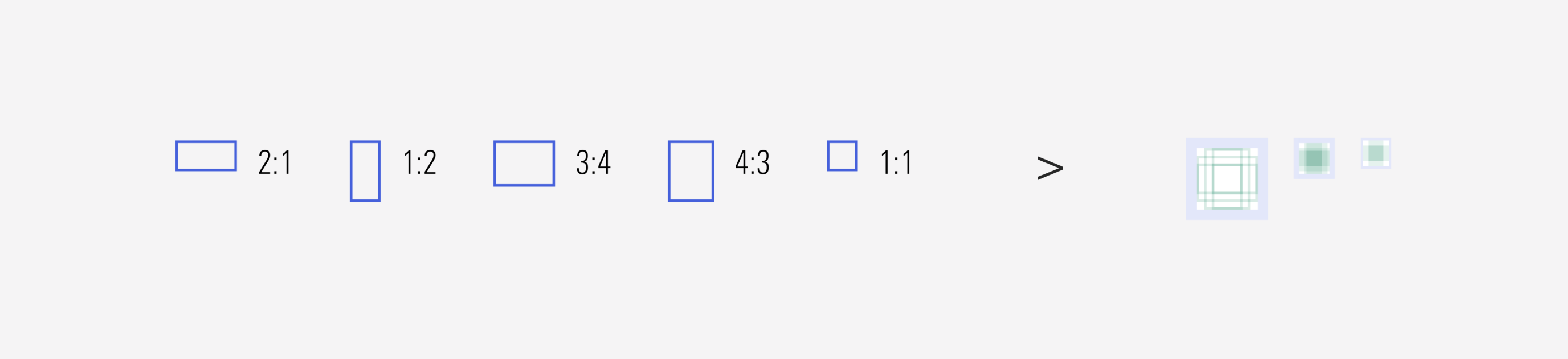
Sizes
Icons are designed to display at their four sizes (SM, MD, LG, XL) square bounding boxes. To avoid non clear or deform of icons, avoid re-sizing them unless absolutely necessary. The icon’s bounding box size should be scaled, if applicable, to match the line height of the text element it accompanies.
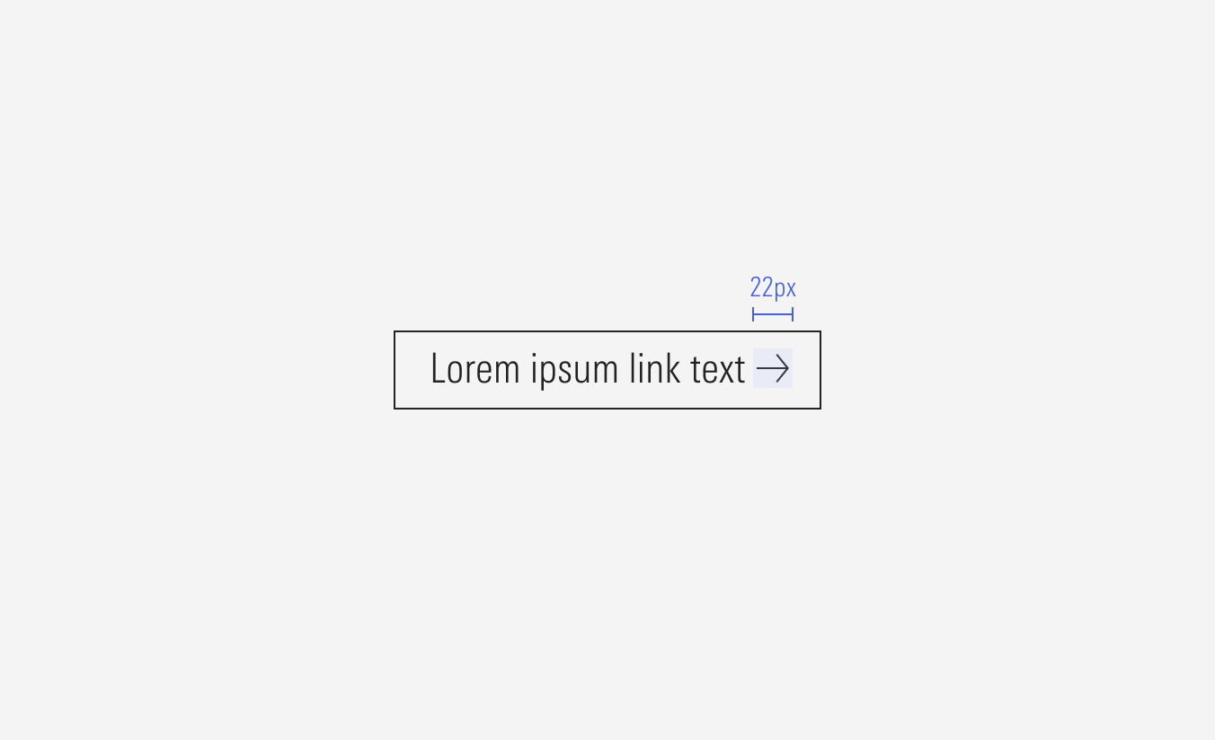
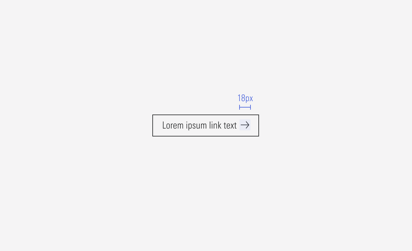
Structure
The structure has this “safe area”, or padding, which consists of a 2px minimum margin (left-right, top-bottom), depending of the share and to maintain proportions, it can get to a max of 4px. This padding helps us manage better distance between icons and other elements.
Proportions
These common proportions were used to construct the key line grid. All anchor points of a vector object should fall on a whole pixels.
Adding New Icons
When new icons are needed, ensure they are styled to match similar icons already existing in the library, are named accurately, and they follow the proper layer naming convention. Also, use exact values for the shapes to avoid large decimals in sizing (ex. the Vector path of the icon has a dimension of 12x24px), and it should be given the default color of neutral-85.
Create the icons on each component boundary (14×14px, 18x18px, 20x20px, 22x22px), the entire vector shape should be combined into one compound pathway (if necessary) and add “Scale” to its constraints. This will allow it to be interchangeable with other icons and these ones to be scalable.
Neutral-80
Used in the icon for all light backgrounds, alone or part of a component.
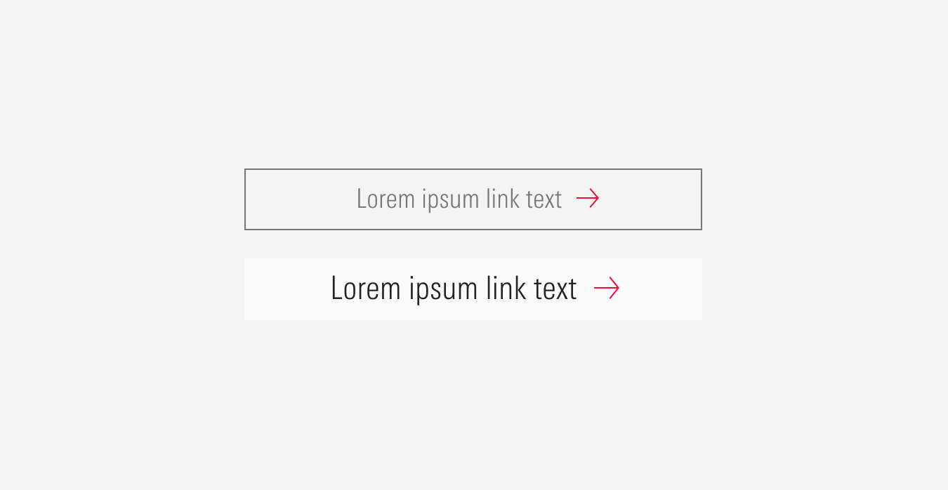
Red-50
Used in the right arrow icon as part of the hover state for some components.
Neutral-2
Used in the icon for red backgrounds, alone or part of a component.