Responsive Design
Elements
Adapt chart elements for responsiveness in any order—there’s no set order to follow. Identify which elements are most essential to interpreting the chart, then reposition, simplify, or replace. For readability, preserve enough space for data marks, patterns, and relationships.
Legend
Preserve the legend when it is necessary to identify series, categories, or values.
Apply Direct Labels
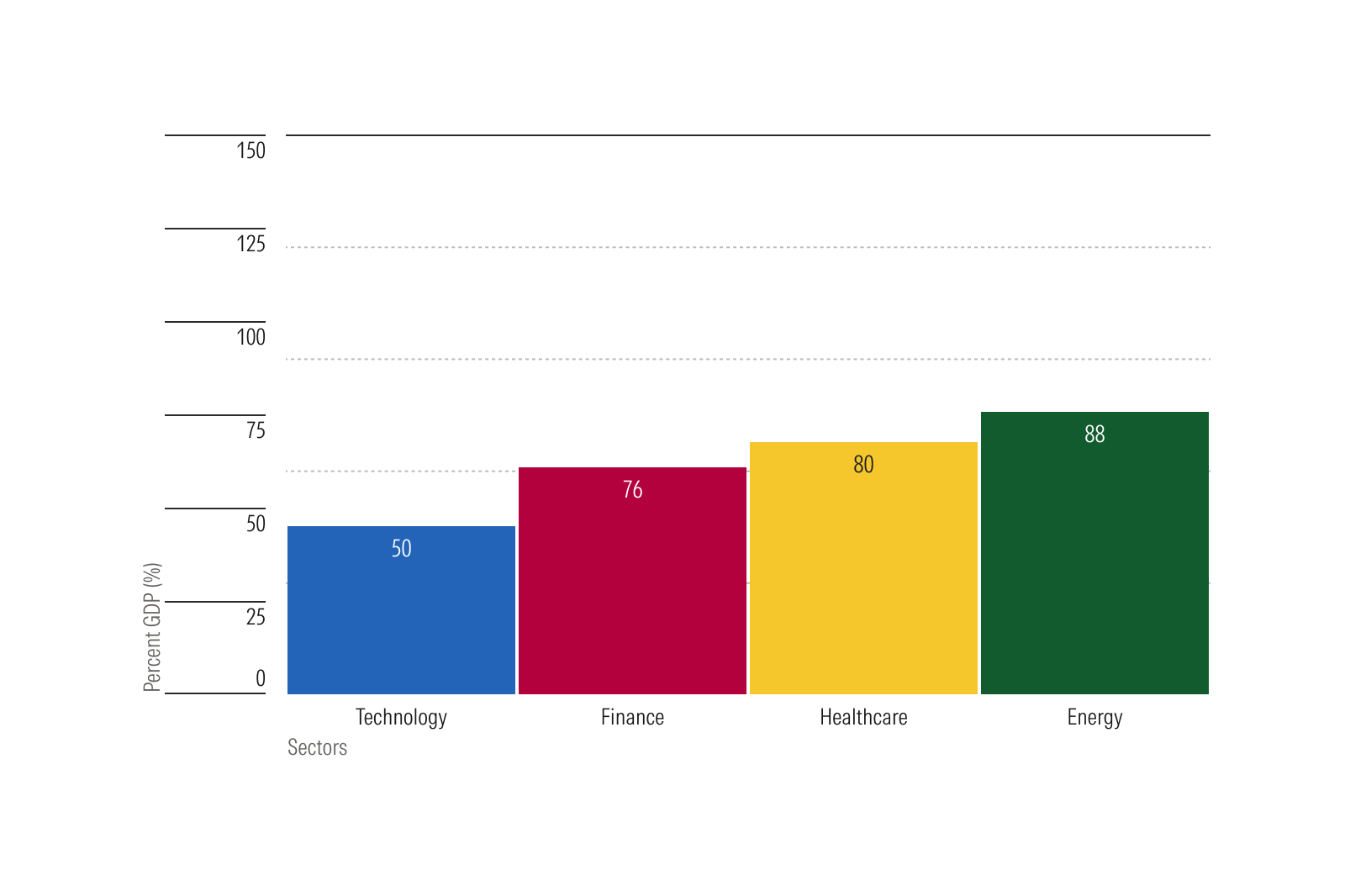
Label series directly on the chart when practical to save space. Direct labels reduce the need to look between the plot and legend and saves space for the plot area and other chart elements. When only one series exists, use a title or direct label instead of a legend.
Placement and Scale
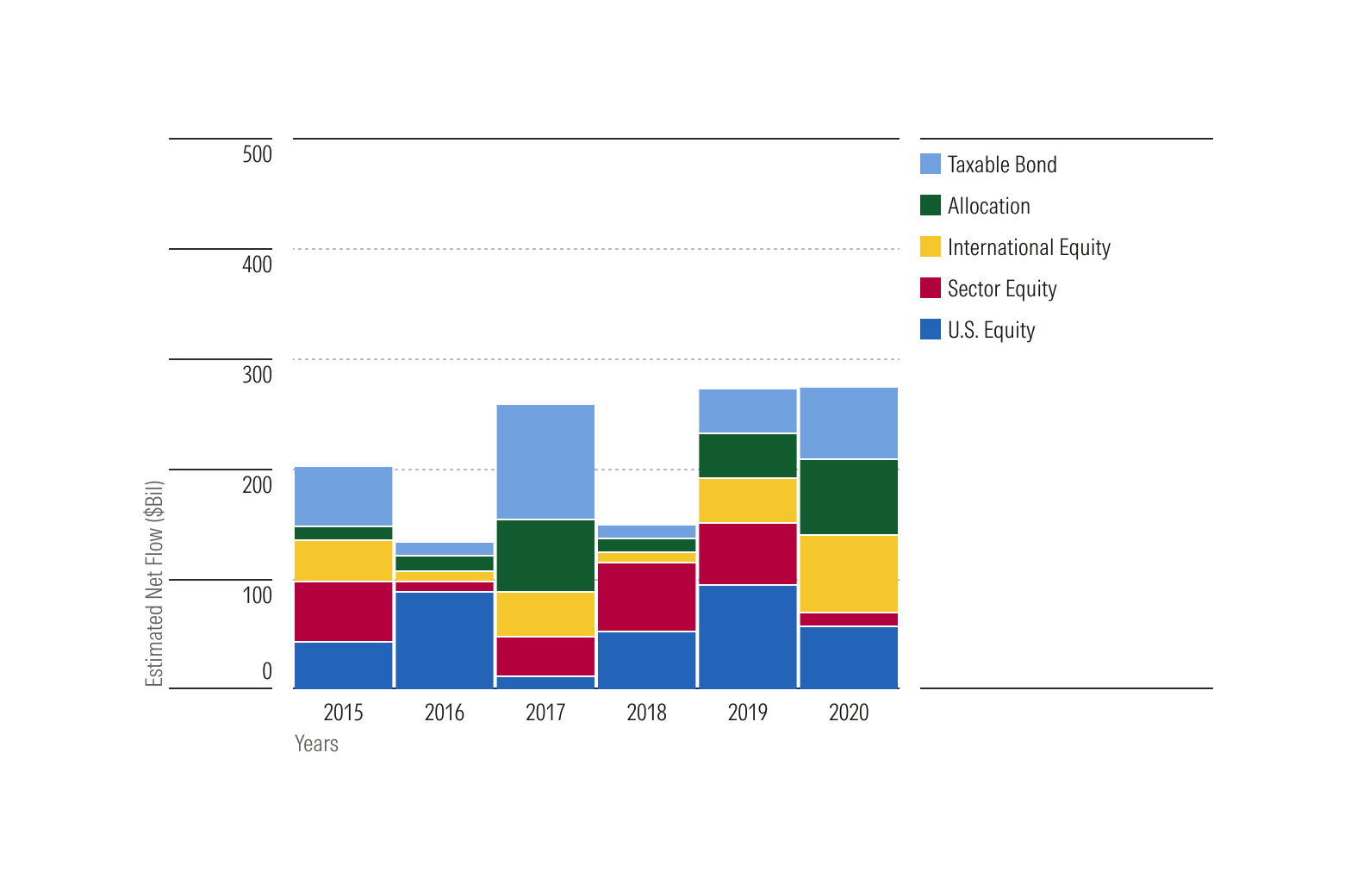
For desktop layouts, position the legend to the right of the chart. Horizontal bar charts always start with the legend on top.
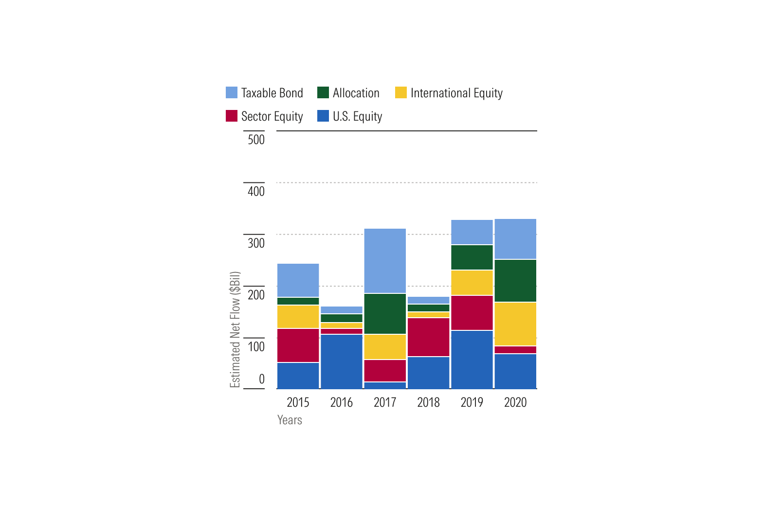
When width is constrained, as in mobile, position the legend at the top of the chart.
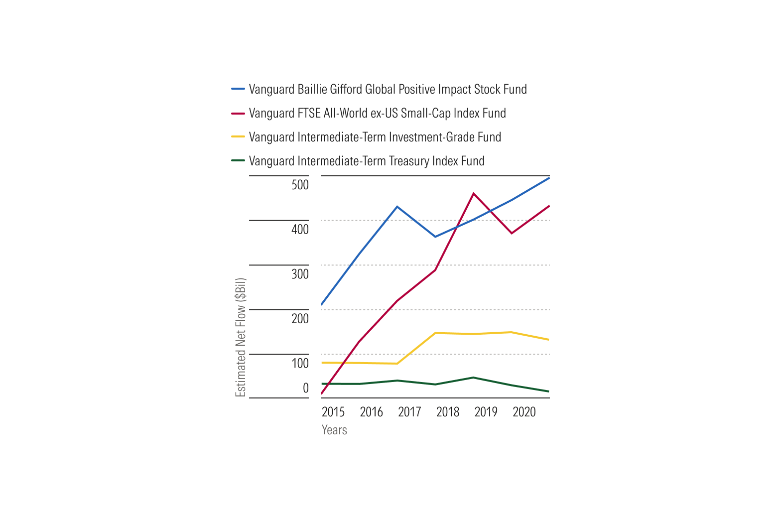
Do keep the top legend smaller that the plot area.
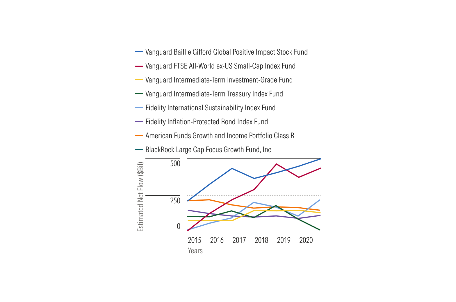
Don’t make the top legend taller than the plot area if doing so makes the chart difficult to interpret.
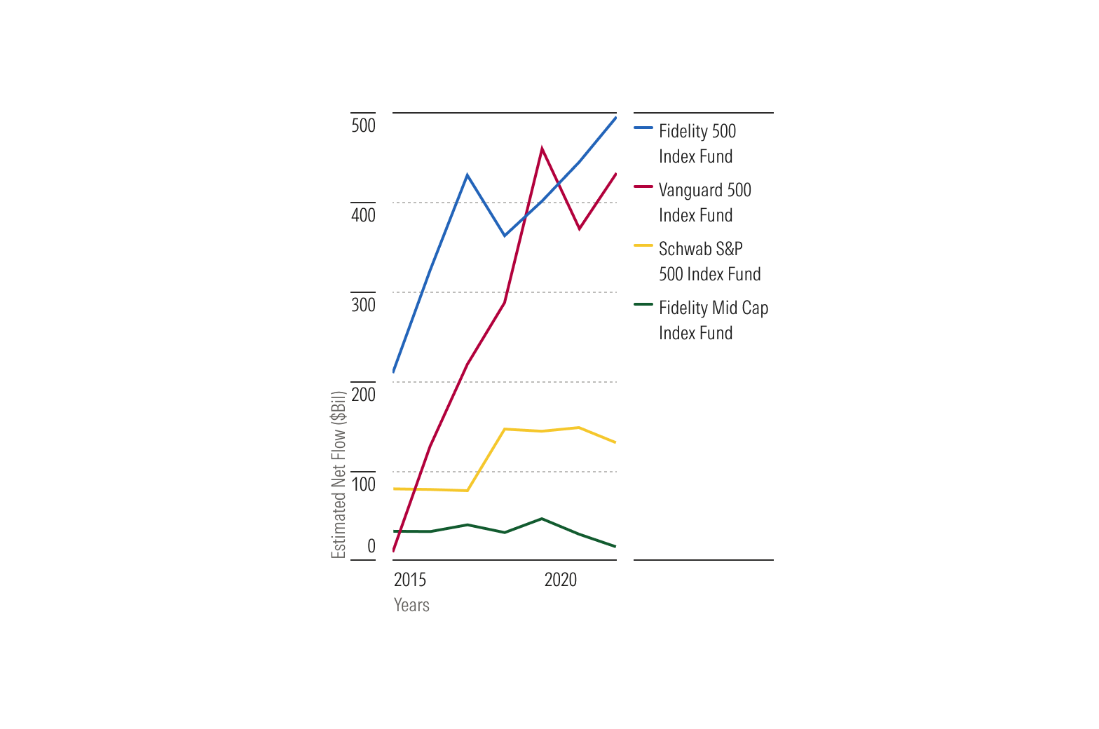
Do keep the right legend smaller than the width of plot area.
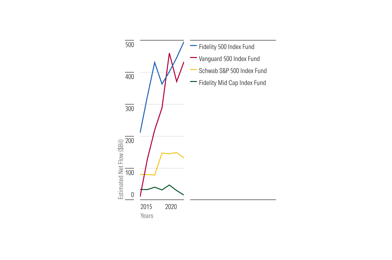
Don’t make the right legend wider than necessary to fit the content, especially when doing so makes the chart difficult to interpret.
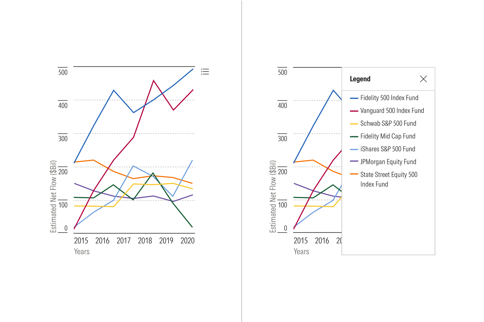
Collapse When Constrained
Axes
Don’t assume an x-axis or y-axis is more important than the other. Preserve the scale, values, categories, and labels most critical to the chart’s intended comparison and user task.
Adjust for Density
Axis ticks and labels must never overlap and shouldn’t change the underlying scale or meaning of the data.
As space allows, aim for five to seven major ticks. When space is constrained, aim for two to four to reduce tick density. Consider shortening labels while preserving enough reference points to interpret the scale or categories.
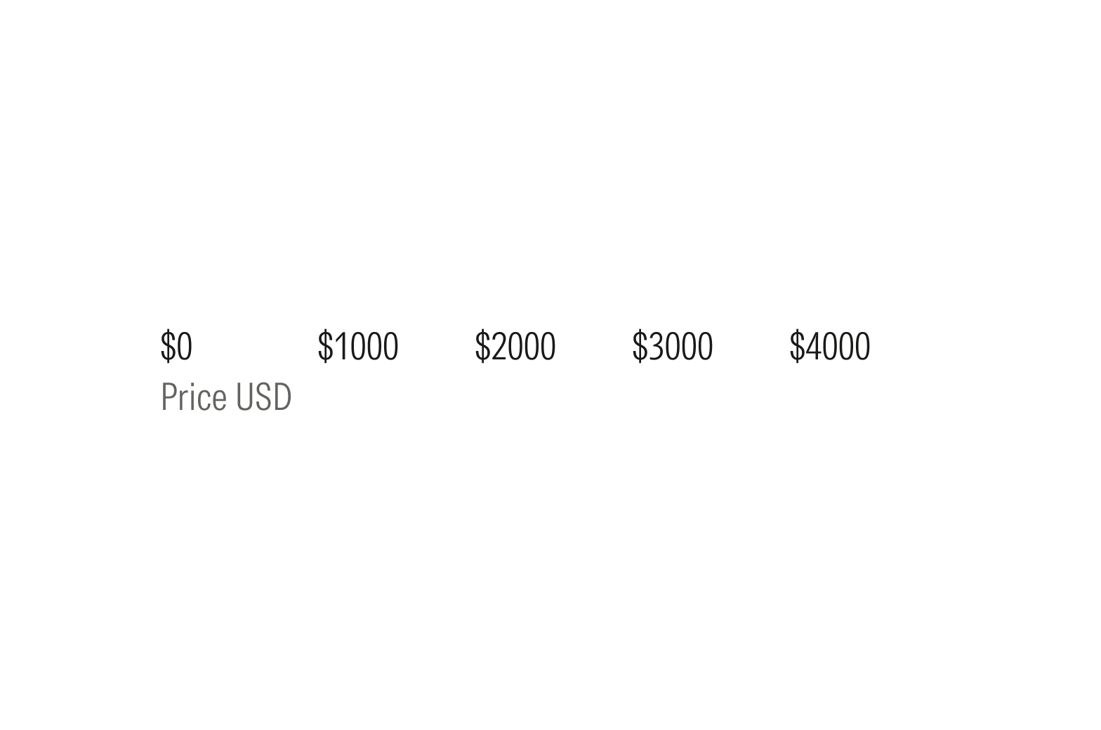
Do reduce the number of visible ticks at equal intervals.
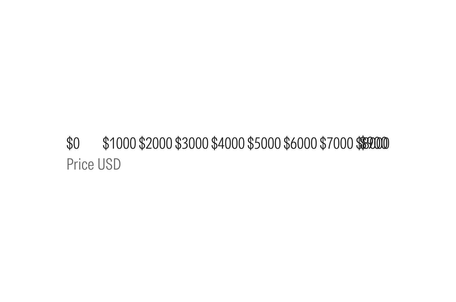
Don’t risk tick overlap or collision in constrained spaces; reduce tick density.
Adapt Long Labels
When labels don’t fit, adjust the content or layout first. Rename or abbreviate labels, or use a chart layout that better accommodates longer labels, such as a horizontal bar chart.
Then, adapt the labels. Wrap or truncate with ellipses to prevent excessive wrapping.
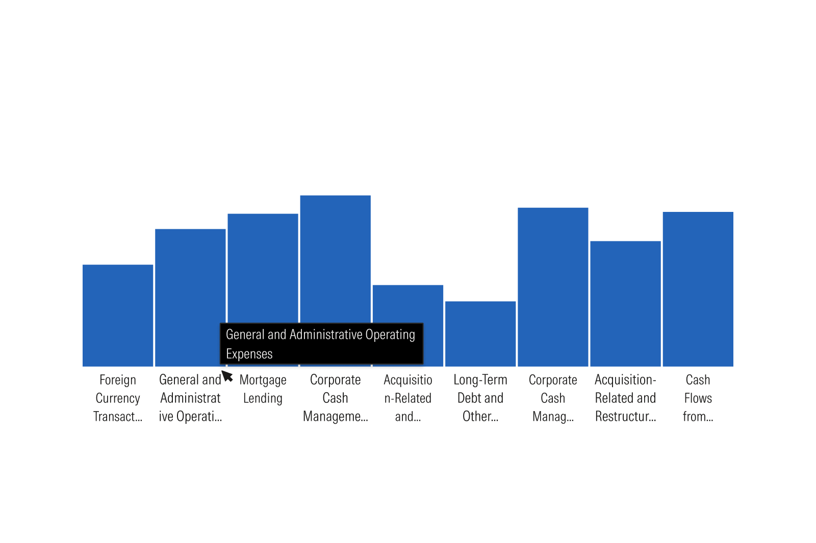
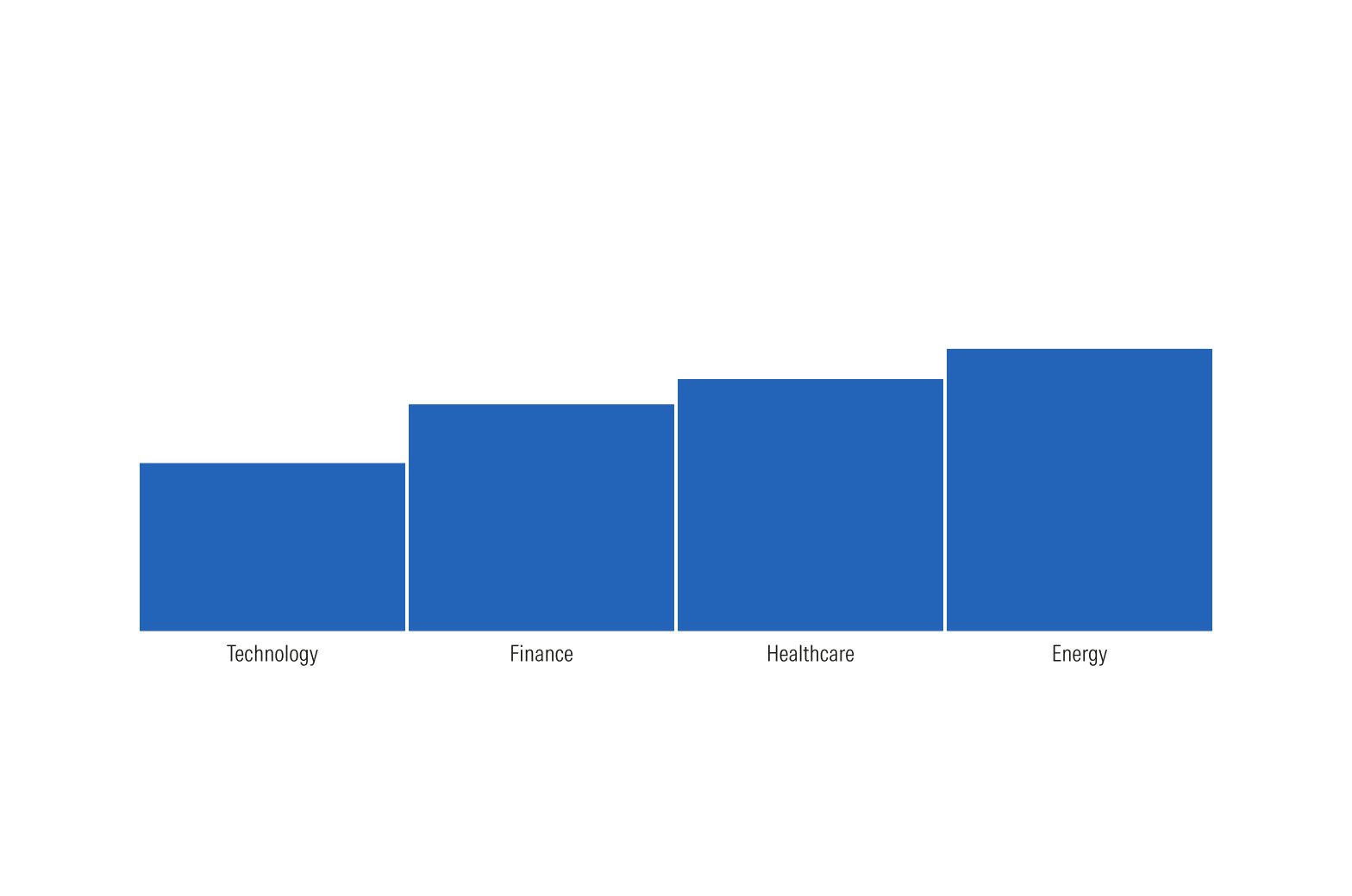
Do use shorter labels in a chart.
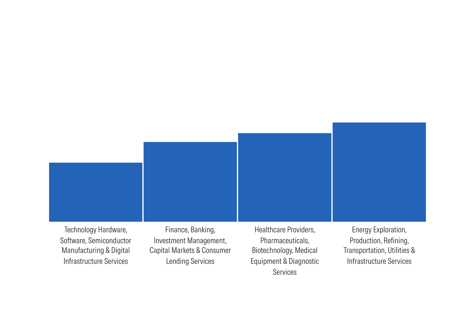
Don’t use long labels in a chart where space is limited.
Hover Flag
Prevent Clipping
Keep the hover flag within the chart container and reposition it near an edge rather than clipping its content.
Limit Content When Constrained
When there is not enough space to display multiple series clearly, show only the selected series. Do not preserve additional content at the expense of legibility or clipping.
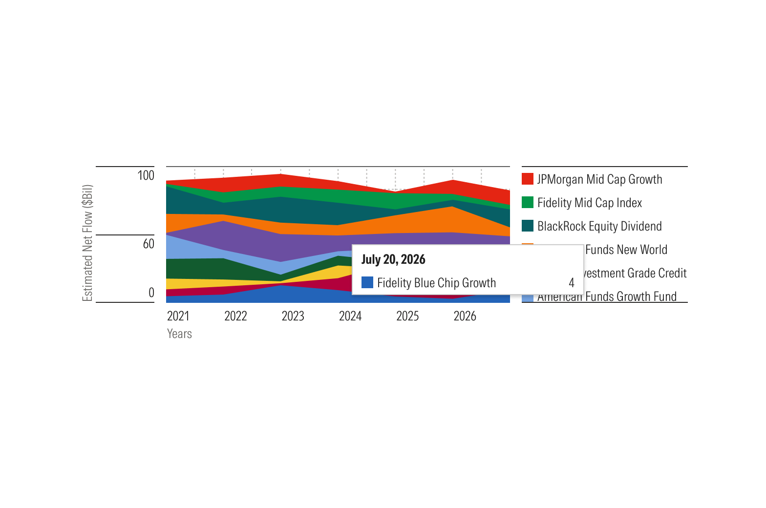
Do limit the hover flag to a single series when space is limited.
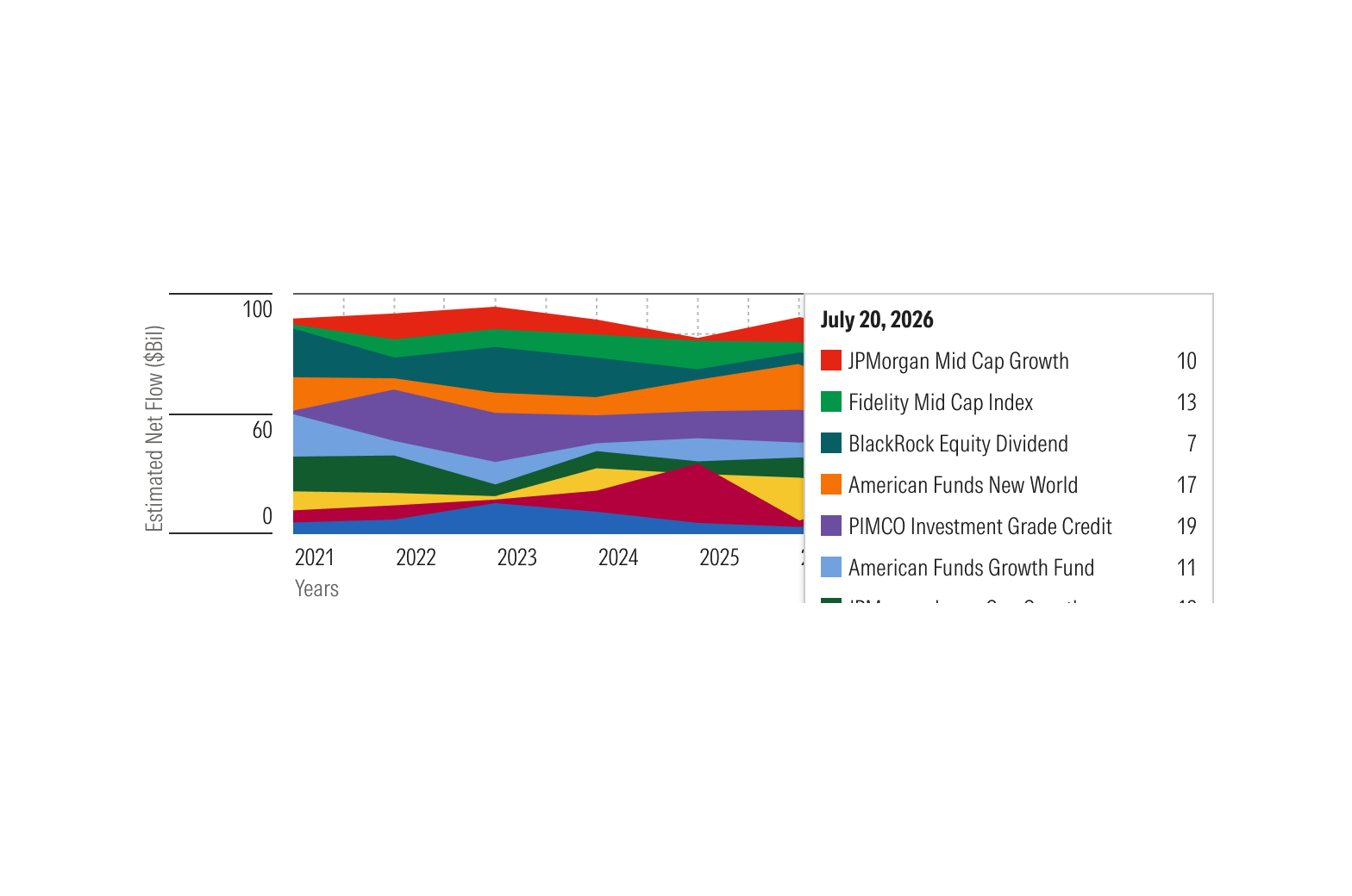
Don’t clip the hover flag by displaying all series.