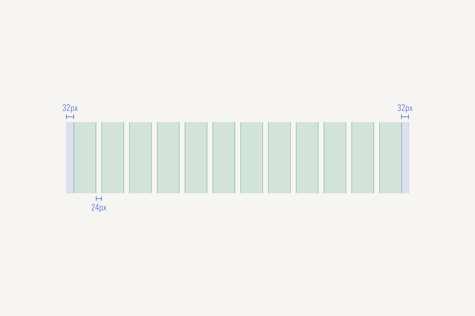
Grids
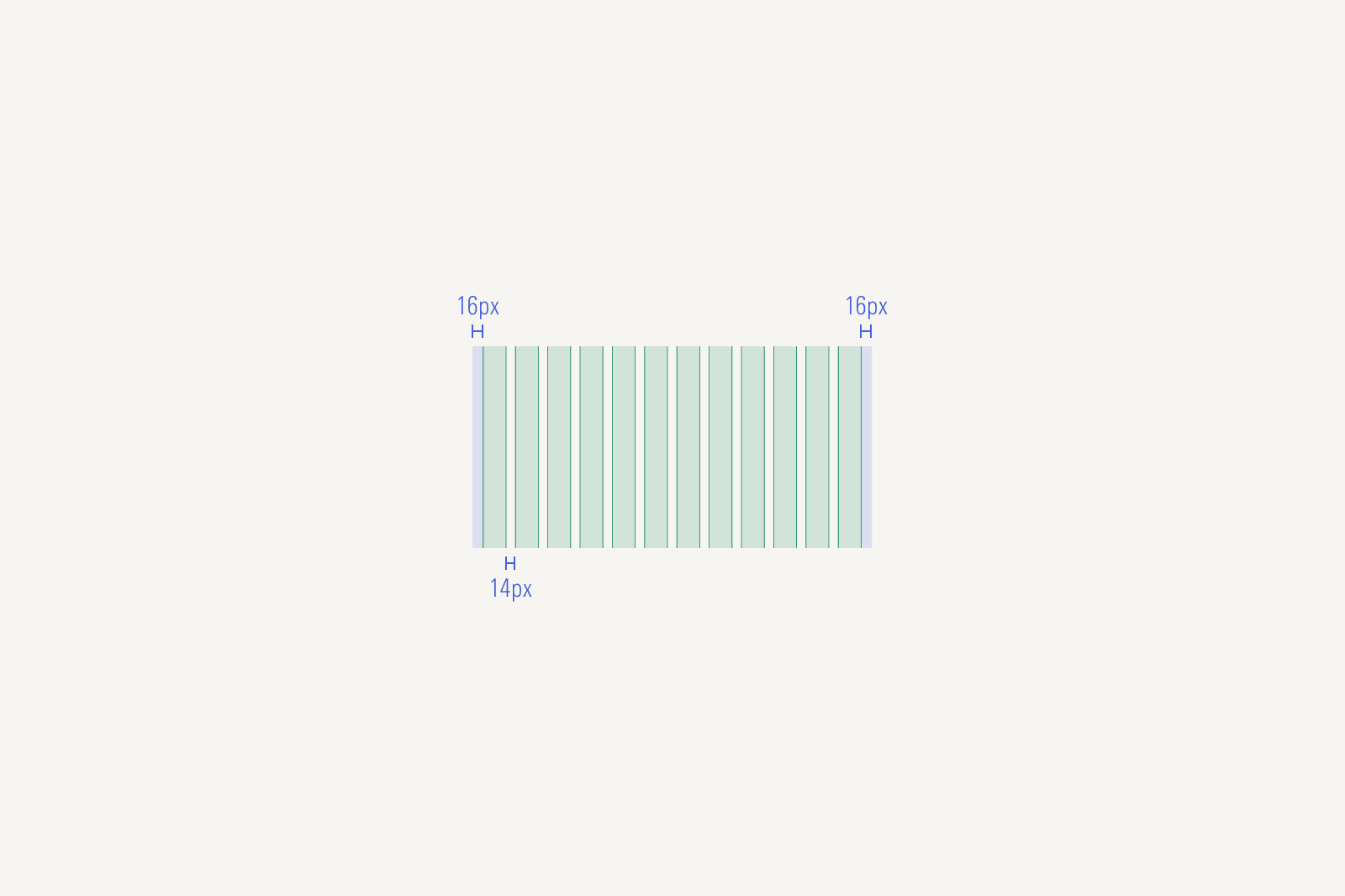
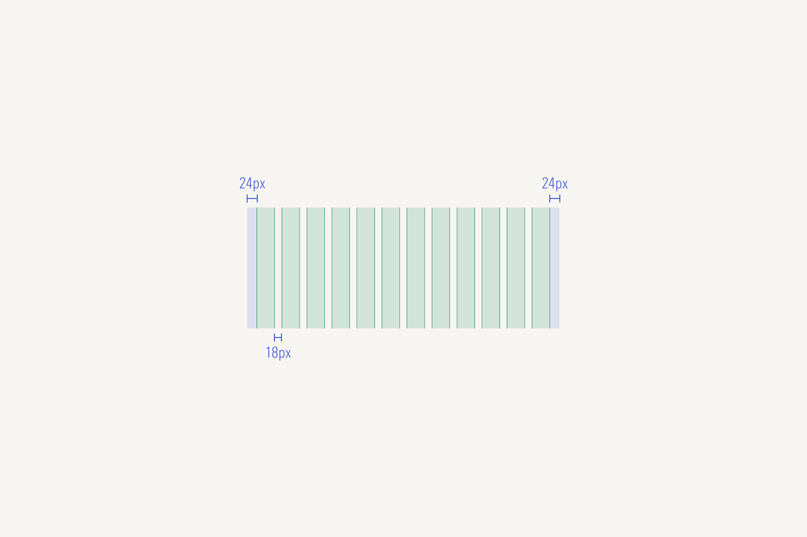
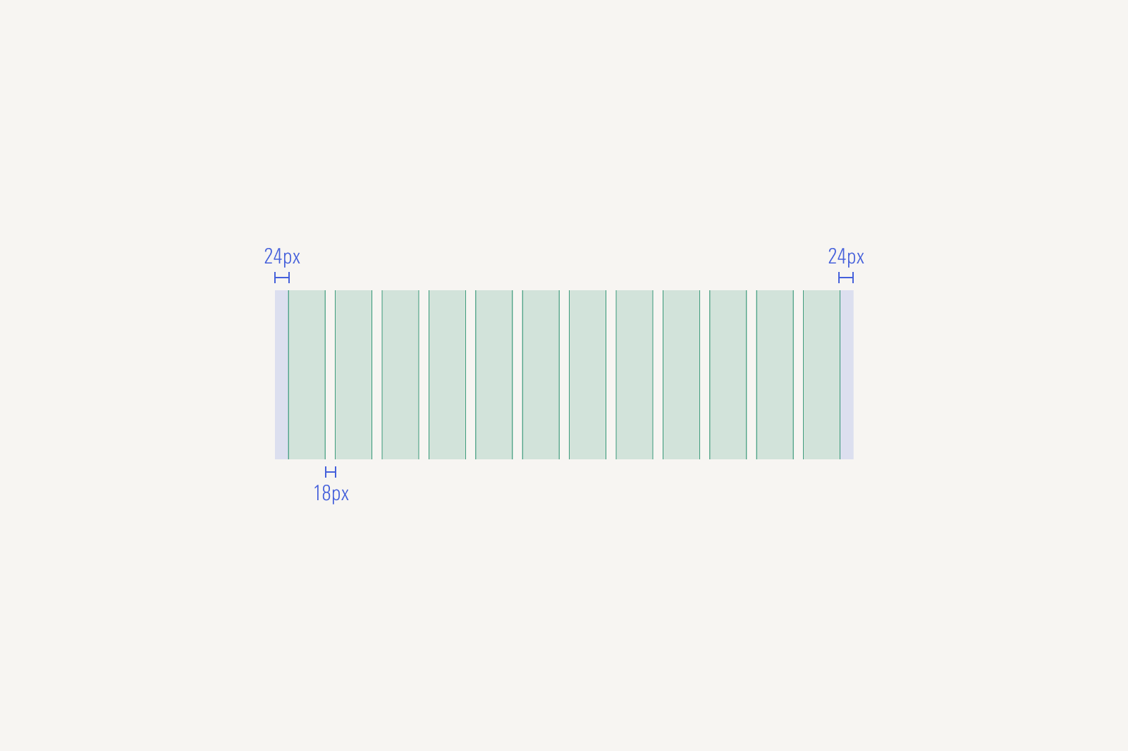
The layout grid provides a 12-column, responsive, mobile-first grid system.
Responsive and Mobile First
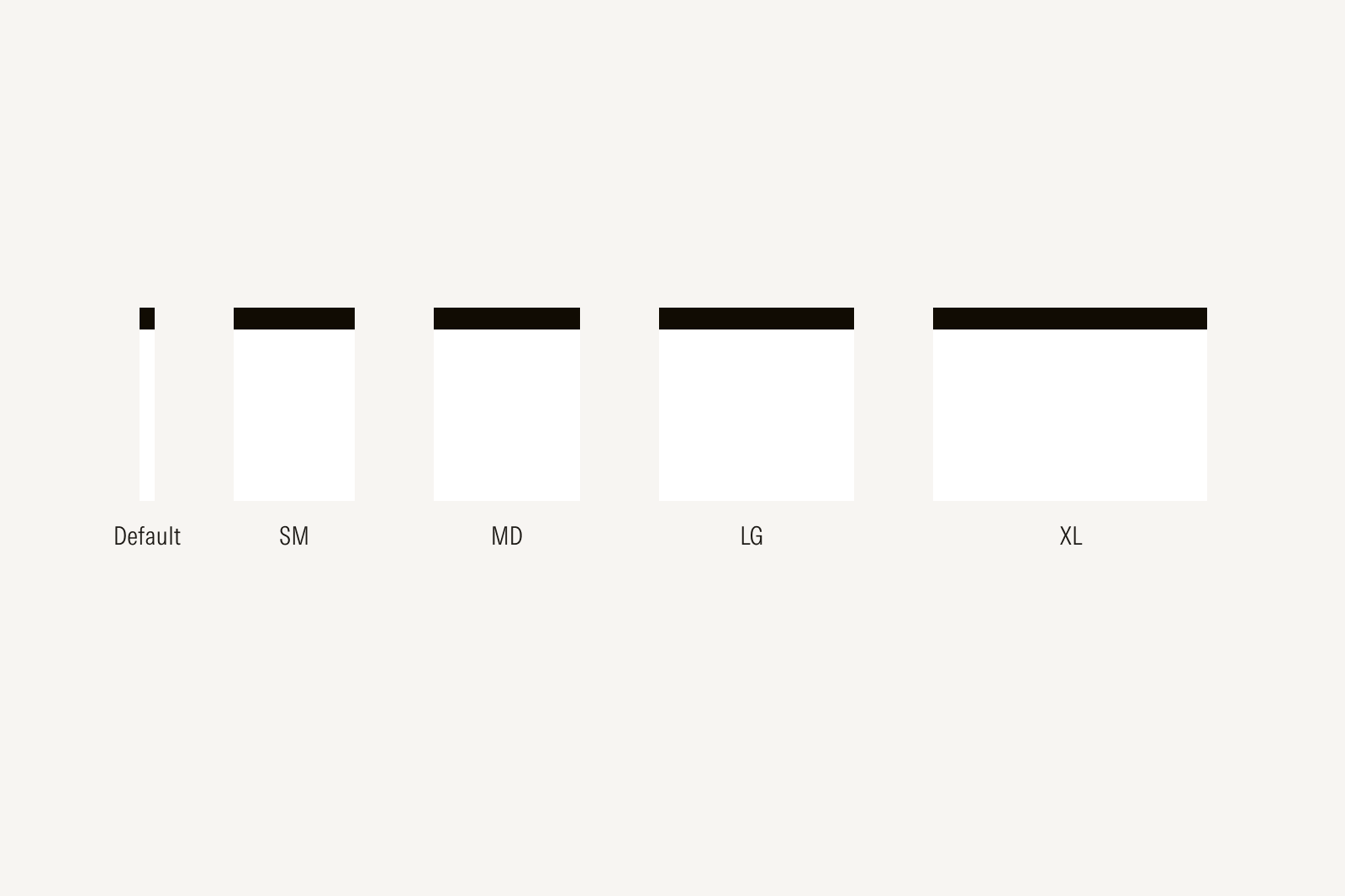
The layout grid includes five breakpoints—Default (0px), S (640px), M (768px), L (1024px), and XL (>1440px)—to configure your layout across viewport widths. A mobile-first approach means that you start with the smallest breakpoint first and configure what changes as viewport width increases.