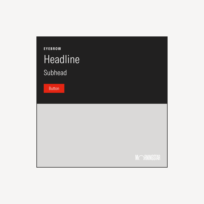
LinkedIn Ads
Morningstar uses LinkedIn organic and paid ad placements to amplify our campaigns and generate leads from targeted audience segments.
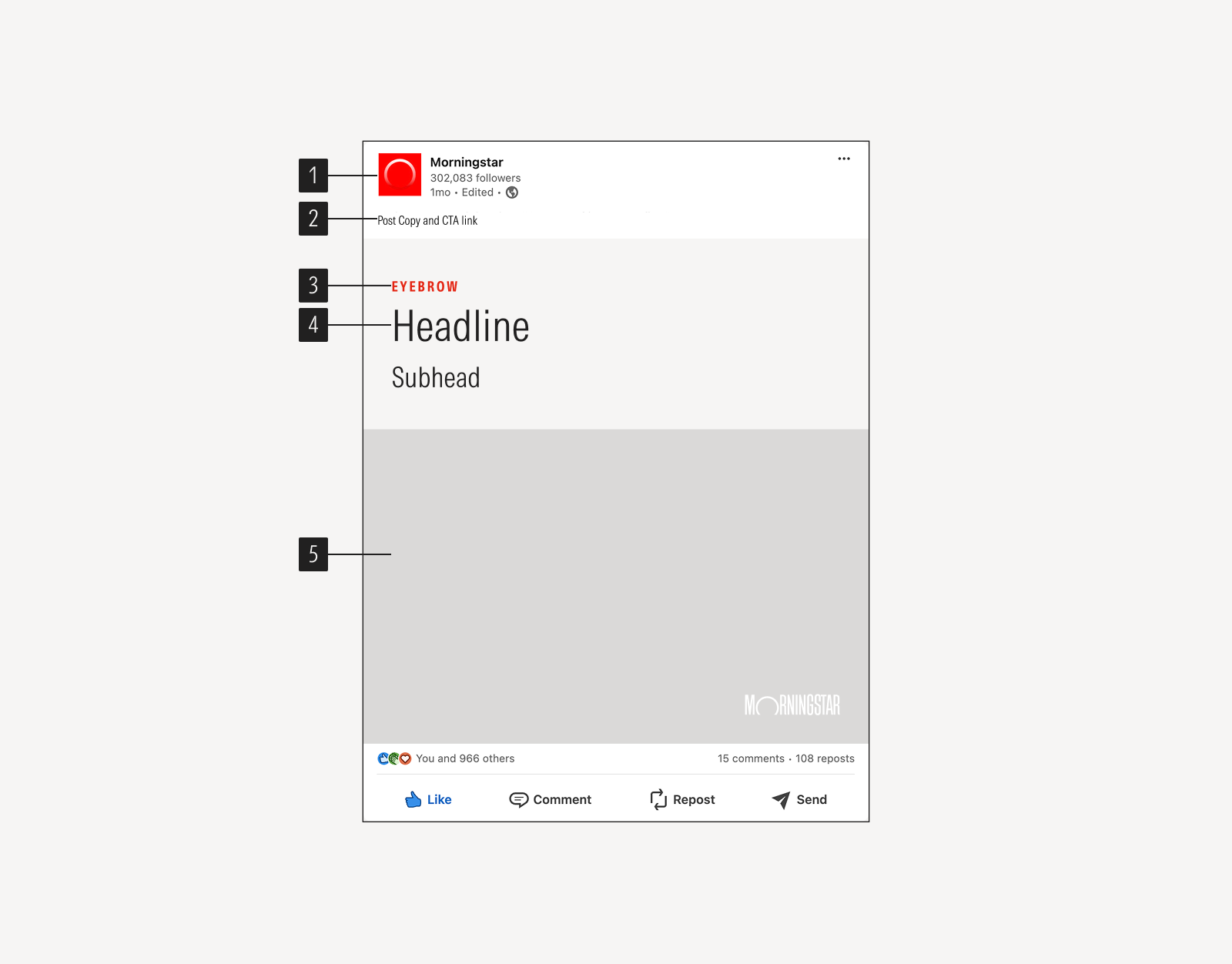
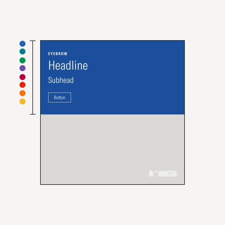
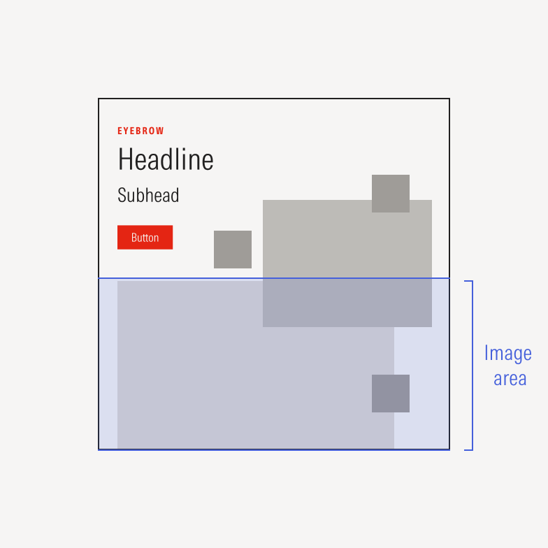
- Social media logomark appears on all Morningstar social media accounts.
- Post copy and CTA link is used to add context to the card content or direct users to a call-to-action. Target ≤150 characters and fewer than four emojis.
- Eyebrow is optional for identifying products, programs, or research report titles.
- Text block is used to grab a user’s attention and support the card imagery.
- Image area defines where visuals appear on the card.
Paid Social Ads
LinkedIn paid social cards always include a button because the whole card is clickable.
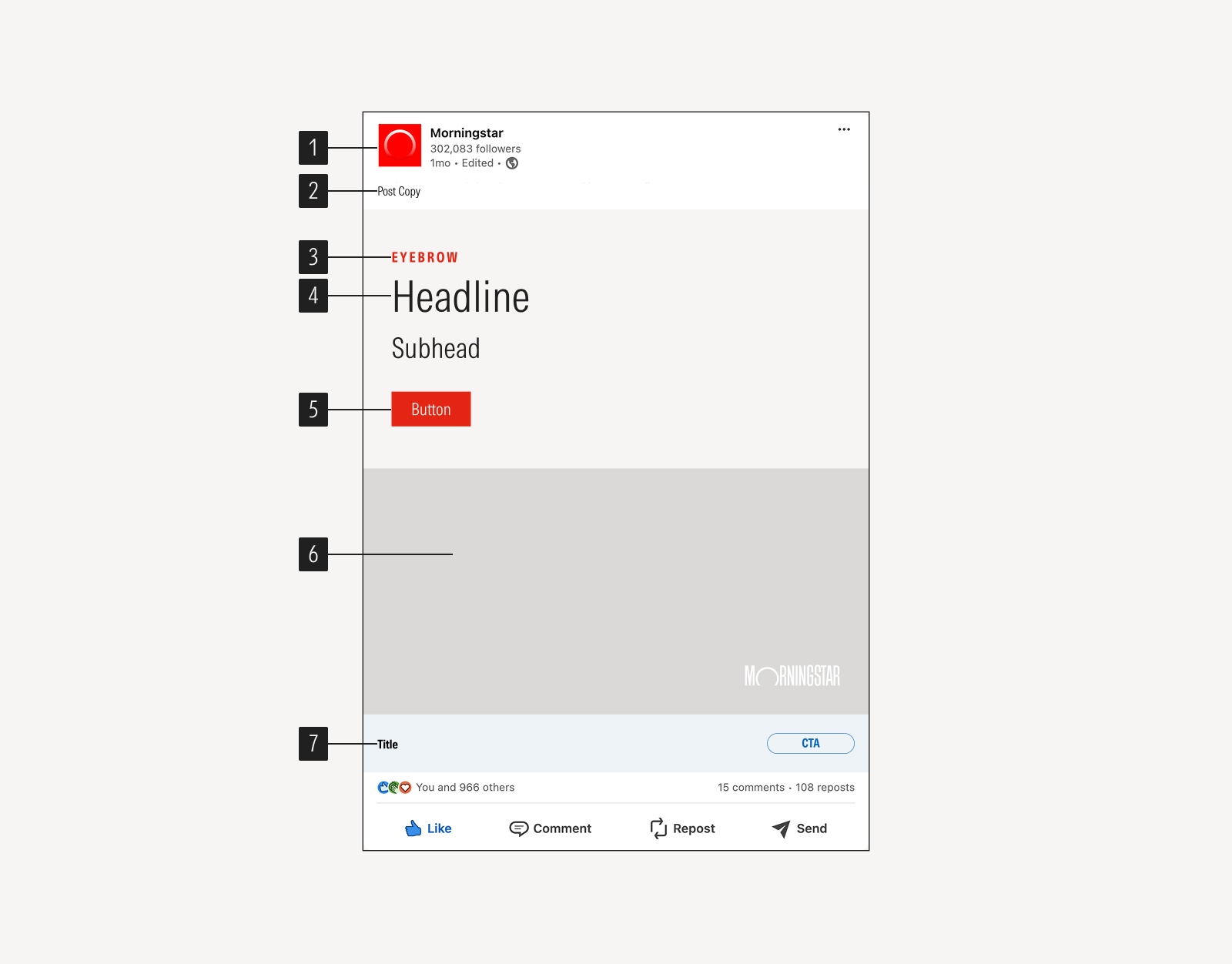
- Social media logomark appears on all Morningstar social media accounts.
- Post copy is used to add context to the card. Target ≤150 characters and fewer than four emojis.
- Eyebrow is optional for identifying products, programs, or research report titles.
- Text block card content grabs a user’s attention and support the card imagery.
- Button sets the call to action.
- Image area defines where visuals appear on the card.
- Native CTA includes space for a final call-to-action, and reiterating the button action. Aim for ≤70 characters to avoid truncation.
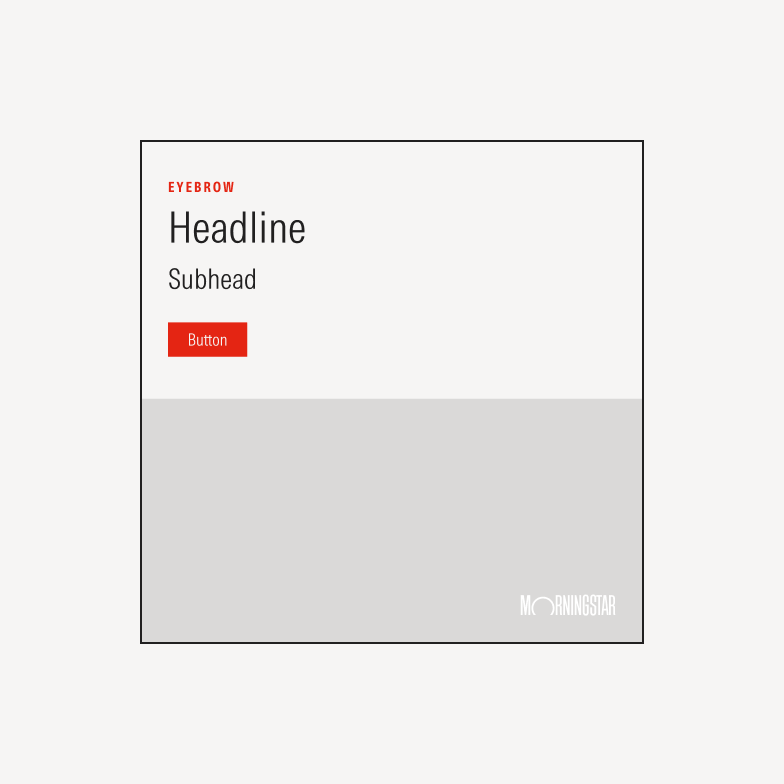
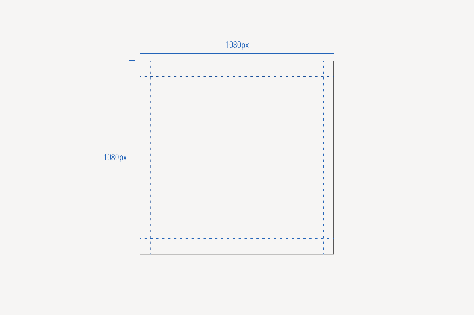
Square ads are 1080x1080px.
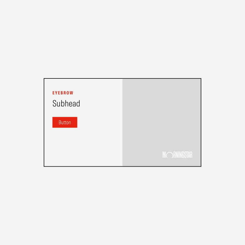
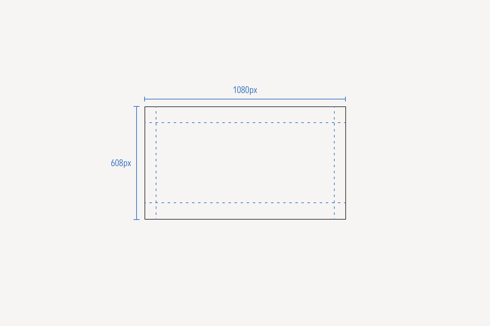
Rectangular ads are 1080x608px. Note that 1080x608 is a 16:9 proportion, the 1080 pixel ensures a consistent logo size across all ads.
Background Color

Light backgrounds is always Neutral 5.
Dark backgrounds is always Neutral 85.
Color backgrounds can be used on occasion. We often use an outlined CTA button instead of the red, which can vibrate on other colors.
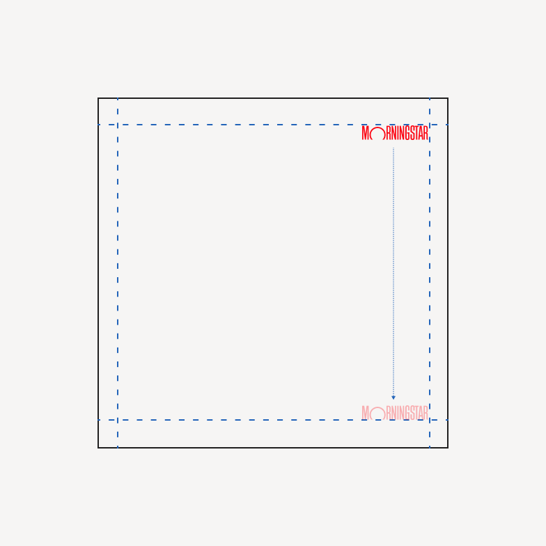
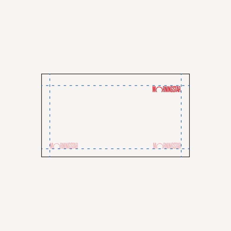
Image Area
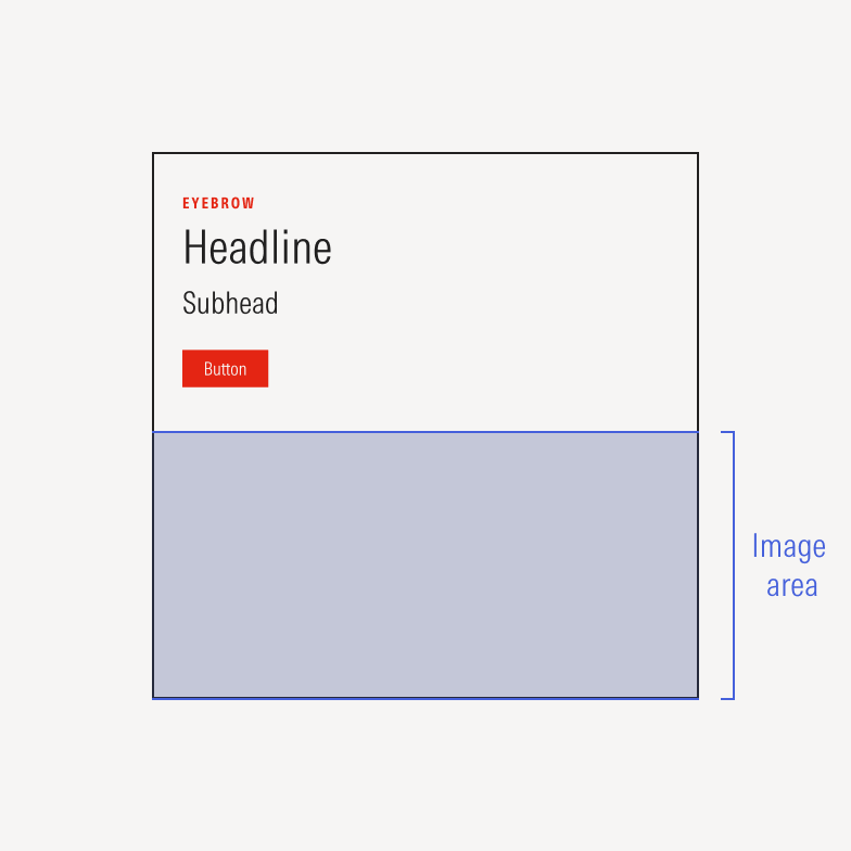
Do use the image area at full bleed.
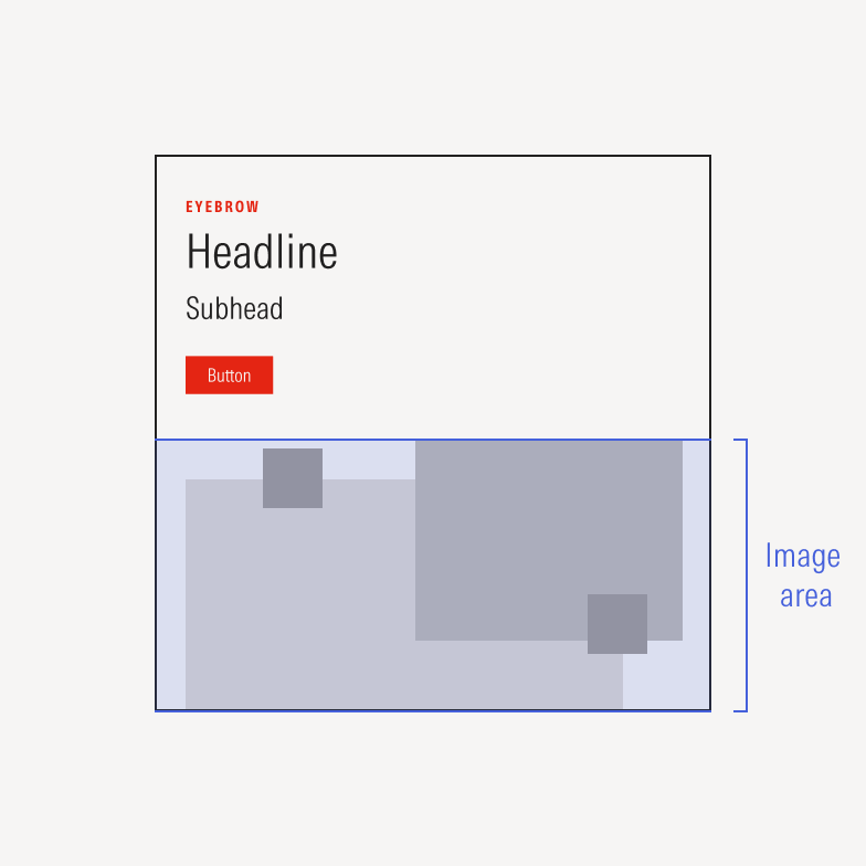
Do keep design elements inside the image area when using a transparent background to show the card background color.
Don’t place imagery outside of the image area when using a transparent background behind the design elements.
Copy Guidelines
Effective copy builds on Morningstar’s independent view of the markets. We incorporate attention-grabbing data, questions, or takeaways from our thought leaders.
Our ad copy serves as the connective tissue between value and the offer, whether a free trial, a downloadable piece of content, or an event. It makes clear how this offer is relevant to the specific audience and their goals.
Do use headlines that highlight the value of the piece being promoted. What will our target audience take away from consuming it?
Don’t use headlines longer than two lines. Use a subhead or shorten for readability.
LinkedIn features four main copy slots that we can use to explain the value of our content.
- Post copy adds context above the card. For longer descriptions, prioritize important information in the first 150 characters before the “Read more” cut-off and extend copy to up to 600 characters max. We can break up longer copy with emoji bullet points for visual interest.
- Card copy complements the visual and is most likely the first content the user will see. Keep copy concise for readability, relying on the other sections to tell the full story. We spark curiosity by teasing the content of the report without revealing all takeaways.
- Native CTAs appear under card content as a final safety net for conversion. Begin with an open-ended question or a frictionless action verb—calls to action like “learn how” can feel burdensome and create mental load. Authors also use the report title when relevant.
Do tease findings from the report or guide that the reader might not expect.
Don’t stoke engagement through fear.
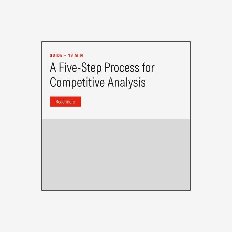
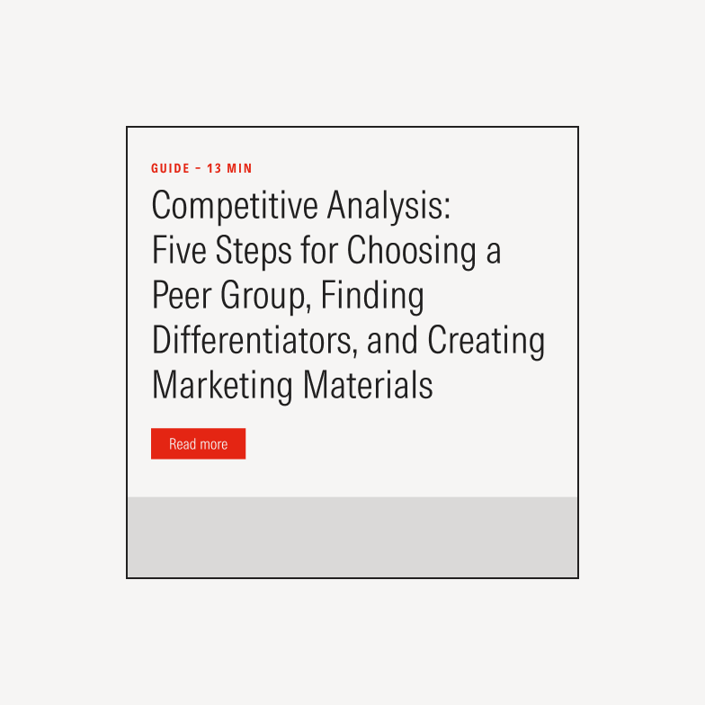
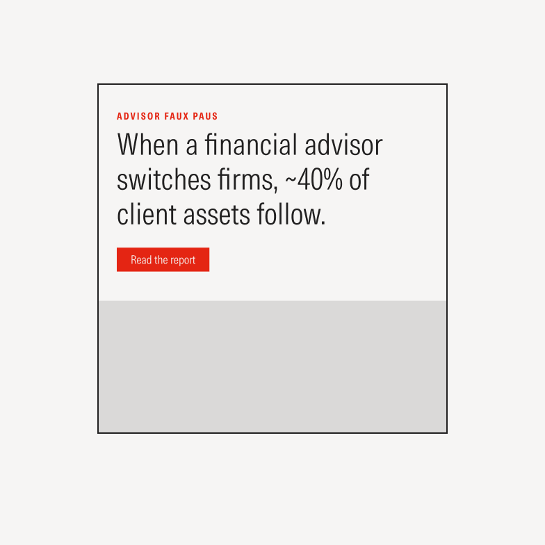
Card Categories
Card templates fall into eight categories. A limited set of options builds consistency, allows content to be displayed in a variety of ways, accelerates design and copywriting, and offers a range of formats to test.
Card categories can exist in light and dark, organic and paid, and often in square or rectangular sizes.

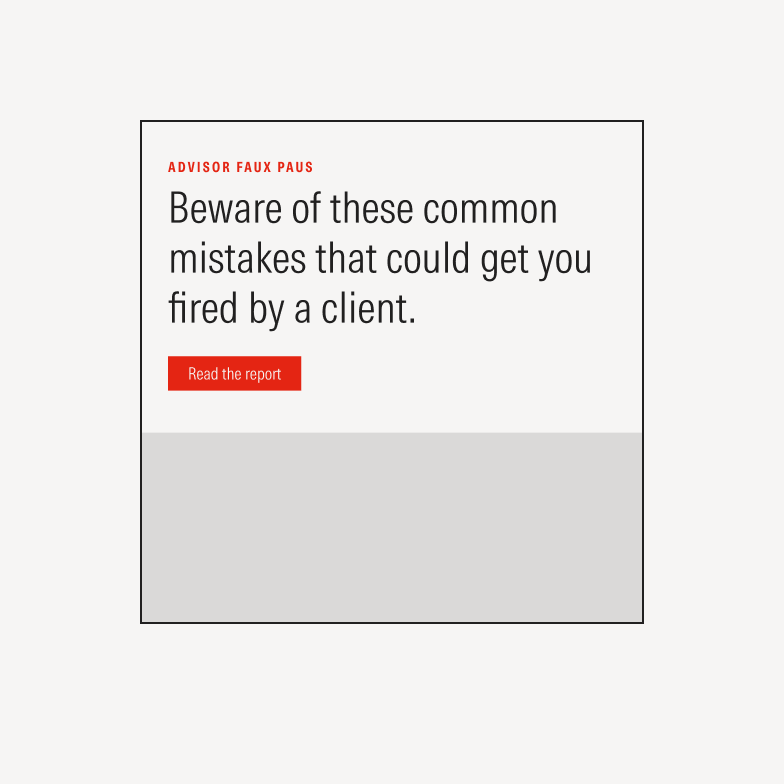
Narrative cards share knowledge about a research topic or Morningstar product offering.
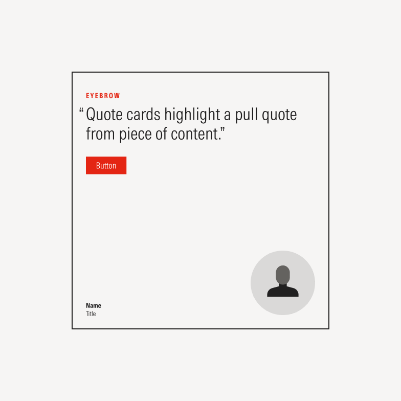
Quote cards highlight an important line from a piece of content.
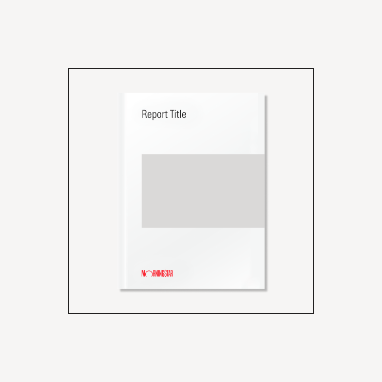
Cover cards showcase a piece of research or marketing guide.
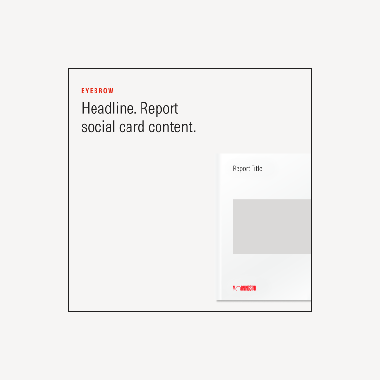
Cover cards with narrative showcase a piece of content and provide some context.
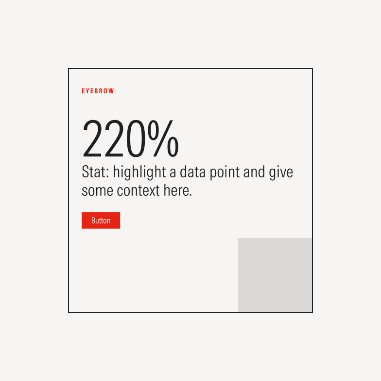
Stat cards highlight a data point and give some context.
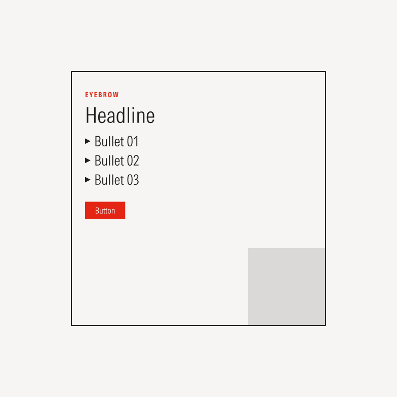
List cards use bullet points to spell out benefits or key takeaways.
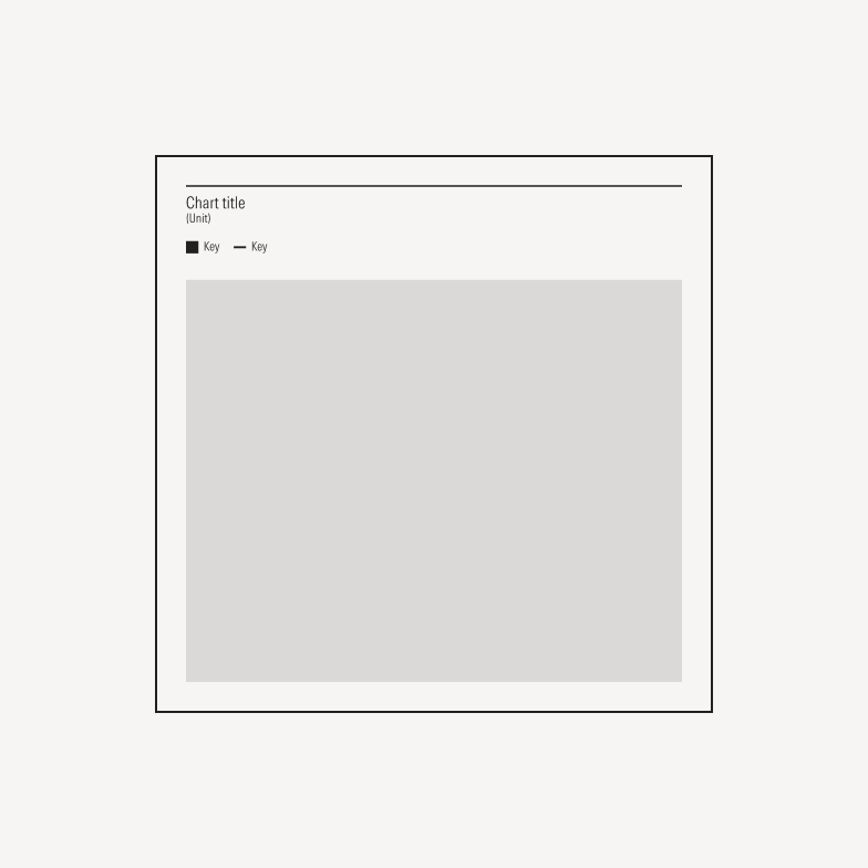
Graph cards showcase Morningstar data. Use ChartLab to generate graphs when possible.
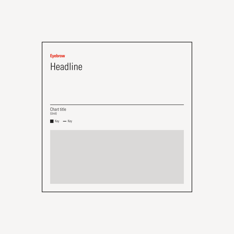
Graph cards with narrative showcase Morningstar data and add context. Use ChartLab to generate graphs when possible.
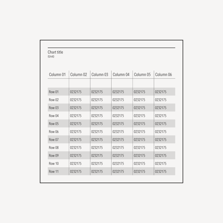
Data table cards showcase Morningstar data. Use ChartLab to generate tables when possible.