Logos
Morningstar
Using Morningstar’s logotype consistently ensures that our customers experience our brand the same way across all our products and services.
Use Cases
When to use
When we’re showcasing Morningstar itself, our values, audiences, or comprehensive set of solutions and capabilities, we lead with our master brand, using the logotype; in copy, we reference the Morningstar name in text.
Specific scenarios for using the main logotype include:
It represents the master brand as the main focus of a touchpoint, such as in mastheads or page shells.
It serves a legal or structural purpose, such as in website footers or nav bars.
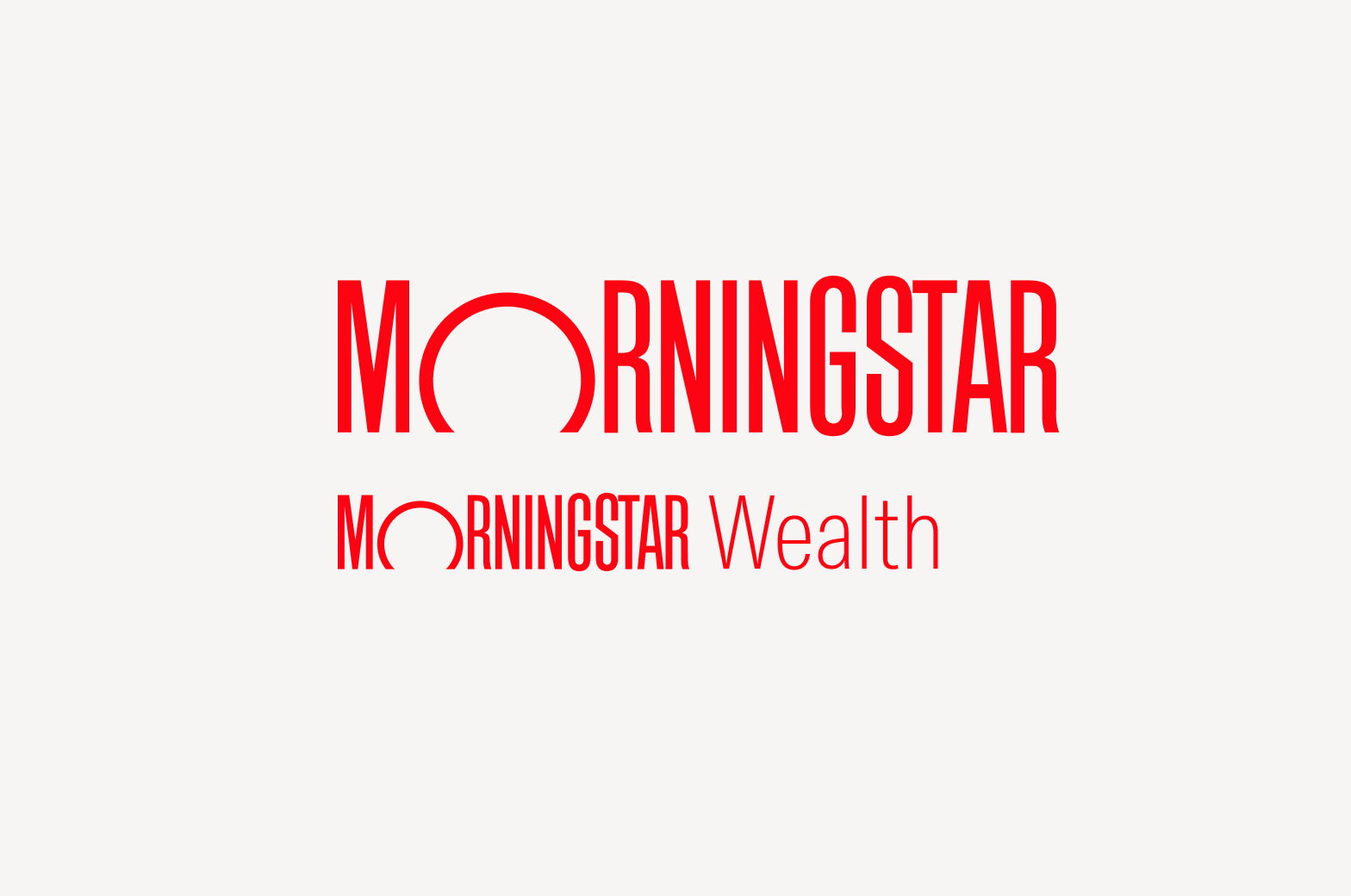
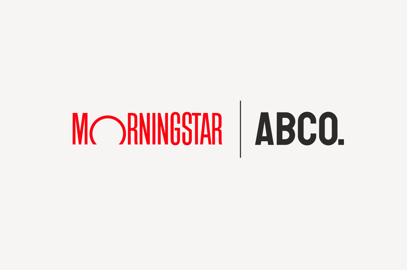
It's part of a family brand lockup (always precedes the family brand name—see Family Brands).
It’s one of the special cases approved by the Brand team when a product is endorsed by Morningstar (see Naming).
When not to use
Don't use the logotype where it competes with a product or family brand for focus, or in unapproved endorsements or lockups. When in doubt, email the Brand team.
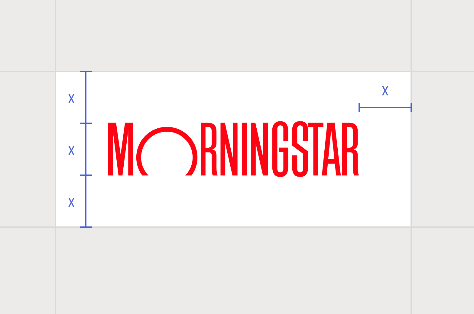
Avoid reducing the logotype below 75% its original size, thereby rendering the trademark symbol illegible.
Avoid enlarging the logotype above 175% its original size, thereby rendering the trademark symbol distractingly large.
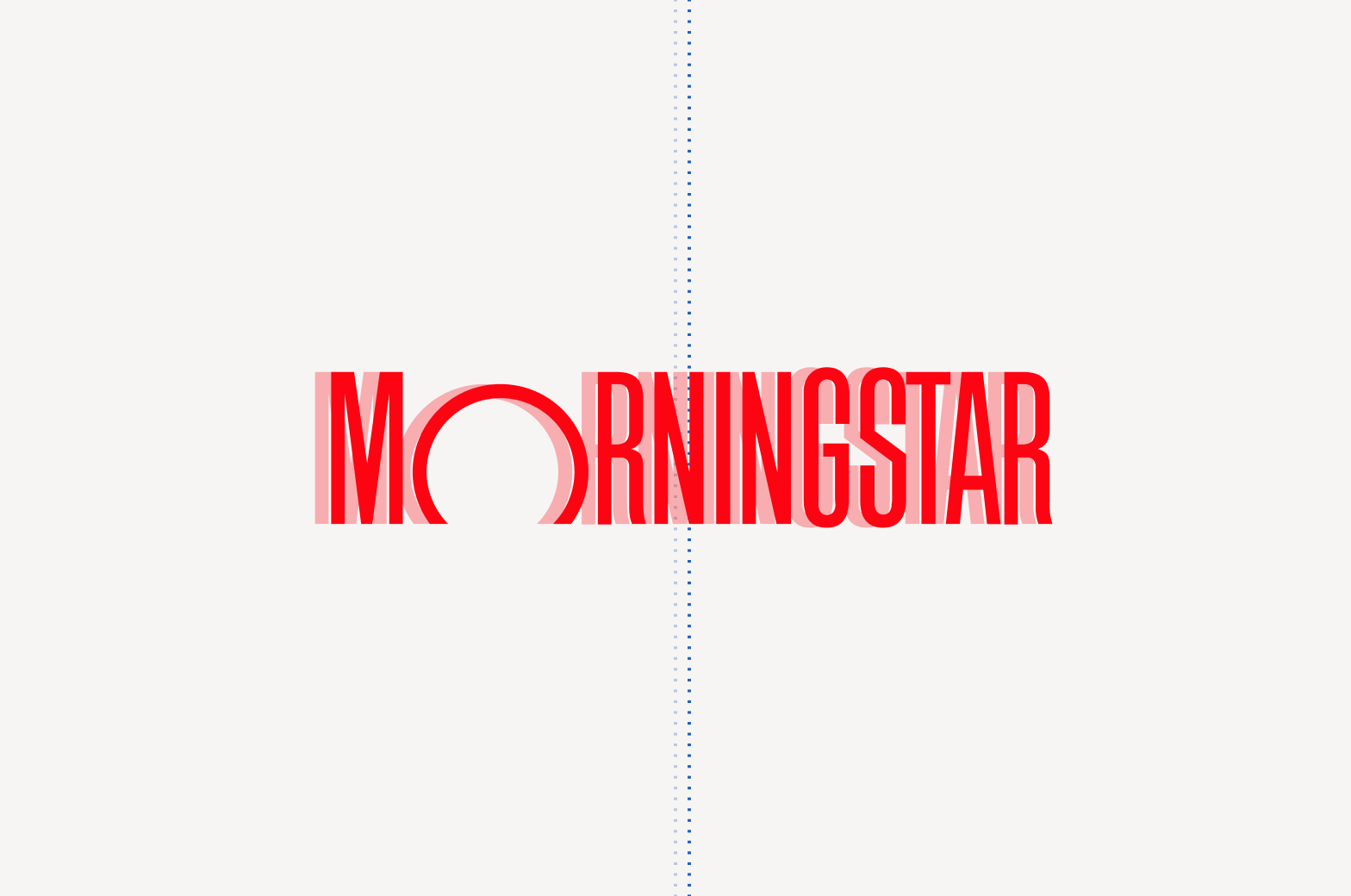
Don’t squish or deform the logotype in any way.
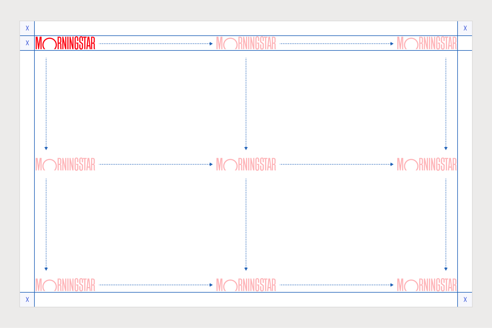
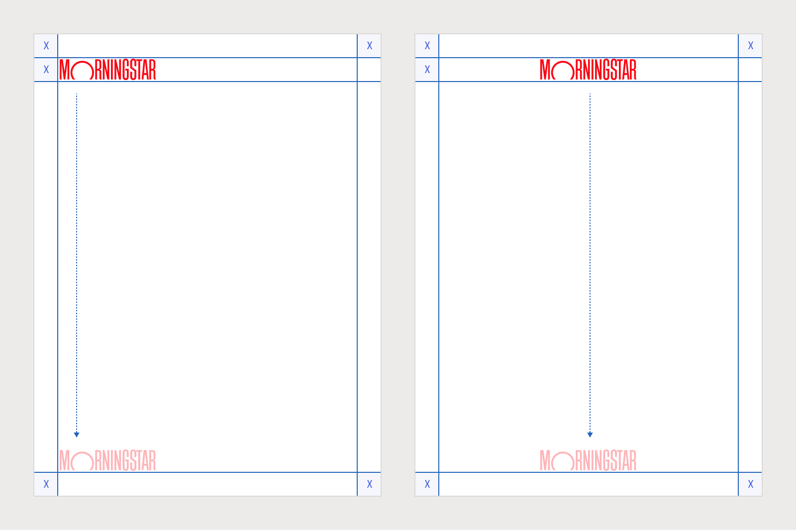
Consider optically centering the logotype.
Don’t rotate the logotype.
Don’t place the logotype and lockup next to each other.
Trademark Symbols
We distinguish between our use of the Morningstar logotype and its use by others, including partners, licensees, and media. For more robust guidance, see Trademarks.
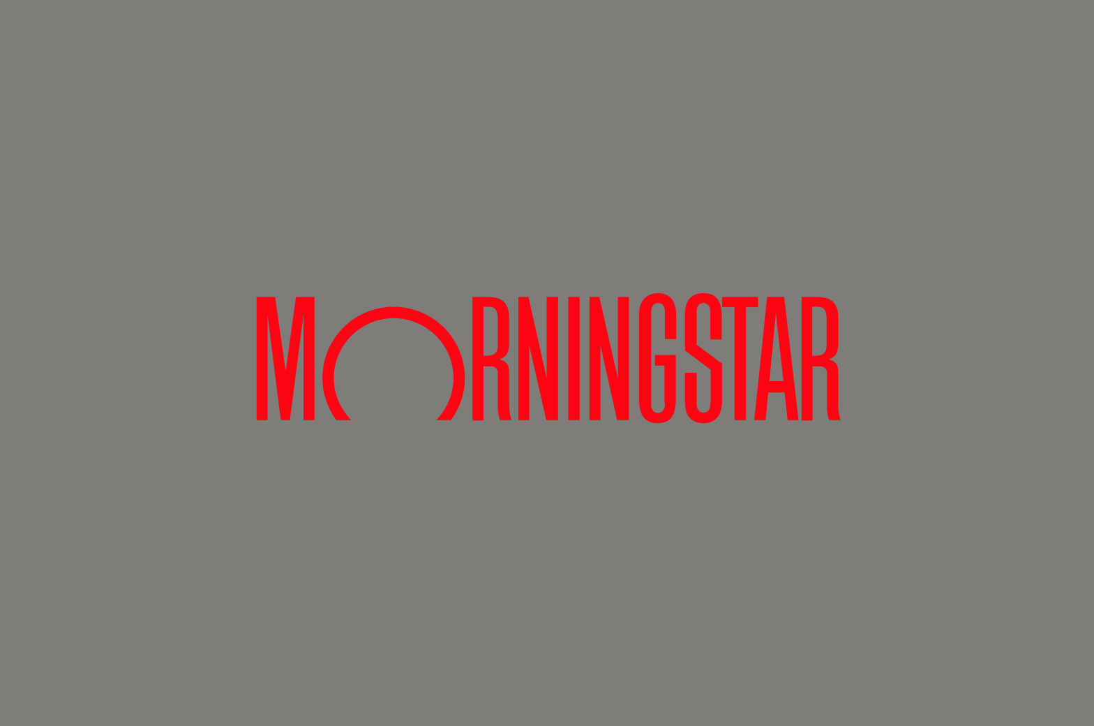
Avoid vibrating or illegible color combinations.

Avoid color combinations of similar values which render the logotype illegible.
Don’t apply the logotype to nonstandard background colors.
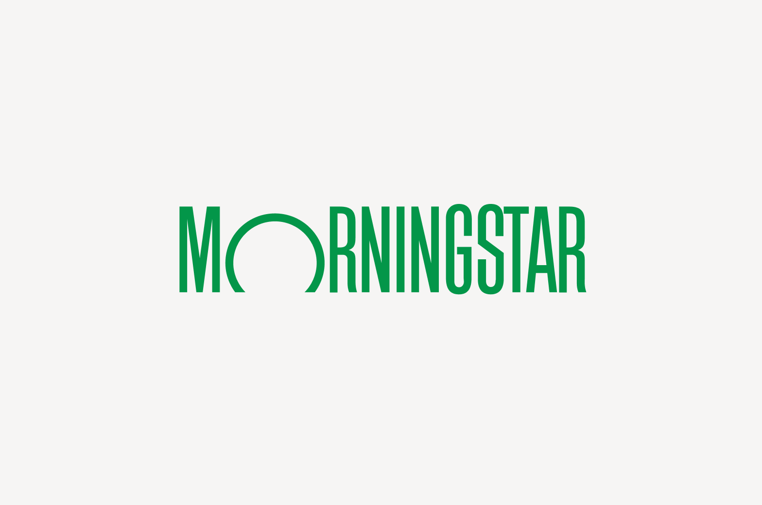
Don’t apply nonstandard colors to the logotype.

Don’t tweak the color of the red logotype to meet accessibility requirements.
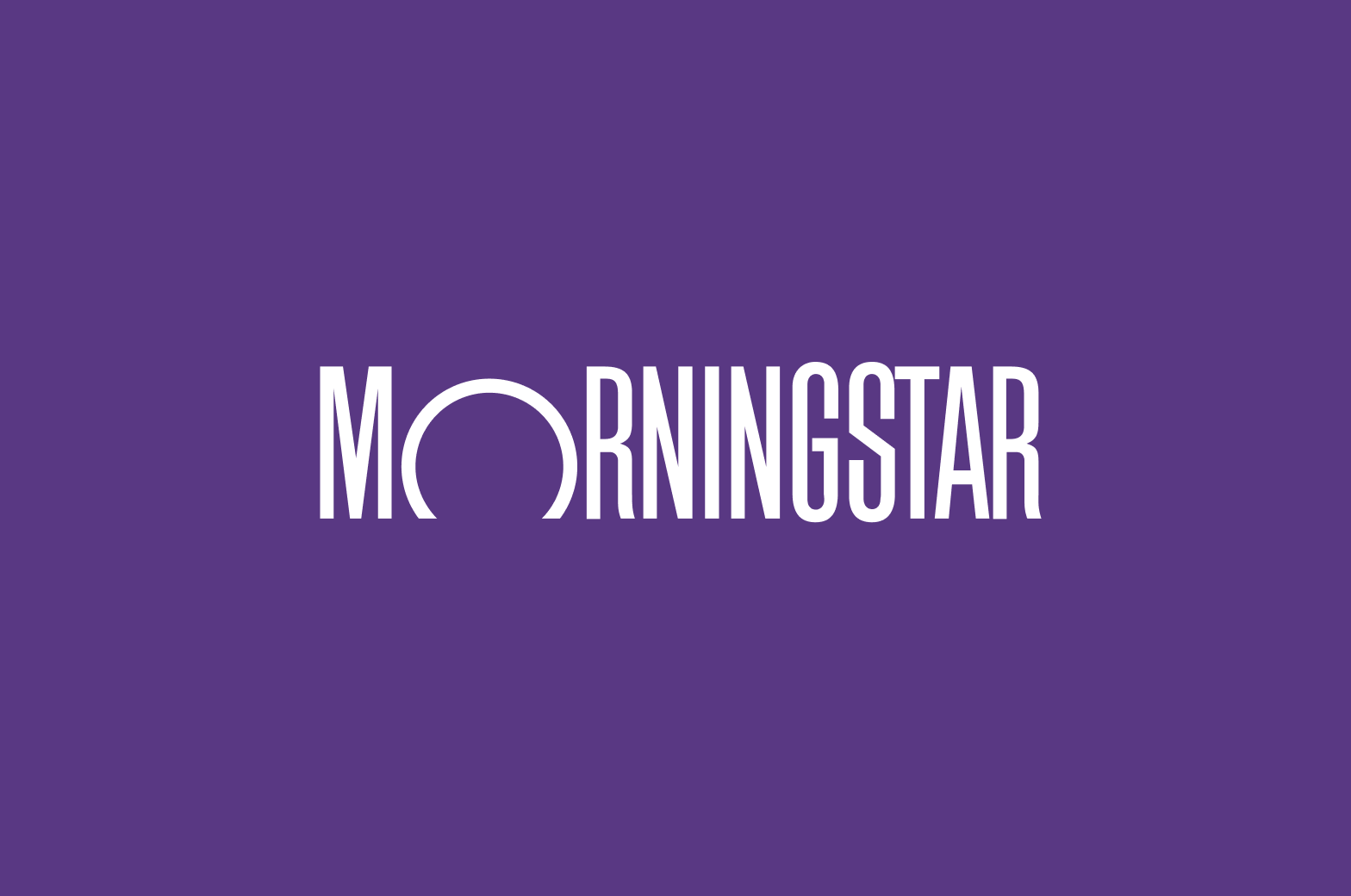
Positive Colors
Negative Colors
Don’t apply gradients or other color effects to the logotype.

Don’t apply drop shadows for decorative effect.
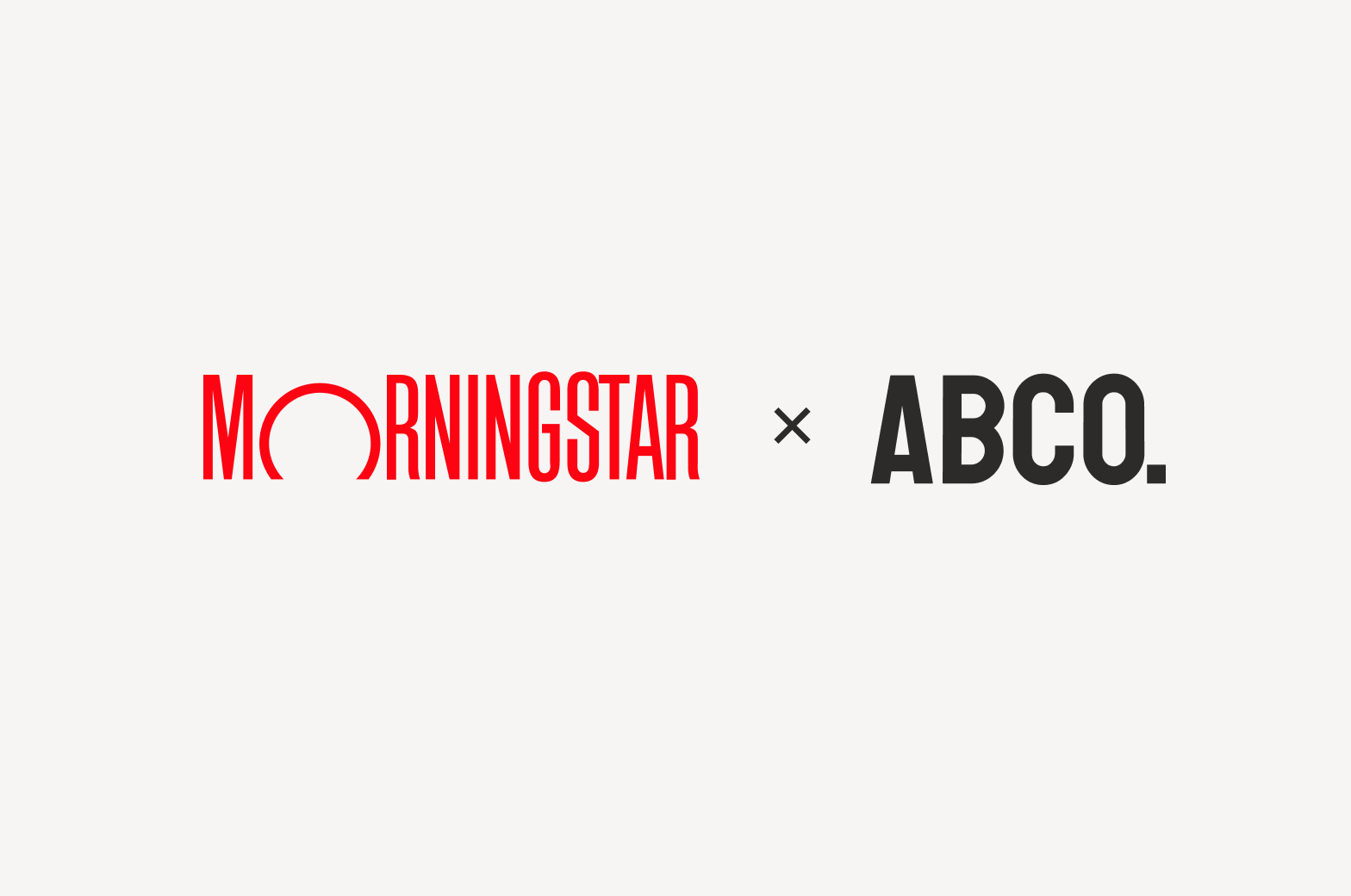
Don’t lock up the logotype with any other logo without prior approval.
Don’t add symbols or glyphs to the logotype.

Don’t add text or slogans to the logotype.
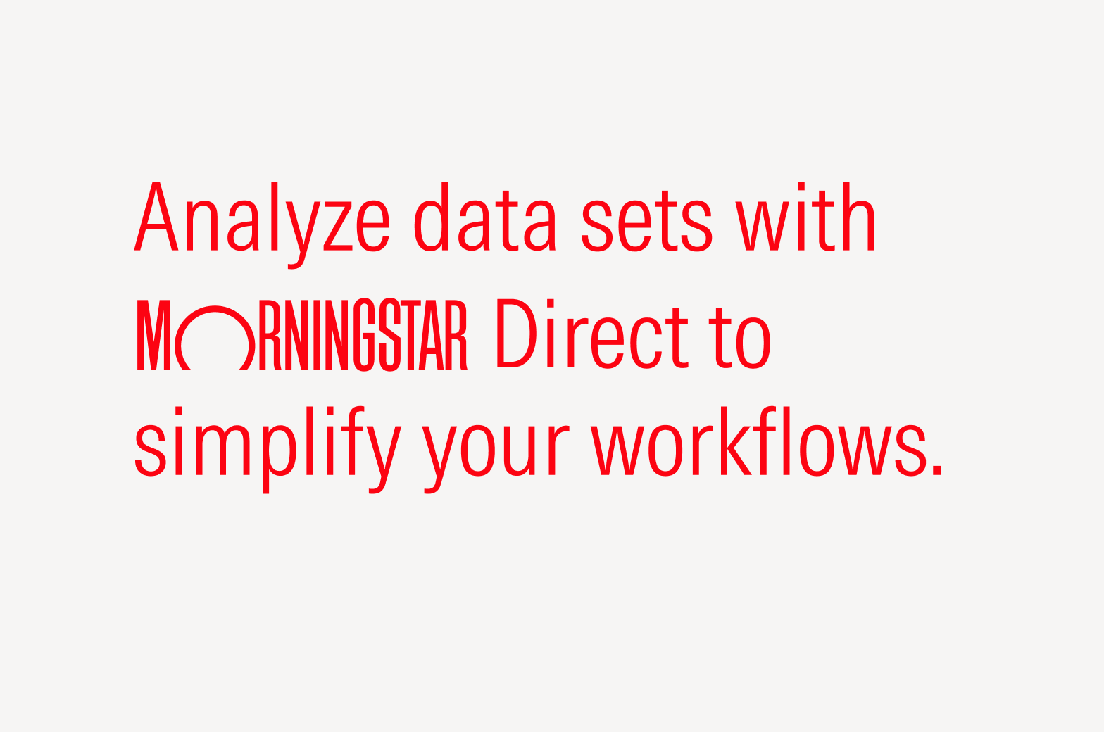
Don’t place the logotype within inline text.
Don’t modify, rearrange, or break apart the logotype.
Don’t take any elements from the logotype to create new artwork.
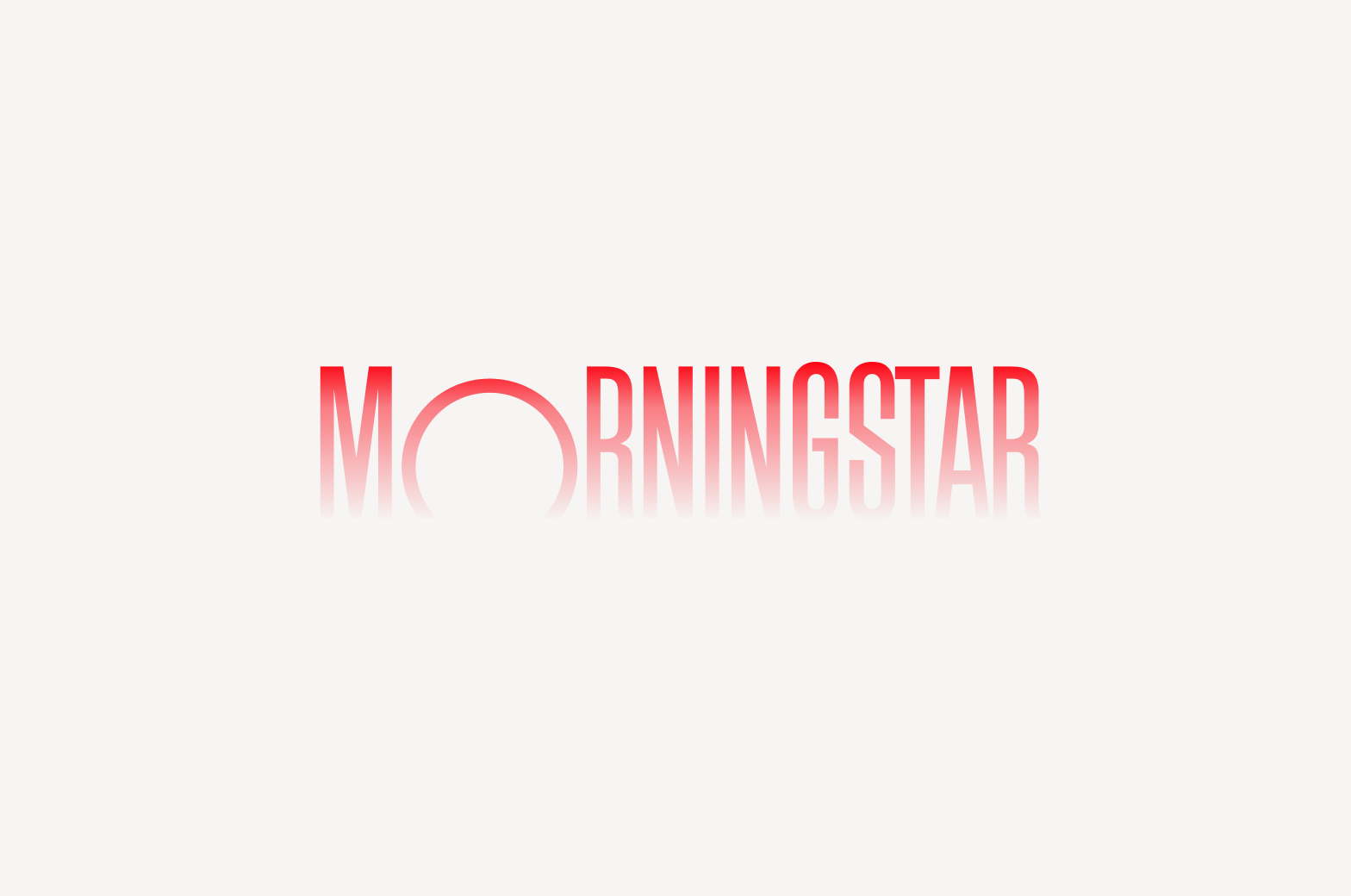
Animation
Animation adds a temporal dimension to the logotype in digital environments where its vertical movement is reminiscent of the rising and setting sun. This animated version is available in two directions and three speeds to work in a variety of use cases, from in-office digital displays to application splash screens.
For broad guidance on animation, see Motion.
Don’t add to or layer effects on the animated logotype.
Don’t loop the animated logotype.
Don’t use the animated logotype as a loader. For the loader component, see Product System.
Don’t place the animated logotype on top of busy or distracting footage.
Avoid mismatching the tone of the animated logotype with the intent of the overall video.
Do match the tone and length of the animated logotype with the intent of the overall video.
Speed
The animated logo is available in three speeds: standard, rapid, and gentle. The speed you choose will depend on a number of factors, including overall time constraints and intended tone. For more on tone, see Motion.
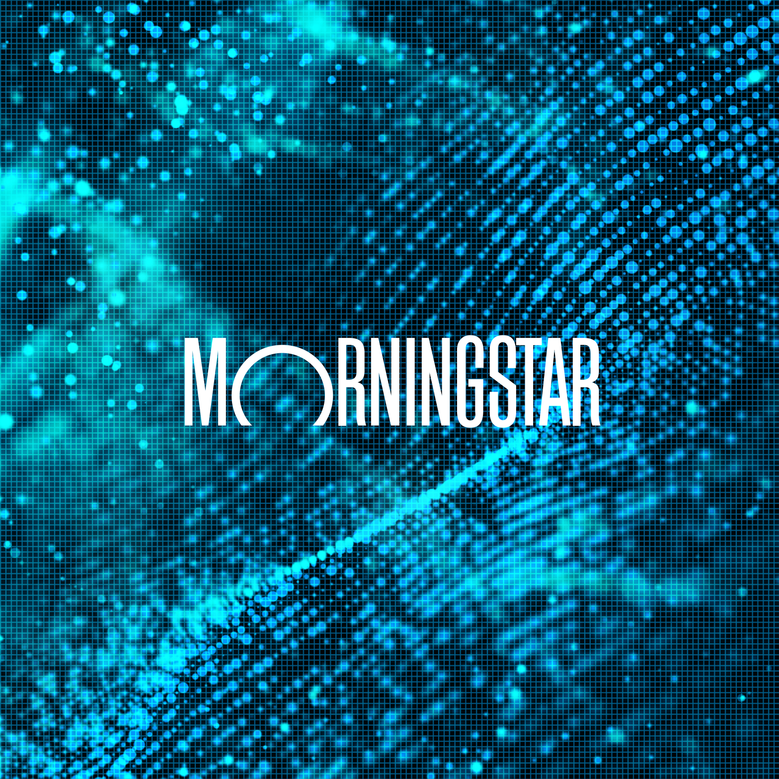
Don’t place the lockup on busy backgrounds.
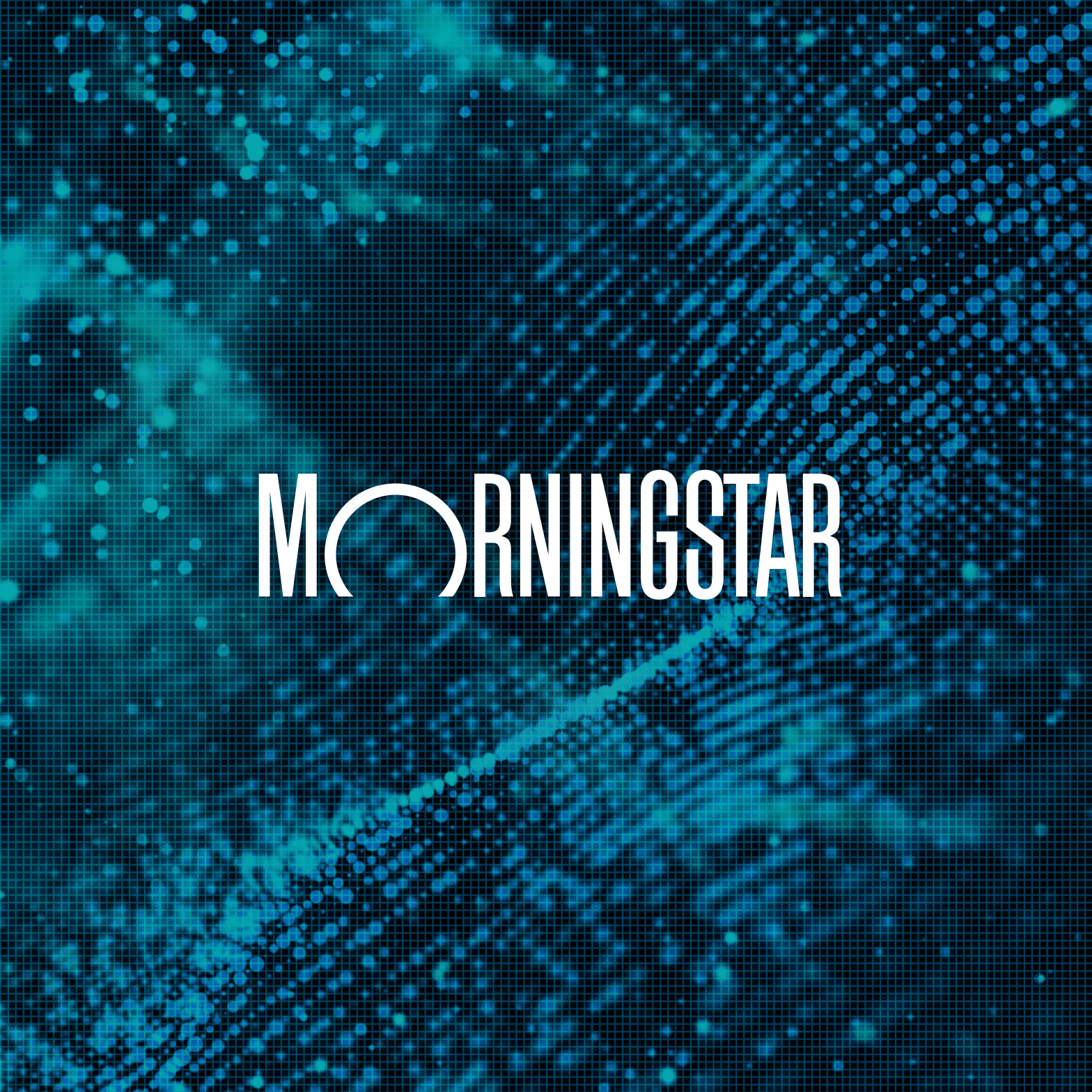
Do apply overlays or subtle drop shadows to increase legibility.

Don’t place the lockup on backgrounds of similar colors.

Do apply overlays or subtle drop shadows to increase legibility.