Logos
Family Brands
A family brand lockup brings together the Morningstar logotype and one of five family brand names to form a combined wordmark.
Use Cases
When to use
When we’re showcasing an individual family brand, its solutions and capabilities, and/or products that fall under it, we lead with the family brand using the lockup; in copy, we reference the family brand name in text. Specific scenarios for using the lockups include:
- The family brand is the central focus of a touchpoint, as in a page shell or masthead.
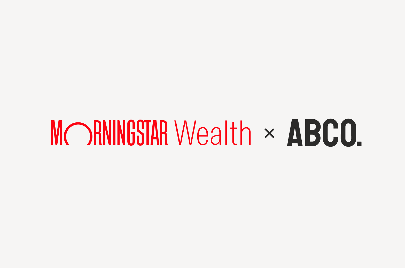
- A product endorsed by a family brand is the central focus of a touchpoint.
When not to use
Don't use on legal documentation, as family brands are not business entities. See Background tab for additional guidance.

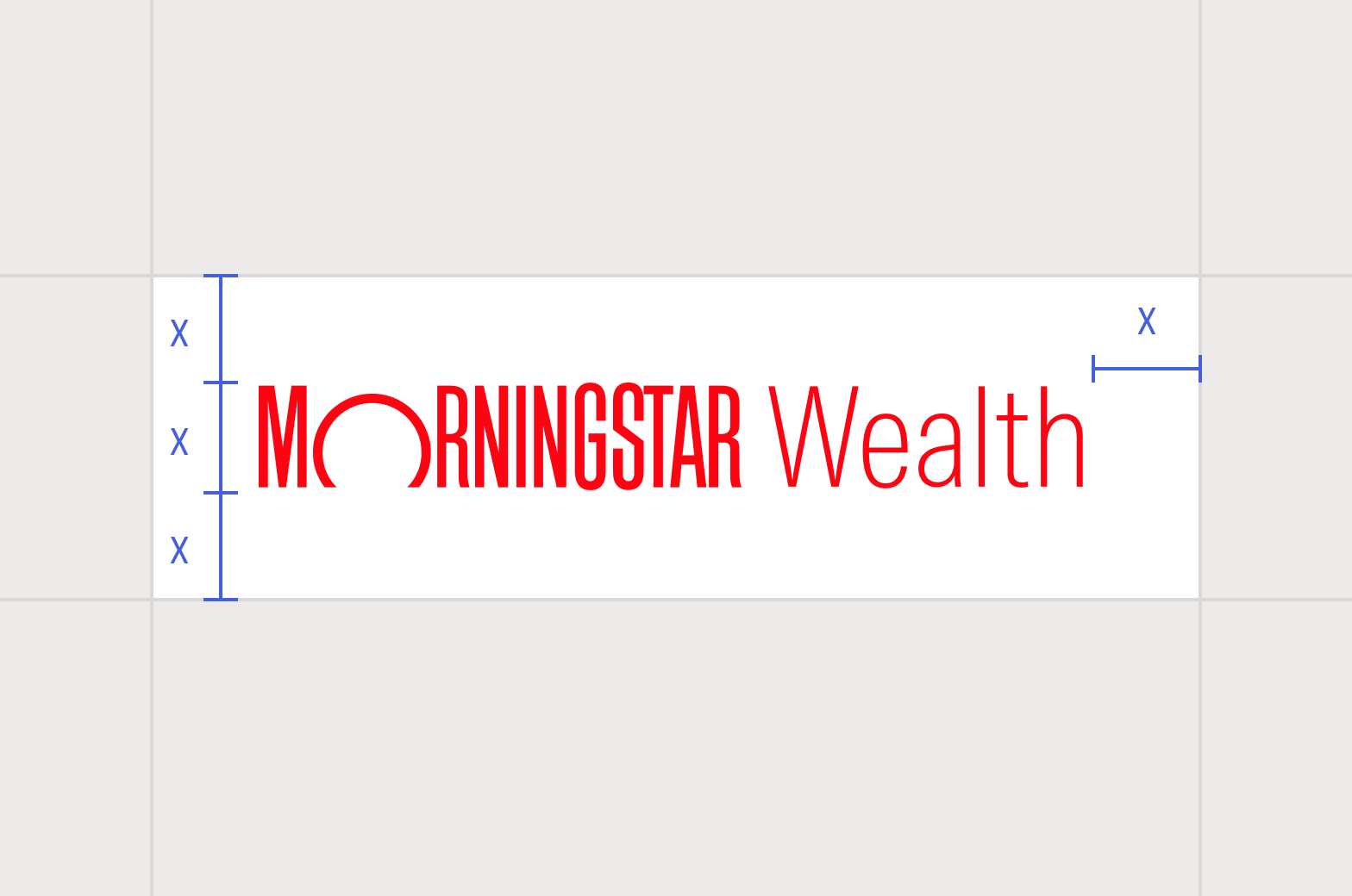
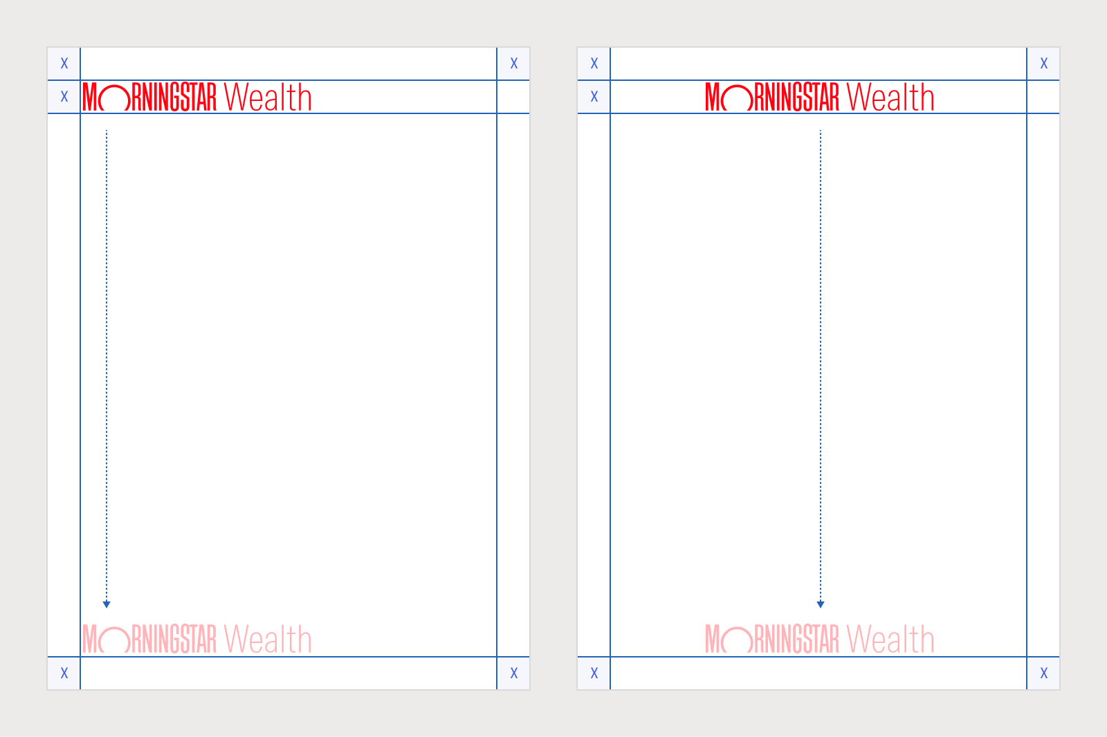
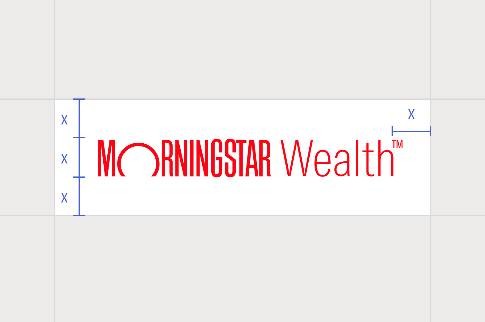
Maintain proper clear space around the lockup.
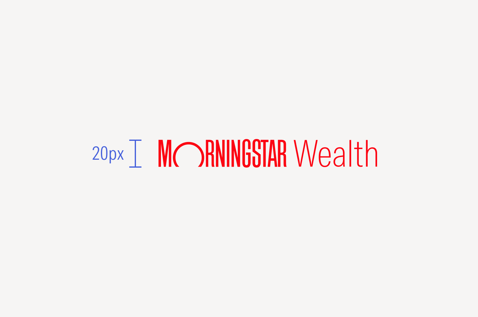
A minimum height of 20 px is required to maintain the legibility of the lockup. For print, the minimum height is 0.125 in or 3.175 mm.
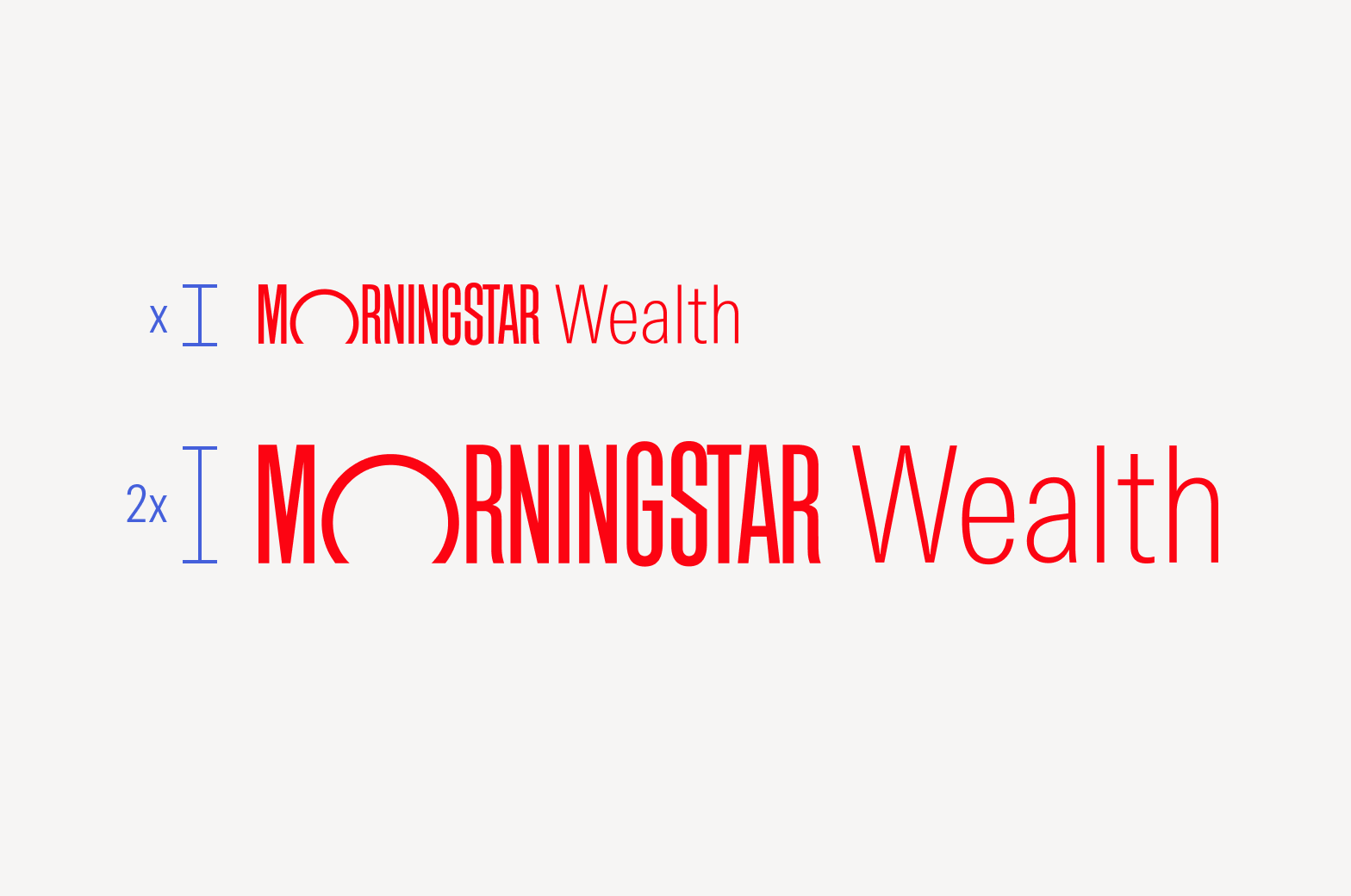
The maximum size of the lockup should be no more than twice provided artwork size.

Don’t squish or deform the lockup in any way.

Consider optically centering the lockup.

Don’t rotate the lockup.

Don’t place the logotype and lockup next to each other.
Trademark Symbols
Using the Morningstar name itself is how we protect our family brands in-market; we don’t rely on separate marks.
Family brand lockups and names within Morningstar-owned touchpoints, like our website or marketing materials, don’t need a service mark (SM) or trademark (TM) symbol at the end. However, on first use, all external parties are required to use either a service mark (SM) or trademark (TM) symbol at the end of lockups and family brand names. For additional guidance, see Trademarks.

When used on Morningstar-owned touchpoints, lockups don’t need an ℠ or ™ symbol at the end.

Third parties must use an ℠ at the end of a lockup in most countries. For guidance, see Trademarks.

In jurisdictions that don’t recognize an ℠ symbol, third parties should use a ™ at the end of the lockup.
The clear space around the trademark or service mark version of the lockup is measured from the edge of the artwork itself, excluding the symbol.

Morningstar Red on White

Neutral 60 on White

Neutral 80 on White

Neutral 90 on Neutral 5

White on Morningstar Red
White on Black

White on Neutral 80

White on Neutral 50

Avoid vibrating or illegible color combinations.

Avoid color combinations that are similar in value.

Don’t use nonstandard background colors.

Don’t use nonstandard lockup colors.

Don’t tweak the color of the red lockup to meet accessibility requirements.

Don’t apply gradients or other color effects to the lockup.

Don’t apply drop shadows to a lockup for decorative effect.
Don’t add graphic elements to the lockup.

Don’t add a registered trademark symbol to the logotype.

Don’t add a registered trademark symbol to the end of a lockup. For guidance, see Trademarks.

Don’t rearrange or stack the lockup.

Don’t create unapproved lockups.

Don’t modify or create a new version of a lockup. Only use the artwork as provided.

Don’t lock up a family brand with any other logos.
Don’t add symbols or glyphs to a lockup.

Don’t add text or slogans to the lockup.

Don’t place the lockup within inline text.
Animation
Animation adds a temporal dimension to the lockup in digital environments where its vertical movement is reminiscent of the rising and setting sun. This animated version is available in two directions and three speeds to work in a variety of use cases, from in-office digital displays to application splash screens.
For broad guidance on animation, see Motion.
Transition in
Transition out
Transition in and out
Don’t add to or layer effects on the animated lockup.
Don’t loop the animated lockup.
Speed
The animated lockup is available in three speeds: standard, rapid, and gentle. The speed you choose will depend on a number of factors, including overall time constraints and intended tone. For more on tone, see Motion.
The standard speed can be applied to the widest variety of use cases.
Use rapid speed for application splash screens or social media video clips where time is constrained.
Use gentle speed for long-form editorial and evocative storytelling.
Placement and Intent
Don’t use the animated lockup as a loader. For the loader component, see Product System.
Don’t place the animated lockup on top of busy or distracting footage.
Avoid mismatching the tone of the animated lockup with the intent of the overall video.
Do match the tone and length of the animated lockup with the intent of the overall video.

Don’t place the lockup on busy backgrounds.

Do apply overlays or subtle drop shadows to increase legibility.

Don’t place the lockup on backgrounds of similar colors.

Do apply overlays or subtle drop shadows to increase legibility.