Content
Style refers to the preferences we have for how we express ourselves, such as whether or not to use the Oxford comma. It ensures our communication is clear and consistent, helping us present ourselves uniformly in writing. Grammar refers to rules that govern syntax and punctuation, like when to use a comma versus a semi-colon.
Morningstar Style Guide
Anyone writing for product experiences should always refer to the Morningstar Style Guide for in-house style choices, including how we write out URLs in copy, how we handle acronyms, and which financial terms or team names are capitalized. Use it as a quick reference to ensure you’re following our shared conventions.
In many instances, the guide aligns with Associated Press (AP) Style, but notable exceptions for product contexts are included here. Importantly, be consistent about your style choices across a given page, flow, or document.
For access, please email the copy desk.
Capitalization
- Headers for page, section, and container headers are title-cased if the header is a sentence fragment; full sentences are sentence-cased.
- Labels for navigation items and form field names are title-cased.
- Call-to-action text in buttons and other elements that prompt a response from the user is title-cased or in all caps, whichever is consistent with your product.
- Placeholder and helper text are written in sentence case. If you are referencing names, places, or other proper nouns, capitalize those words as you normally would.
- Product name and objects for products, family brands, and capabilities are capitalized. Places and objects within an application are not capitalized.
- File types should only be capitalized when referring to the file type; lowercase the filename extension.
Dates and Times
Exact and Relative Times
All possible efforts should be made to localize times according to the user’s browser settings. For most use cases, use the three-letter ISO abbreviations.

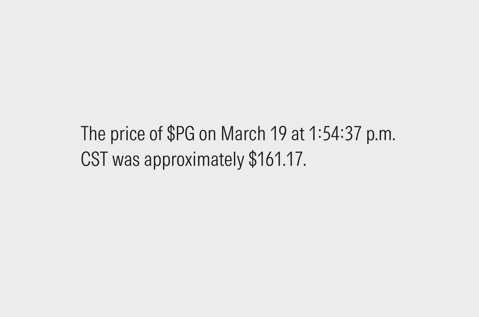
Do use exact times (July 27 at 12:45:04 p.m. CST) refer to a specific point in time, like the price of a stock on a given date or the arrival time of a flight.
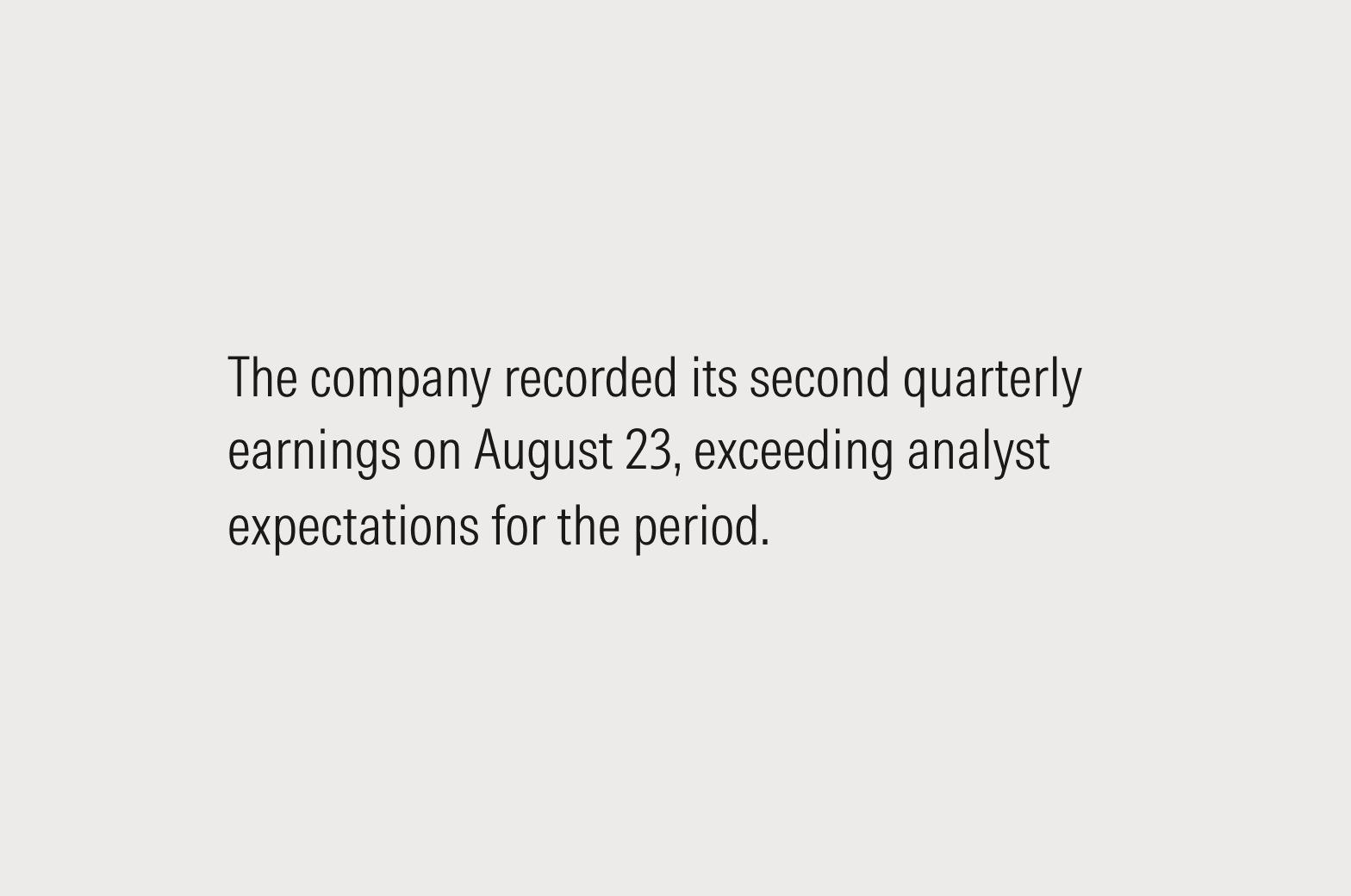
Do use relative times to convey a sense of recency or urgency, or for rolling analysis, when the starting point should be a constant interval from today’s date.
Full Sentences
In editorial usage, Morningstar typically follows AP style, which would be Jan. 24. In product experiences, designers have discretion to choose the style that best matches their use case. For more guidance, see the Morningstar Style Guide.
Feel free to omit the year if the information refers to the current year and the omission won’t create confusion.
Do write out the full name of the month, formatted in the prevailing local style (January 24 or 24 January).
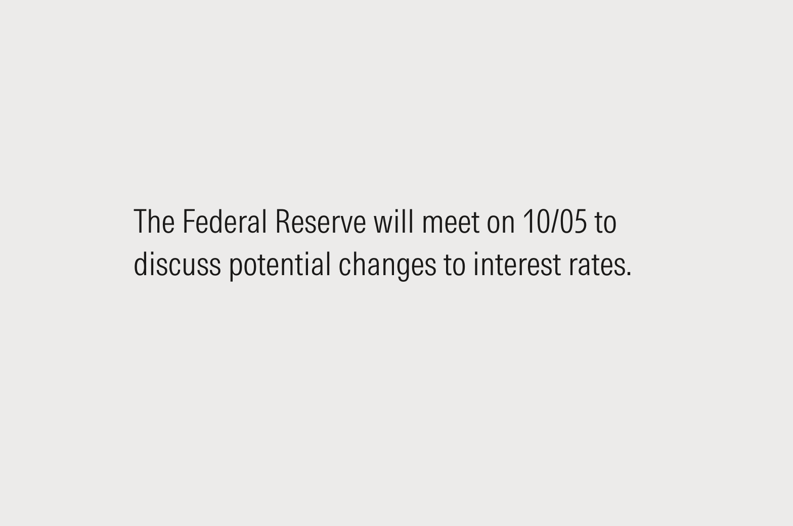
Don’t use MM/DD; all readers will be able to understand “March 4” but could get tripped up by a numeral-only format.
UI Labels
There are often design or typographic constraints that make it difficult to prescribe a single style in all cases. Here’s our order of preference for how to write dates in UI labels. While mixing styles within an application is expected, try to maintain a single style across similar elements.
- Full month and day: March 29, 2024
- Three-letter abbreviation: Mar 29, 2024
- Numeric date: 11/05/24
One broad exception to all of the above: When formatting dates and times for display, it’s okay to defer to the browser’s native presentation settings. This is mostly a mobile concern.

Do include a year with numeric dates.

Don’t use MM/DD format without a year. Not everyone reads dates in that order, and there’s too much risk for confusion.
Placeholders
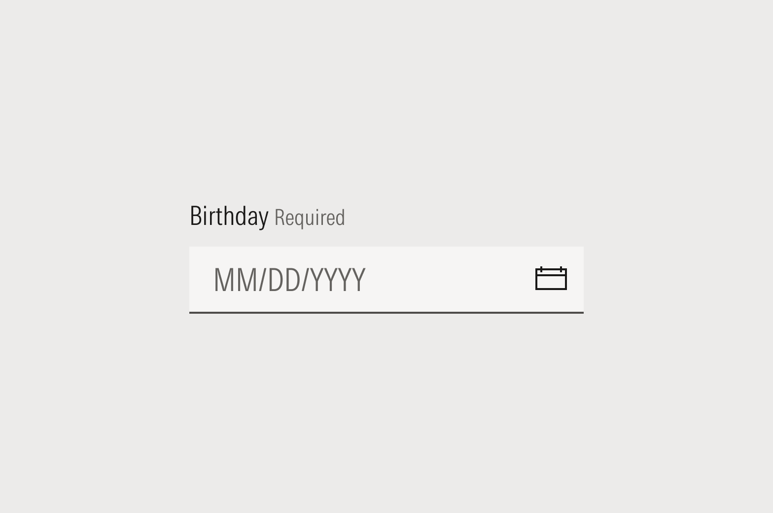
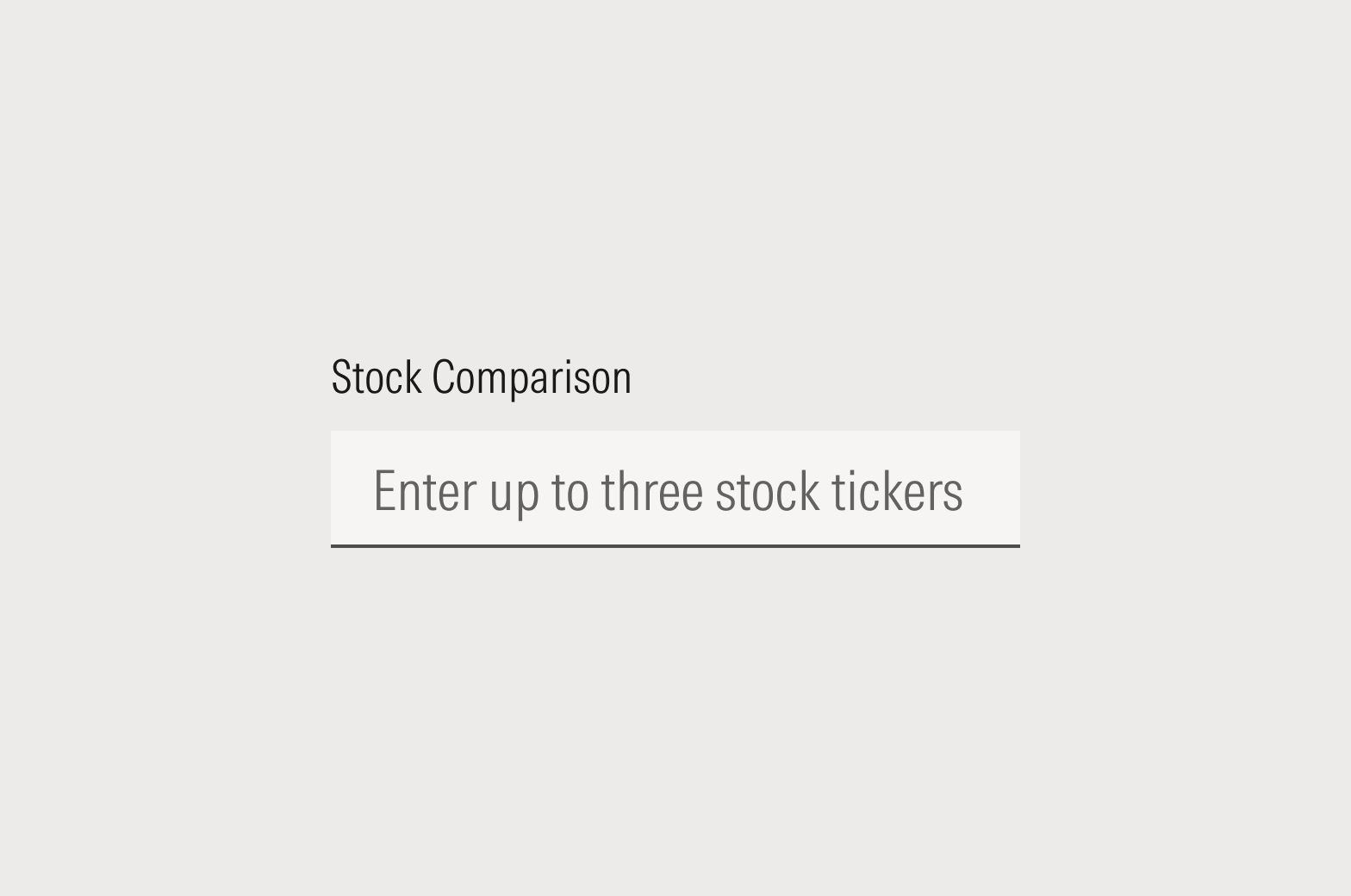
Do use “Enter date” or the date format, such as MM/DD/YYYY.
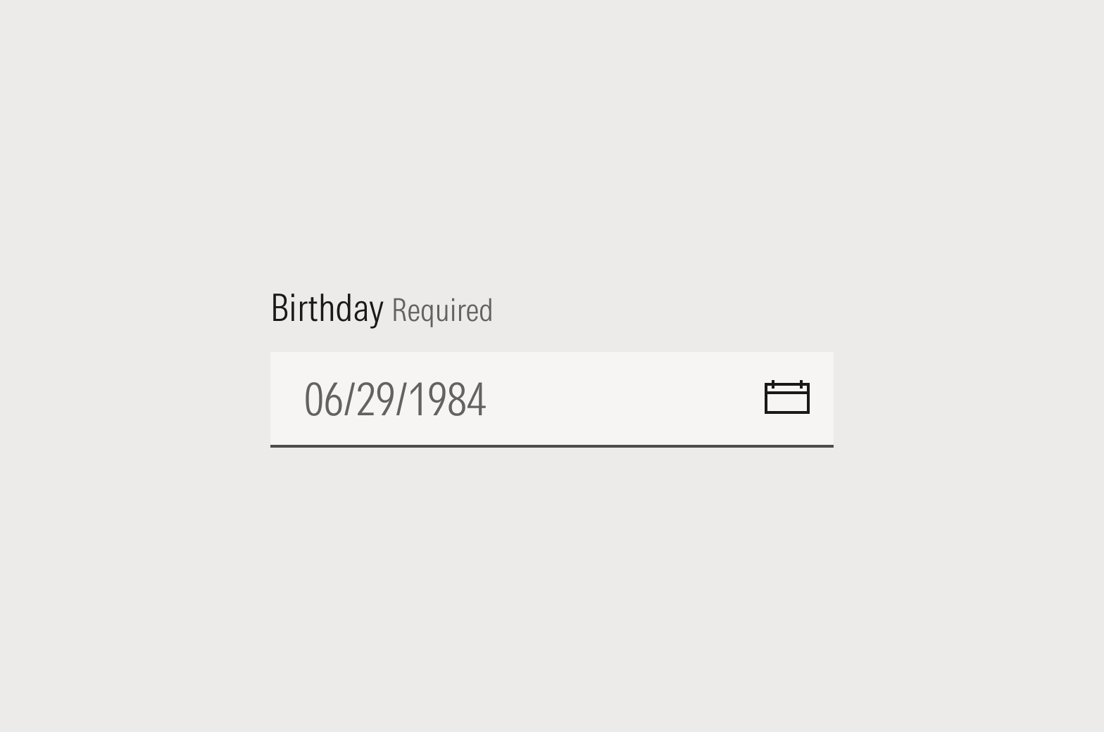
Don’t use an example date for placeholder copy. Input validation should be written as “MM/DD/YYYY” or “DD/MM/YYYY.”
Pronouns
Avoid using personal pronouns in UI copy if possible. For example, instead of “My Library” or “Your Library,” simply use “Library.” If using a personal pronoun is unavoidable, use the second person (you/your) to support a conversational tone in the interface; for example, “Shared With You” or “No files have been shared with you.”
The exception is when writing copy for Mo. Responses from Mo should always be in the first person.
Diacritical Marks and Non-English Words
Morningstar Style prefers American English terms. Non-English words or phrases that are likely unfamiliar to most readers should be italicized (“Meer doen,” but “rendezvous”). When in doubt, refer to the Merriam-Webster dictionary and use your discretion.
Do spell out all numbers under 10 except in dates, percentages, or when typographic or design decisions make it unreasonable or weird looking.
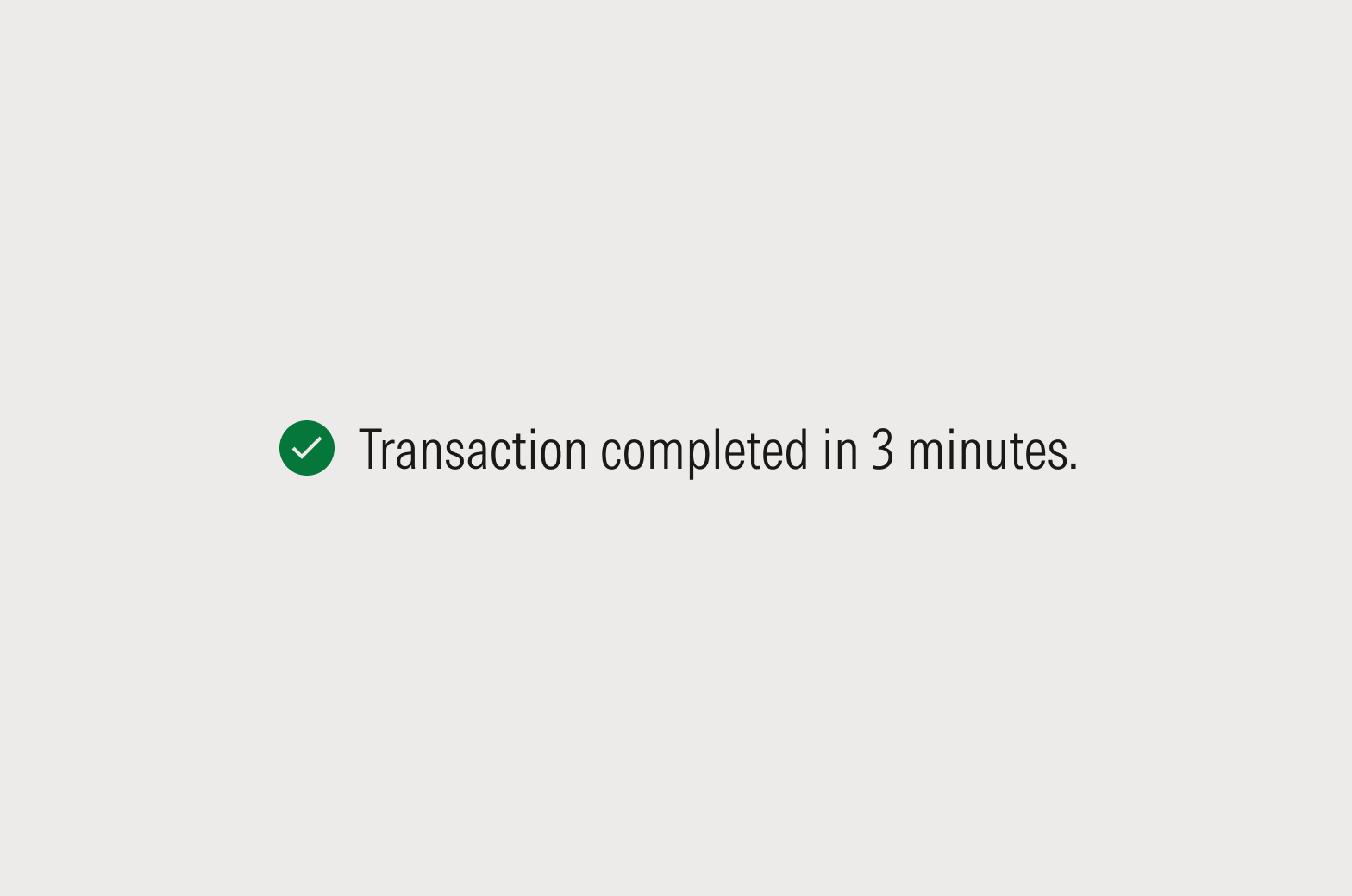
Do use numerals in messages that dismiss or resolve after a short period to aid with scannability.
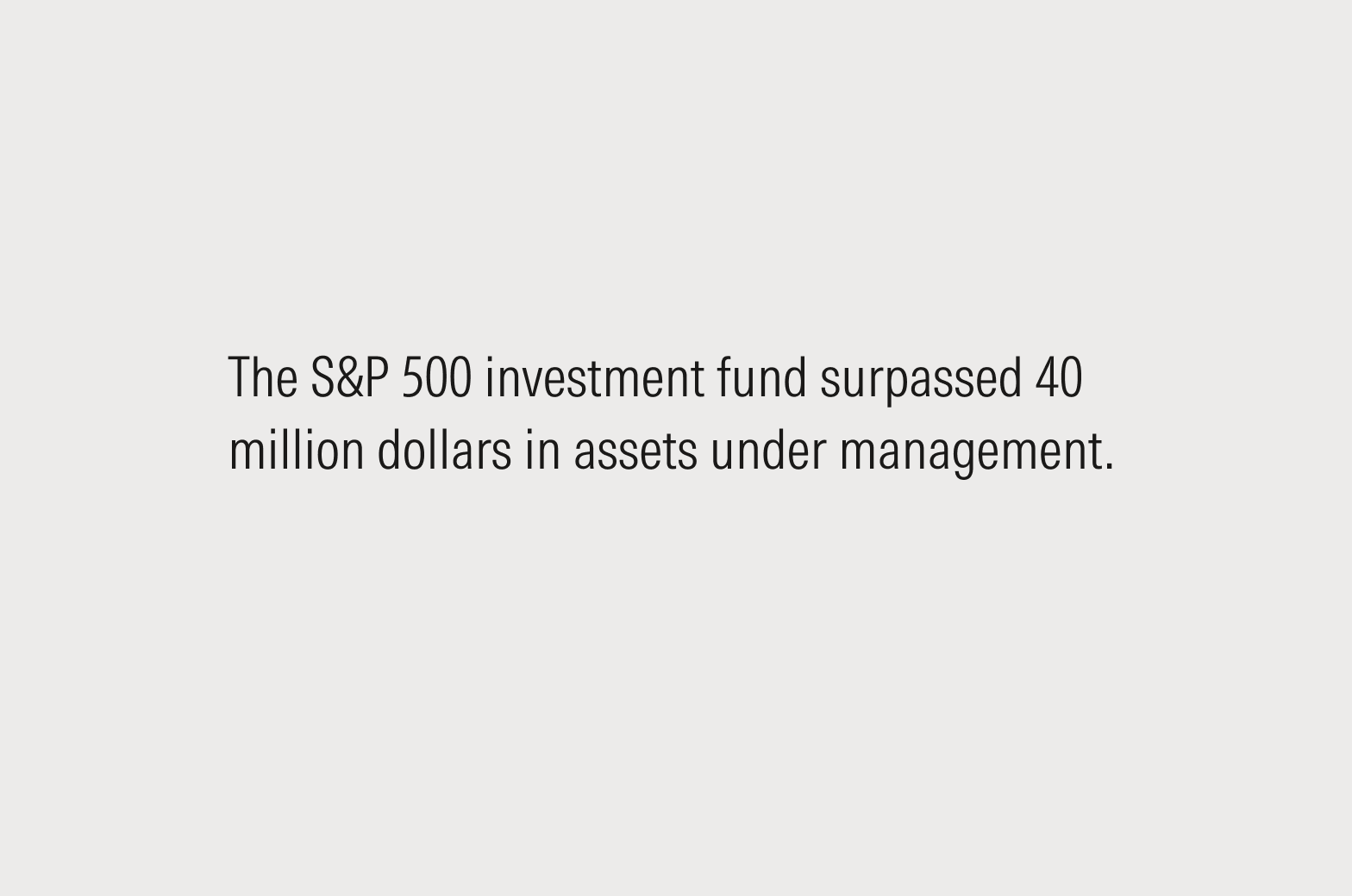
Do write out denominations above a million in copy. Use single-letter abbreviations, below, in space-constrained placements.
Data Visualizations
Since space is constrained and scannability is critical, use numerals in data tables, charts, and graphs.
Single Letter Abbreviations
Use K for thousand as in kilowatt, not the Roman numeral M. For all other numbers use the first letter of the English word. K is a more common convention for 1,000 than the Roman numeral M and 1MM (a thousand thousand) may be confusing.
- K for thousand ($1K for $1,000)
- M for million ($1M for $1 million)
- B for billion ($1B for $1 billion)
- T for trillion ($1T for $1 trillion)
Punctuation
Periods
It comes down to context, but a simple rule is that if it reads like a sentence, give it a period.
- Top-level page titles, headlines, and labels generally should not have periods.
- Second-level heads usually should get periods because they tend to be written as sentences, whereas our top-level ones aren’t.
- Helper text and tooltips should have periods.
- Lists are content-specific. In a list of sentence-like items, each item should end in a period. Omit the period in a list of items like names or terms.
Final (or ending) punctuation should be formatted in the plain style: no bold, italics, or underlines. Link styles on single words should never extend onto the punctuation mark.
Exclamation Points
There are no hard-and-fast rules for the use of exclamation points, but they should be used sparingly. If everything is worth an exclamation point, then nothing is.
Do put forward a value proposition in fair and reasonable terms—X does Y. The second sentence gives it that extra kick.
Don't use an exclamation point if it creates a potential tone mismatch—like aggressive, commanding, or overly excited—in your message.
Ellipses
In a UX context, ellipses are commonly used to shorten long strings that don’t fit in a container. As such, don’t put spaces before, inside, or after the ellipsis.
Curly vs. Straight Punctuation
Always use curly quotation marks, apostrophes, and primes. They are usually curved, depending on the font, and have different opening and closing versions. Most modern word processors default to smart quotes, but always check to ensure consistent use across your copy.
For more guidance and to access keyboard shortcuts, see Typography. For more on proper punctuation use, see the Morningstar Style Guide.