Content
UI writing choices directly shape how people understand, navigate, and trust our products. Thoughtful, consistent copy supports clarity, reduces friction, and helps the interface feel purposeful at every moment.
Buttons
Button Labels
When writing button labels, imagine you’re putting words in the mouth of the user. Effectively, the user is verbally telling the system what to do using the words you put on the button. Always use the word that most accurately describes the action being taken from the user’s perspective. For example, use “Search” to run a search rather than “Run,” or “Upload” instead of “Done” to upload a file.
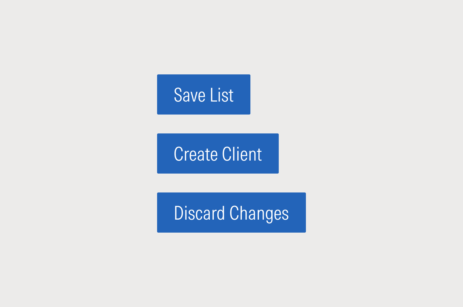
Do reiterate the action and confirm the affected object, if any. Avoid generic words like “Done” and “Okay” as much as possible.
Do write buttons from the perspective of the “voice of the user.”
Button Glossary
Always use the word that most accurately describes the action being taken from the user’s perspective. If the action is search, use “search.” If the action is to register, use “register,” or “sign up.” Don’t use “Edit name” for “rename” and as much as possible avoid words like “Okay” or “Done.”
Of course, there are plenty of times when you just need an “Okay” or a “Done.” Below is a list of some standard UX terms and explanations of when they are used in the Morningstar Product System. This is not an exhaustive list of acceptable terms.
Verb | How to Use |
|---|---|
Create | When the user is establishing a new object-record in the system, such as clients, lists, portfolios. |
New | Can also be used to establish a new object-record in the system. Do not combine with other terms, such as Create New. |
Add | When the user is appending or attaching additional items to an existing set. For example, adding investments to a list, goals to an investment plan, or fee tiers to a billing record. |
Duplicate | Creating a new object-record in the system with the same attributes as the original. Do not use “Make a copy.” |
Run | When the application is running an calculation, or compiling content into a new object or format—such as a report, proposal, or risk model. |
Export vs. Download | In general, Export should be used when extracting raw or minimally analyzed data; Download should be used for pulling down a finished file. |
Edit | Use Edit to put an object into a state where multiple attributes can be updated simultaneously. Do not use Modify. If only one attribute is being changed, use a more specific verb, like “Rename.” |
Delete | Use Delete when the object is being permanently erased from the system. |
Remove | Use with Add to pull an item out of a set, but not erase the item from the system. |
Discard | Use Discard to end an editing workflow without saving changes to the system. Discard should revert the object-record to its pre-edit state. |
Labels
Labels should clearly indicate a space or an action users can take. Keep them concise—generally no more than two or three words—and be precise about the space you’re labeling. Most importantly, keep labels consistent throughout an experience.
Use title case in most instances and do not include final punctuation.
Do use clear and concise labels that are visible at all times.
Don’t make labels longer than they need to be. If users are having difficulty, examine the UX and consider using placeholder or helper text.
Placeholders
Placeholders in Form Fields
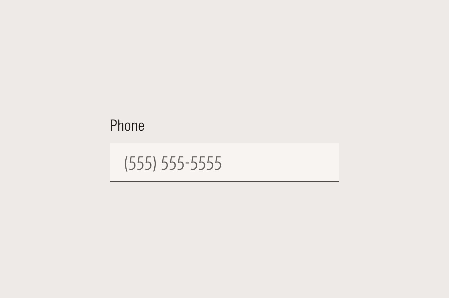
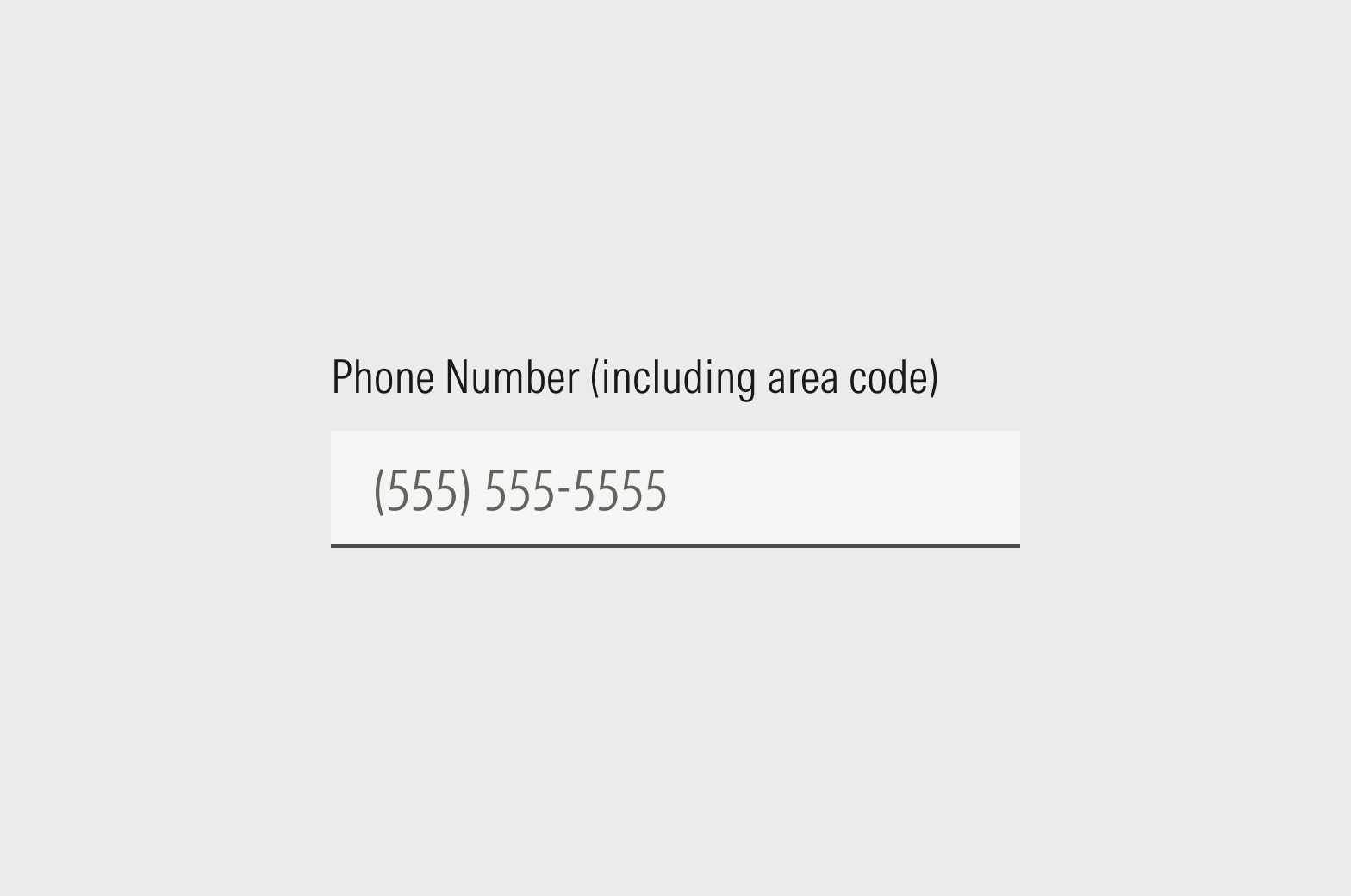
Placeholder text temporarily holds the place of what the user will ultimately enter. It isn’t required, but you should be internally consistent within your application and never have a form where some fields contain placeholder text and some don’t.
Use a descriptor like “First name” or show how data should be formatted (MM/DD/YYYY). Never use the space to provide an instruction to the user, like “Enter first name here” or an example. Placeholder text should be in sentence case, and never include final punctuation.
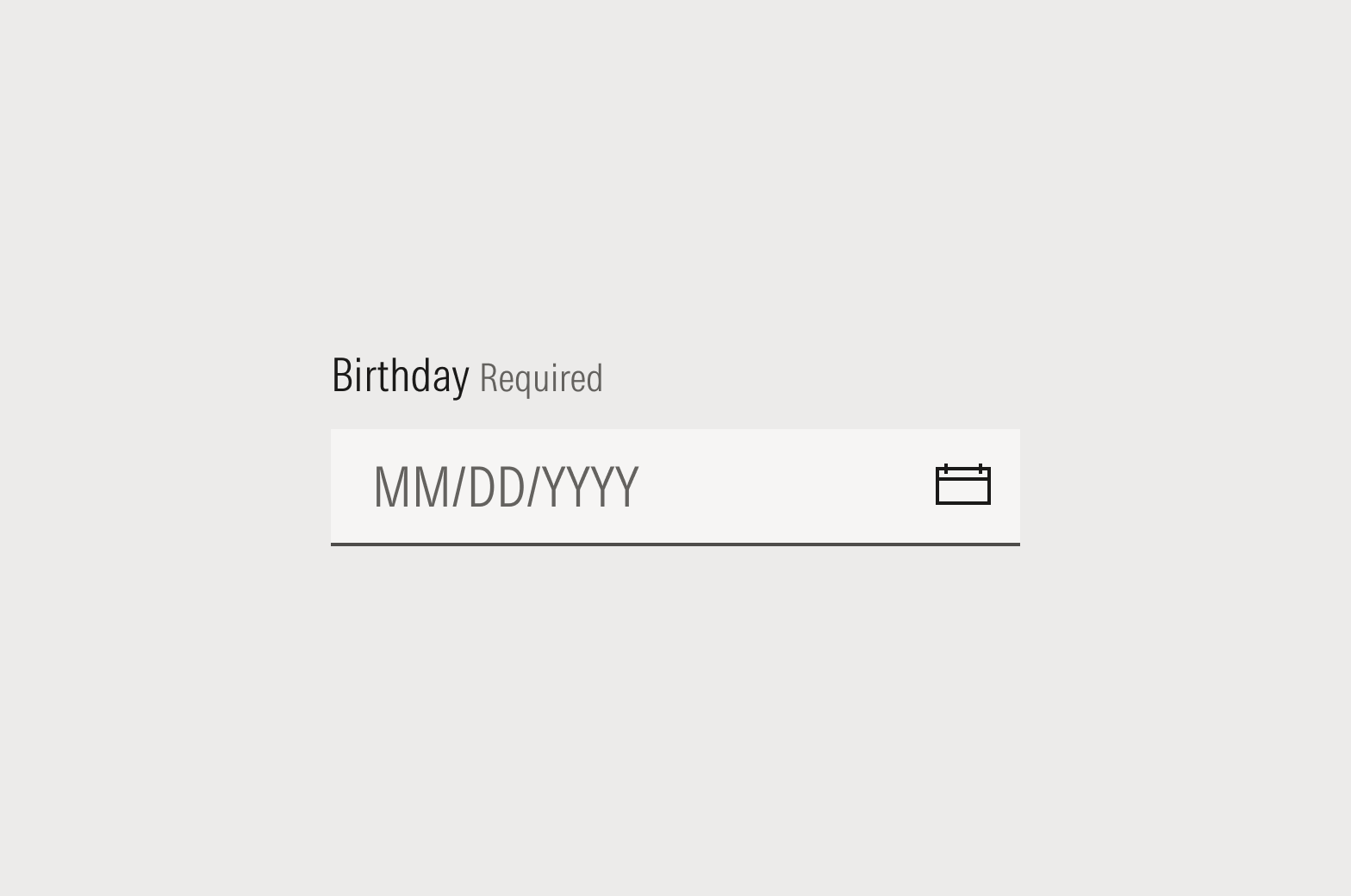
Do indicate the format in which data should be entered. When appropriate, the system should automatically format the data. Do the hard work to make it easy.
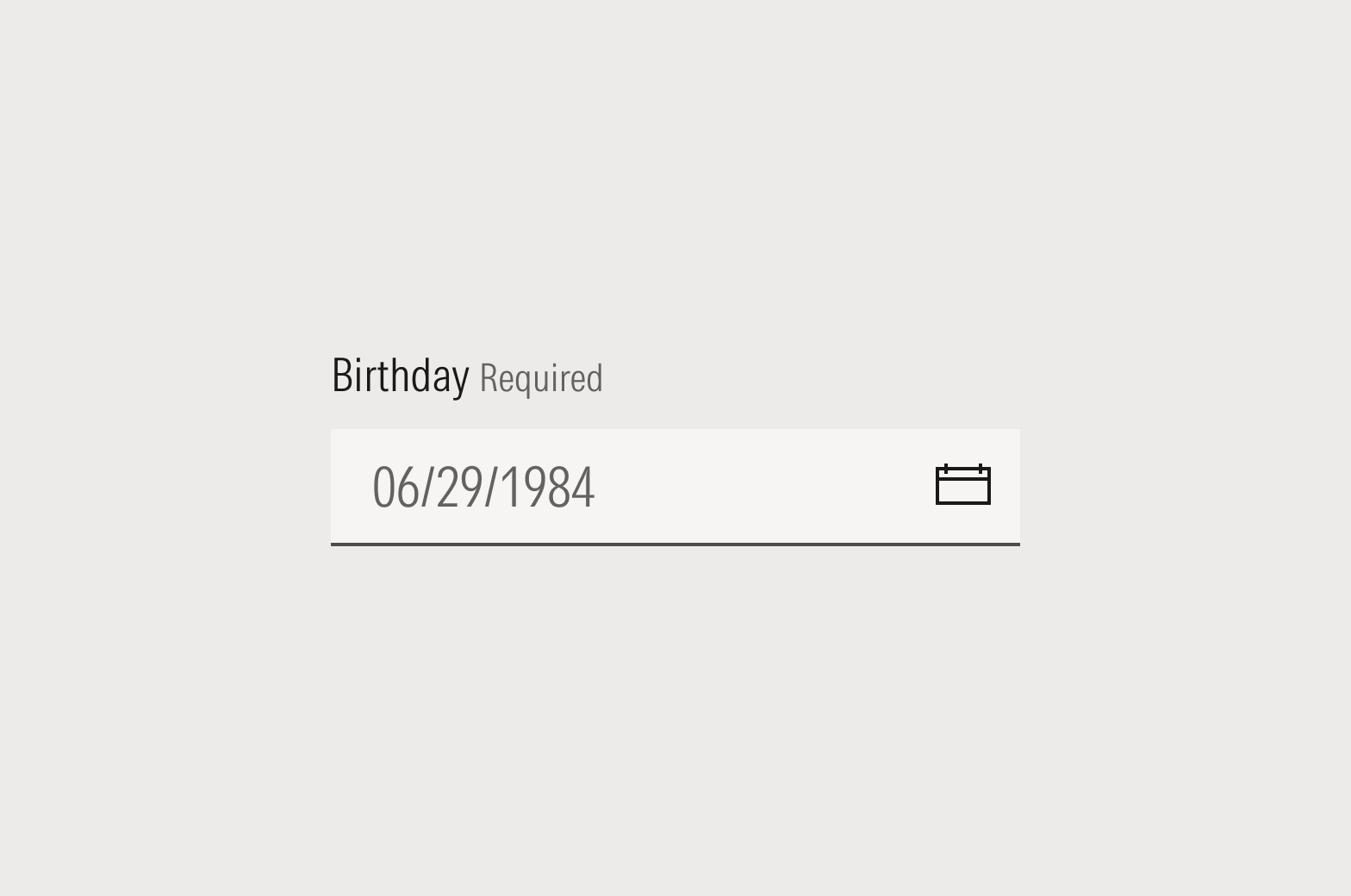
Don’t provide an example as placeholder text.
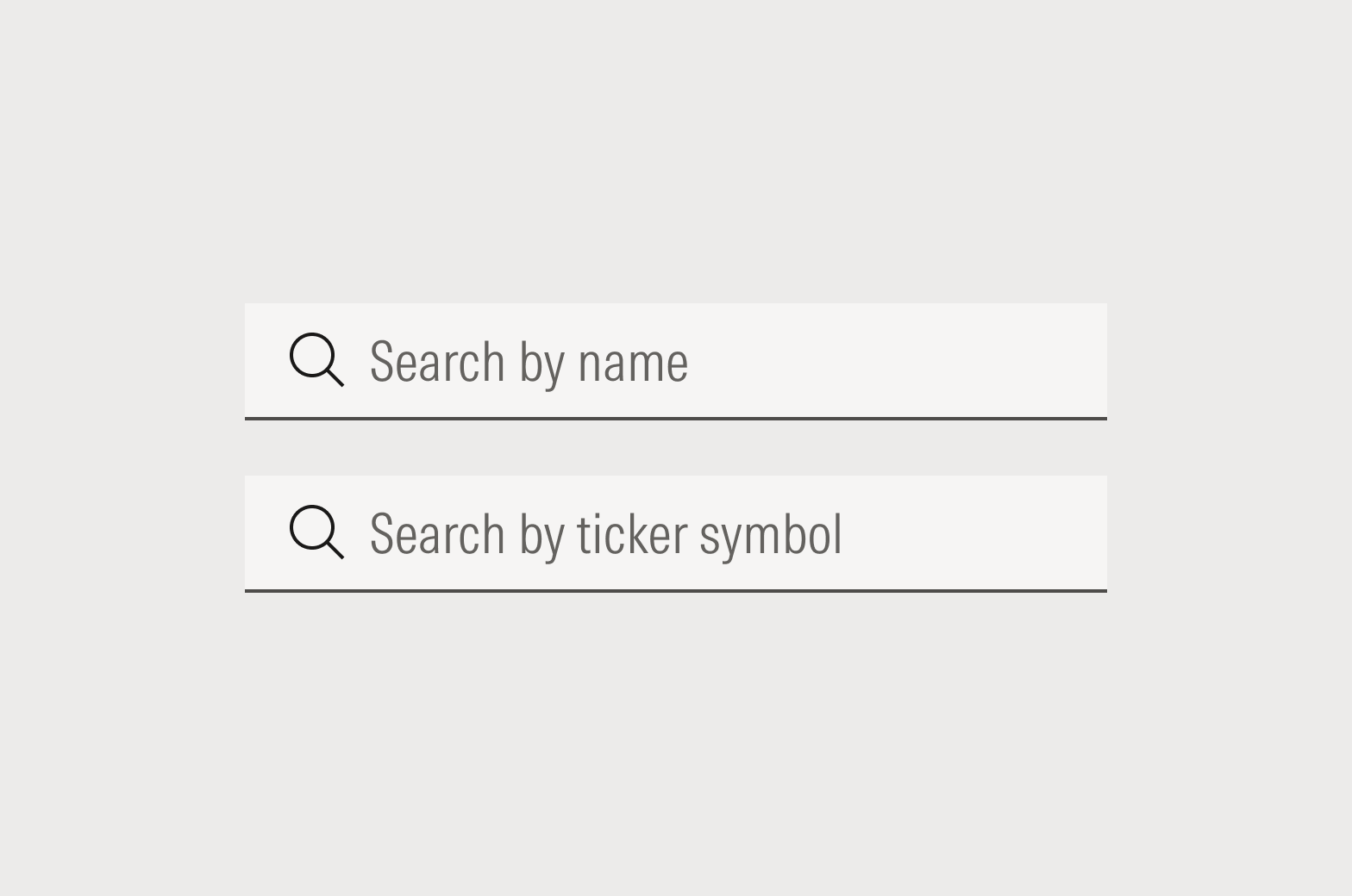
Placeholders in Global Search Boxes
With global search, we can’t be sure how the user will try to look up their query—but we do know the universe of things a user can search through. For that reason, global search boxes should specify the spaces, databases, or objects that are searchable.
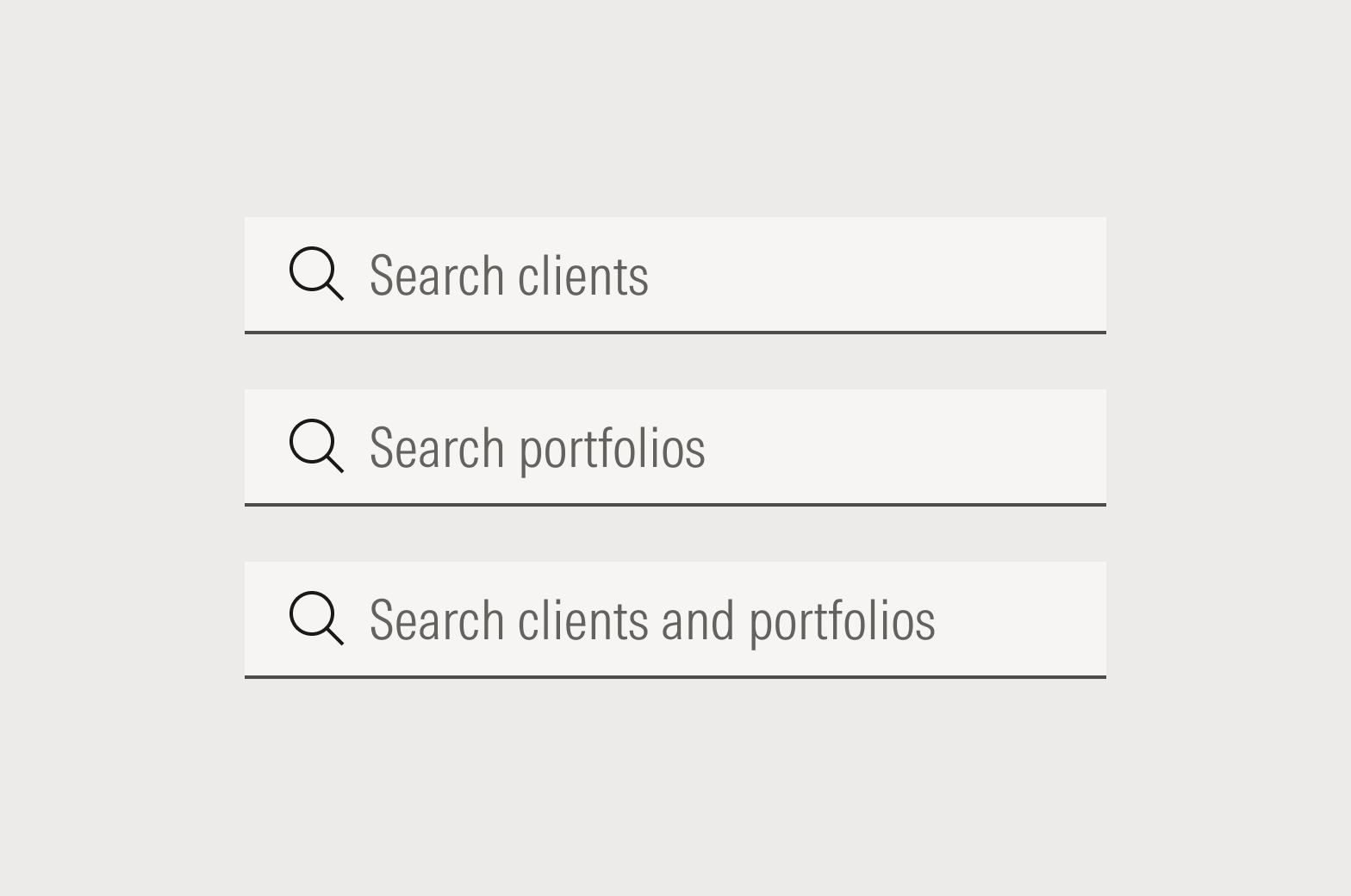
Do specify the sets of things that can be searched.
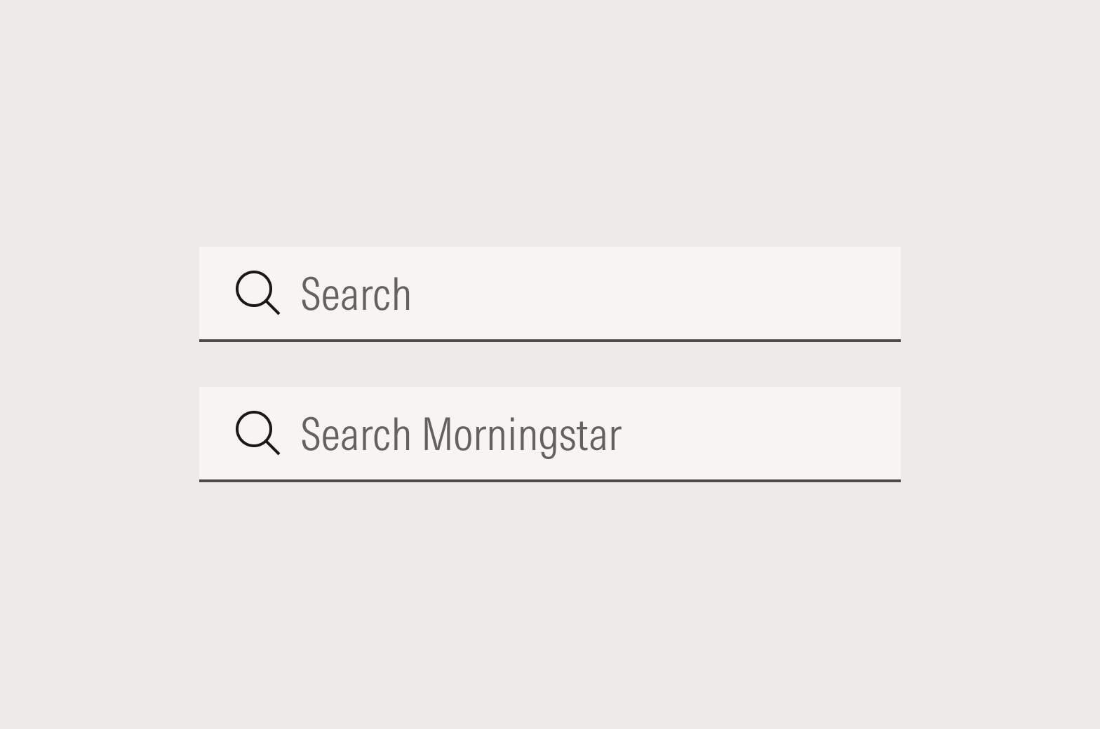
While specificity is most helpful to users, you can simply say “Search” or “Search Morningstar” if there are more than two or three sets being searched.
Placeholders in Filter Search Boxes
With search to filter, we should specify what attribute of the object is searchable so the user knows how to begin.
Do specify the searchable attribute.
Helper Text
Helper text is just that—an assist. It should be used in conjunction with the label or headline to provide additional information that can’t be captured in a one- or two-word label.
Aim for two sentences max. If you need more than two sentences, re-examine the UI and UX to determine why you need so much explanation for an input field. Use complete sentences, including ending punctuation.
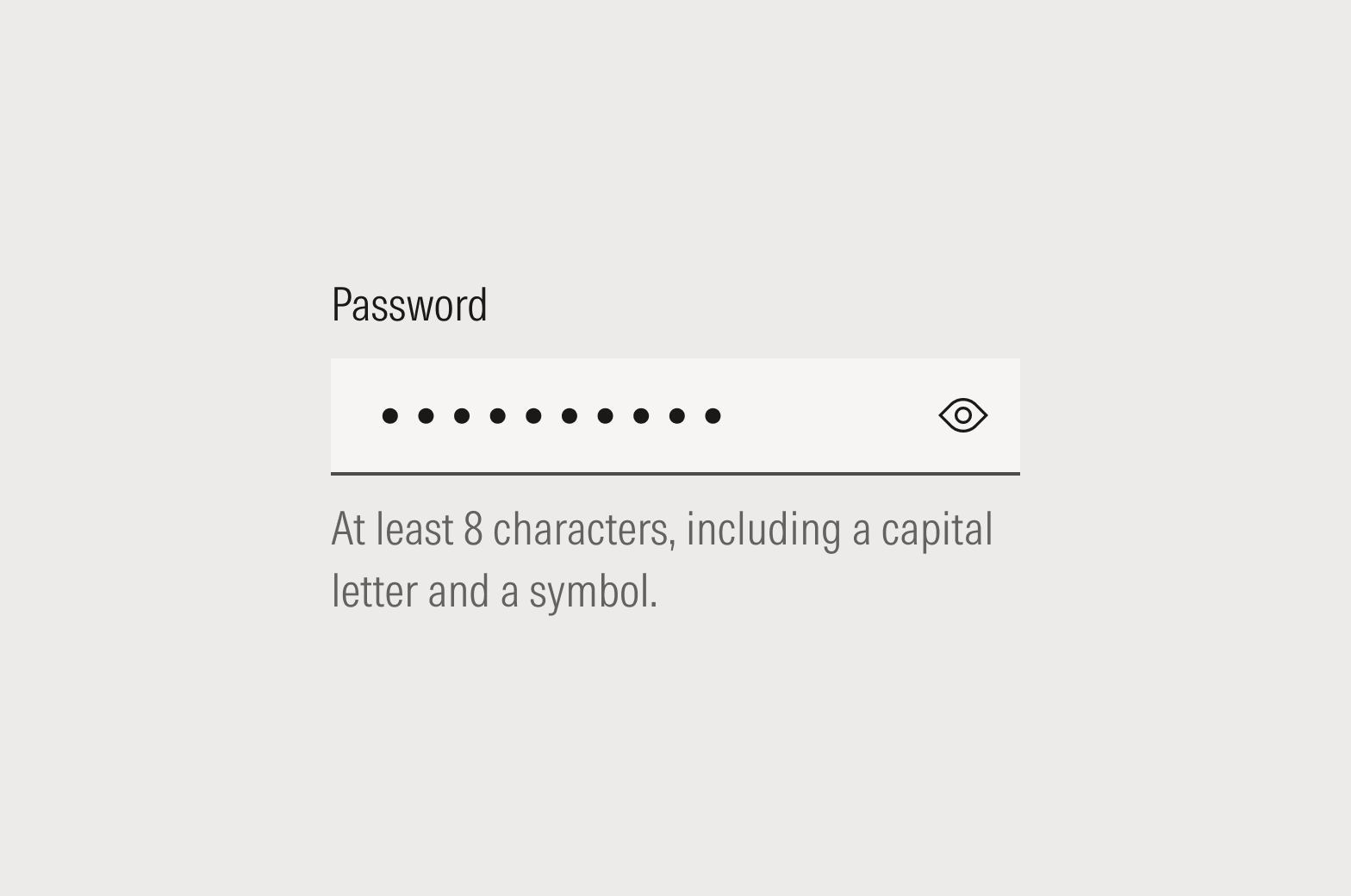
Do provide useful, assistive information that helps the user complete the task successfully the first time.
Don’t restate the label in more words.
Dialogs and Page-Level Notices
Dialogs
When writing things like dialogs or buttons, imagine that the user and the interface are having a conversation. Think about the way you interact with a voice interface like Alexa or Google. Good UX copy mimics a verbal conversation between the user and the interface, distilling the key nouns and verbs into UI elements.
Headlines should be sentence case. Final punctuation should be omitted for statements but included for questions. Body copy should be sentence case, and final punctuation should be included.
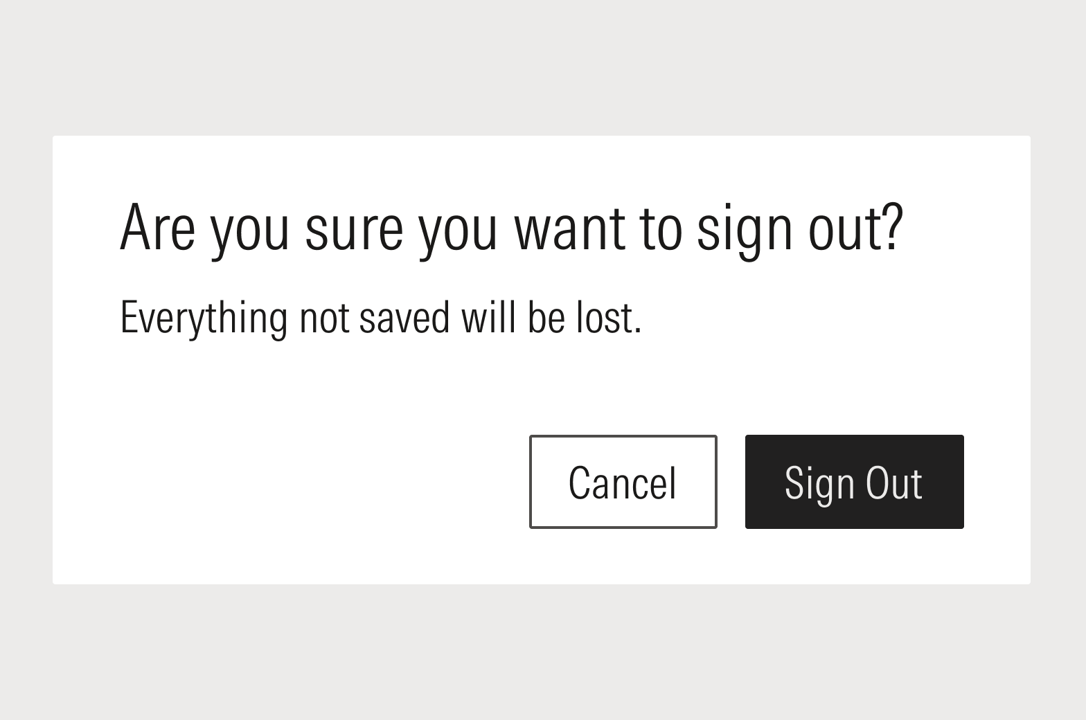
Do repeat the action in the headline and the affirmative button label.
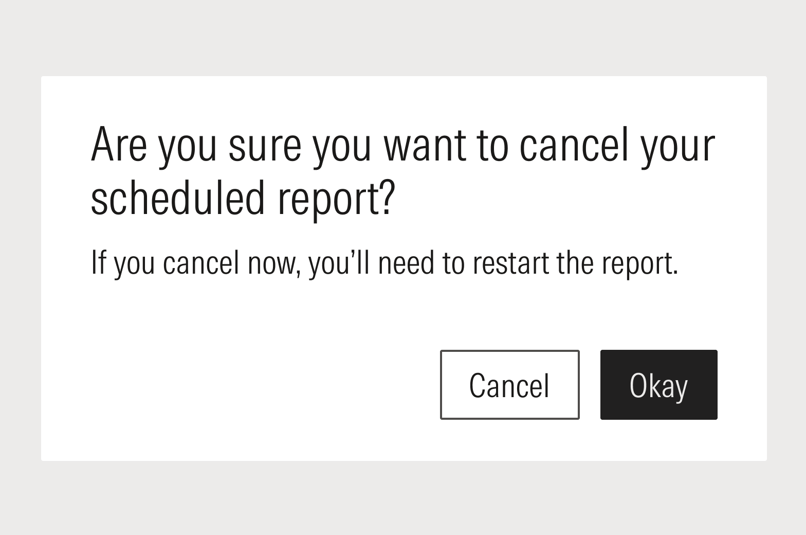
Don’t use generic actions—they are far too likely to confuse users.
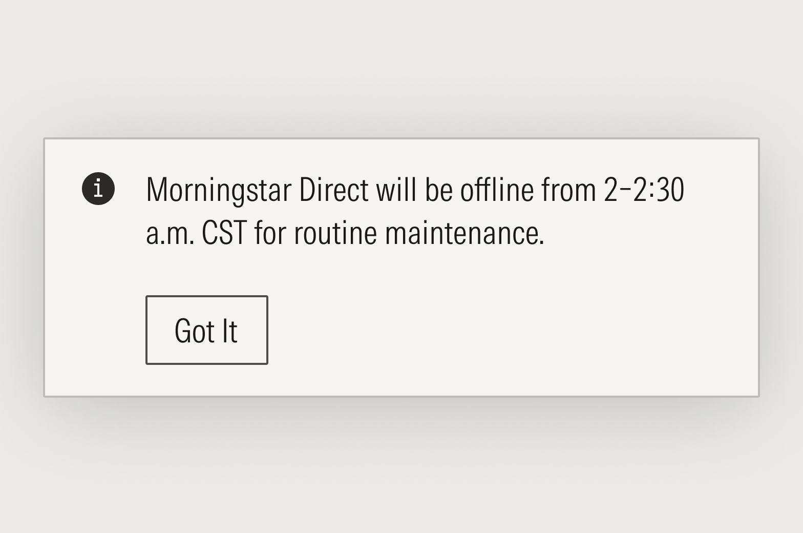
Page-Level Notices
Consider using the notification or banner component for page-level notices.
Headlines should be sentence case and final punctuation should be omitted. Body copy should be sentence case and final punctuation should be included.
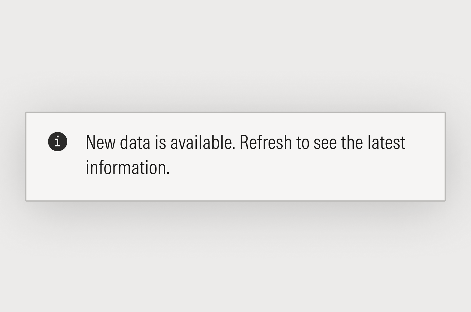
Do lead with the value or impact to the user before the task or action.
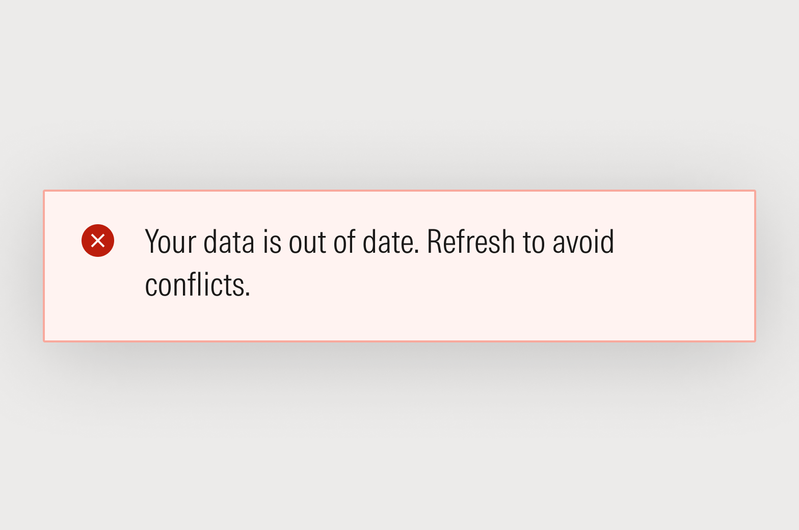
Don’t blame the user, or create unnecessary anxiety.
Empty States
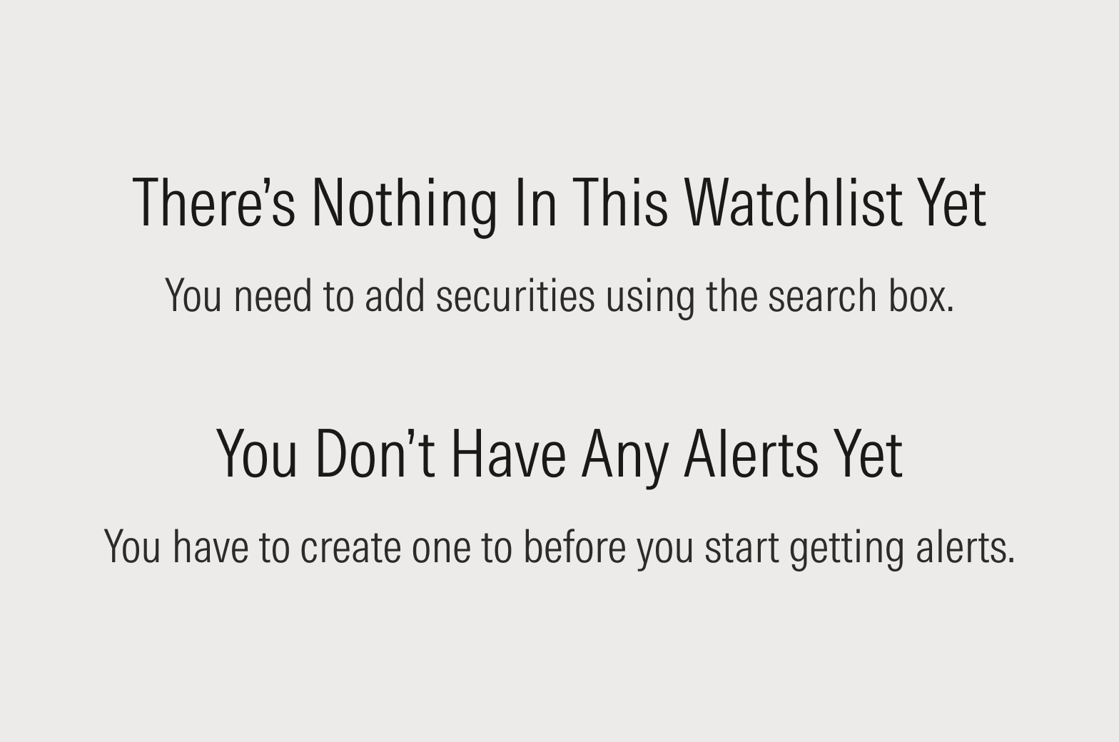
When the User Did Something Something
This empty state result is because a user did something; for instance, they added too many screening criteria to a set of investments and nothing matches their query. The user’s actions have taken them to the end of the road, and there’s nothing left to do but back up.

Do use the headline to explain the situation, and the body to provide a path forward.

Don’t blame the user. Avoid phrasing like “you did something.”

Do focus on the situation, not the user’s behavior. Use phrases like “there weren’t” and “it doesn’t.”

Don’t apologize or take the blame for the application’s expected behavior. Save phrases like “we couldn’t” and “sorry” for when we really are at fault.
Default “No Results” Messages
The standard message formats below can be used as written, or adjusted to fit the context. In all cases, use complete sentences and specify the kind of result that wasn’t found.
Be mindful of the tense. If an object in the system can be deleted and, therefore, may have existed in the past, then use “There are no” (simple present tense). If an object cannot be deleted and therefore never existed, use “There hasn’t/haven’t been” (present continuous). This signals to the reader whether they need to refine their search or refine their expectations.
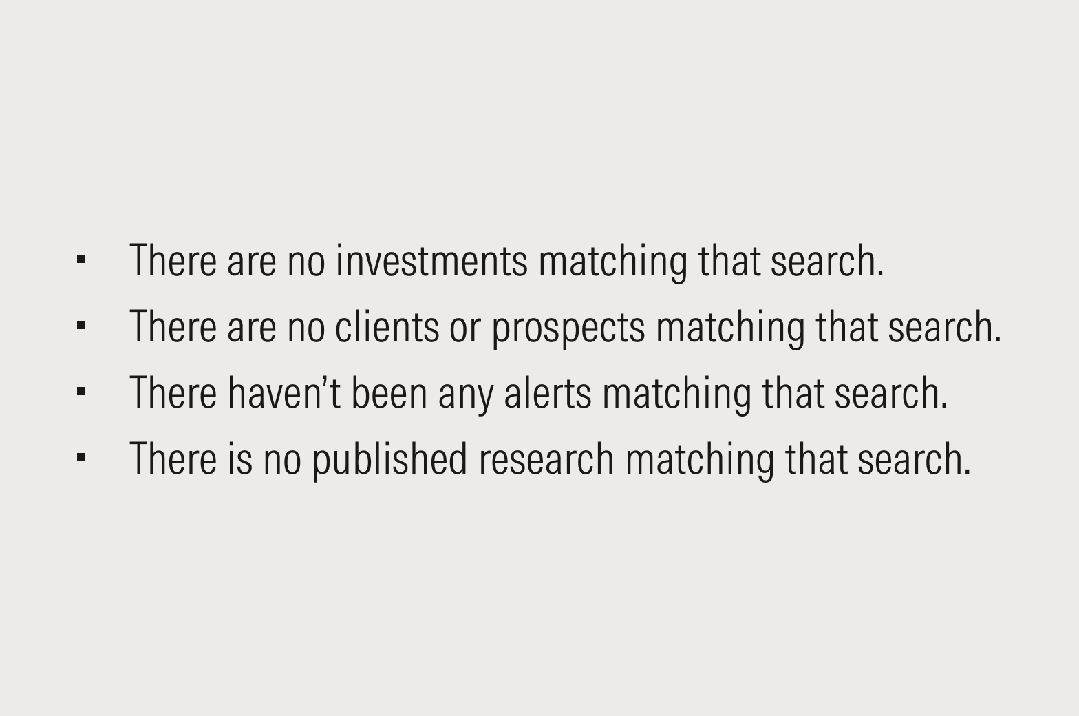
Sample messaging for when a search contains just one or two object types.

Sample messaging for when a search contains more than two object types.
When the User Needs to Do Something
The narrative flow of the experience and visual cues should be enough to tell the user what to do next. Be thoughtful and judicious when adding copy to a screen; don’t add copy just because you have the space. However, if you discover through testing and user feedback that copy is required, see the guidance below.

Do focus on what the user can do rather than what hasn't been done yet, by reiterating the feature’s value proposition.
Don’t blame the user for just starting a workflow.
Errors and Stress Cases
The best errors and alerts are the ones that don’t need to be written. Before sitting down to write an error message, think about how the UI/UX can be improved to make the error case impossible. Do the hard work to make it simple.
If you’ve determined that the error is unavoidable—or the least-worst option—make sure the error is communicating three basic pieces of information:
- What happened
- Why it happened
- How to resolve or move forward
It may not be necessary to explicitly communicate each point in words. The UI/UX can and should provide some signals to the user. An effective user experience communicates all three points, but the content is just one part of the overall interface. Don’t lean on content to solve UI/UX problems.
Inline Errors
Inline errors should be avoided as much as possible by finding UI and UX solutions. For instance, date entry fields shouldn’t have to throw formatting errors; they should be smart enough to insert delimiters for the user.
Use a component's error-text property. Use sentence case and always include final punctuation.

Do explicitly but concisely explain the situation.
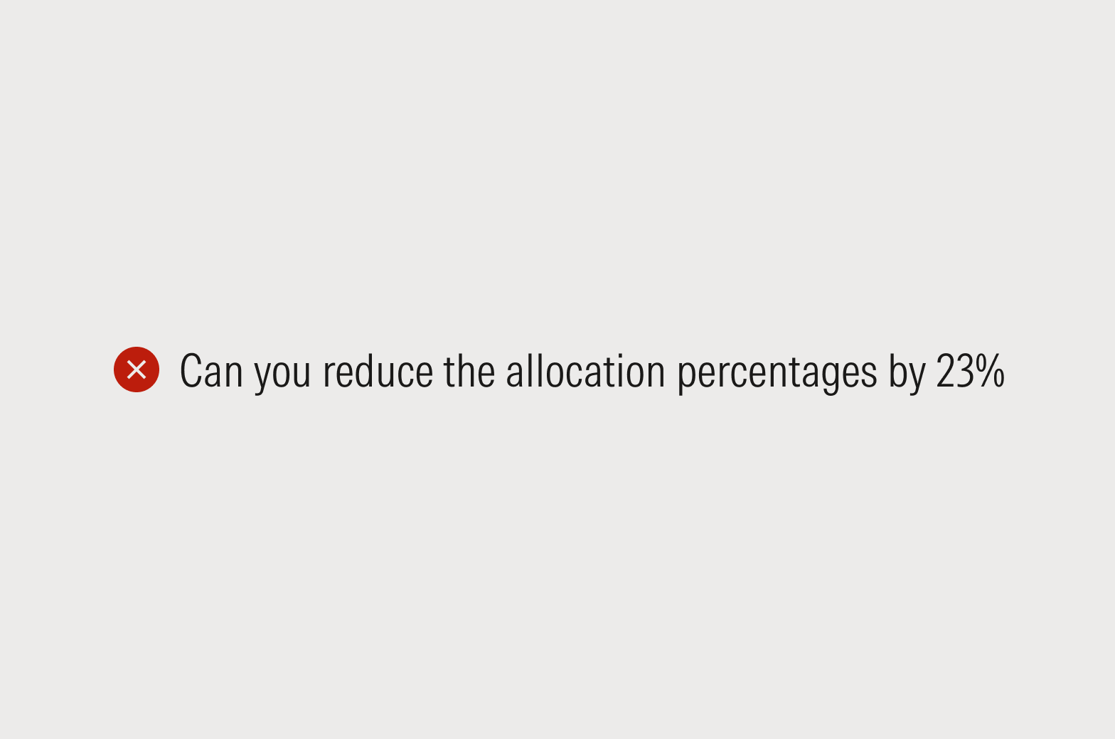
Don’t frame errors as questions or tasks.
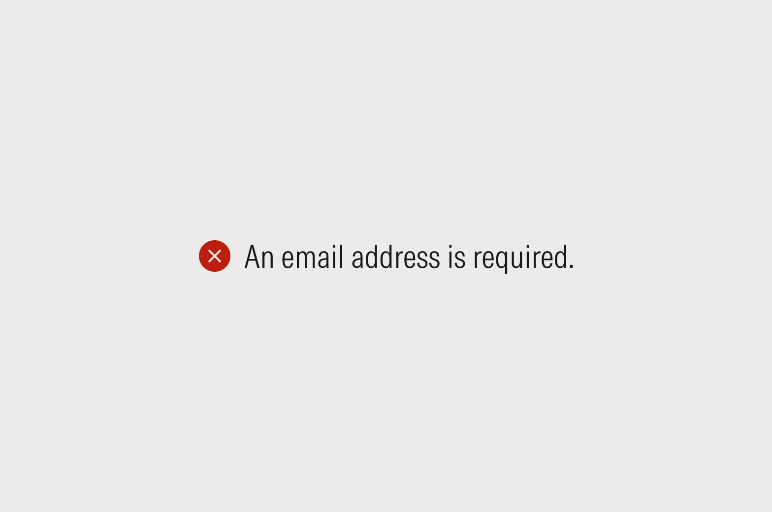
Do put the focus on the situation or the product, not the user.
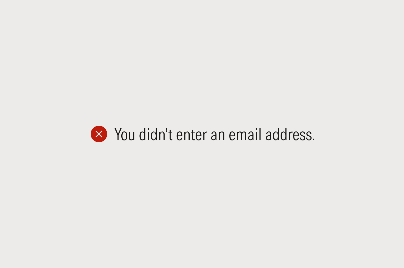
Don’t blame the user. They’ll understand that an error means they need to take an action.
Don’t blame the user. They’ll understand that an error means they need to take an action.
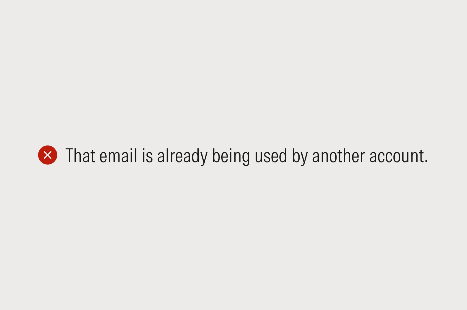
Page-Level Errors
Use the notification component. Headlines should be sentence case, and final punctuation should be omitted. Body copy should be sentence case, and final punctuation should be included.
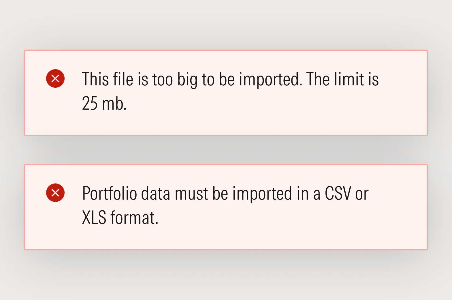
Do present one issue at a time.
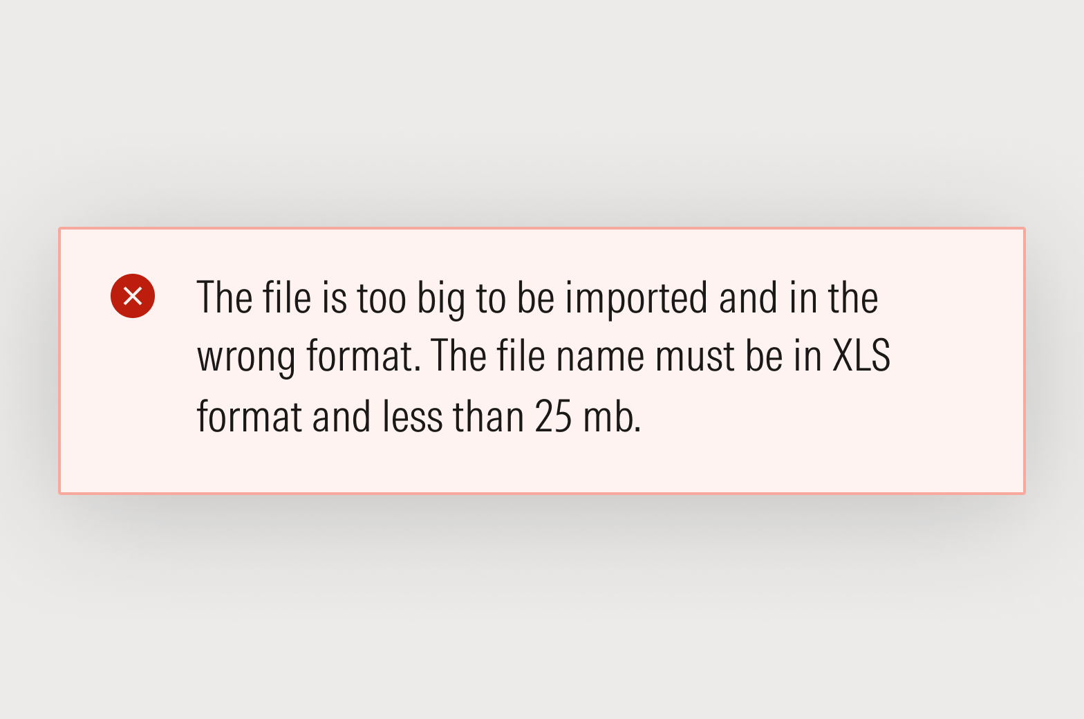
Don’t present multiple issues simultaneously. The exception: recapping required fields on form submission.
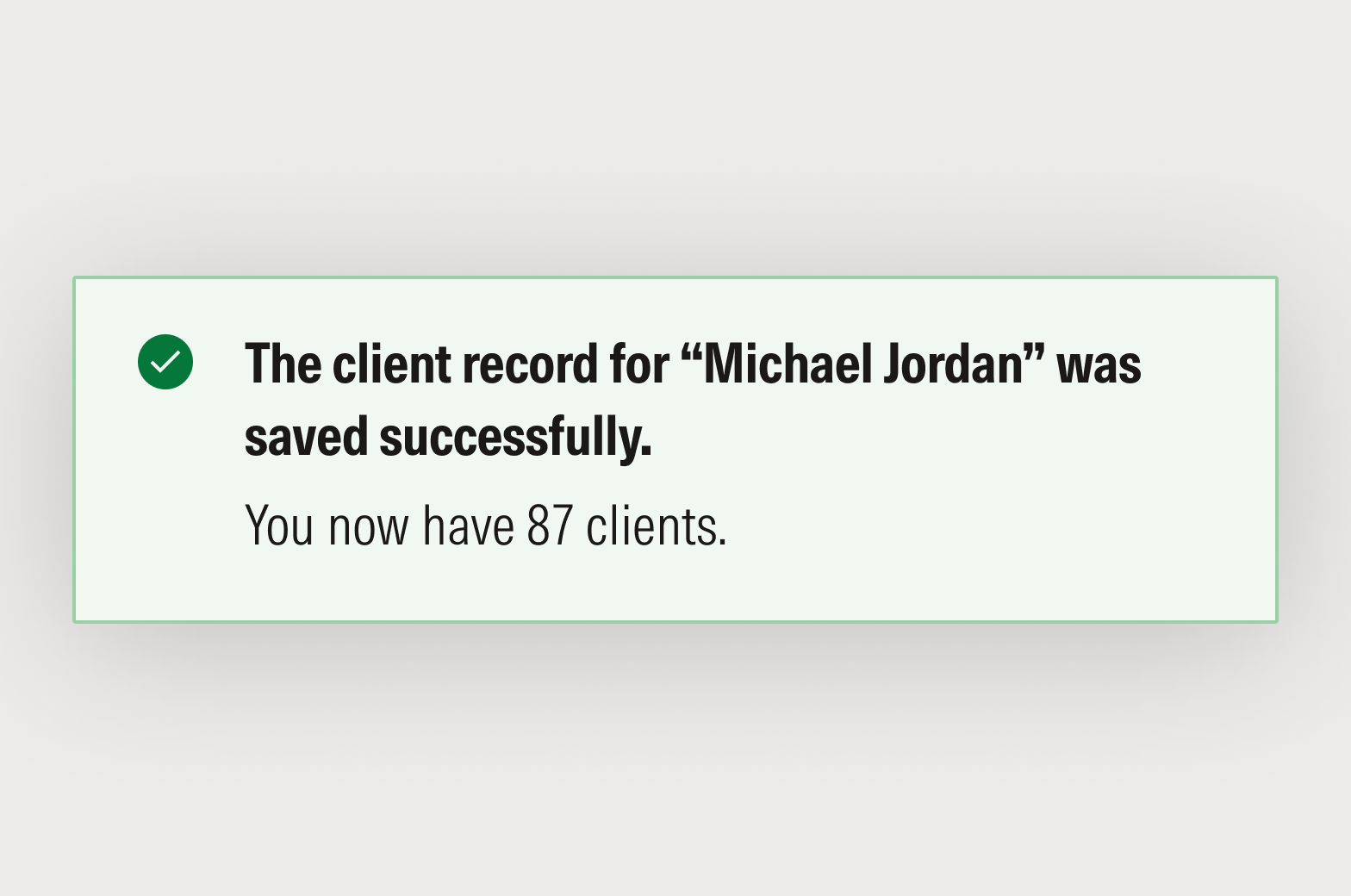
Success Messages
When a task is completed successfully—like adding investments to a list, saving an object, or submitting a form—try to convey a sense of completion. Depending on the exact nature of the message, success notifications can be an opportunity to inject life and personality into the product.
Use the notification or block message component. Headlines should be sentence case and, if the headline is a sentence fragment or phrase, final punctuation should be omitted; if the headline is a complete sentence, include final punctuation. Body copy should be sentence case, and final punctuation should be included.
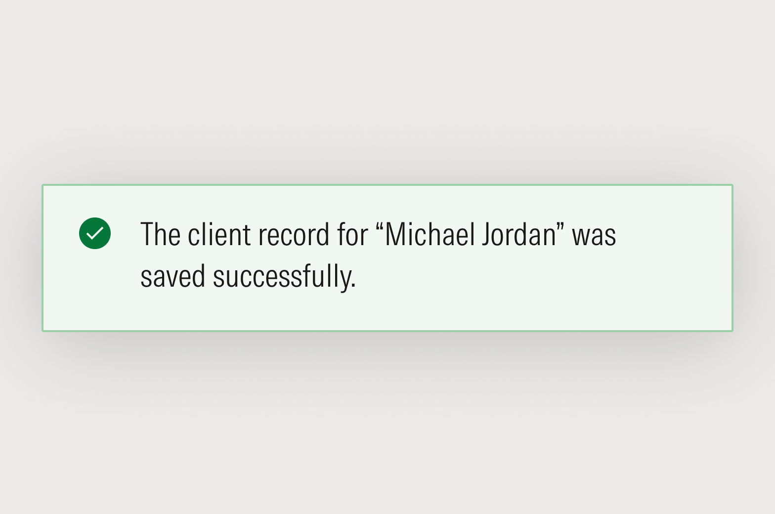
Do be extraordinarily explicit about what was successful by referring to the object type and file name.
Don’t volunteer information that isn’t relevant or needed in the moment.
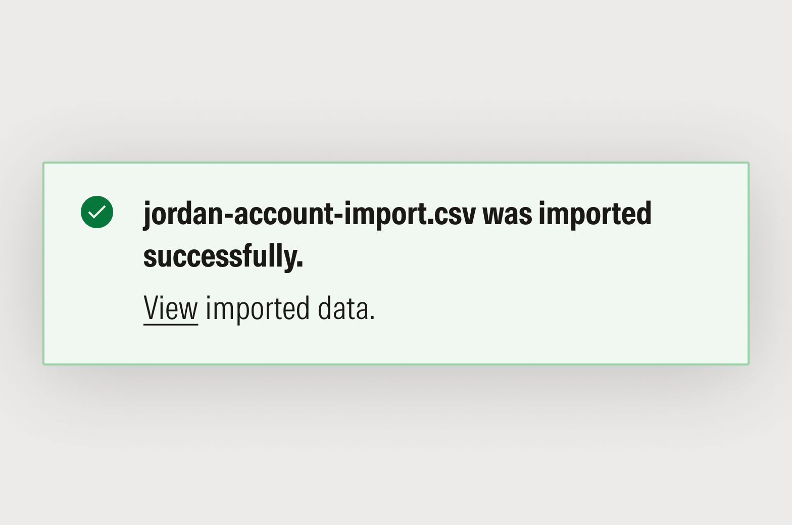
Do include helpful follow-on actions, where appropriate.