Iconography
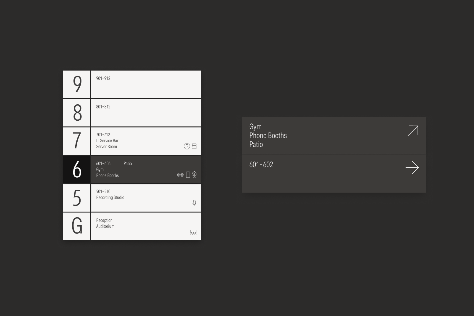
When selecting icons, understand the user’s intent and assign the icons specific roles; for example, consistently using a lock icon to represent security across a product interface. Icons may also be adapted for wayfinding or redrawn for UI to maintain a consistent look among Morningstar icons.

The minimum icon size is 48×48 px.

Don’t shrink the icon below 48×48 px or substitute it for a user interface icon.

Do redraw icons to simplify artwork when below 48×48 px.

Don’t squish or stretch the icon.

Do scale the icon and stroke weight proportionally.

Don’t maintain the stroke weight when scaling the icon.

Do use the icon as provided.

Don’t apply drop shadows for decorative effect.

Don’t combine icon expression states. See more on Expressions.

Don’t modify the icon to simulate practical effects like overprinting.

Don’t modify an icon to depict it in a three-dimensional space.
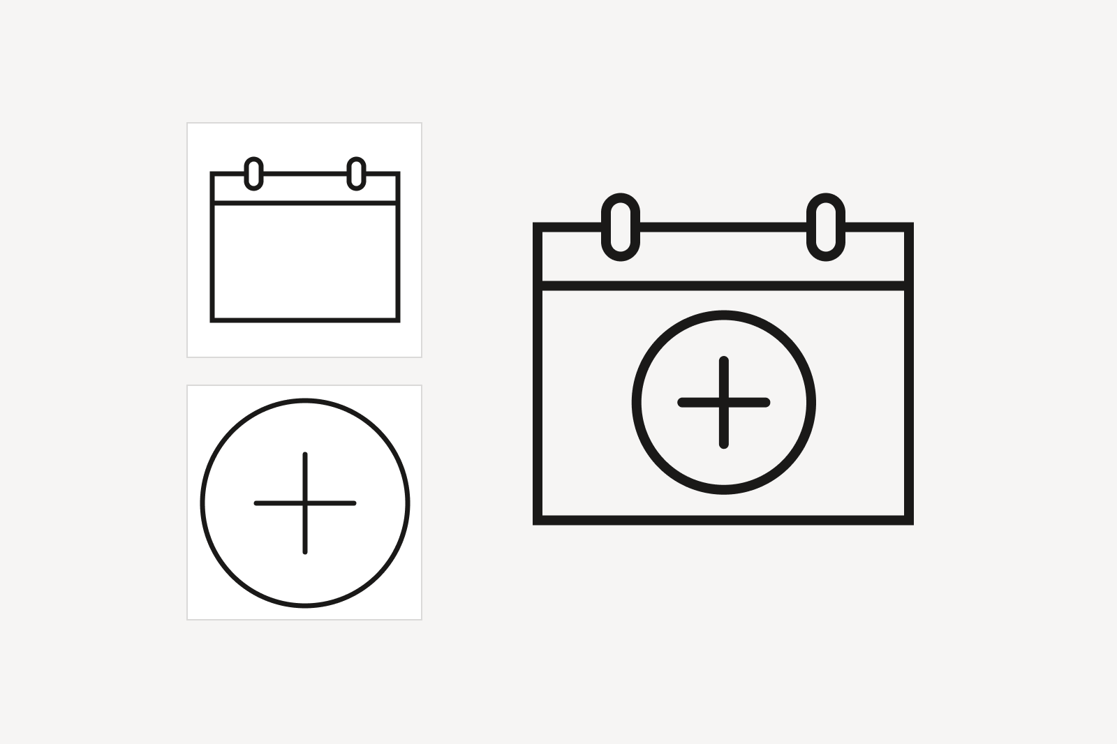

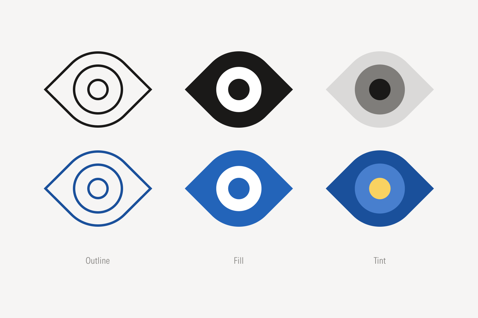
Do combine icons of the same expression. See more on Expressions.

Don’t combine icons of different expressions.
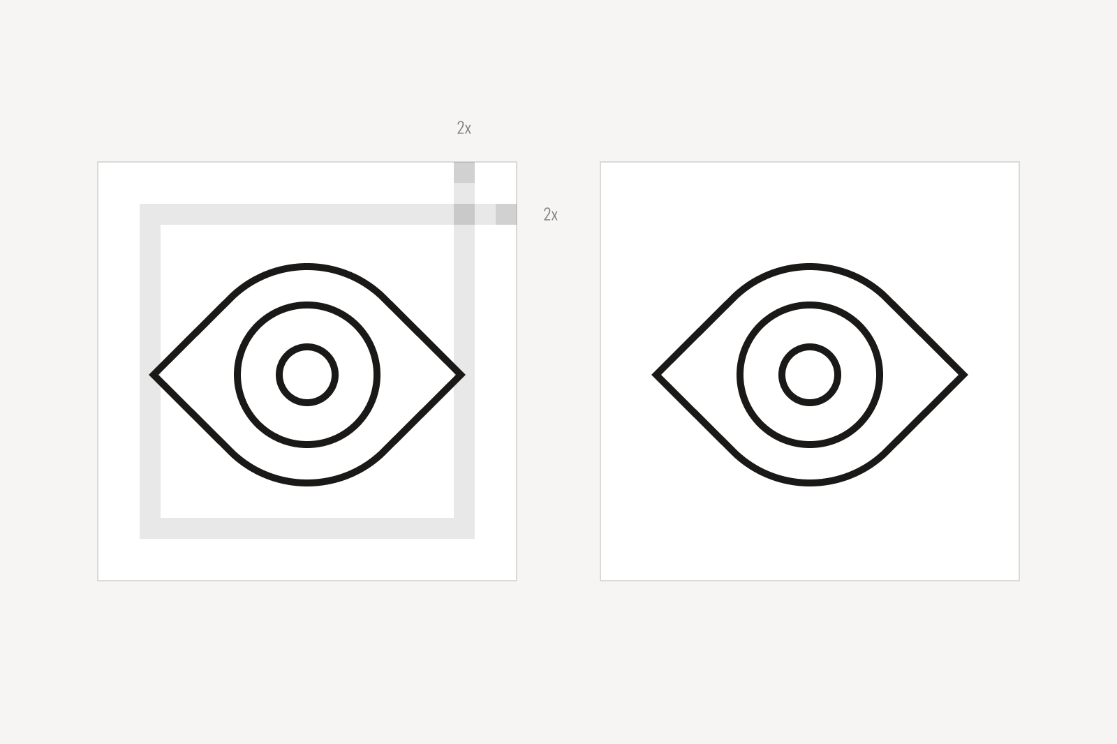
Ensure proper clear spacing around the icon.
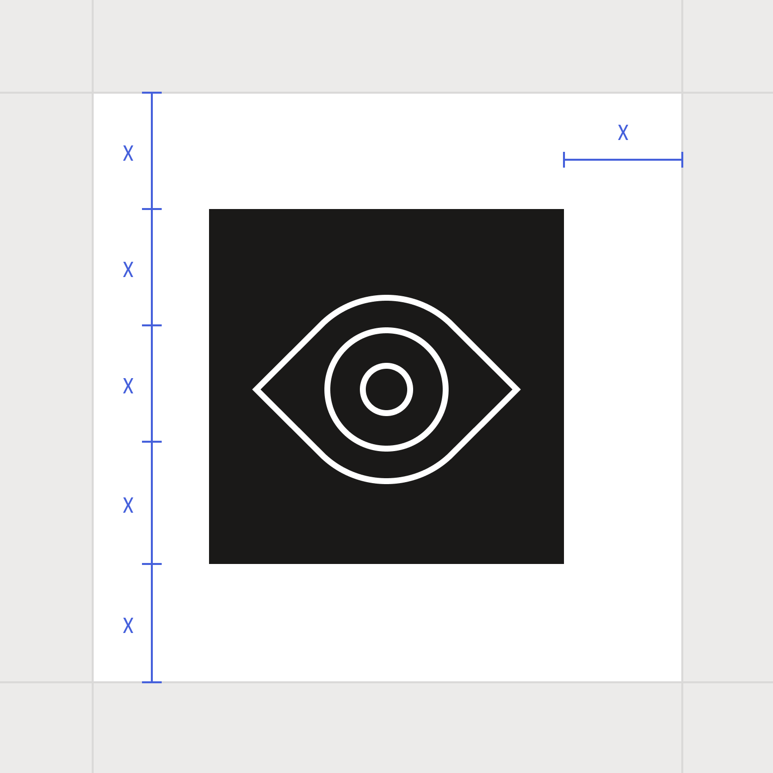
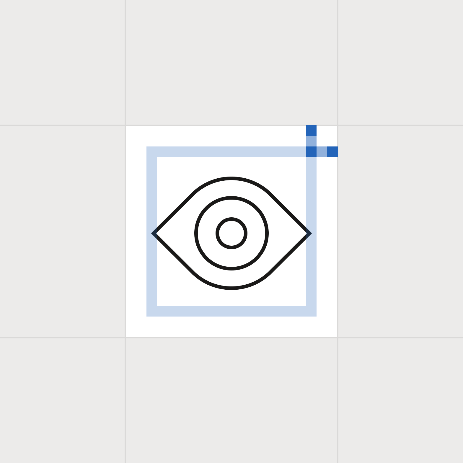
Ensure proper clear spacing around the enclosed icon.
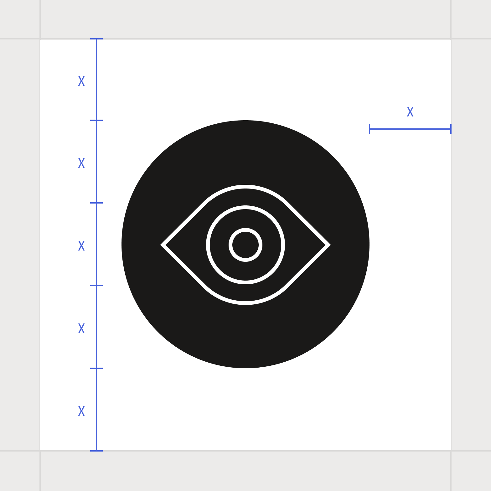
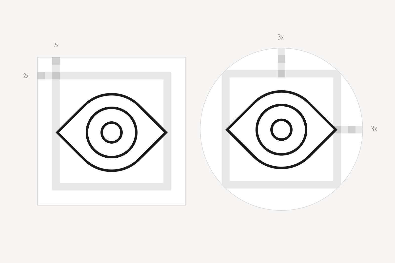
Ensure proper clear spacing around the enclosed circle icon.
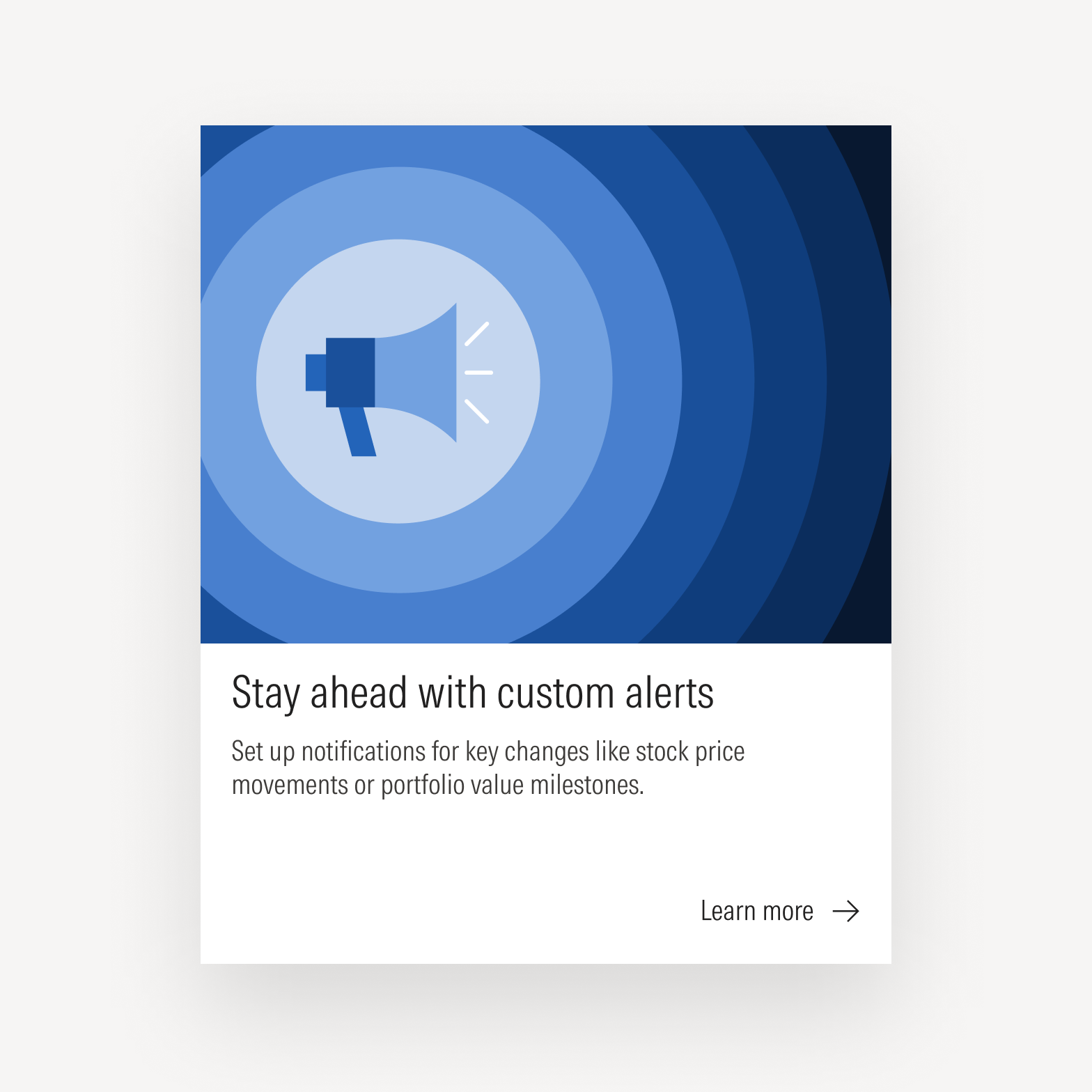
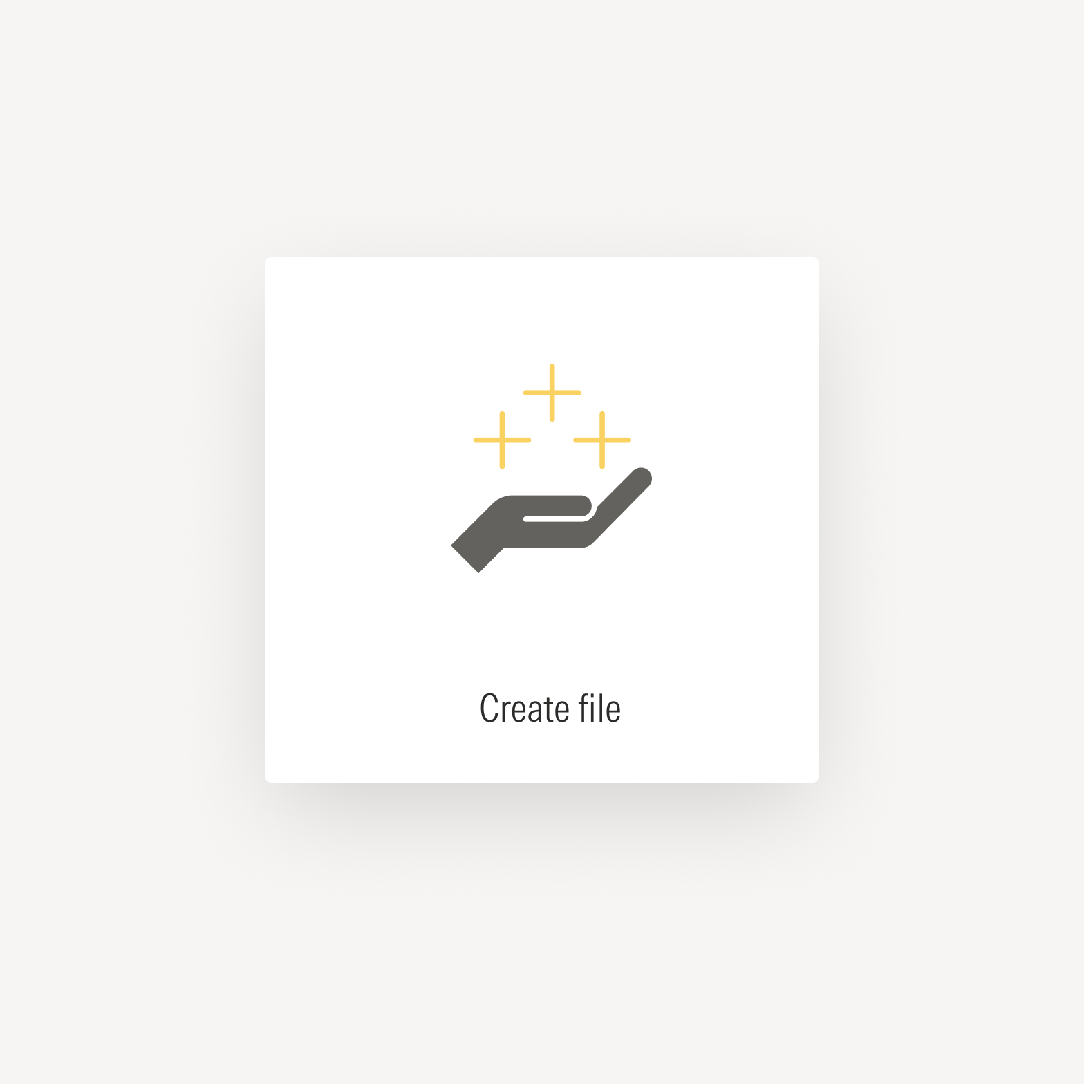
Icons can be used to draw attention and provide visual interest.
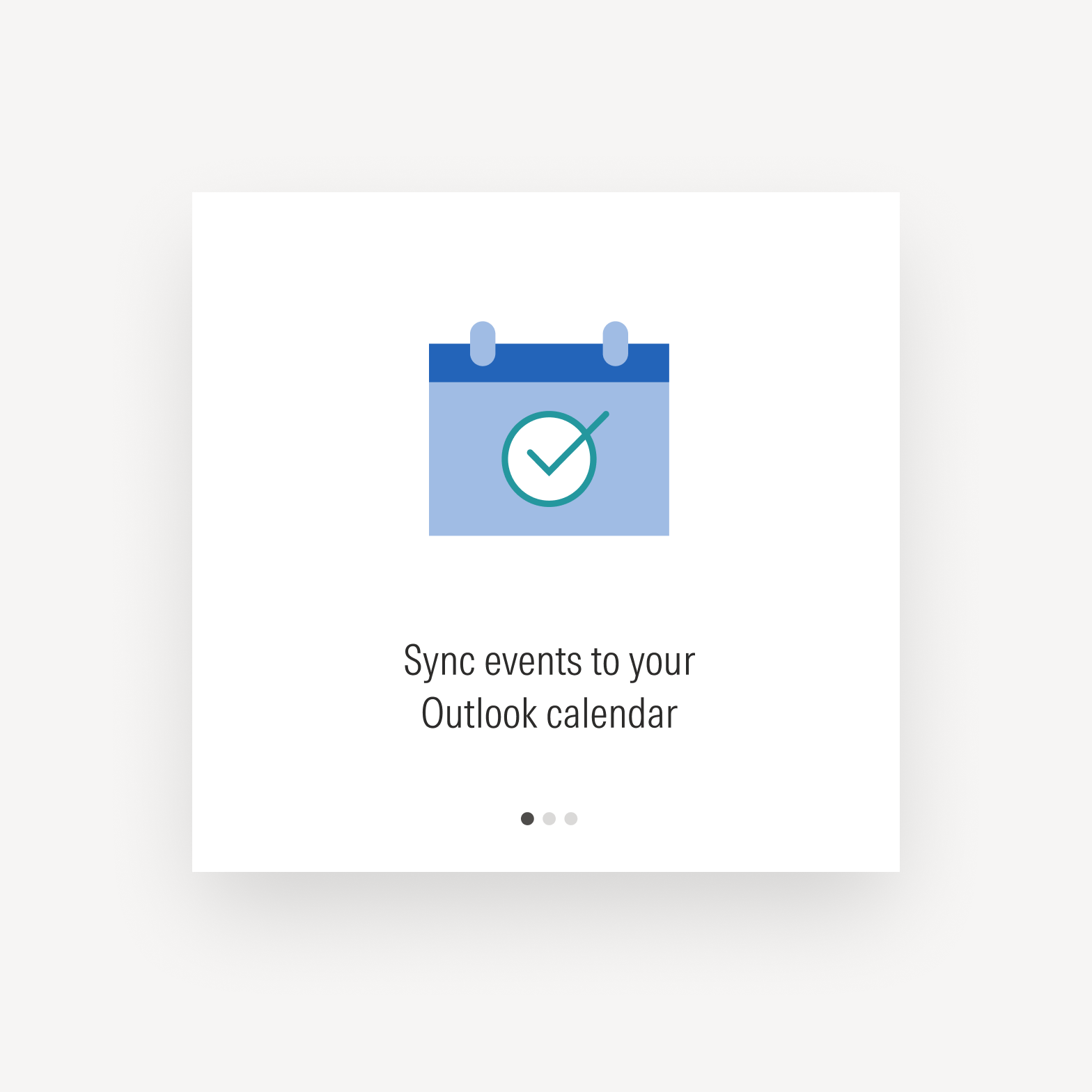
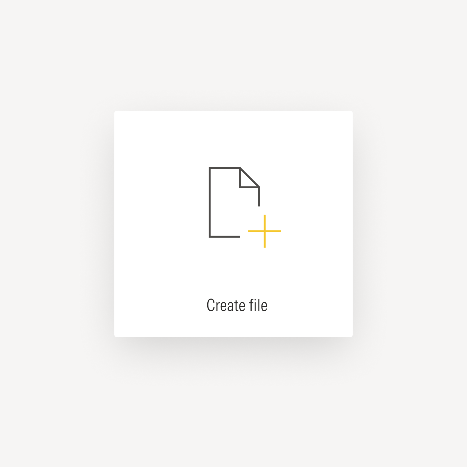
Icons can be used to support the comprehension of text.

Don’t use icons that depict Morningstar signature assets to create new artwork like badges, emblems, or anything else that in a way implies the endorsement of a fund or product.
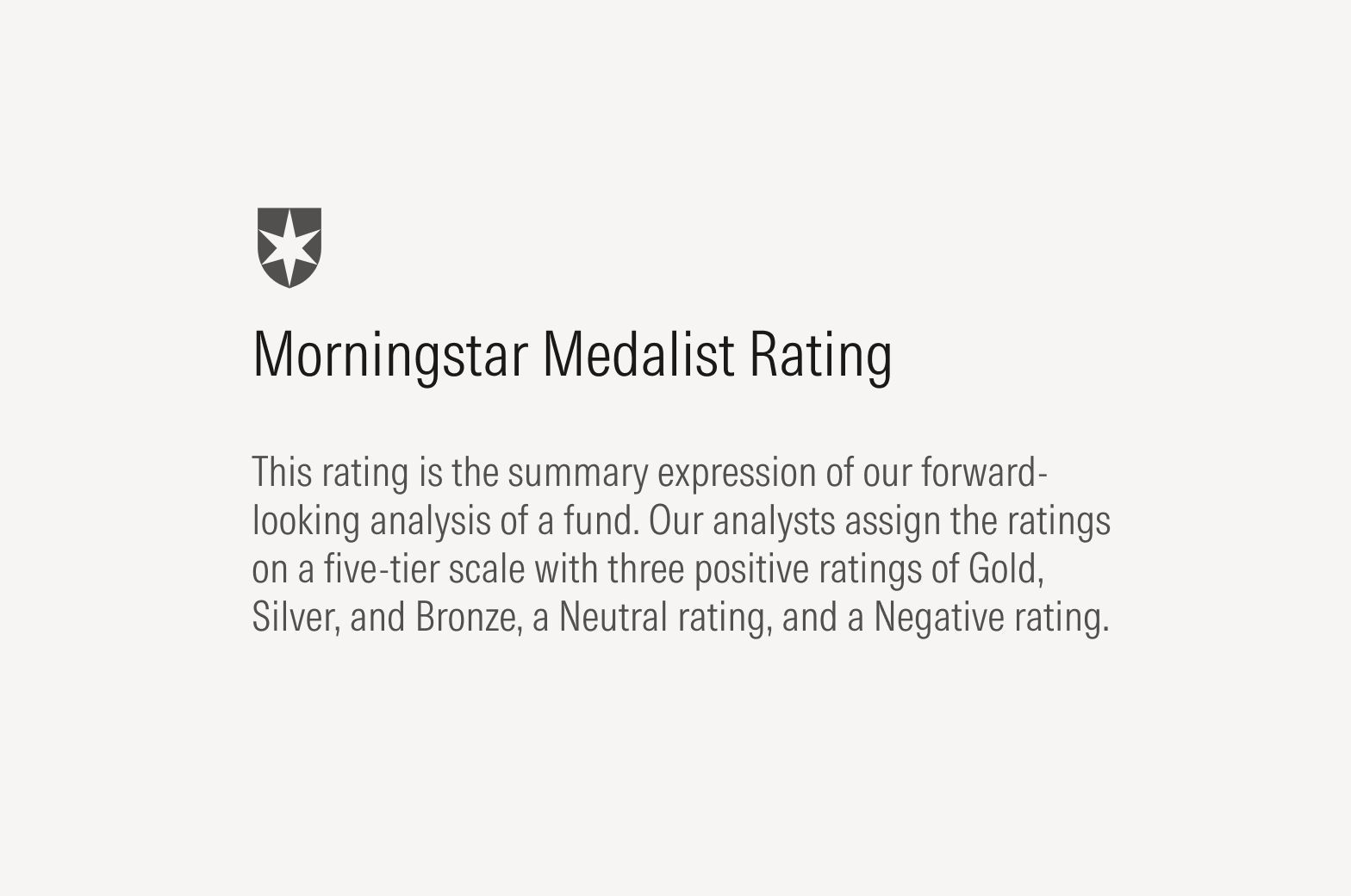
Do use icons that depict Morningstar signature assets, such as the Morningstar Medalist Rating, to indicate a benefit for users or help users navigate a product or portion of a web page.
Don’t use icons to afford interactivity in user interface components, like buttons or tiles.
Do use existing user interface icons to afford interactivity in components. For a definitive list of user interface icons, see UI Icons.
Don’t create new logos with icons.