Photography
Our visual style reflects our commitment to craft and clarity. We allow photos to speak for themselves by avoiding unnecessary effects that detract from their meaning. This focus on transparency helps these images feel uniquely Morningstar and showcase our brand values.
Lighting and Exposure
Natural, even exposure, and accurate color balance contribute to the true-to-life representation of a subject. With correctly set white balance, saturation, and color temperature, images feel genuine and visually coherent. In some cases, exaggerated lighting may be used for dramatic effect.


Avoid overexposing bright areas, like in front of windows or screens.

Don’t use lens flare for decorative effect.

Don’t leave photographs unadjusted for white balance, color saturation, or temperature.

Don’t use motion blur for decorative effect.
Depth of Field
The amount of an image that appears in focus shapes how the photo is perceived. A moderate to deep depth of field typically strikes the right balance of context and detail. Shallow focus can help isolate a subject but it should be used thoughtfully to avoid losing essential visual information.

Avoid shallow depth of field and steep drop-offs.

Avoid applying color washes over photographs or applying decorative color filters.

Don’t leave visual distractions in the frame, especially near the margins.
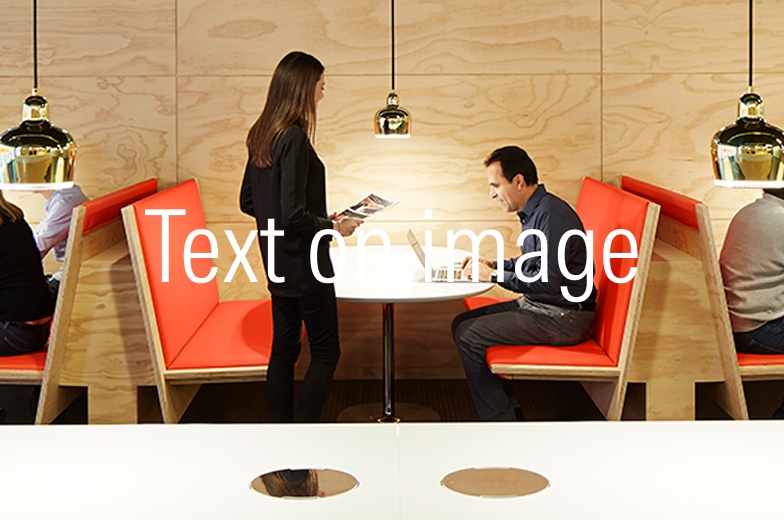
Don’t overlay text without applying any contrasting techniques; see Typography.
Clichés and Ensuring Authenticity
Photos should reflect specific, genuine experiences. Visual clichés like posed subjects, improbable scenarios, or generic themes often feel inauthentic. They don’t articulate our uniqueness in the financial services industry nor reflect the refined essence of our brand.

Avoid generic situations and forced poses, particularly those with out-of-context facial expressions or emotions.

Avoid overlaying graphic elements.

Avoid static, overly polished flat lays.

Avoid abstract pattern imagery.

Avoid overused or tired concepts and visual metaphors.