Page Shell
A page shell provides a uniform layout across Morningstar products, creating a clear, reliable experience as users move through the product.
For Applications
The application page shell supports functionality-focused experiences requiring persistent navigation, contextual tools, and workspace areas for complex tasks and data management.
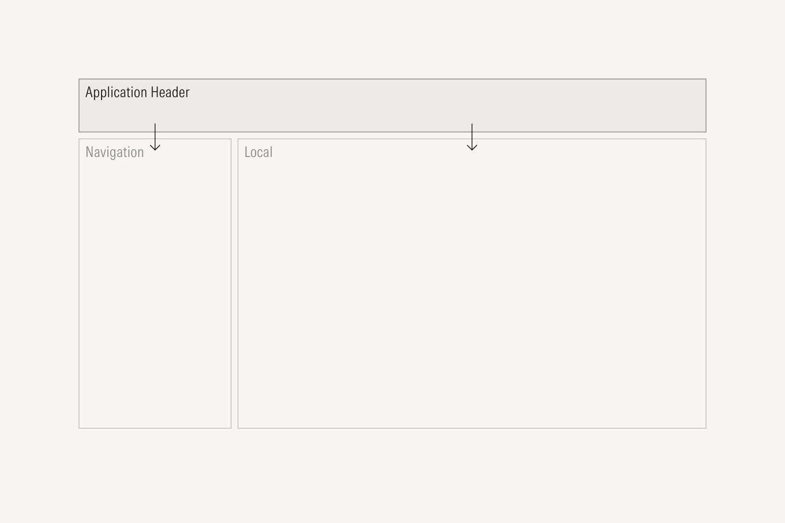
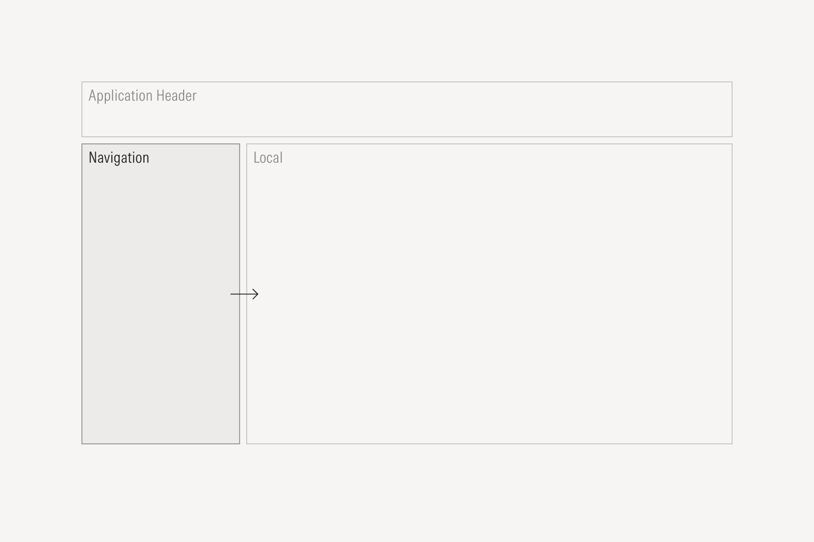
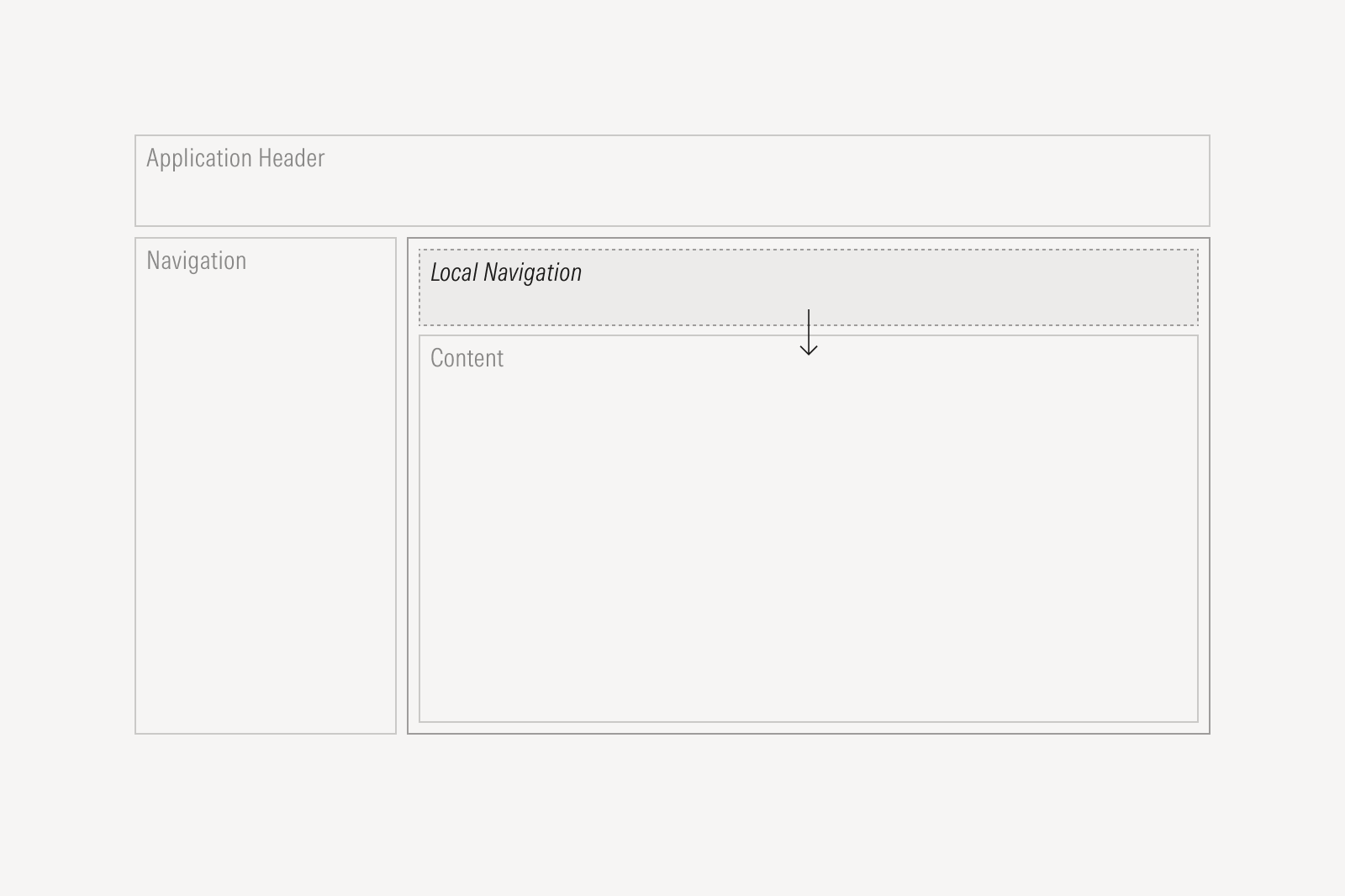
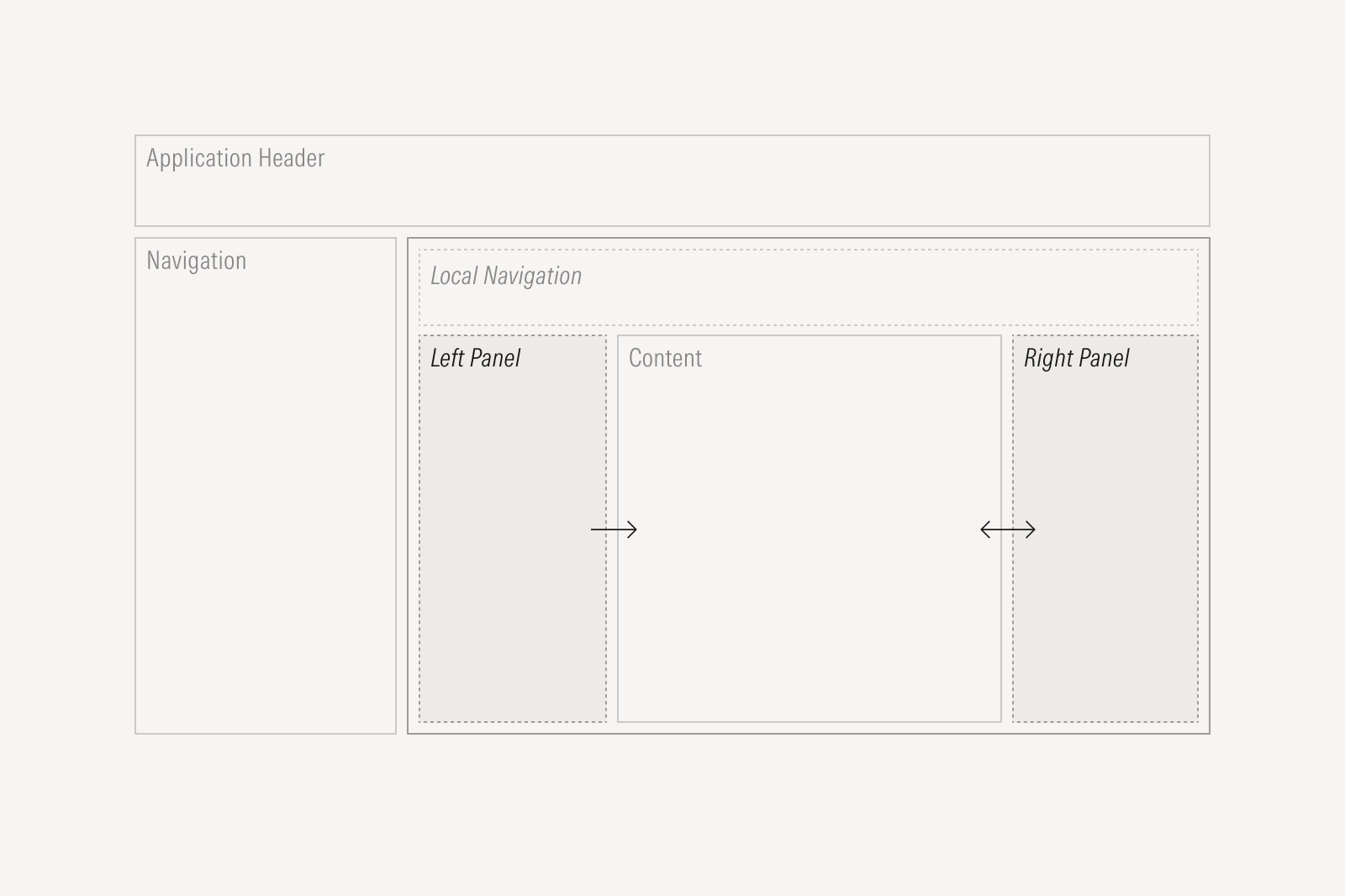
Global areas, like the application header, navigation, and floating action, remain visible across all pages. They provide consistent access to product-level navigation and utilities. Local areas, like the main content area, local navigation, and panels, contain page-specific content, workflows, and tools. They update dynamically based on user actions, including selections made in global areas.
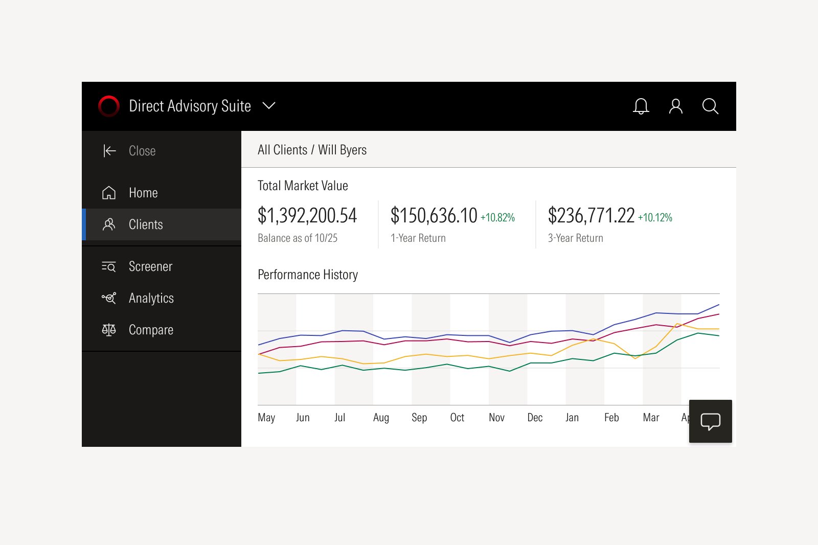
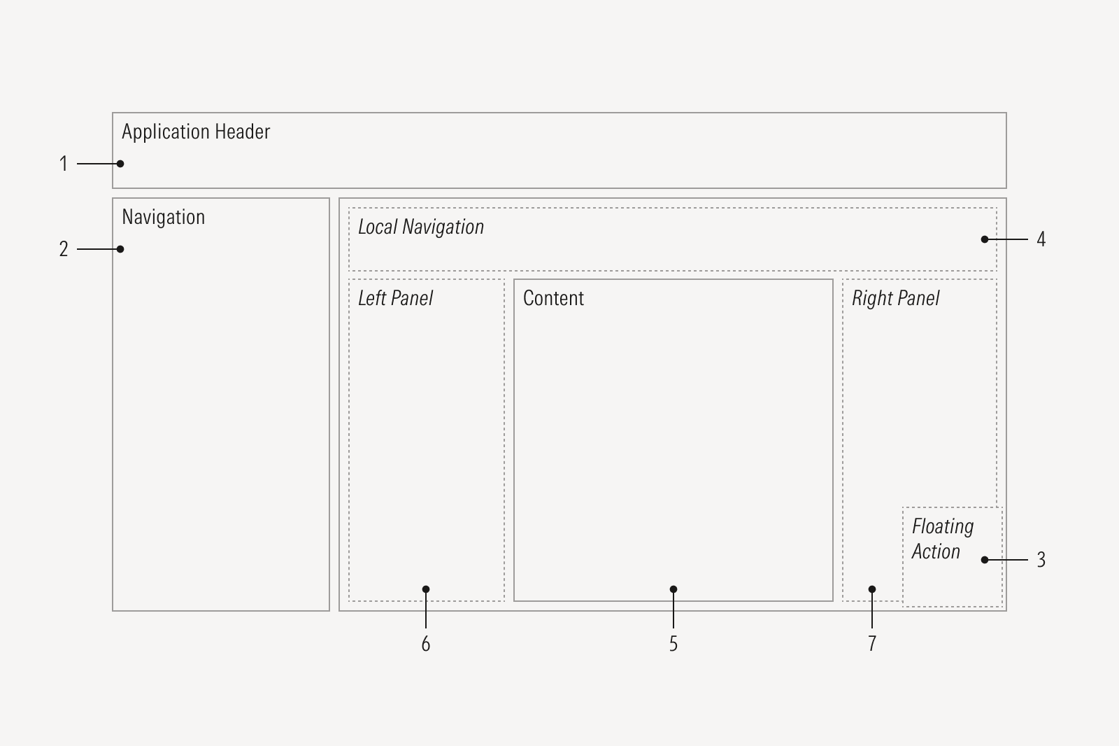
Application Header is static and determines what the navigation and content areas display.
- Navigation follows the application header and defines what local navigation and content display.
- Floating Action populates the content area and panels.
- Local Navigation is defined by global navigation and updates the content area and panels.
- Content reflects global or local navigation selections and determines what the right panel displays.
- Left Panel displays tasks that affect the content area.
- Right Panel displays context-driven information that impacts the content area.
Application Header
The application header identifies the product and gives users consistent access to global actions like managing a profile, reviewing billing, or switching products. When a user switches products, the header and navigation update so they can clearly understand where they are and what they can do next.
Use the Application Header component, and consider which global actions your users will need to access while in-app.
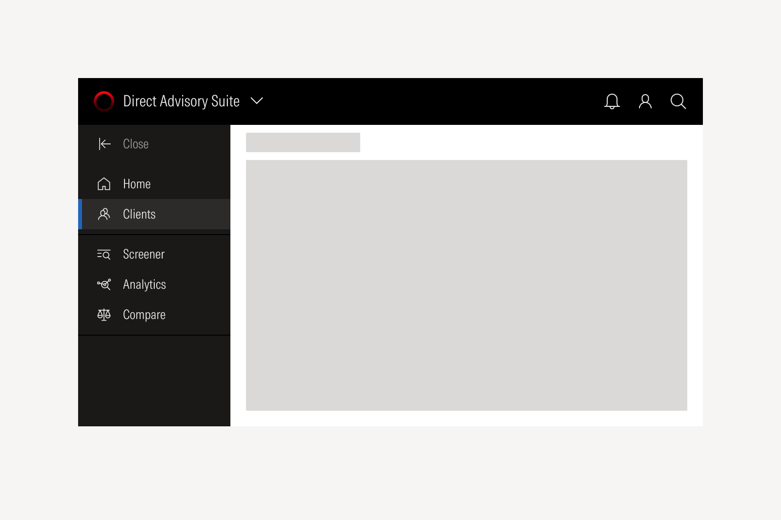
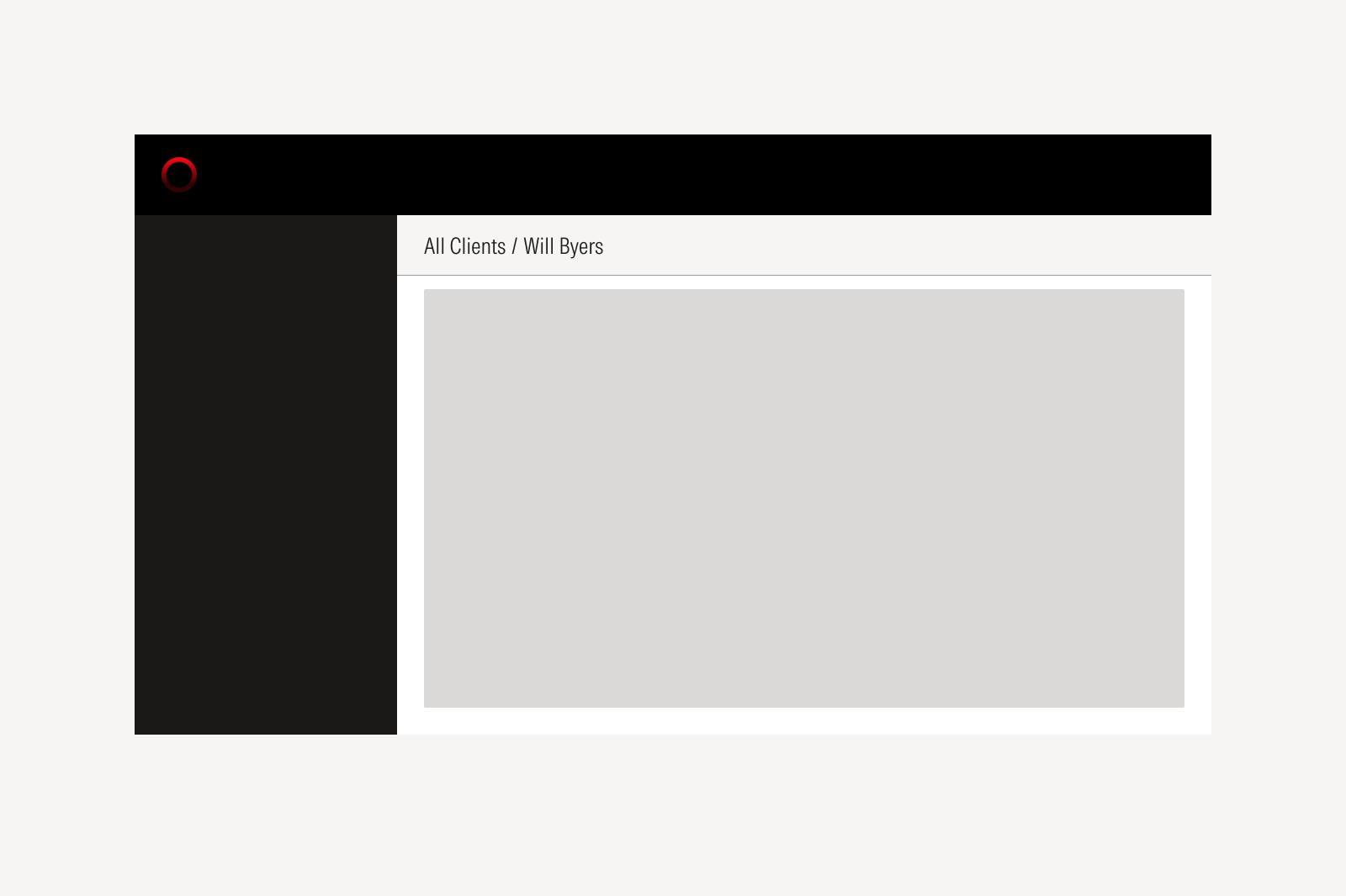
Navigation
Navigation helps users understand the pages and sections available to them and what they contain. The page should update based on the user's selection, and some links may open in a new window or a tab when needed. Navigation always works in conjunction with the application header to offer a sense of place in the application.
Use the Navigation component, which always works in conjunction with the Application Header to offer a sense of place.
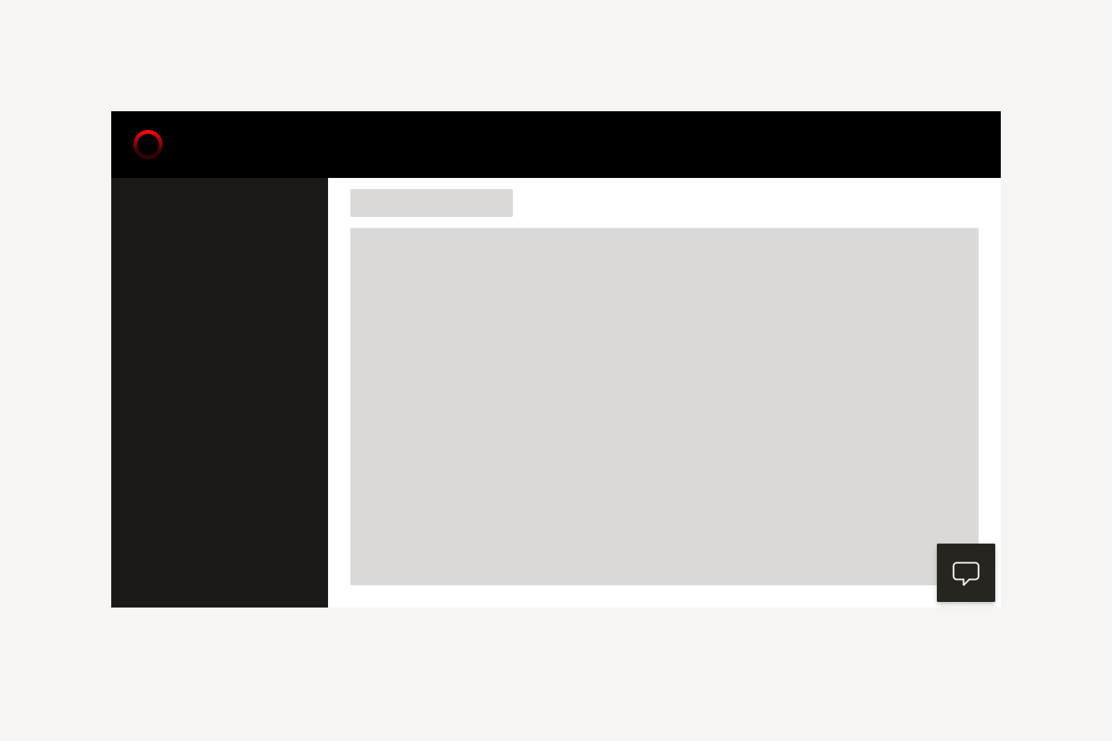
Floating Action
The floating action is an optional area that provides quick access to assistive tools across the application. It can be used for actions like opening an AI assistant, launching conversational tools, or sharing feedback.
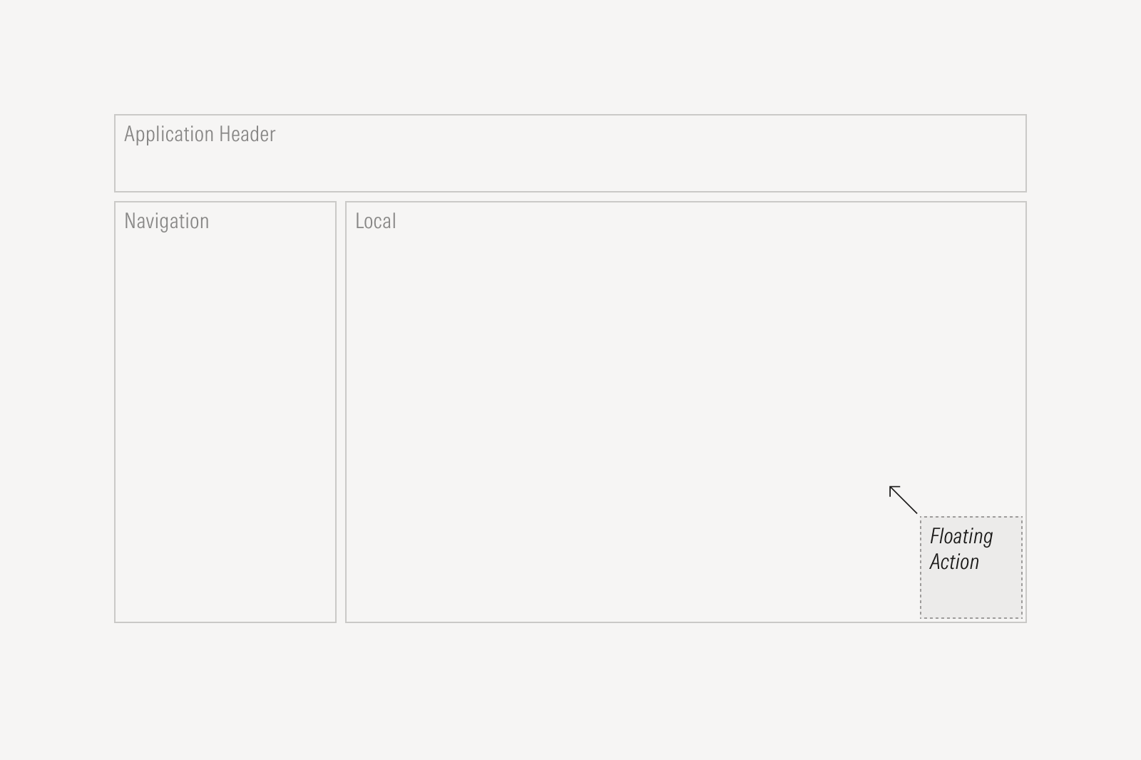
The floating action is always located at the bottom right corner of the product’s screen and remains fixed while the user scrolls or navigates to a different screen.
Local Navigation
Local navigation is an optional area that helps users understand their location within a page or section and move between related areas efficiently. It often includes breadcrumbs and other contextual links that update as users navigate.
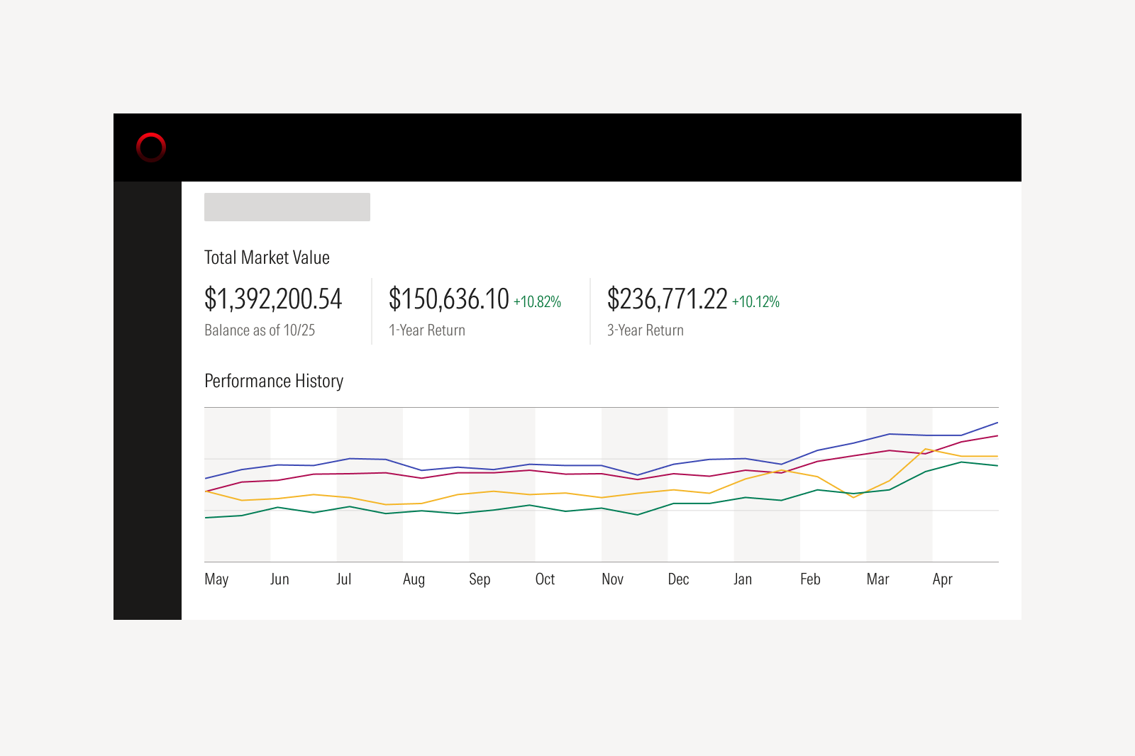
Content
The content area holds the components and patterns that support the product’s core workflows and features. Users spend most of their time here completing page-specific tasks such as creating items, managing lists, updating information, or moving through the steps of their workflow.
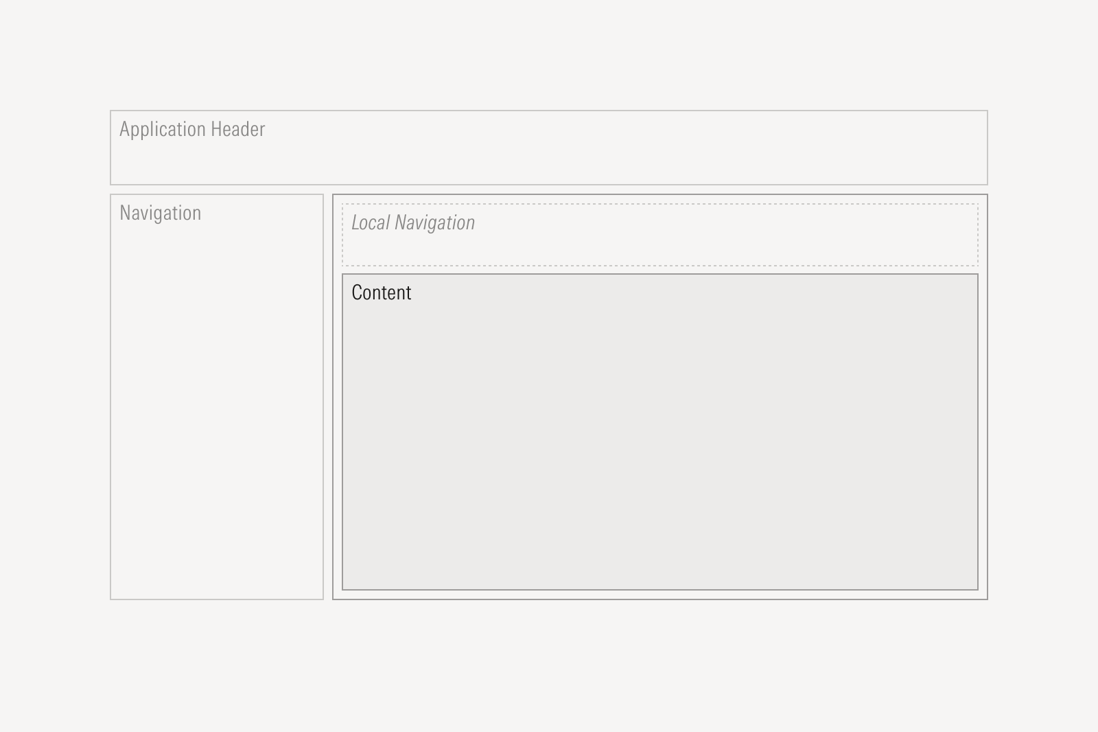
The content area organizes information and tools relevant to the user’s current task. Components such as Data Tables, Cards, and Tabs help present data clearly and support efficient workflows.
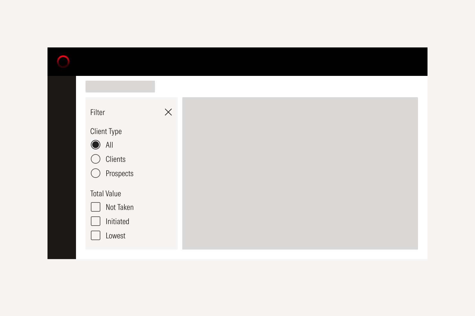
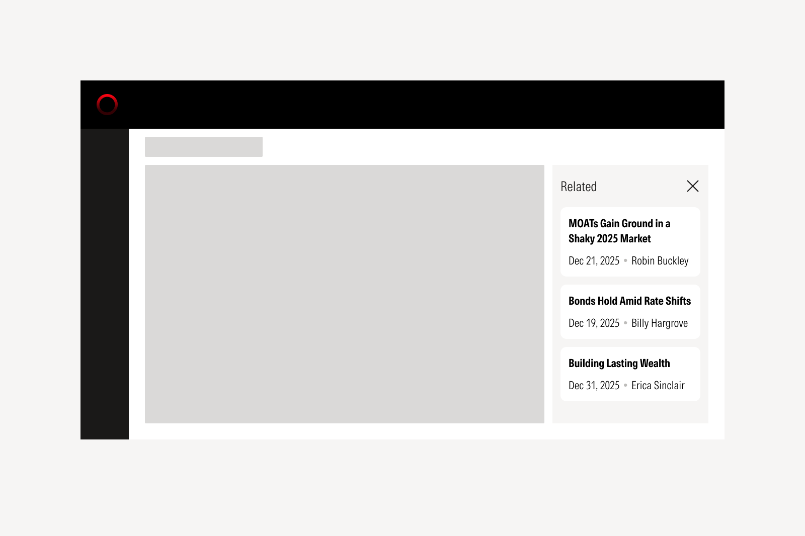
Optional Panels
Optional panels provide space for page elements that support or enhance local content and may be essential in certain workflows. They may appear to the left or right of the main content panel. Their placement and behavior should reflect when users need the information and whether the panel should stay open or collapse until needed.
Left Panel
The left panel contains task-driven content that helps users begin and advance their workflow such as filters or screeners. It highlights the actions that users typically do first.
Right Panel
The right panel offers contextual information or secondary tasks that support the main content and is often collapsed by default. Examples include related information, customization tools for dashboards, conversational interfaces, or settings that refine the user’s experience.