Merchandise
Merchandise transforms everyday items into branded touch points. Use existing standards for logos, colors, and typography alongside merchandise-specific guidance, including product selection and imprint methods, to ensure consistent application.
Clear Space, Scale, and Alignment
For broad guidance on logotype usage, see Logos.
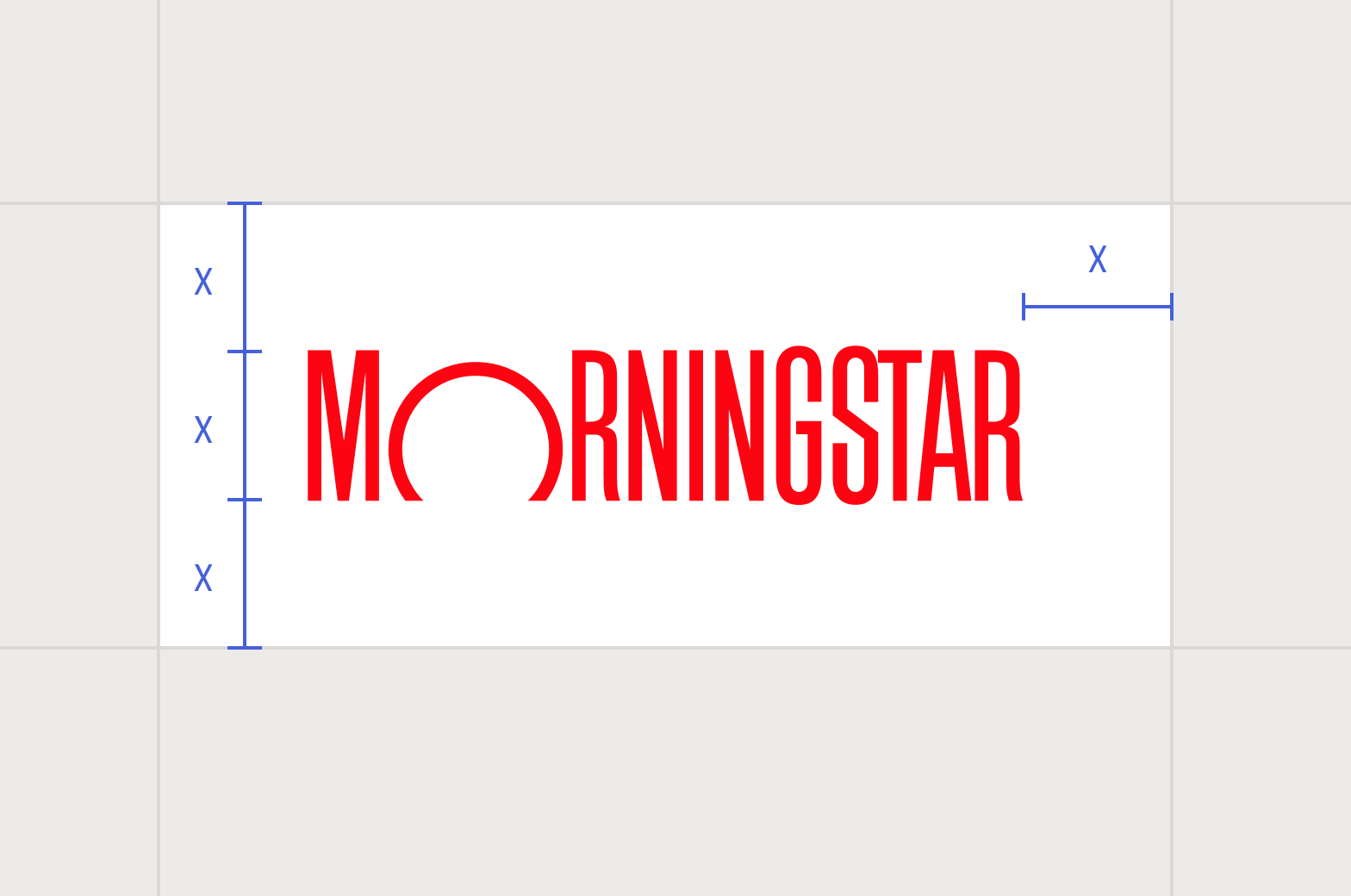
Maintain proper clear space around the logotype.
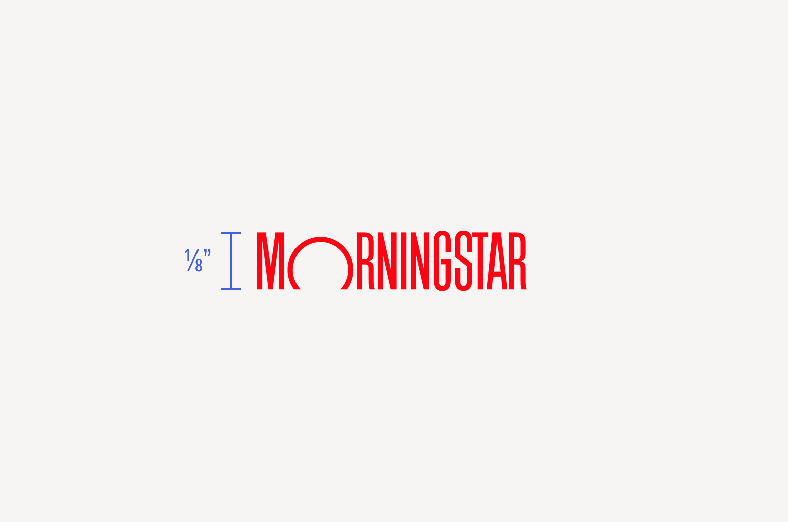
Ink imprints have a minimum height of ⅛ inch (or ⅓ cm) while embroidery has a minimum height of ¾ inch (or 1¾ cm). As imprint methods vary, check with your supplier on recommended minimums and request samples.
Color Combinations
Choose imprint methods that best suit the medium. For tonal color combinations, choose screen printing, foil, debossing, etching, or embroidery.
When imprinting the logotype, use solid colors when possible rather than process colors. Always match Morningstar Red as closely as possible, working with suppliers to ensure accurate ink, thread, or other imprint colors. For general guidance on color, see Color.
On Red
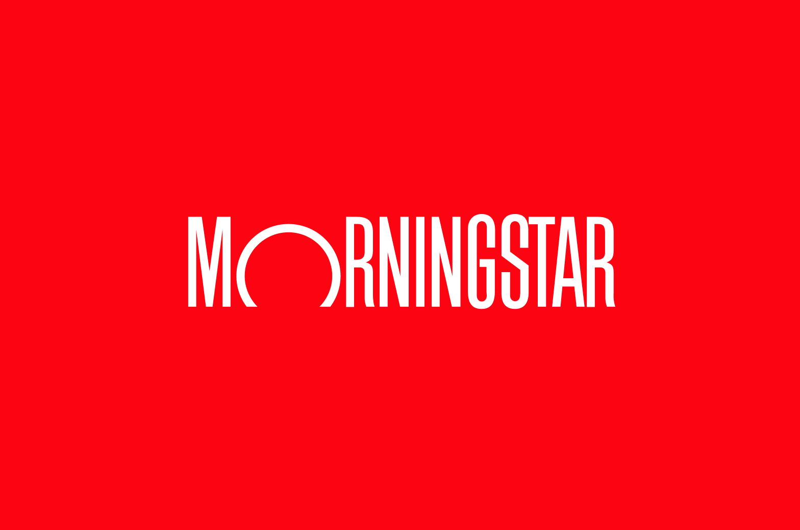
Neutral 0 (White) on Morningstar Red

Morningstar Red on tonal
On Dark
Morningstar Red on Neutral 85 or darker
Neutral 15 or lighter on Neutral 85 or darker

Tonal on Neutral 85 or darker
On Light

Morningstar Red on Neutral 15 or lighter

Neutral 50 or darker on Neutral 15 or lighter

Tonal on Neutral 15 or lighter
On Gray

Neutral 15 or lighter on Neutral 50

Neutral 85 or darker on Neutral 50

Tonal on Neutral 50

Avoid red on neutrals as the colors tend to vibrate.
On Unfinished Surfaces
For mediums like glass, clear, metal, leather or wood. For guidance on other substrates, contact the Design Foundations team.

Tonal on opaque, unfinished surfaces like metal, leather, or wood

White on clear materials like plastic or glass

Tonal on clear materials like plastic or glass

Avoid red on clear or metallic surfaces as they tend to vibrate.
Additional Visual Considerations
Functionality is essential to any product, but merchandise also imparts our brand identity. Focus on quality even if it results in smaller batches.
Exacting Quality
Prioritizing quality reflects the sophistication of our design choices and showcases the enduring nature of our brand. Select retail-quality products over flimsy ones that don't convey longevity. Choose refined matte or satin finishes over sparkly or glossy finishes, and subtle textures or patterns over noisy ones. Choose solid inks, vinyl, or screen printing over digital printing to give our logo and designs the precision they deserve.
Refined Minimalism
Using simple or elegant forms over complex shapes and solid or tonal colors over multicolor illustrates our commitment to clarity. Similarly, minimal decoration over unnecessary flourishes allows our logo—and the meaning behind it—to stand on its own.
Product Selection
All merchandise, whether for business or personal use, should also meet the following standards.
Compliance and Ethics
Follow any gift-giving regulatory guidelines and value limits; for specific guidance, refer to Morningstar’s Code of Ethics.
Choose merchandise that is culturally respectful, inclusive, and appropriate for a professional setting. Never place the Morningstar logo on anything associated with drinking, gambling, and other vice-related products.
Sustainability
To reflect our long-term commitment to sustainability, prioritize materials and production methods that reduce environmental impact. When possible, choose recyclable materials, but be aware of greenwashing: for example, reusable totes made from polypropylene are difficult to recycle and must be used more than 100 times to have a positive environmental impact. Consider working with local producers or printers to reduce the carbon footprint associated with global shipping.
Resources
Employees must create a Morningstar eStore account to order official Morningstar-branded merchandise or place custom orders. The curated collection of branded items is periodically updated by the Brand team and managed by our vendor, Zorch.
For orders outside of the US and Canada: use the above guidelines as you work with your own trusted vendors.