Iconography
When drawing or compositing investing-centered icons, consider the subject matter and any established visual conventions; the icon’s metaphor should feel clear and intuitive to most users. The fundamentals outlined in this section can also guide other types of illustration.
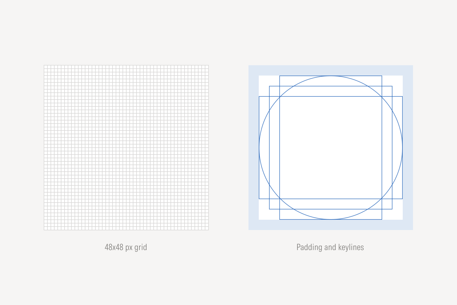
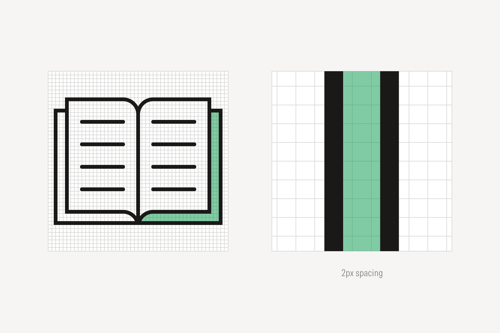
Padding
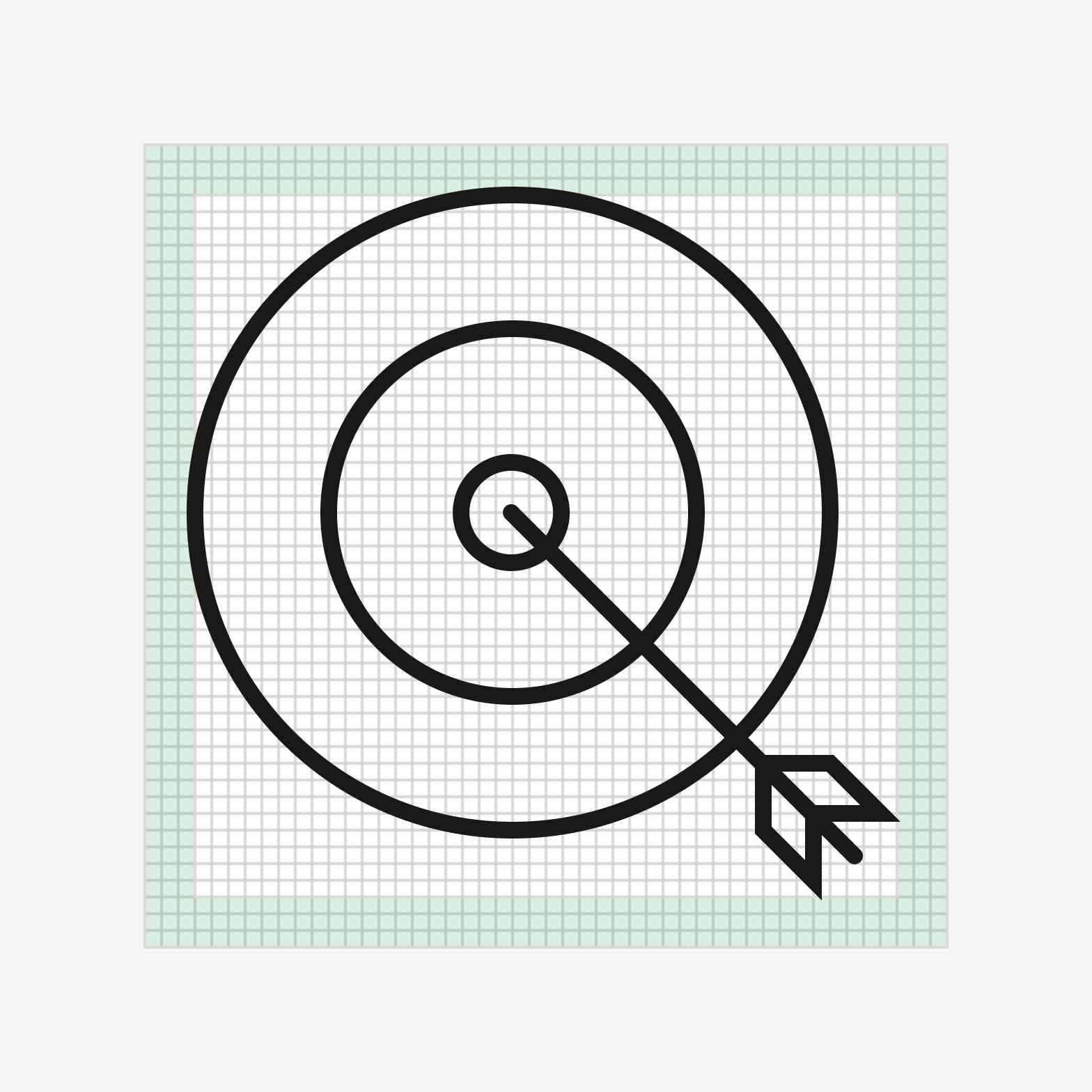
Do keep artwork within the padding area.
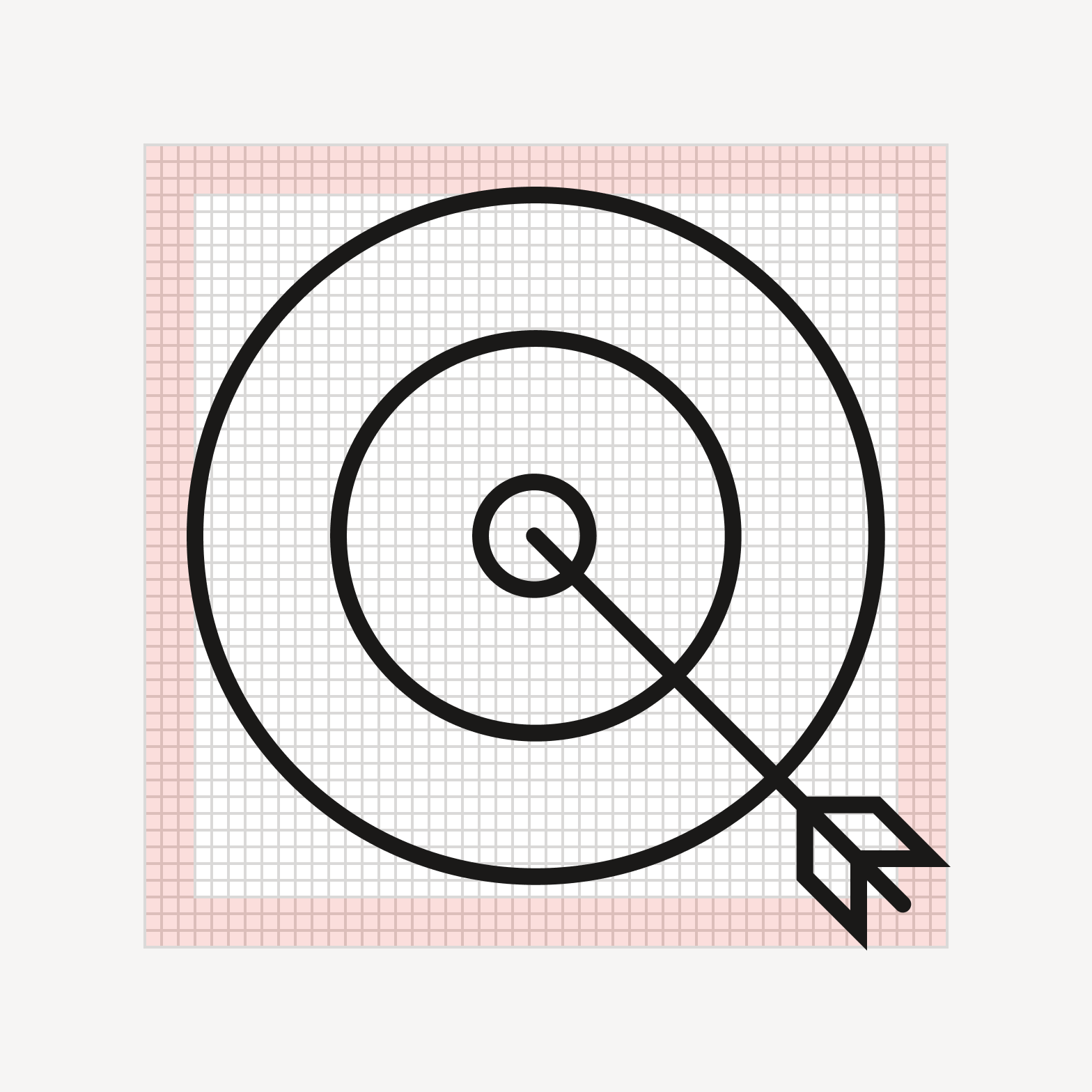
Avoid allowing the artwork to encroach on the padding area.
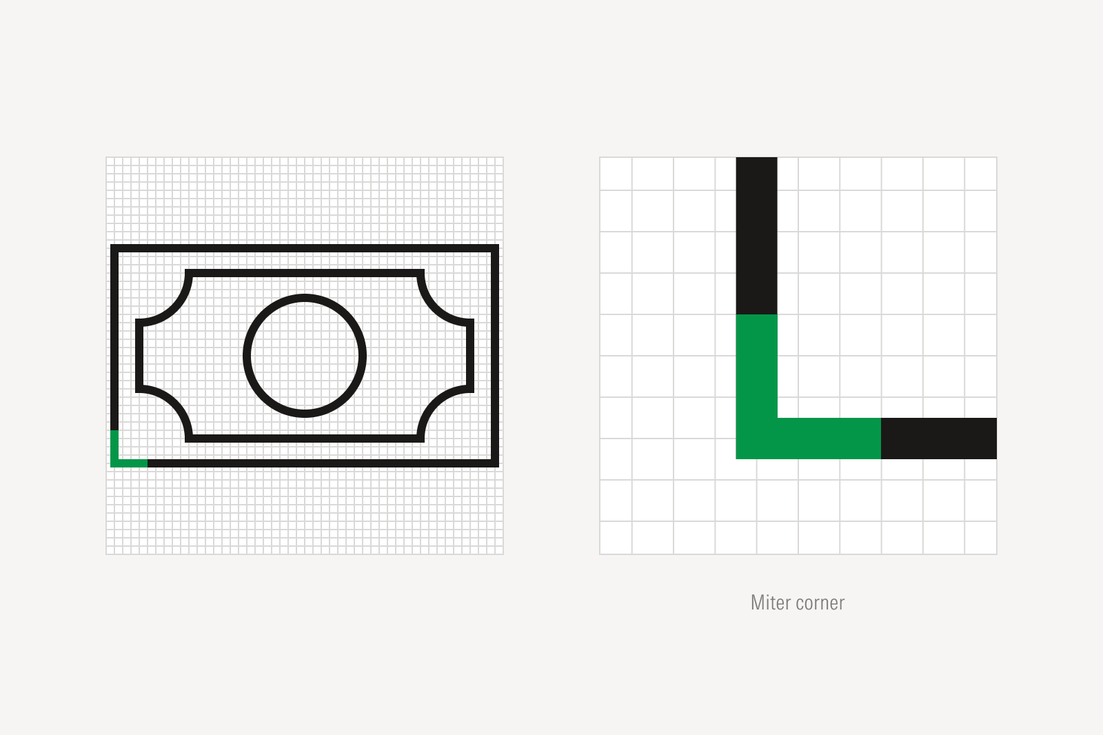
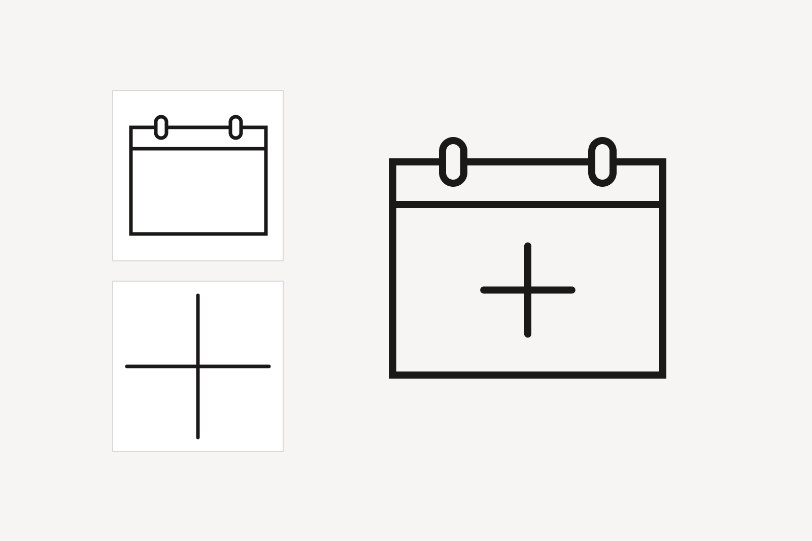
Keylines
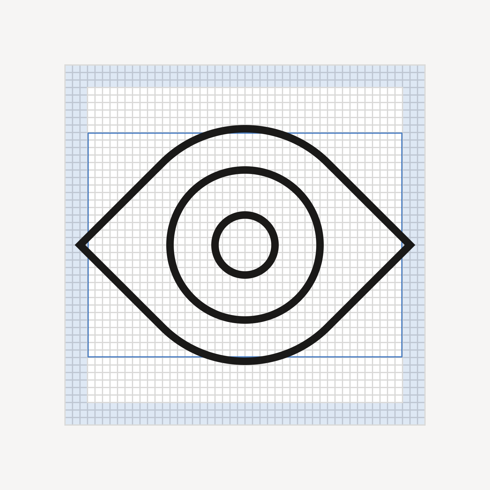

Do align strokes to the grid.
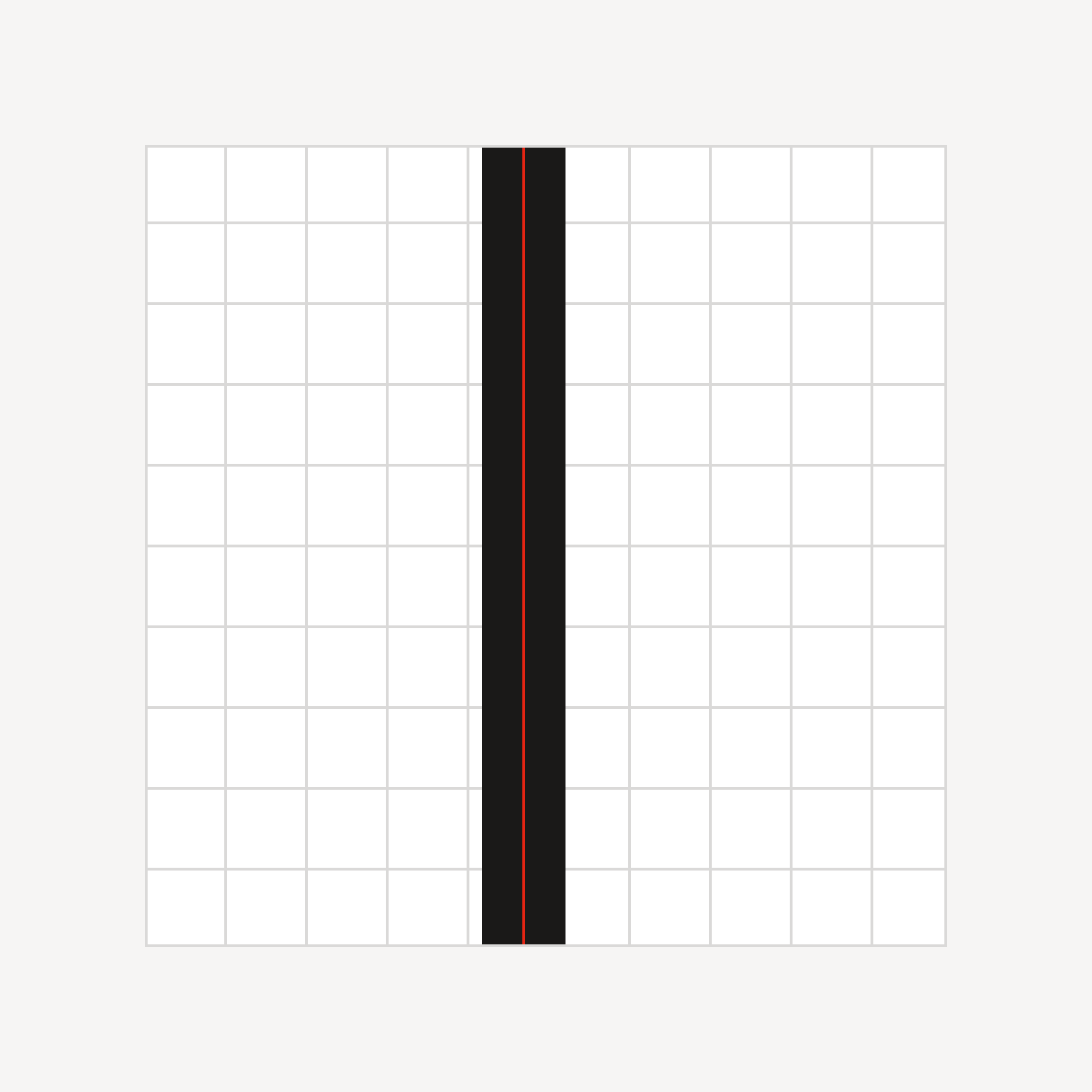
Don’t draw lines in between gridlines.
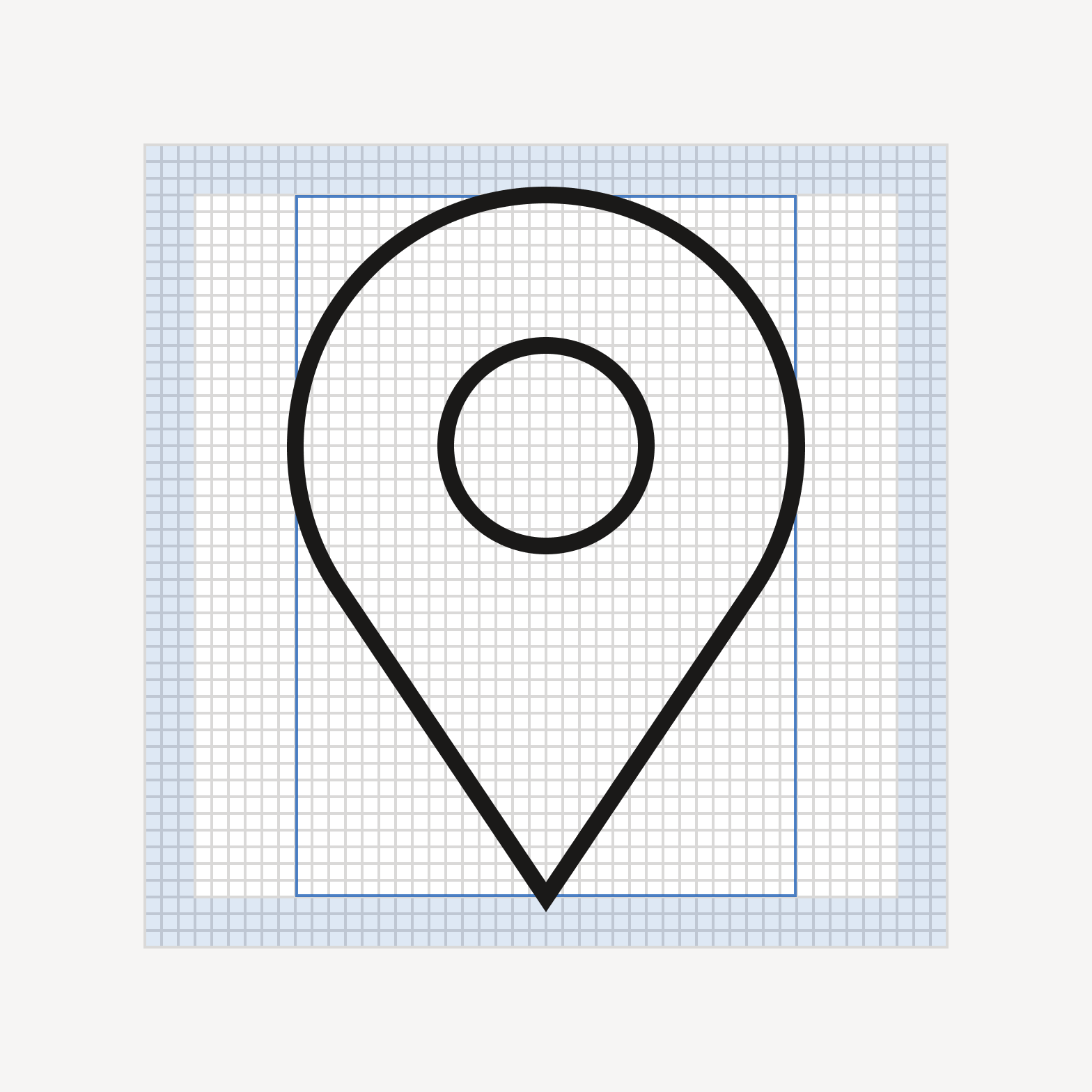
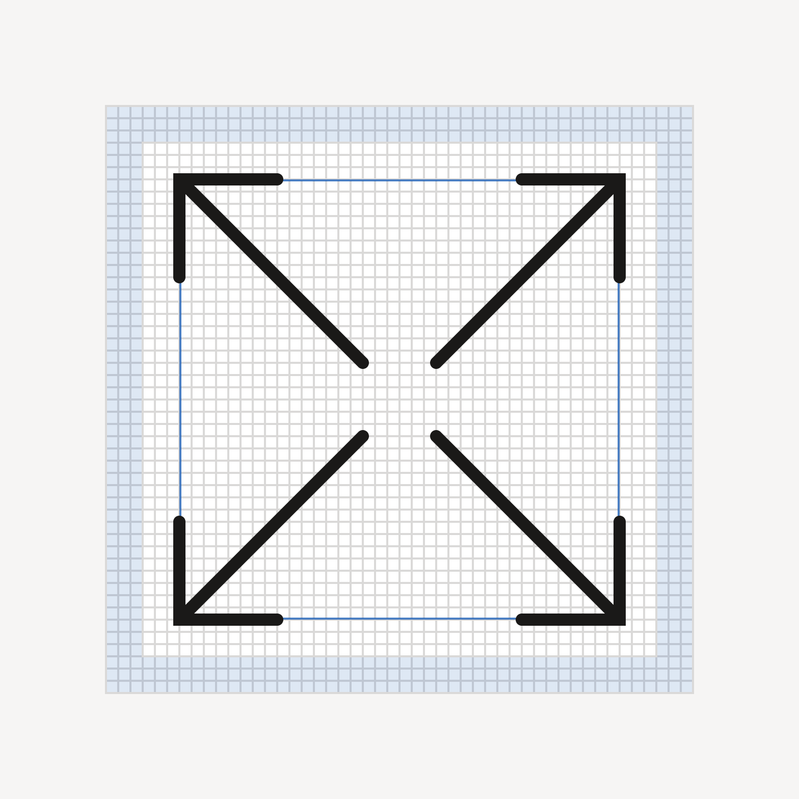
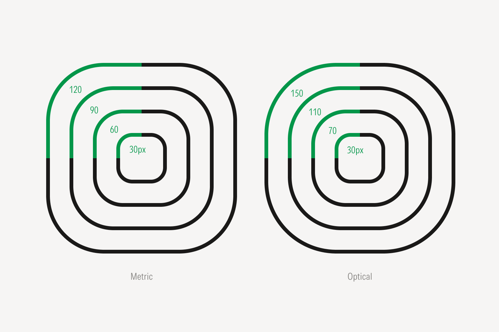
Alignment
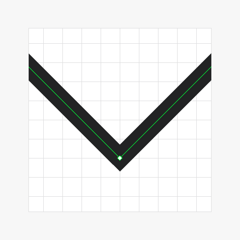
Do ensure vertices align to the grid.
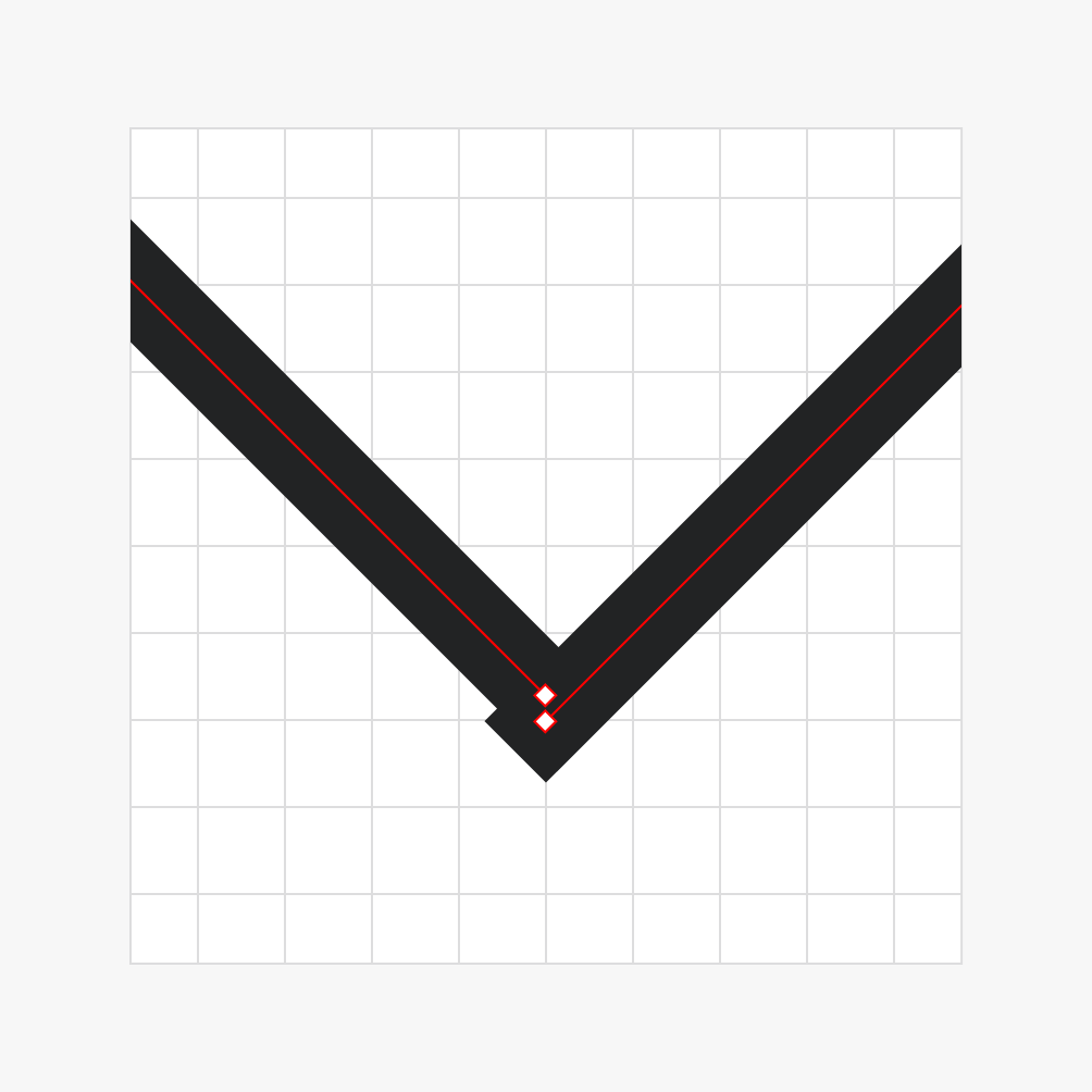
Avoid placing vertices off the grid.
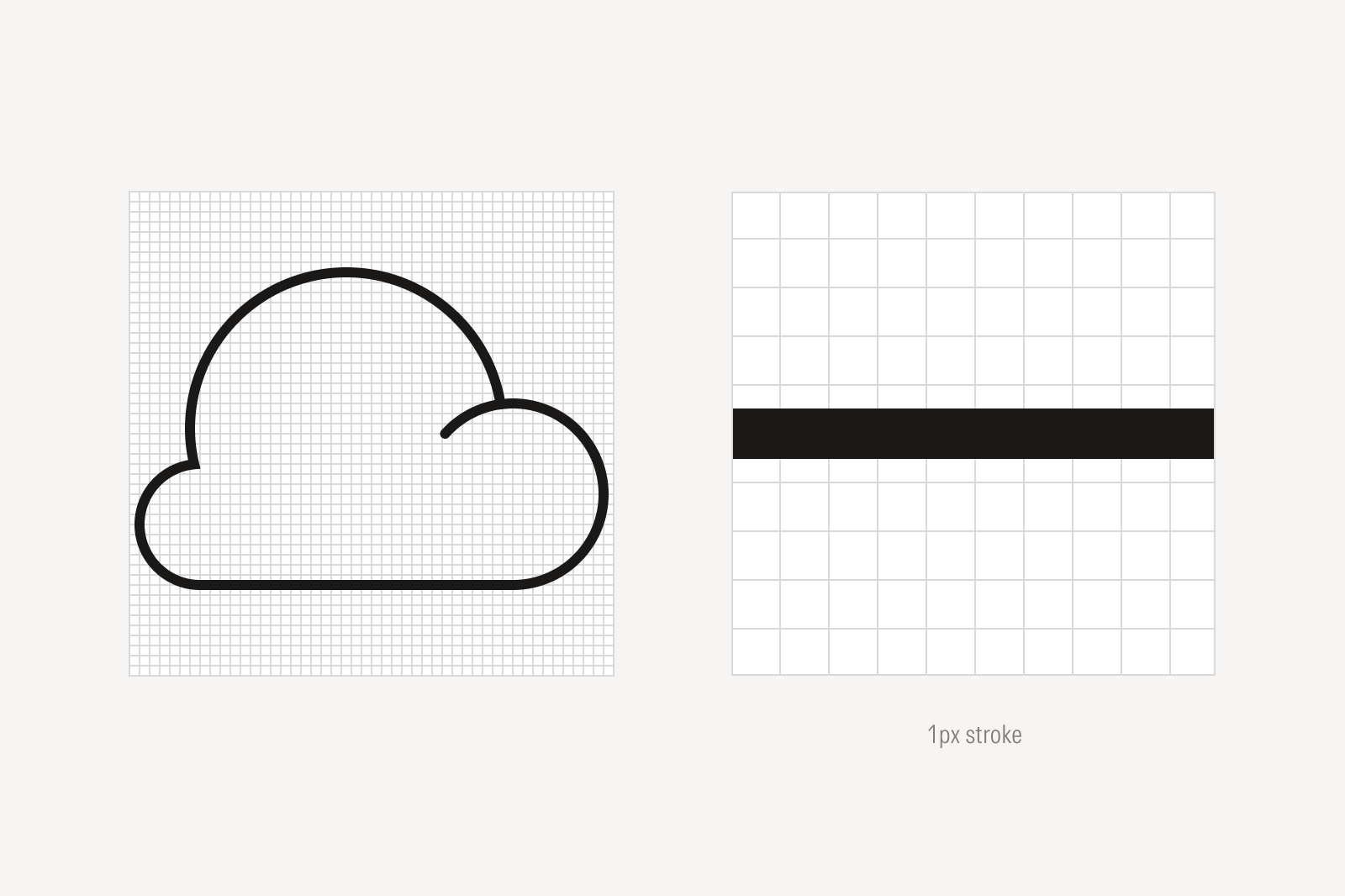
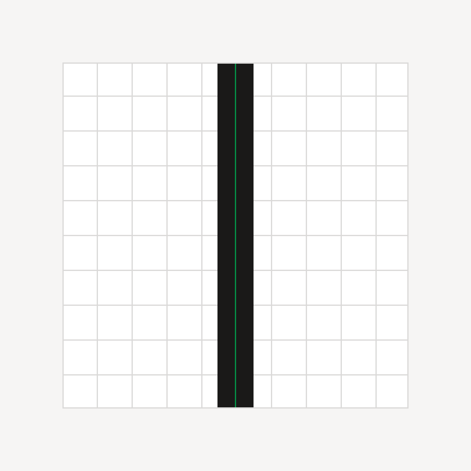
Do scale the icon and stroke weight proportionally.
Don’t maintain the stroke weight when scaling the icon.

Don’t mix different stroke weights within the same icon.
End Points
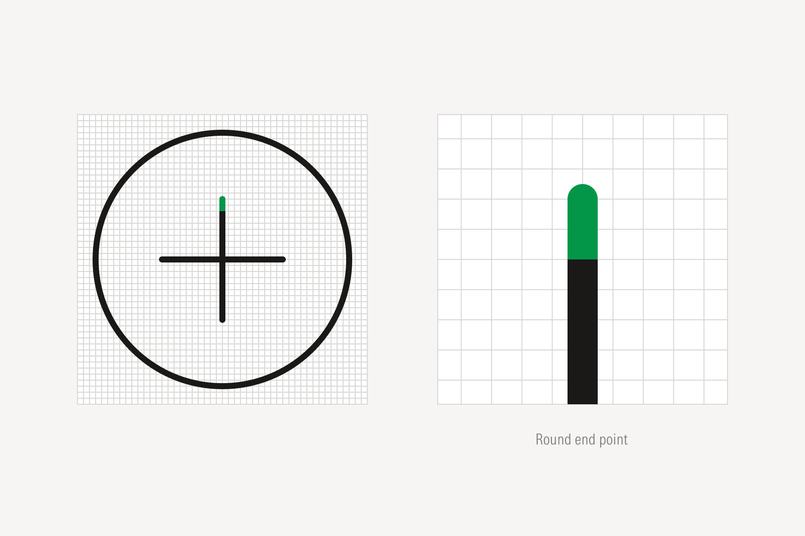

Do use round end points.

Don’t use square end points.
Breaks

Do join all lines in the icon.

Avoid decorative line breaks unless they help clarify the idea of an object.
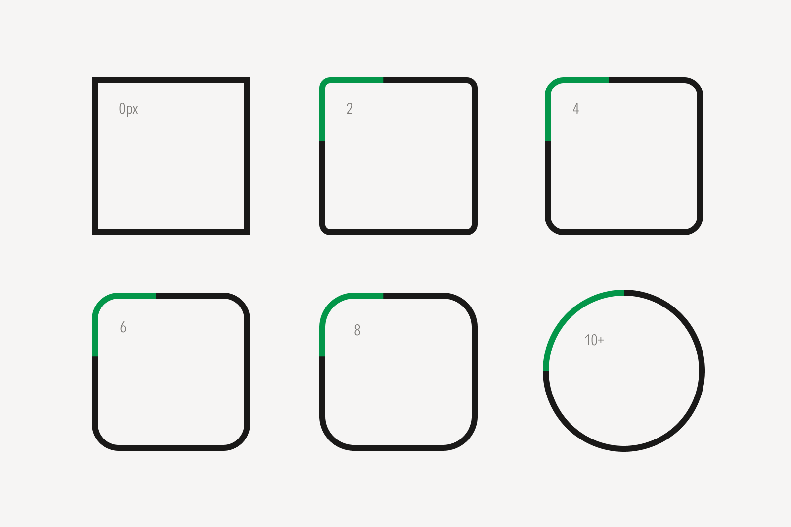
Materiality
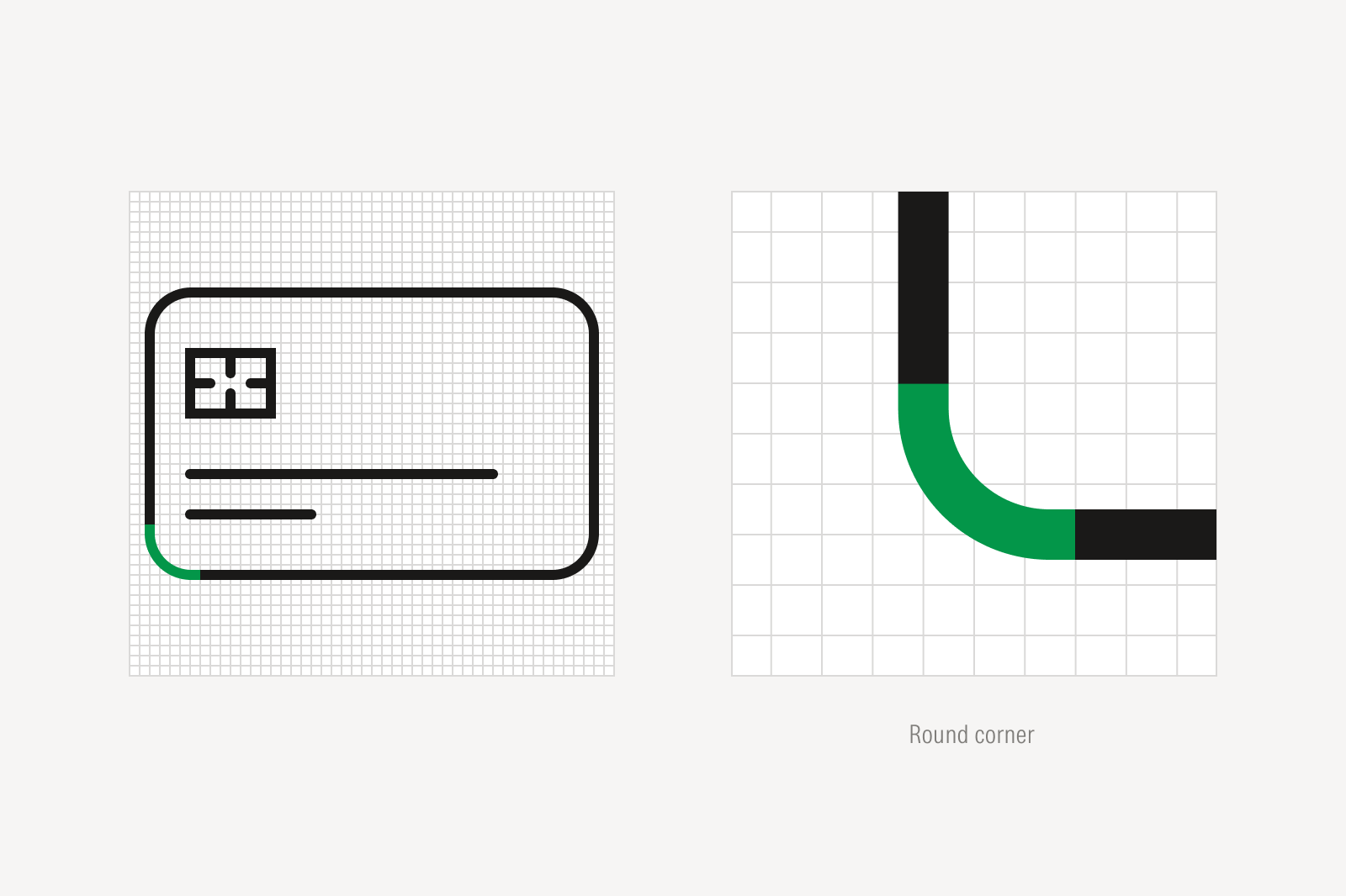

Avoid drawing round corners when depicting objects that do not have them.

Don’t apply round corners for decorative effect.
Angles
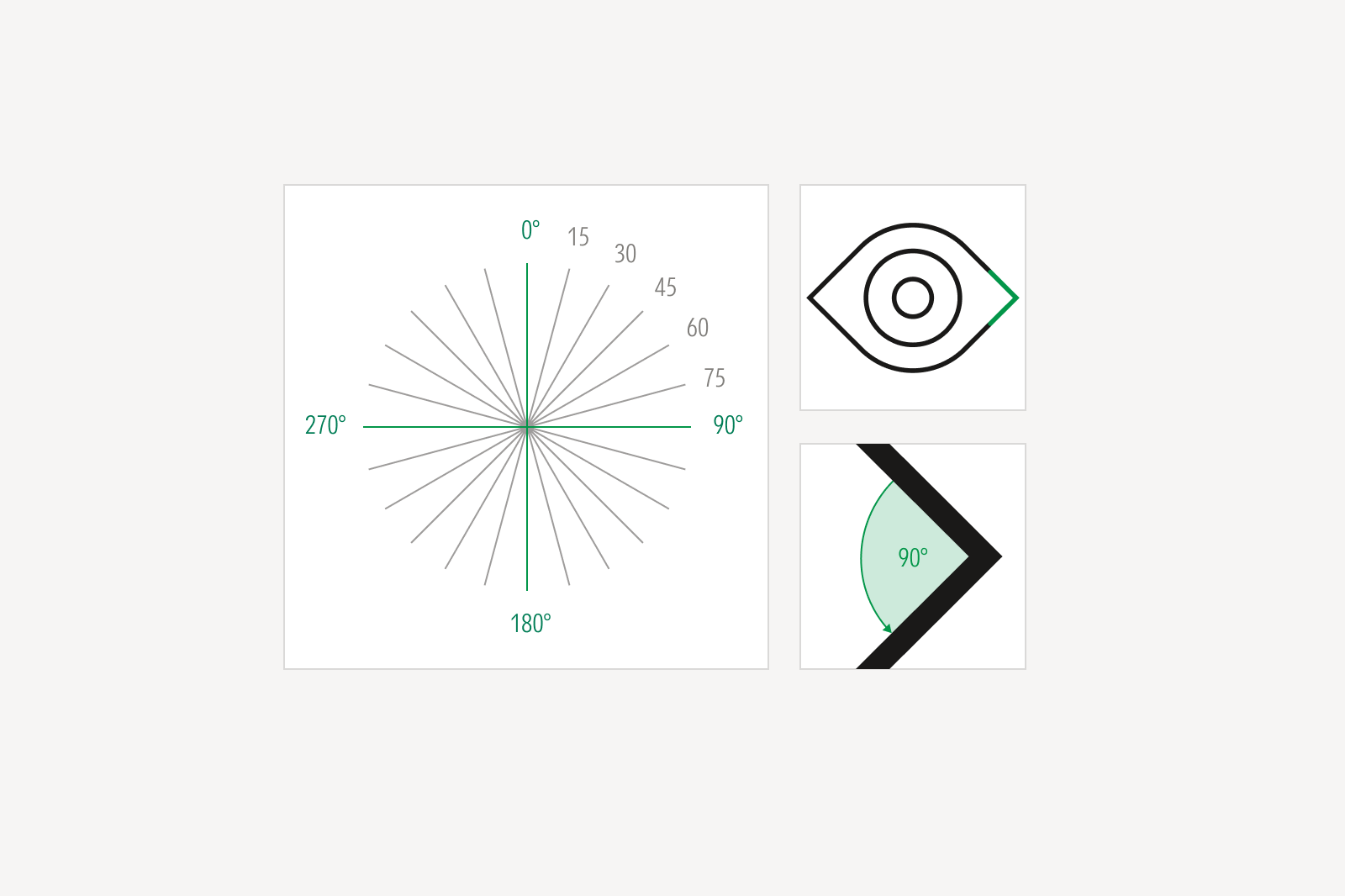
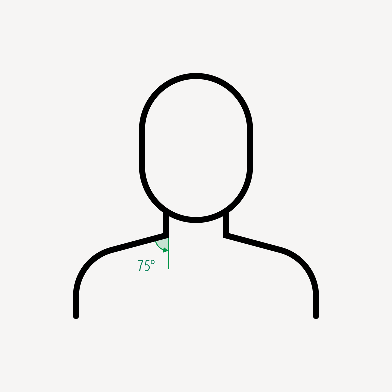
Do draw angles at 15-degree increments.
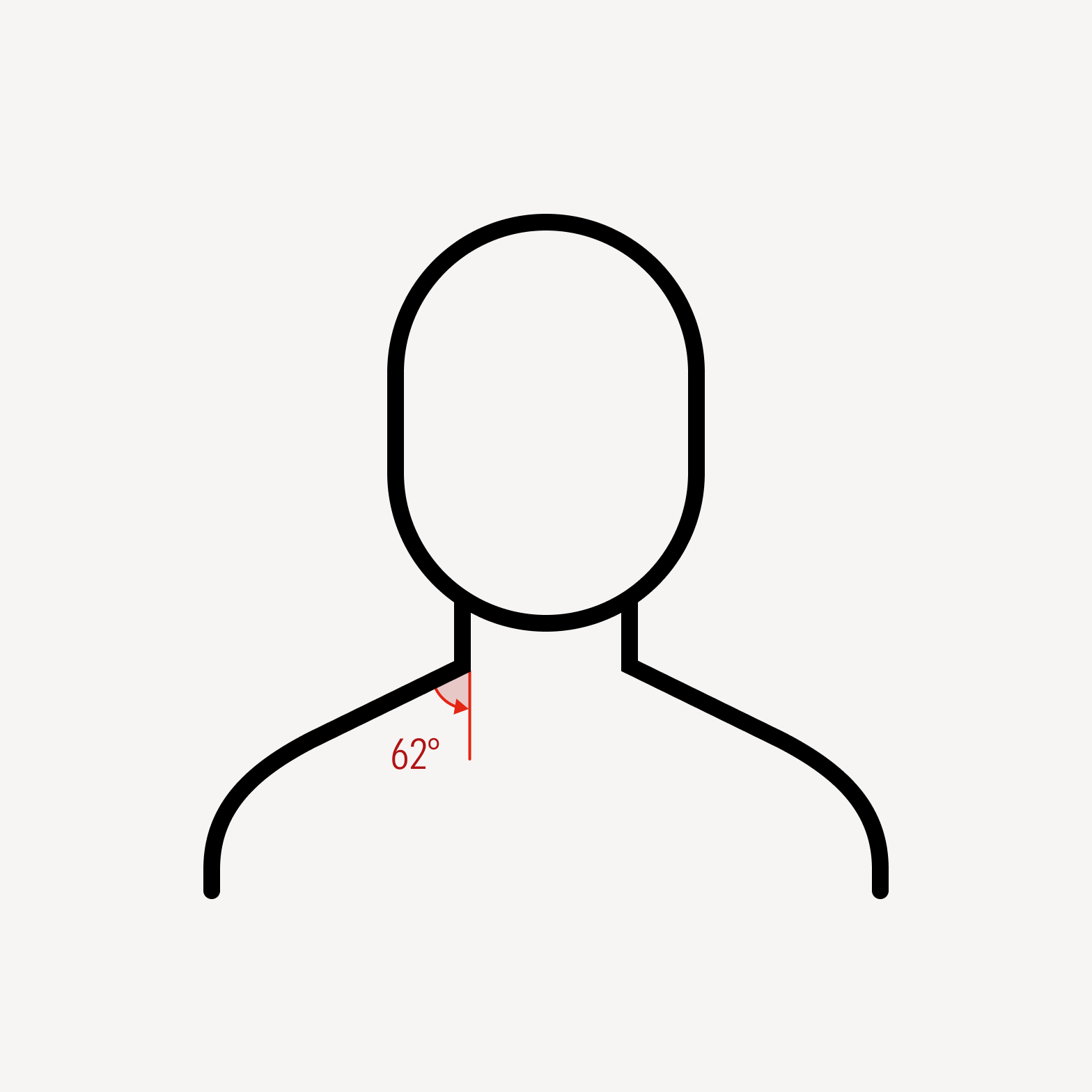
Avoid arbitrary angles.


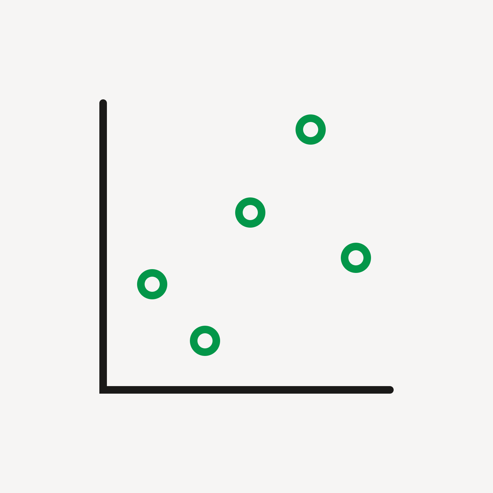
Do use outlined dots to bring visual balance to an icon.

Do use filled dots for decorative moments or to retain optical balance within an icon.


Do depict objects on a two-dimensional plane.

Avoid three-dimensional depictions of objects.

Do use the same icon expression throughout the entire icon. See more on Expressions.

Don’t mix icon expressions.

Don’t combine different stroke weights.

Avoid overly dense or complicated embellishments.

Do use drawn symbols or glyphs.

Don’t use font symbols or glyphs.
Overlap


Avoid overly complex composites. An icon's metaphor should be simple and understood intuitively.
Connectors


Do use breaks between lines and objects.

Avoid connecting lines to objects.

Be mindful of implicit biases when depicting people, things, or ideas.

Look for commonality when choosing people, things, or ideas to depict.