Typography
Formatting
These advanced formatting guidelines bring greater precision to your typography. These techniques not only make copy easier to read, but they also elevate your typographic craft.
Punctuation and Symbols
Hanging Punctuation and Symbols
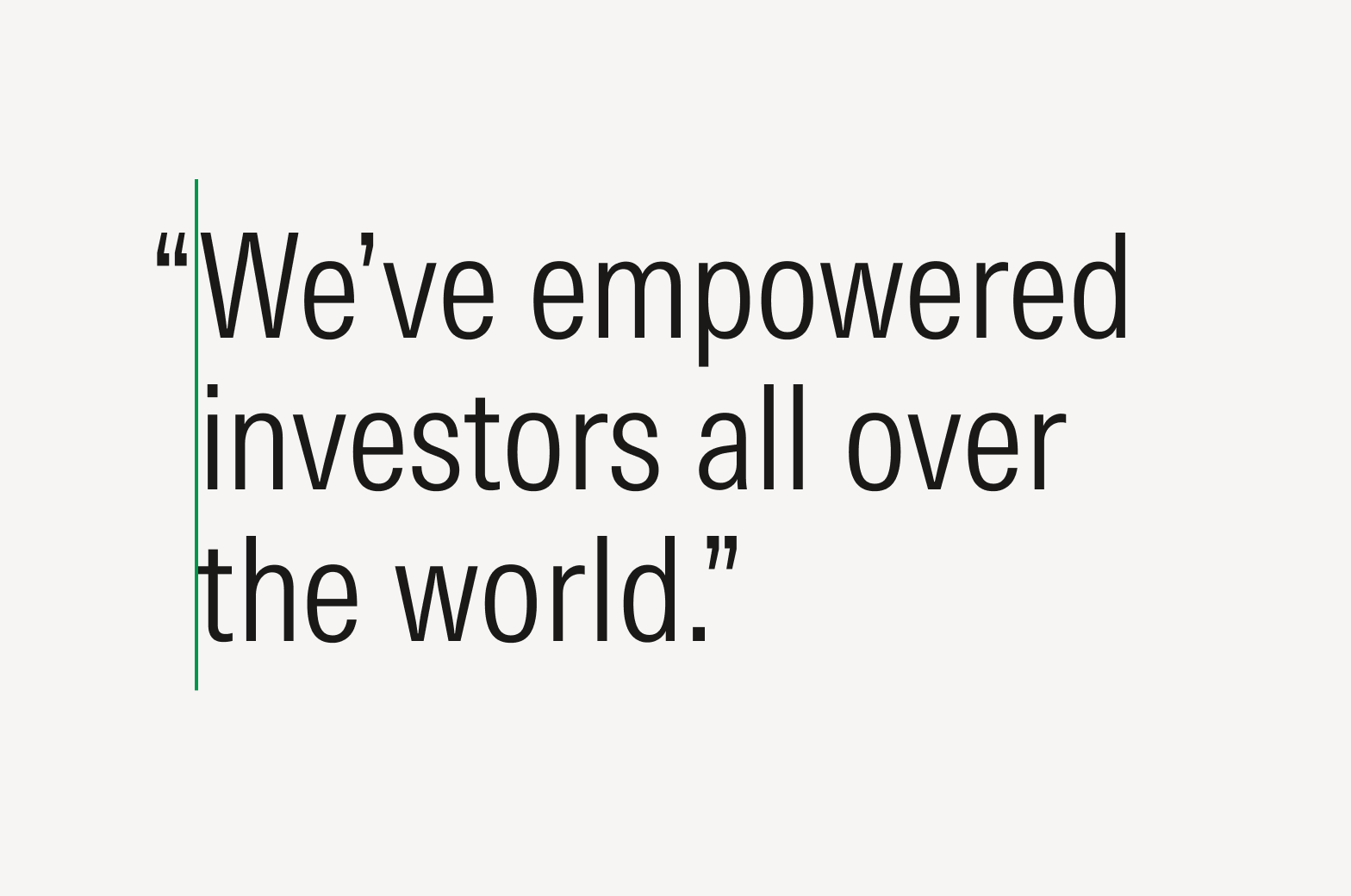
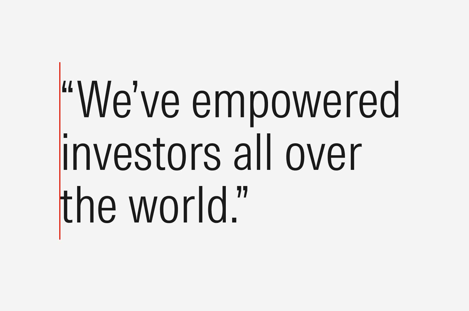
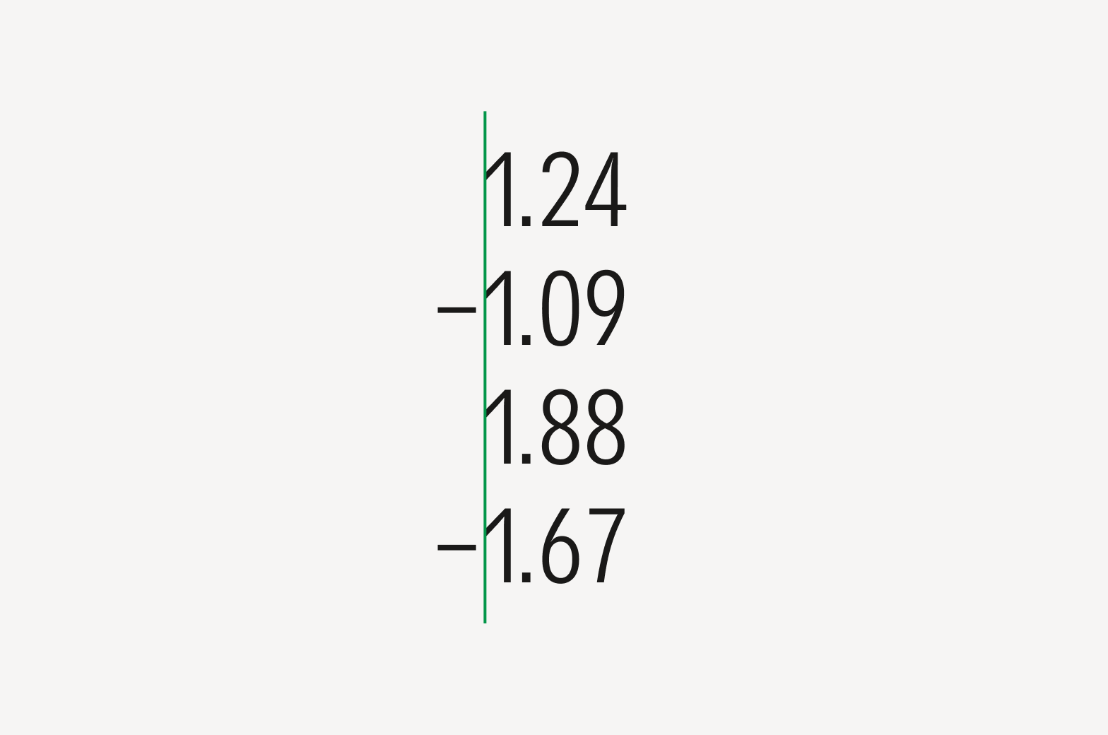
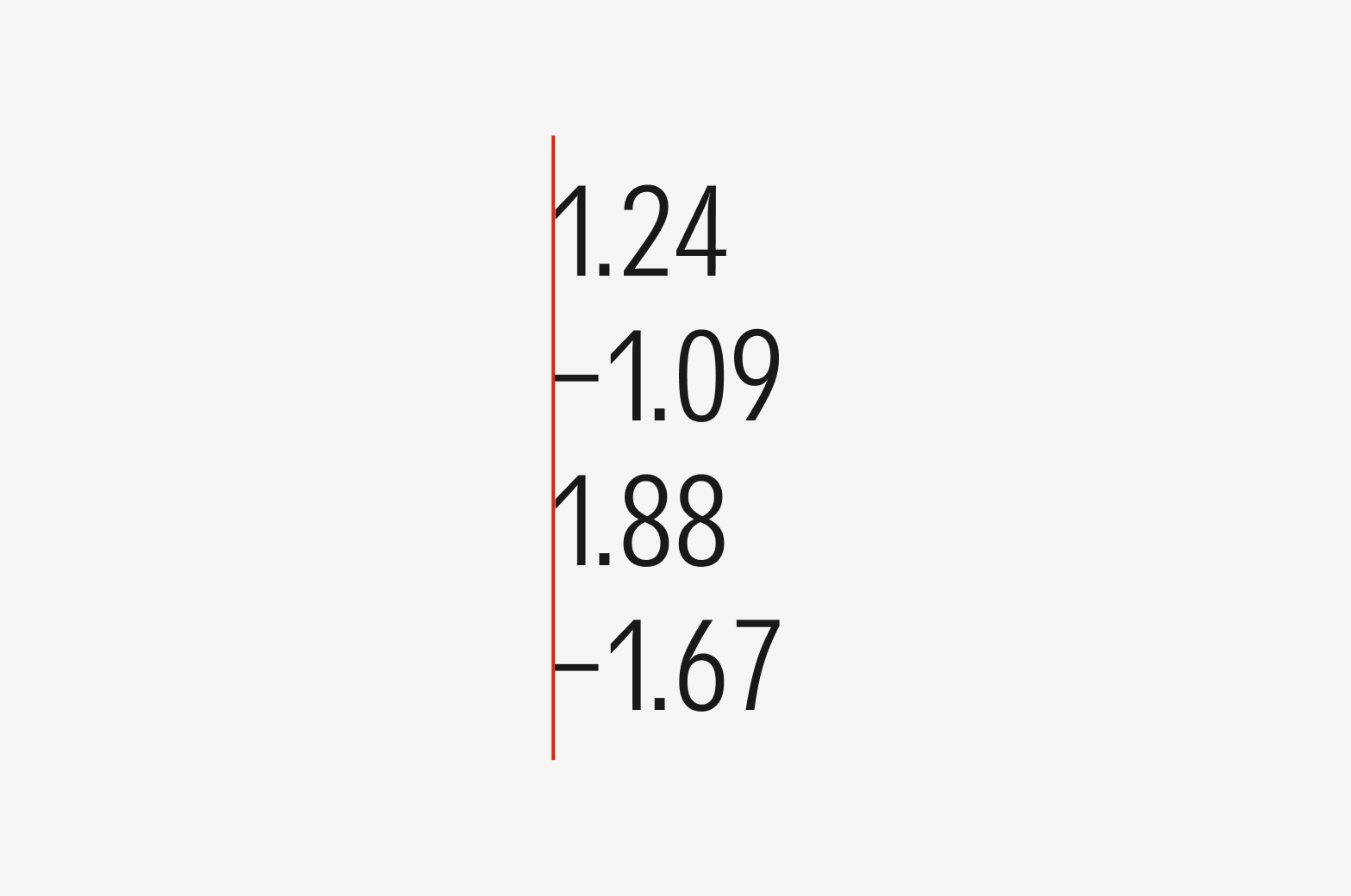
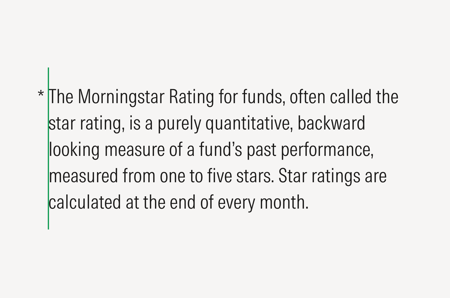
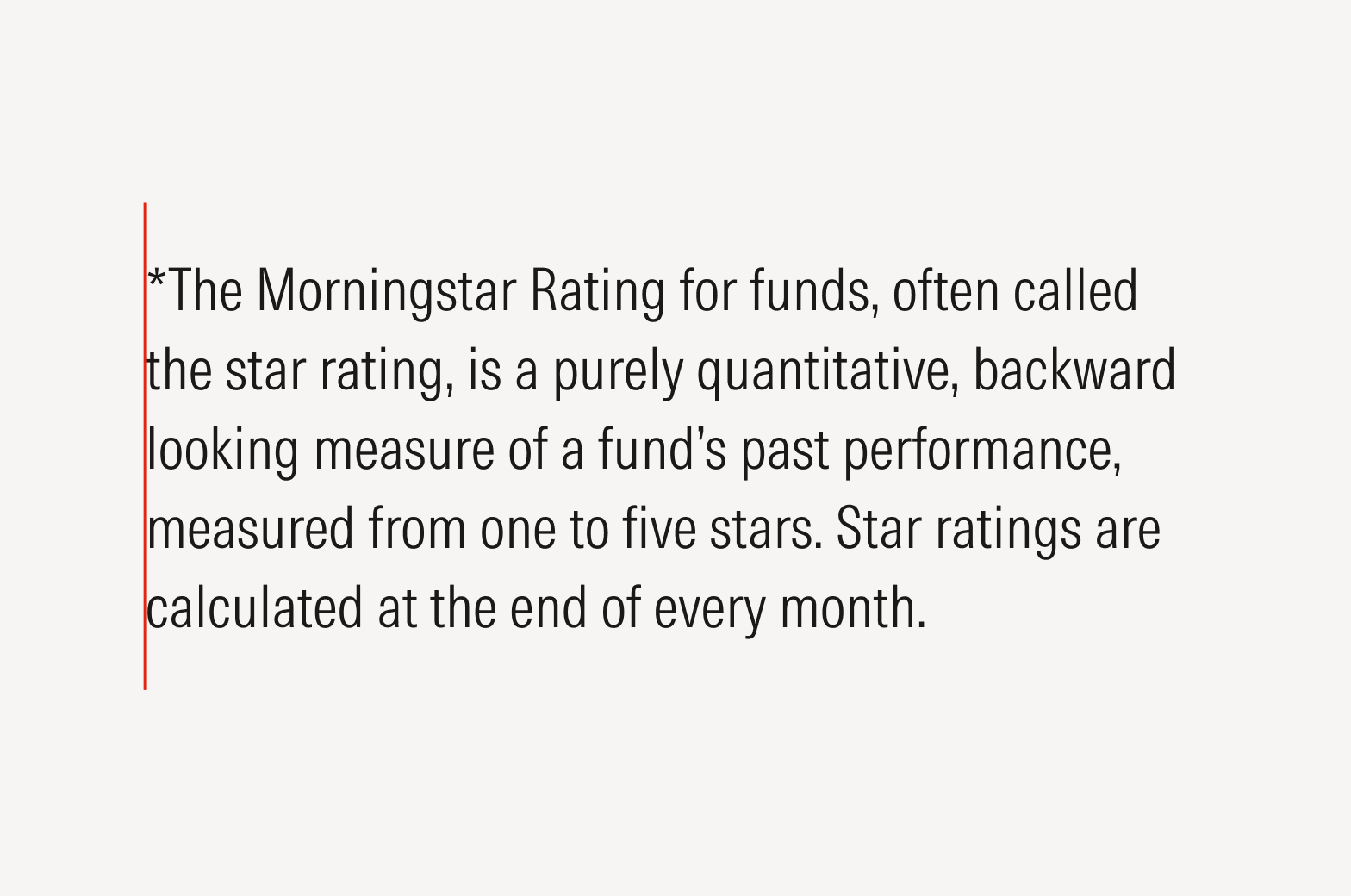
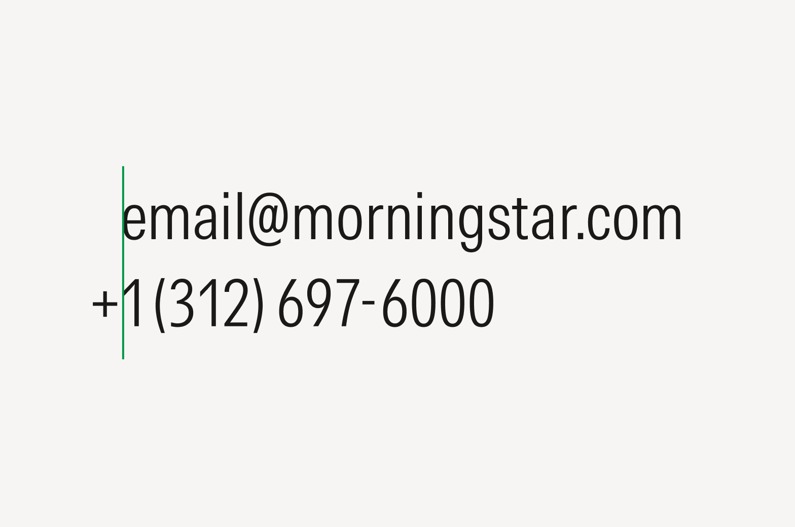
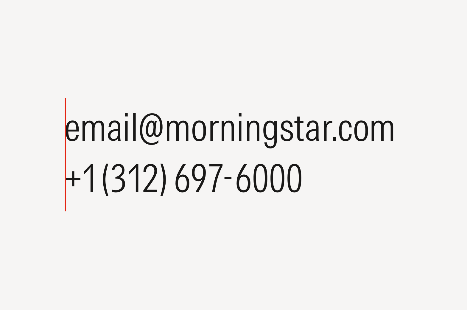
Extending some punctuation marks or symbols into the margin of flush text—that is, hanging (or hung) formatting—gives a more uniformly aligned appearance. Unhung punctuation can give the impression of an unnecessary indentation.
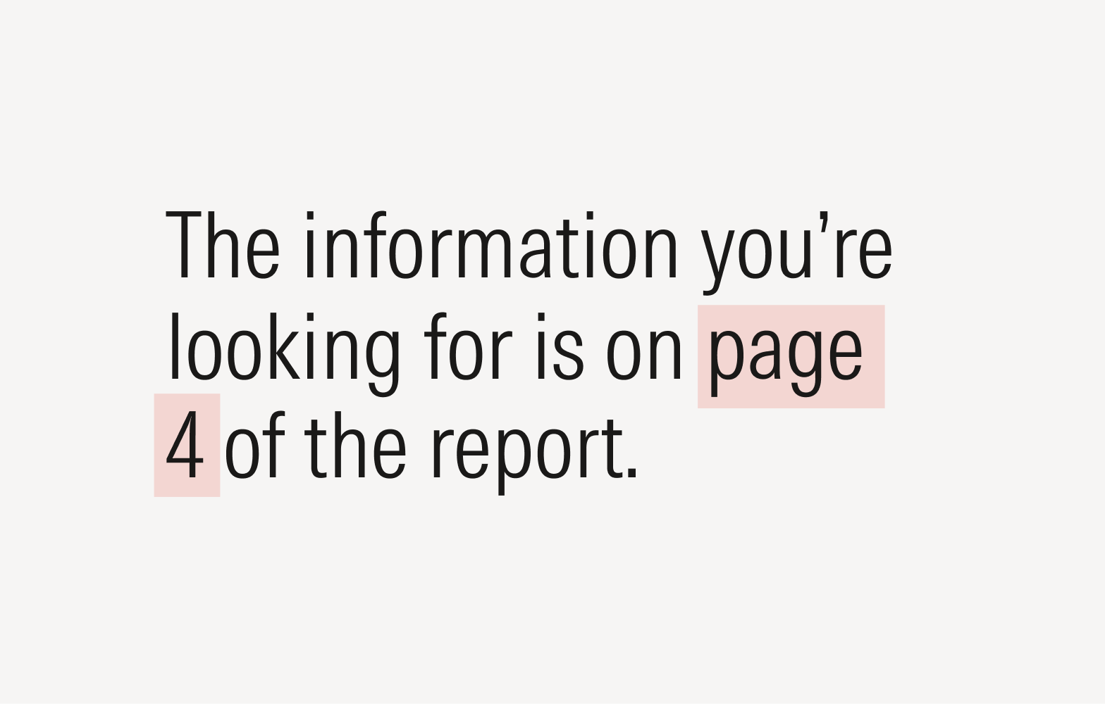
Punctuation marks (including quote marks, hyphens, en dashes, commas, and periods) and symbols (like asterisks and the plus symbol) should be manually hung when possible. Search for “hanging punctuation” or “optical margin alignment” in your settings to automatically activate this. While you can activate an automatic setting for hanging punctuation or optical margin alignment, further manual adjustments may still be necessary.
Ellipses

Do use the ellipses glyph (…) rather than three consecutive periods; see Keyboard Shortcuts.
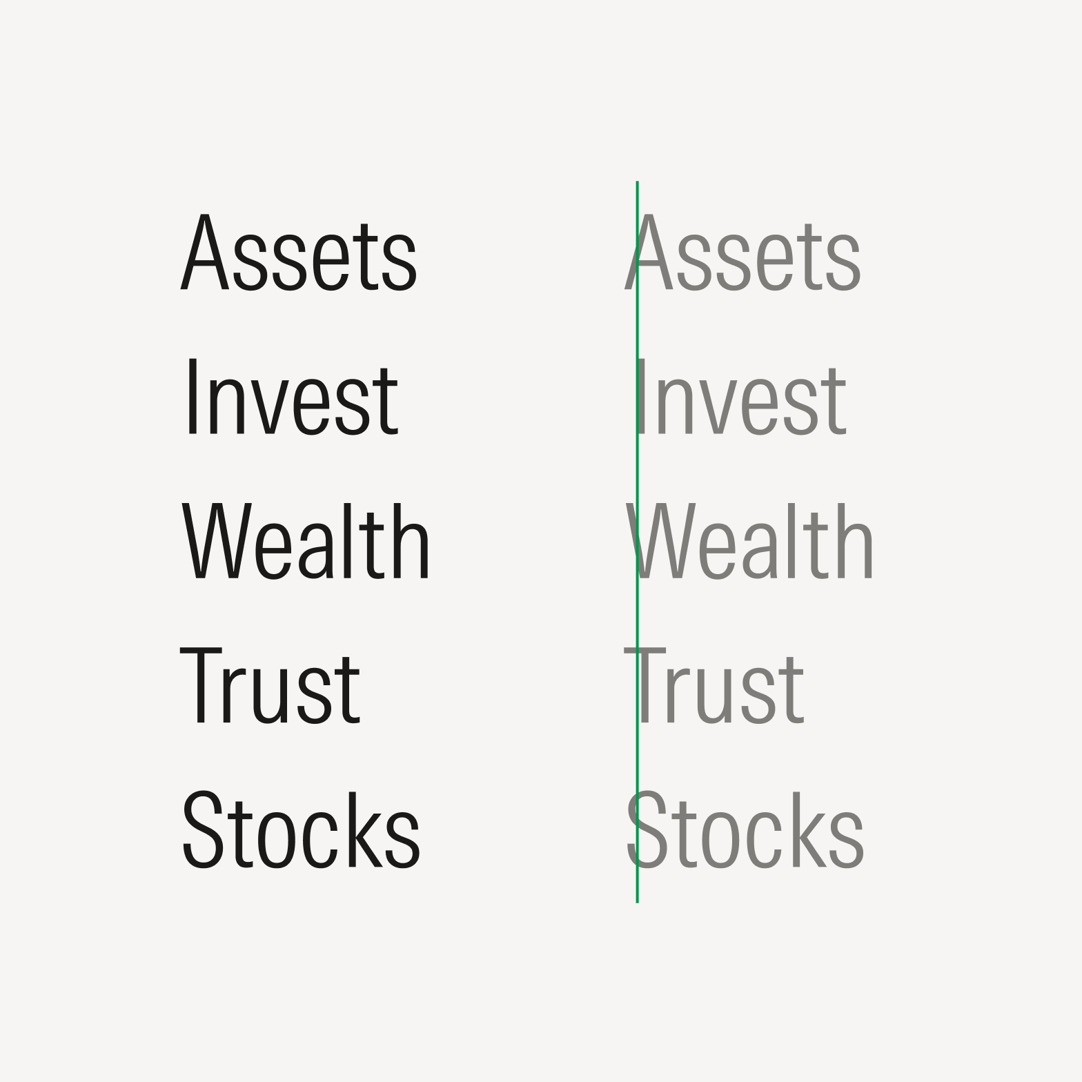
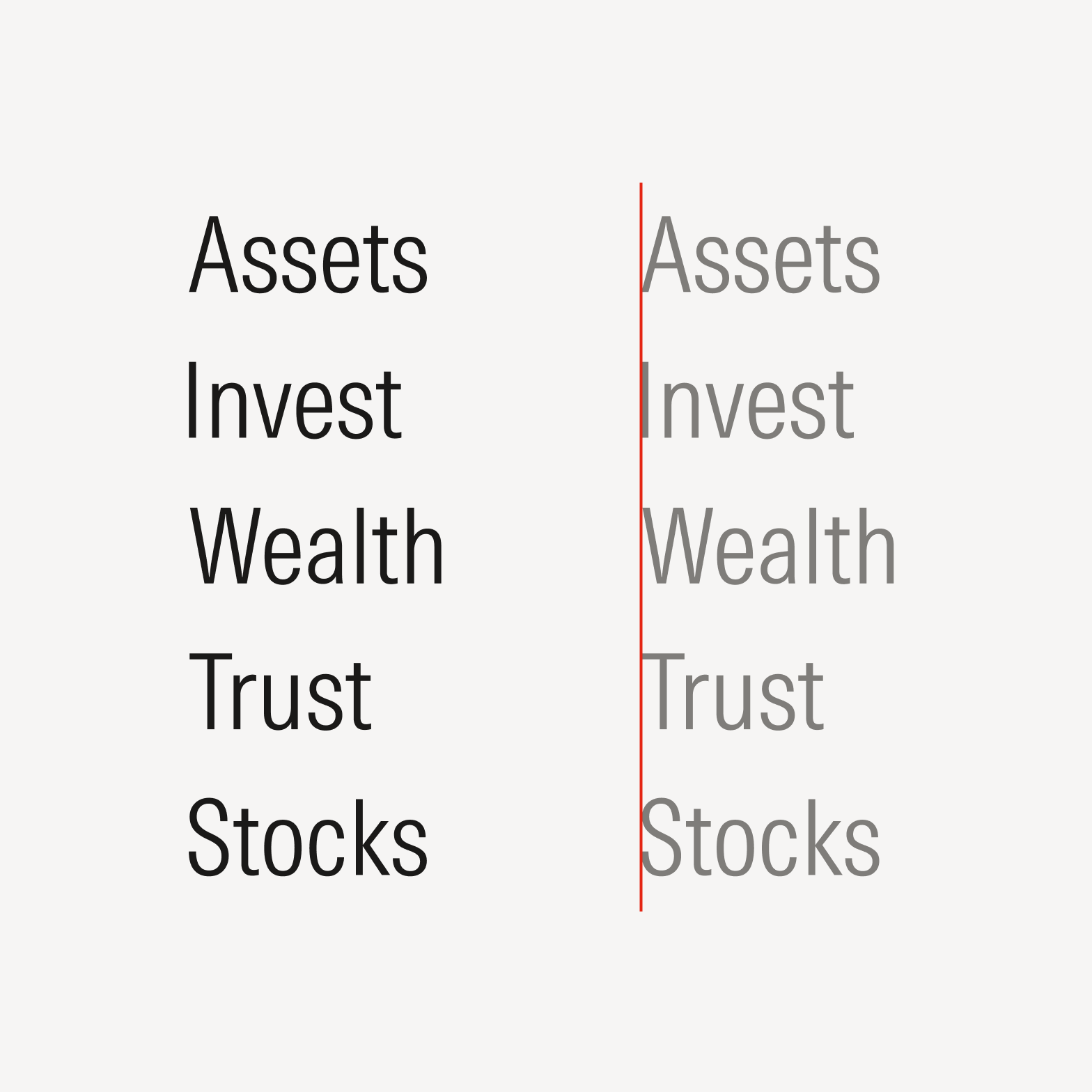

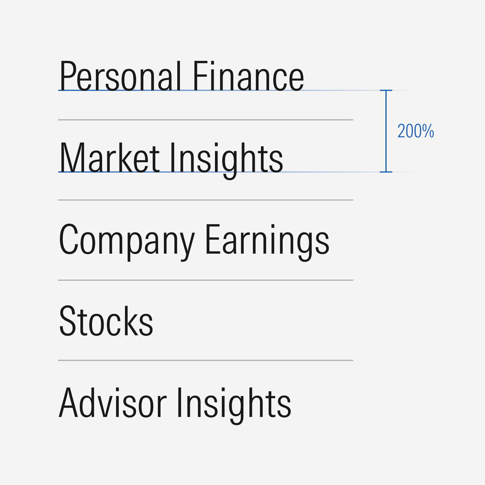
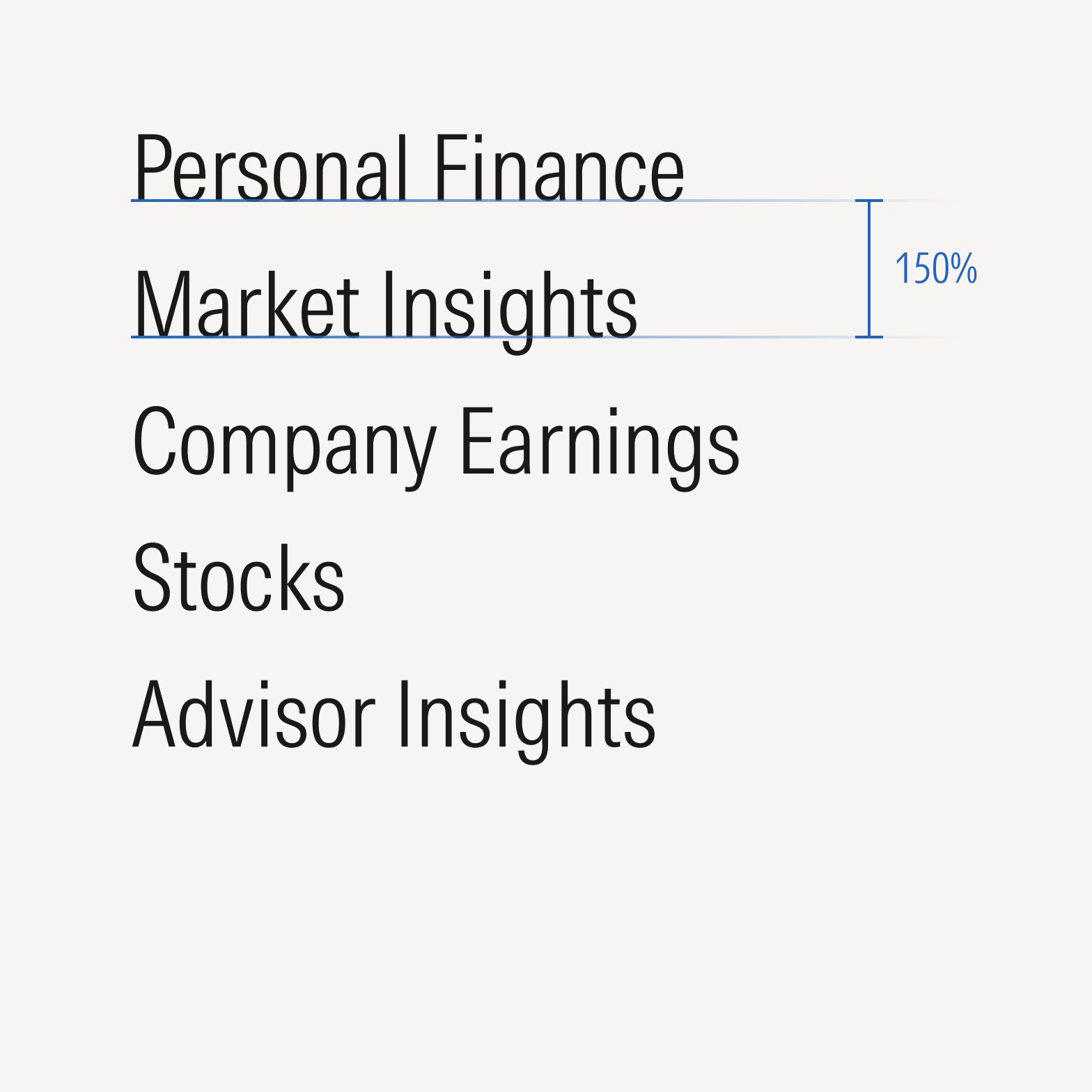
Do optically align text and images.

Avoid using default bounding boxes to align text and images, as they may not align optimally due to variations in letterforms.
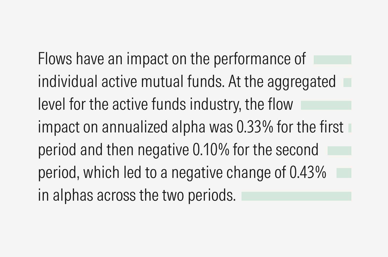
Do manually adjust rags so there’s consistent irregularity, which helps with readability.
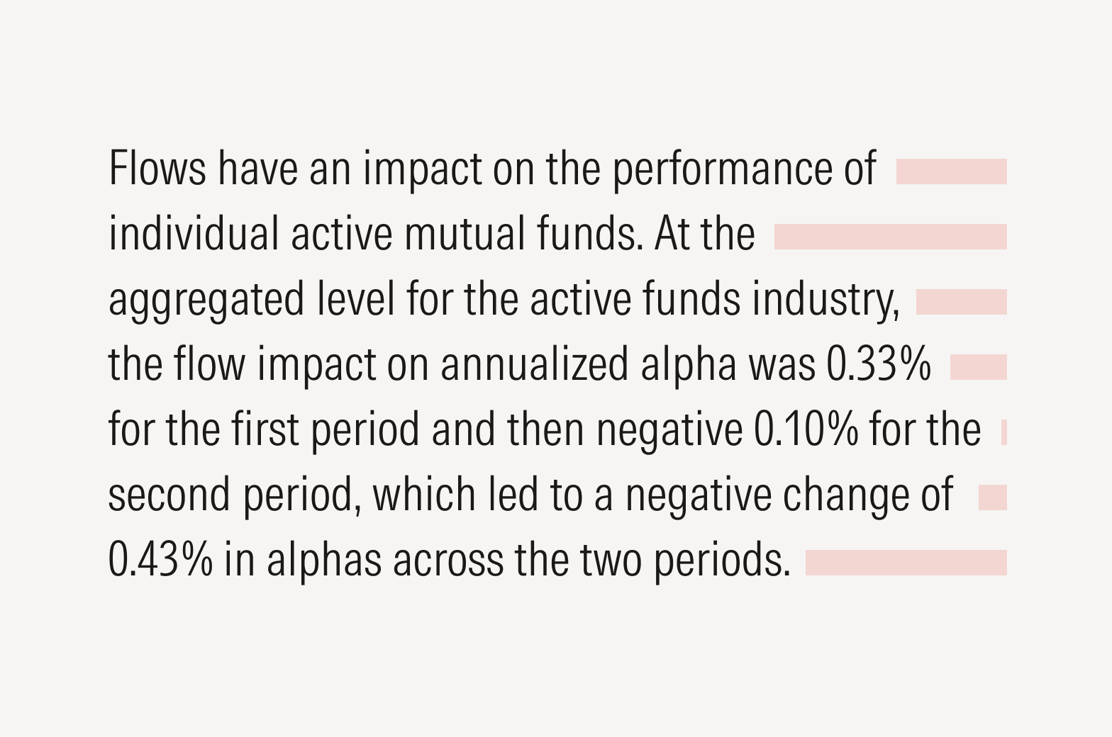
Don’t allow distracting shapes to form in your rags, which draw attention to the text’s visual appearance rather than the copy.

Avoid repeating words at the end or front of a line of text.
Widows and Orphans
When typesetting, single words may be accidentally left at the end of a paragraph (orphan) or at the start of a column (widow). You may rewrite the text or apply line breaks within the body of text.
Spacing
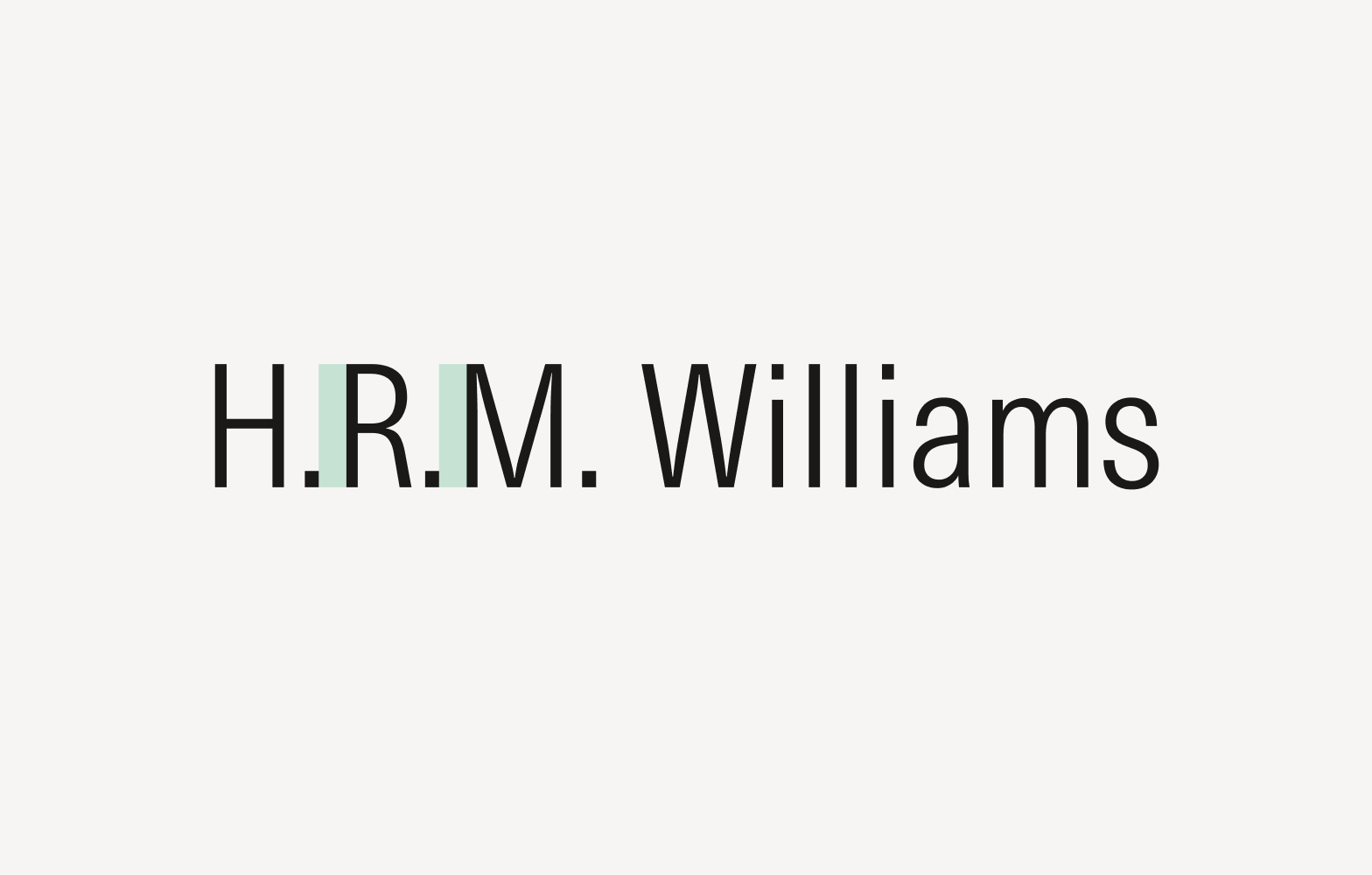
Hair Space
Hair space is the thinnest space and allows for the most subtle adjustments. It is typically used after intermediary periods in initials within names. If the hair space tool is not available, it’s advisable to use no space at all. Normal word spacing follows the last period in a string of initials.
Thin Space
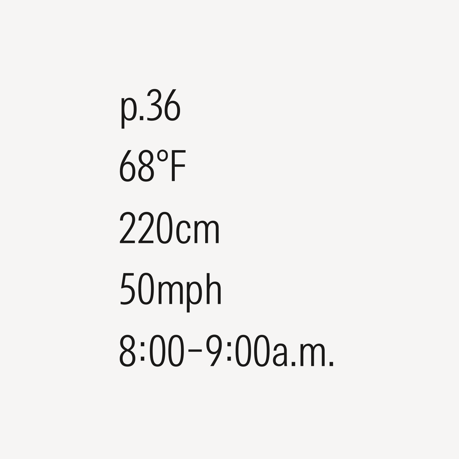
Thin space, slightly wider than its hair space counterpart, allows for nuanced adjustments in spacing between characters. Thin spaces are commonly used between numerical values and units. If a thin space isn’t possible, opt for an en space instead. Don’t use no space.
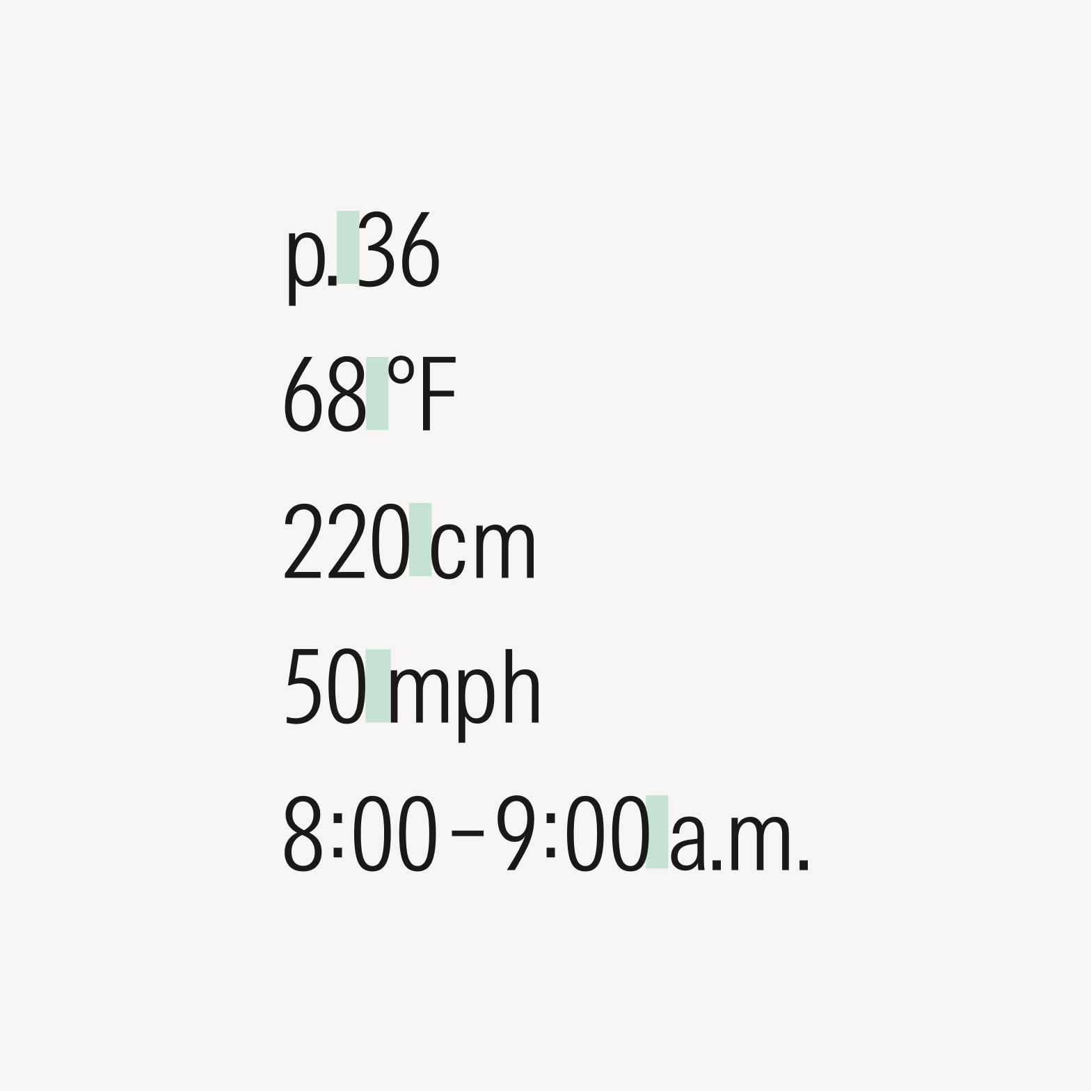
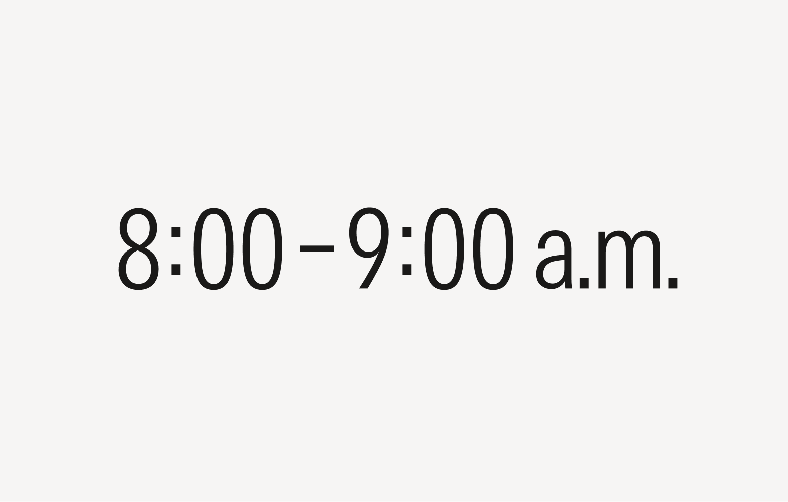
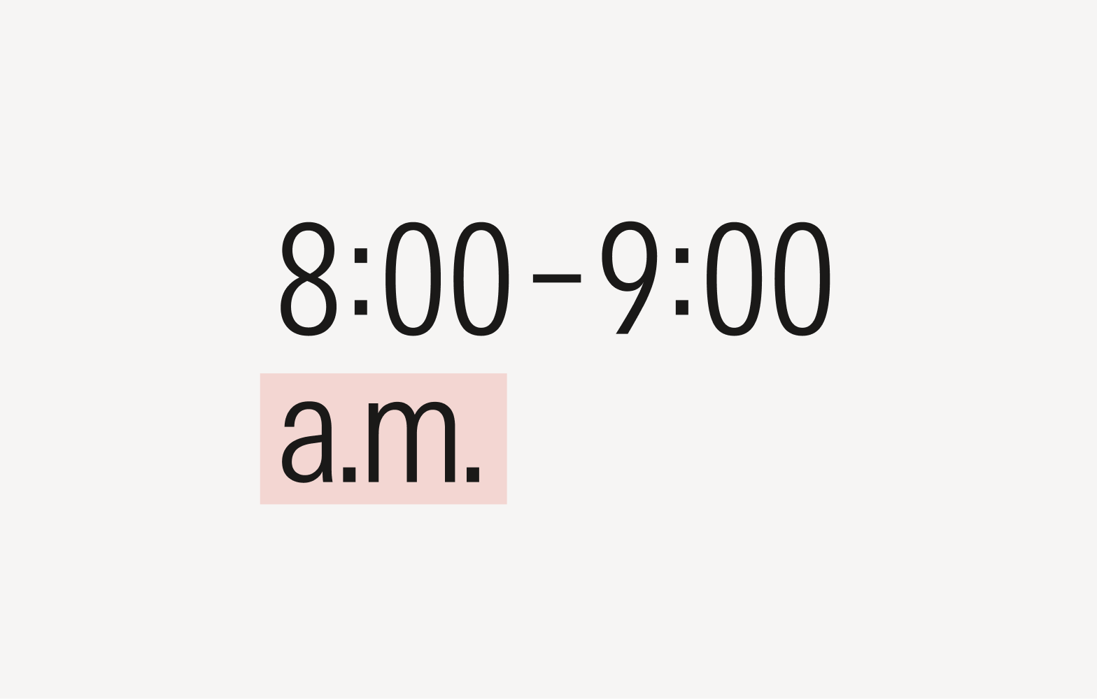
Non-breaking Space
Non-breaking spaces keep a connected unit of measurement or an idea together on the same line to preserve formatting and improve readability. It’s commonly used between numbers and numerical expressions and between phrases and numbers that would appear awkward or out of context if separated.

Do apply a color overlay to the image or a subtle drop shadow to the text to improve contrast between the text and background.
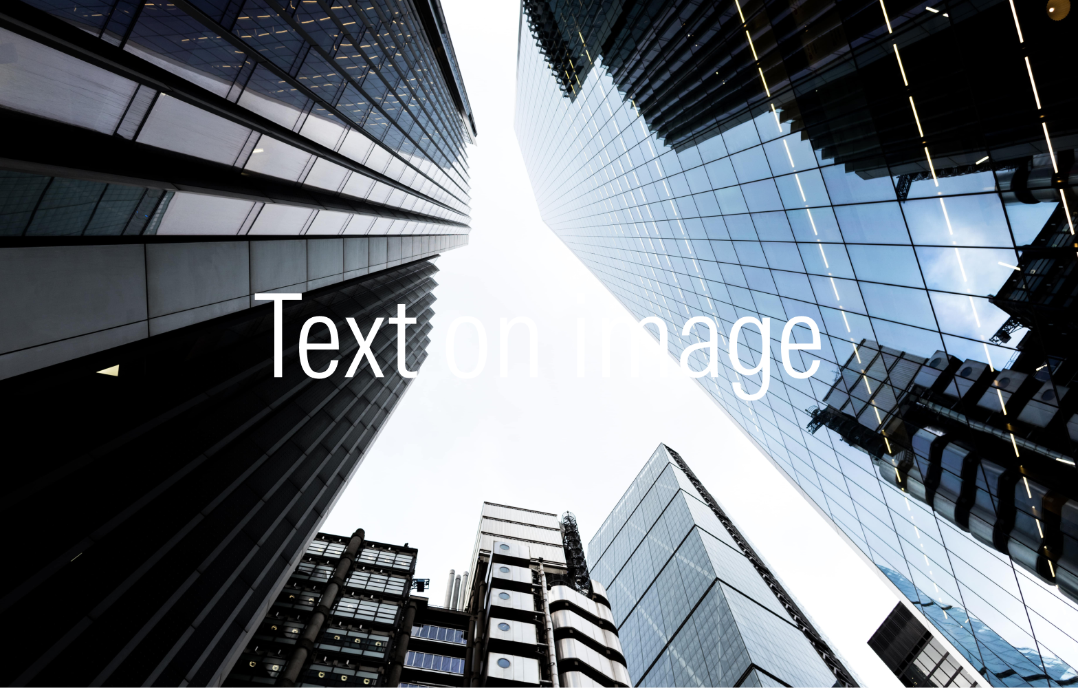
Don’t overlay text on an image without applying any contrasting techniques, as the lack of contrast impacts legibility.

Don’t rasterize text within images, which makes it inaccessible.