Color
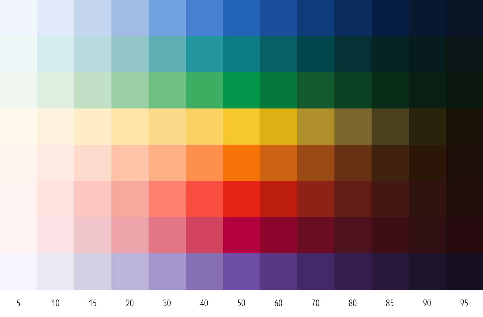
Foundational colors are organized into ramps with a consistent optical progression of tints and shades. They offer a full spectrum of colors for teams to create their own themes, or build palettes and assign roles across any medium.
Core Color
Morningstar Red has a brightness that, at our founding, was unique in the financial services industry and signaled our courage and unwavering commitment to challenging the status quo. Originally chosen by designer Paul Rand in 1991 as Pantone 185 U, it has since expanded to include equivalent values across color systems.
In key moments where we spotlight our brand, use Morningstar Red as the brightest element in the composition. It’s distinct from Red 50, which serves a different role in our color palette.

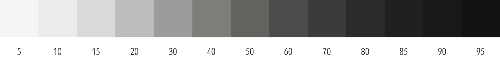
Supporting Colors
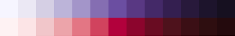
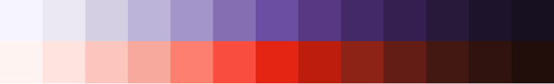
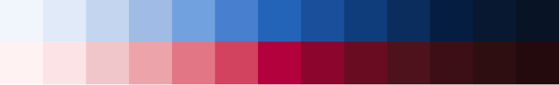
Our full palette of supporting colors feature softened chroma to support—but never compete with—Morningstar Red. Each supporting color is organized into a ramp, starting from 50 and organized sequentially from light to dark. Ramps are eased at their extremes to allow greater versatility for light and dark theming.
Our supporting colors can be curated across a tonal range from tactical to emotive. Always check the minimum contrast ratios, as required by WCAG or other accessibility standards.
For guidance on signature assets, which have their own dedicated colors, see Signature Assets. For additional best practices, see Other Considerations.
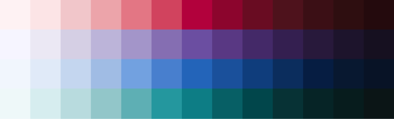
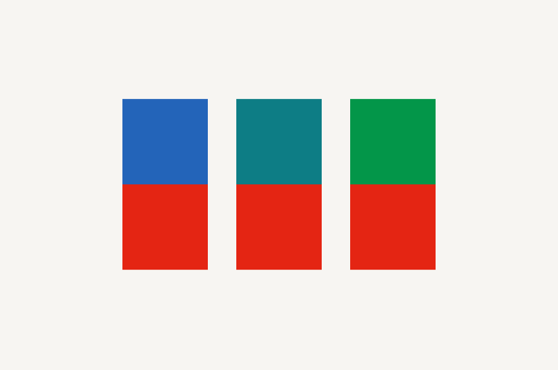
4-Color Families
Consider using a four-color family for complex data visualizations and other evocative illustrations.
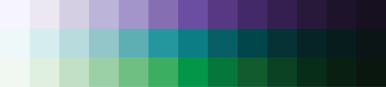
3-Color Families
Three-color families work for most applications.


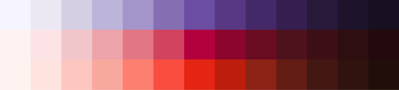
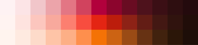
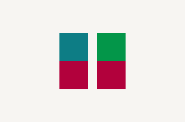
2-Color Families
Consider a two-color family for binary data sets and more focused illustrations.


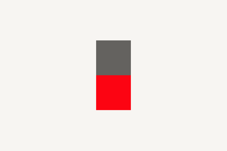
1-Color Families
Consider a one-color family for quiet illustrations, textures and backgrounds, or very simple data visualizations.


Tips for Creating Families
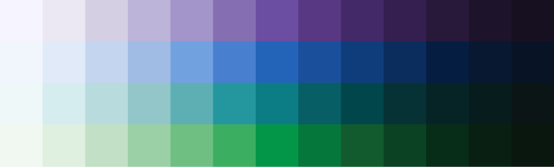
Avoid certain color combinations unless required for specific applications, such as data visualization, or to meet accessibility requirements.
Avoid pairing red with blue, teal, or green.
Avoid pairing magenta with teal or green.
Consider pairing Morningstar Red with neutrals only.
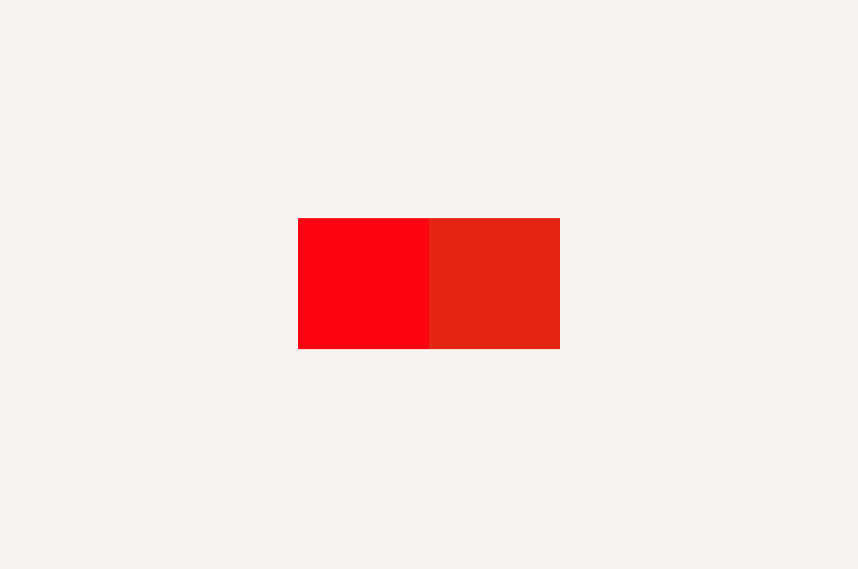
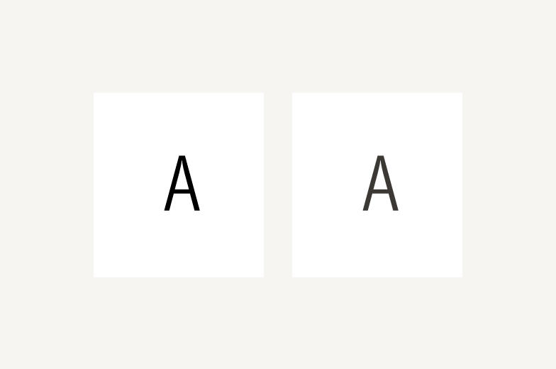
Apply Morningstar Red (left) exclusively to logos or select branded moments in a composition. For all other applications, such as a user interface or data visualization, use Red 50 (right) or any of its shades.
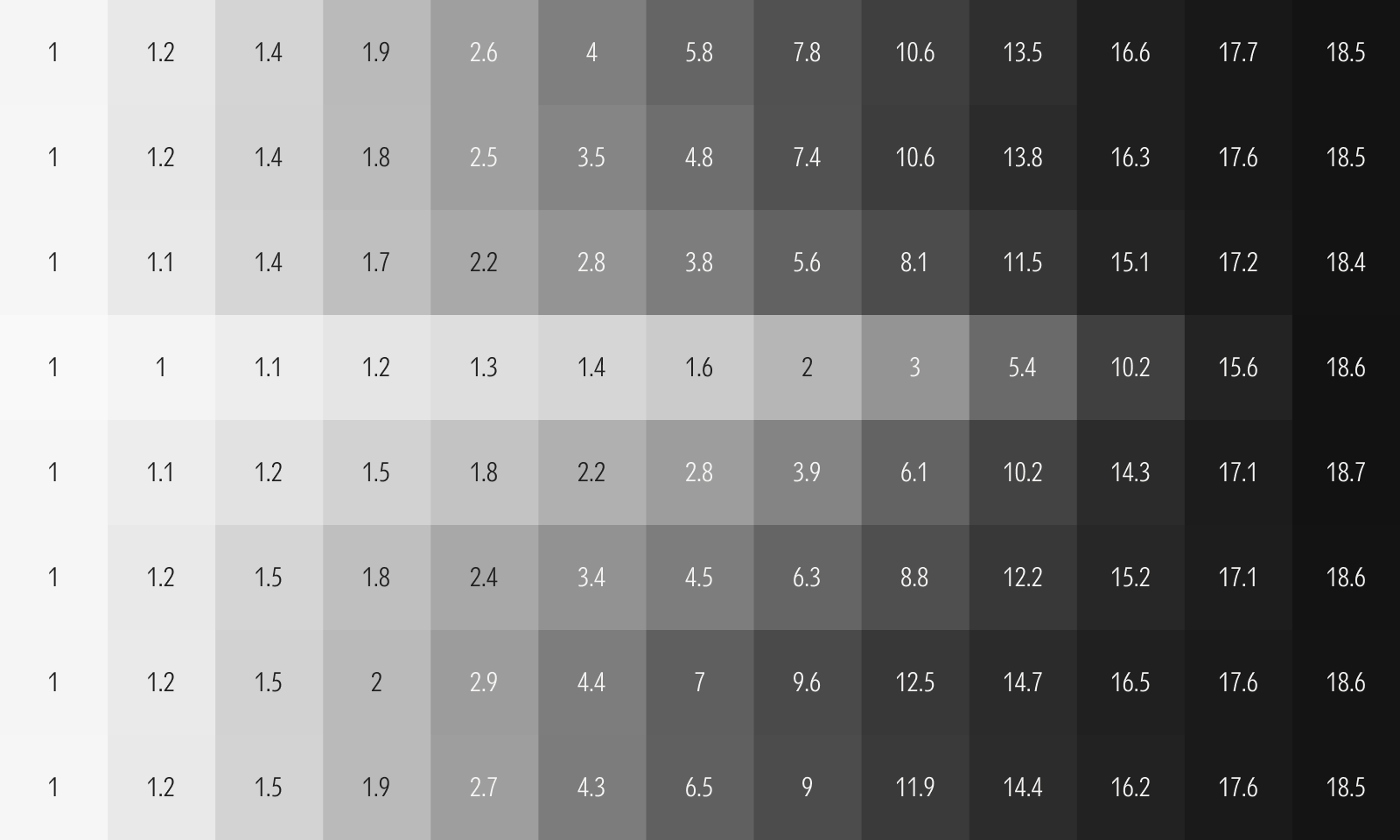
Extreme contrast can appear harsh and impact readability. On Neutral 0, Neutral 80 (right) appears softer and easier to read than Neutral 100 (left).
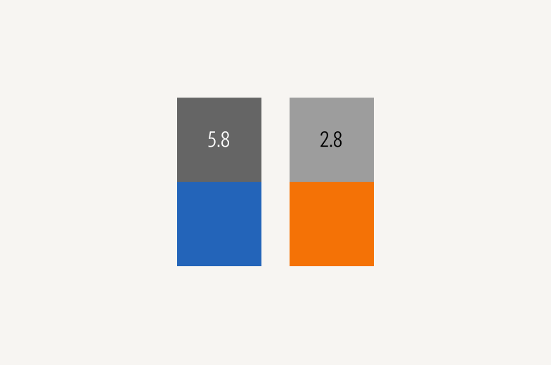
Colors with the same stop value often don’t share similar contrast ratios. Check colors against accessibility standards. Blue 50 (left) meets the minimum contrast ratio required by WCAG, while Orange 50 (right) doesn't.
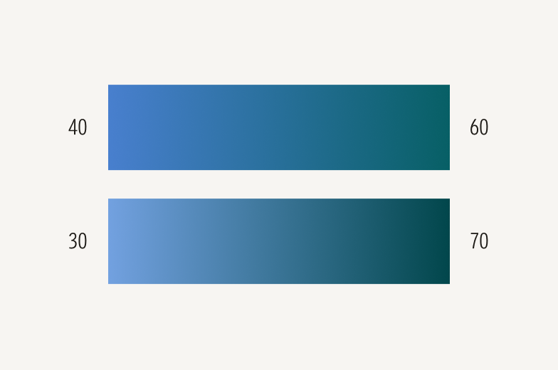
Extreme stop differences of 40 or more between the ends of a gradient (bottom) appear harsh. A difference of 20 (top) appears softer, giving more depth and dimension.
Applications
These foundational colors are designed for flexibility. Product, marketing, and data visualization teams should create themes and assign roles tailored to their specific use cases. For hex and RGB values, see Specifications.