Typography
Formatting
These guidelines outline the fundamentals of good typography that everyone should apply, including standard punctuation treatment and approaches to alignment and spacing.
While typography focuses on how to present text, editorial style, as detailed in the Morningstar Style Guide, defines the proper use of punctuation and case style. For access, email the copy desk.
Weights
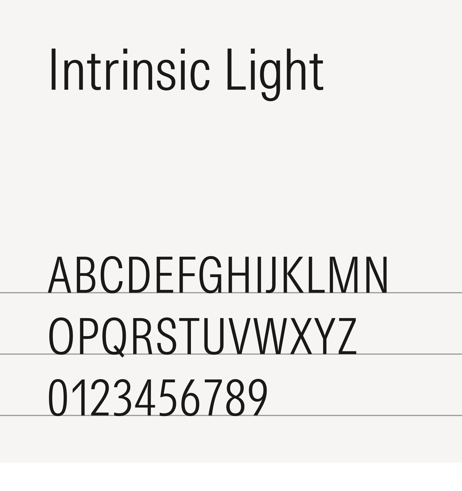
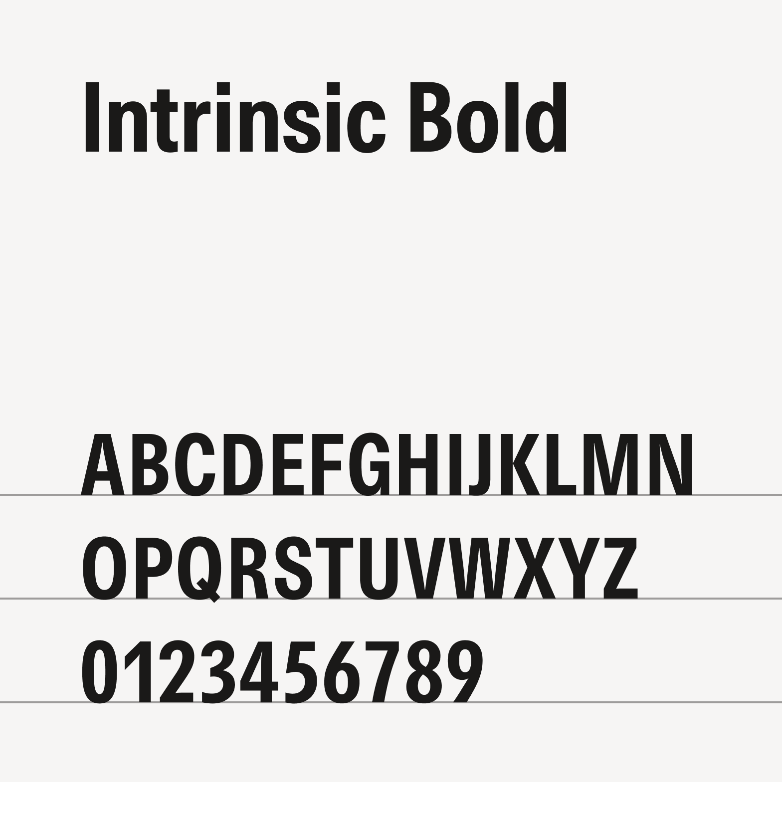
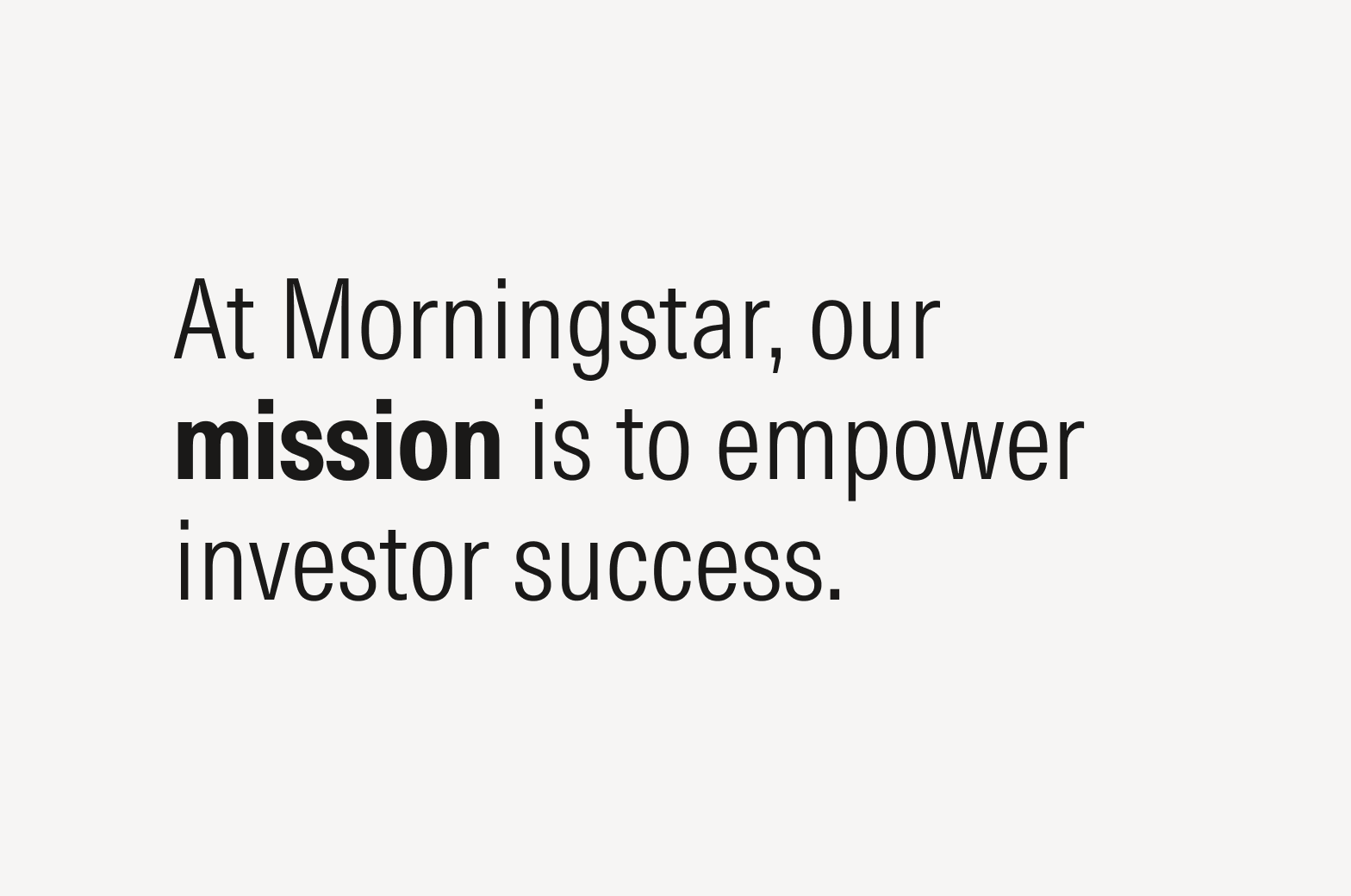
Morningstar Intrinsic comes in two weights. Use the heavier weight to bring clarity and hierarchy to text, but do so sparingly. Intrinsic Bold is also typically used for eyebrows and small headings.
For more guidance on choosing the right weight, see Emphasis.
Paragraphs

Do align text flush left.
Avoid center aligning text.
Don’t align text flush right.
Don’t fully justify text.
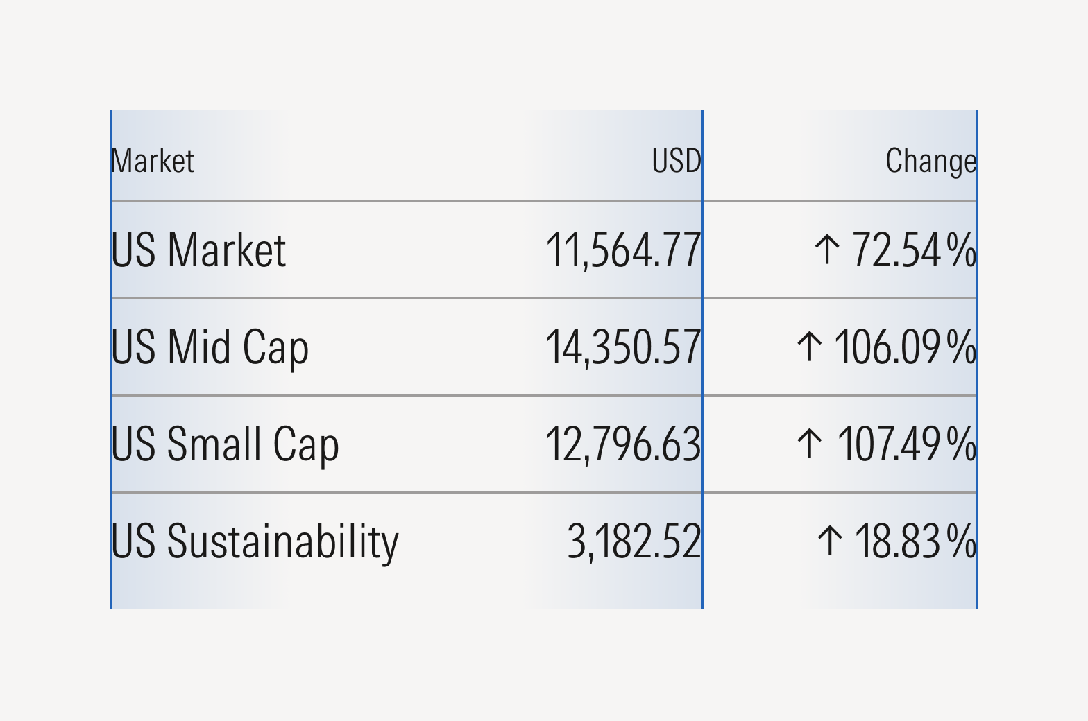
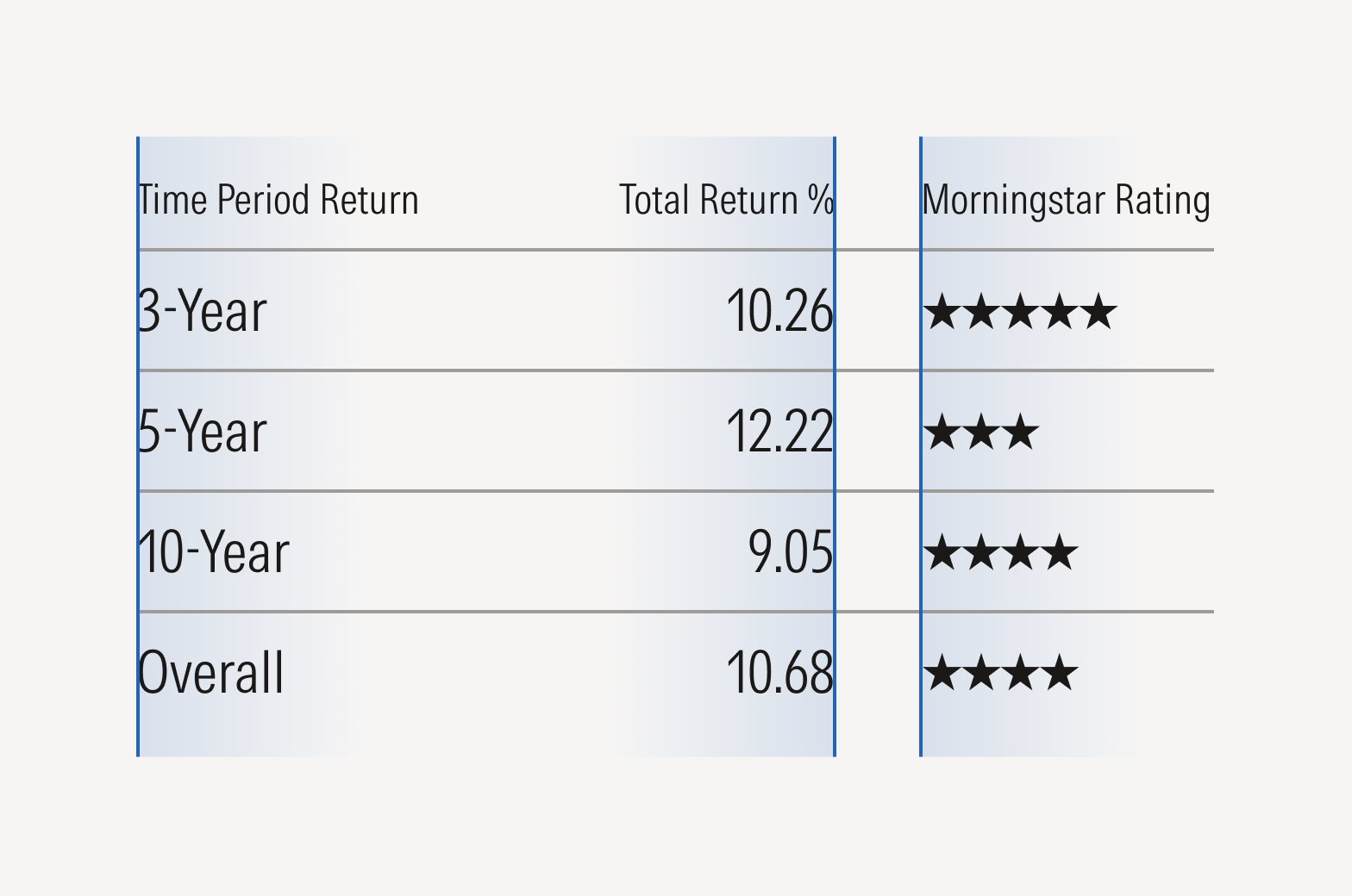
Tables
Leading
Also known as line spacing, leading refers to the space between lines of text. Effective leading makes it easier to distinguish one line from another, ensuring a smooth reading experience.
Leading that is too tight looks crowded and causes eye strain, while loose leading increases eye movement and gives the appearance of a lack of structure—avoid either extreme.
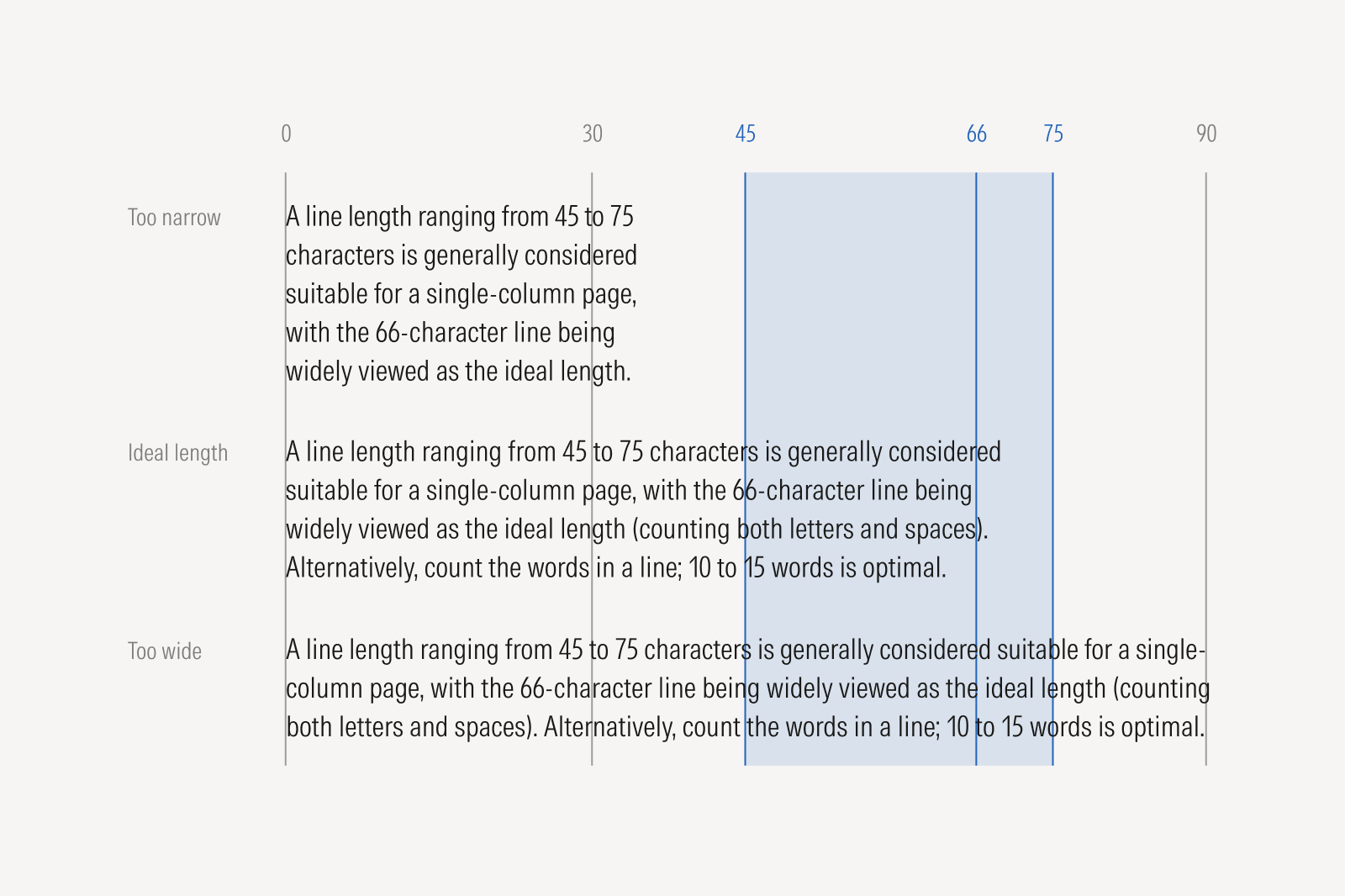
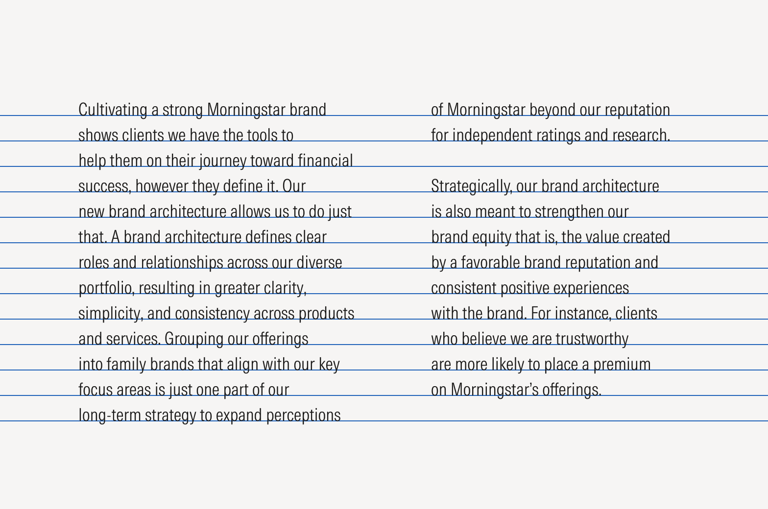
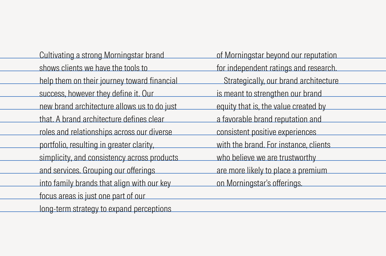
Line Length
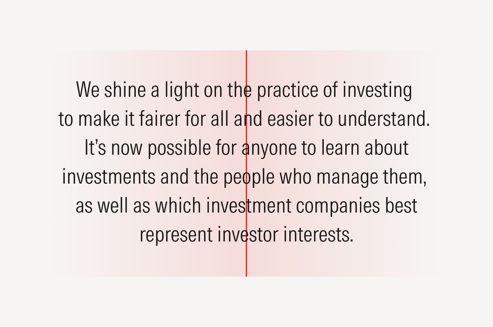
Comfortable Reading for Single Columns
Whether measured in characters or words, finding the right balance of line length is essential for preventing eye strain. Optimal line lengths, neither too long nor too short, make the text easier to follow.
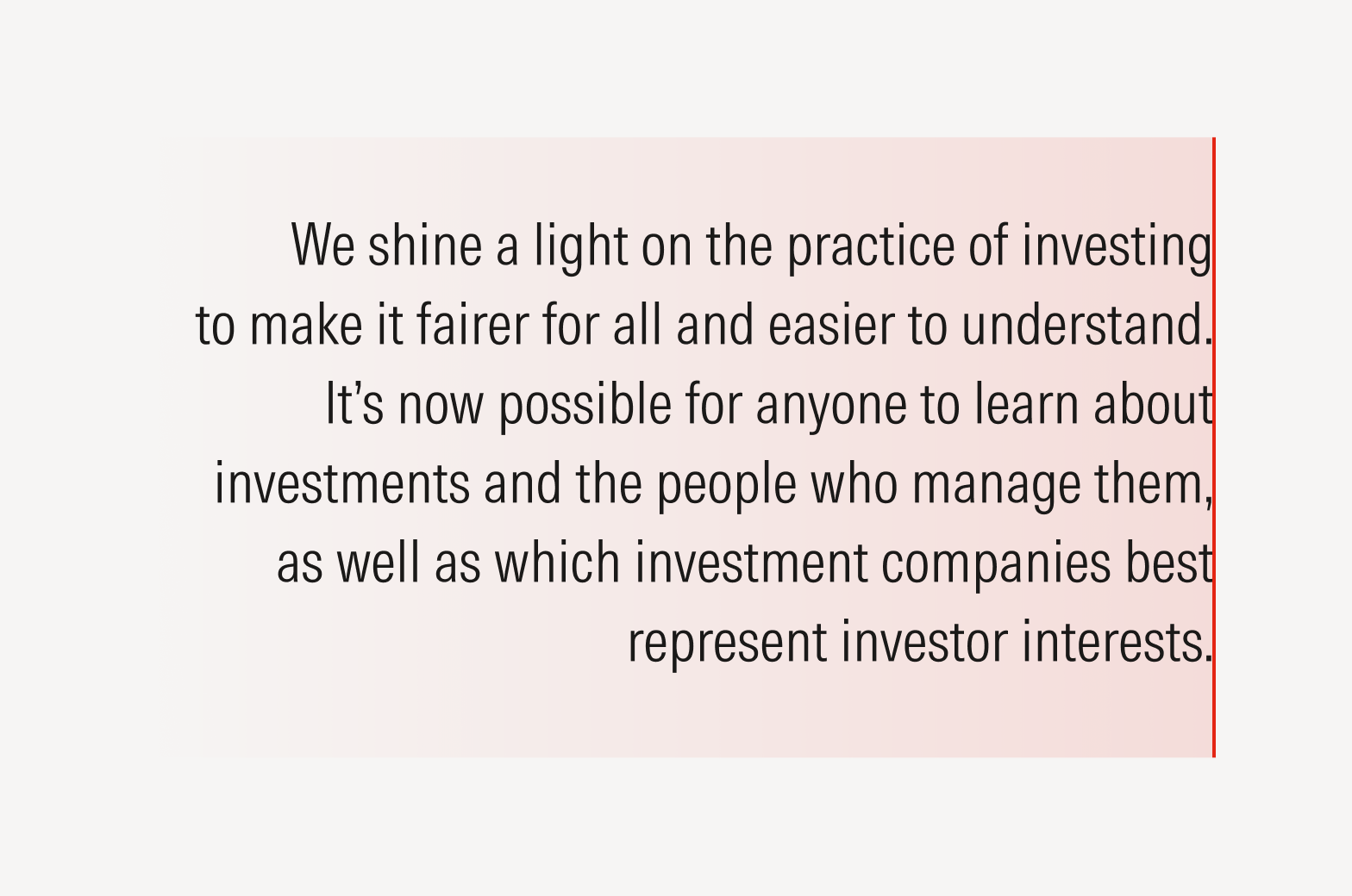
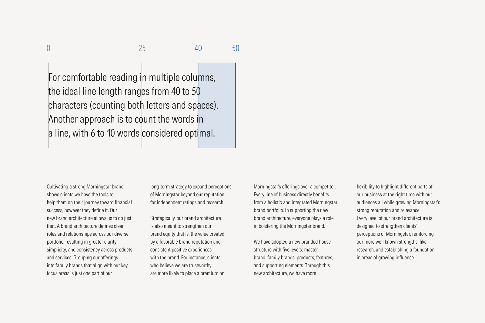
Comfortable Reading for Multiple Columns
To maintain readability in multi-column layouts, use shorter lines than the standard single column length.

Do use Intrinsic Bold to emphasize a word or phrase.

Don’t use Intrinsic Bold for any punctuation that follows an emphasized word or phrase.

Do ensure a better letterfit by kerning an upright “Roman,” or non-italicized, comma. Alternatively, use an italicized comma.

Don’t create a spacing issue by leaving the space between an italicized word and a “Roman” comma unkerned.
Do use one emphasis technique to help the reader focus on what’s most important.

Don’t use overlapping emphasis techniques like weight, color, size, and style. Known as “belts and suspenders,” this overlap can dilute the power of the intended message.
Apostrophes and Quotes
Apostrophes are used for contractions, indicating possession, or enclosing words within quotation marks. Quotes are used to note direct speech, quotations, and titles or to emphasize specific words.
Use opening and closing “curly quotes” for quotation marks. Avoid using single or double “straight” quotes, as these are artifacts from the typewriter era and a frequent error in contemporary typography.
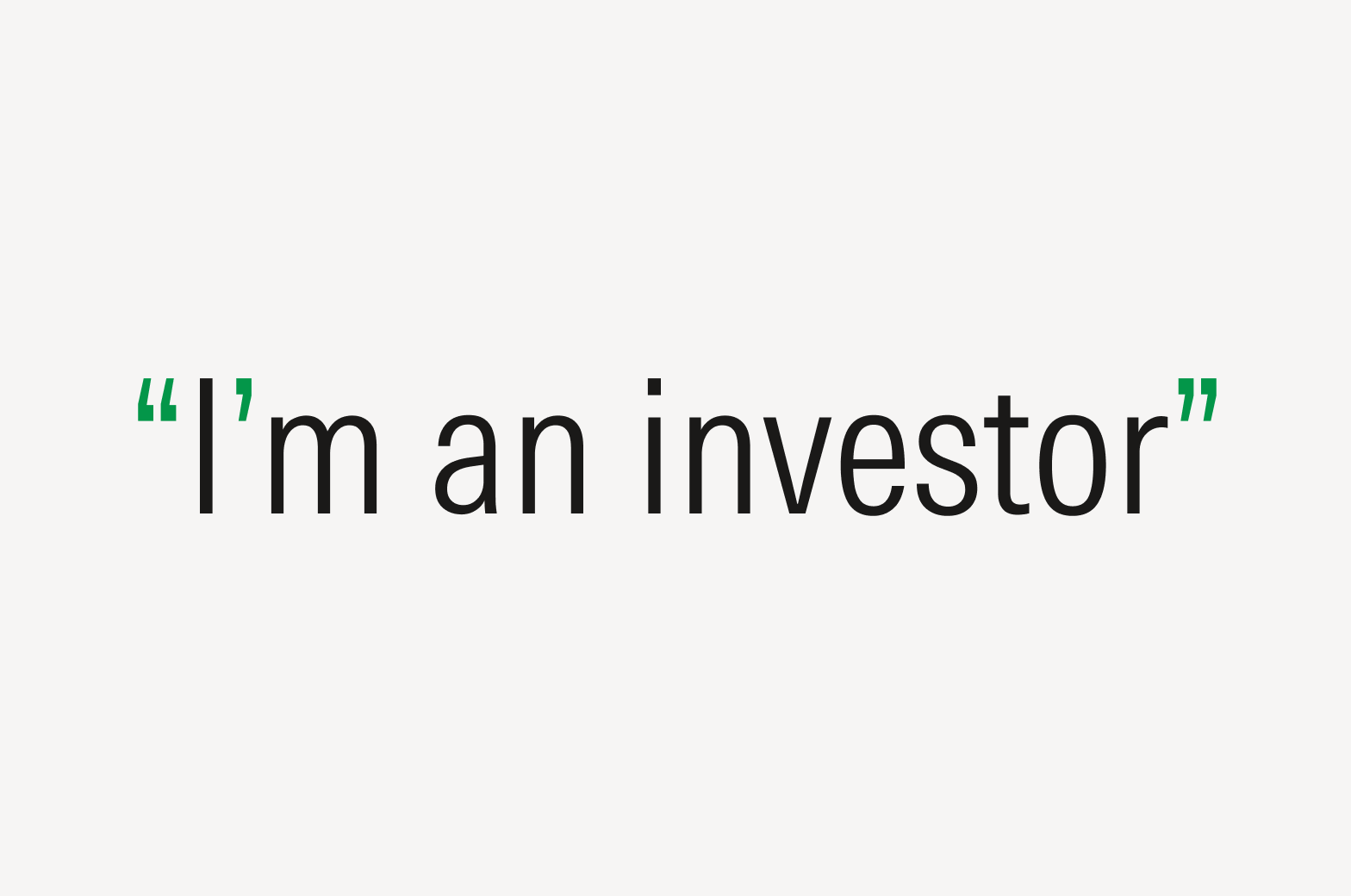
Do use a curly apostrophe or quotation marks.
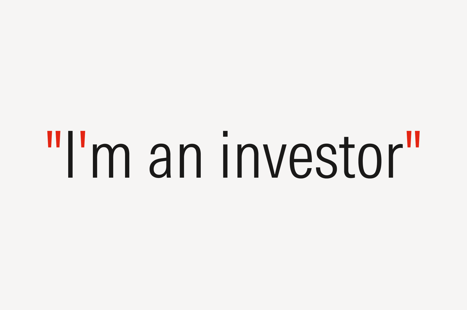
Don’t use a straight apostrophe or quotation marks.
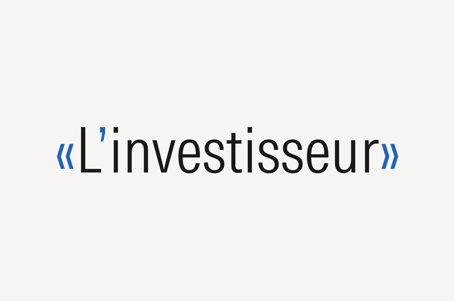
Be mindful that some languages use other types of quotation marks, such as French guillemets.
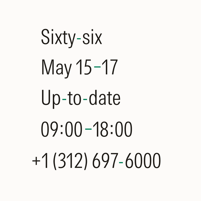
Do use the shorter hyphen mark to connect words or parts of words. Use the slightly longer en dash to indicate ranges, relationships, or connections between items.
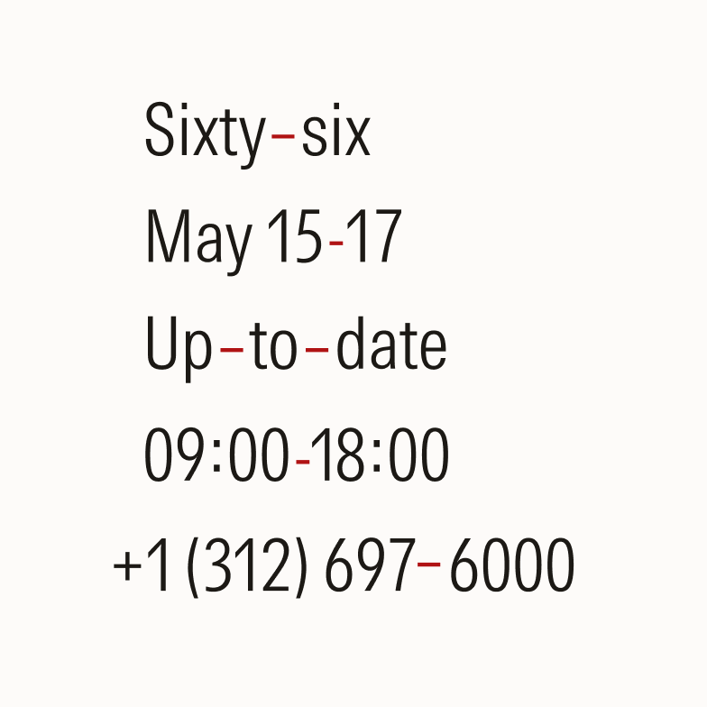
Don’t use hyphens and en dashes interchangeably.
Hyphenation in Line Breaks
Do leave at least two characters behind and bring at least three to the following line at hyphenated line breaks.
Avoid taking two characters or fewer to the next line after the hyphenation.
Avoid three or more consecutive hyphenated lines.

Avoid leaving the stub-end of a hyphenated word as the last line of a paragraph.
Em Dashes (—)

Em dashes are used to set off information or create emphasis but should be used sparingly.

Do spell out “and,” but use the ampersand symbol if space is limited, such as with headlines.
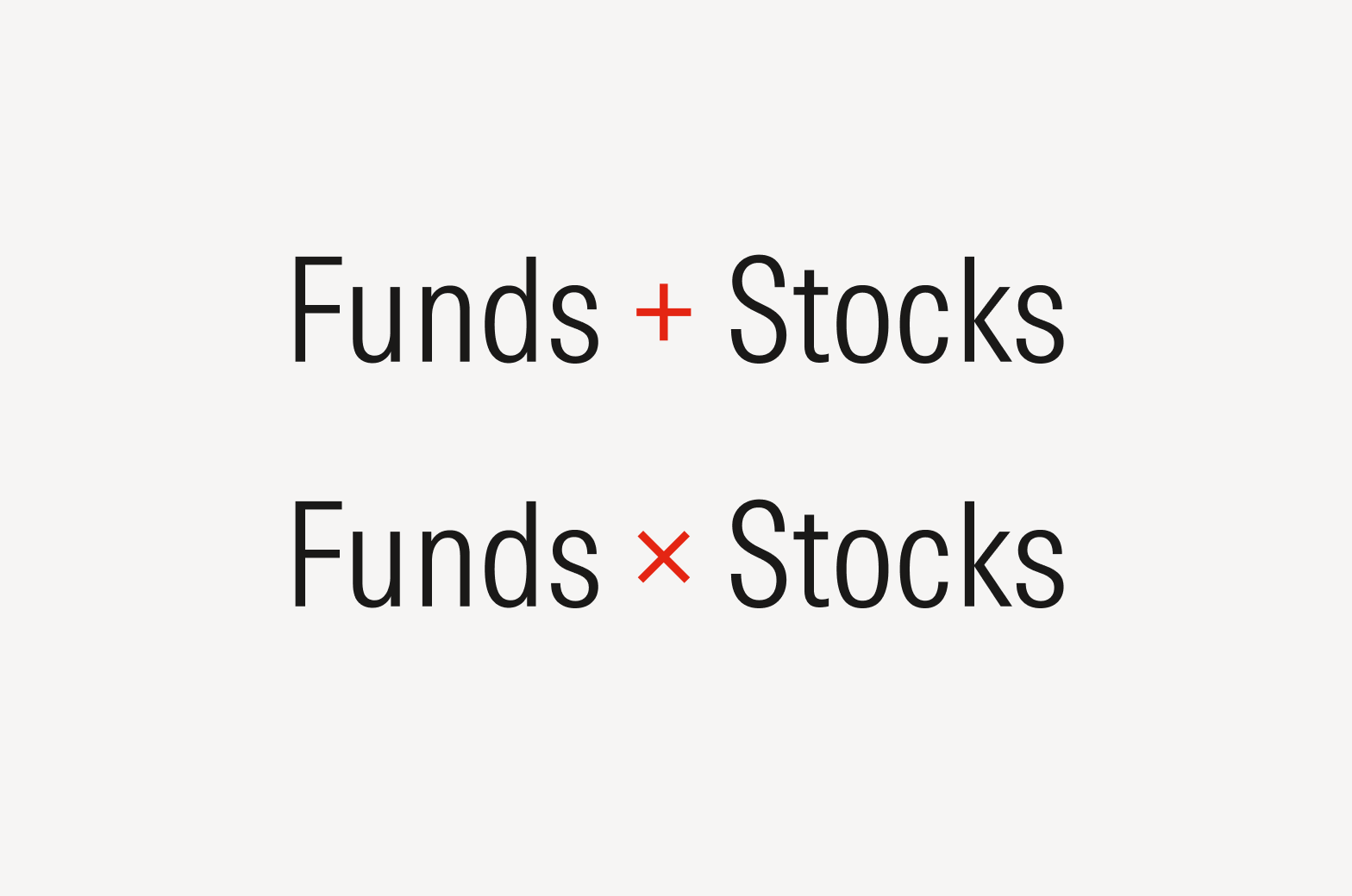
Don’t substitute “&” or “and” for mathematical symbols unless the symbol is part of a title or name, like Morningstar Data+Analytics.
Mathematical Symbols
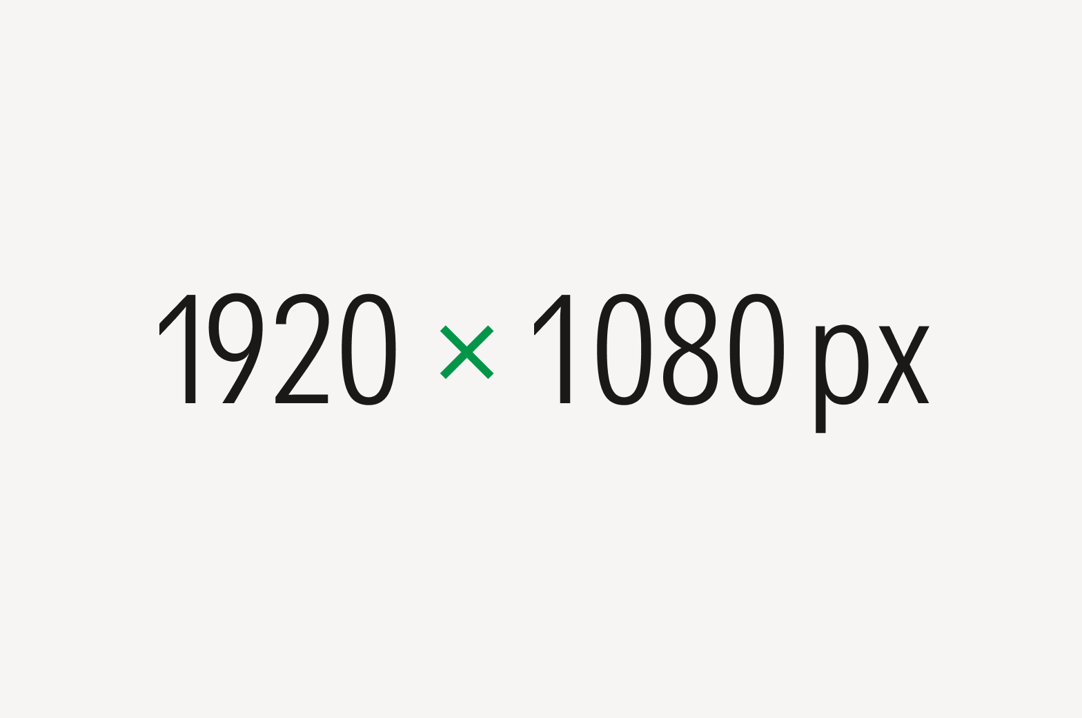
Do use the shorter, wider multiplication symbol (×) instead of the letter “x” in formulas and dimensions.
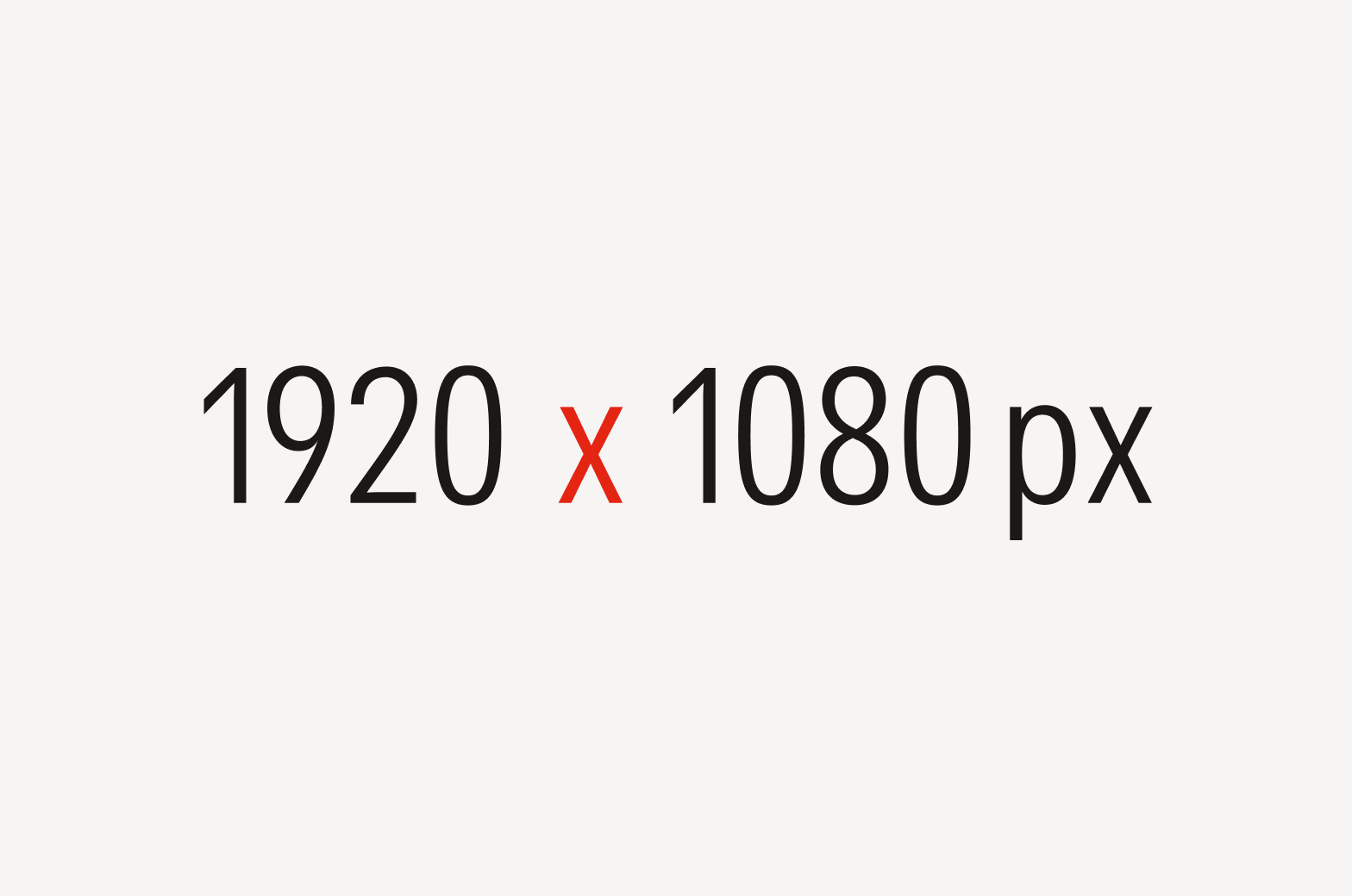
Don’t use the letter “x,” which appears taller and narrower, in place of the multiplication symbol (×).
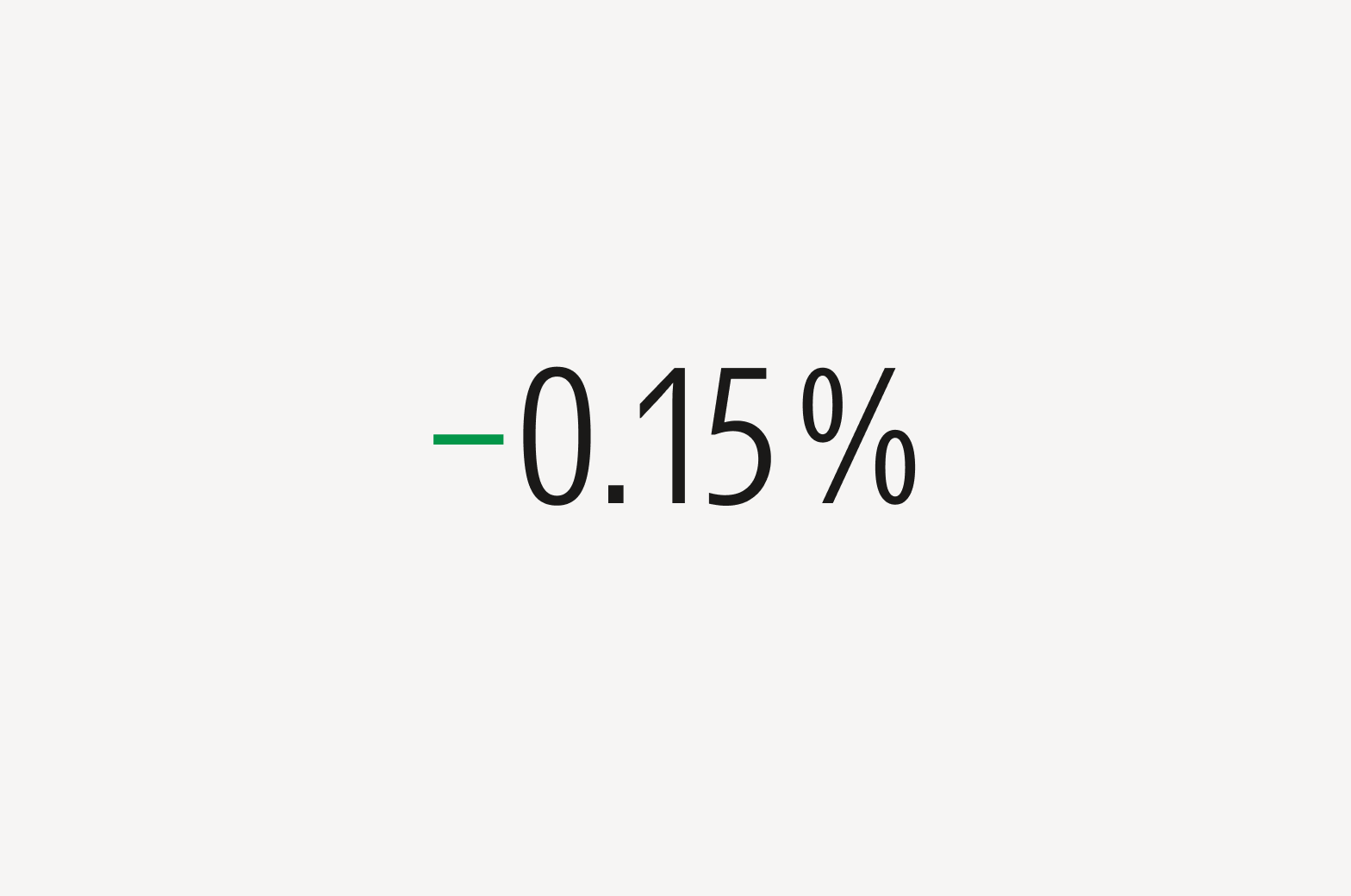
Do use the minus sign (−) for negative numbers.
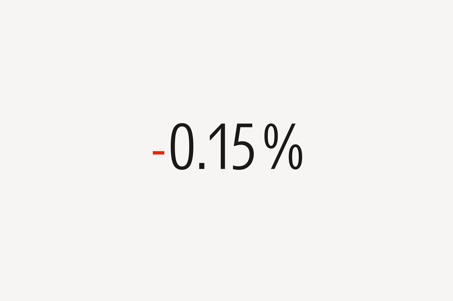
Don’t use hyphens or dashes for negative numbers.
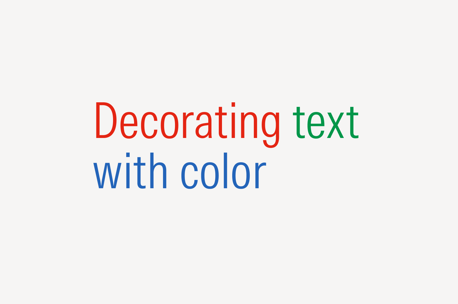
Color
In most instances, we use neutral color text on light and dark backgrounds. You may use color to highlight important text, but use it sparingly and consider legibility and accessibility. To see our full color palette, see Color.
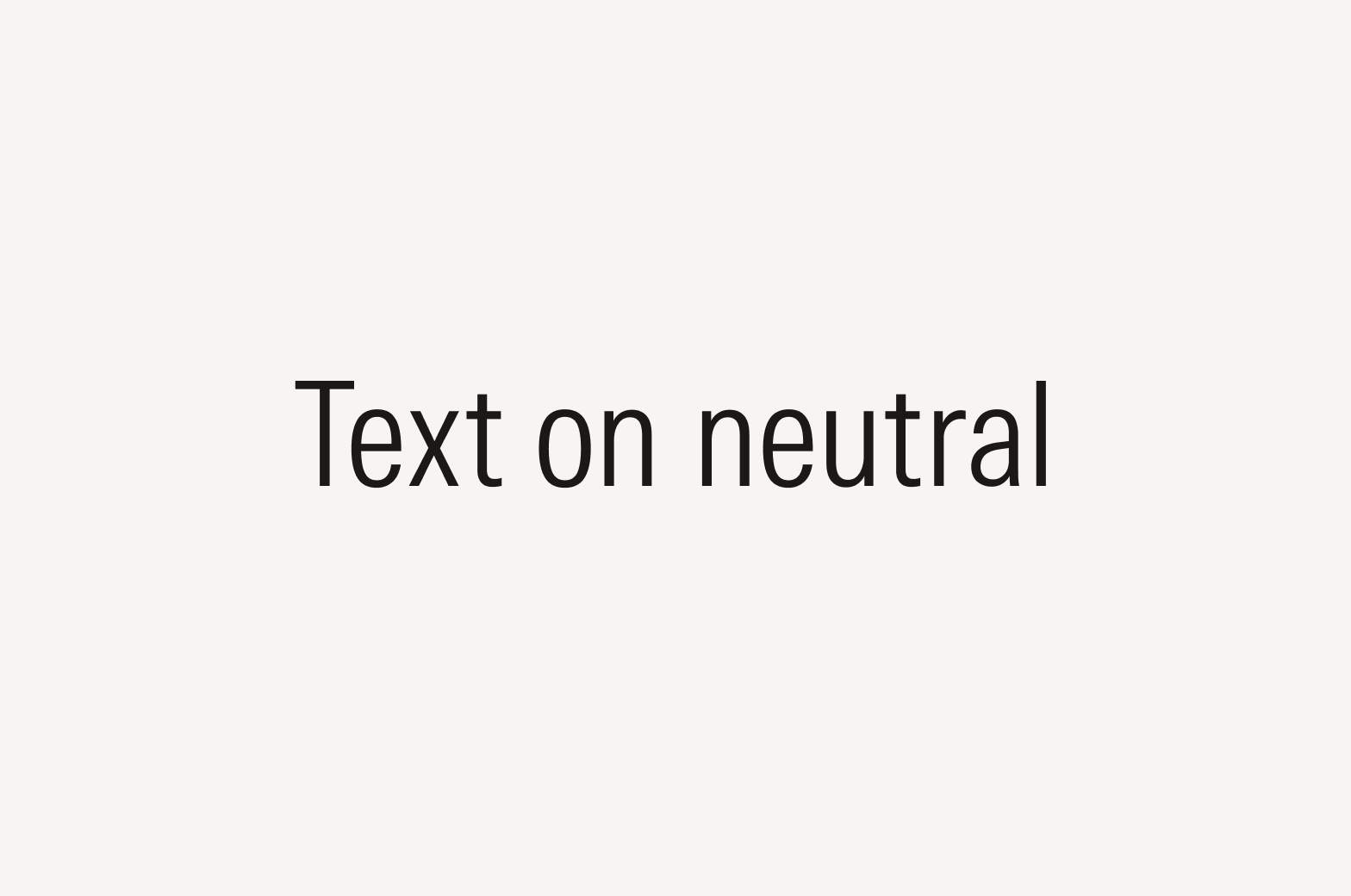
Do set dark neutral text on light neutral backgrounds.

Do set light neutral text on dark neutral backgrounds.
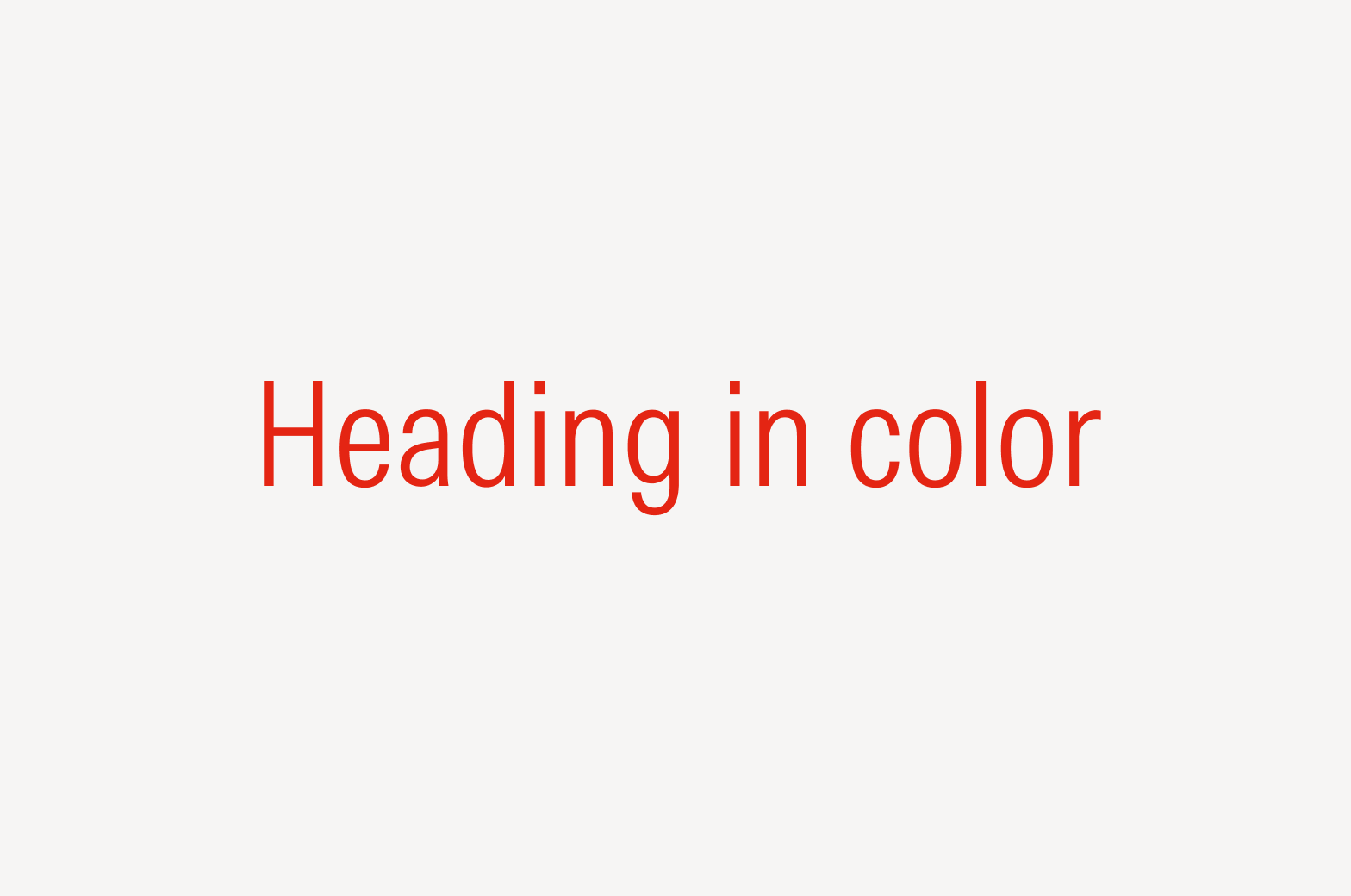
Consider setting large text like headings in a color for added emphasis.

Avoid setting text with very low contrast.
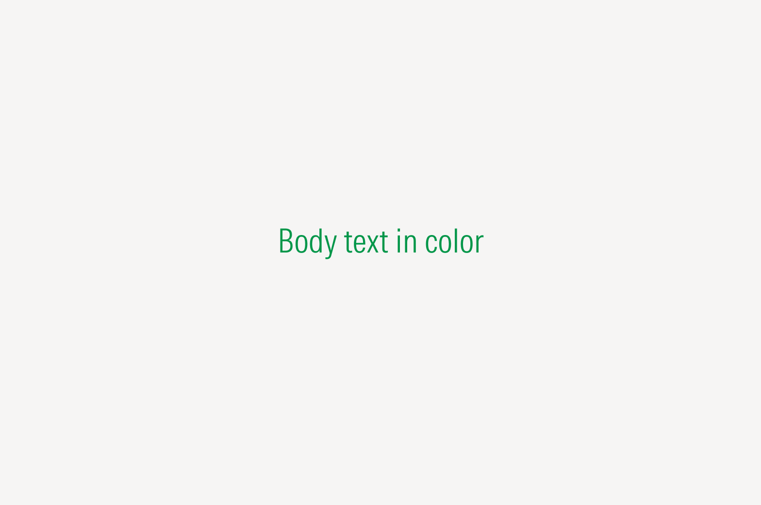
Avoid setting body text in a color on a light background, as it might impact legibility and accessibility.
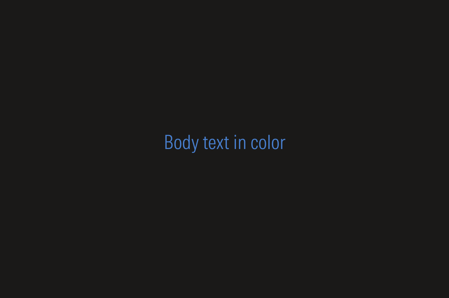
Avoid setting body text in a color on a dark background, as it might impact legibility and accessibility.
Don’t set text in a color for decorative purposes.
Symbol | MacOS Shortcut | Windows Shortcut |
|---|---|---|
Apostrophes (‘) (’) | Available on keyboard | Available on keyboard |
Quotes (“) (”) | Available on keyboard | Available on keyboard |
Primes (′) (″) | Shortcut not available | Shortcut not available |
Hyphen (-) | Available on keyboard | Available on keyboard |
En Dash (–) | [Option] + [-] | [Alt] + [0150] |
Em Dash (—) | [Shift] + [Option] + [-] | [Alt] + [0151] |
Ellipsis (…) | [Option] + [;] | [Alt] + [0133] |
Copyright symbol (©) | [Option] + [G] | [Alt] + [0169] |
Bullet point (•) | [Option] + [8] | [Alt] + [0149] |
Interpunct (·) | [Shift] + [Option] + [9] | [Alt] + [0183] |
Ampersand (&) | [Shift] + [7] | [Shift] + [7] |
Degree symbol (°) | [Shift] + [Option] + [8] | [Alt] + [0176] |
Multiplication symbol (×) | Shortcut not available | Shortcut not available |
Division symbol (÷) | [Option] + [/] | [Alt] + [0247] |