Histogram
Histograms plot the distribution of a single continuous variable within intervals, or bins. The height of each bar represents the frequency or count within each bin.
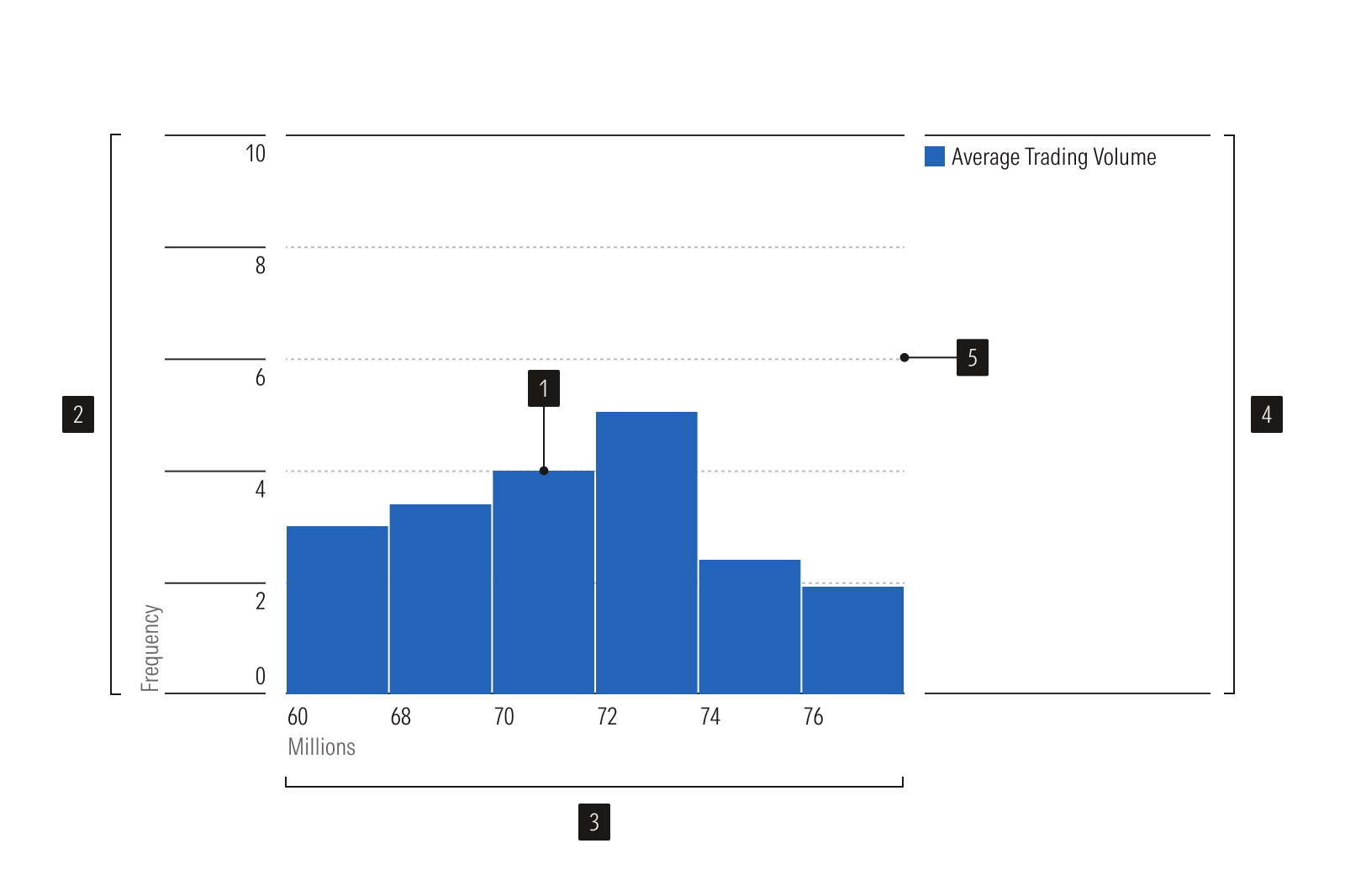
- Histogram plot is a bar chart that shows data distribution.
- Y-axis is a vertical axis that uses a numeric scale to show frequency or count.
- X-axis is a horizontal axis that uses a numeric range sliced into discrete intervals, or bins.
- Legend identifies the data represented on the chart.
- Gridlines help read values accurately.
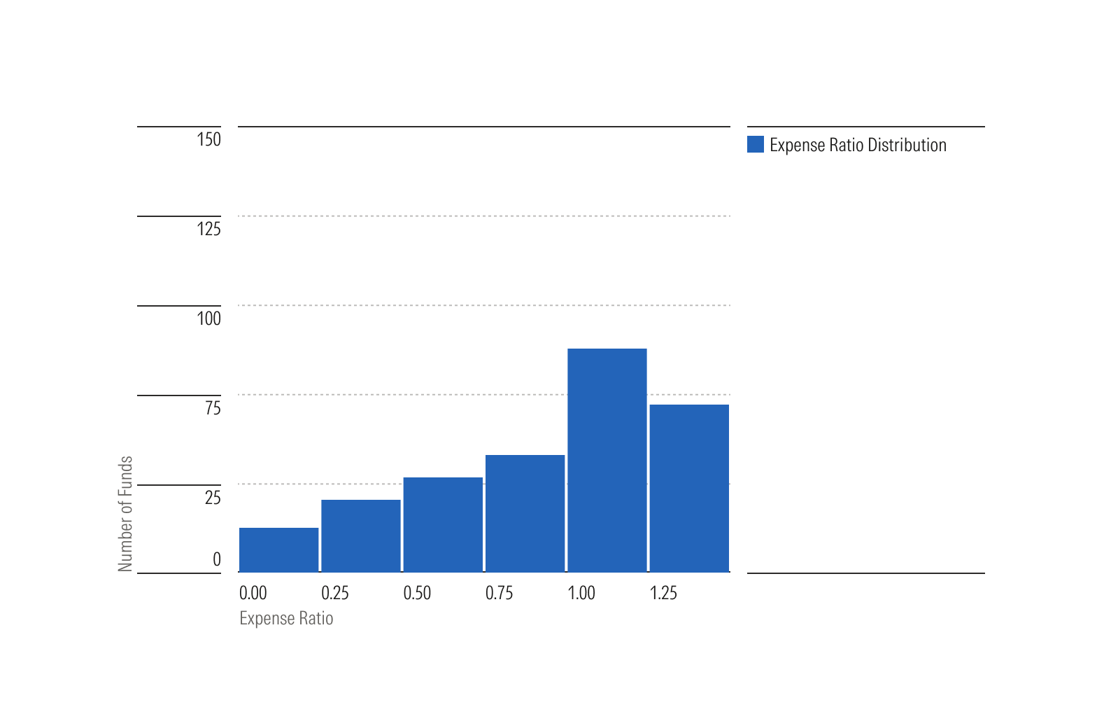
Linear scale shows distribution of continuous, numerical data.
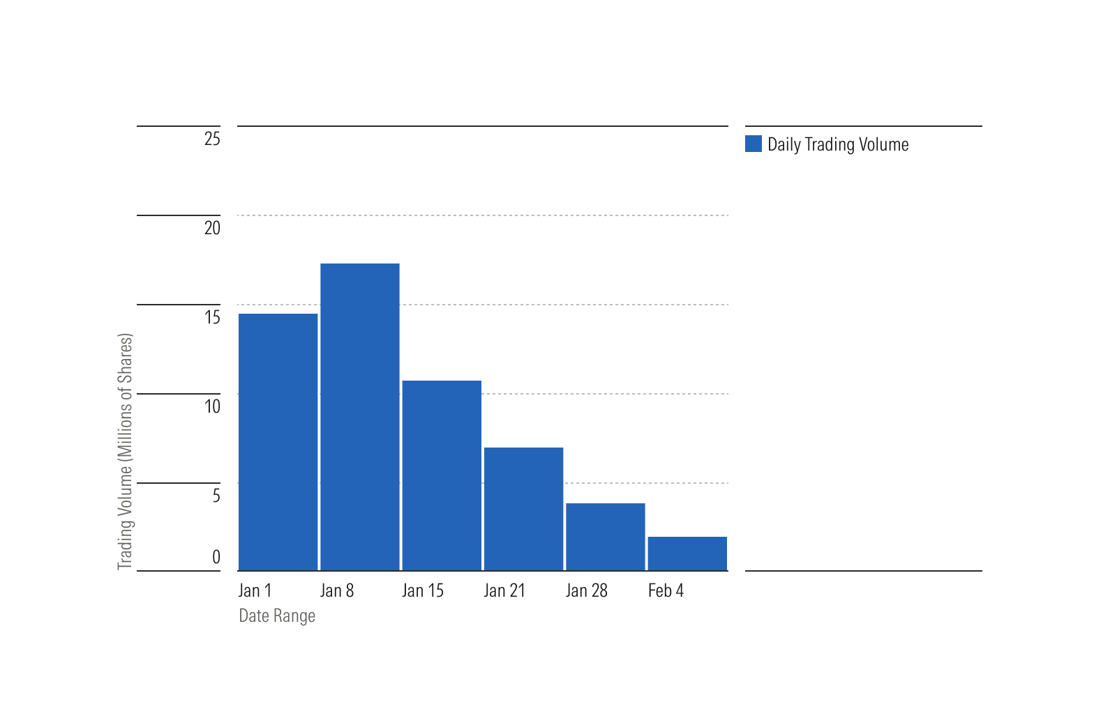
Time scale shows distribution of data over time periods.
Usage
Use when:
- Measuring continuous, quantitative data where frequency distribution can be analyzed such as height, distance, and time.
- Plotting the data can help identify a frequency distribution curve of a single variable.
Avoid when:
- A dataset is qualitative. Qualitative datasets are neither numerical nor countable and should use an alternative plot like a bar chart.
- Comparing multiple categories or multiple dimensions of values.
- Dataset consists of timestamps, where each data point represents a specific moment in time. Instead use a line or bar chart.
- Plotting discrete numerical values, such as shoe size. Use either a histogram or bar chart instead.
Best Practices
- Bars should always be touching each other, unless there are no data in an interval or bin, indicating the data is continuous across the x-axis.
- Use equal bin sizes for easier interpretation of the data.
- Since the chart plots only one series, consider omitting the legend and including a descriptive title instead.