Bar Horizontal
Horizontal bar charts compare values across categories. They can be used in place of a vertical bar when there are too many bars to fit in a typical display without scrolling, or when bar labels are too long to display clearly along the x-axis.
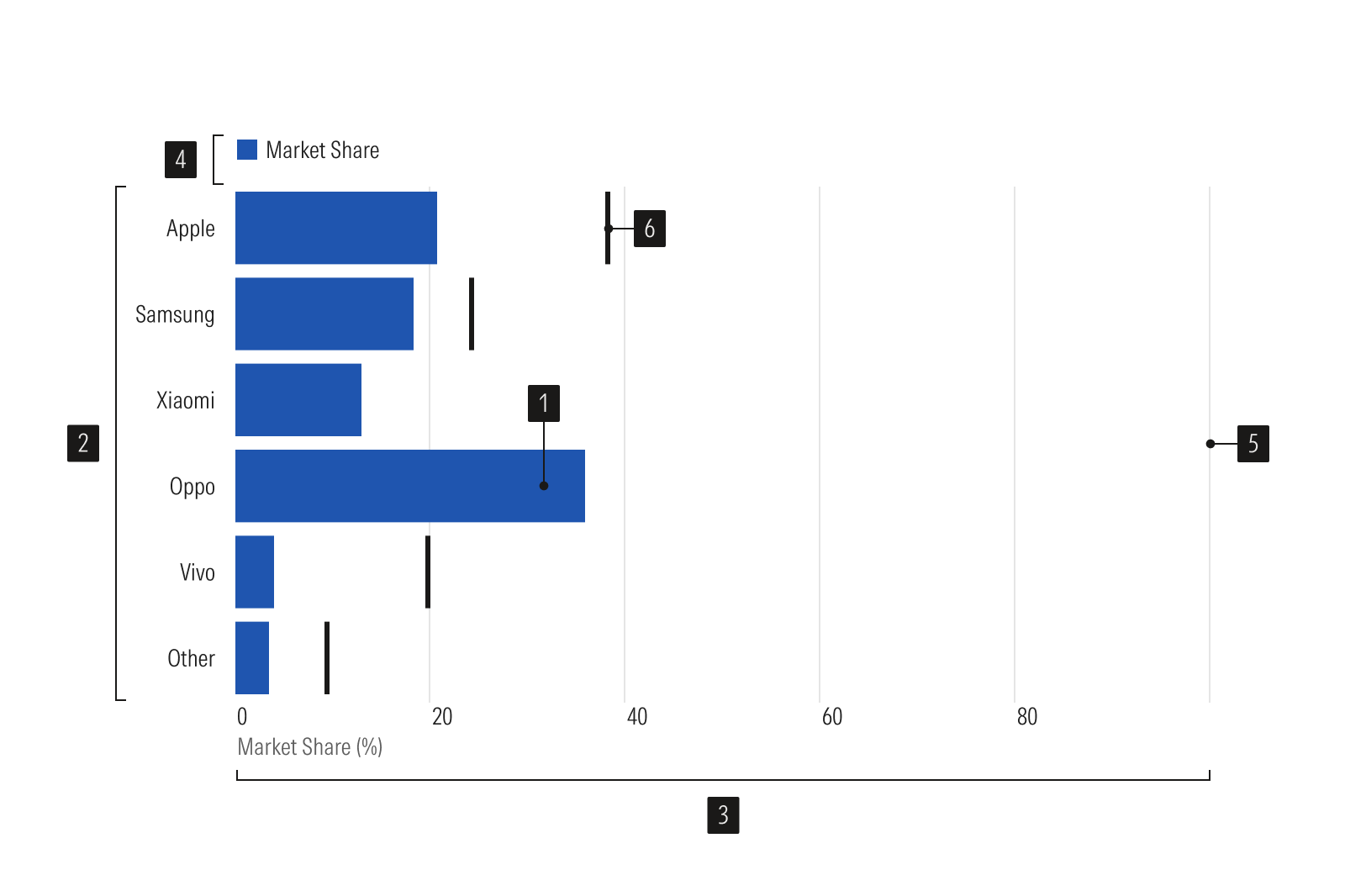
Horizontal bar plots are representing data values.
Y-axis is a vertical axis, uses a categorical scale.
X-axis is a horizontal axis, uses a numeric scale.
Legend identifies data categories.
Gridlines help read values accurately.
Benchmark is a standard point of reference.
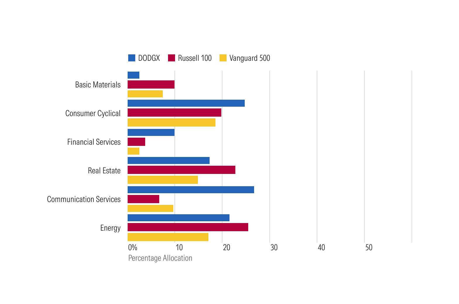
Grouped bar charts compare items within groups defined by a second overlay variable, such as annual revenues by market segment.
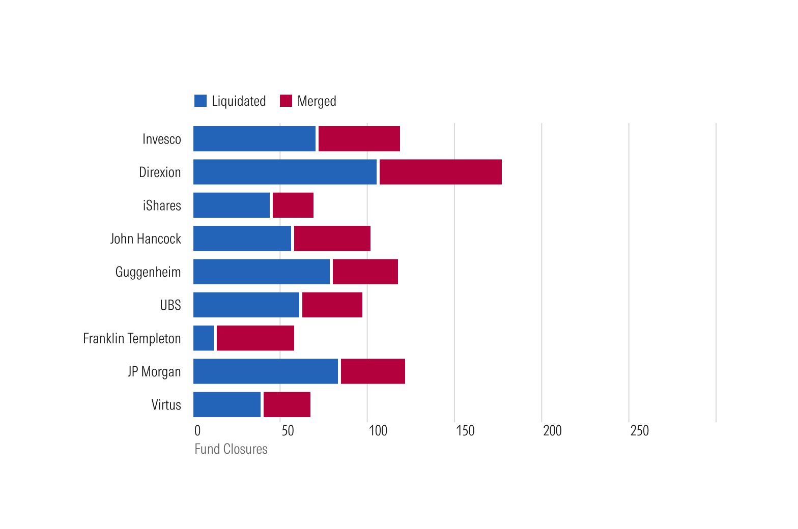
Stacked bar charts function similarly to grouped bar charts. While they make it easier to compare the total length of each bar, it's more difficult to compare the groups within each bar, especially if some groups are very small relative to others.
Usage
Use when:
- Working with long x-axis labels.
- Pairing with a data table.
Avoid when:
- Representing trends. Instead, use a line plot.
- Comparing information over time. Instead, use a vertical bar plot or line plot.
- Comparing proportions that total to 100%. Instead, use a donut plot, area plot, or stacked bar plot.
Best Practices
- Use vertical gray bands to align bars with their corresponding x-axis labels when there are negative values within a chart.
- The horizontal axis should start at zero, or should span zero if plotting both positive and negative values. Bars should be anchored at zero, whether positive or negative.
Usage
Packages
Technical documentation and usage examples are available in Storybook.
Package | Storybook |
|---|---|
@mc/bar-horizontal | |
@mc/bar-horizontal-grouped | |
@mc/bar-horizontal-stacked |