Donut
Donut charts show the proportional relationship of parts to their whole. They may display additional information in the open center. Donut charts are popular due to their simplicity, and ideal for displaying data sets with only a few categories.
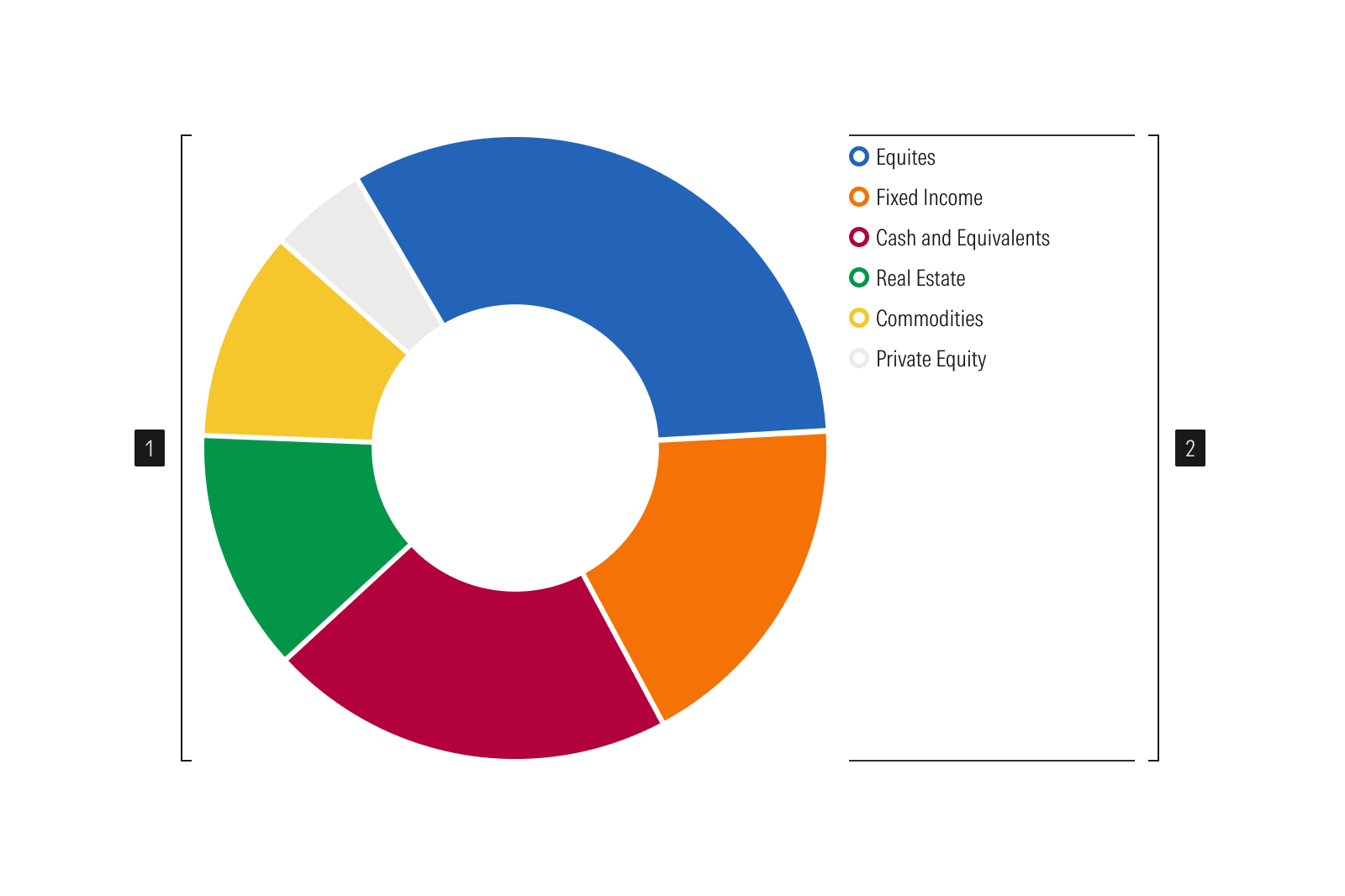
- Donut plot is a circular plot showing proportions.
- Legend identifies data categories.
Usage
Use when:
Showing how an item is composed of various parts, with all the parts totaling 100%.
Avoid when:
- Representing data that includes both positive and negative values.
- Representing percentages that may not total 100%. Instead, use a horizontal bar plot.
- There are multiple small segments that make comparison difficult. Use a bar chart instead.
Best Practices
- Build clockwise from the top, in descending order starting with the largest category.
- Use as few segments as possible to retain readability. Consider combining multiple small segments into an “other” category.
- Include annotations since segments of similar proportions are difficult to distinguish.