Line
Line charts show changes in value across time or another variable. Line charts are particularly useful for highlighting trends, such as changes in market value over time.
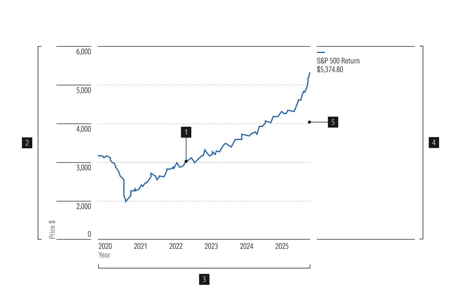
- Line connects a series of data points.
- Y-axis is a vertical axis that uses a numeric scale.
- X-axis is a horizontal axis that uses a categorical or time scale.
- Legend identifies each data series.
- Gridlines help read values accurately.
Usage
Use when:
- Representing items in a sequence, such as changes over time.
- Emphasizing trends rather than quantities. For example, when the change in price for a given security is more important than its overall value.
Avoid when:
- Emphasizing quantities rather than trends. Instead, use an area chart.
- Representing information that is intended for comparison, but not for comparing trends over time. Instead, use a vertical bar chart.
Best Practices
- Don’t show too many data sets, which clutters the chart and makes the information difficult to understand.
- Don’t smooth out lines, since doing so may be misleading.
- Unlike a bar chart or histogram, you don’t always need to include a zero baseline. However, it's best to start with a zero baseline before adjusting your axis. Focusing on the data is more important than showing the zero point.
Usage
Packages
Technical documentation and usage examples are available in Storybook.
Package | Storybook |
|---|---|
@mc/line-linear | |
@mc/line-band | |
@mc/time-line |