Bubble
Bubble plots show the distribution of points relative to two variables, weighted by a third variable that defines the size of each bubble. Bubble plots show relationships between data series. Optionally, bubbles can be grouped by another variable to add context and depth.
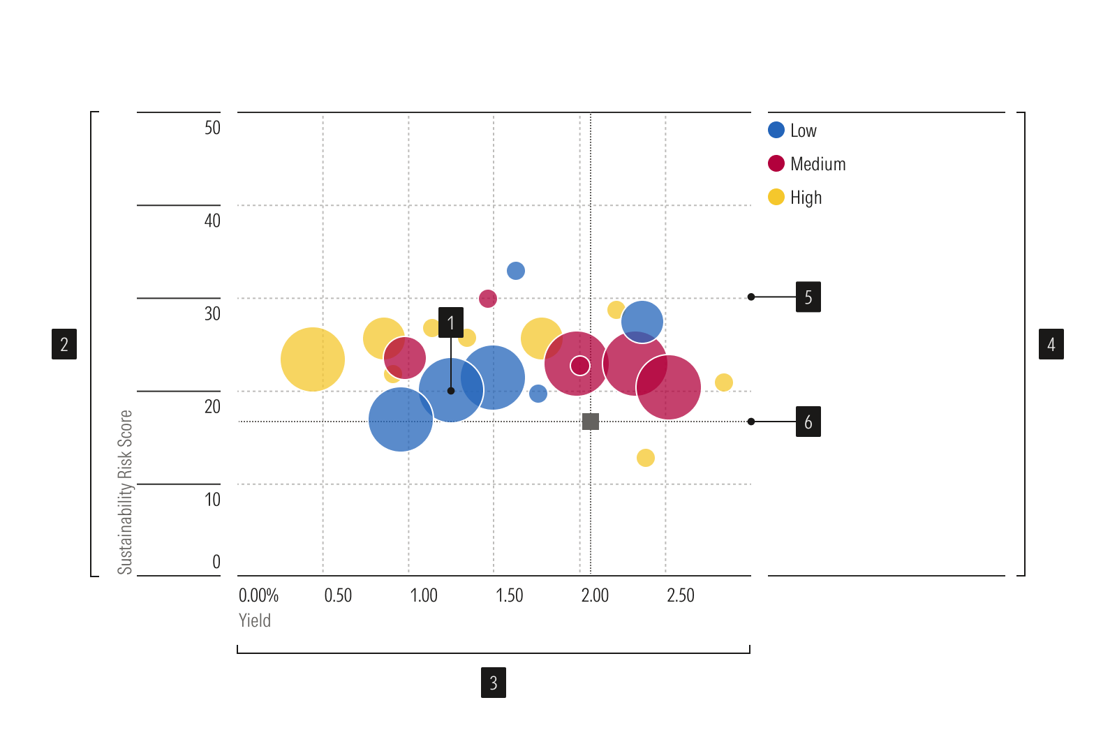
- Bubble plot dots represent data points
Y-axis is a vertical axis that uses a numeric scale.
X-axis is a horizontal axis that uses a numeric scale.
Legend identifies each data point or group.
Gridlines help read values accurately.
- Benchmark is a standard point of reference.
Usage
Use when:
Plotting the distribution of items relative to three variables, where the third variable determines the size of each point; for example, plot Return %, Standard Deviation, and Portfolio Weight.
Avoid when:
- Displaying the distribution of items relative to only two axis variables. Instead, use a scatter plot.
- Showing the statistical correlations among a set of items. Instead, use a correlation matrix.
- When there are too many bubbles overlapping. Use a bar chart instead, or consider combining data points into aggregate categories.
Best Practices
- Use transparency in a dense chart to make sure all bubbles are visible.
- Use colors that are easy to distinguish.
- Scale bubbles based on area, rather than diameter or radius, to more accurately reflect the underlying data.
- Include a title, caption, or legend to identify what bubble size represents.