Bar Vertical
Vertical bar charts compare quantities within categories, or similar quantities over time. The height of each bar shows the value for each category, making it easy to compare them visually.
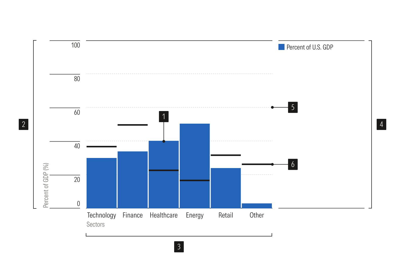
- Vertical bar plots are vertical bars representing data values.
- Y-axis is a vertical axis that uses a numeric scale.
- X-axis is a horizontal axis that uses a categorical or time scale.
- Legend identifies data categories.
- Gridlines help read values accurately.
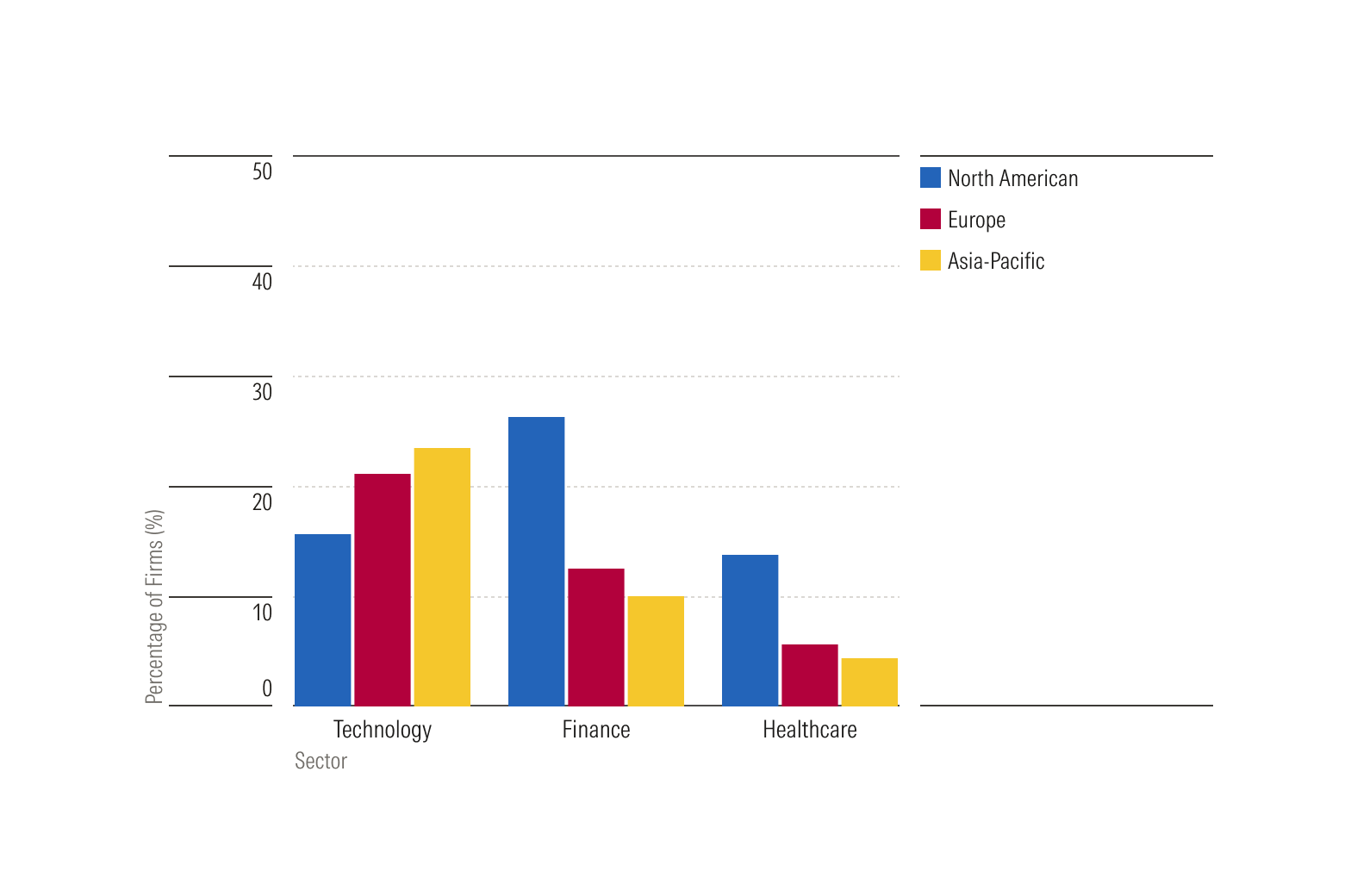
Grouped (or cluster) bar charts compare values across two or more data categories.
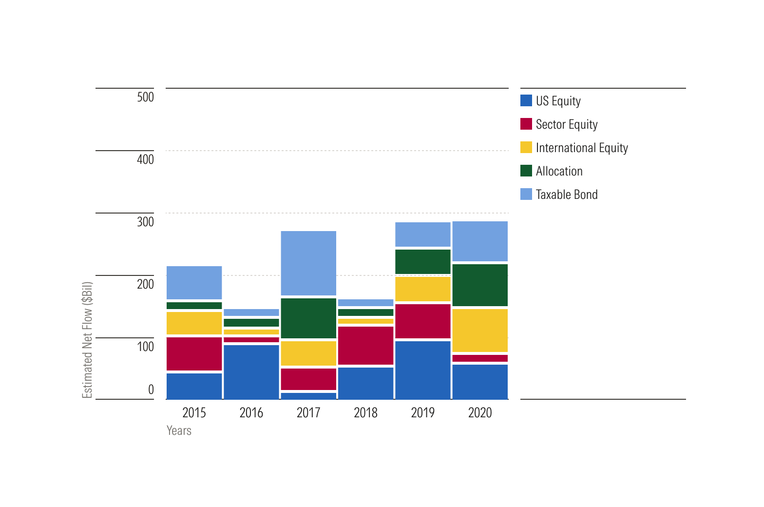
Stacked bar charts compare items with groups defined by a second overlay variable. While they make it easier to compare the total height of each bar, it's more difficult to compare the groups within each bar, especially if some groups are very small relative to others.
Usage
Use when:
- Comparing quanities within categories, such as revenues by sector.
- Comparing quantities over time, such as revenues by quarter.
Avoid when:
- Representing trends. Instead, use a line plot.
- Comparing data with long x-axis labels. Instead, use a bar plot horizontal.
- Comparing proportions that total 100%. Instead, use a donut plot.
- Comparing many categories; a horizontal bar plot may be a better choice, particularly if data are sorted so that largest bars appear at the top of the chart.