Scatter Plot
Scatter plots show the distribution of points relative to two variables, highlighting relationships between data series. Points can also be grouped by another variable to add context and depth.
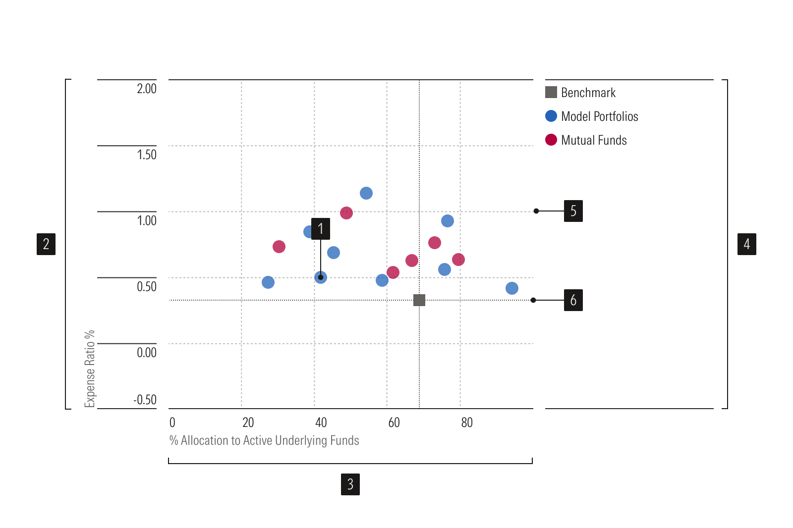
- Scatter plot dots represent data points.
- Y-axis is a vertical axis that uses a numeric scale.
- X-axis is a horizontal axis that uses a numeric scale.
- Legend identifies data points or groups.
- Gridlines help read values accurately.
- Benchmark is a standard point of reference.
Usage
Use when:
Displaying the distribution of a set of items relative to two axis variables.
Avoid when:
Displaying the distribution of a set of items relative to three variables, one of which is expressed through the size of the plotted item. Instead, use a bubble chart.
Showing the statistical correlations among a set of items. Instead, use a correlation matrix.
Best Practices
- When the color of the points in a scatter plot are mapped to a ratio scale, use a continuous sequential color palette. Include a legend to help users identify the meaning of the colors.
- Use color to help visualize patterns, not to label each data point.
- Show all the data points, unless some are truly not needed and removing them doesn’t degrade the integrity of the chart.
- Don’t use different shapes to distinguish between points.