Box Plot
Box plots show the distribution of a dataset by summarizing it into five key values: the minimum, lower quartile, median, upper quartile, and maximum. The resulting shape makes it easy to see how data is spread and where it clusters, giving investors a quick, clear read on variability and outliers within a dataset.
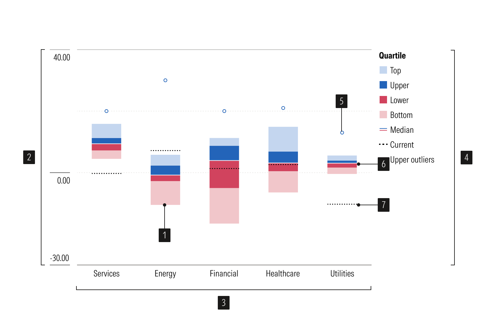
- Bar plots represent top and bottom data values.
- Y-axis is a vertical axis that uses a numeric scale.
- X-axis is a horizontal axis that uses a categorical scale.
- Legend identifies each data series.
- Outlier identifies values that fall far from the data.
- Interquartile range show how spread out the typical values are.
- Benchmark is a point of reference.
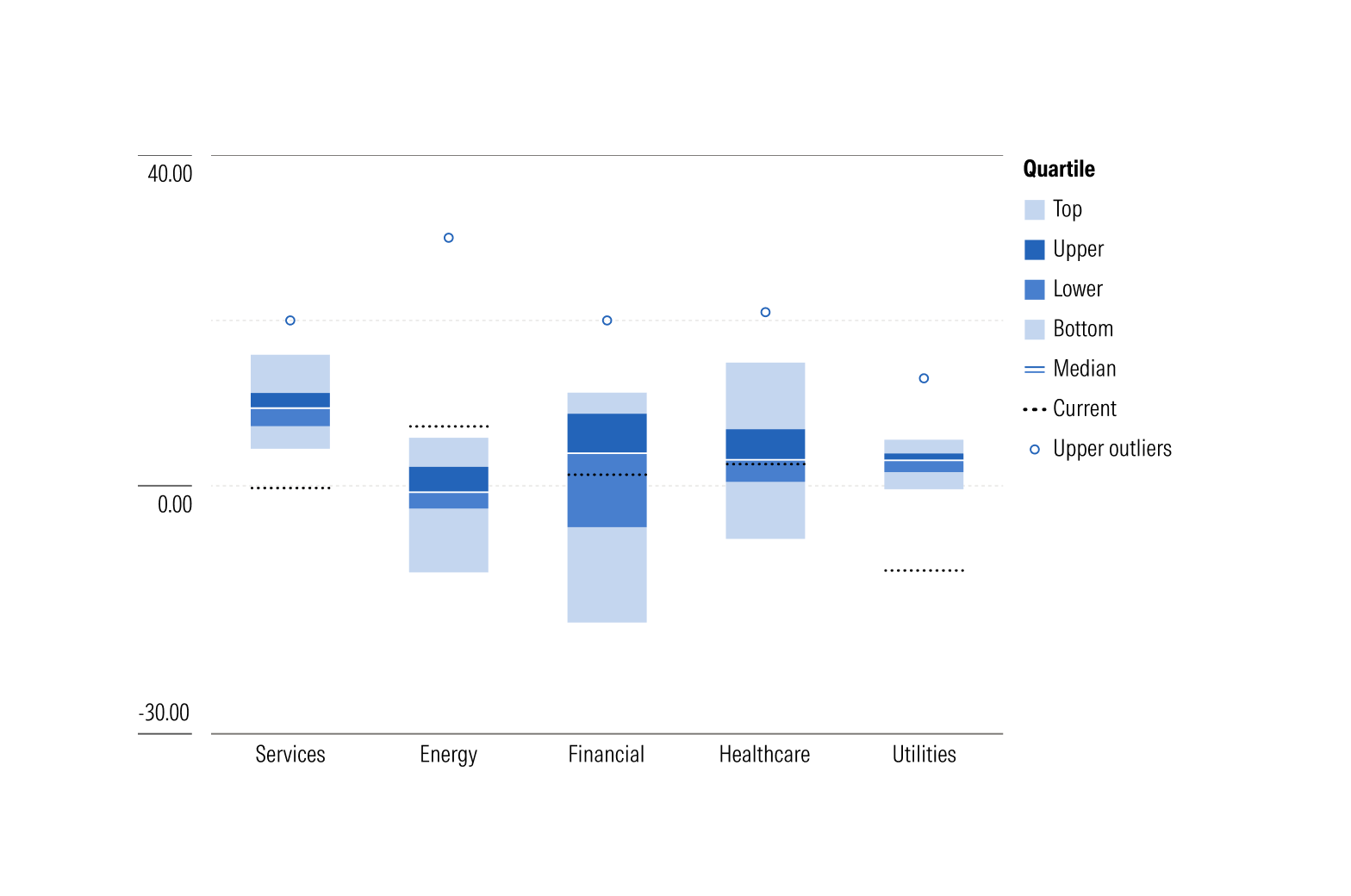
Vertical box plot is best used for data with few categories, short labels, or left-to-right ordering.
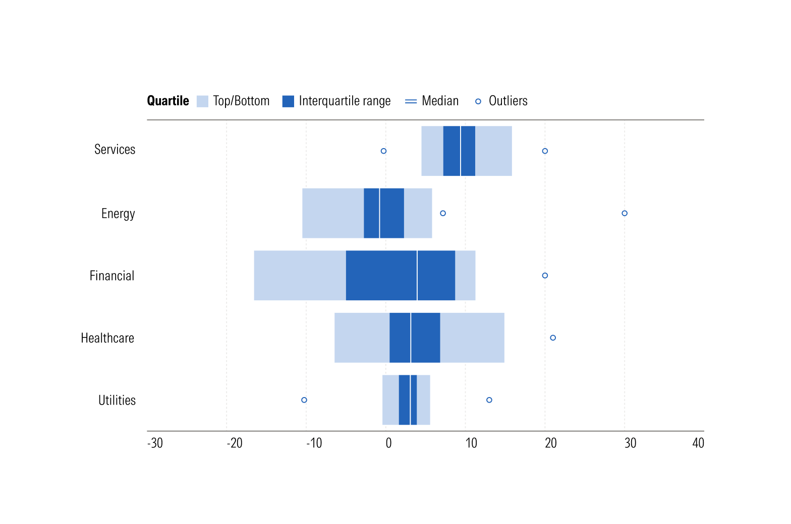
Horizontal box plot is best used for data with many categories, long labels, or top-to-bottom ordering.
Usage
Use when:
- Comparing the distribution of a continuous variable across two or more groups.
- Spread, skewness, or outliers tell you more than a single average would.
Avoid when:
- Plotting a single distribution where shape matters, such as identifying two peaks in the data. Use a histogram.
- Showing exact totals or comparing precise quantities. Use a vertical bar chart.
Best Practices
- Label the median, quartiles, and both axes clearly.
- Mark outliers as distinct points.
- Use a legend and a consistent color when comparing multiple groups.
- Sort groups by median when their order is arbitrary, since this makes patterns easier to spot.
- Limit the number of compared categories along a single axis to improve readability.
Usage
Packages
Technical documentation and usage examples are available in Storybook.
Package | Storybook |
|---|---|
@mc/box-plot | |
@mc/box-plot-horizontal |