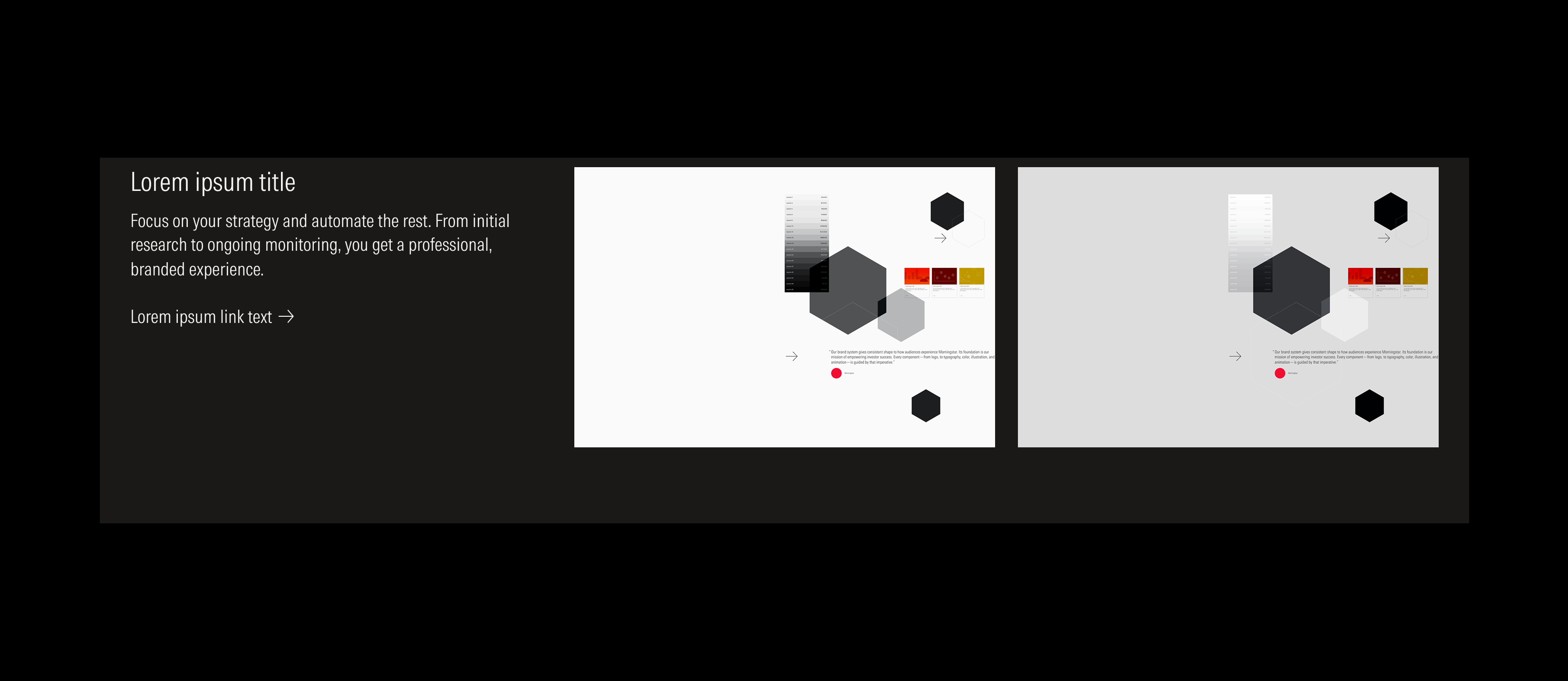
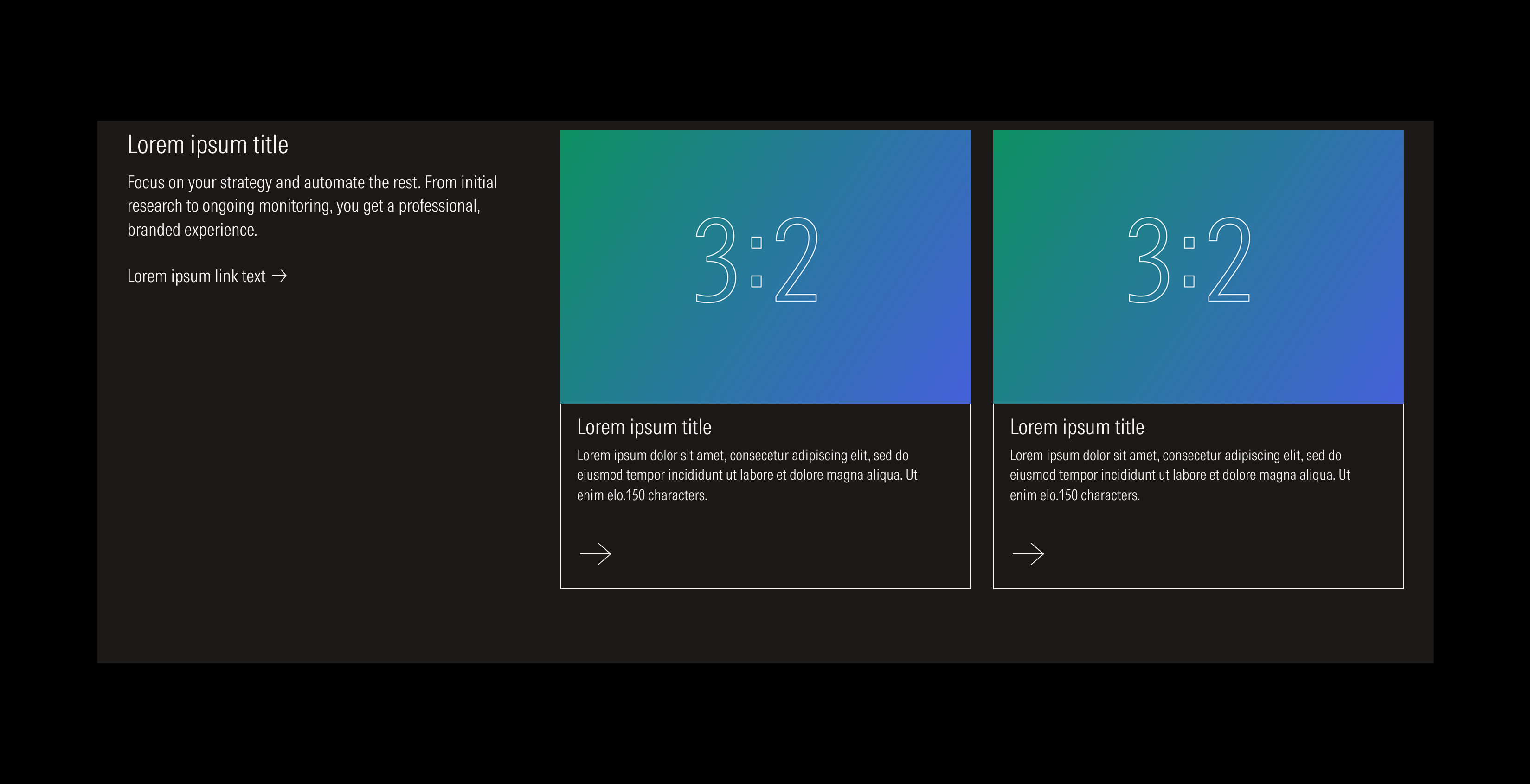
Layout Section
Layout sections facilitate the grouping of a text block with a content slot (which can hold images, cards, or videos) and its behavior on the breakpoints we manage.
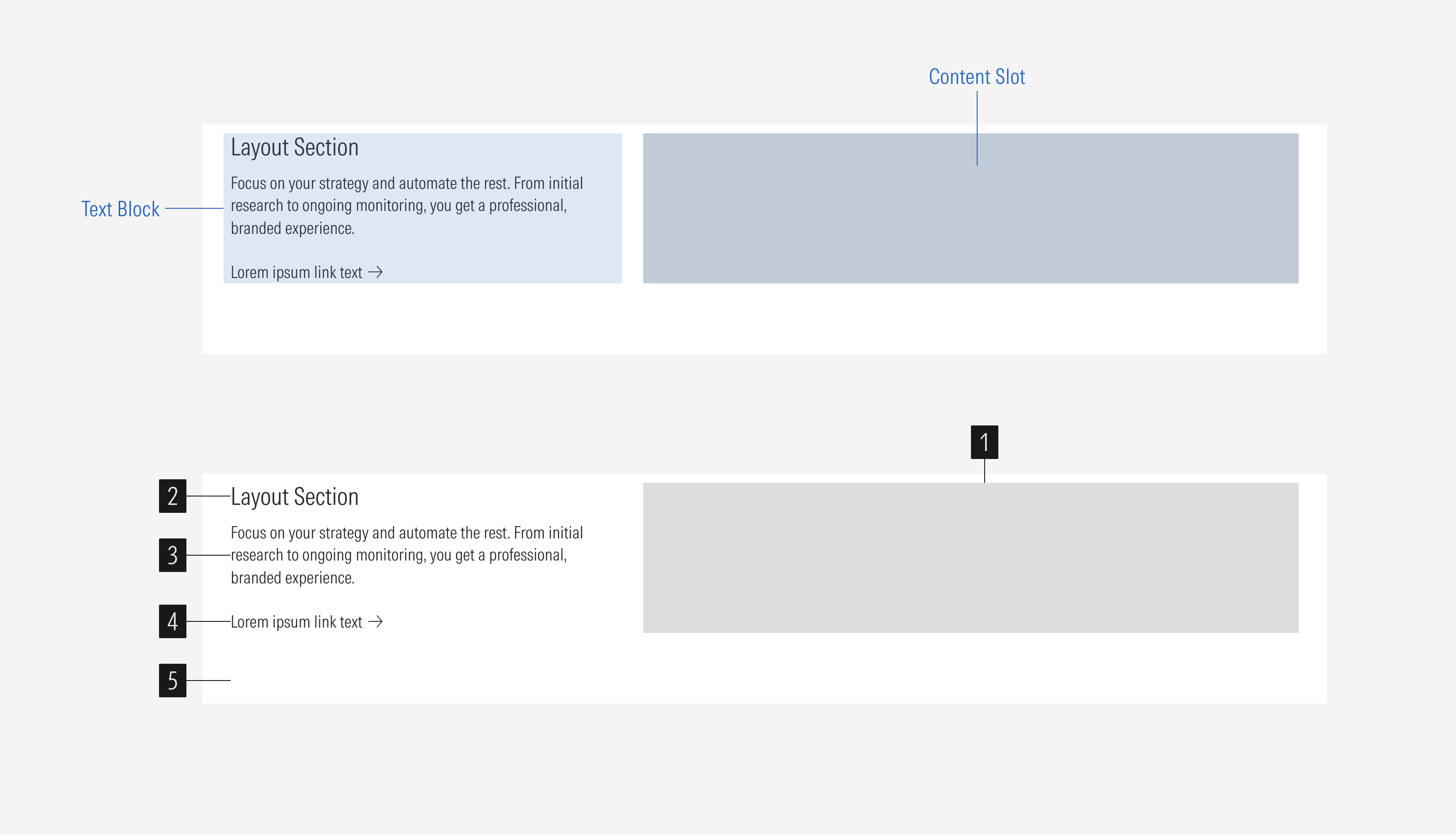
Content slot is a single element or group of elements that composes the content of the layout section and relates to the content of the text block. It could include one or more images, cards, or one video. If there are multiple images or cards, there could be from one to four rows that will adjust according to the view-port.
- Title sets the topic for the layout section.
- Body gives more context. It is optional.
- CTA enforces the desired user action. Users can click to see more about the content presented. It is optional.
- Background defines the space of the layout section.
Usage
When to Use
Use the layout section to showcase content with a group of cards, images, a video, or just the text block. The layout section establishes a consistent behavior, standard spacing and sizing between them.
When Not to Use
Don’t use a layout section when you need to display a single card, or when you need to present and advertise content that differs from what is presented on the page. Use one of the card types or a flexible module instead.
Variation | Purpose | Title | Body | CTA | Columns | Rows |
|---|---|---|---|---|---|---|
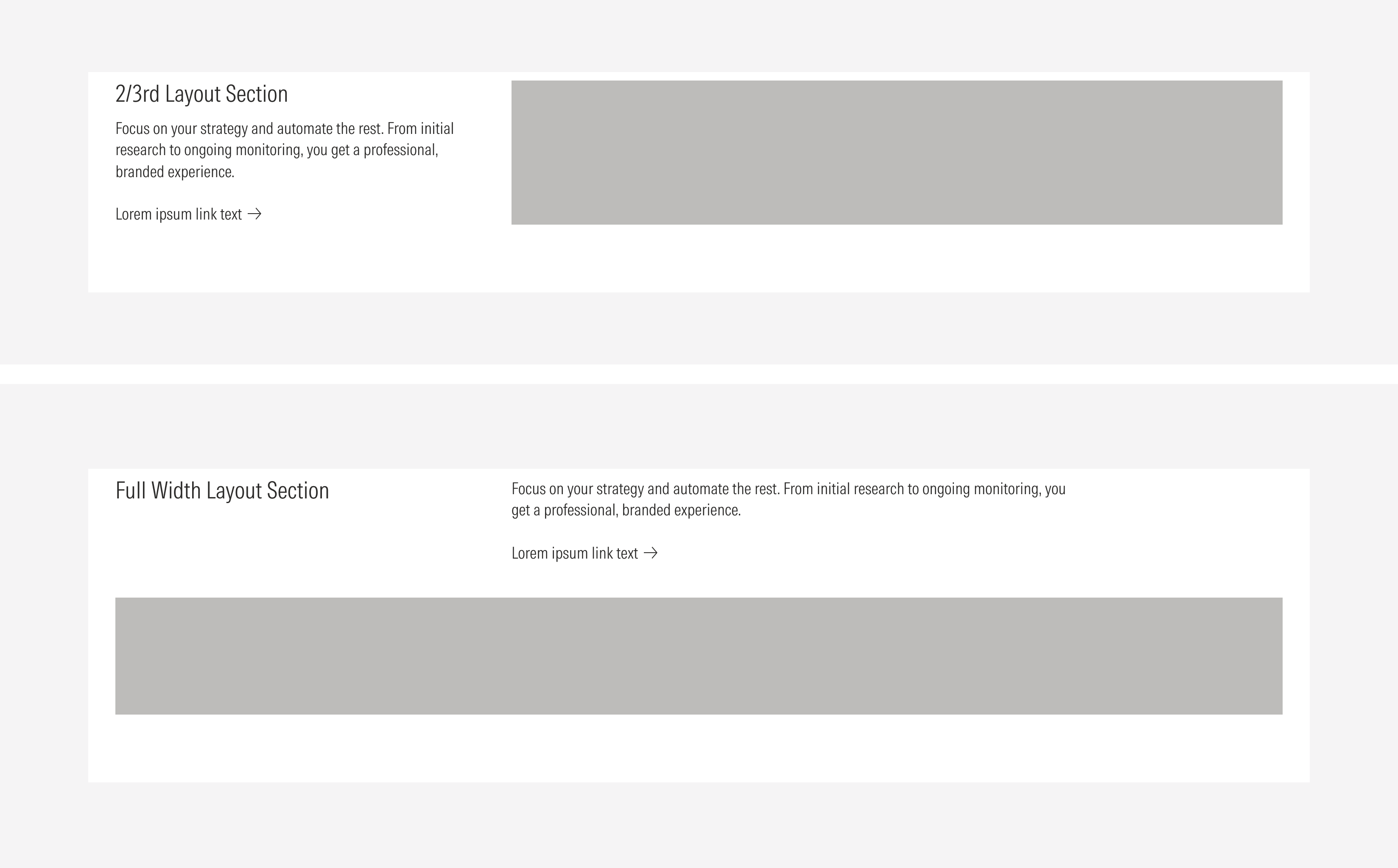
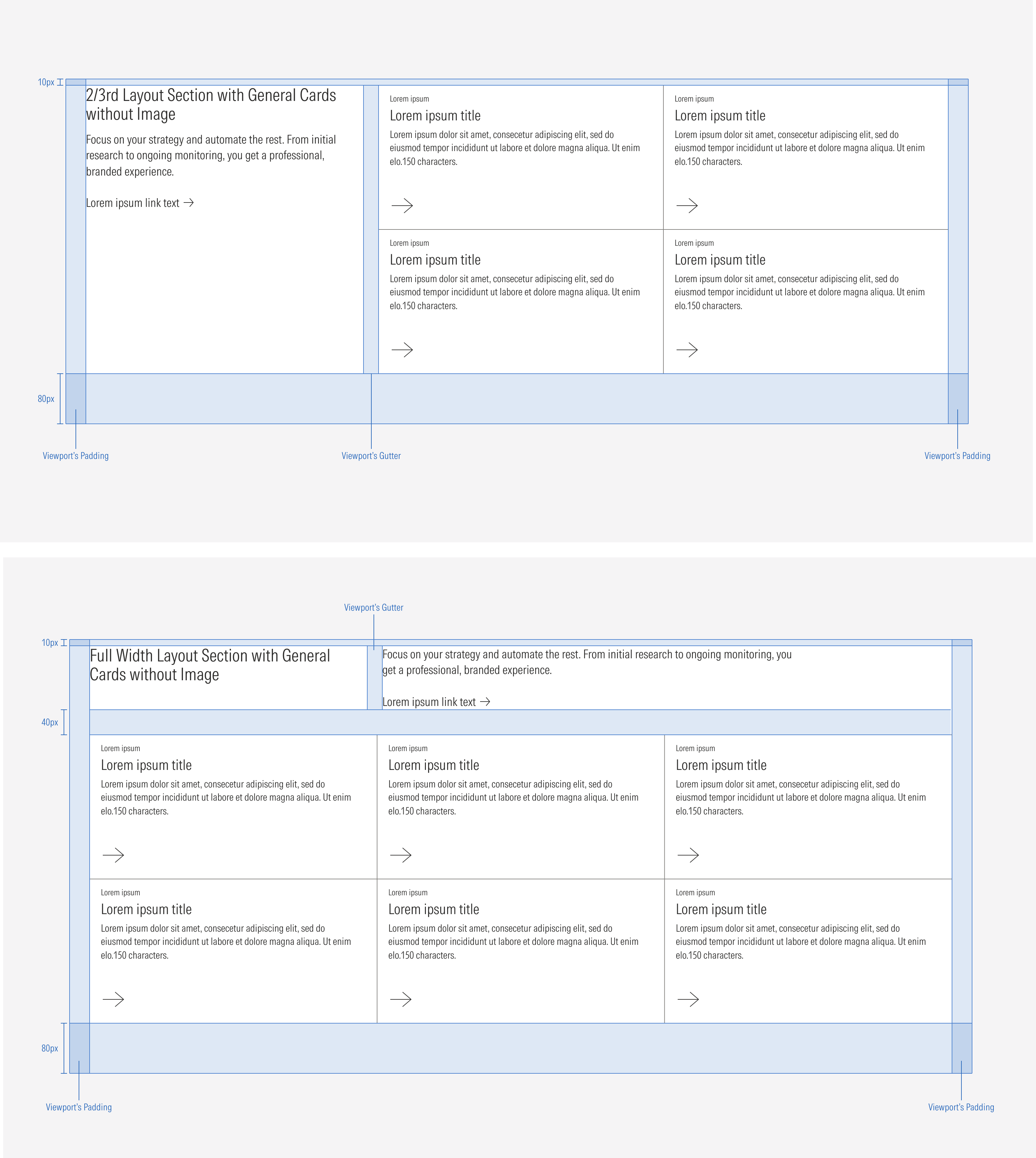
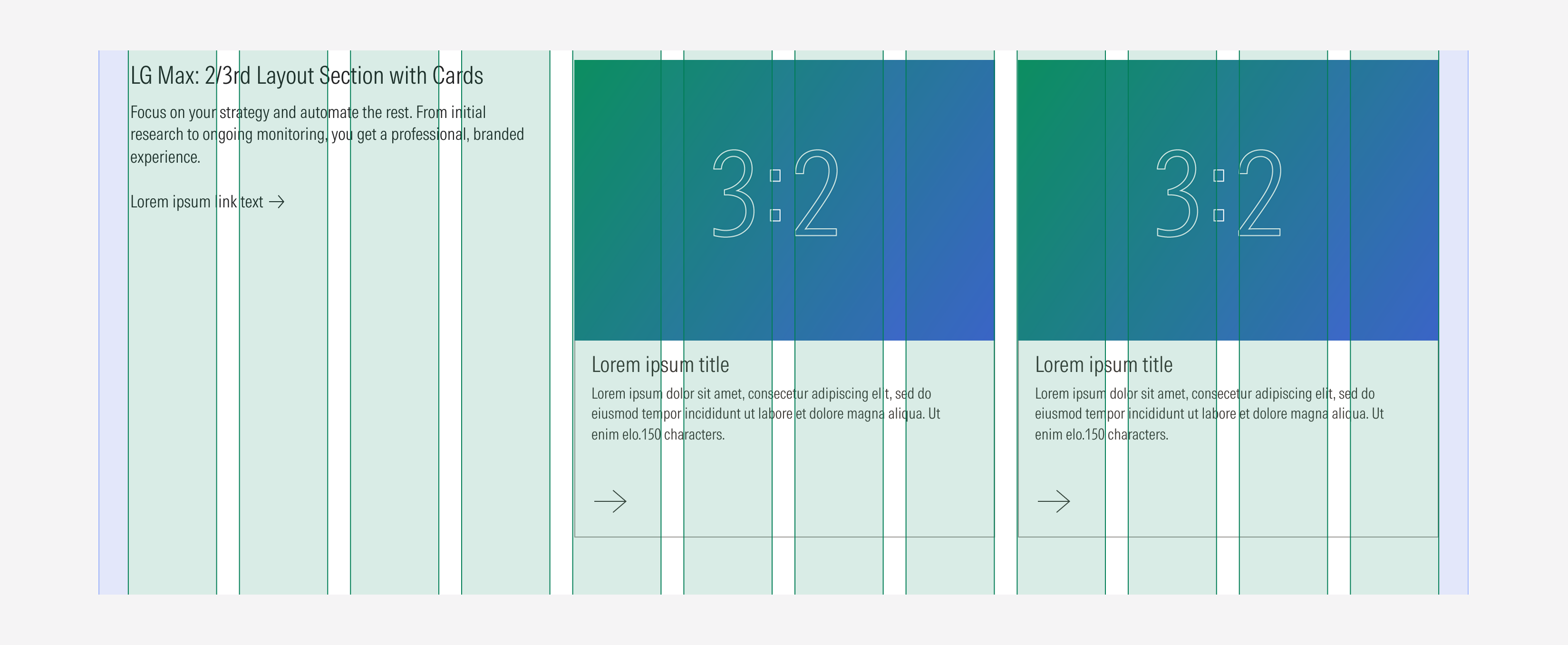
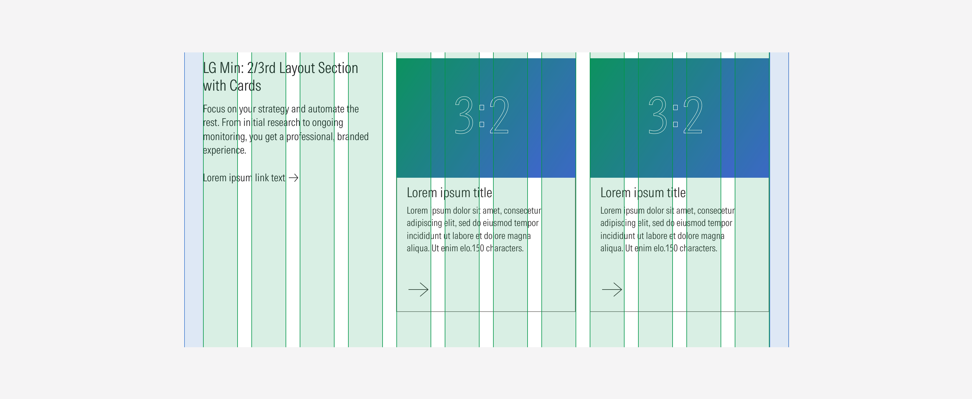
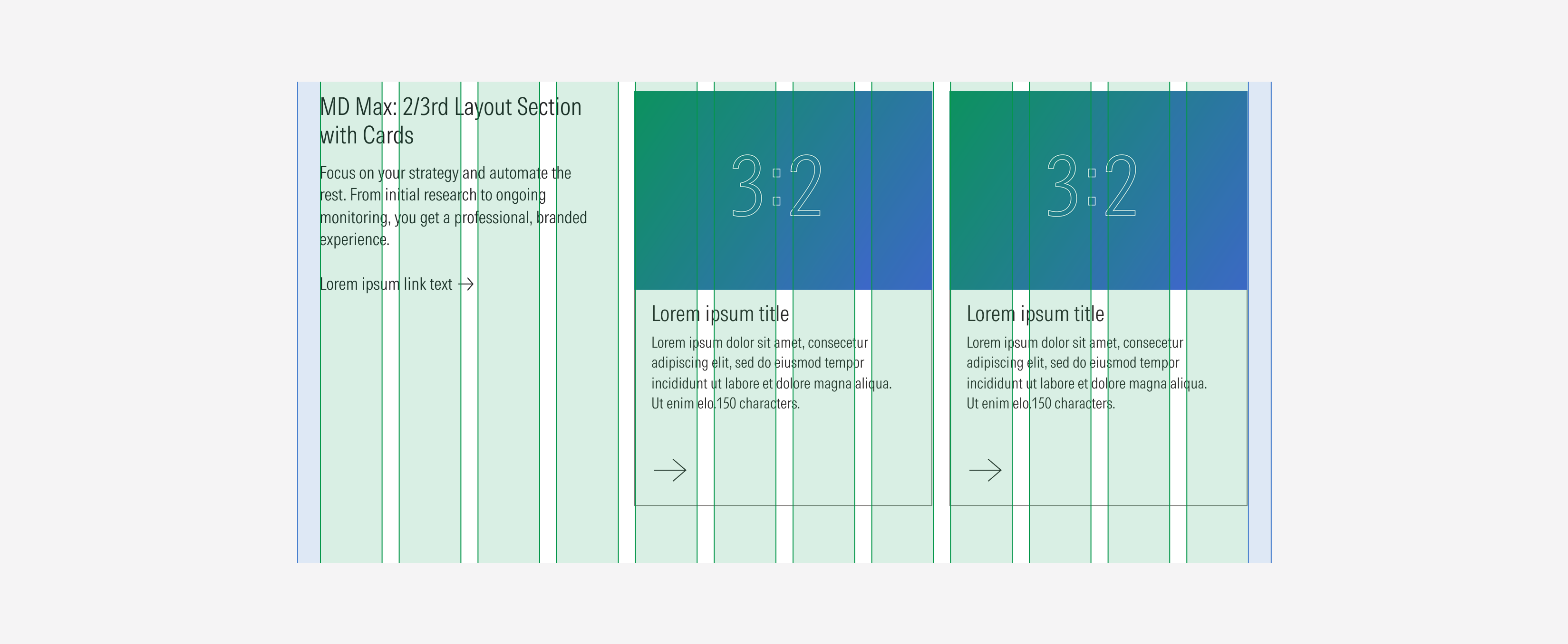
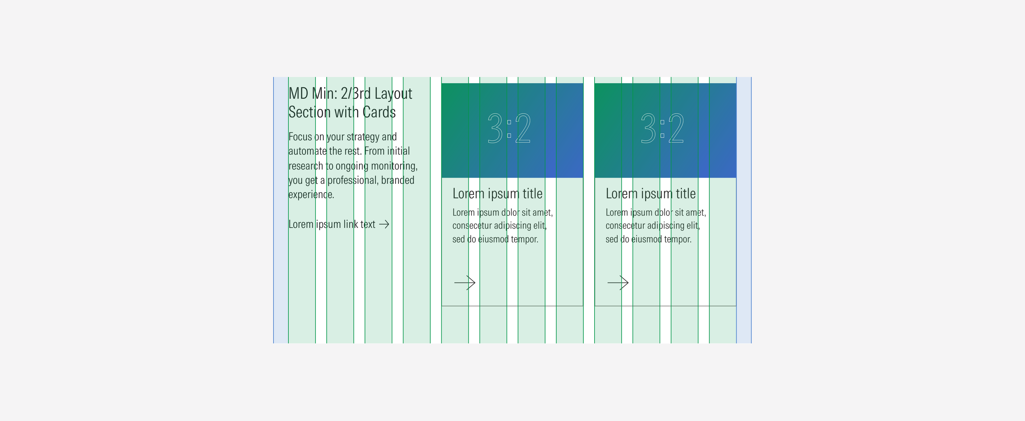
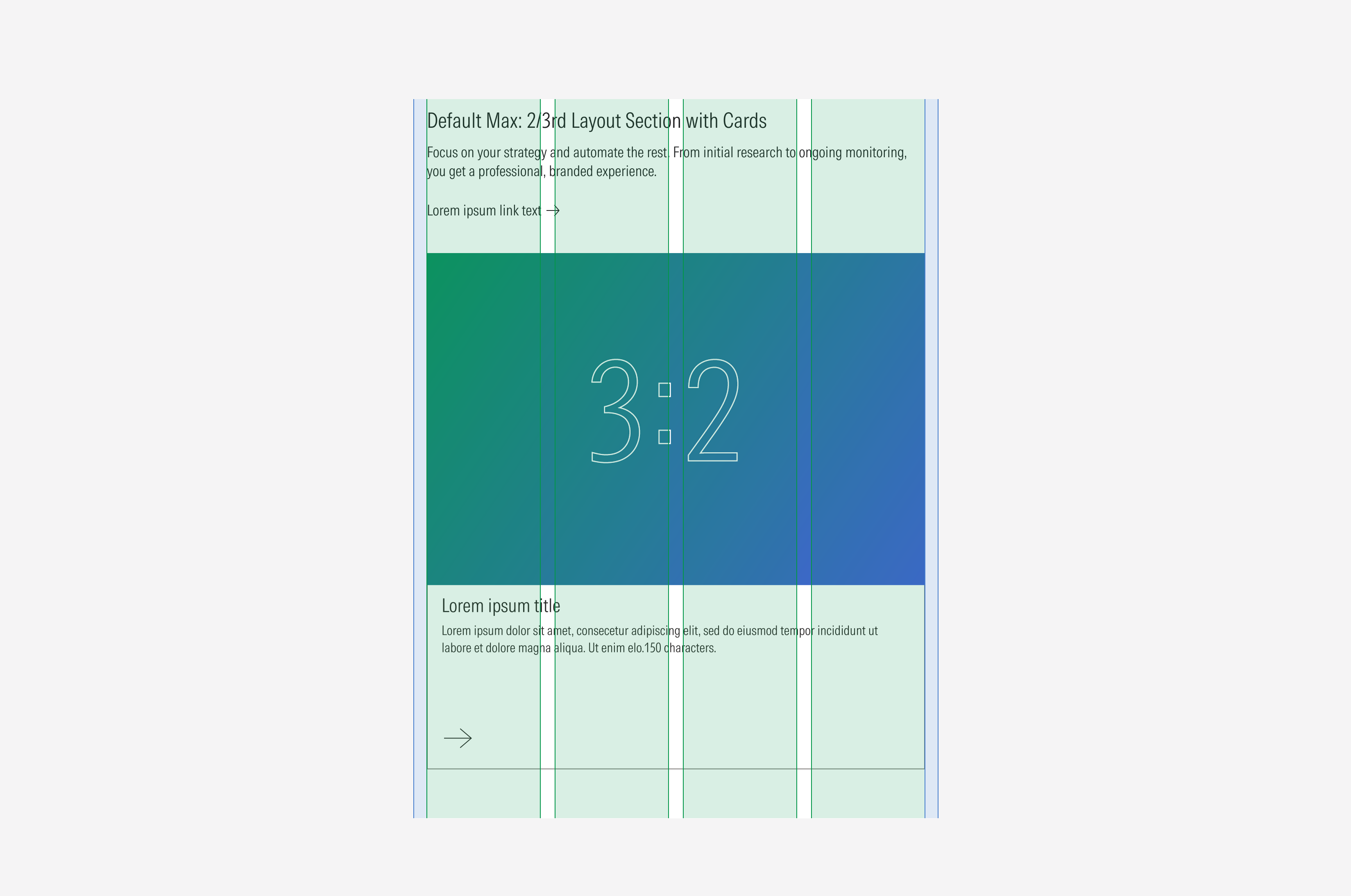
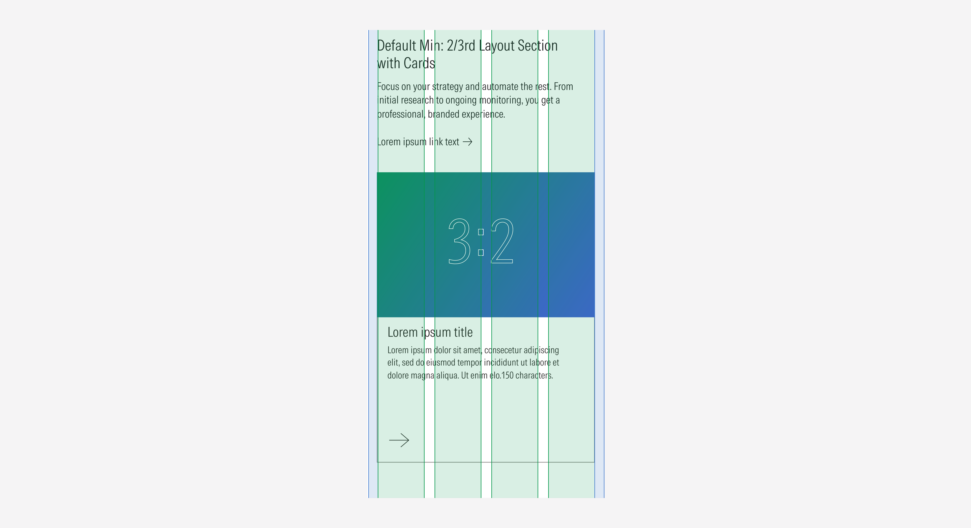
2/3rd layout section | Use to display content with a text block, to give more context. This variation gives the same level of importance to the text block and the content. Also use this option to give “white” space to the layout. | With title | With body, no body | With CTA, no CTA | Cards: 1, 2, 3, 4 Images: 1, 2, 3, 4 Video: 1 | Cards: 1, 2, 3, 4, 5, 6 Images: 1, 2, 3, 4, 5, 6 Video: 1 |
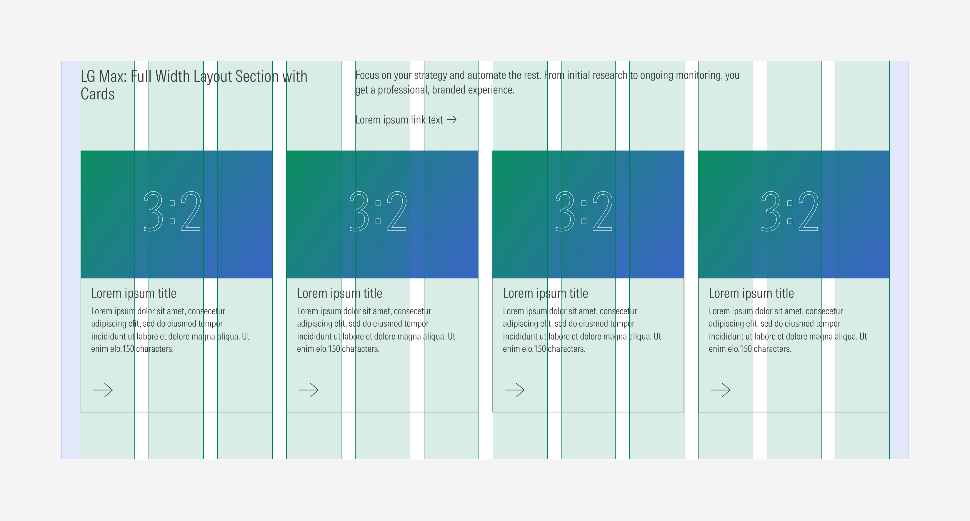
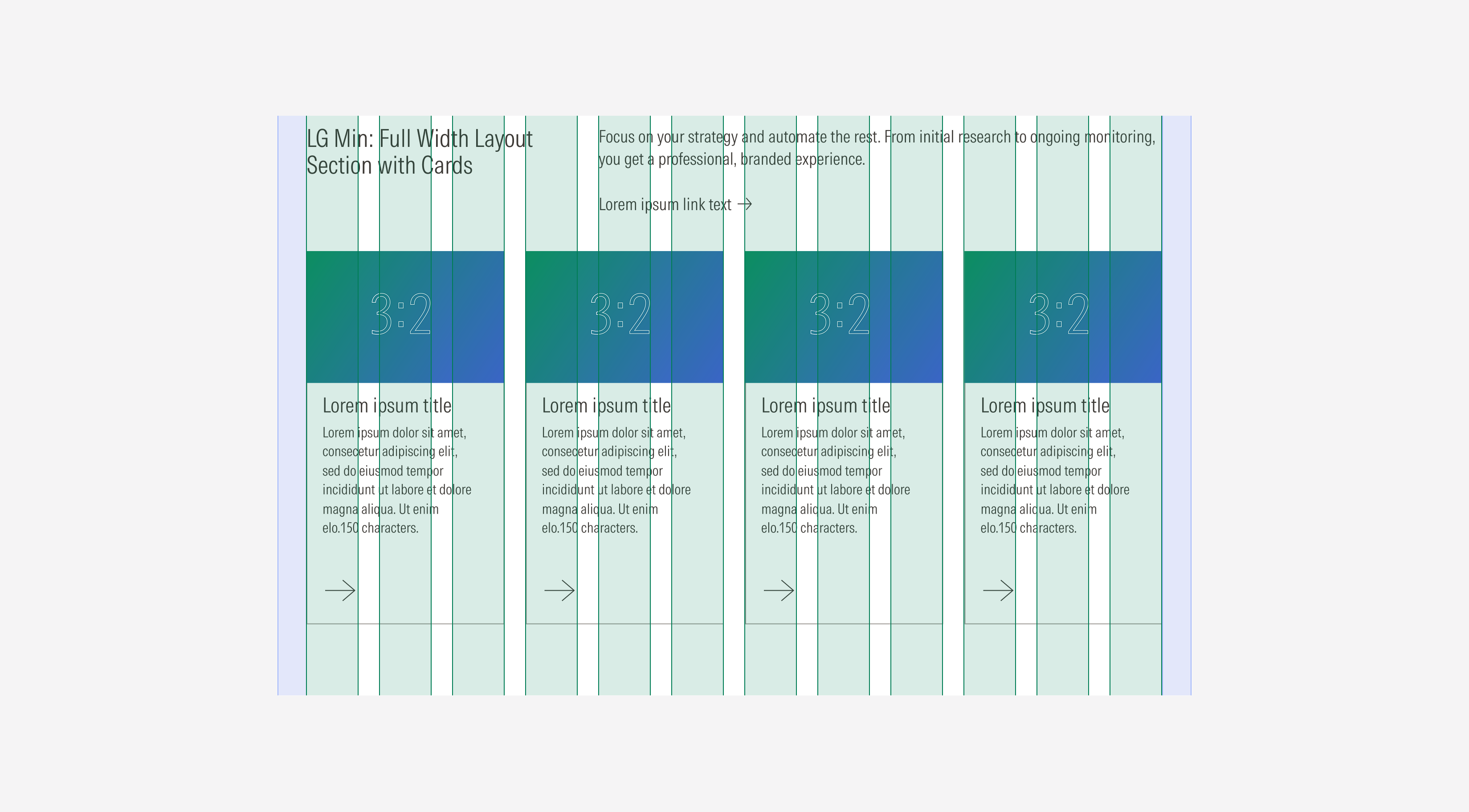
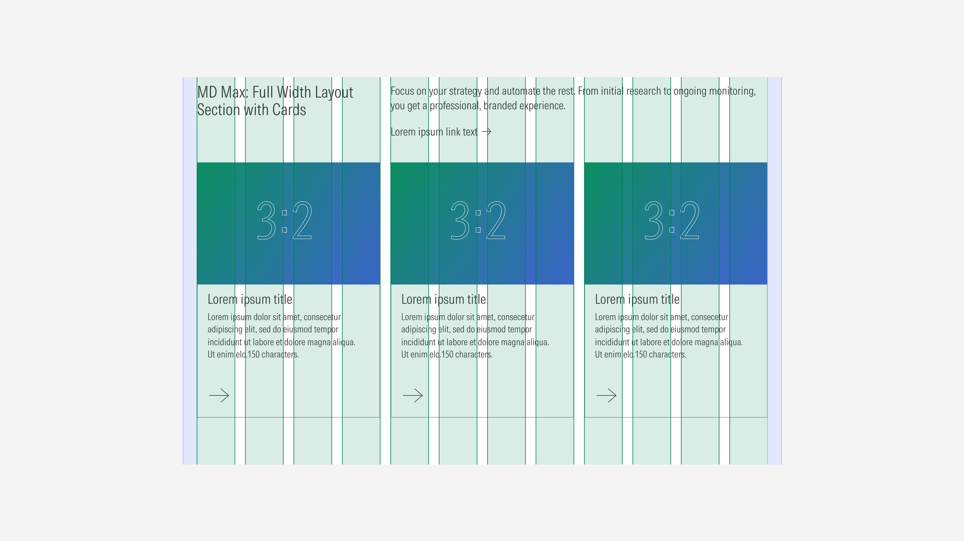
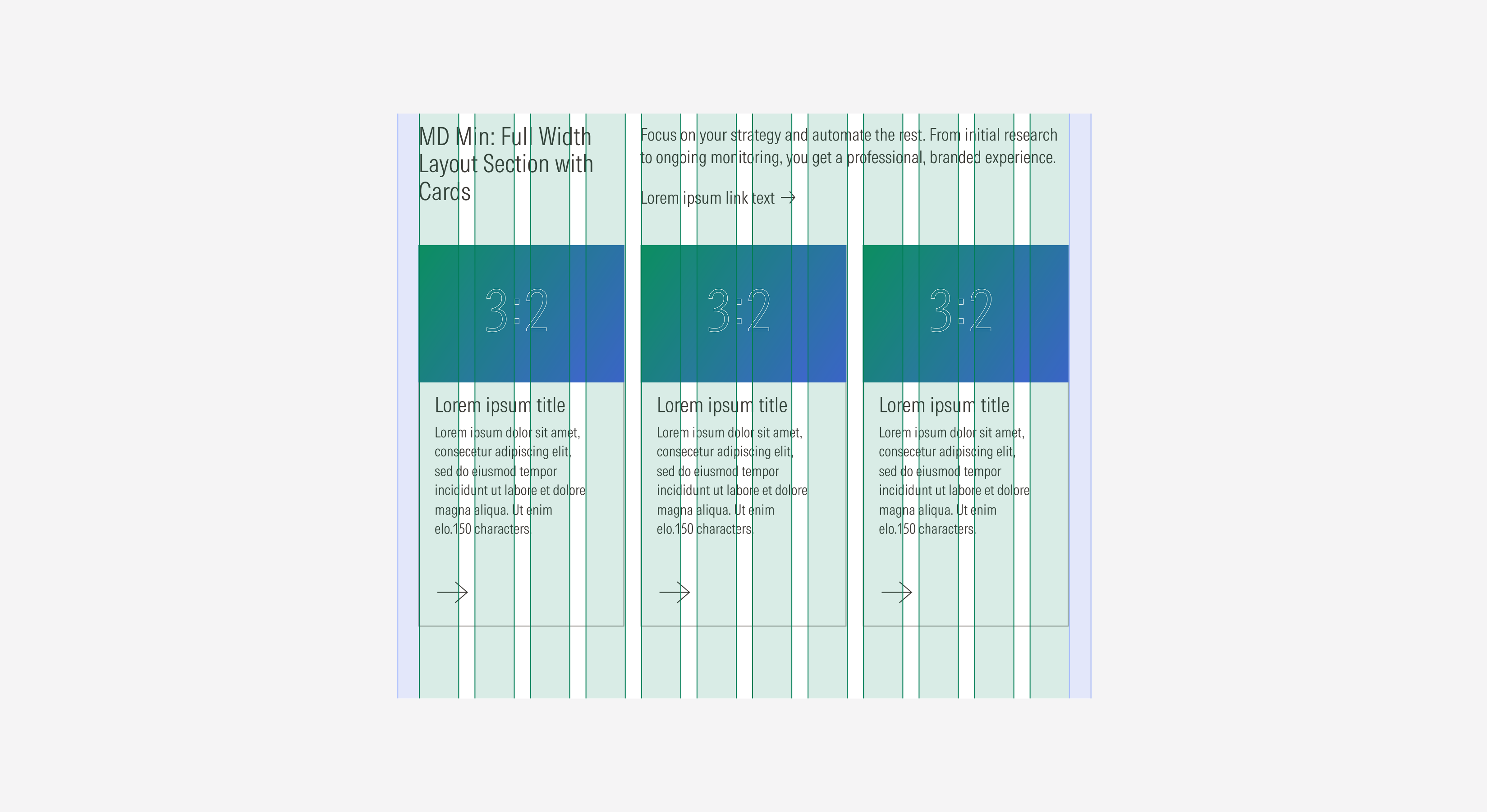
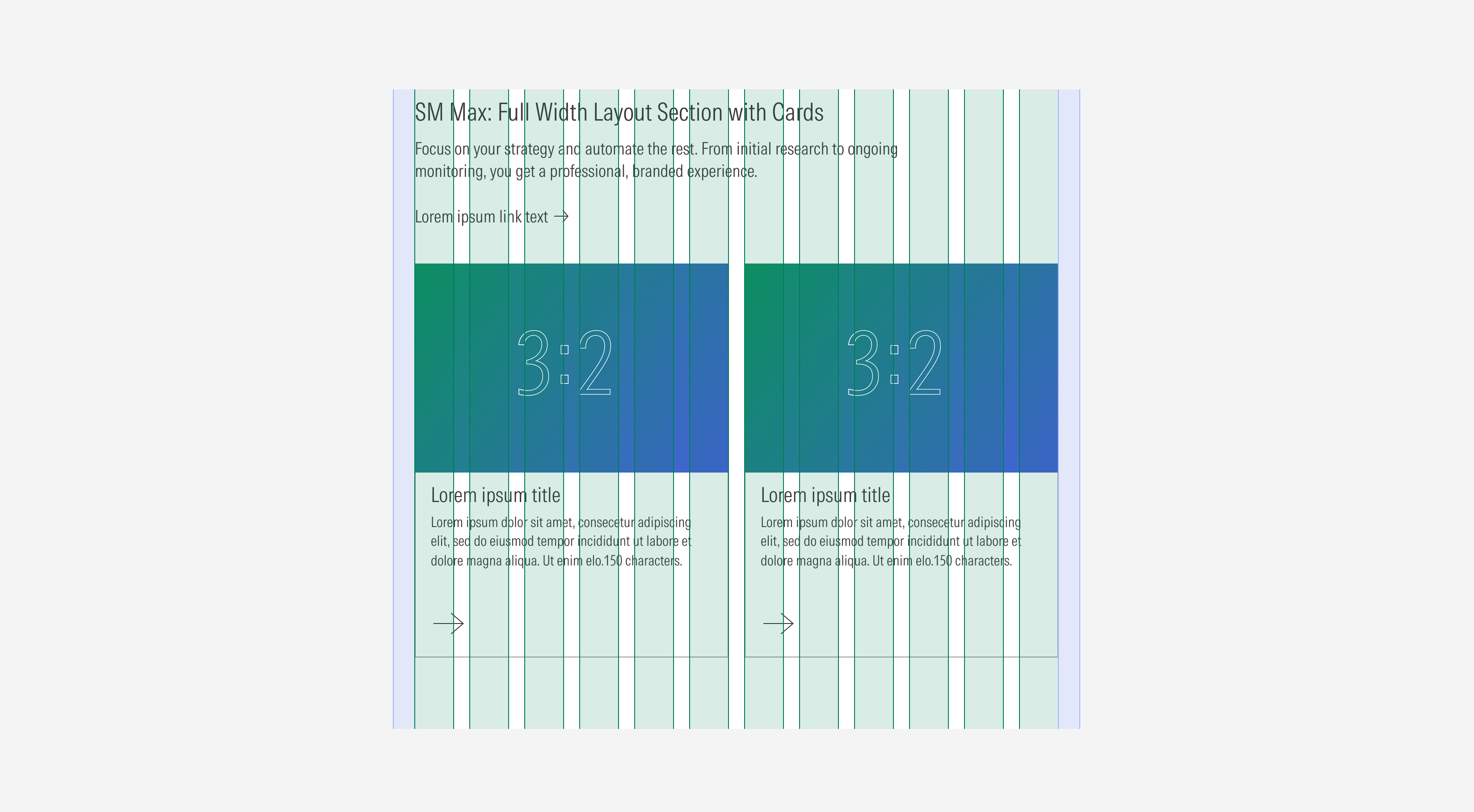
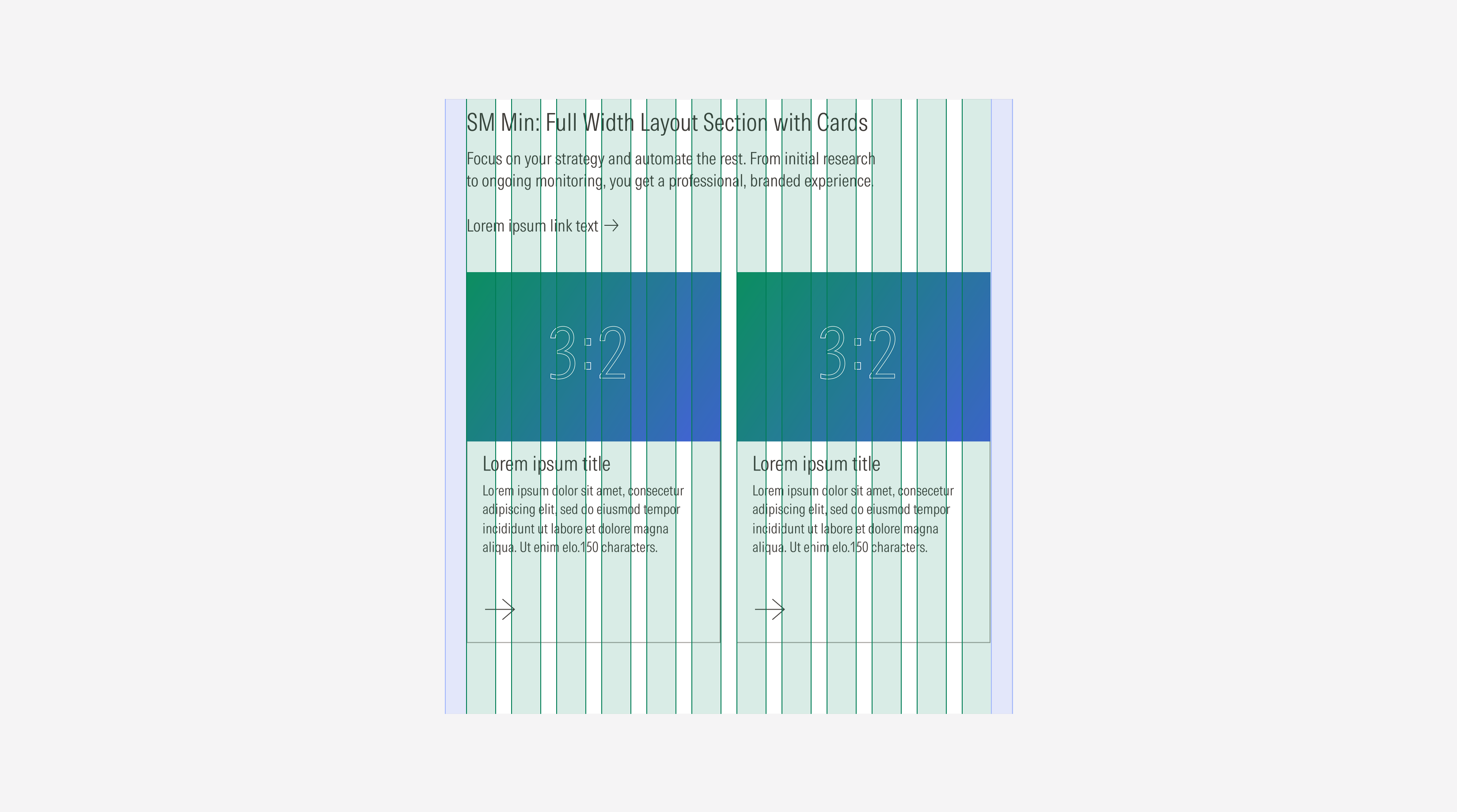
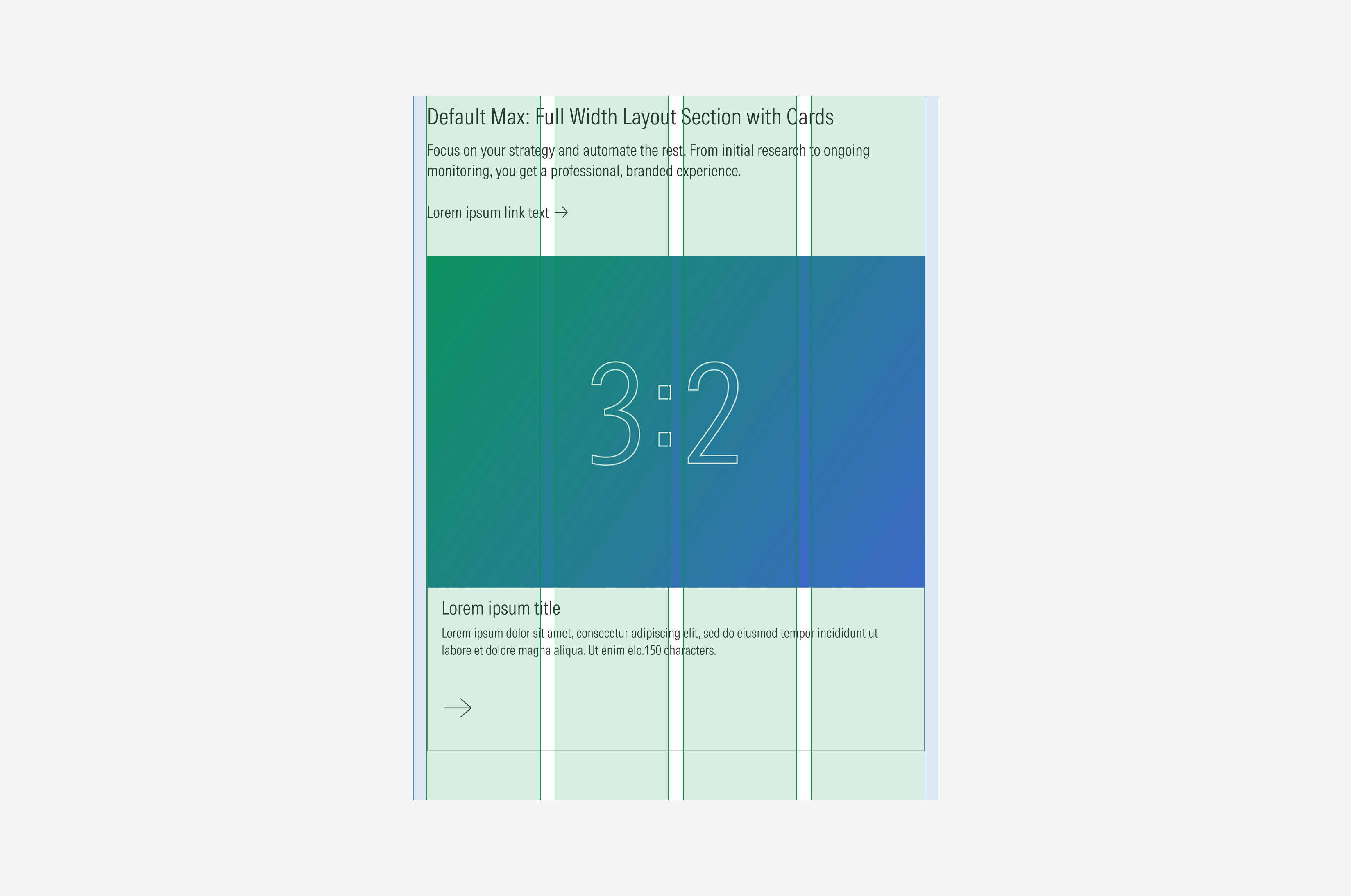
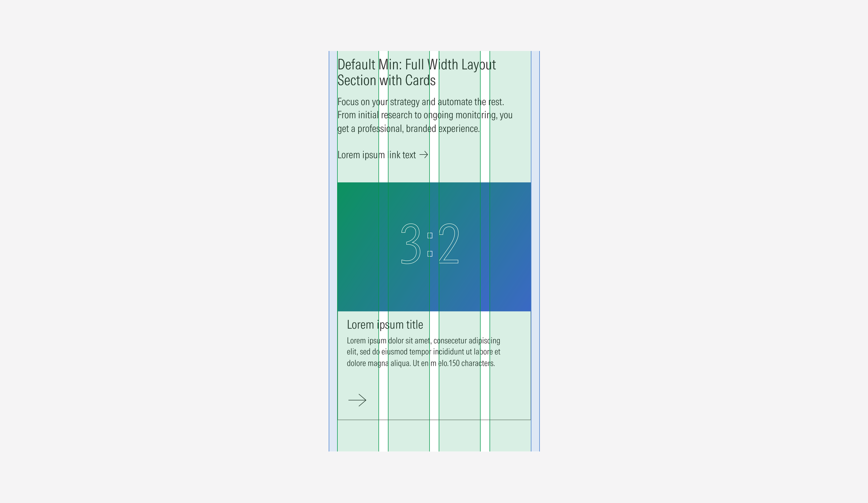
Full width layout section | Use to display content with a text block, present them to give more context. This variation gives the text block the primary level of importance and gives the content more space (width) to be displayed. | With title | With body, no body | With CTA, no CTA | Cards: 1, 2, 3, 4 Images: 1, 2, 3, 4 Video: 1 | Cards: 1, 2, 3, 4, 5, 6 Images: 1, 2, 3, 4, 5, 6 Video: 1 |
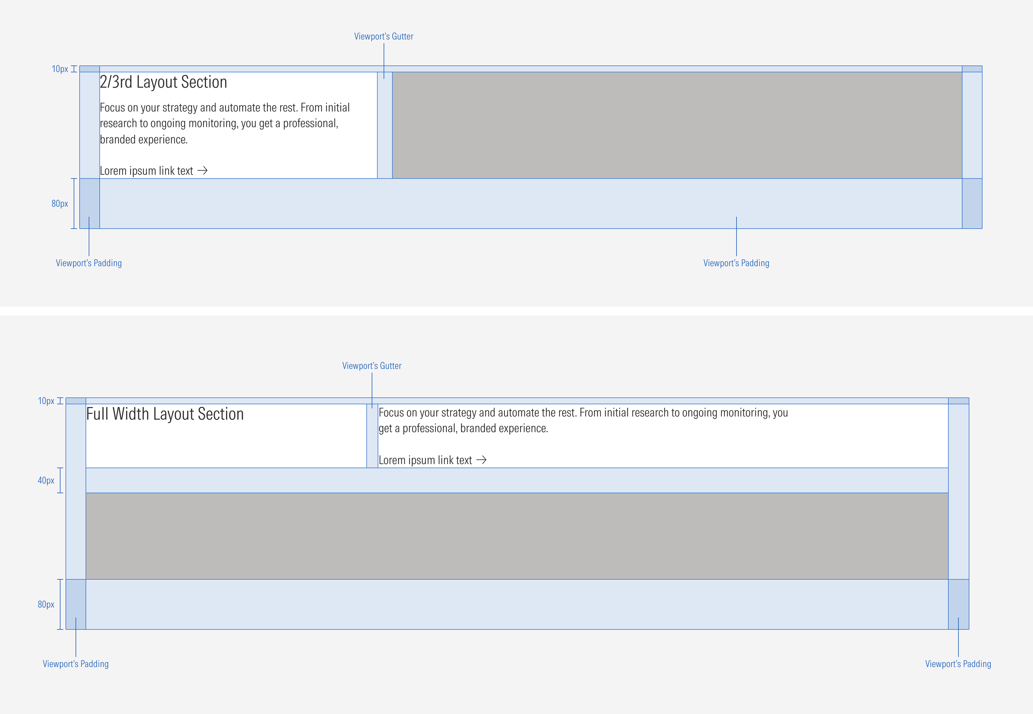
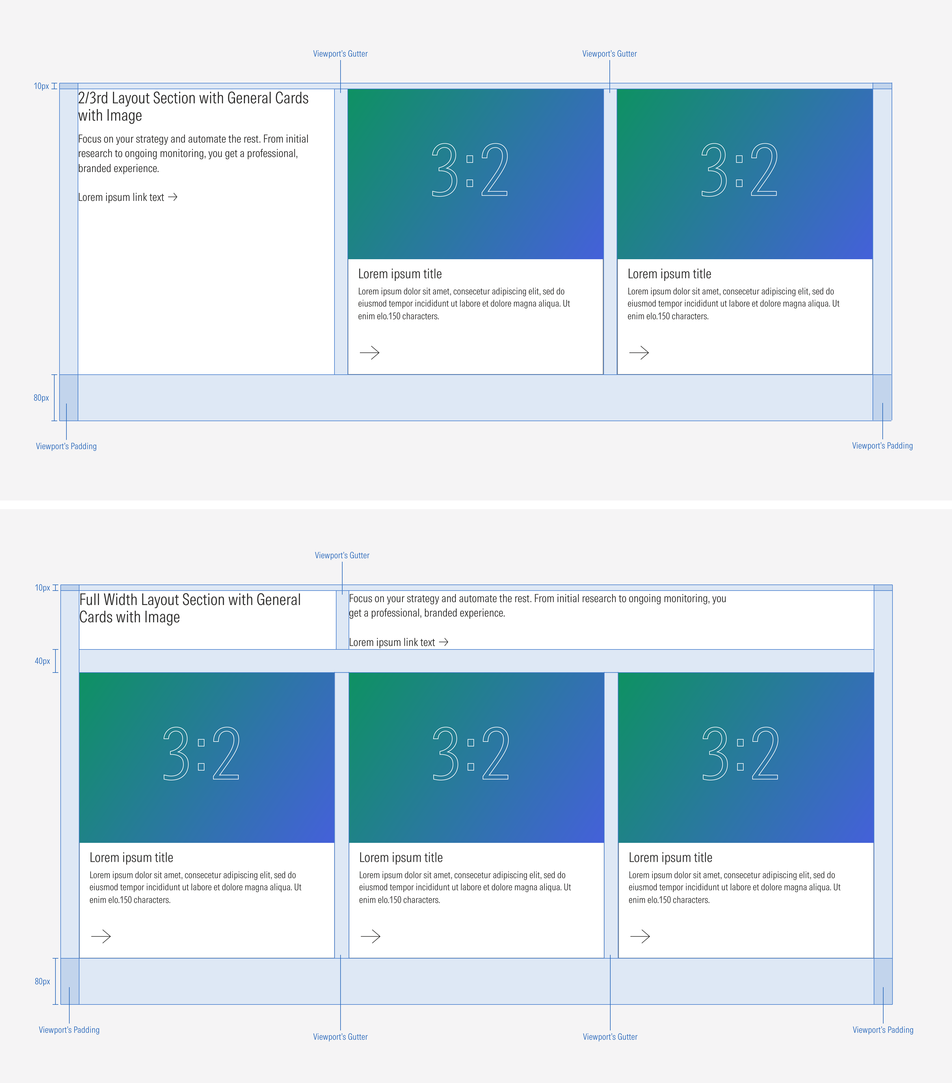
Container
Spacing
Ensure that proper space is given between each item in the layout section. Besides the horizontal padding and gutter, the layout section has a top and bottom margin. Note that the horizontal and vertical spacing between each item (when having more than one card or image) will match the gutter of the grid (behavior per view-port).
Scale Down Behavior
The content slot of the layout section can manage from one to four columns of cards depending on the viewport.
- LG: 1 to 4 Columns of cards
- MD : 1 to 3 Columns of cards
- SM : 1 to 2 Columns of cards
- Default : 1 Column of cards
Also, the number of cards displayed in a row (and the number of columns in a layout section) will be closely related to the size of the screen and the breakpoint of the page. This means that the layout section will adapt to the view-port.
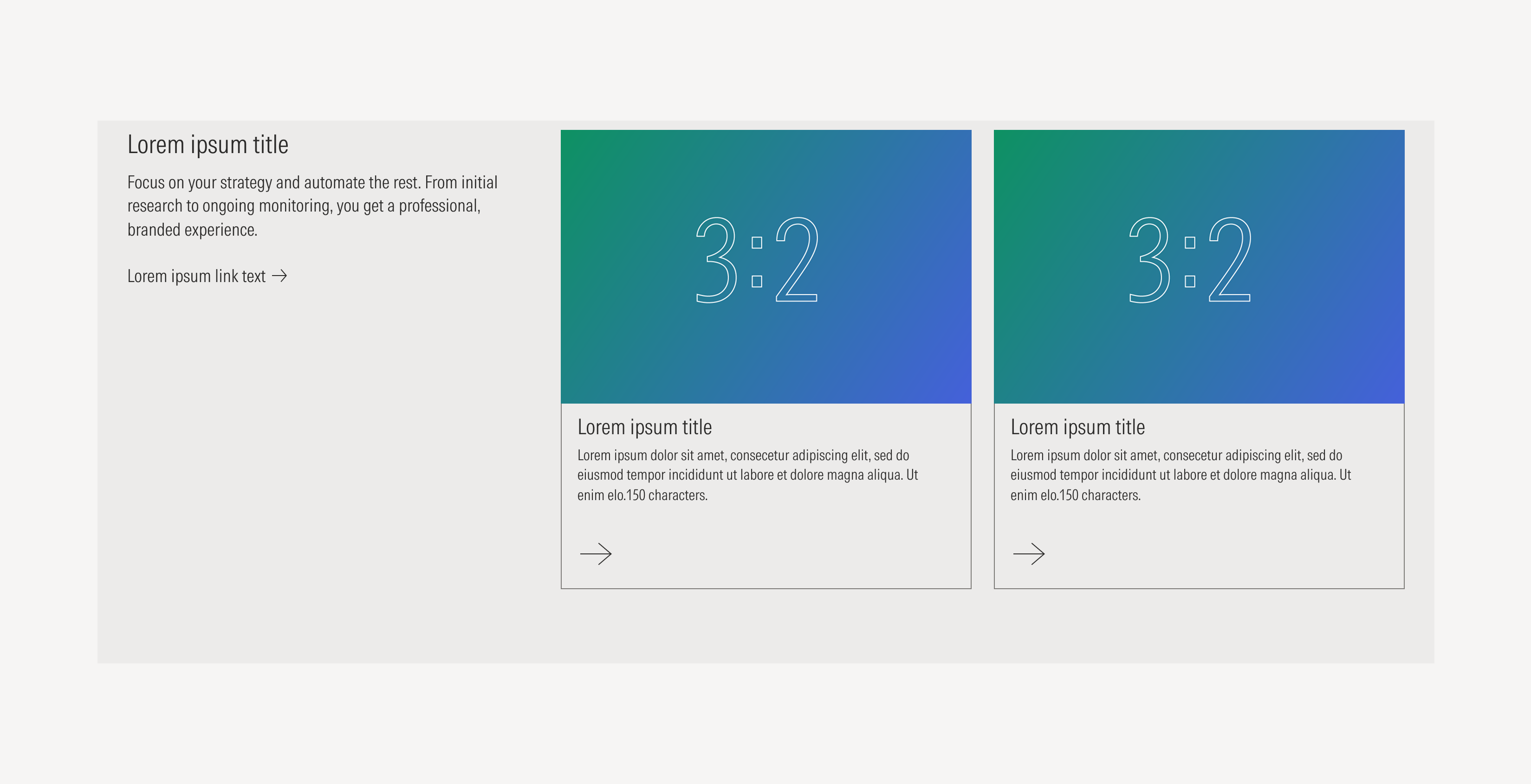
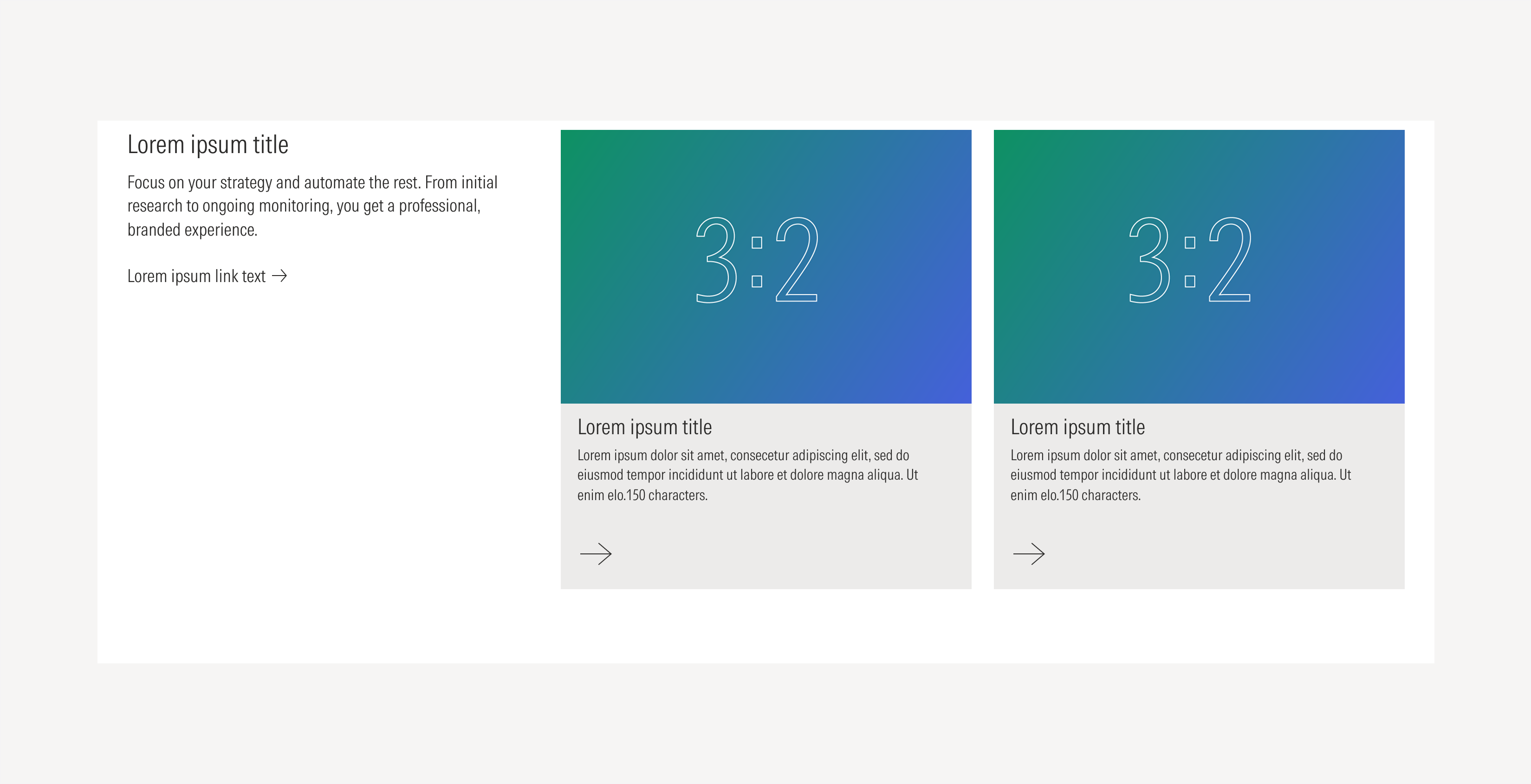
Use Case 1: Columns with Cards and Text Block - Type A
At the LG breakpoint, the layout section can display a max of three blocks per row; one text block and two cards.


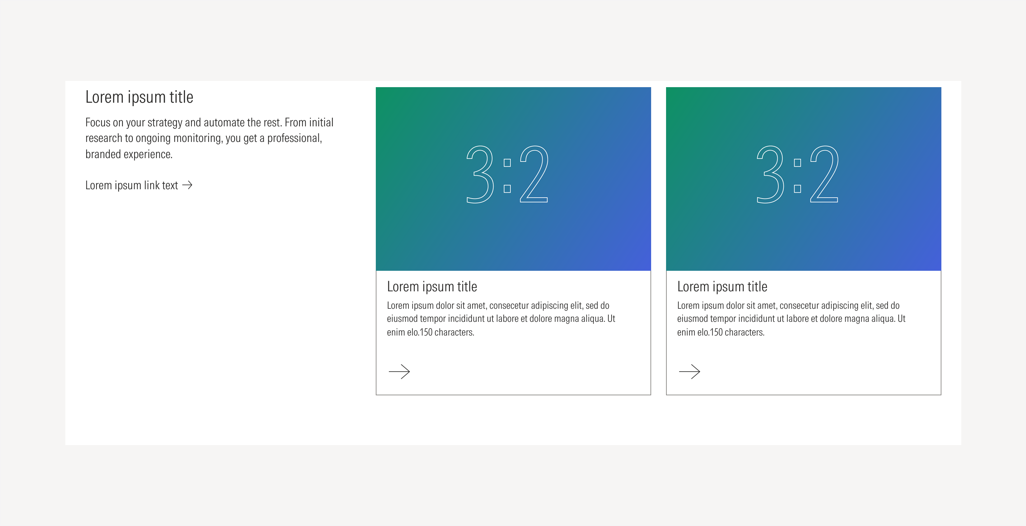
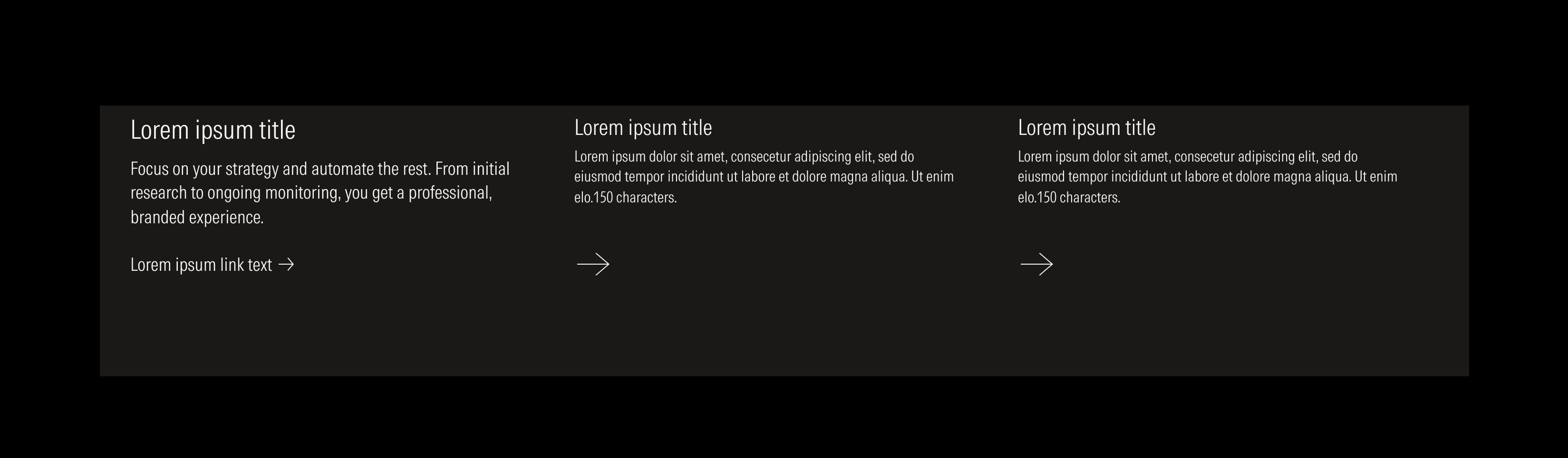
Use Case 2: Columns With Cards and Text Block - Type B
At the LG breakpoint, the layout section can display a maximum of three blocks per row; one text block and two cards.
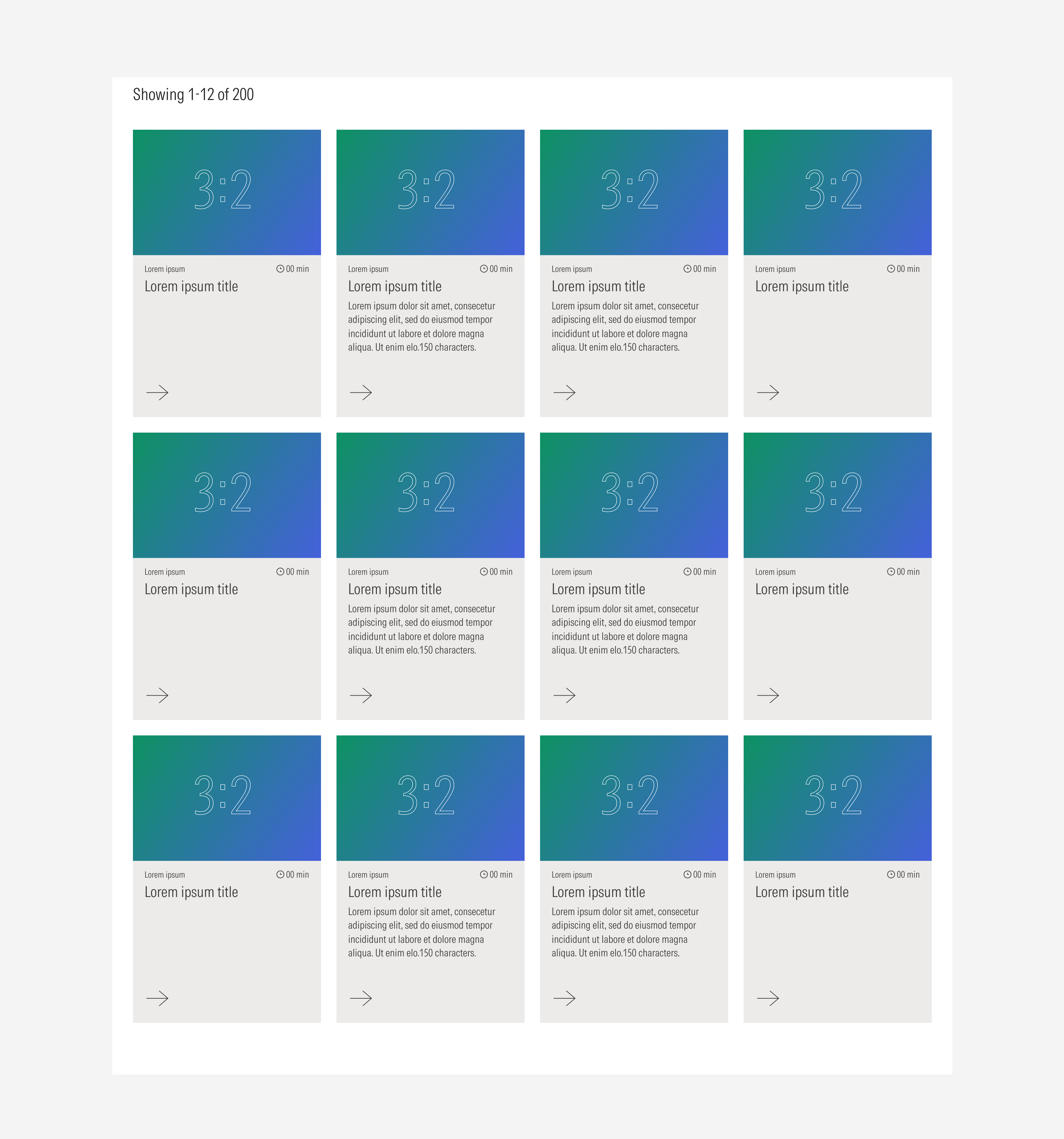
Card Grid Layout Behavior
When having a layout section with cards, there is a maximum amount of rows each viewport should displayed. The total amount of cards being displayed on a grid will remain the same when switching viewports. These rules will also apply when pagination is applied..
Collapsed Behavior
When a group of cards or images takes the whole width of the layout section (full width variation) and there are multiple rows of cards, a “Show more” button appears at the bottom of the group so users are able to expand and display the rest of the card rows. Users can also collapse them again.
Case B: Outline Cards
Case C: Fill Cards
Case D: Blurbs