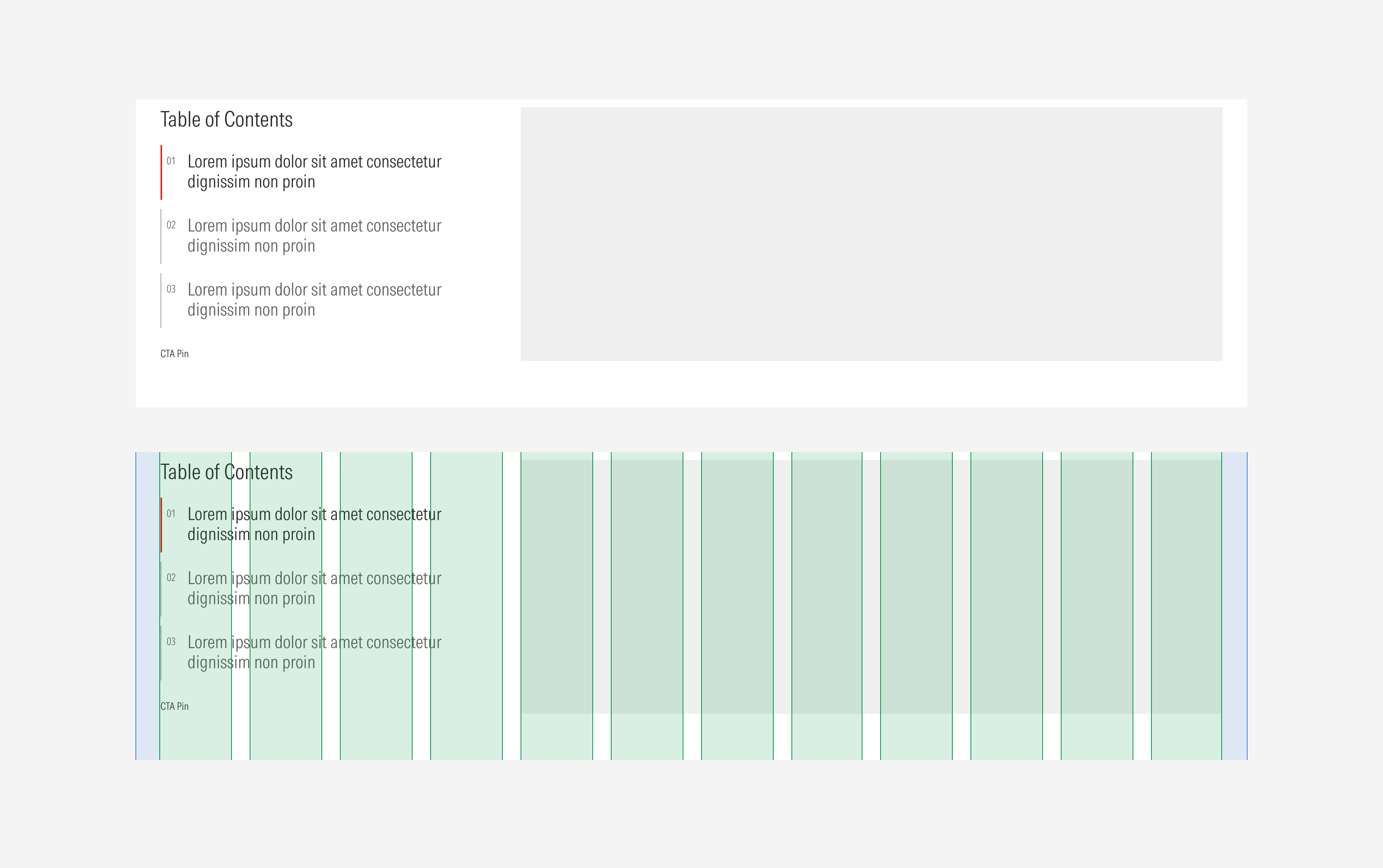
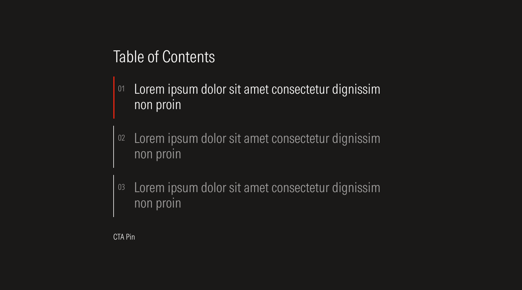
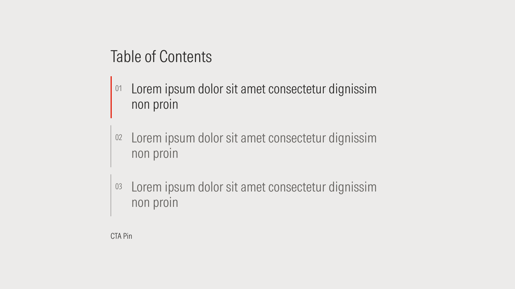
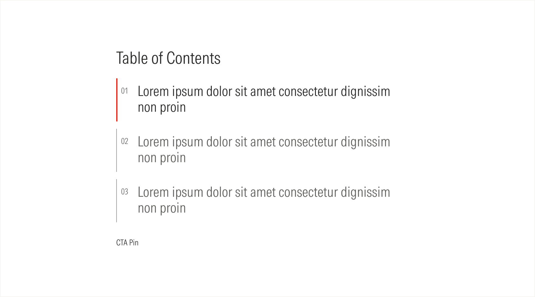
Tab
Tabs organize content to help the user navigate through it easily. They are clickable components aligned horizontally.
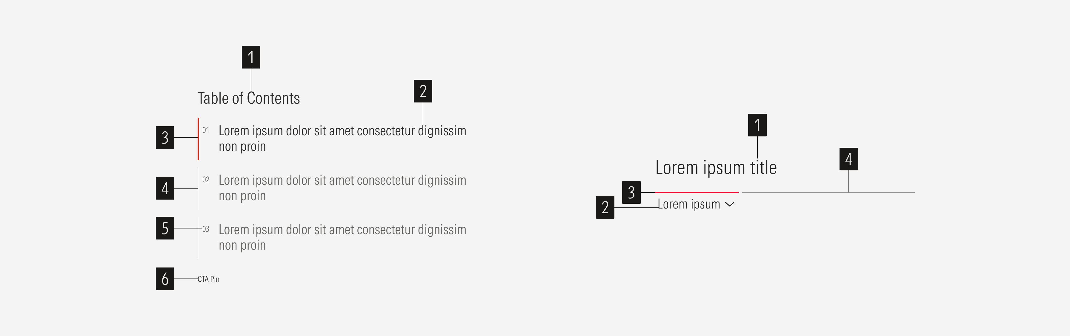
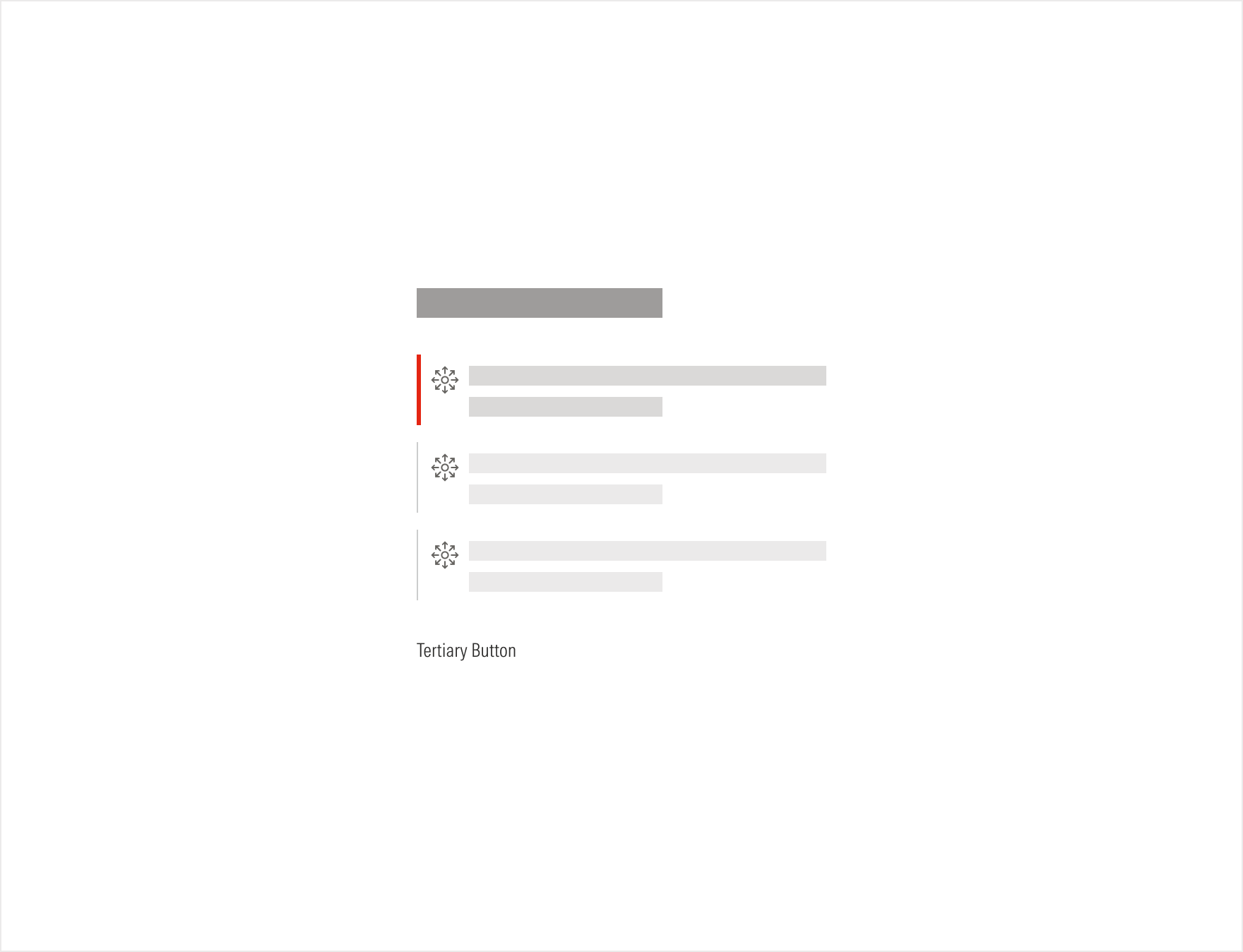
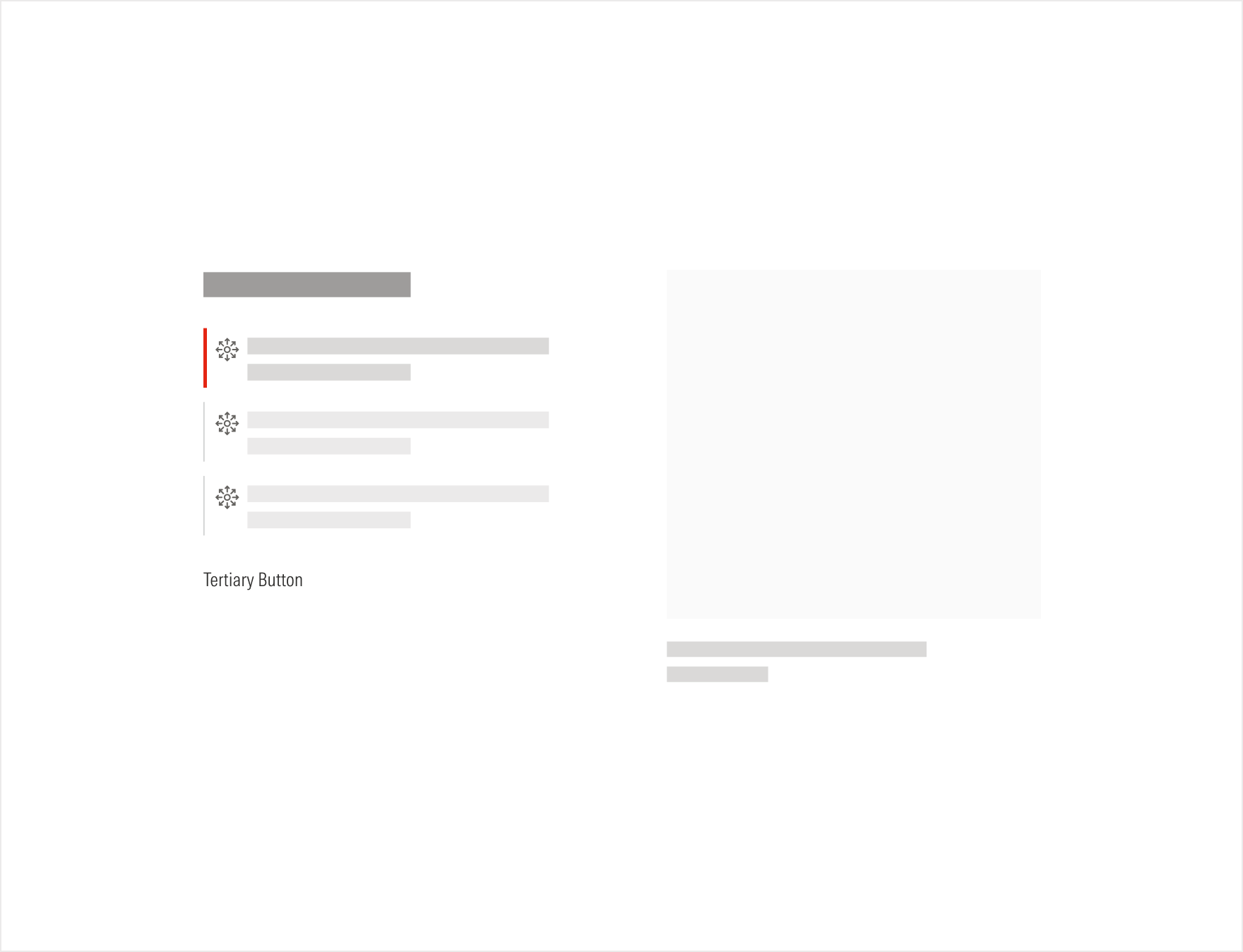
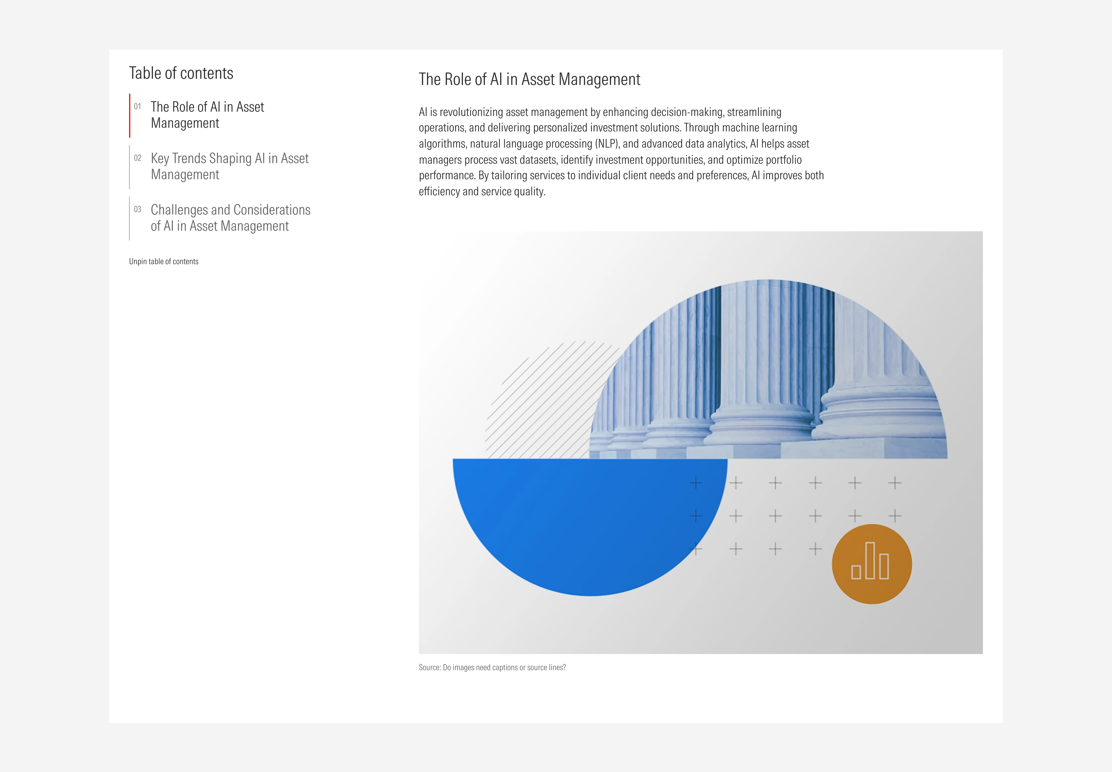
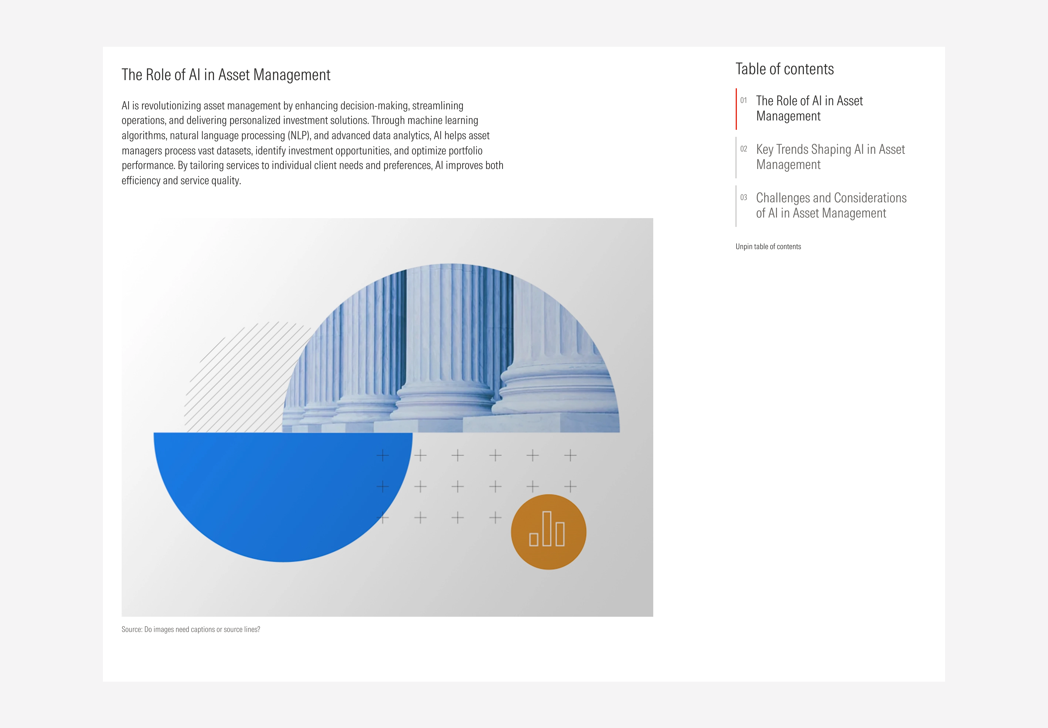
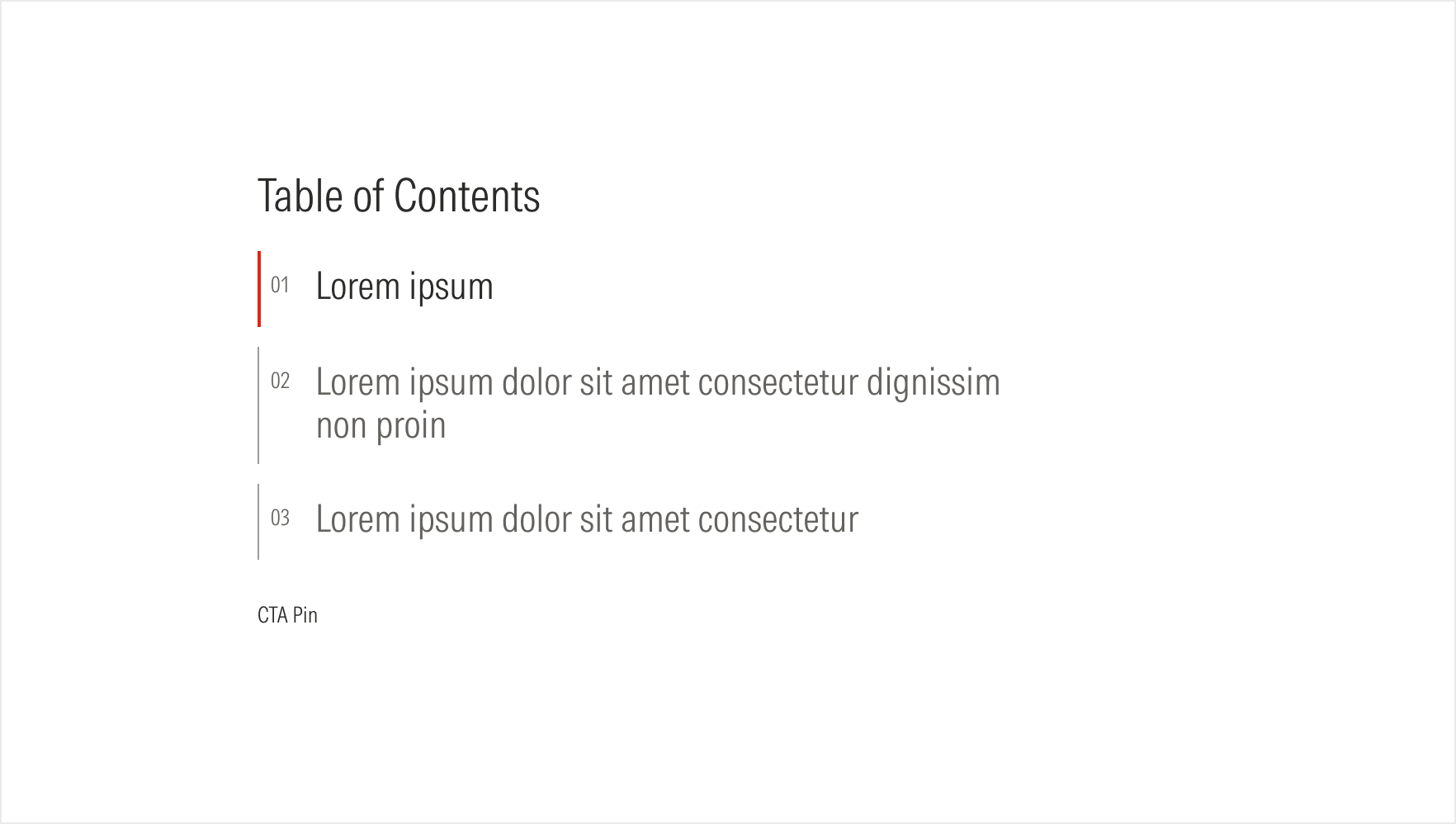
- Section title sets the topic for the section.
- Tab title sets the topic for the tab.
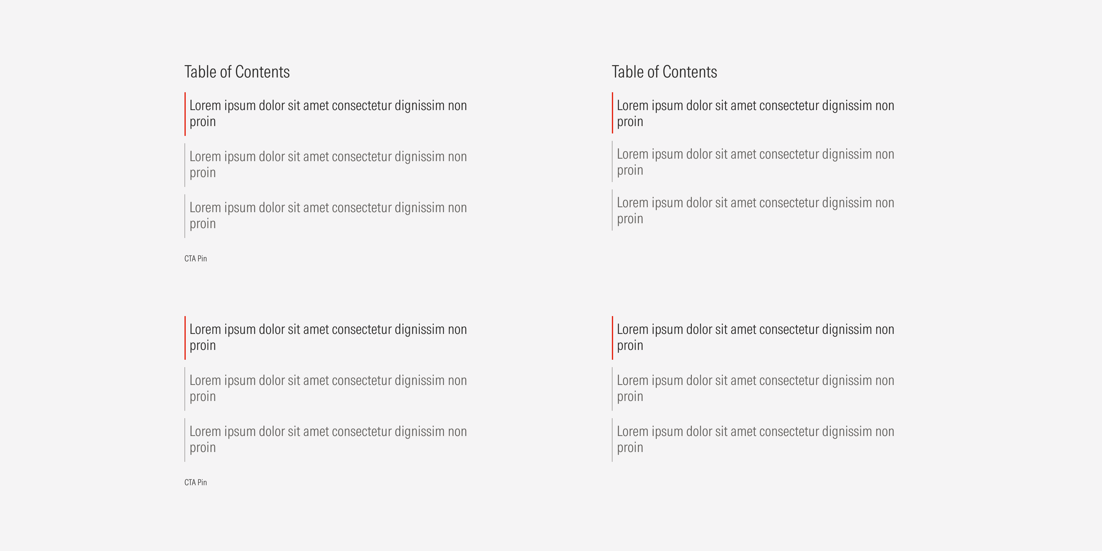
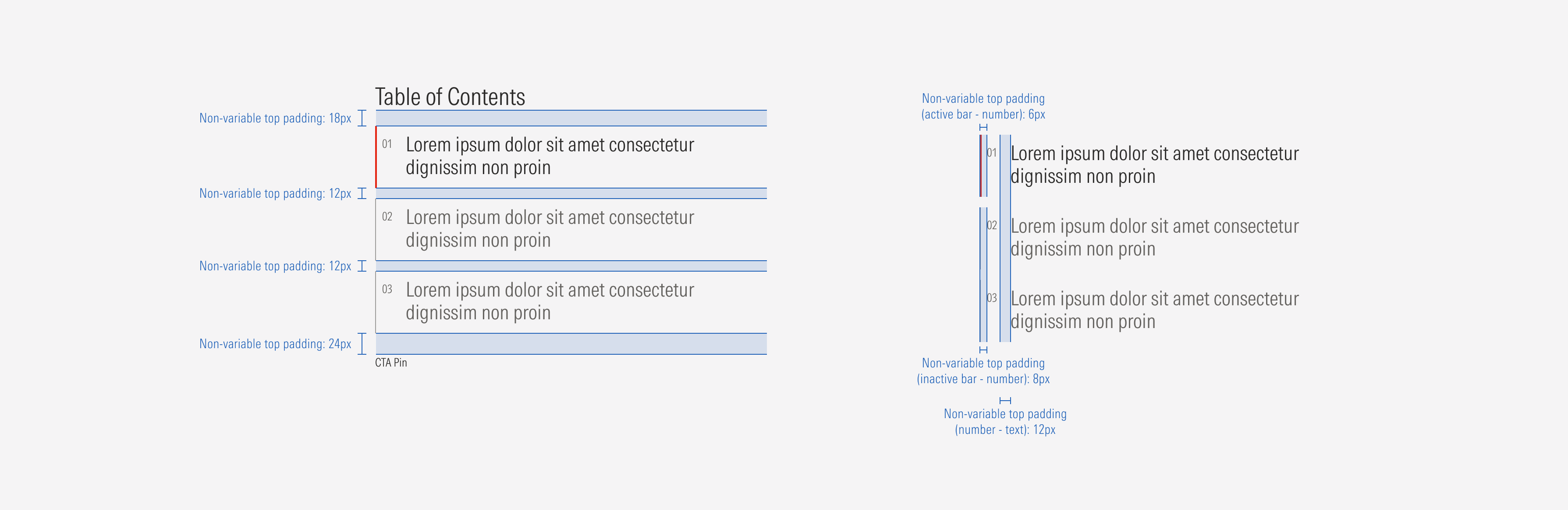
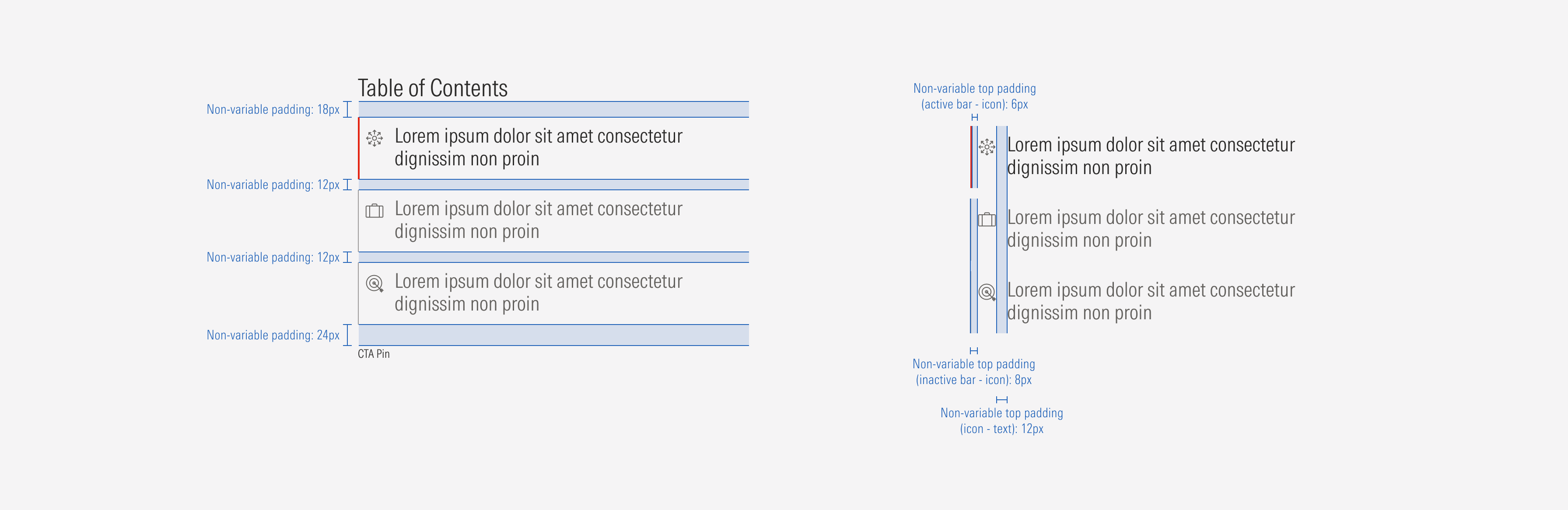
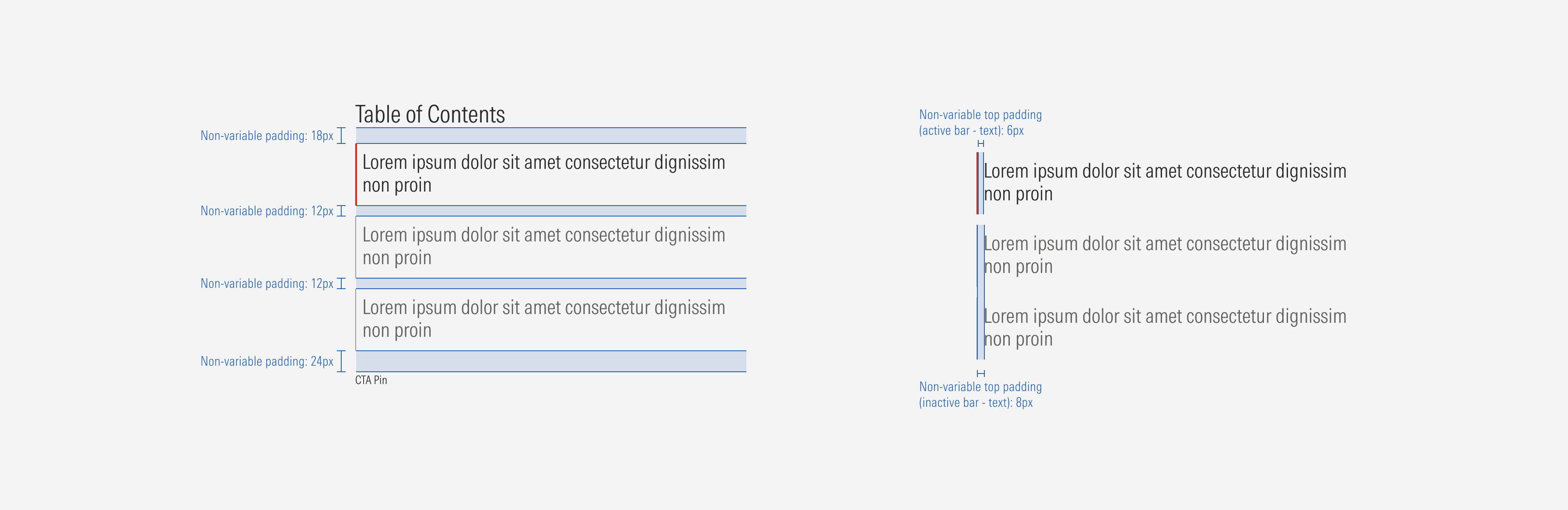
- Active tab communicates which tab is active and which content is currently being displayed. The red bar has a 2px weight.
- Inactive tab communicates which tab is inactive and which content is currently not being displayed. The neutral bar has a 1px weight.
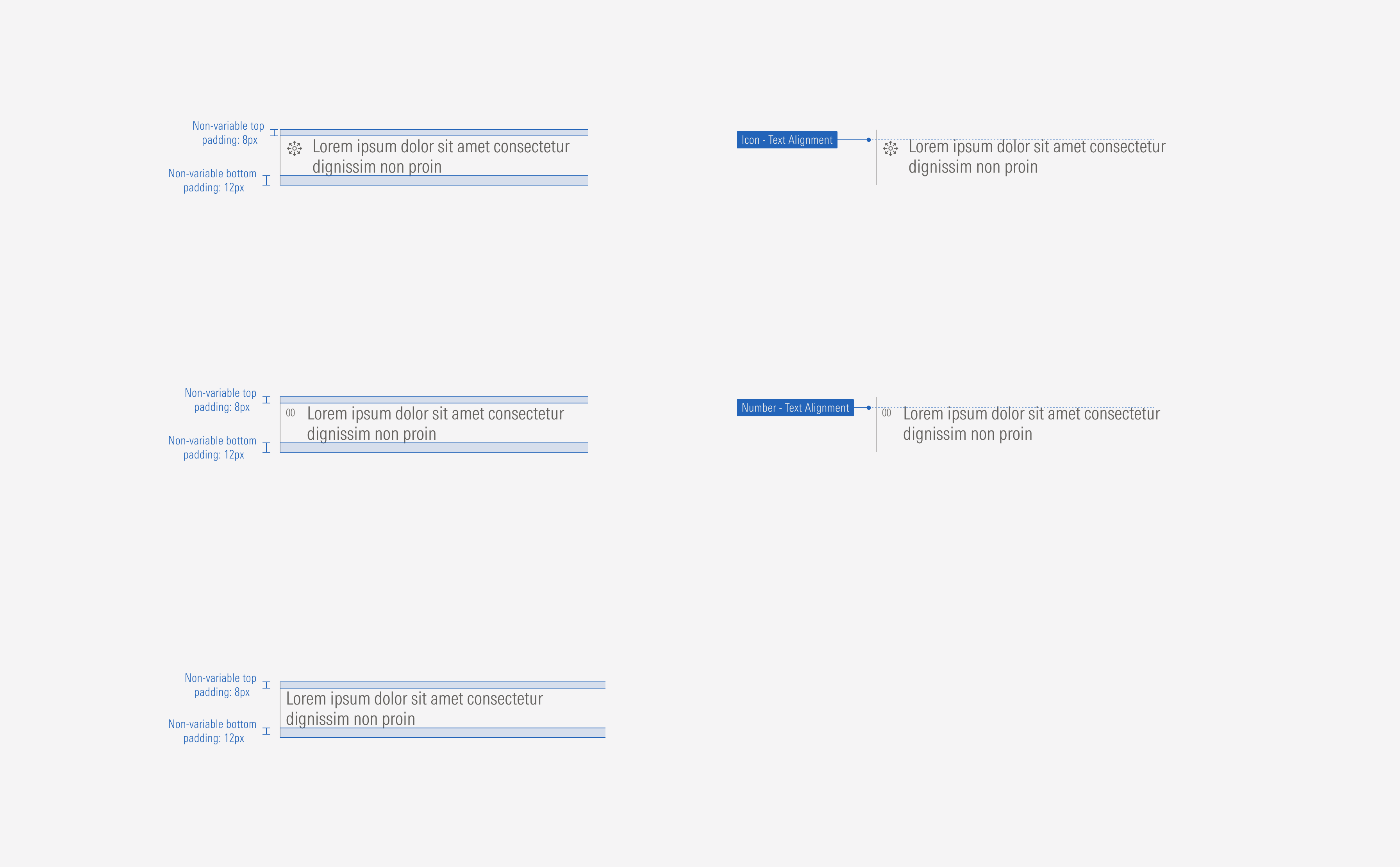
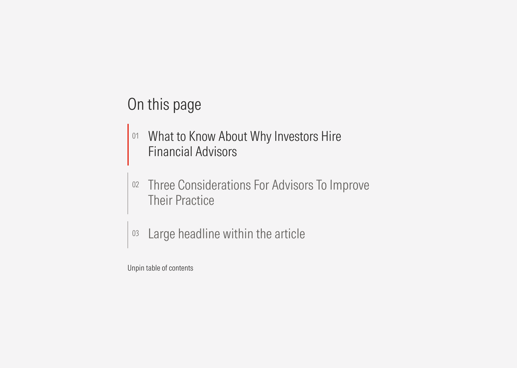
- Bullet uses a number or brand icon (size XL: 22×22px) to highlight the order of the tabs or to add visual context for the content topic. When using brand icons, each tab should have a unique icon. The bullet usage is optional.
- Pin CTA is a tertiary button that helps pin or unpin the content. It is optional.
Usage
When to Use
Use tabs to organize related content. Use when a large amount of content is grouped in sections to allow users to quickly and easily switch between them.
When Not to Use
Don’t use tabs when there is a small amount of information to be categorized or when content sections aren’t closely related. Use cards or a card container instead.


Variation | Purpose | Title | Bullet Brand Icon | Bullet Number | Pin |
|---|---|---|---|---|---|
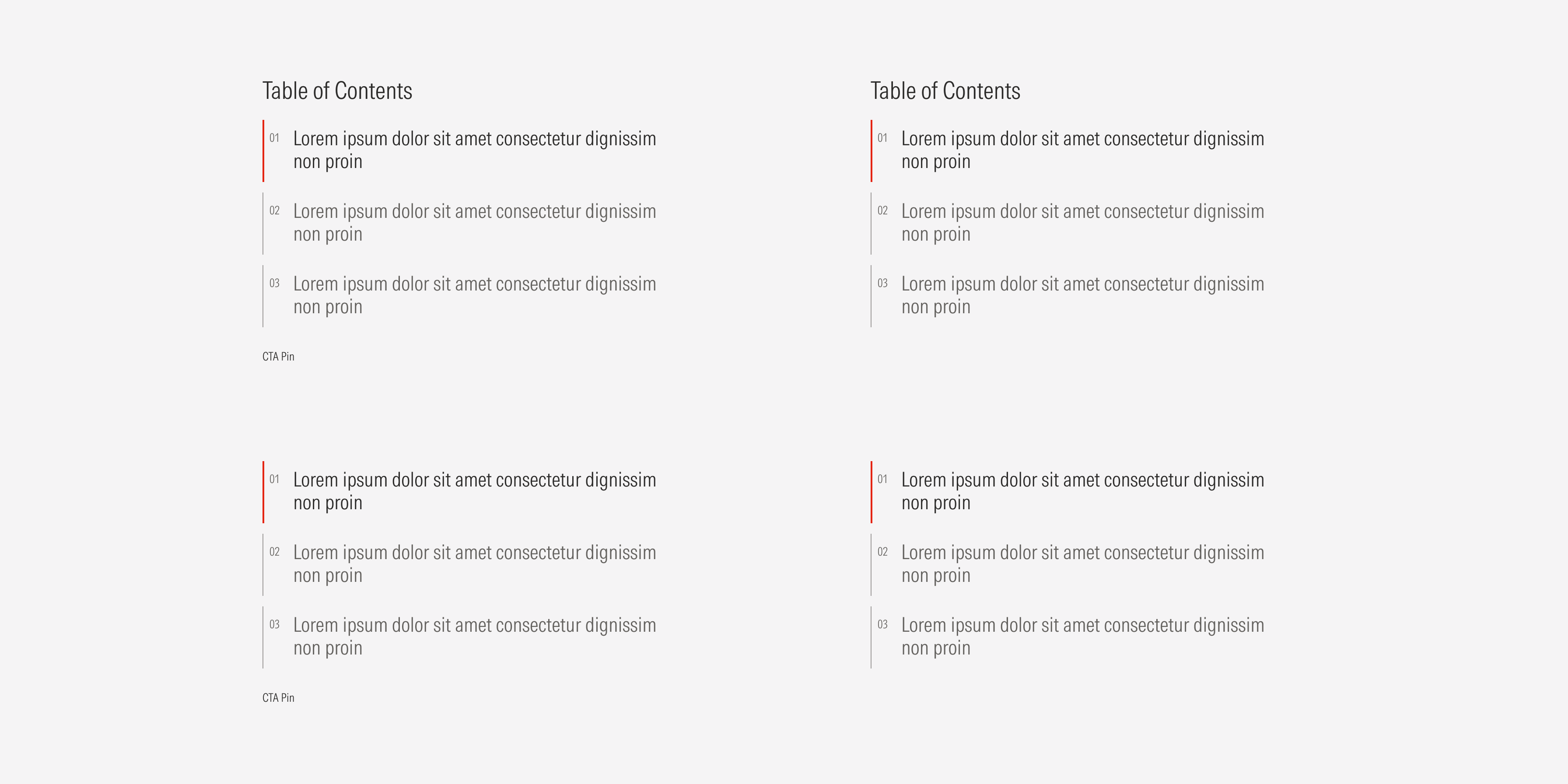
Numbered | Use to highlight the suggested order of the content. | With title, no title | No brand icon | With bullet number | With CTA pin, no CTA pin |
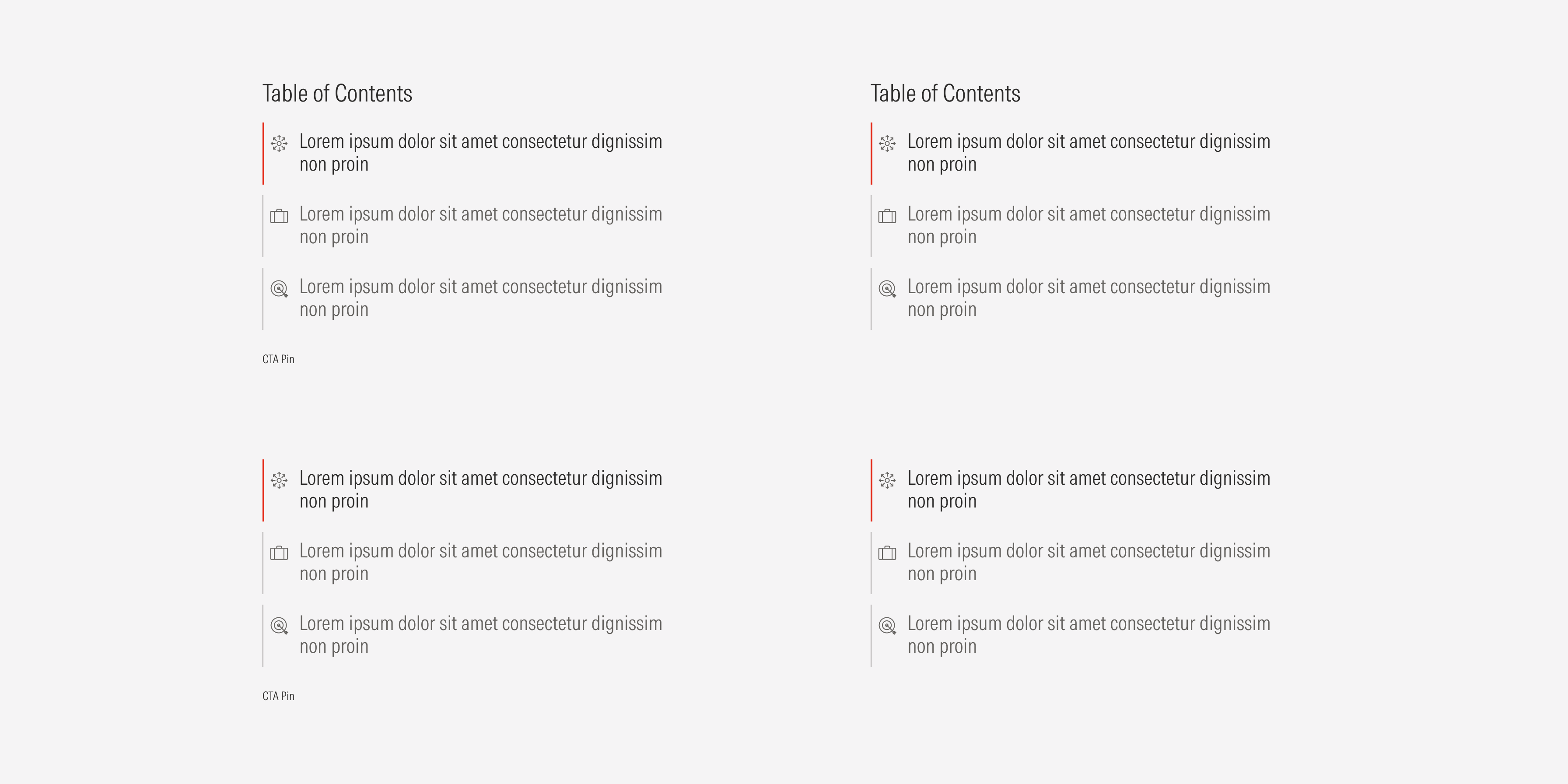
Brand icon | Use to give visual context for each tab topic. | With title, no title | With brand icon | No bullet number | With CTA pin, no CTA pin |
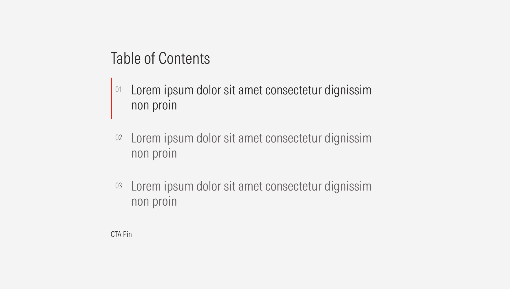
Single | Use to organize the content into groups. | With title, no title | No brand icon | No bullet number | With CTA pin, no CTA pin |
Brand Icon
Single
Hierarchy
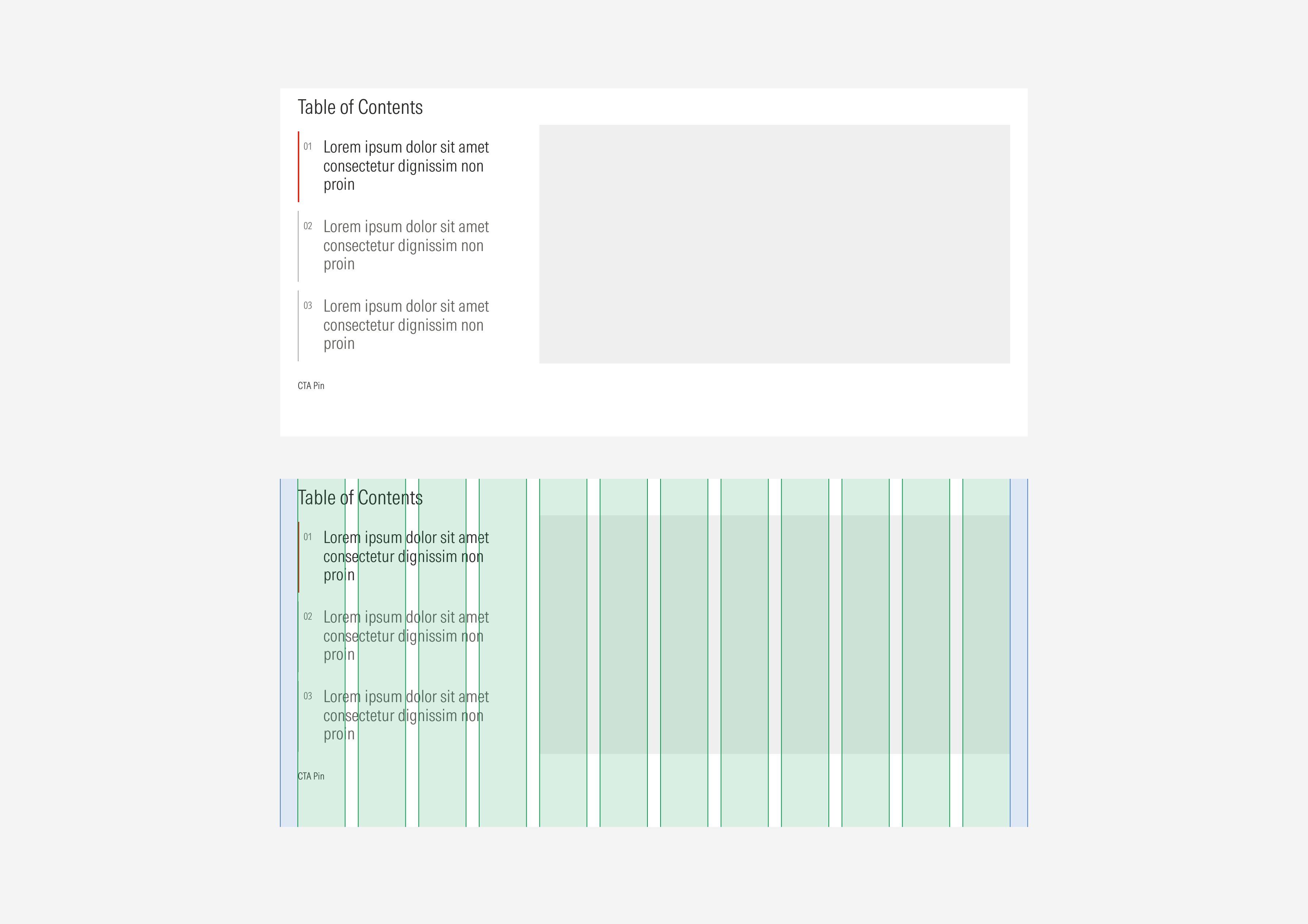
A proper hierarchy must be ensured for the elements that compose the tab container. The CTA pin of the container should be a tertiary button (with label only) at the bottom of the container. Icons or numbers should be placed between the vertical bar and the tab title to support or give more context and order to the textual content. The title, with the highest level of importance, needs to give a clear and short idea of the topic of the section. The tab titles, at a second order of importance, need to give a clear and short idea of the topic of that tab.
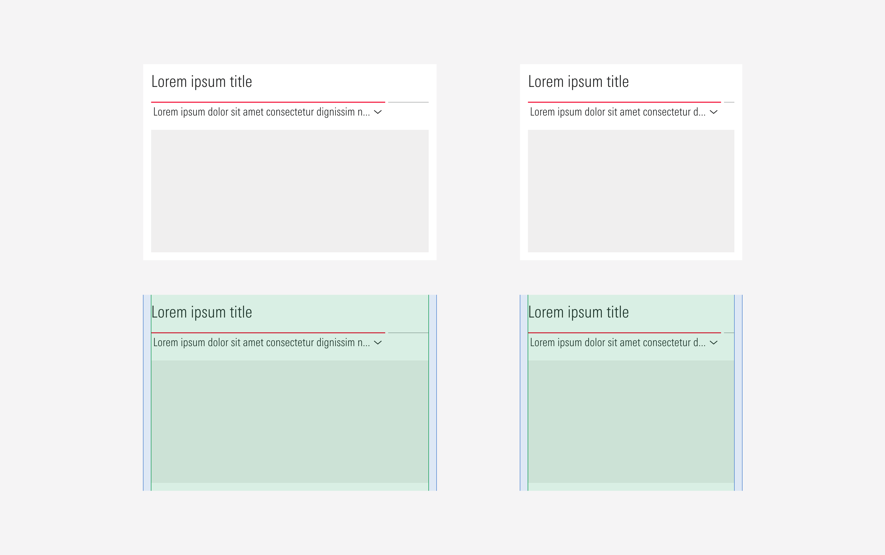
Alignment
All elements of the tab should be left-aligned. Icons and numbers should be top right aligned with the tab title they belong to. The tab container should be at the left of the content slot.
Do top-align the numbers and icons with the tab titles.

Don’t center-or bottom-align the numbers and icons with the tab titles.
Do place the tab container at the left of the section with the content slot at the right.
Don’t place the tab container at the right of the section with the content slot at the left.
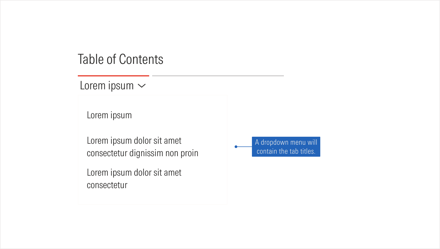
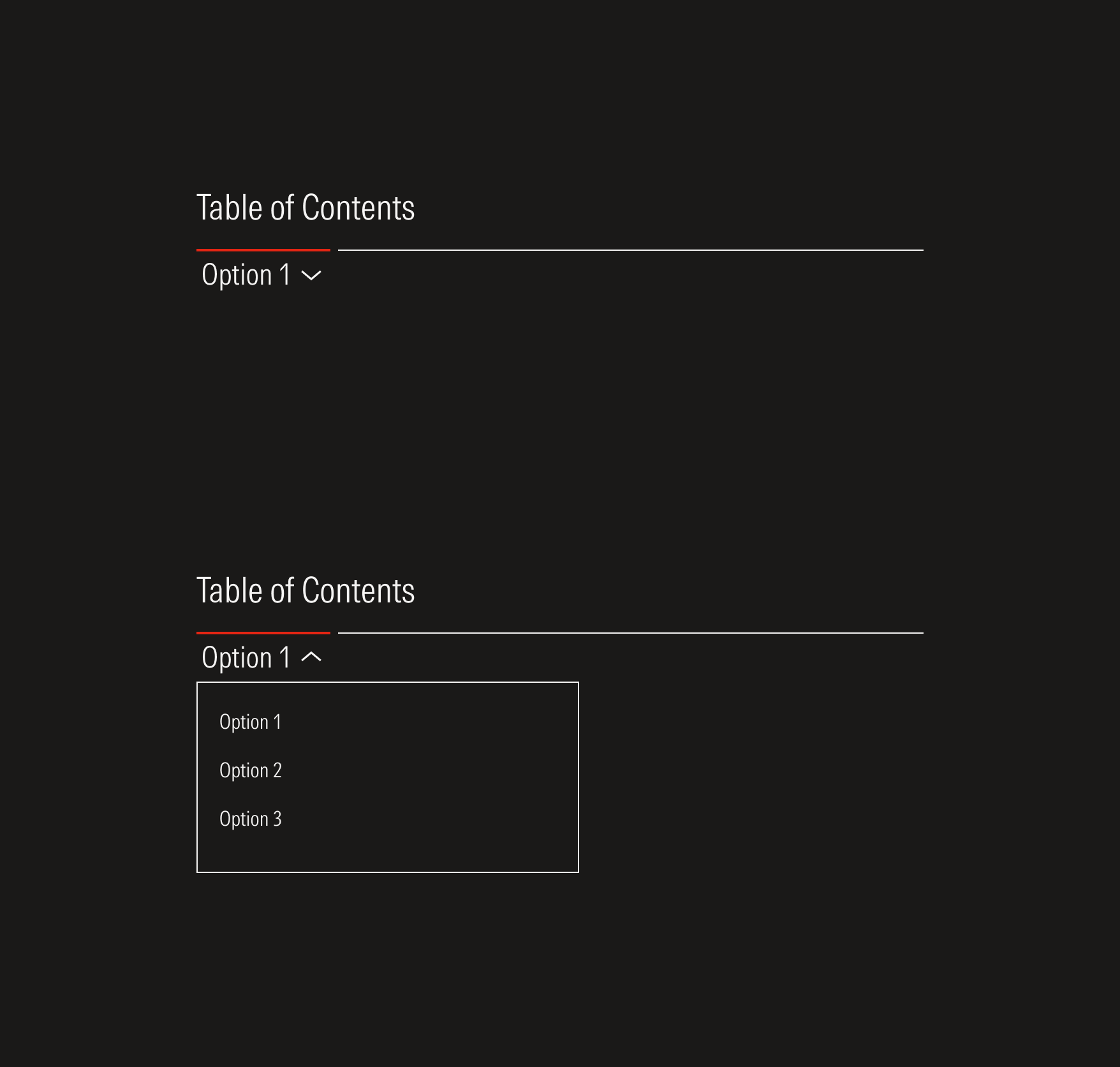
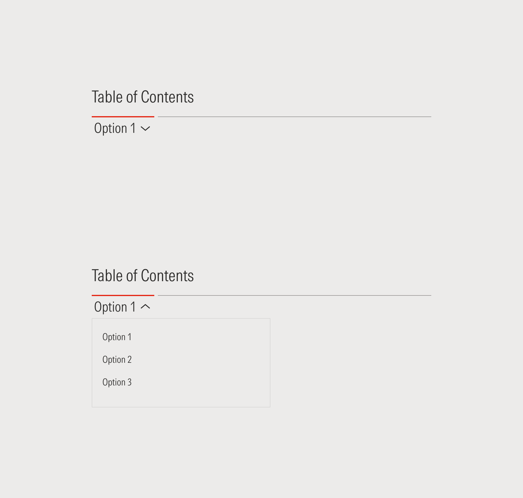
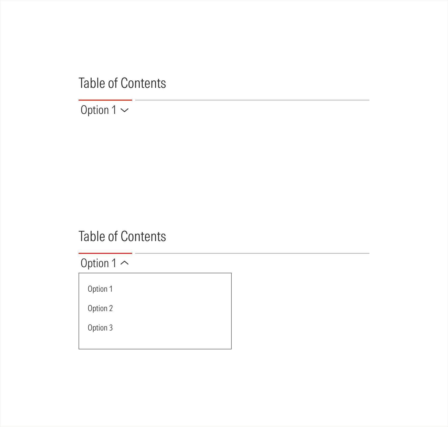
At these breakpoints, the tabs collapse into a selector, and the active option will be displayed. The active red line will take the width of the title with a 50-character limit.
Compact View-ports