Carousel
Carousels display a set of elements by groups, optimizing the use of the space. They have a navigation control that allows the user to slide the content blocks.
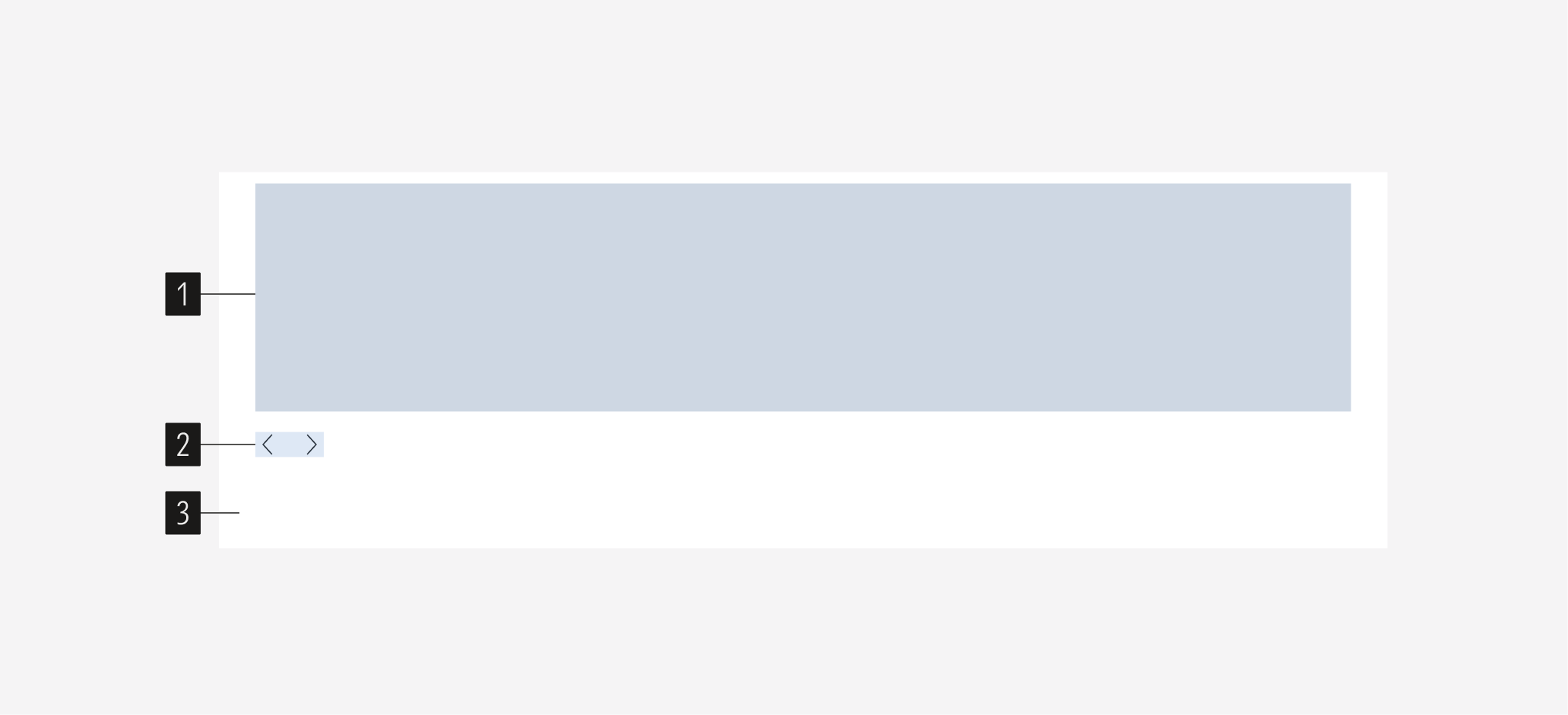
- Content block that compose the content of the carousel. It can be a single element or group of elements. The content is displayed group by group. We recommend not having more than 5 content blocks for the user to slide.
- Navigation controls that allow sliding between content blocks (go to the next or the previous block). These are tertiary icon-only buttons.
Usage
When to Use
Use a carousel to highlight key content (cards, images, quotes) consecutively optimizing the use of the space.
When Not to Use
Don’t use a carousel when the user needs to see all the content at the same time, or when is needed to display more than two blocks of content. Use a single element alone, or a card container instead.
Variation | Purpose | Body | CTA | Content Type | Columns |
|---|---|---|---|---|---|
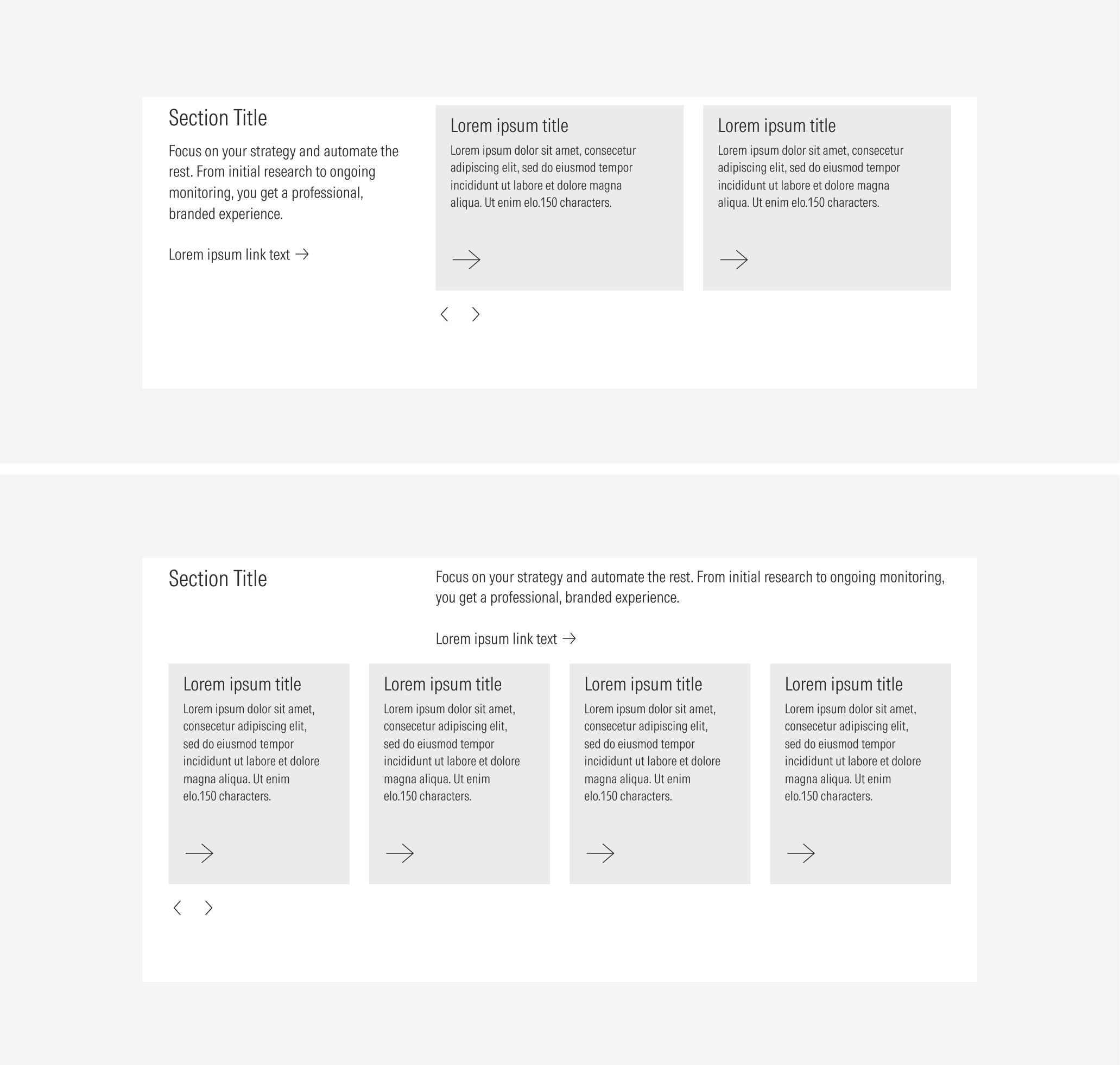
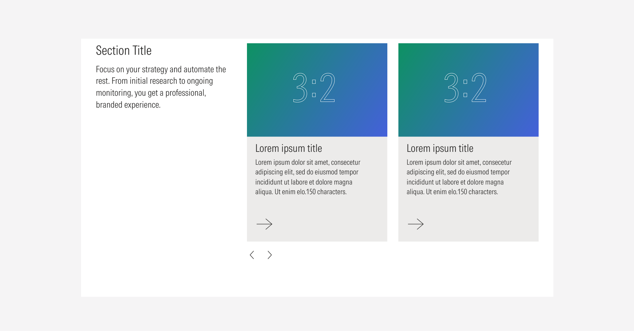
Type A | Use to display content with a text block, to give more context. This variation gives the same level of importance to the text block and the content. Also use this option to give “white” space to the layout. | With body, no body | With CTA, no CTA | Cards, images, quotes | 2 (text block and 1 image), 3 (text block and 2 images) |
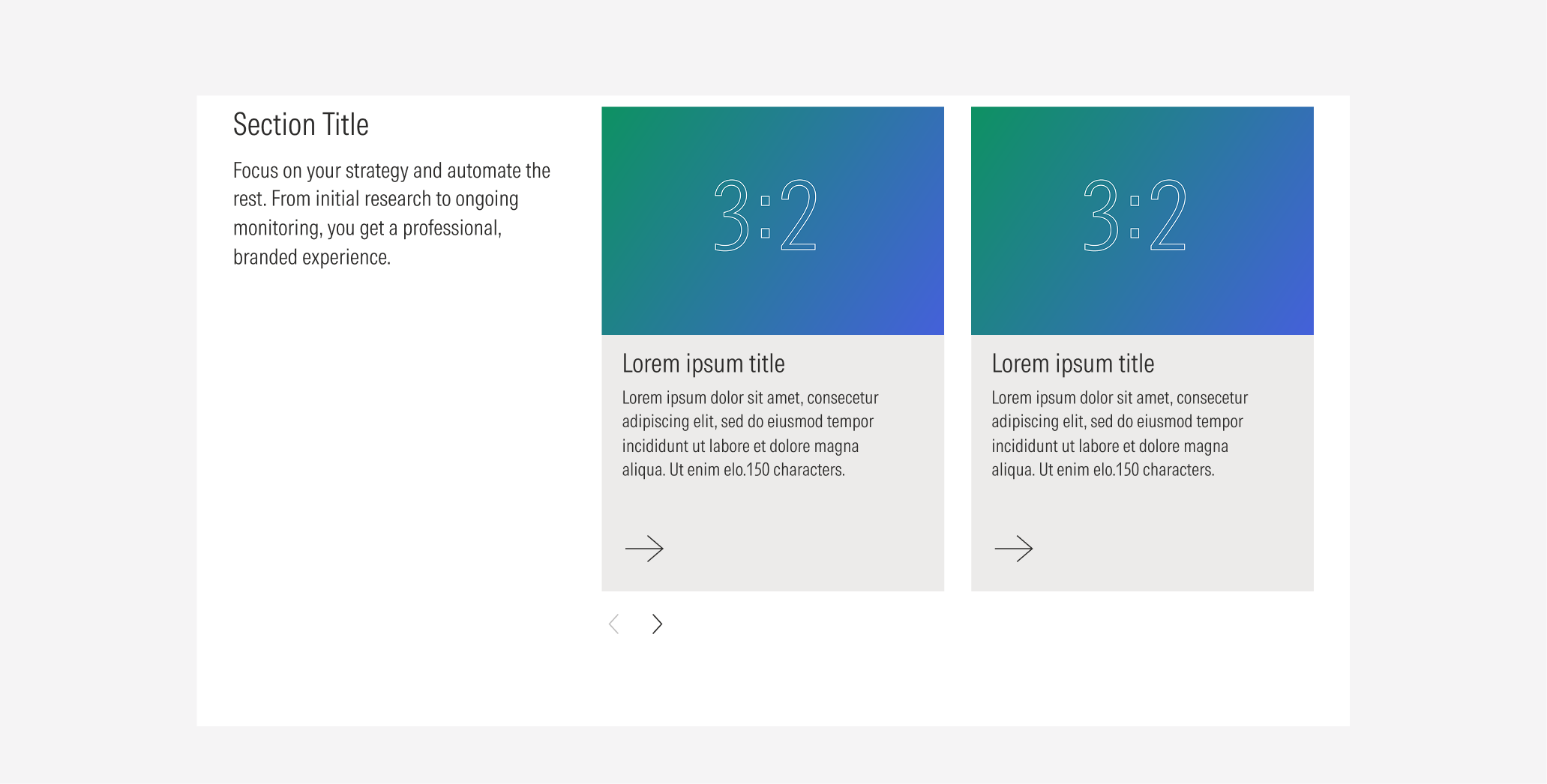
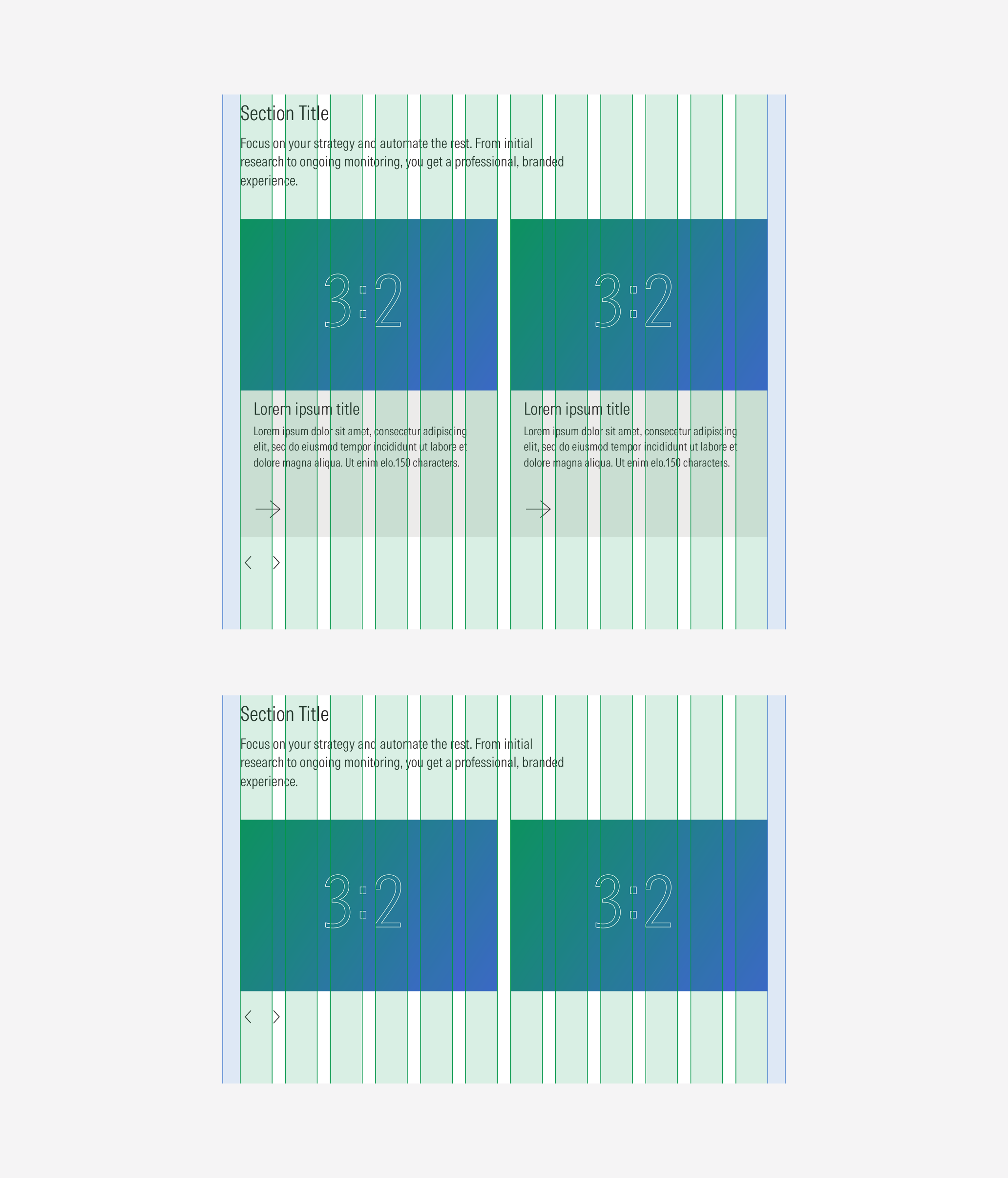
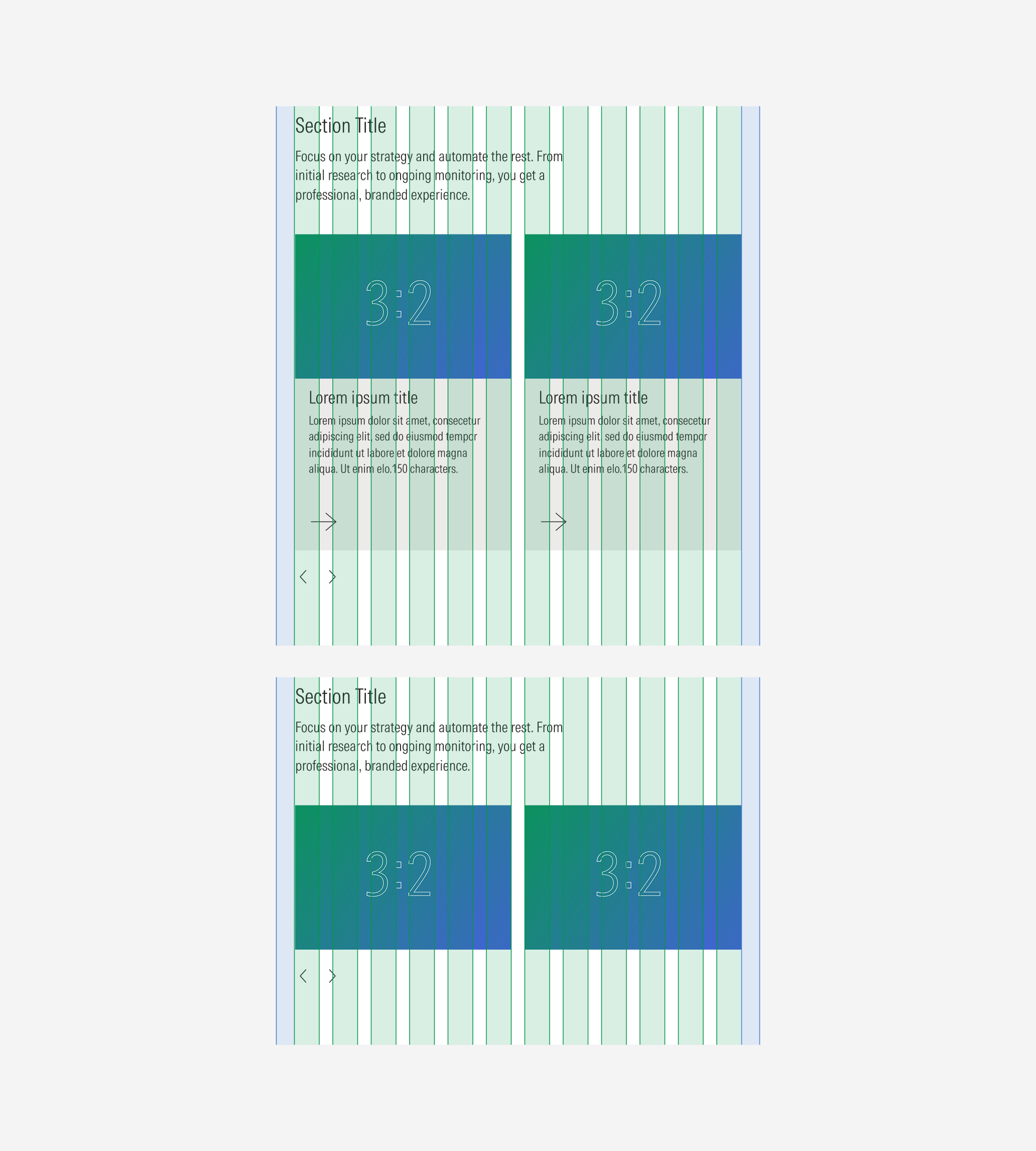
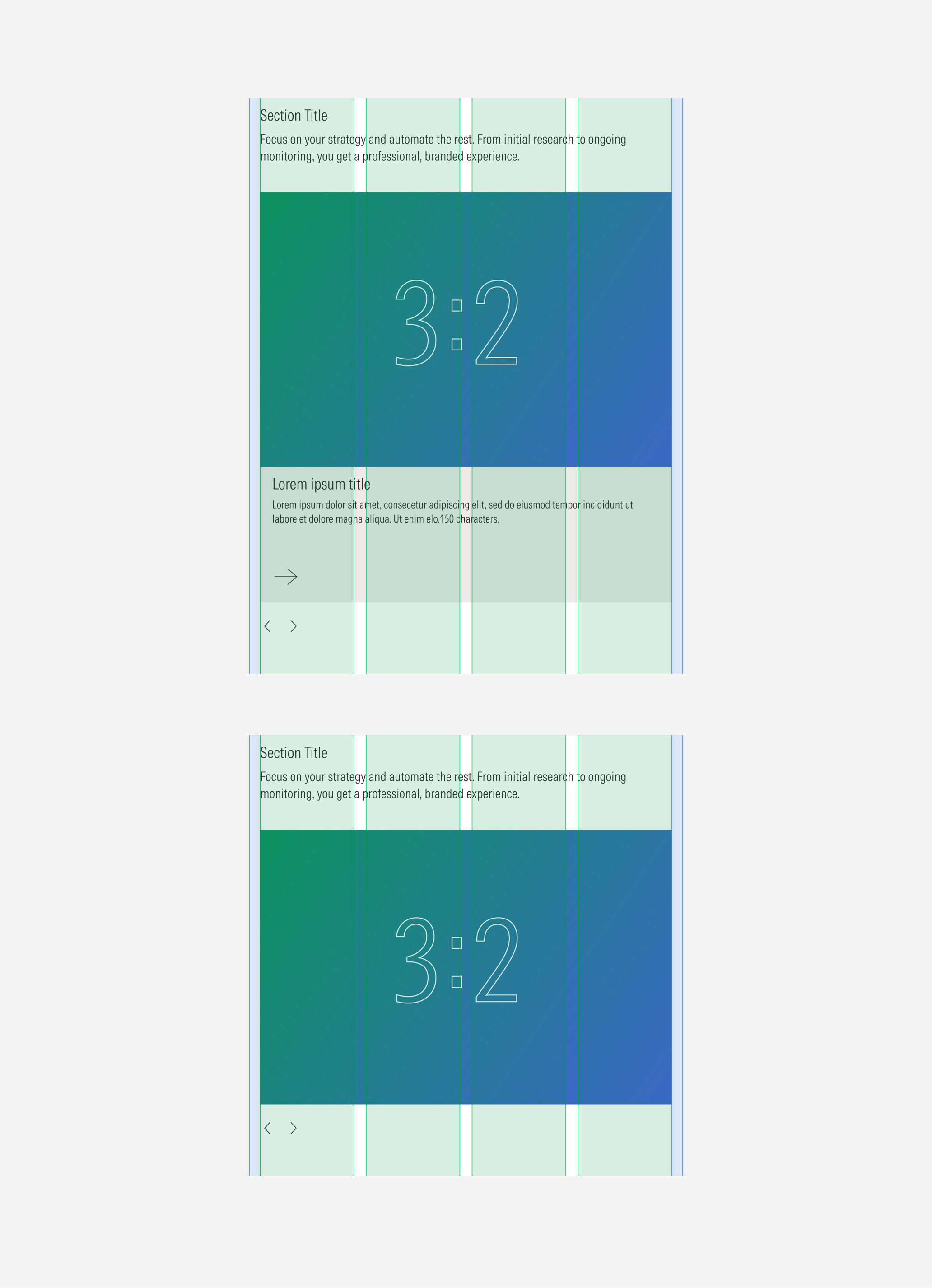
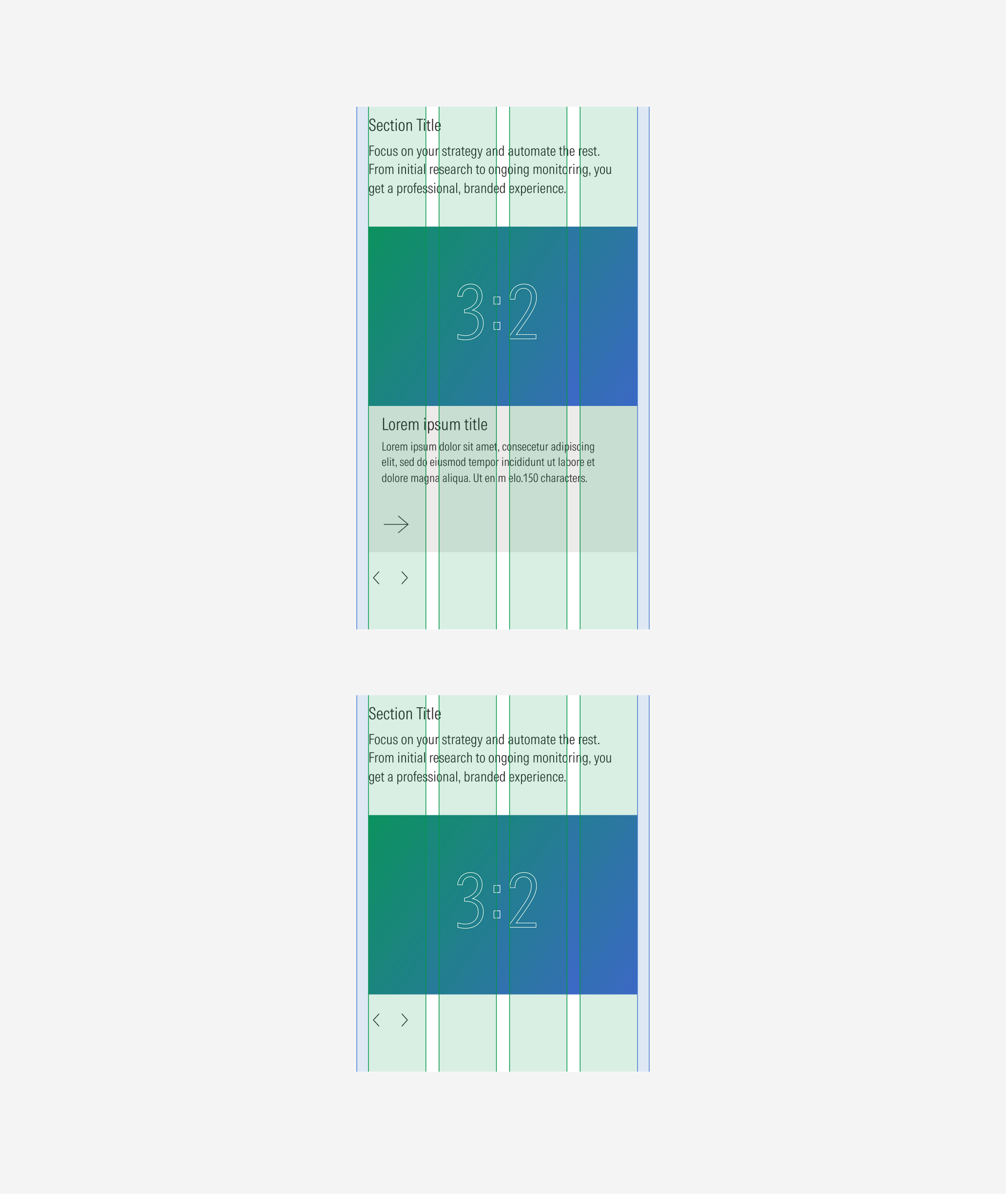
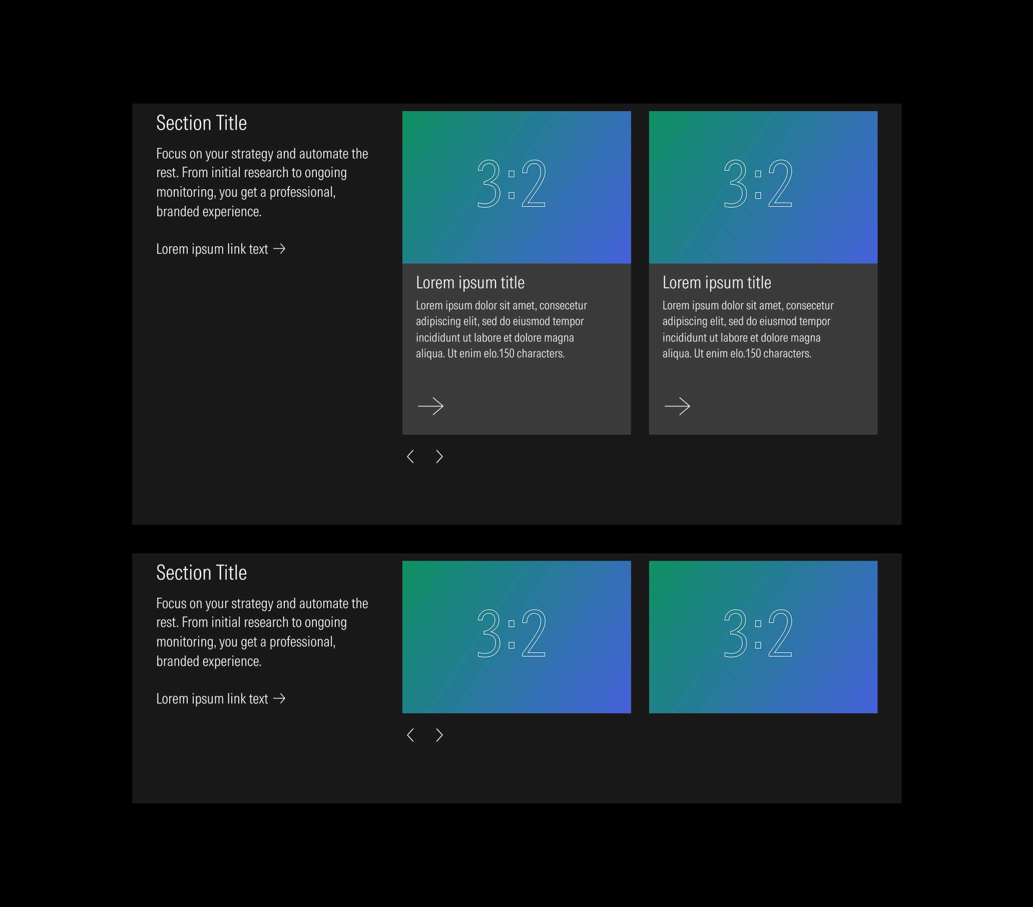
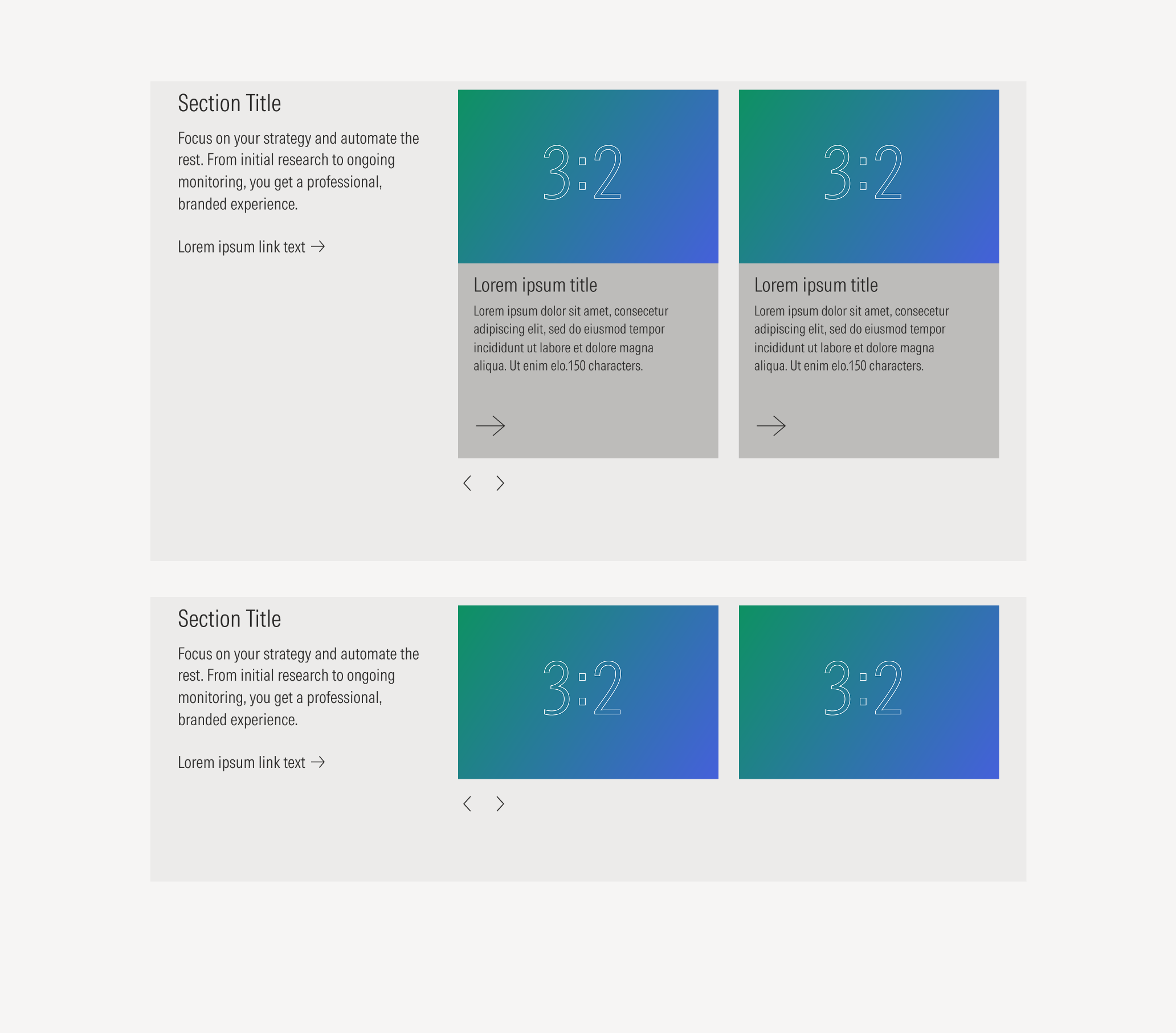
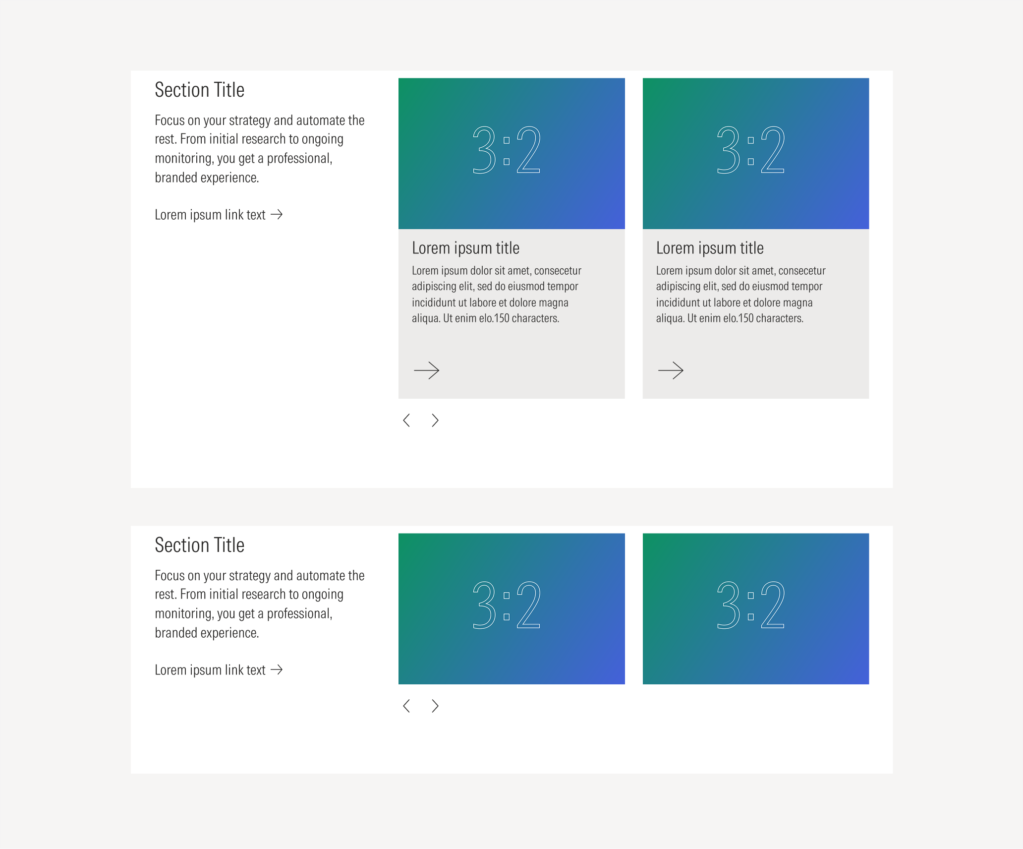
Type B | Use to display content with a text block, present them to give more context. This variation gives the text block the primary level of importance and gives the content more space (width) to be displayed. | With body, no body | With CTA, no CTA | Cards, images | 1, 2 |
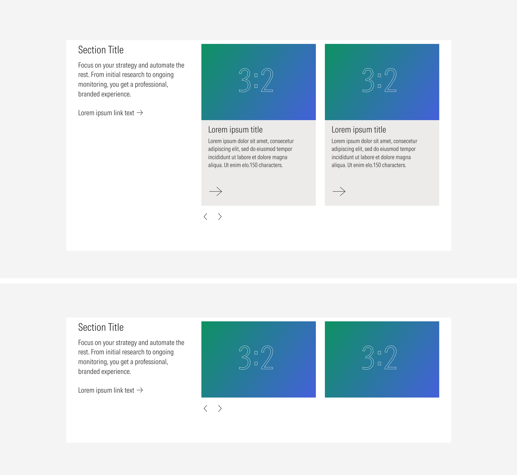
Type B
Use a solid background, and a text block at the top of the content block.
Container
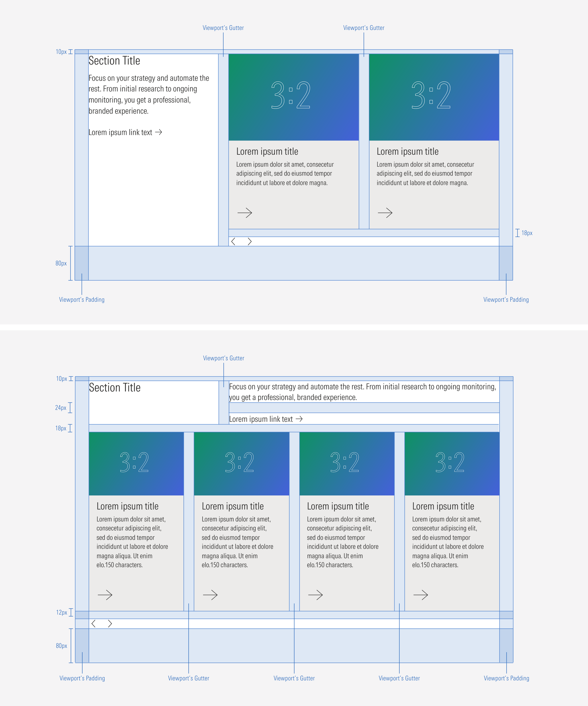
Spacing
Ensure that proper space is given between each item in the container. Besides the horizontal padding and gutter, the carousel has a top and bottom margin. Note that the horizontal and vertical spacing between each item (when having more than one card or image) will match the gutter of the grid (behavior per view-port).
Hierarchy
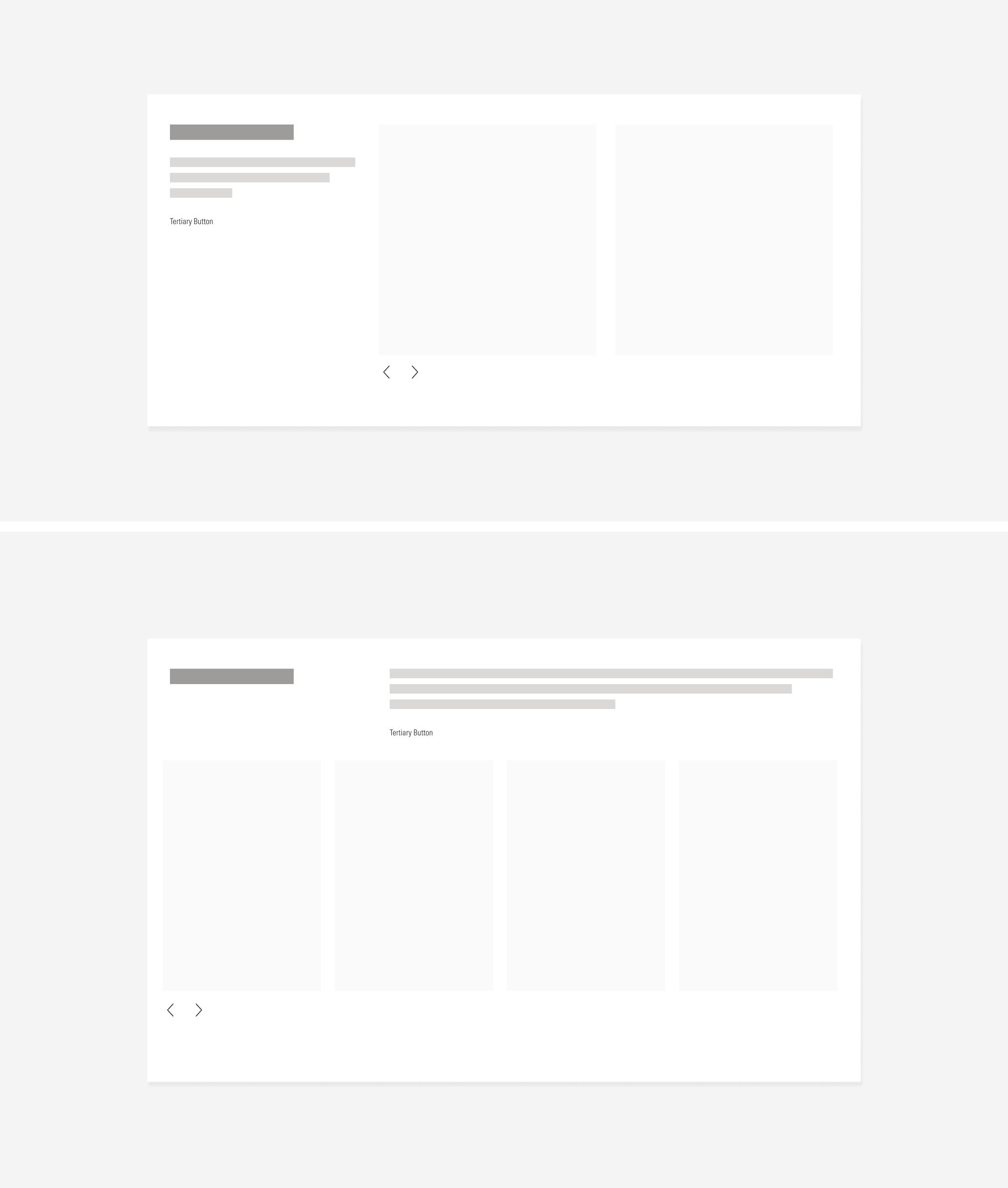
A proper hierarchy must be ensured for the elements that compose a carousel. The navigation controls are tertiary icon-only buttons and they should be at the bottom of the content block. The text block (title only, or with body and CTA) should be placed on the top or left side of the content block to support and give more context. Keep in mind that the CTA will be a tertiary button.
Alignment
The alignment of the components within the carousel container should be left-aligned.
Do place the navigation controls below the content block, aligned to their left.
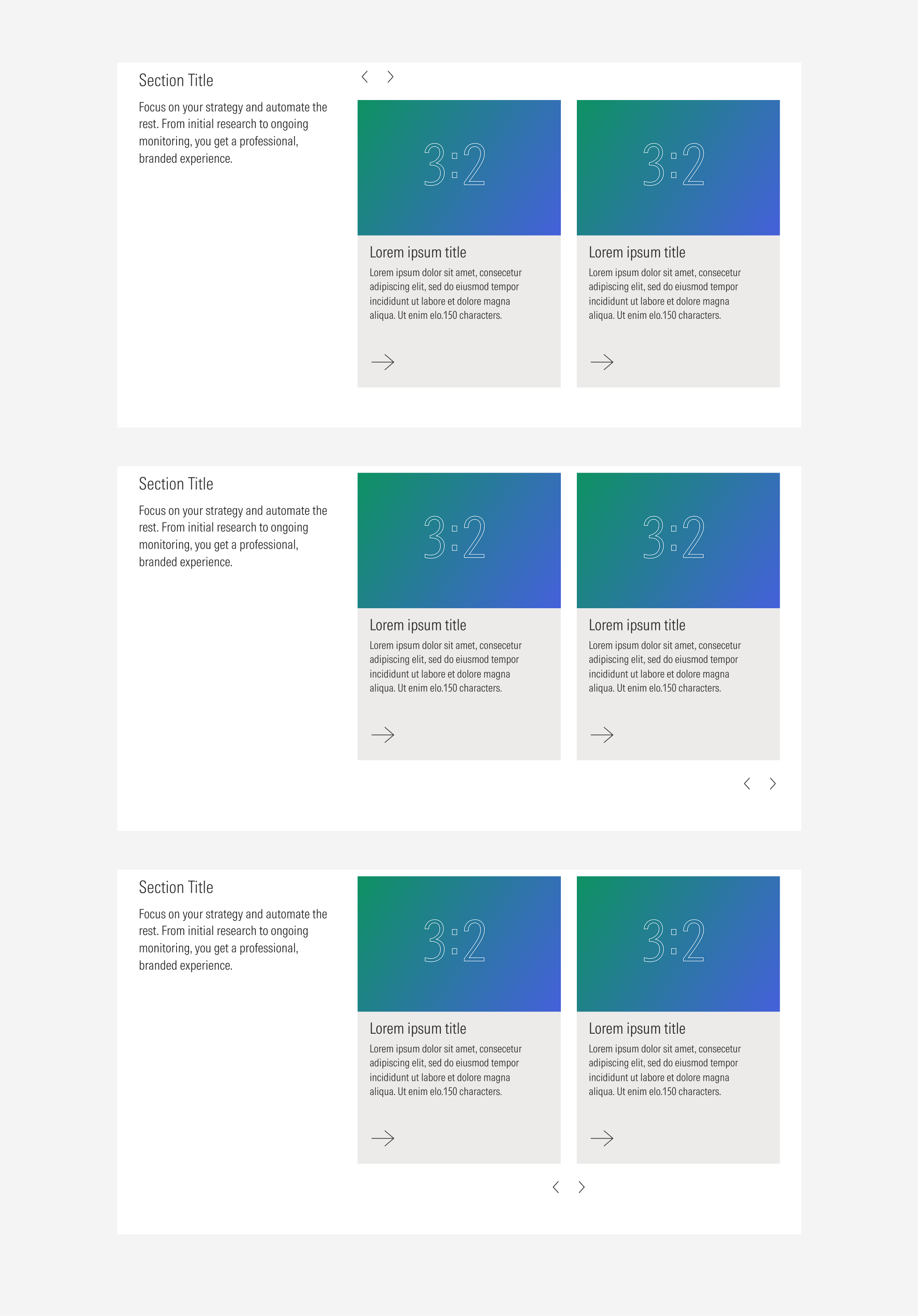
Don’t place the navigation controls on the top, right, or center; aligned to the content block.
Behavior
Navigation Controls
The navigation controls (left and right icon buttons) allow the user to slide through the content blocks. Both will be active at the same time, except on two scenarios:
- When the first content block is displayed, the left arrow should be disabled, and the right arrow should be active.
- When the last content block is displayed, the right arrow should be disabled, and the left arrow should be active.

Scale Down Behavior
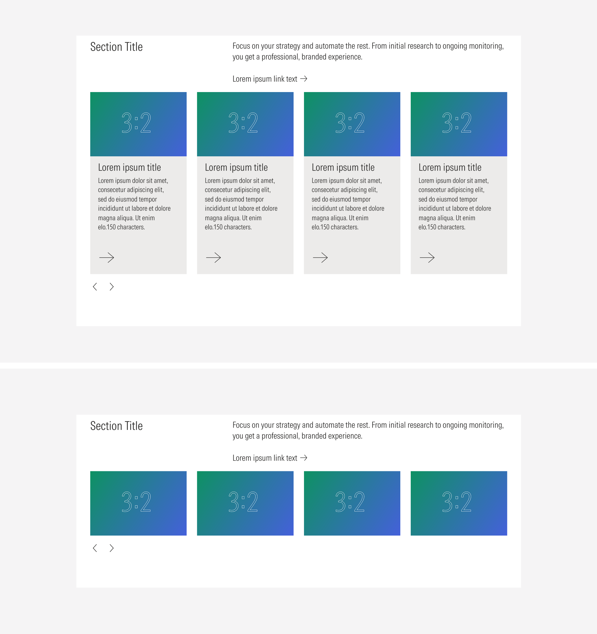
A carousel container can manage from four to one card columns, depending on the view-port.
- LG: 1 to 4 Columns of cards
- MD : 1 to 3 Columns of cards
- SM : 1 to 2 Columns of cards
- Default : 1 Column of cards
Also, the number of cards displayed in a row (and the number of columns from a card container) will be closely related to the size of the screen and the breakpoint of the page. This means that the card container will adapt to the view-port.
Use Case 1: Columns With Only Cards
At the LG breakpoint, the card container can display a max of four cards per row.
