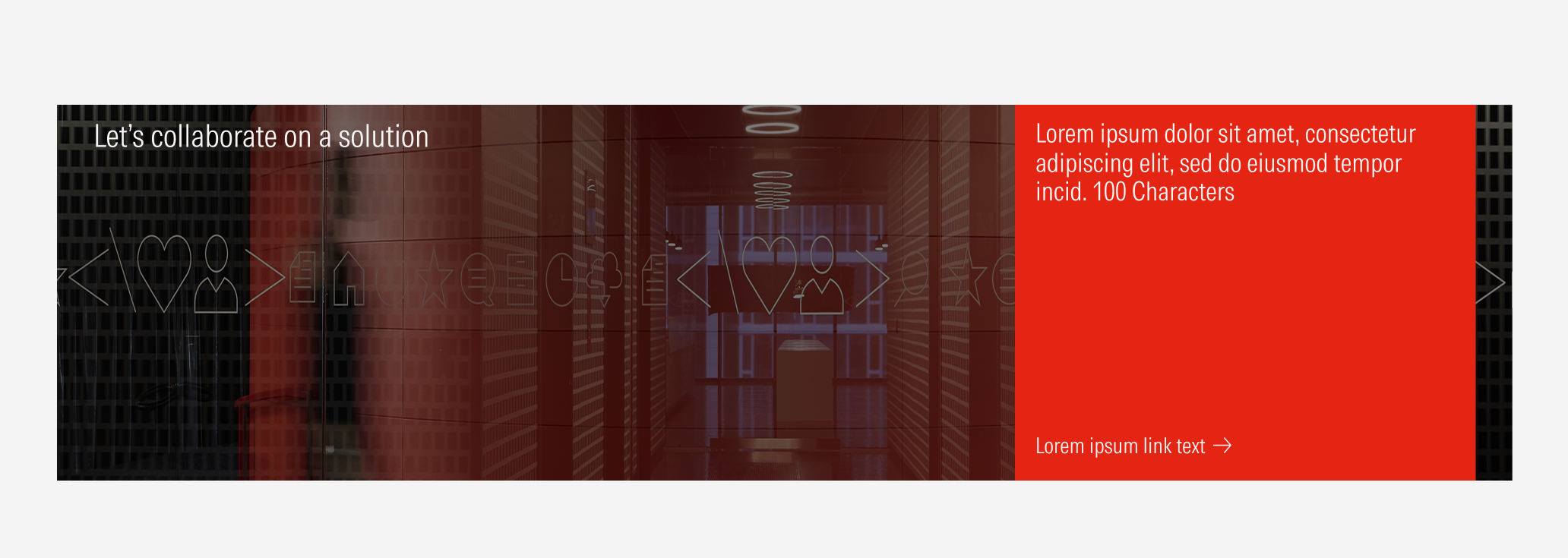
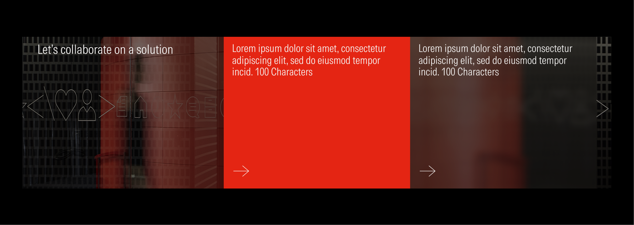
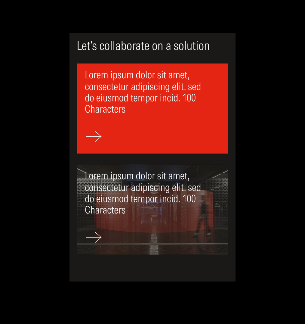
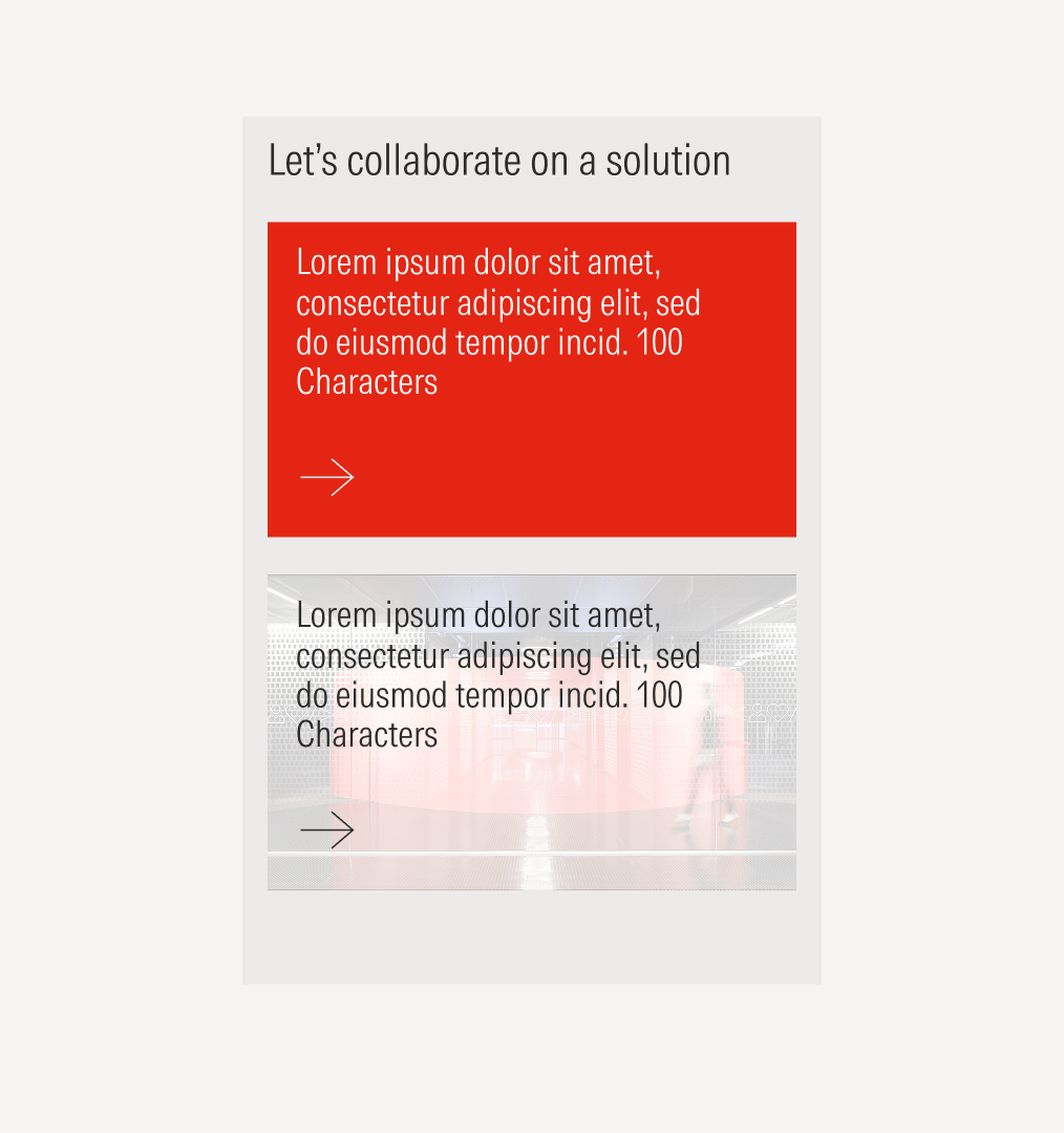
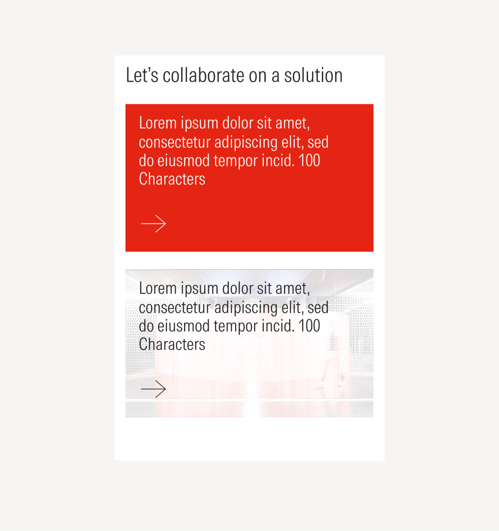
Collaborate
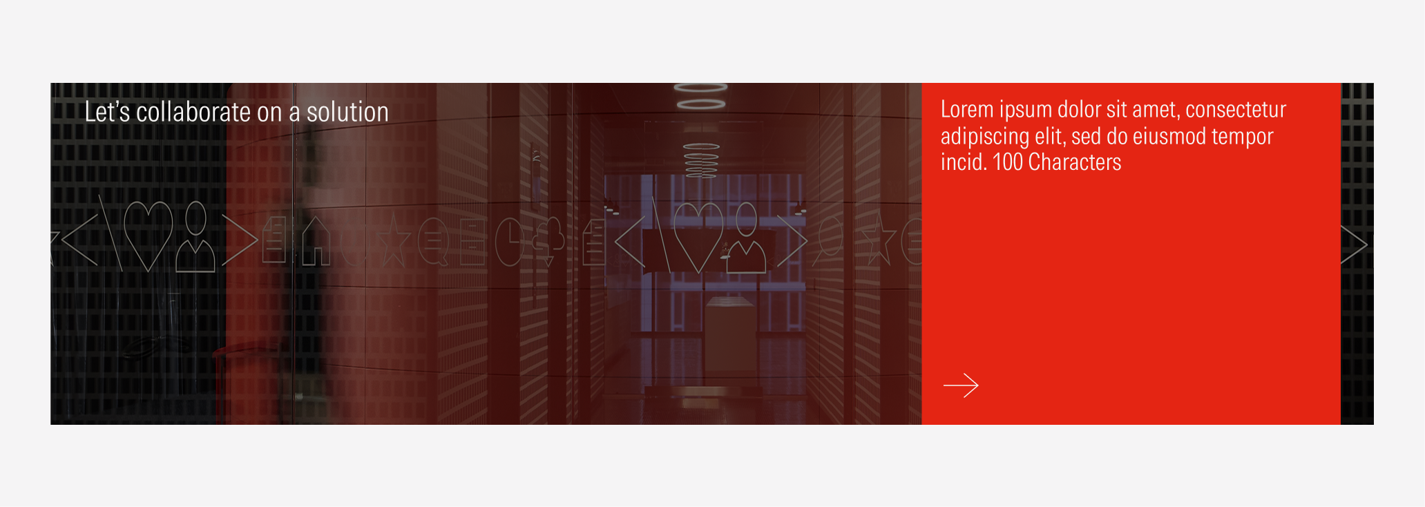
The collaborate section is used at the bottom of mostly every page like a final CTA and contact. We end with a strong use of a red card to reinforce the brand color.
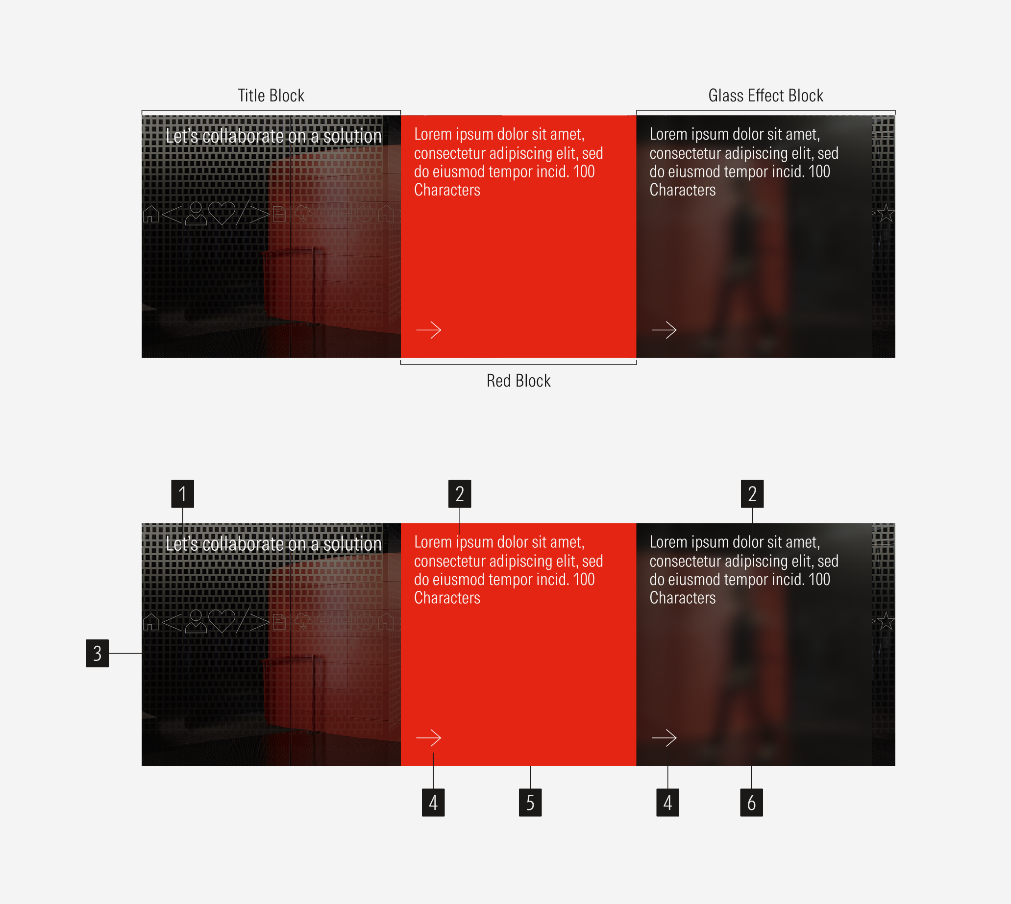
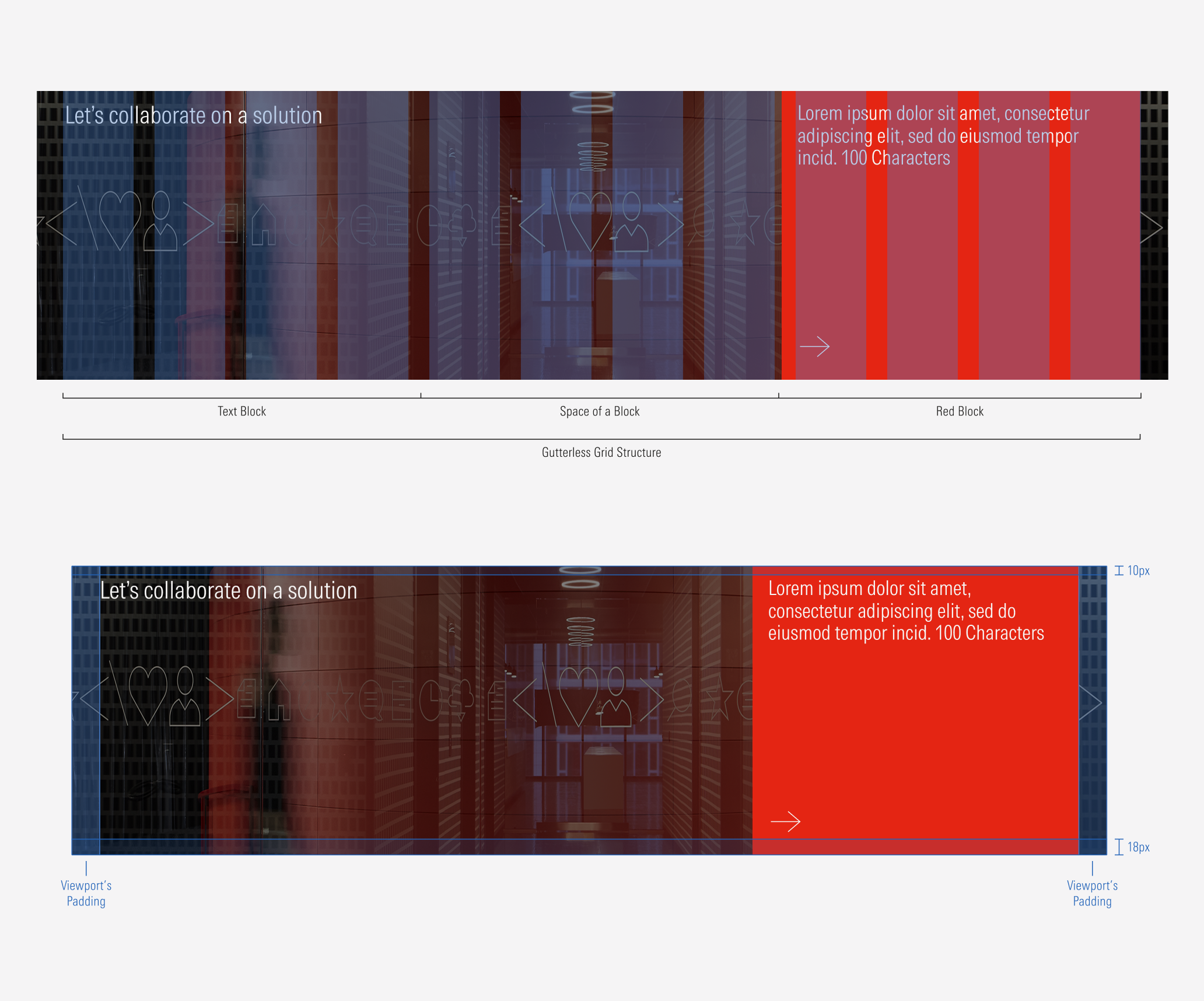
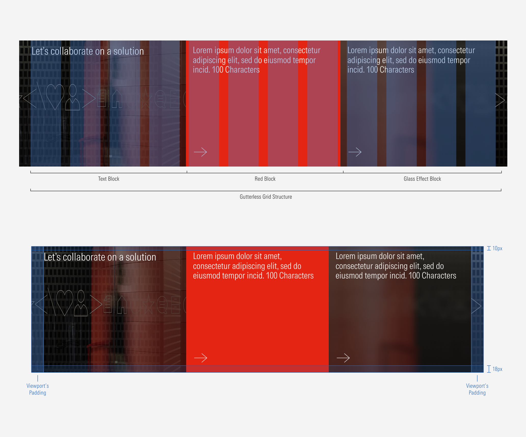
- Section title sets the topic of the section.
- Content block headline briefly describes and present the topic of the block.
- Section background is a specific full-bleed image background for the section. It can be customized.
- CTA enforces the user to take an action. Users can click to see more about the content presented. It will be a tertiary icon-only button of the right arrow with the motion at hover (no color change, just the movement).
- Primary content block is a red tile background. It is visible in both variations.
- Secondary content block is a glass effect block background. It is visible only in the two tiles variation.
Usage
When to Use
Use the collaborate section at the end of every content page to make a final call to action and connect with the user.
When Not to Use
Don’t use the collaborate section when the purpose is to present and describe specific content or to promote. Use the card container or flexible module instead.
Variation | Purpose | Tiles | CTA |
|---|---|---|---|
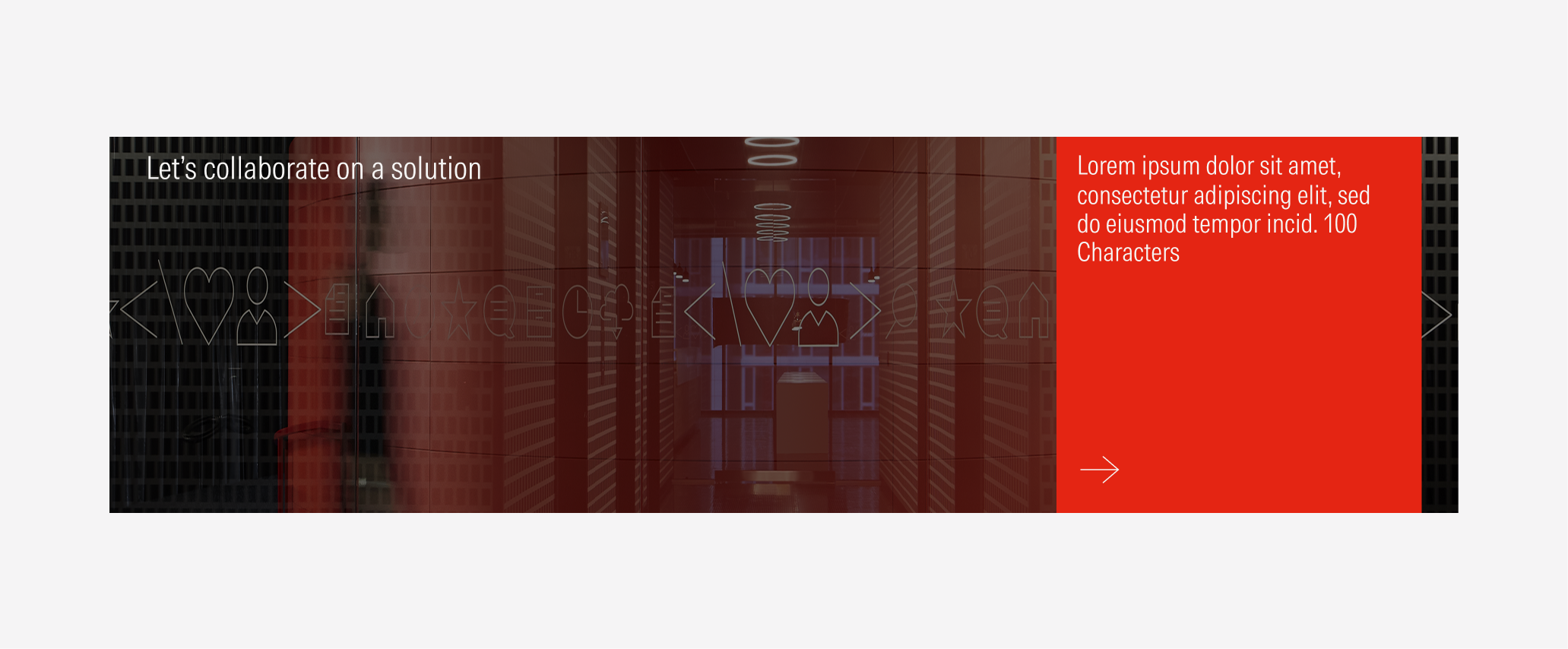
1 Block | Use to present one way to connect at the end of the page. | With red block and without glass effect block | With CTA (tertiary icon only button: right arrow). |
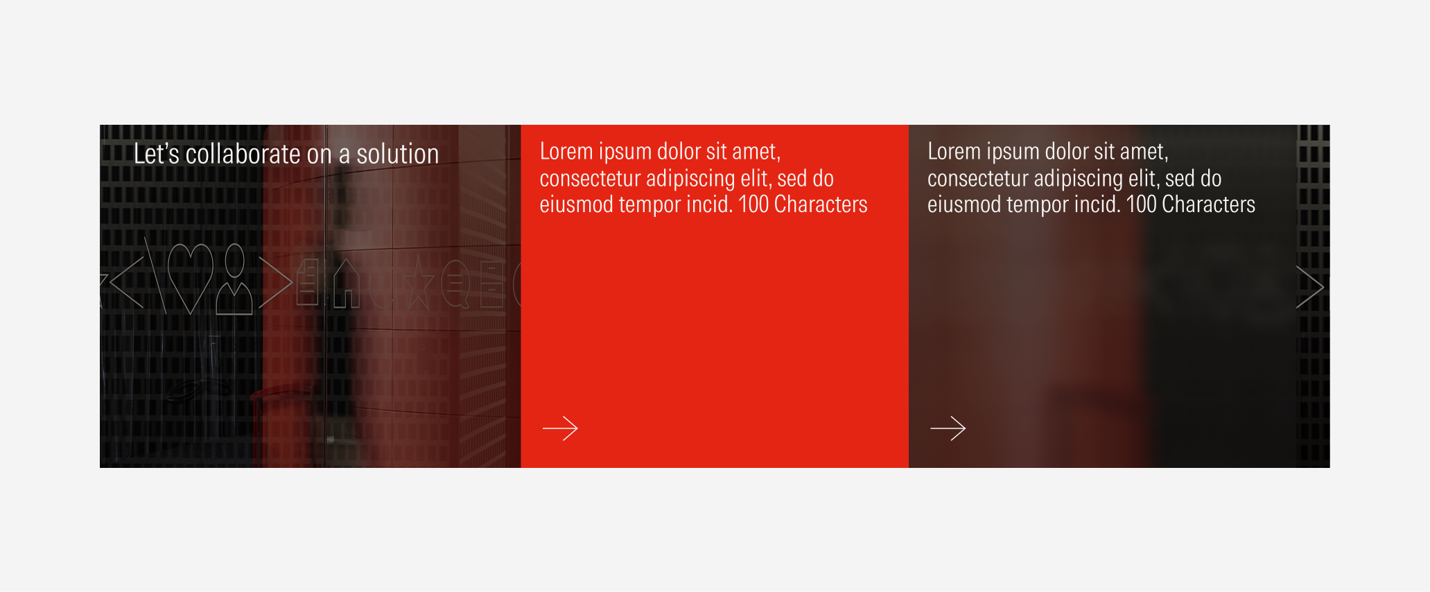
2 Blocks | Use to present two ways to connect at the end of the page. | With red block and with glass effect block | With CTA (tertiary icon only button: right arrow). |
Block Types
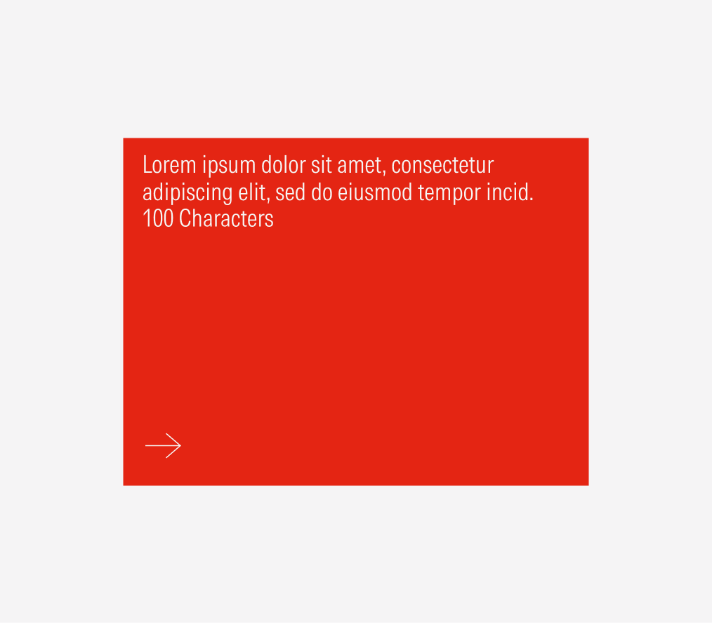
Red Block
This is the primary CTA block. It will always appear in the collaborate section. In the one block instance, the red block will be the only block visible.
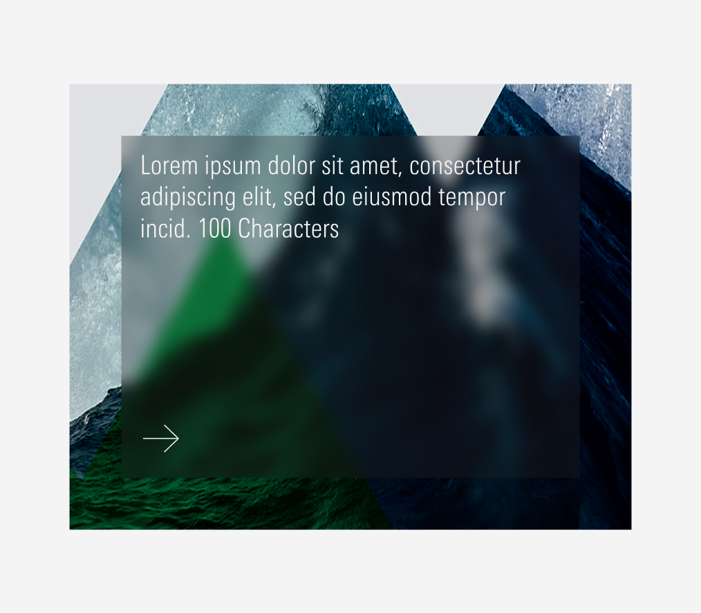
Glass Effect Block
This is the secondary CTA block. It has a glass effect that blurs the background image of that block. It will only appear on the two block variation.
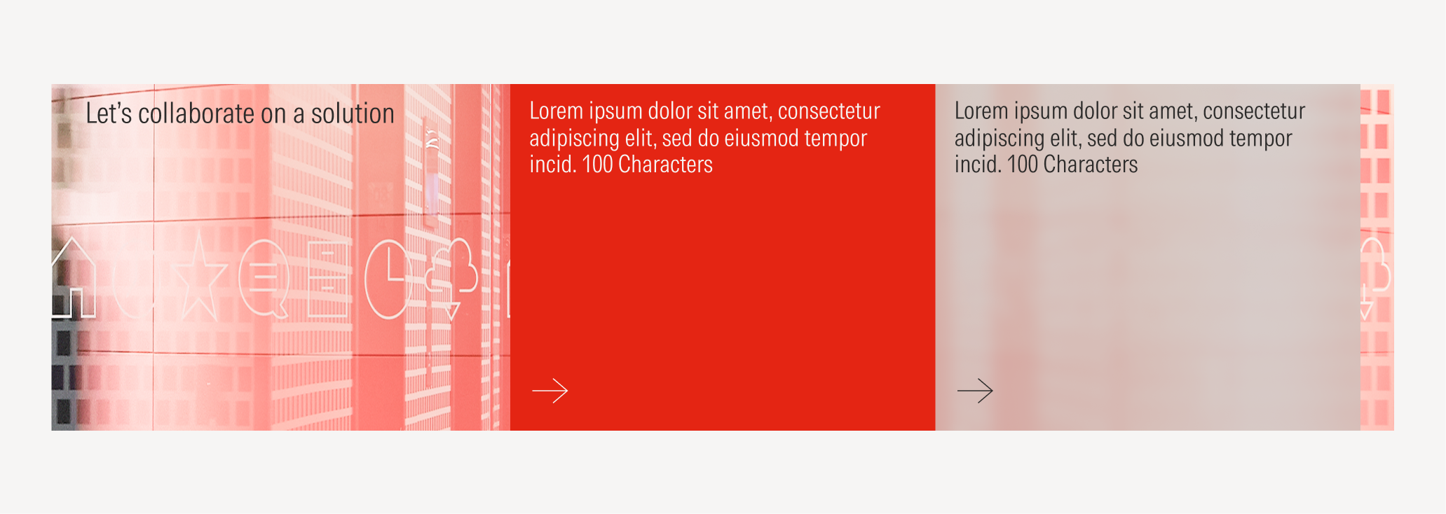
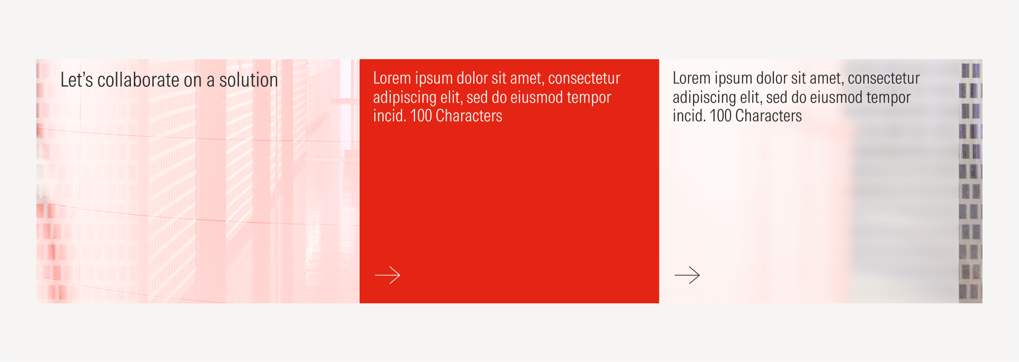
Background Image
Full-bleed background image with a 70% neutral-80 fill set to multiply. The background image can be customized.

Do use a tertiary icon only button as a CTA for the content blocks for better legibility and focus on the headline.
Don’t use a primary or a secondary button as a CTA for the content blocks or a tertiary button with a label.

Do have only a title in the text block as the section’s title.
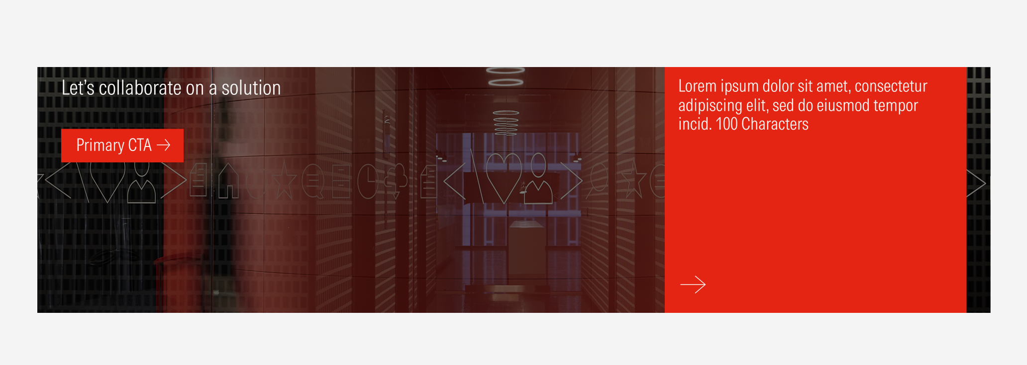
Don’t add a CTA at the title’s block.
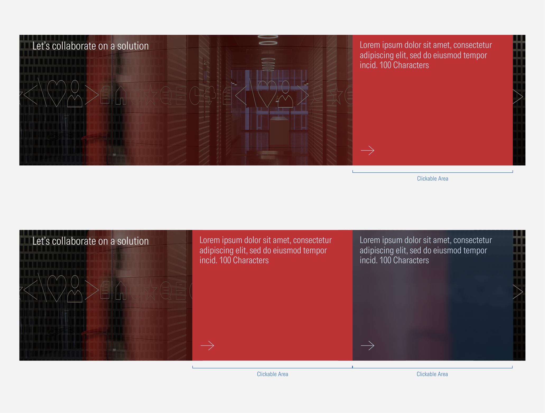
1 Block
2 Blocks
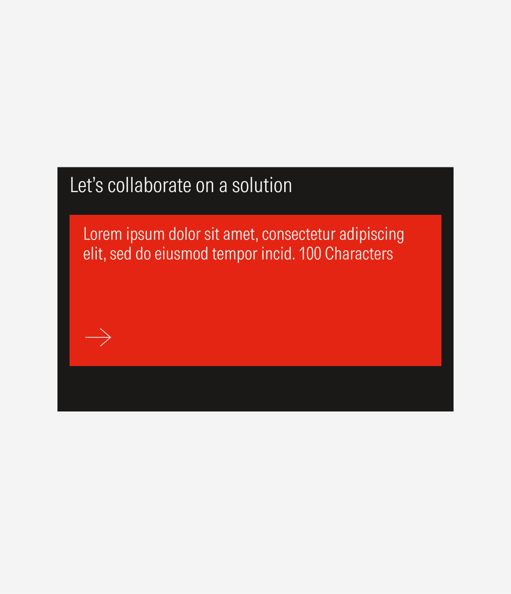
Compact