Buttons
Buttons allow users to take actions, and make choices; they communicate actions that users can take.
Buttons are typically placed throughout the UI and should be easily findable and identifiable while clearly indicating the action they allow a user to complete. This means that the button label should clearly express what will happen when the user clicks or taps it.
Emphasis
A page layout can have more than one button, but a button group cannot repeat the same button style. The on-screen arrangement of content will guide the user and help with storytelling; a page should have a single, prominent primary action, communicating that one is the most important and other actions follow on a secondary or tertiary level of importance.
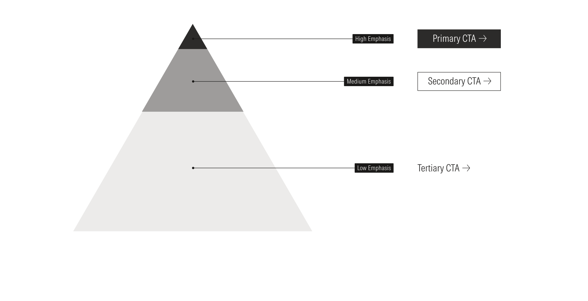
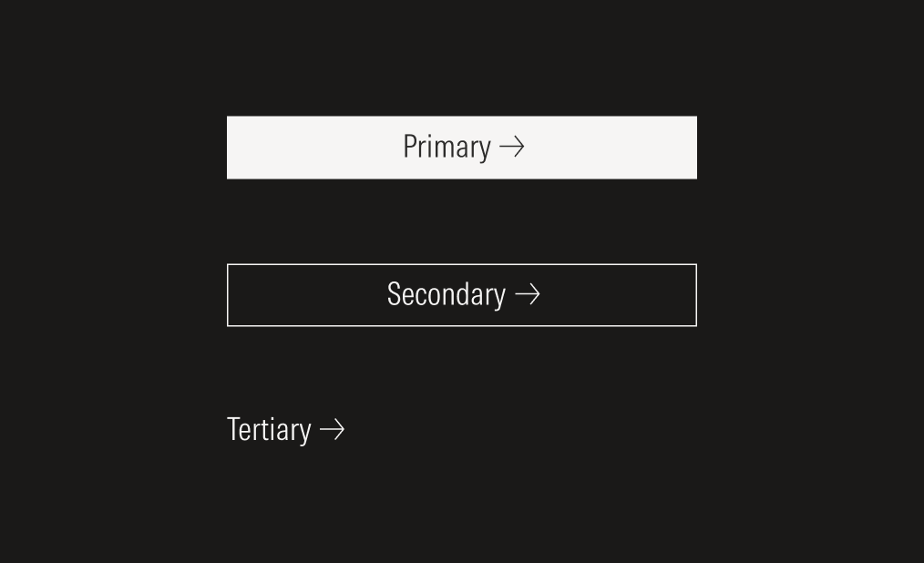
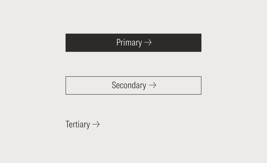
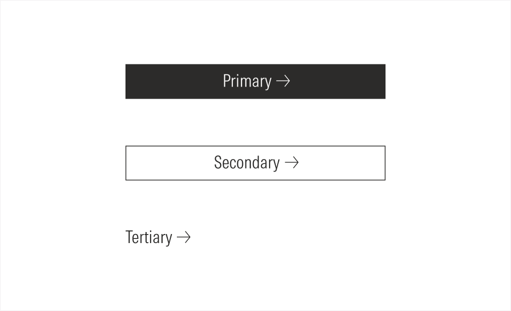
Level of Emphasis | Purpose | Level of Attention | Component | Example Actions |
|---|---|---|---|---|
High emphasis | Use for highest-priority, most important, or most common action on the screen. Use for actions that are required to complete an important task. High-emphasis buttons should be used for the primary action on a page, form, or modal. | Commands the most attention | Primary button | Connect, submit, accept all, start trial |
Medium emphasis | Use for a secondary action on a page, form, modal or for actions that branch away from the primary intended pathway of the page. Use for most buttons triggering non critical actions or actions that don’t distract from other elements. | Second level of attention | Secondary button | Allow only necessary, show more, show less, watch, become a sponsor, start trial |
Low emphasis | Use for non preferred or discreet actions with the least amount of prominence. These could be optional or supplementary actions. | Least amount of attention | Tertiary button | Cancel, read more, learn more, view more, download, get started |
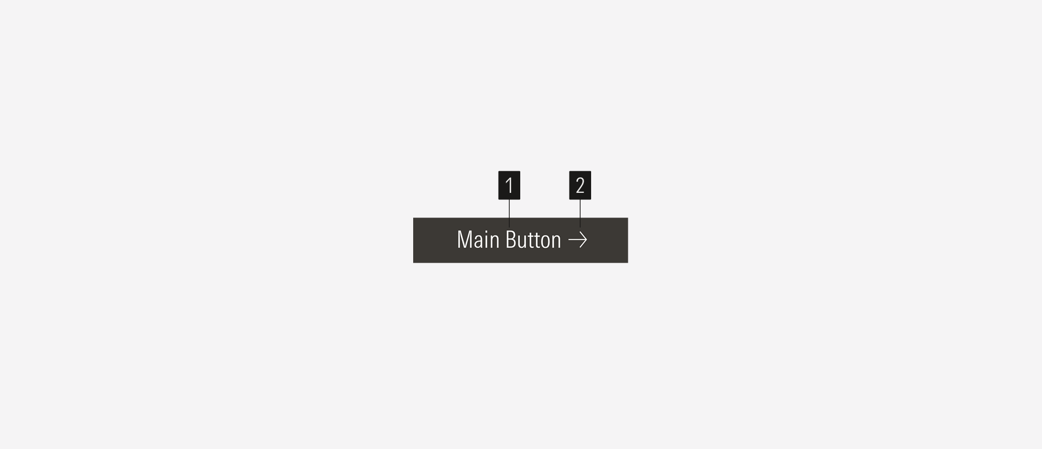
- Label sets the label of the button.
- Icon enforces the meaning of the action. The most common is the right arrow. Icons have animations on hover.
Usage
When to Use
Use buttons to communicate calls to action and afford interaction for features, such as confirming or submitting information entered into a form, canceling an action, creating objects, opening or closing containers, and moving forward or backward in a workflow.
When Not to Use
Don’t use buttons to display a collection of links to sections or a link to an external site. Use list groups or links instead.

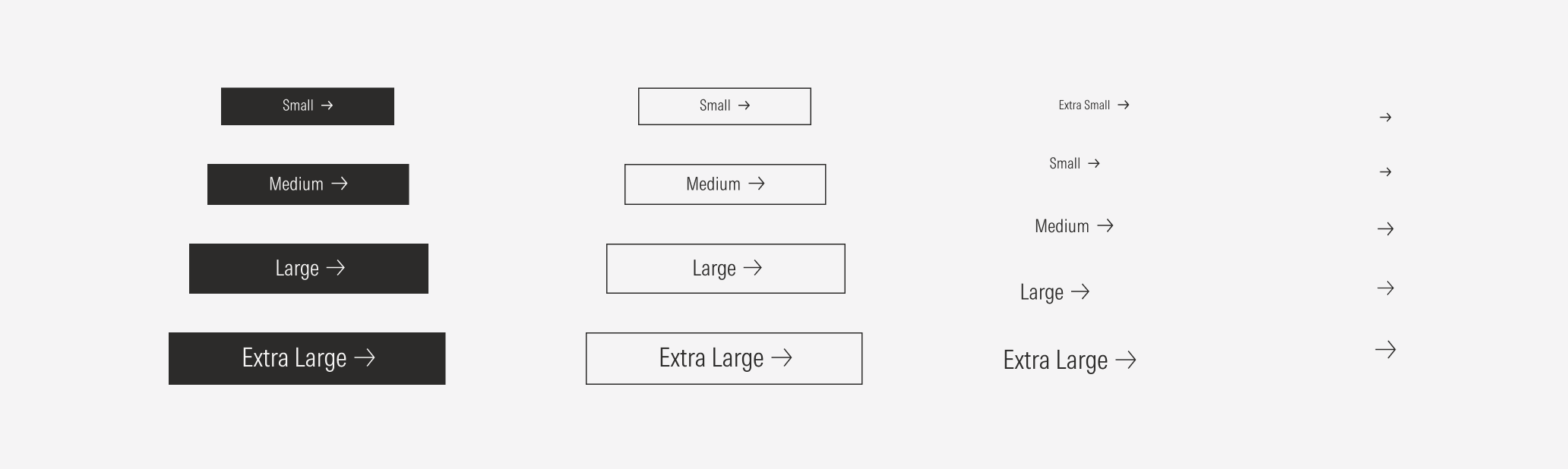
Variations | Purpose | Type | Icon | Sizes | Color |
|---|---|---|---|---|---|
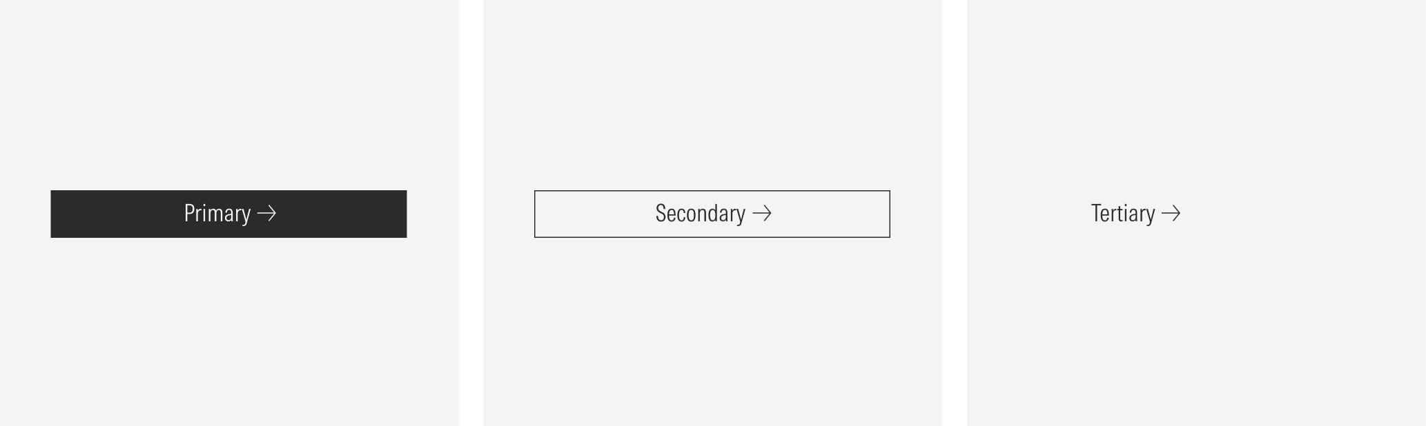
Primary | High emphasis. Use for highest-priority actions that are required to complete the user’s task. Use for the primary action on a page, form, or modal. | Packed, spaced | With icon (right or left), no icon, icon only | XL, LG, MD, SM | Neutral, red (use only with XL and LG sizes), white |
Secondary | Medium emphasis. Use for secondary actions on a page, form, modal, or actions that branch away from the primary intended pathway of the page. Use for most buttons triggering non critical actions, such as back, show more, or show less. | Packed, spaced | With icon (right or left), no icon, icon only | XL, LG, MD, SM | Neutral, white |
Tertiary | Low emphasis. Use for non preferred or discreet secondary actions, such as cancel. | Packed, spaced | With icon (right or left), no icon, icon only | XXL (icon only), XL, LG, MD, SM, XS | Neutral, white |
Spaced
Use the spaced buttons for a list of button items (list groups).

With Icon
Add icons to provide additional affordance or meaning to a button.

No Icon
Use when users don’t need additional context beyond the label when the buttom action is simple and happens on the same page.

Icon Only
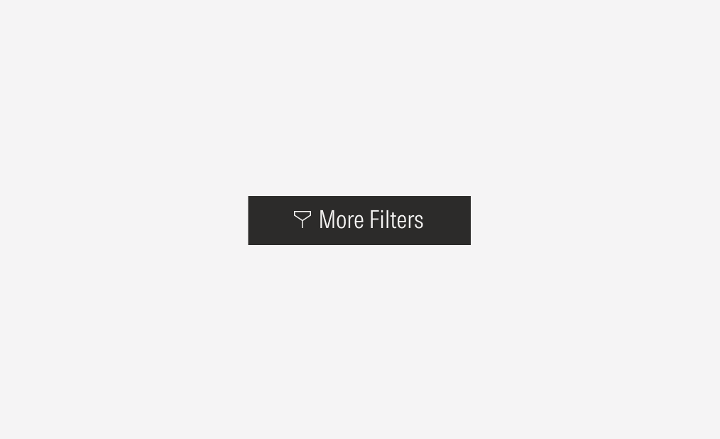
Use for toolbars, cards, and displays where words won’t fit comfortably alongside icons, or to represent a quick, common action where the label is not needed. Icon-only buttons can use any button variant - primary, secondary, and tertiary - but most commonly use with the tertiary variant, especially the right-arrow icon.

Status
All buttons have 6 status that represent specific behaviors from the buttons: default, hover, focus, pressed, disabled, and loading.
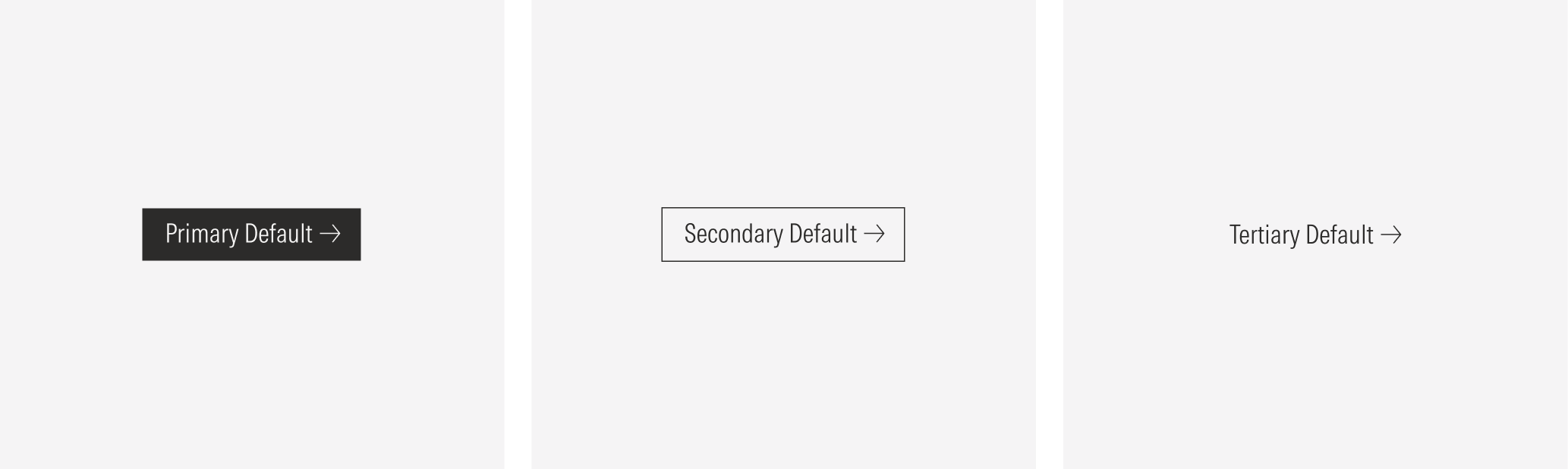
Default
The default state represents how the button appears when it is rendered on th interface without any user interaction. This is the most neutral presentation of the button, and it sets the foundation for all other states.
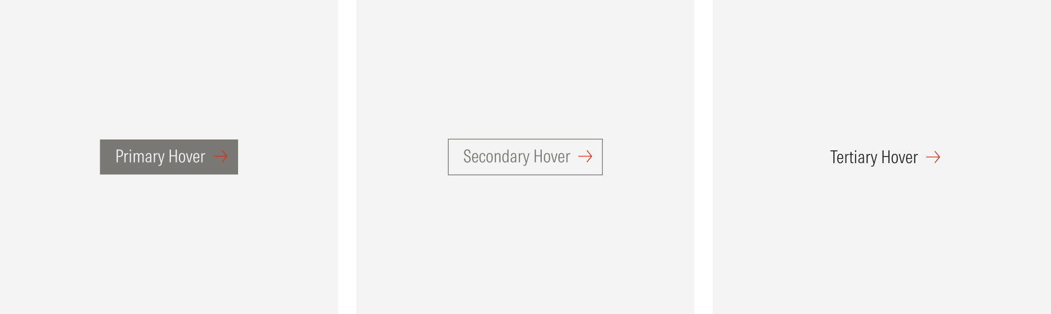
Hover
The hover state communicates interactivity and signals that the button can be clicked. It should provide clear change from the default state without creating confusion with other states.
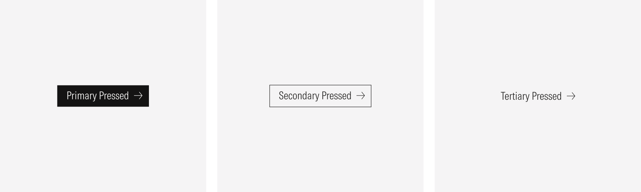
Pressed
The pressed state represents the exact moment when a user clicks or taps the button. It communicates that the interaction is being registered.
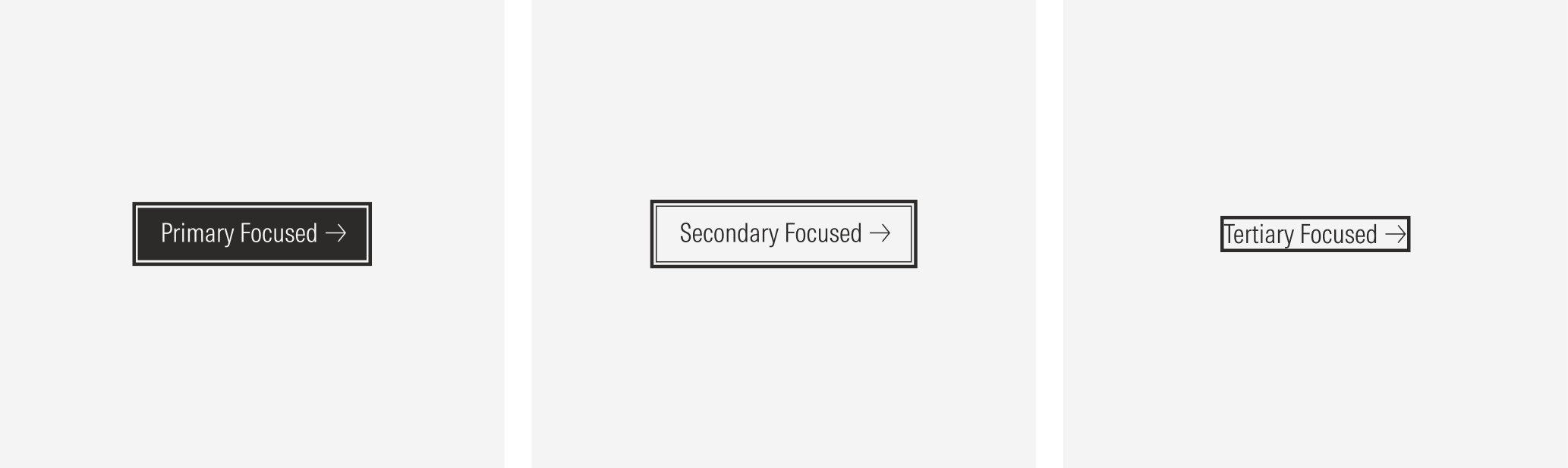
Focused
The focused state indicates that the button is currently the target of user interaction via keyboard, screen reader, or other assistive technology. It ensures that users navigating without a mouse can clearly identify which element is active.
Disabled
The disabled state communicates that a button is visible but unavailable for interaction. It should look clearly inactive while still being legible enough to inform users of its purpose.

Loading
The loading state communicates that an action has been triggered and is currently being processed. It reassures the user that the system is working and prevents duplicate actions. This variation is available for the primary, secondary, and tertiary main buttons.

Hierarchy
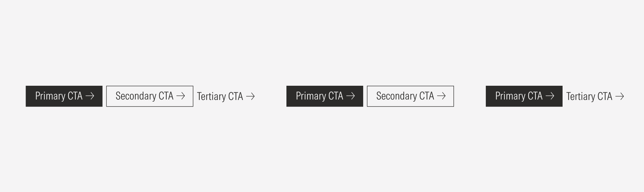
A proper hierarchy must be ensured for the available user actions. To achieve this, buttons of the same type should not be placed next to each other. Place buttons of the most importance or frequent use on the page at a higher level of the hierarchy, and lower priority items at a lower level. Keep in mind that the highest priority button does not always need to be a primary button, as long as additional actions are given a lower priority treatment after your primary action.
The proper button order, from highest to lowest priority is: Primary Button -> Secondary Button -> Ghost Button.
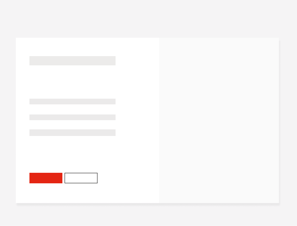
Do place a high priority button with a lower priority button in a button group.
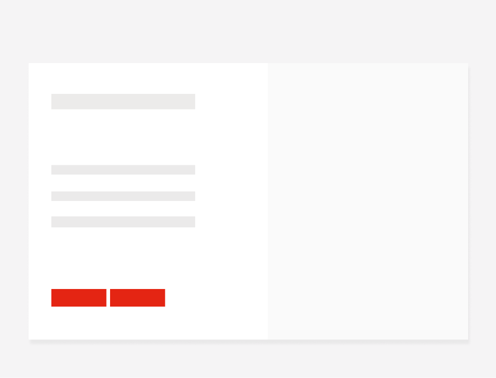
Don’t place two buttons with the same priority level in a button group.
Alignment
The alignment of buttons with their container or content at the same level of the page should follow a left-justified pattern. The primary action should flow to the left-most margin of the content area with the secondary actions following it to the right. In one thrasher variation, the button will be placed after the title, always left-aligned. For the SM and Default view-ports, the CTAs will take the width of the page.
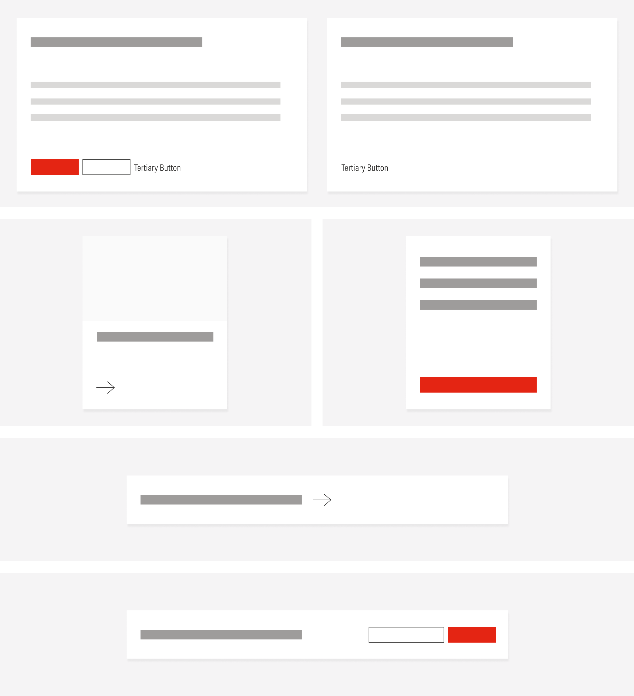
Alignment | |
|---|---|
Left-justified and separate line | In page forms, card call to actions, heros, nested buttons in titles, modals, collaborate section. |
Left-justified and same line | Standard thrasher, filter, search, component groups. |
Right span and same line | Short form thrasher. |
Left span and full width | Call to actions in components for the MD and SM view-ports. |

Do place primary buttons to the left within a group of buttons.

Don’t place primary buttons to the right within a group of buttons.
