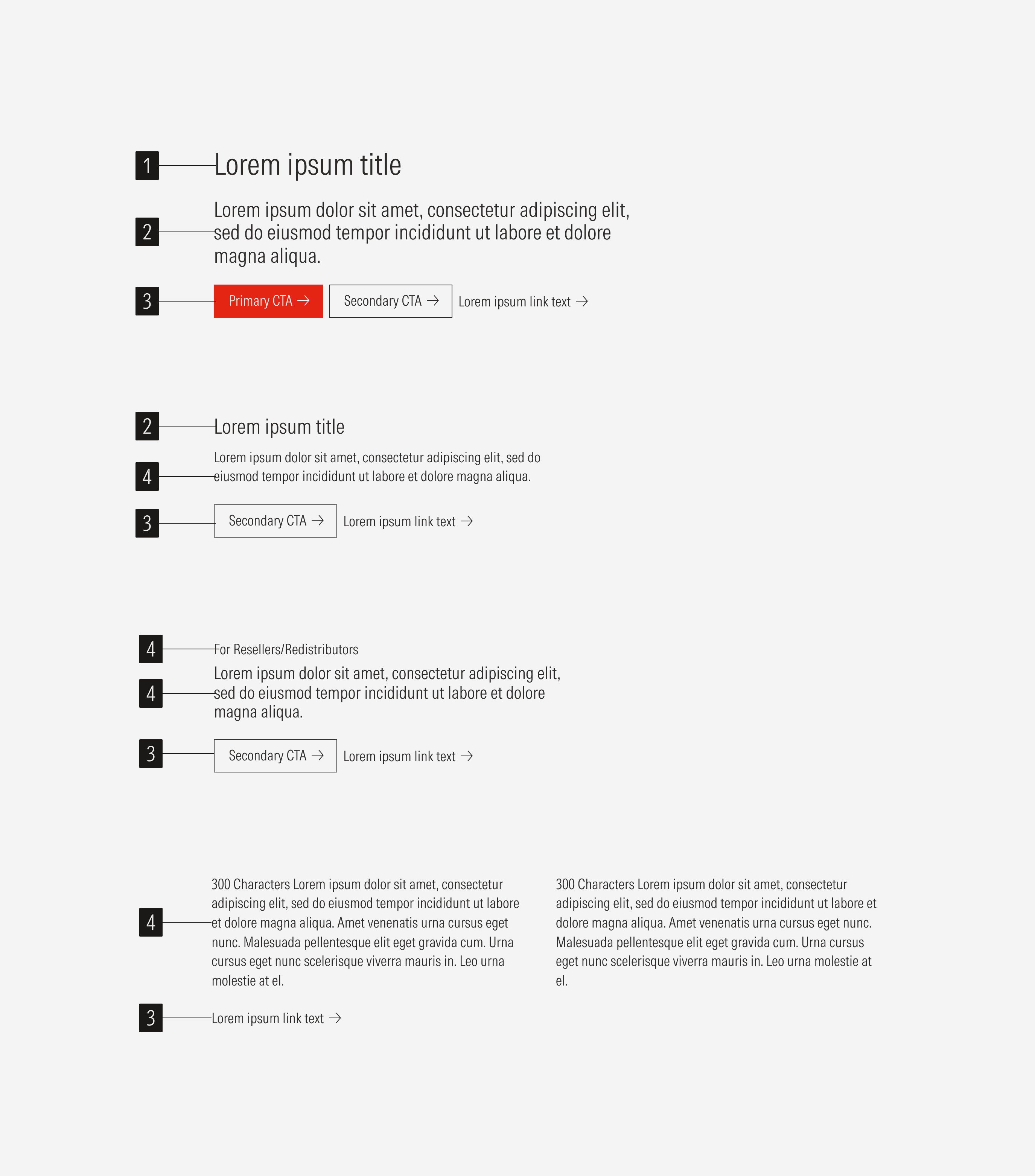
Text Block
These blocks are used for all-text sections. They appear on insights, try, research download, client success story, and campaign landing pages.
Overall Structure: Stacked Text Section Blocks
Overall Structure: Horizontal Text Section Blocks
Overall Structure: Content Text Section Blocks
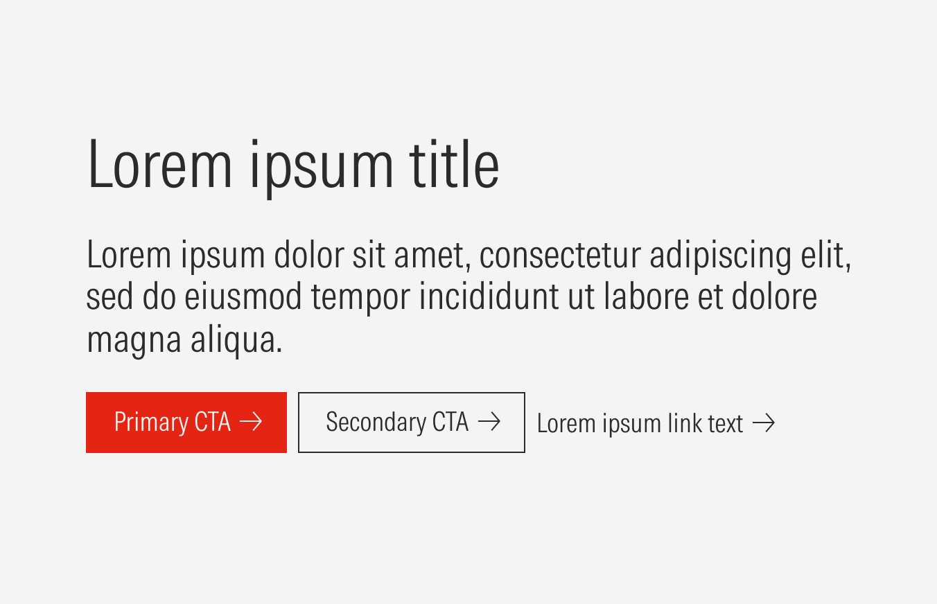
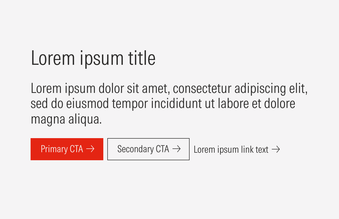
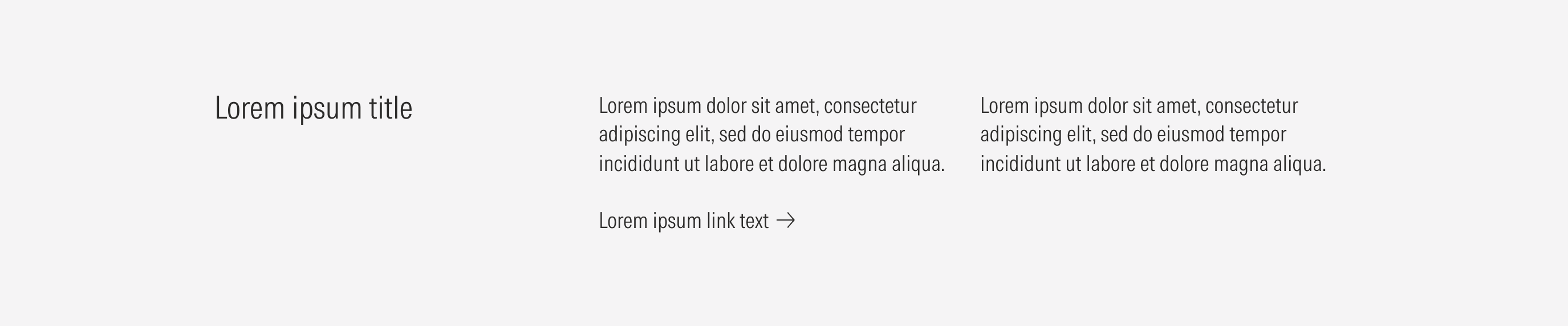
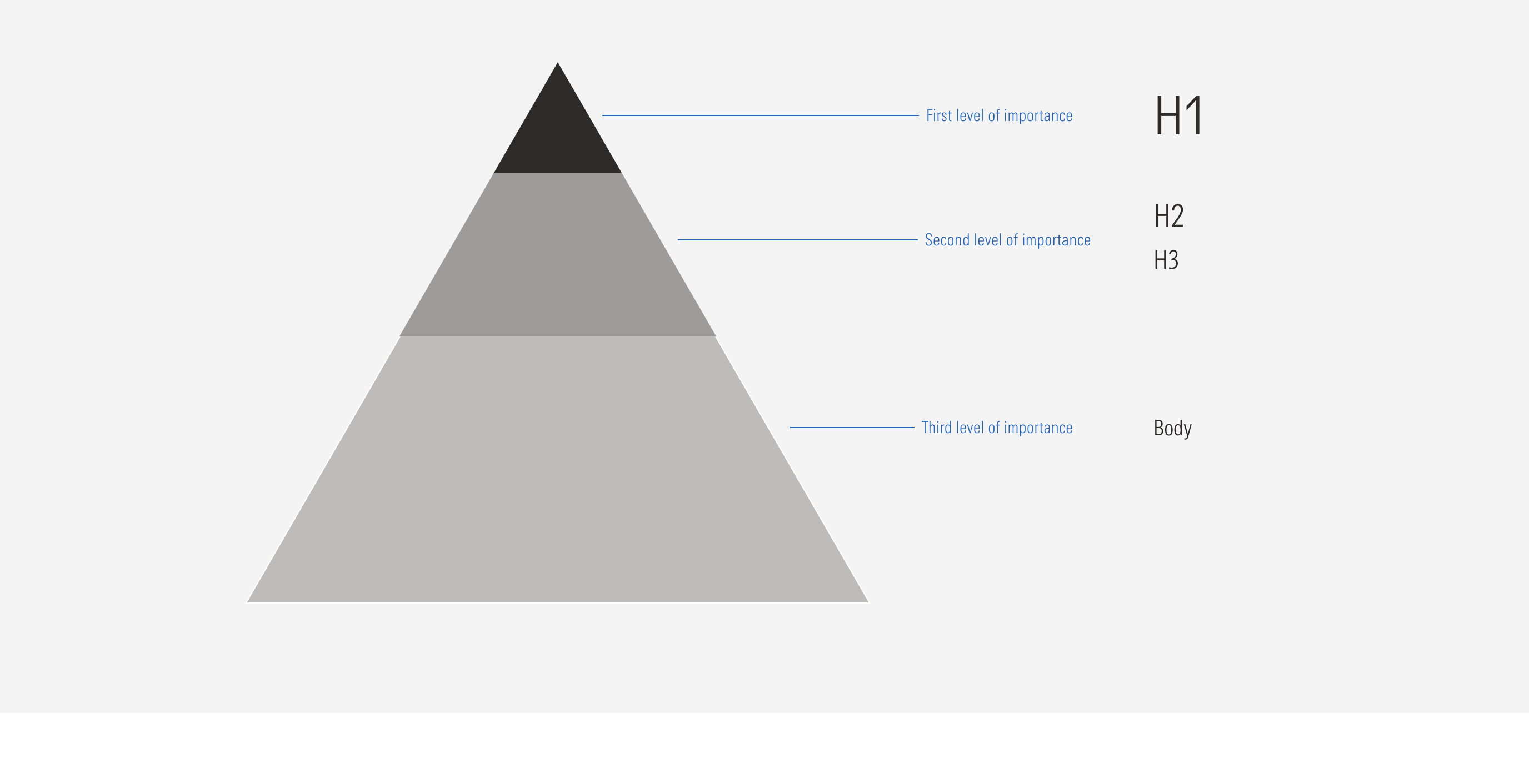
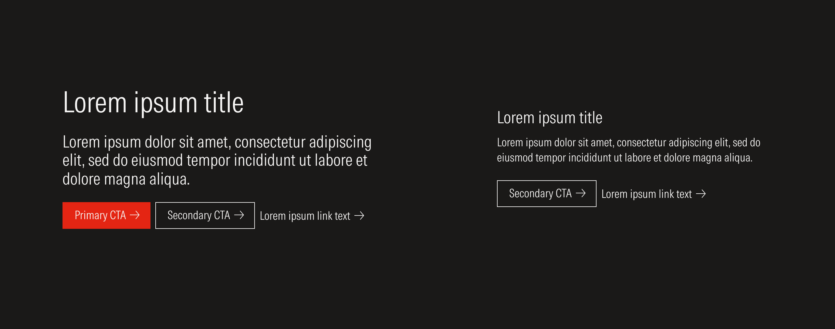
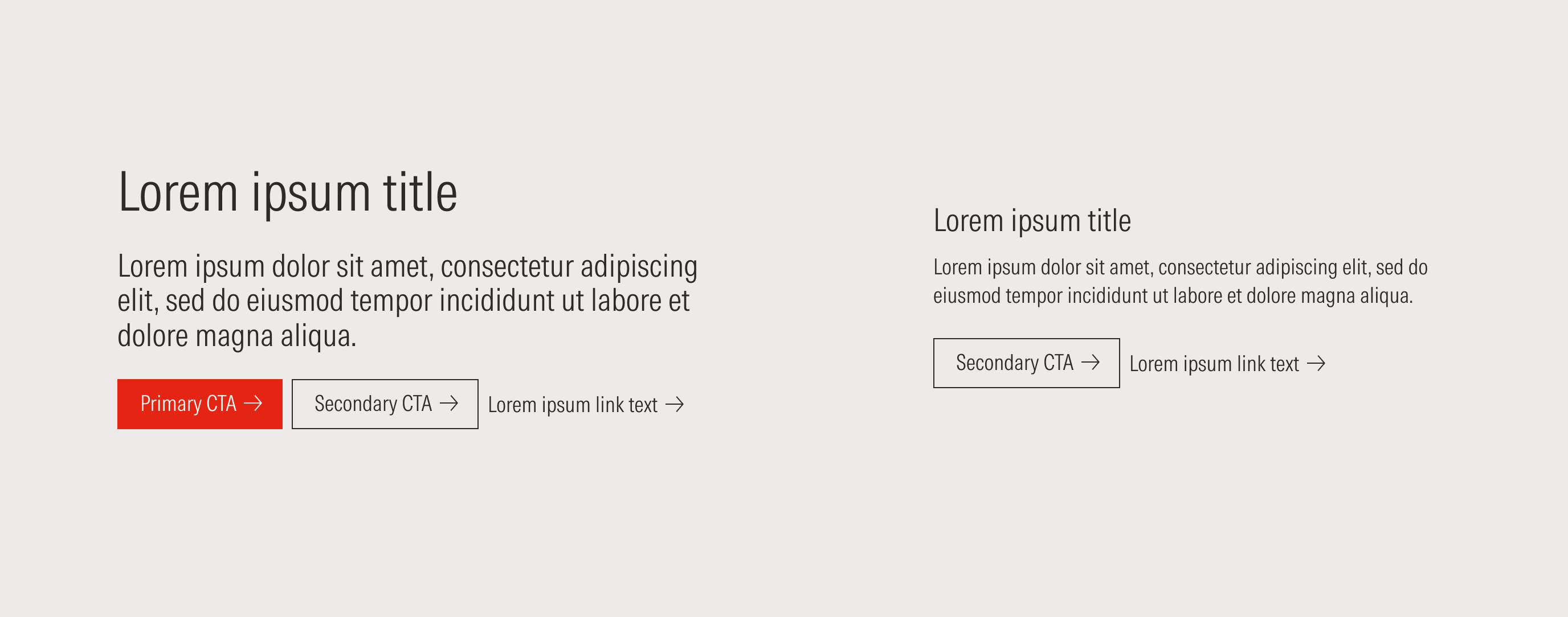
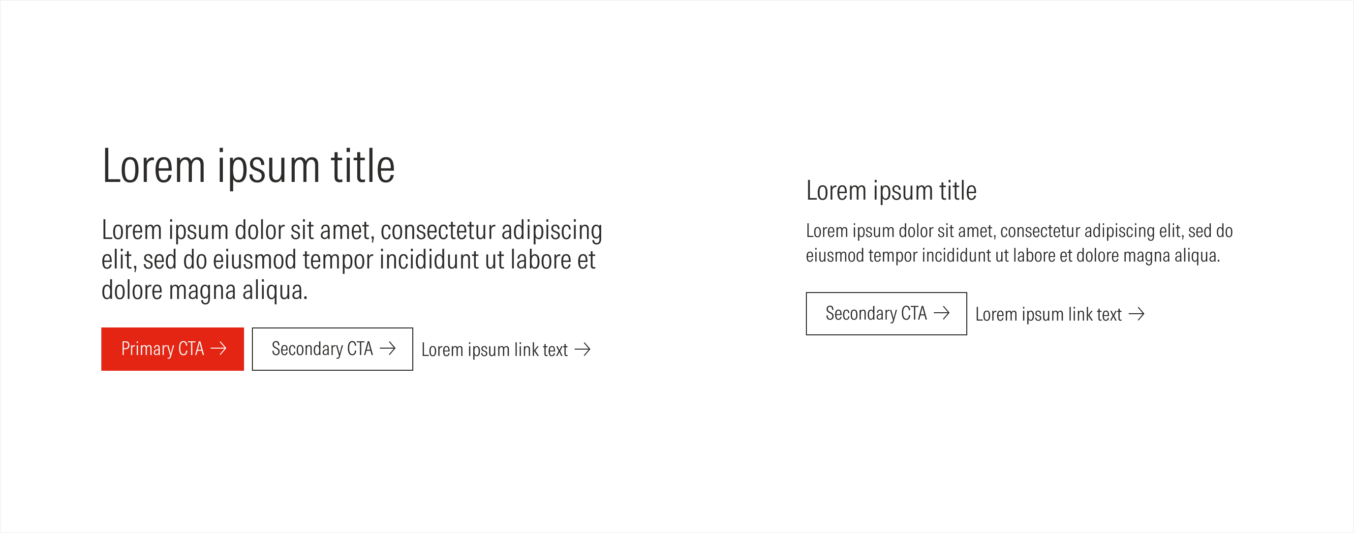
- H1 sets the Heading 1 of the text block. The H1 uses a display text style.
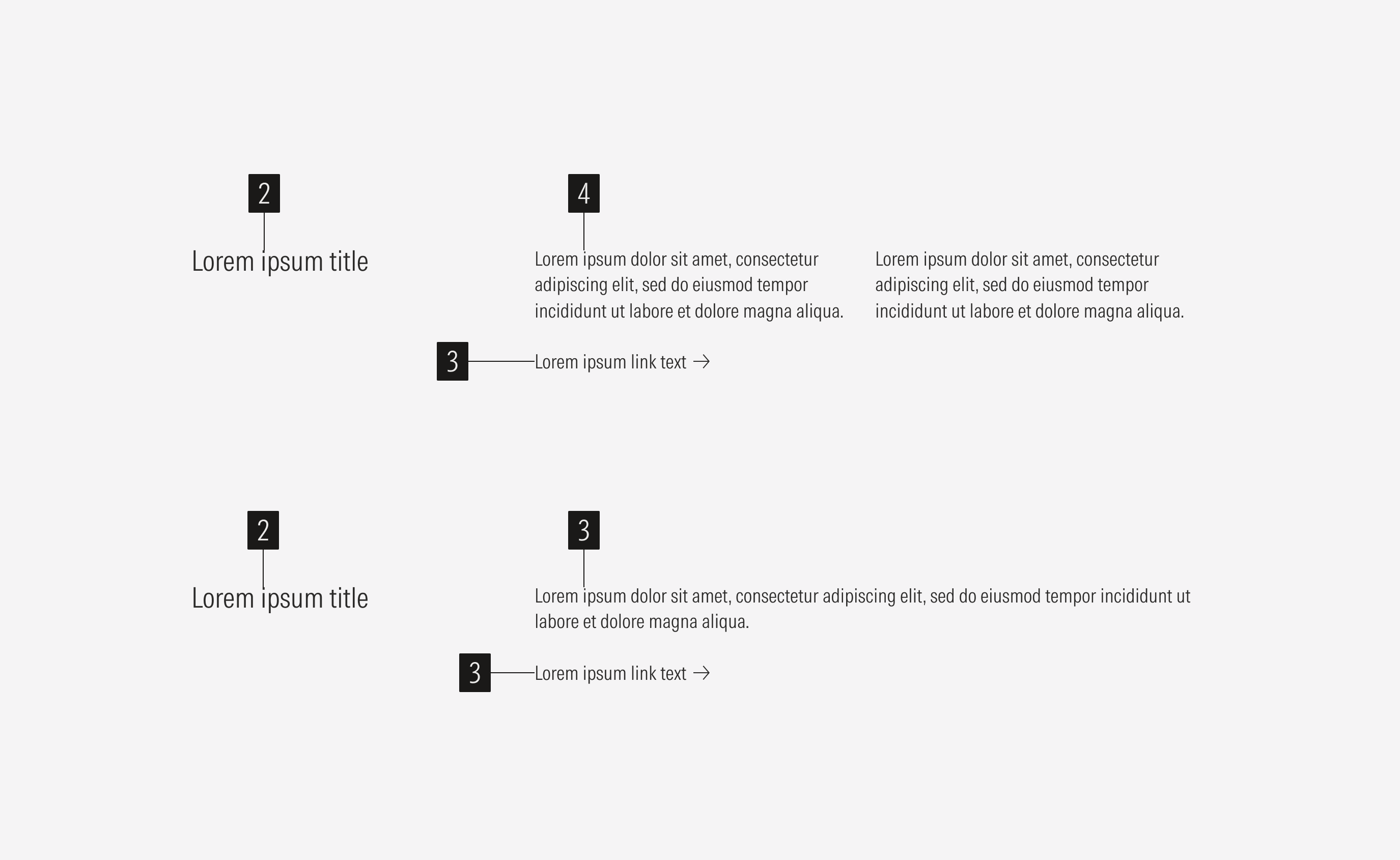
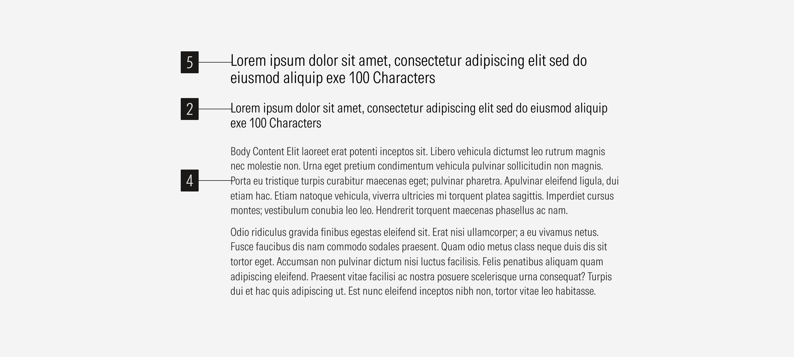
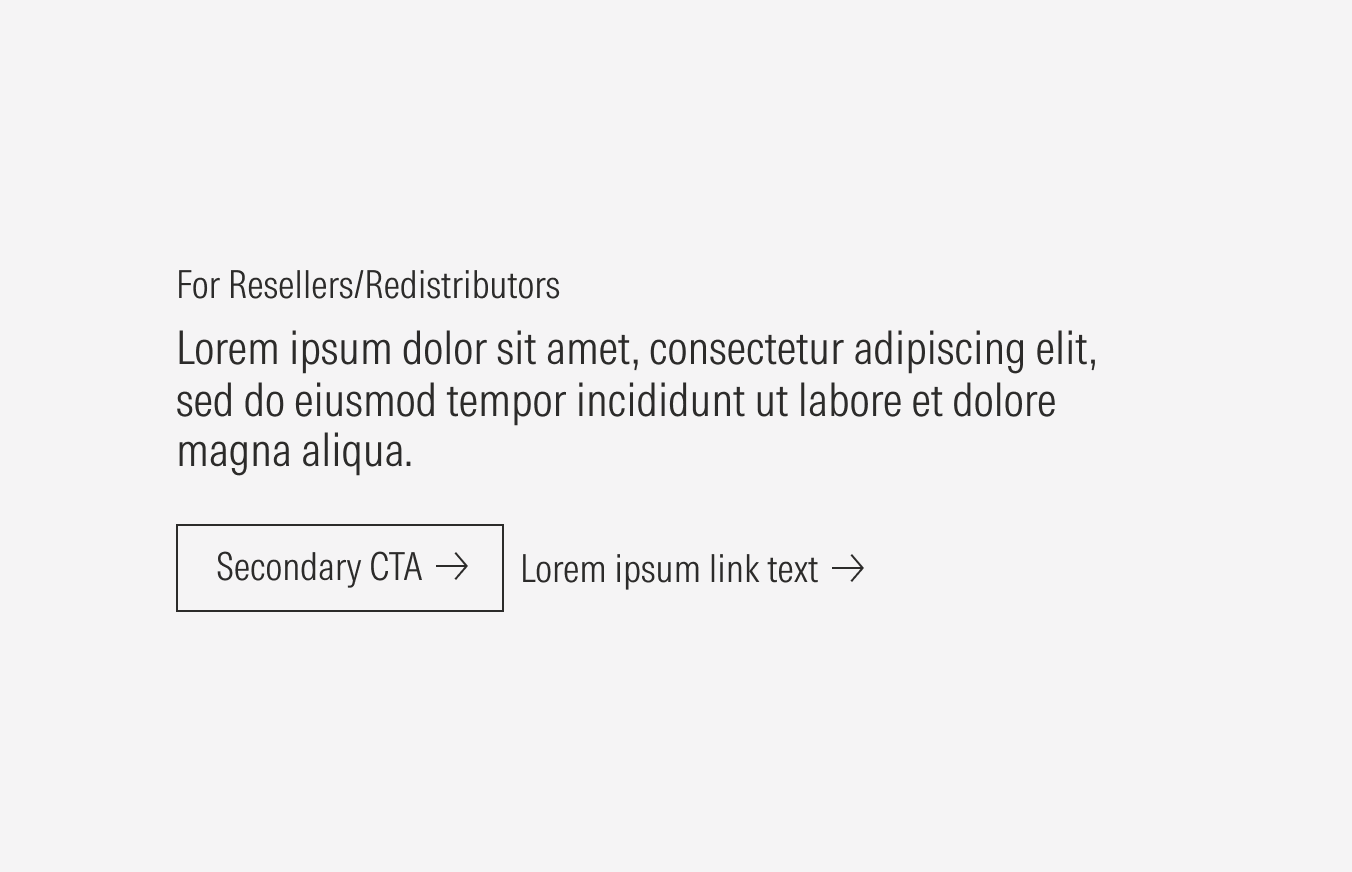
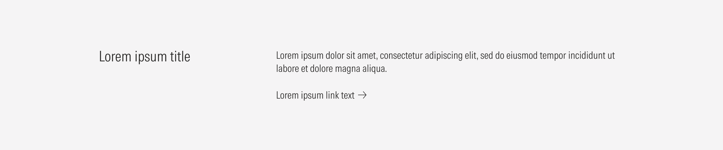
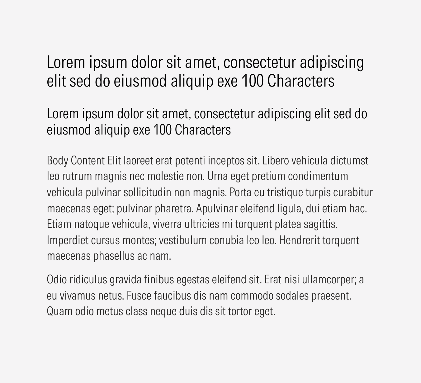
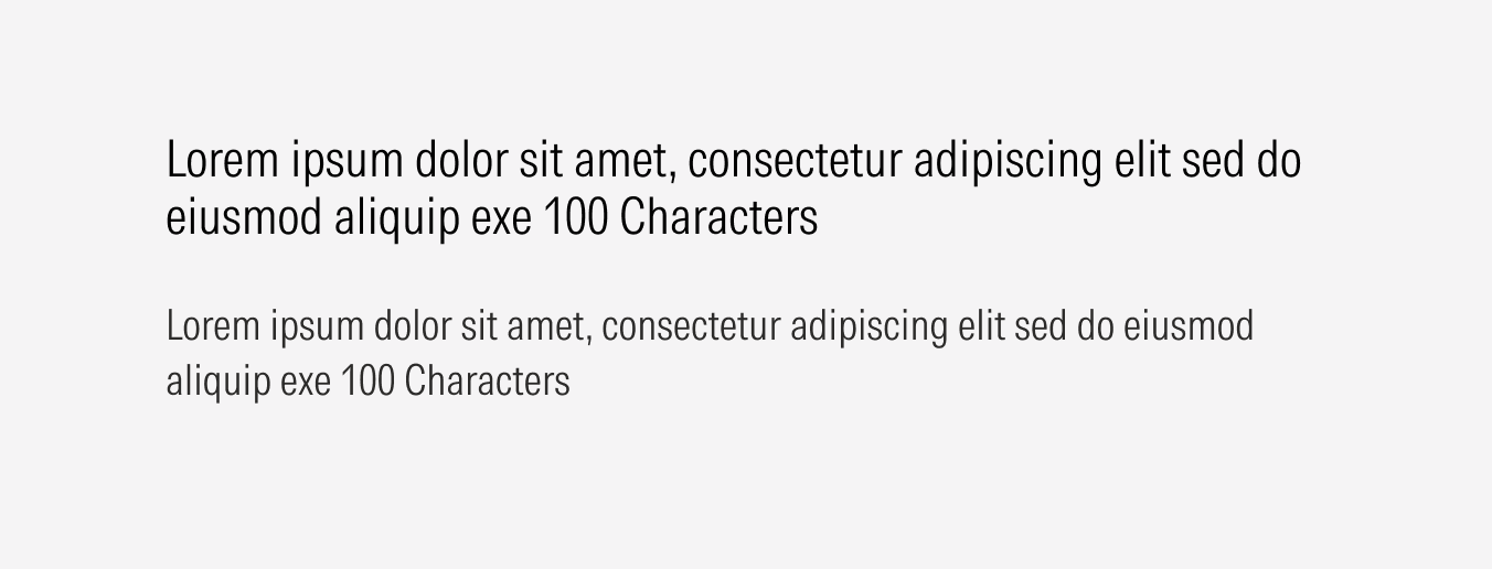
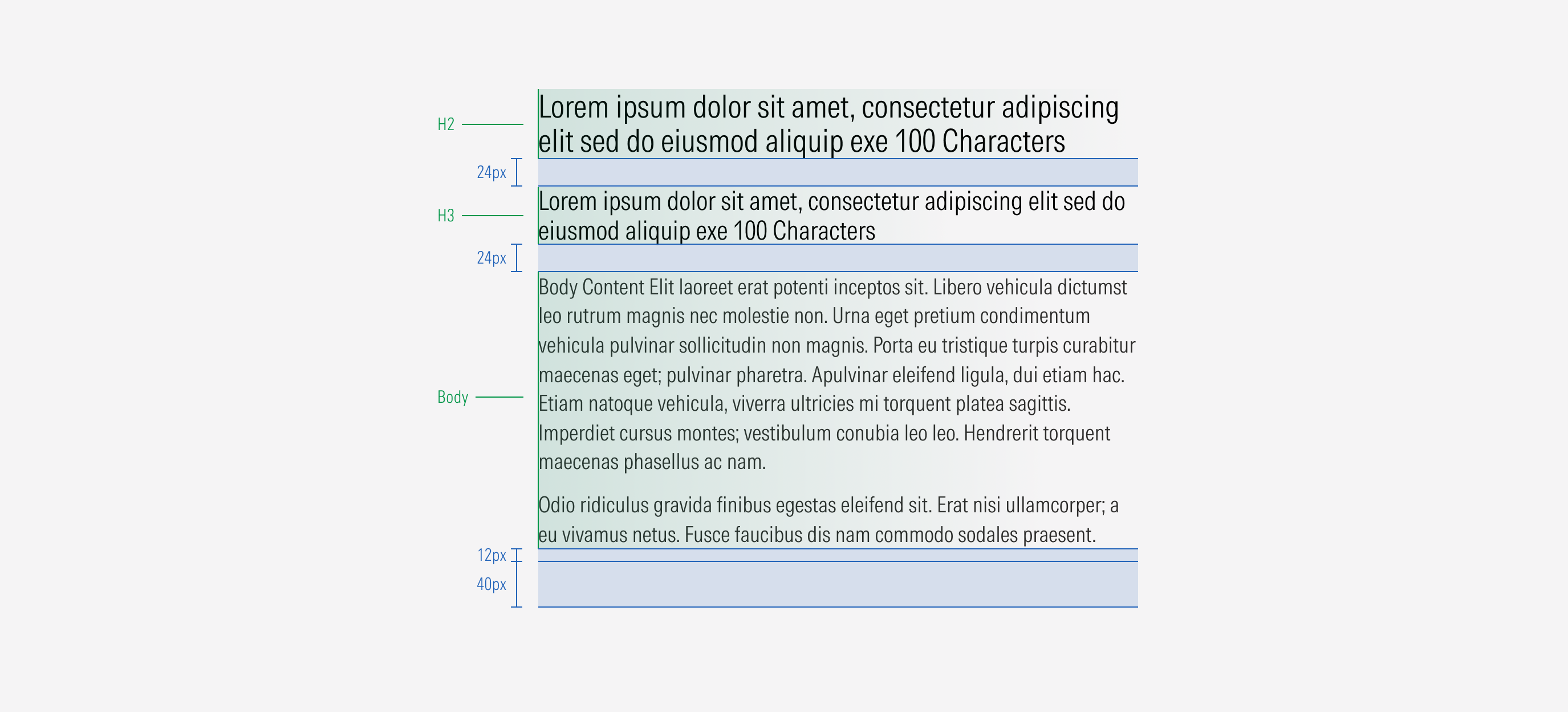
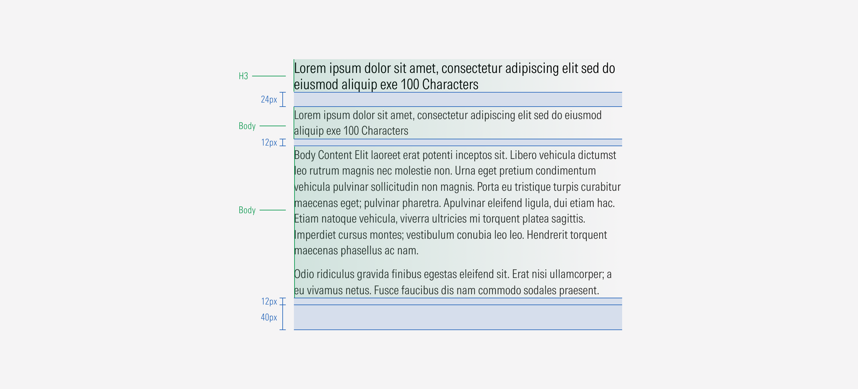
- H2 sets the Heading 2 of the text block. The H2 uses a title text style.
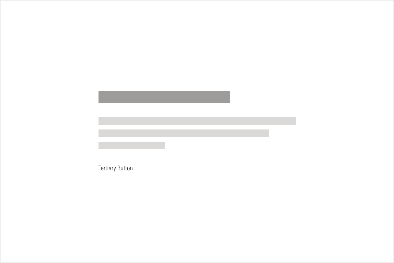
- CTA enforces the desired user action. Users can click to see more about the content presented. There could be a primary, secondary, or tertiary button. A CTA is optional depending on the component or section.
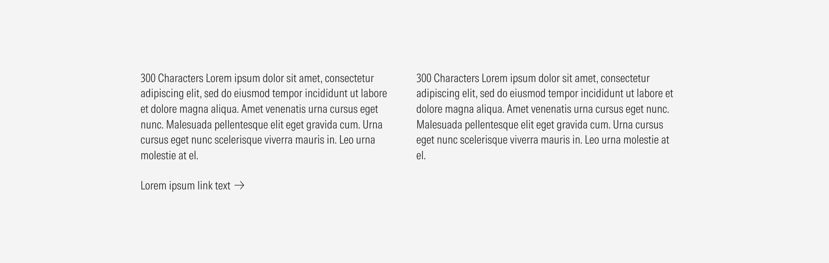
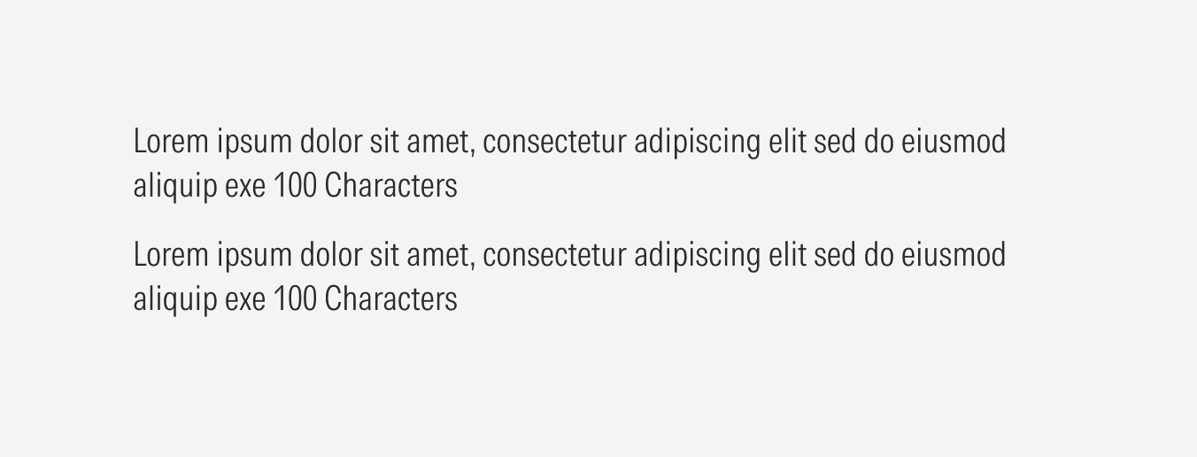
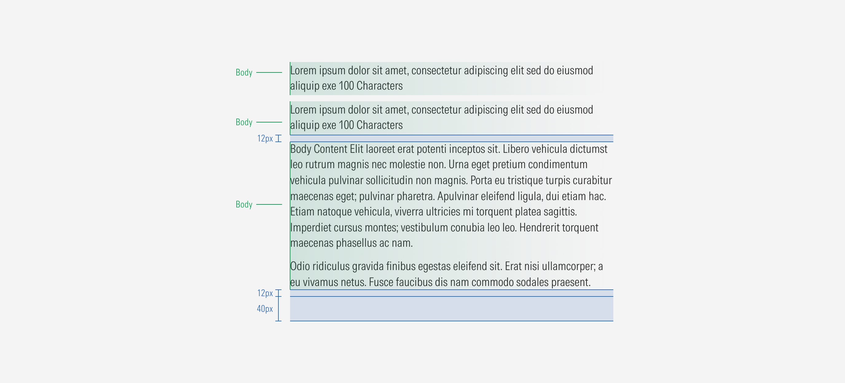
- Body sets the body of the text block. The body uses a body text style.
- H3 sets the Heading 3 of the text block. The H3 uses a title text style.
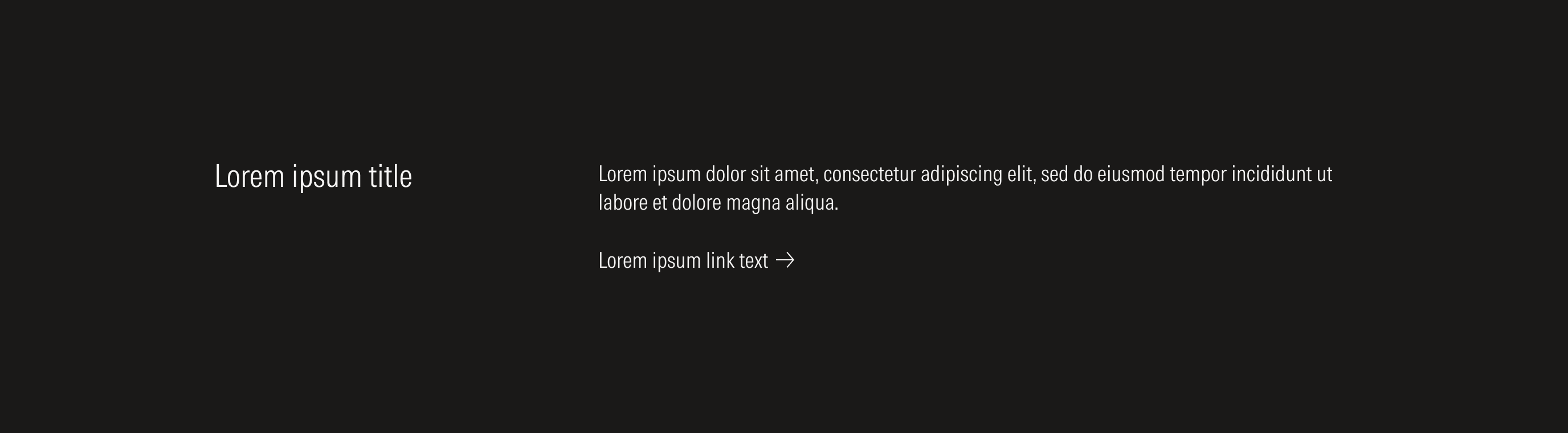
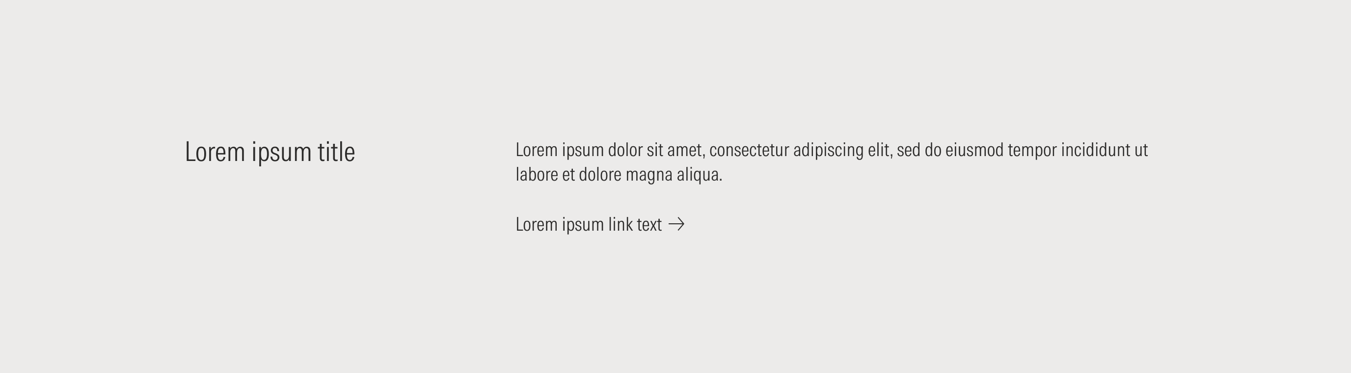
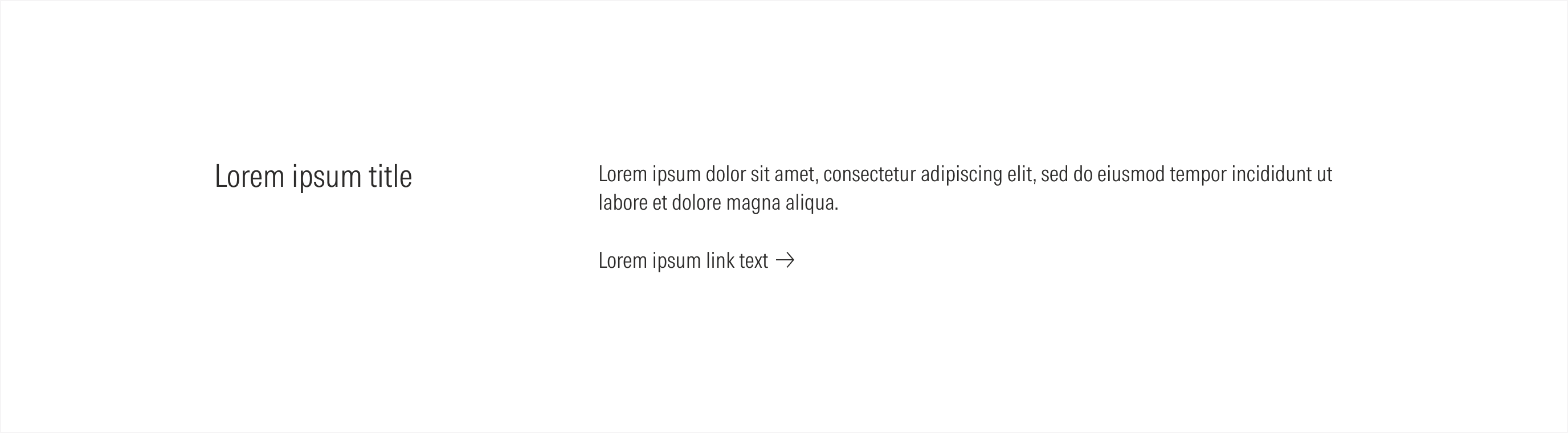
Horizontal Text Section Blocks
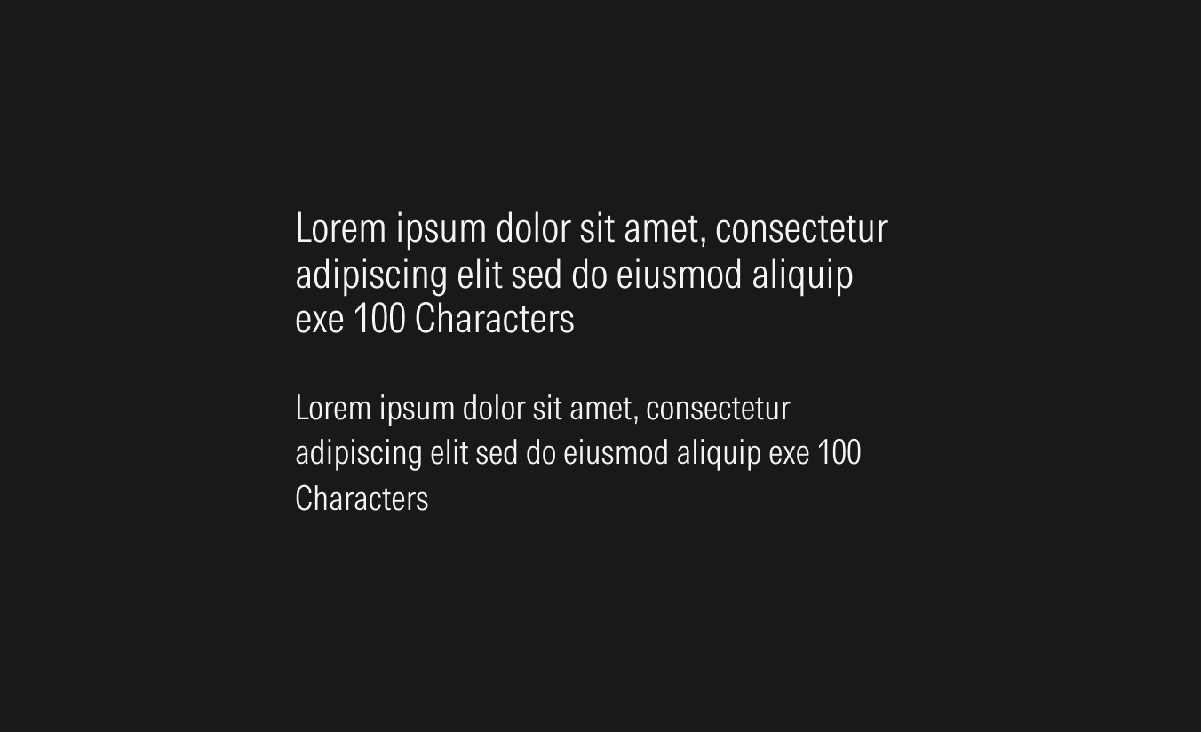
Content Text Section Blocks
Variation | Purpose | Texts | CTA | Columns | Sizes |
|---|---|---|---|---|---|
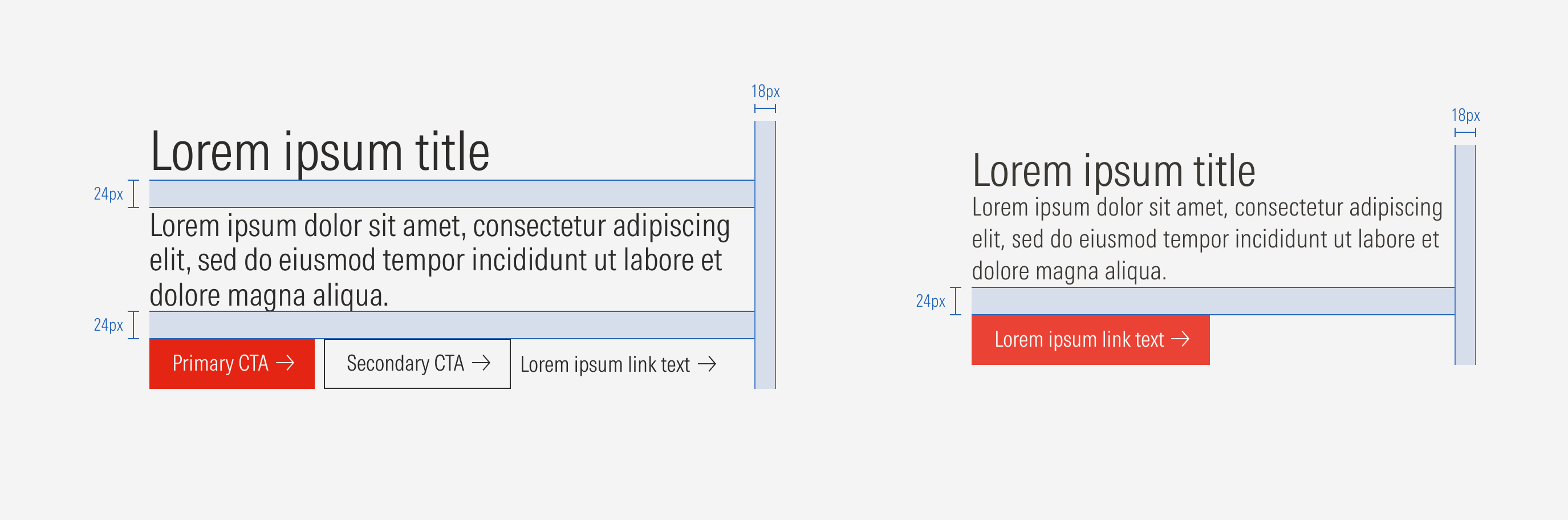
Stacked primary hero | Use for the primary hero and content with the highest level of importance. | H1 (display MD) and H2 (title MD) | Primary, secondary, and tertiary; primary and secondary; primary only; no CTA | 1 Column | Extended, compact |
Stacked secondary hero | Use mostly for the secondary hero component (not the primary variation) and content with the highest level of importance. | H1 (display SM) and H2 (title MD) | Primary, secondary, and tertiary; primary and secondary; primary only; no CTA | 1 Column | Extended, compact |
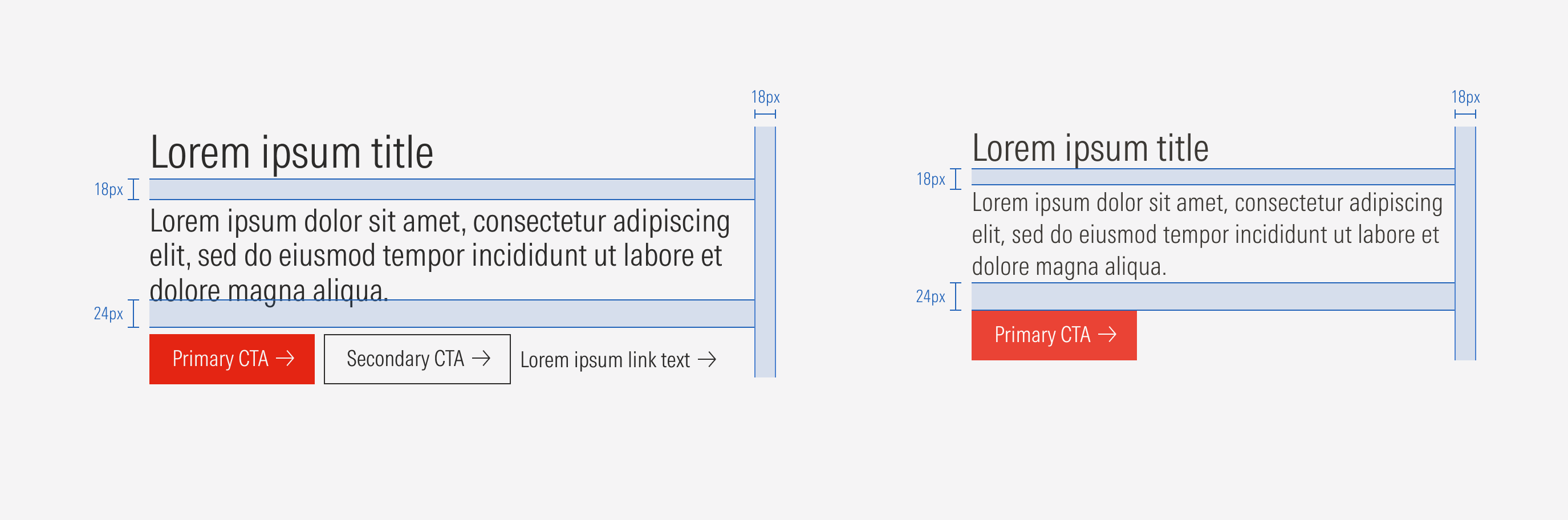
Stacked 1 | Use for other sections and components that follow the hero component and represent content with a secondary level of importance. Examples: promotion section, layout section, and forms. | H2 (title MD) and body (body LG) | Secondary and tertiary; secondary only; no CTA | 1 Column | Extended, compact |
Stacked 2 | Use for sections and components with a tertiary level of importance. Example: some layout sections. | Body (body LG) and H2 (title SM) | Secondary and tertiary; secondary only; no CTA | 1 Column | Extended, compact |
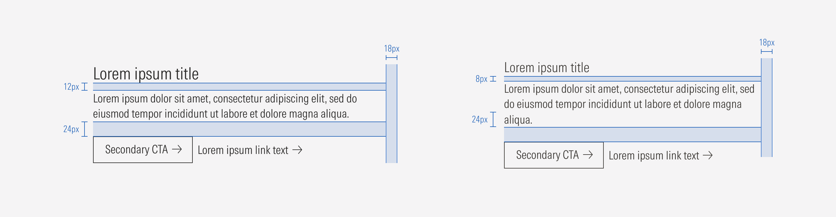
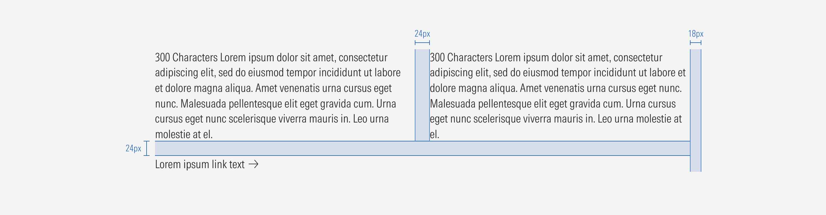
Stacked double column | Use for sections with long content to make effective use of the space. | Body (body LG) | Tertiary only; no CTA | 2 Columns | Extended, compact |
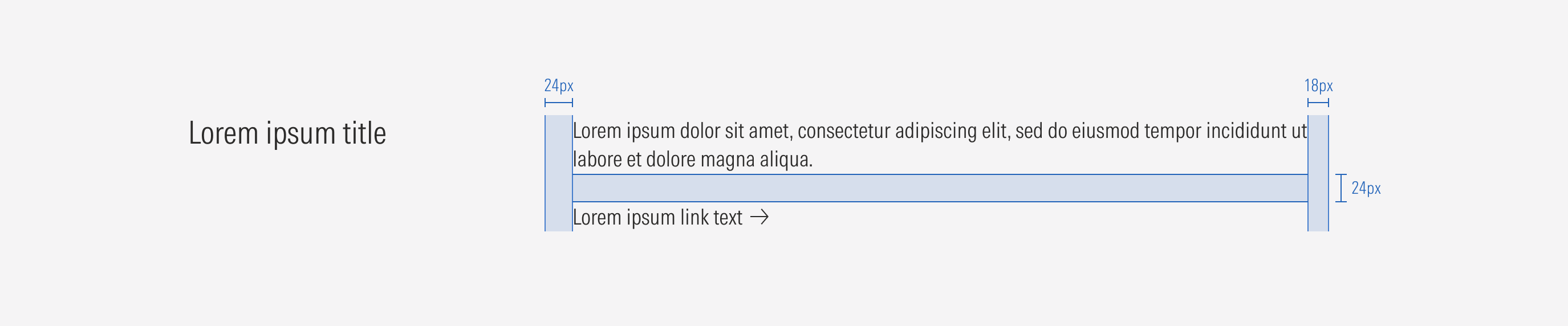
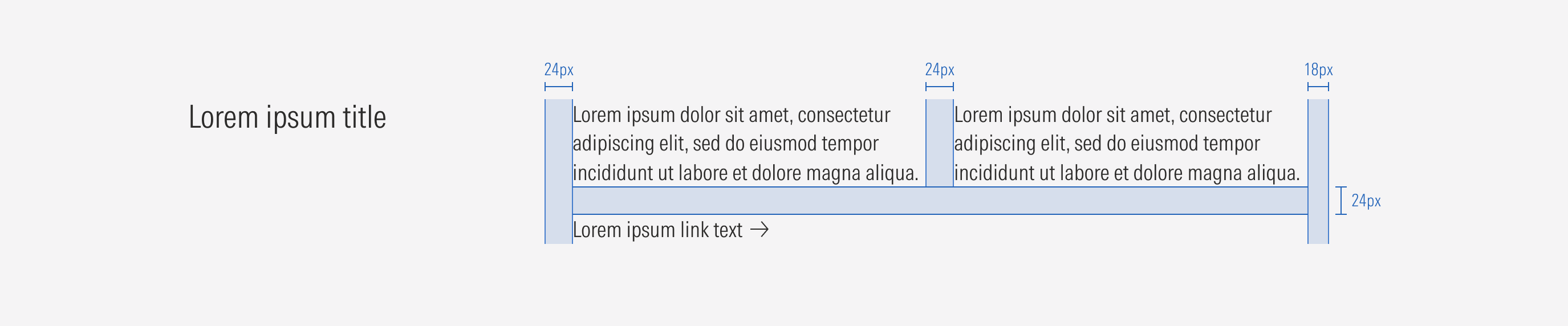
Horizontal text | Use for the layout section. | H2 (title MD) and body (body LG) | Tertiary only; no CTA | 1 or 2 columns | Extended, compact |
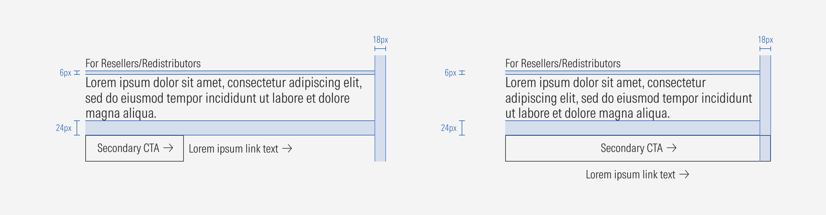
Content text | Use for textual content. | H2 (title MD), H3 (title SM), and body (body LG); H3 (title SM), body (body LG), and body (body LG); Body (body LG), body (body LG), and body (body LG) | Tertiary only; no CTA | 1 or 2 columns | Extended, compact |
Hierarchy
A proper hierarchy must be ensured for the text styles that compose a text block. The display text style will be used for the most important elements, followed by title, and then body. This should be represented in the order of the headings and body of each block.
Alignment
Elements within the text block should be left-aligned.
Horizontal Examples
Content Examples