Thrasher
A thrasher will appear on the middle of the page as a larger CTA and will extend the full page width.
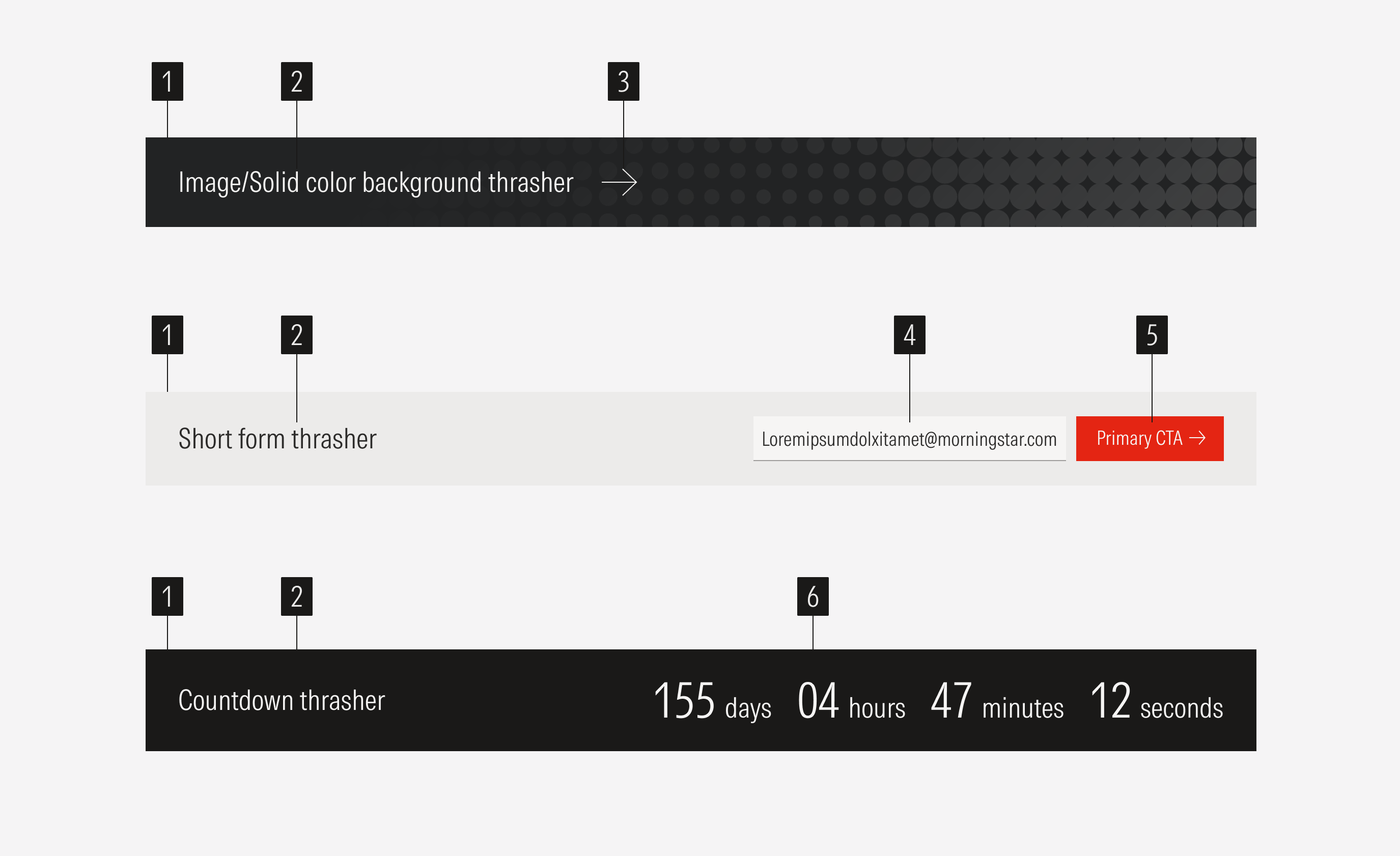
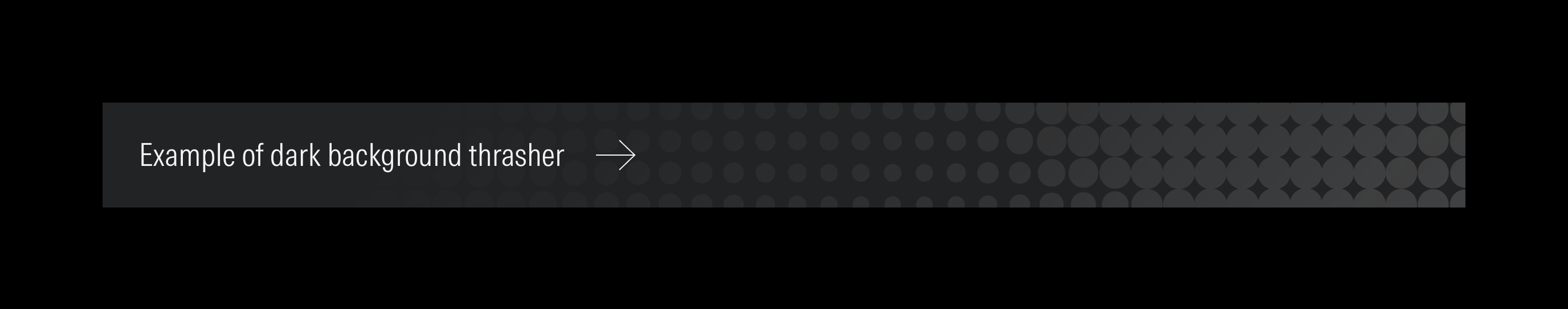
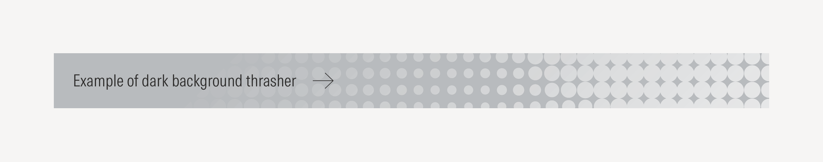
- Section background can be a solid color or a full-bleed image. Consider the section layout when creating the image.
- Section title sets the topic for the section.
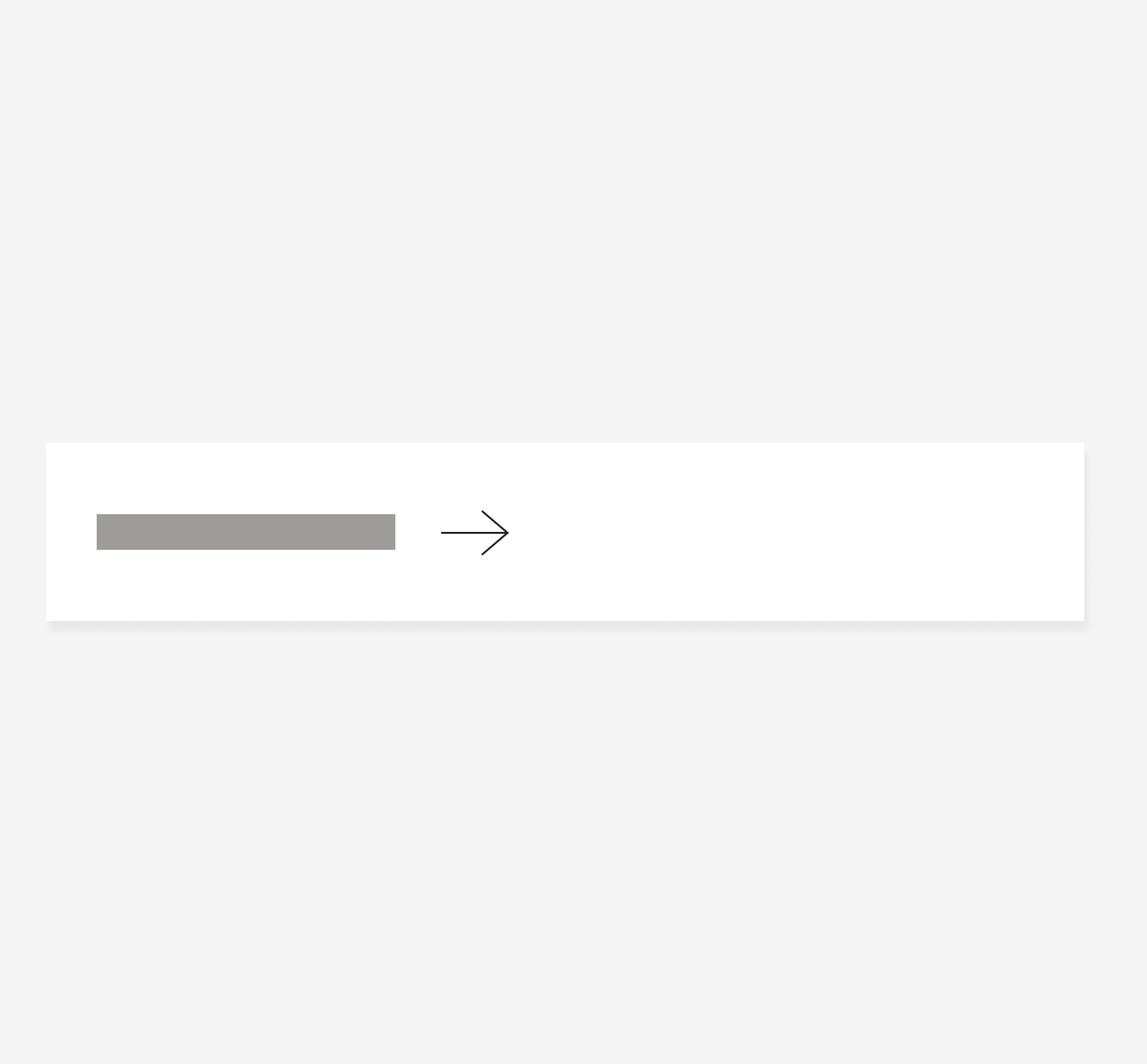
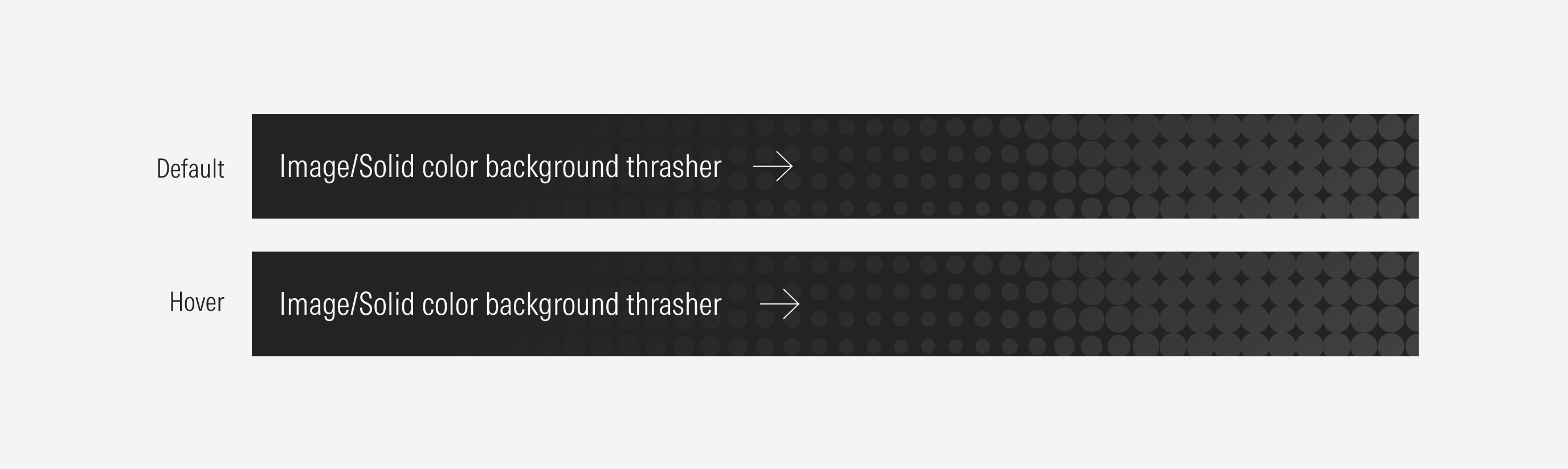
- Text input enforces the desired user action. It should be a tertiary icon-only button with the right arrow and the hover motion animation (no color change, just the movement).
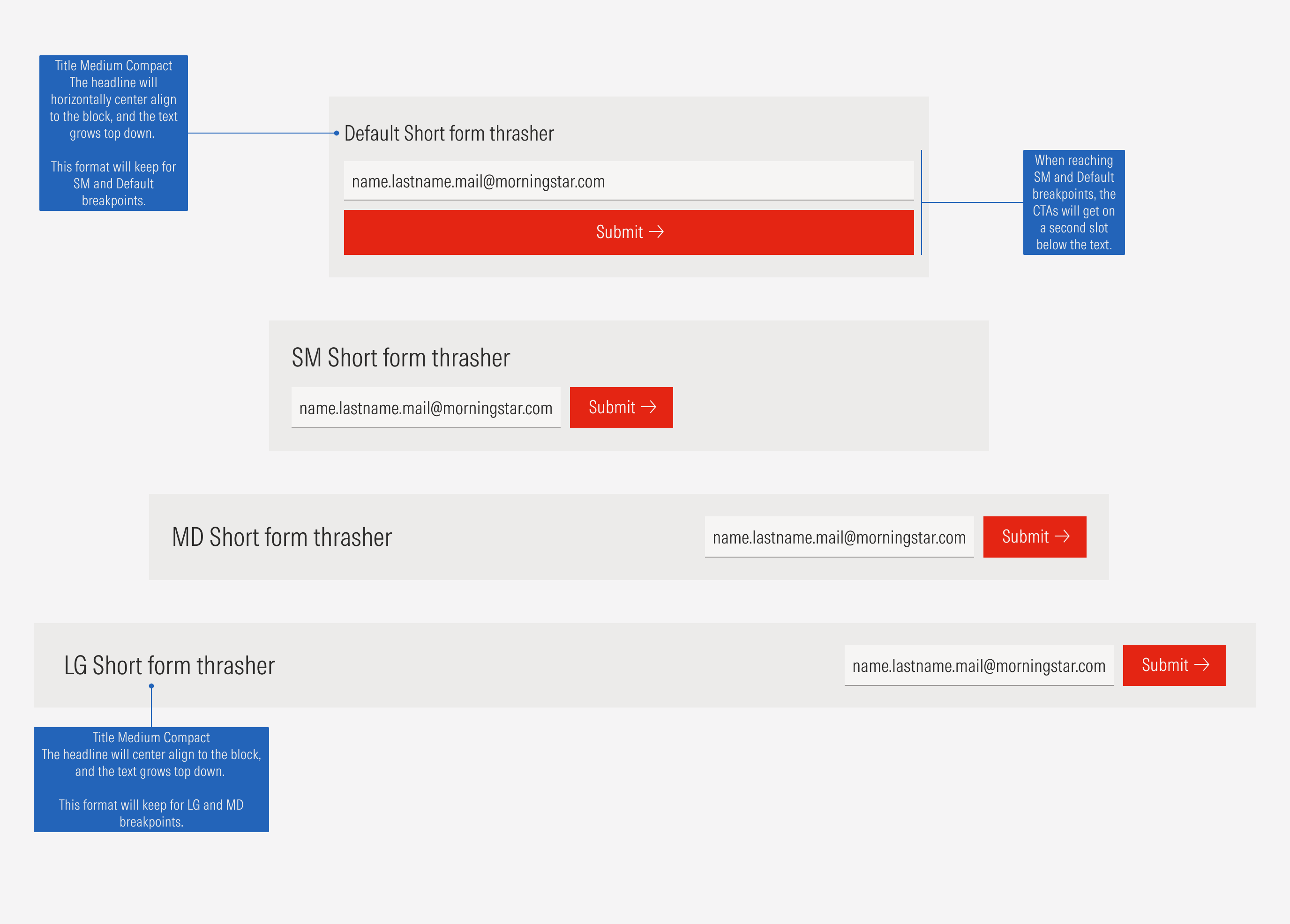
- Email input is an interactive element where users will enter their email.
- Submit CTA is a primary button that enforces the desired user action.
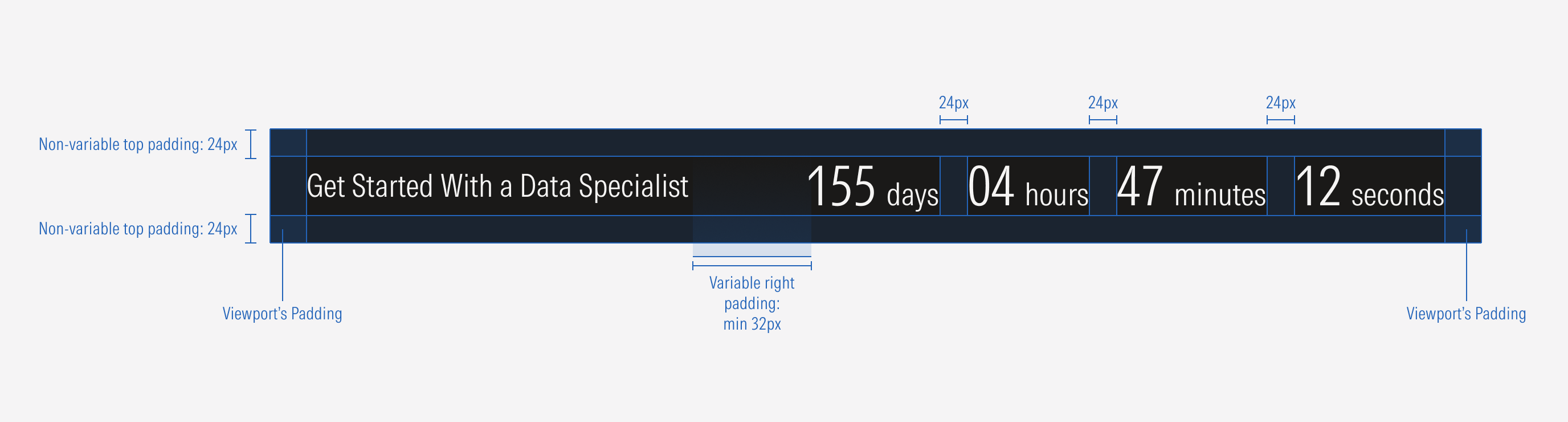
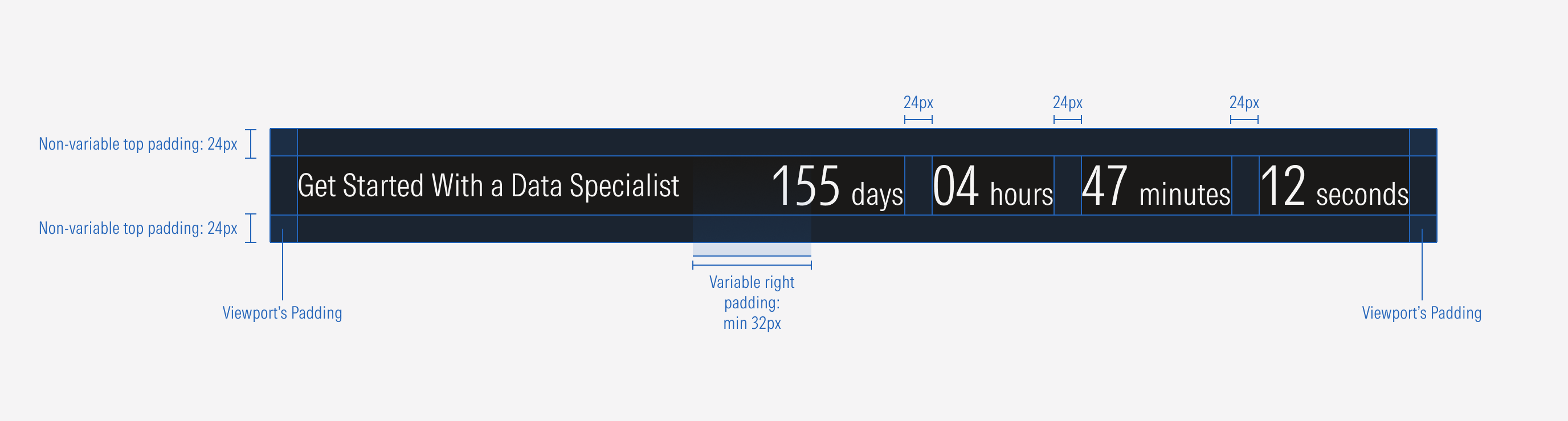
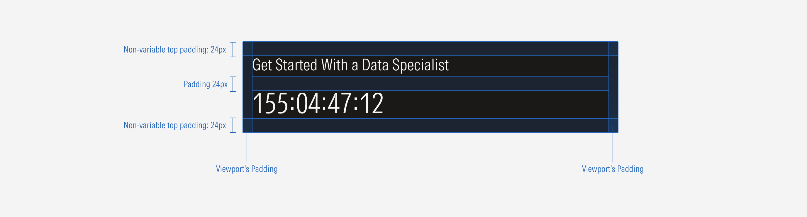
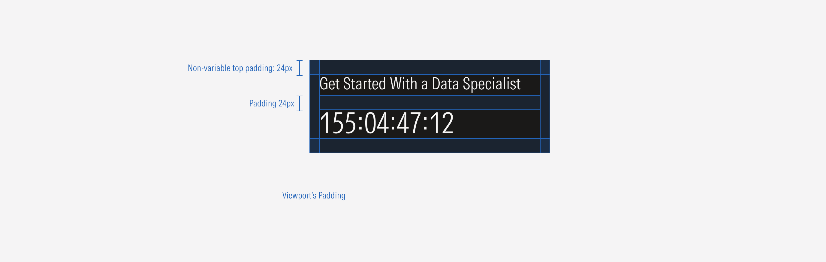
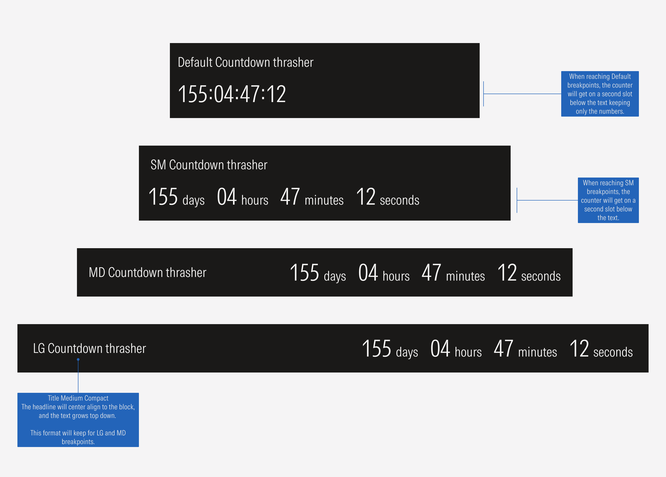
- Counter that sets the countdown of the event.
Variation | Purpose | Background | Text Input | CTA |
|---|---|---|---|---|
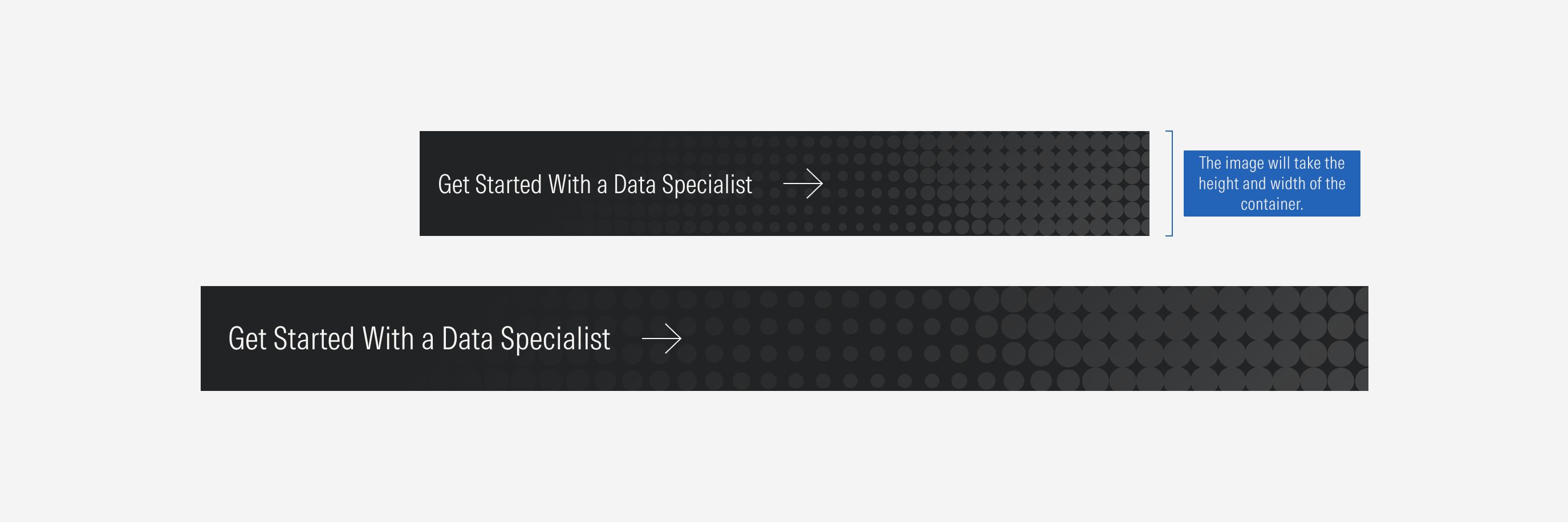
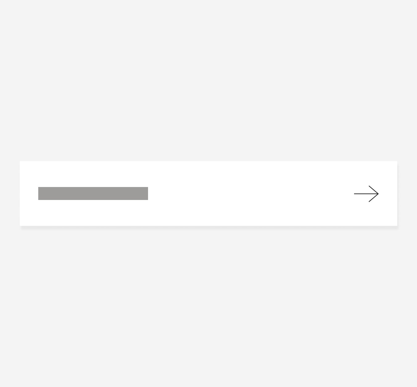
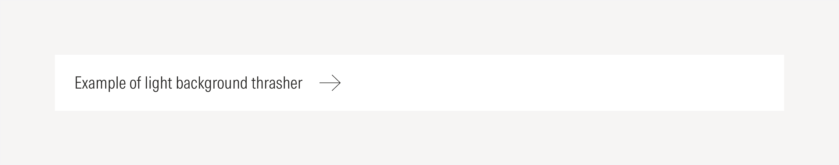
Image background | Use to highlight an action or a short message and give a visual hook. | With image background | No text input | With CTA (tertiary icon-only button: right arrow. Arrow has motion animation but no color change). |
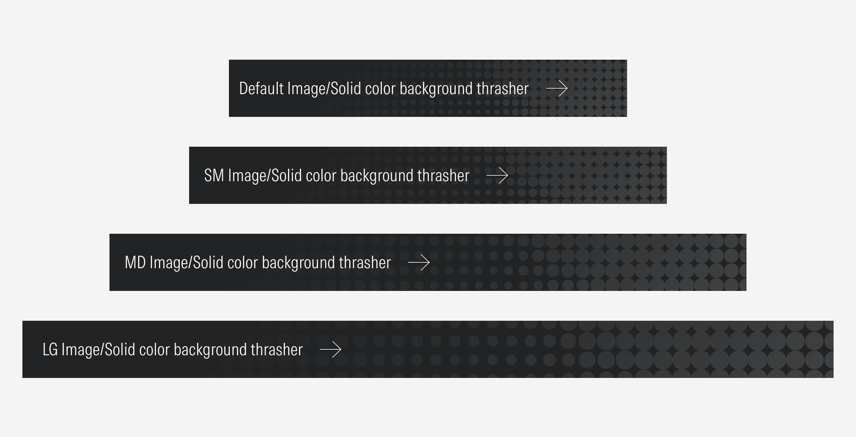
Solid color background | Use to highlight an action or a message. | With solid color background | No text input | With CTA (tertiary icon-only button: right arrow. Arrow has motion animation but no color change). |
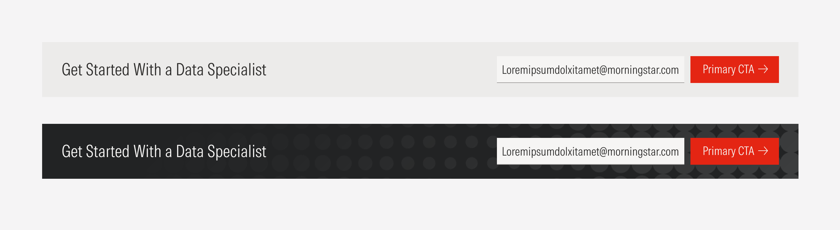
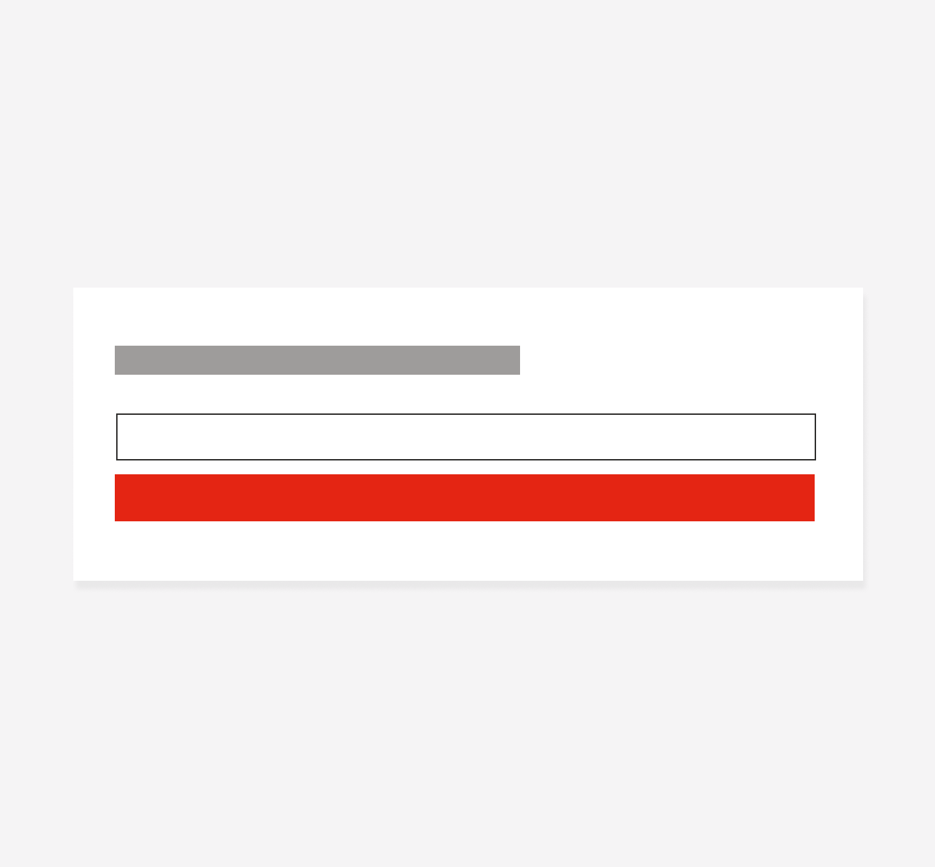
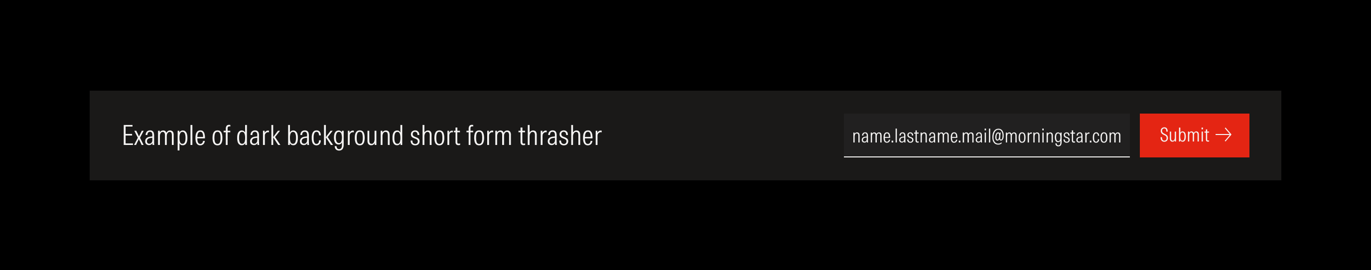
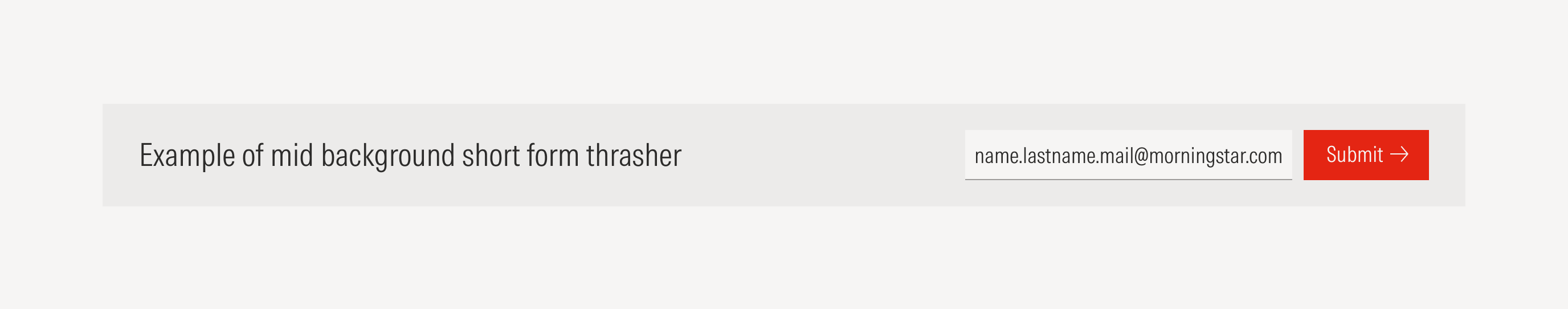
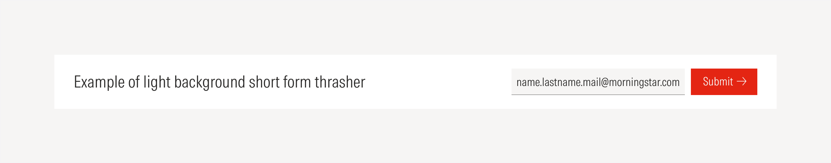
Short form | Use to highlight an action that requires users to enter a single data element before submitting an action (for example: entering an email to receive information about an event). | With solid color background, with image background | With text input | With primary button. |
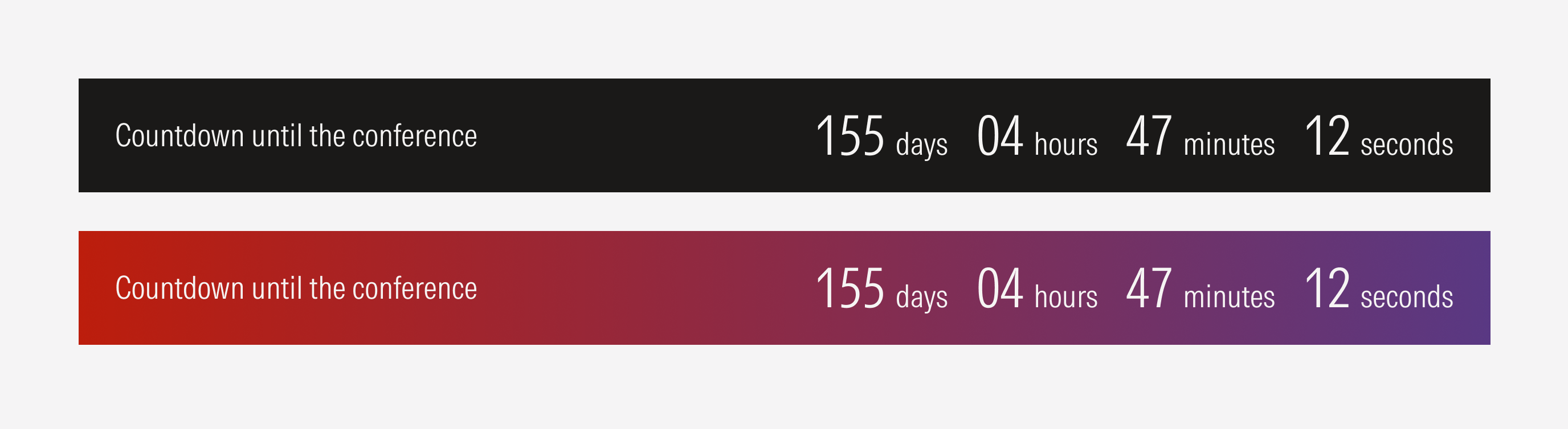
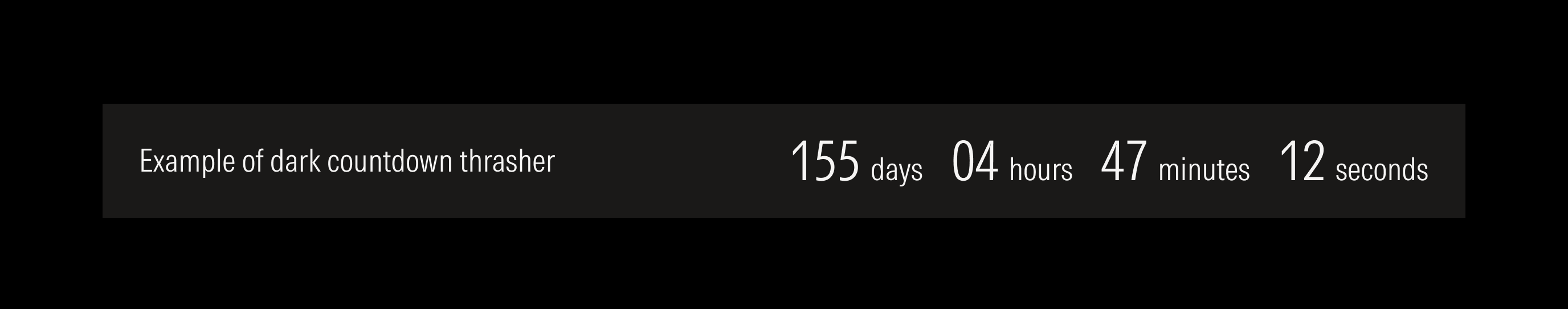
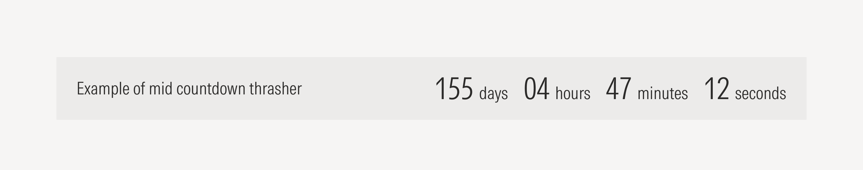
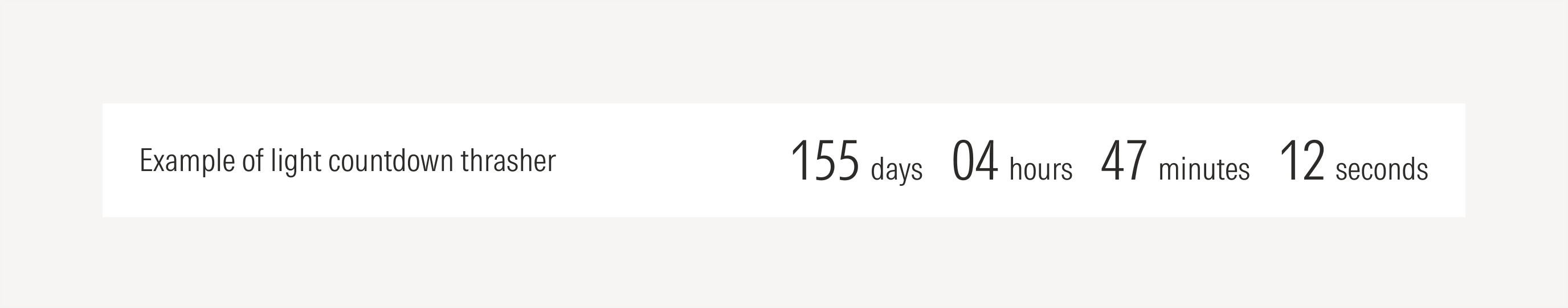
Countdown | Use to show the countdown to a date of an event. | With solid color background, with color gradient background. | With counter | No CTA |
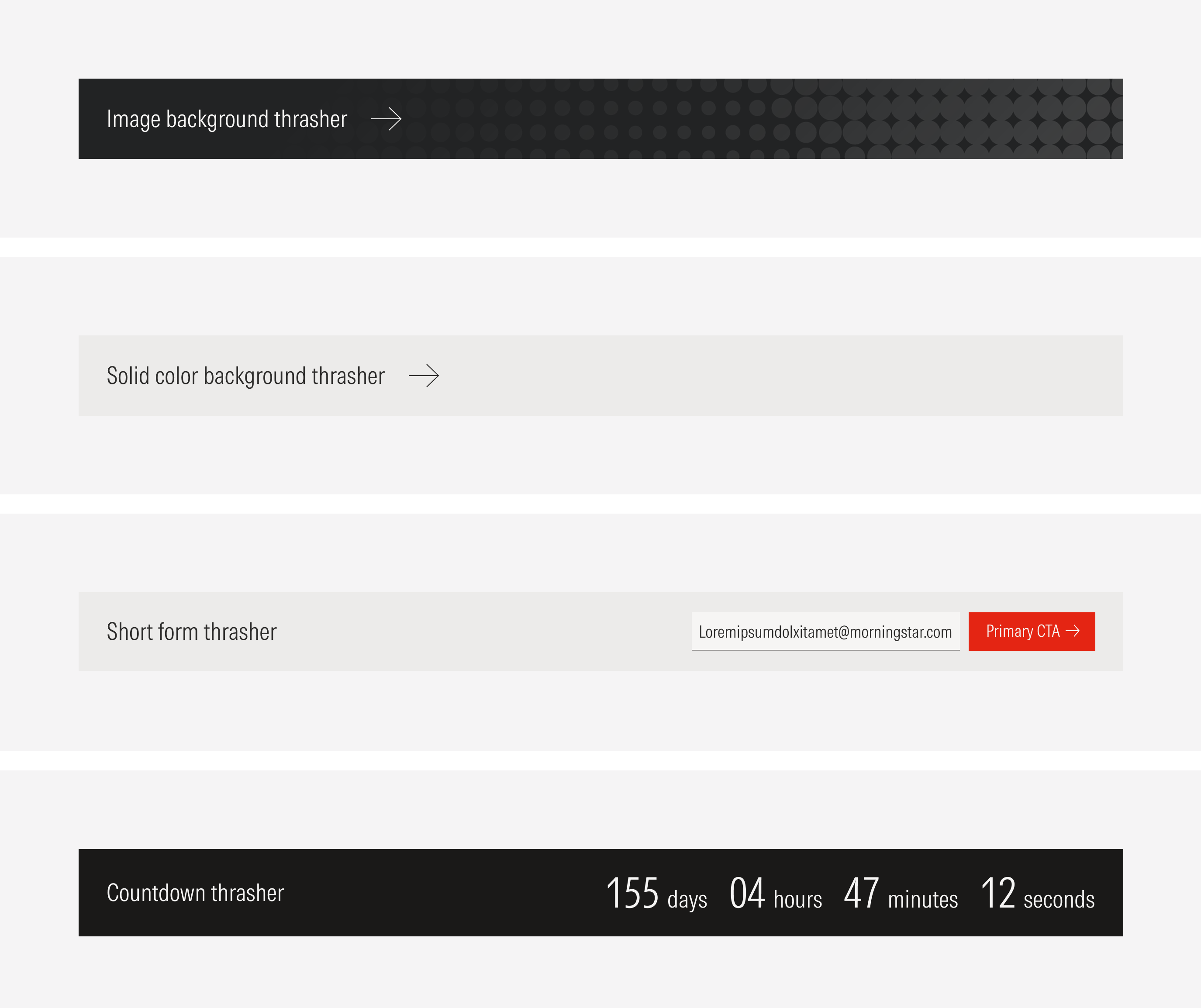
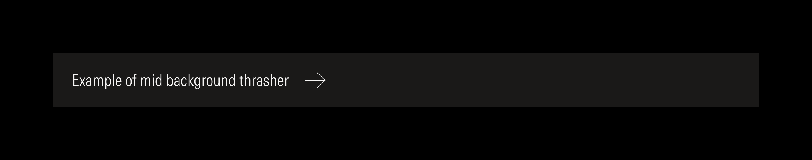
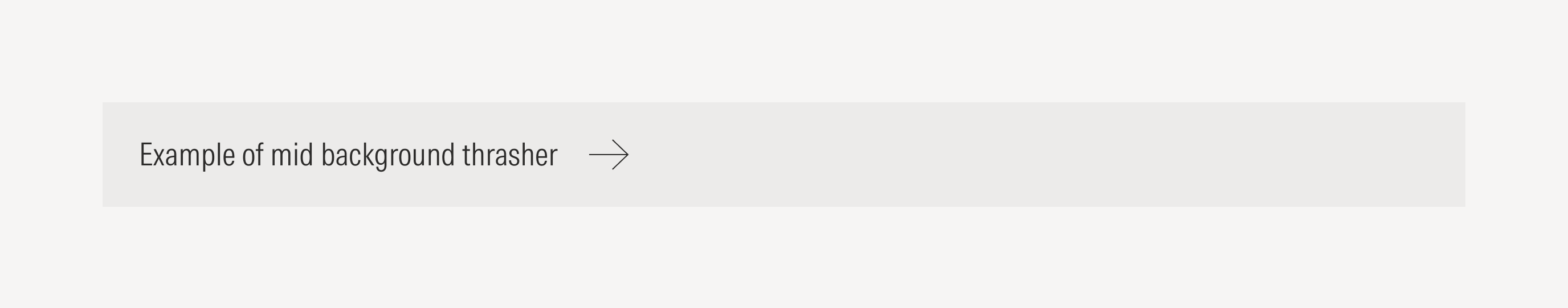
Solid Color Background
Use a solid color for the background. When choosing the color, make sure that the text and CTA are legible.
Short Form
Use a solid color or a customizable full-bleed background image for the background. When choosing the color or creating the image, consider potential legibility issues for the text and CTA.
Countdown
Use a solid color or a customizable color gradient for the background. When choosing the color or creating the gradient, consider potential legibility issues for the text and counter.
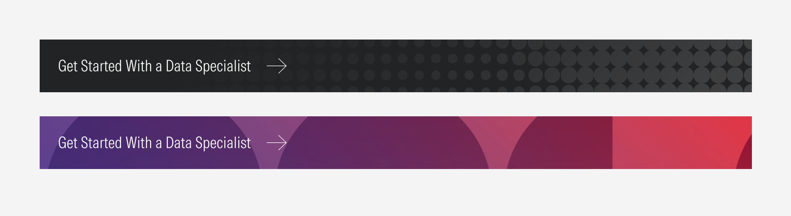
Background Image
This element maintains the alignment and content distribution at every breakpoint.
Hierarchy
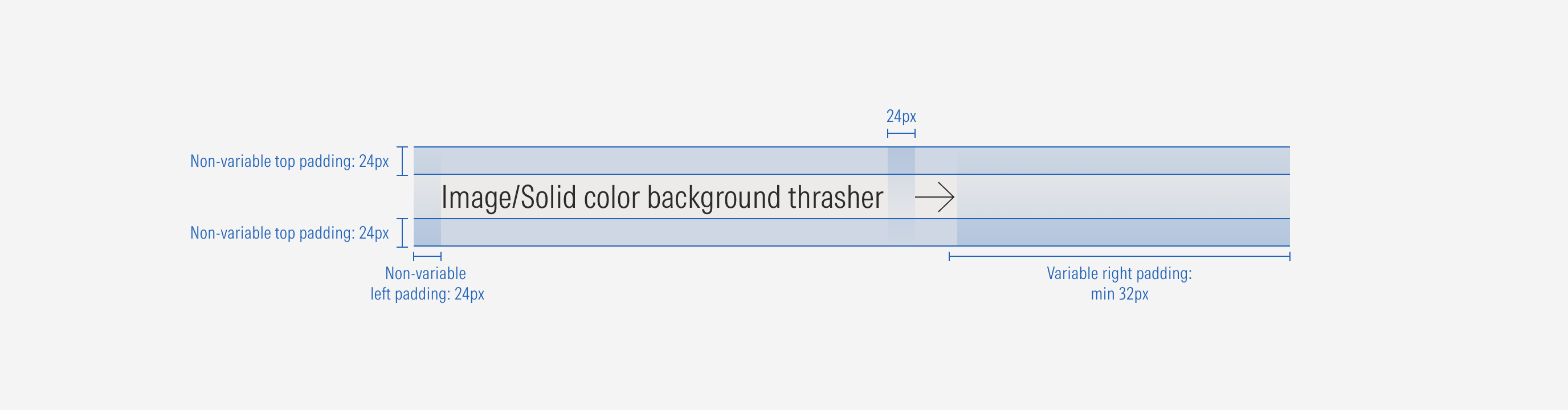
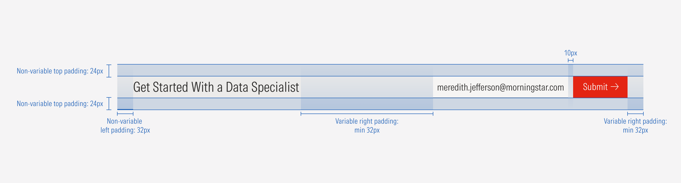
A proper hierarchy must be ensured for the elements that compose the thrasher. The CTA of the image/solid color background variation should be at the right of the title with a fixed padding, and it should be a tertiary icon only button (right arrow).
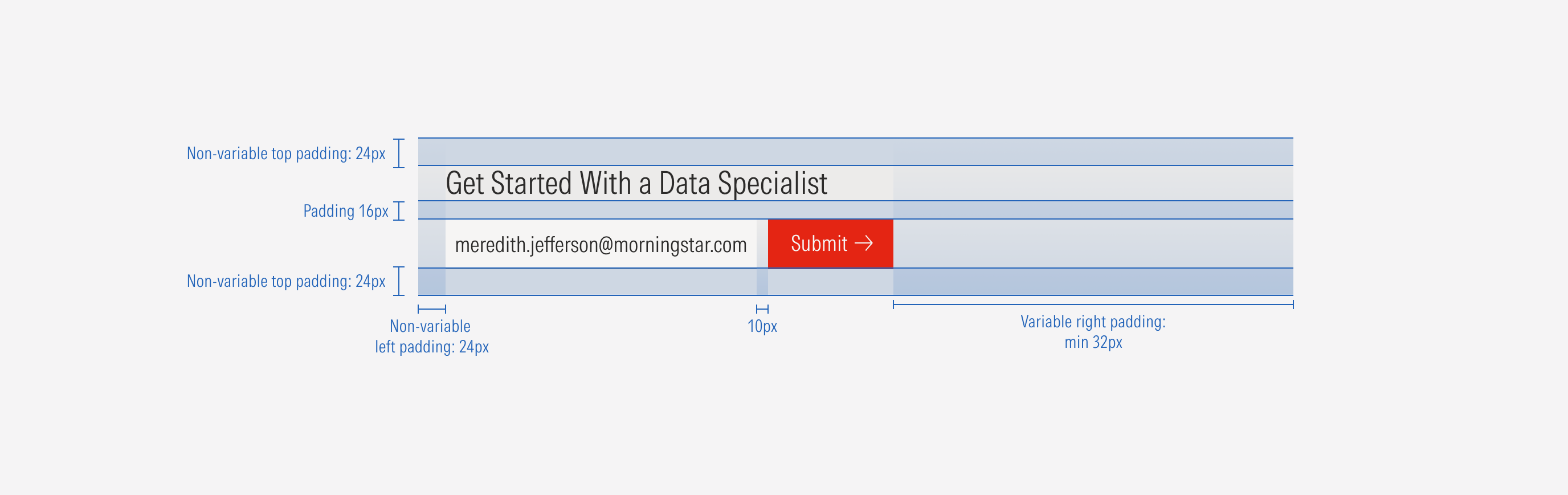
For the short form variation, the text input (without label) and the CTA (primary button) should be at the right of the title with a variable padding. The title, with first level of importance, needs to give a clear and short idea of the topic of the thrasher. Keep in consideration that in case of the short form variation, the CTAs should be on a second line below the title, and they have to be placed at the bottom of the container.
Do left-align the CTA, with the auto padding at the right.
Don’t right-align the CTA, with the fixed padding at the right.
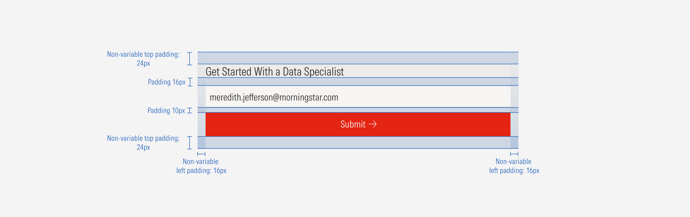
Do adjust the CTAs to take the full width of the container on SM viewports.
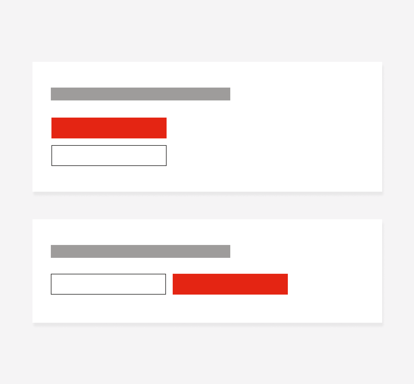
Don’t left-align the CTAs or keep them to one line when reaching SM viewports.
Alignment
The alignment of items within the thrasher container or in relation to content at the same level of the page, should follow a left-justified pattern. Exceptions include the input and button on the short form variation, and the counter on the countdown variation, which should be right-aligned. The title should flow to the left-most margin of the content area with the CTA following it to the right, always left-aligned. For the short form variation, on SM and Default viewports, the CTAs, input, and counter will take the width of the page.

Solid Background
Short Form
Countdown