Form Elements
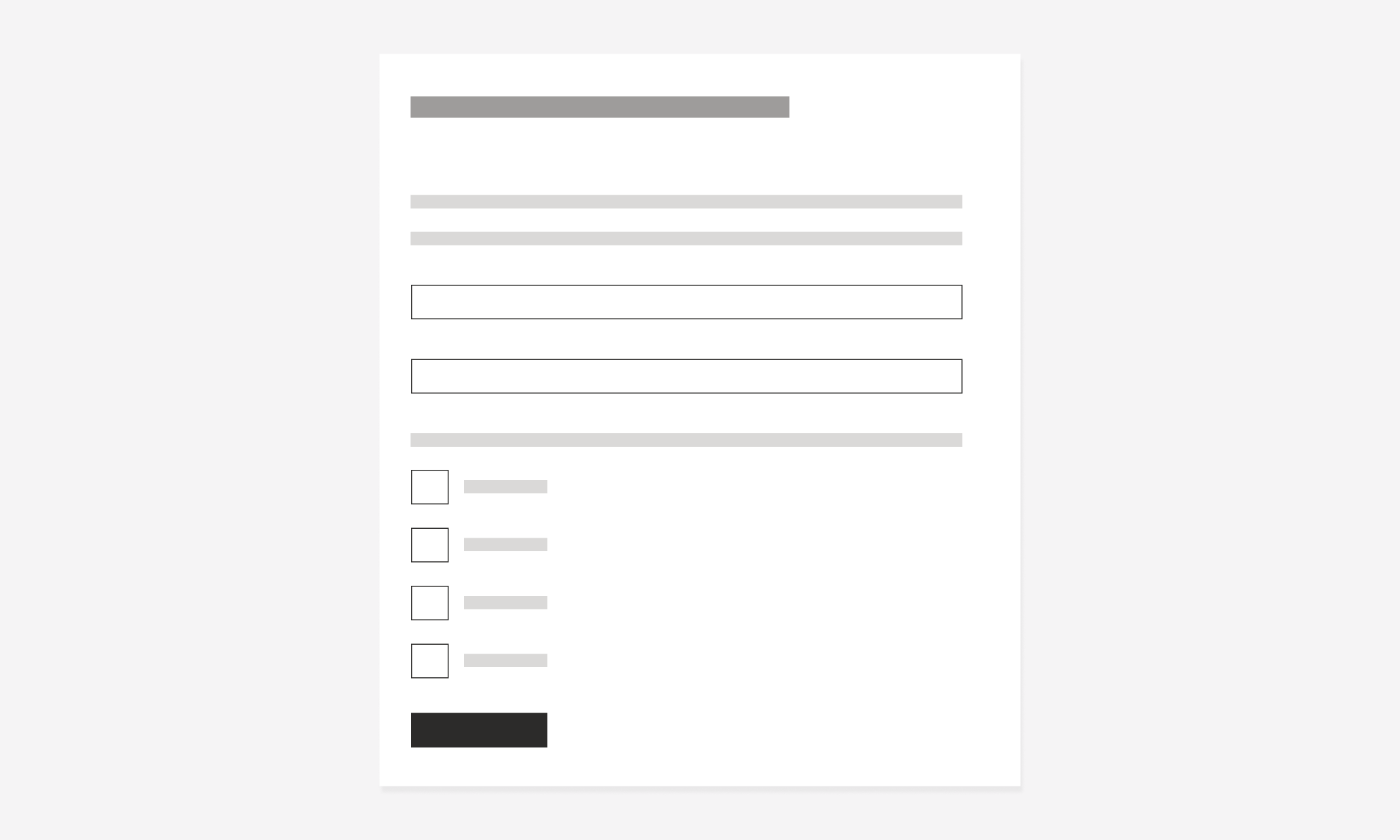
Checkboxes represent a multi selection input, allowing the user to select more than one option from a group of choices. These are mainly used in forms. Because of its nature, a checkbox field needs one option at minimum which could be selected or empty.
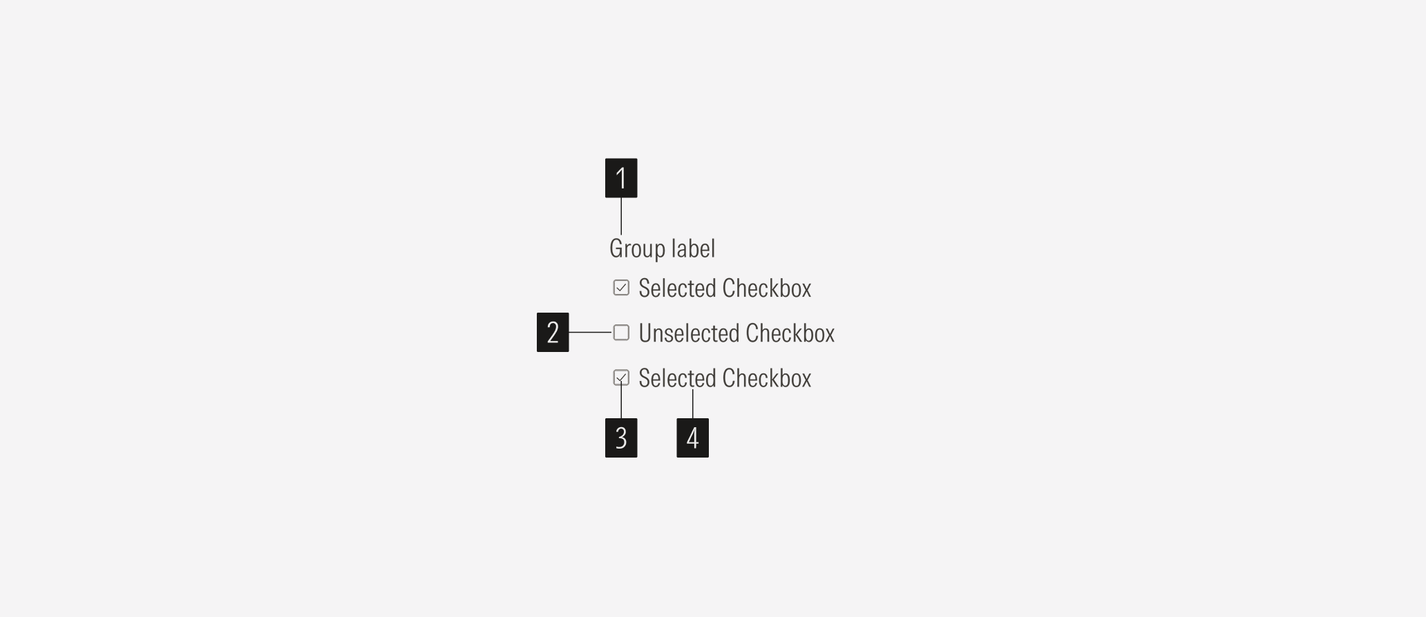
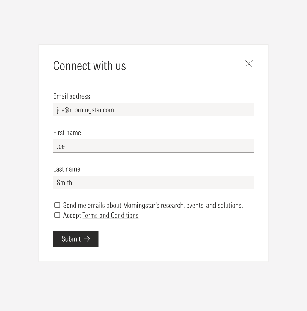
- Group label sets the label of a checkbox group. Checkboxes could have a label or not, depending on where they are used.
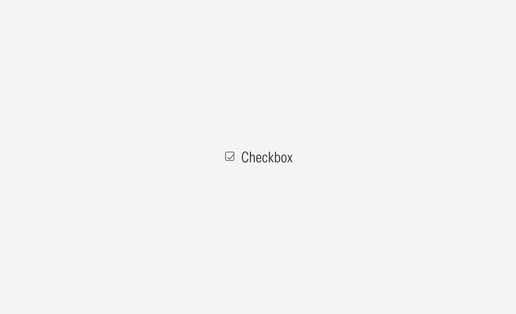
- Box is the interactive element of the checkbox. When selected, it has a check inside the box when empty, there is none.
- Check icon sets the selected status of the checkbox.
- Checkbox label sets the label of the checkbox option.
Usage
When to Use
Use checkboxes when users have a list of options to select from and they can select zero, one, or multiple options. These are mostly used in forms and can be used in a group or as a single item.
When Not to Use
Don’t use a checkbox when the user needs to select at least one option. Use radios or a toggle instead.

Variation | Purpose | Icon | Sizes |
|---|---|---|---|
Checkbox | Use for optional selects and multiple selection. | With check icon (selected), no icon (un-selected) | LG, MD |
With Icon
There is a check icon in the box when the option is selected.
No Icon
There is no icon in the box when the option is unselected.

Container
Spacing
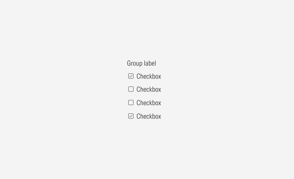
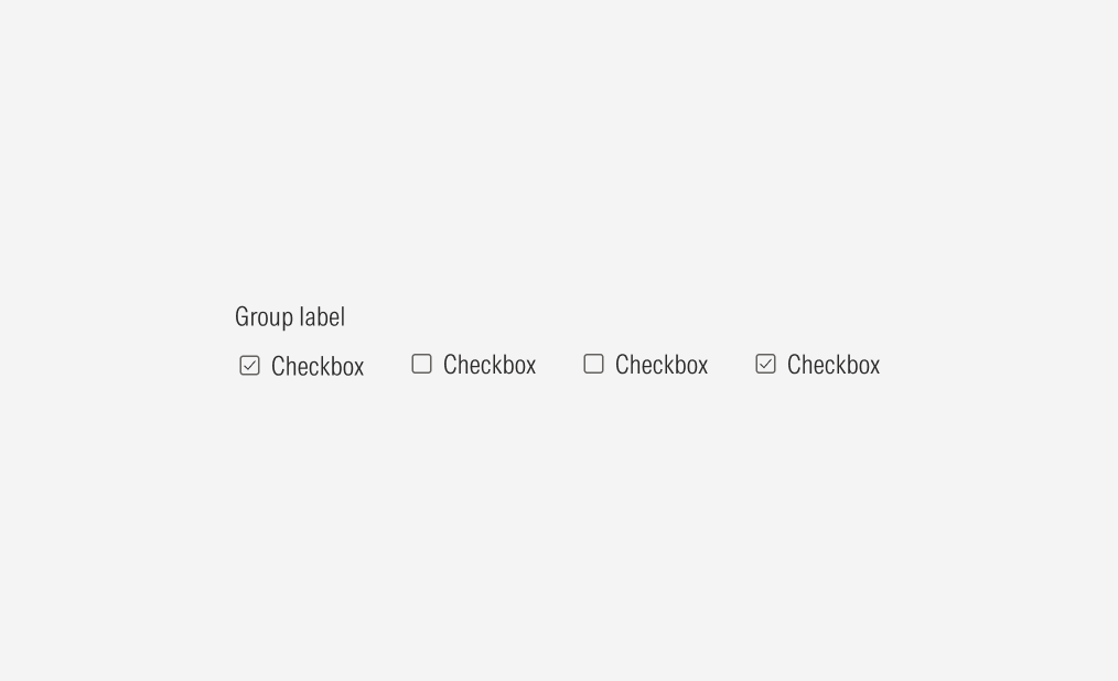
A checkbox container can add standard spacing between checkboxes. Ensure that proper space is given between each checkbox when placed next to each other vertically or horizontally. The standard vertical distance between grouped checkboxes is 8px, and the horizontal distance between grouped checkboxes is 24px.
Alignment and Hierarchy
The alignment of checkboxes with their container or in relation to content at the same level of the page should follow a left-justified pattern.
Checkboxes are mostly used in forms, alongside other form elements, to ensure a proper hierarchy between the available user actions. All form elements should be the same size.
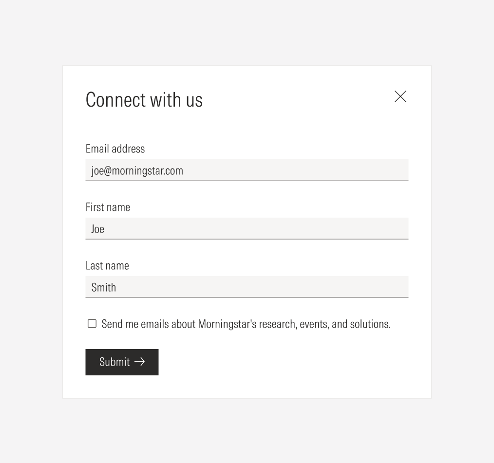
Do place checkboxes following the same placement rules as the other form elements: each on a separate line, taking the whole form width, and keeping the same padding between them.
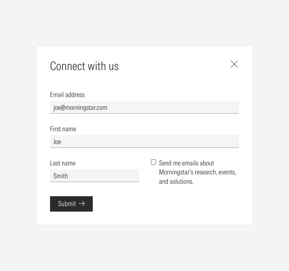
Don’t place checkboxes to one side of other form elements.
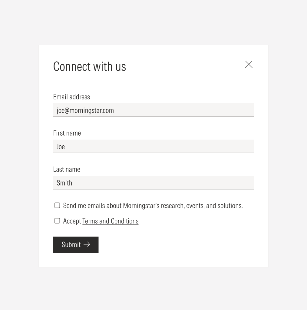
Do keep the same padding between individual checkboxes when they don’t belong to a group and don’t share the same topic.
Don’t place individual checkboxes as a group without a label if the don’t share the same topic.


