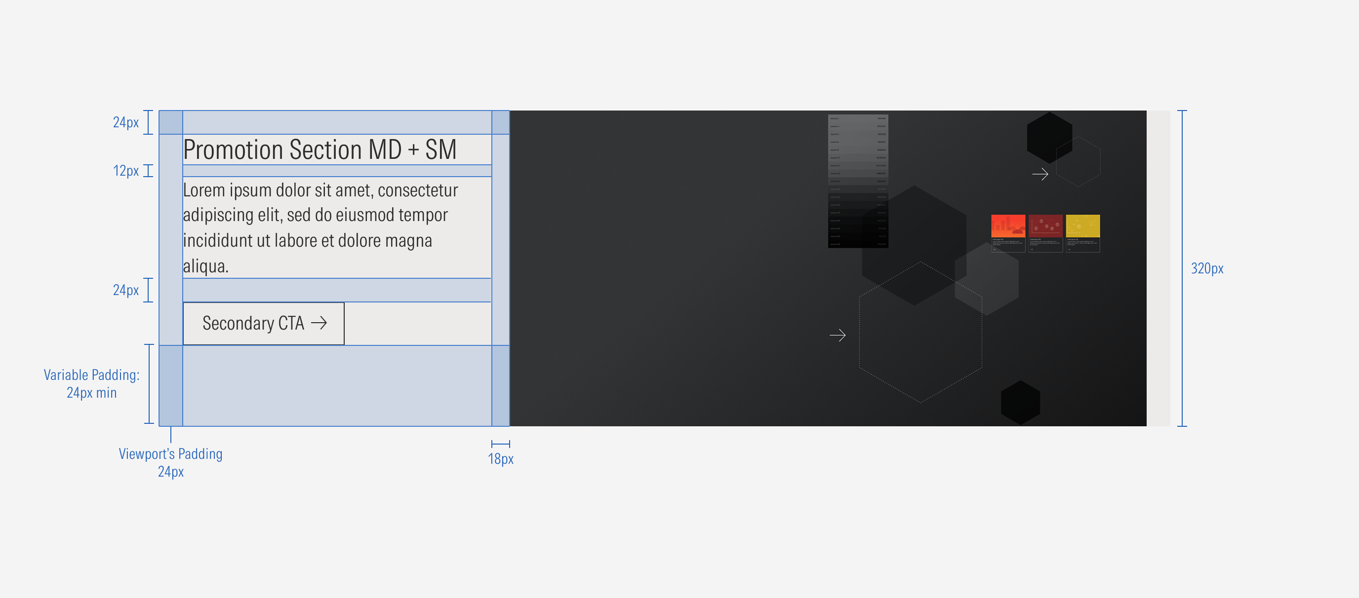
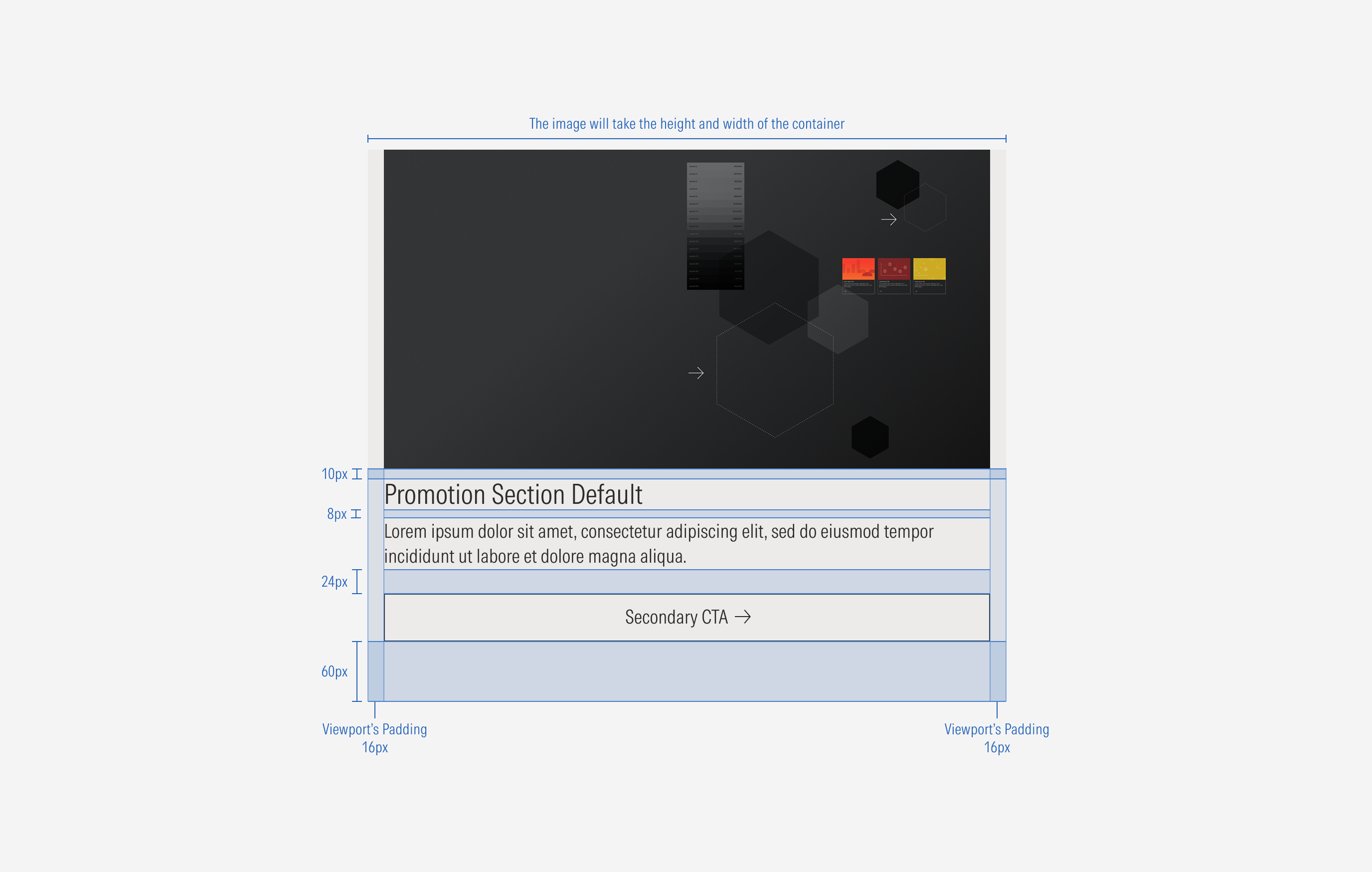
Promotion Section
A promotion section is a section used in the middle of a page to highlight specific content, inviting the user to take action.
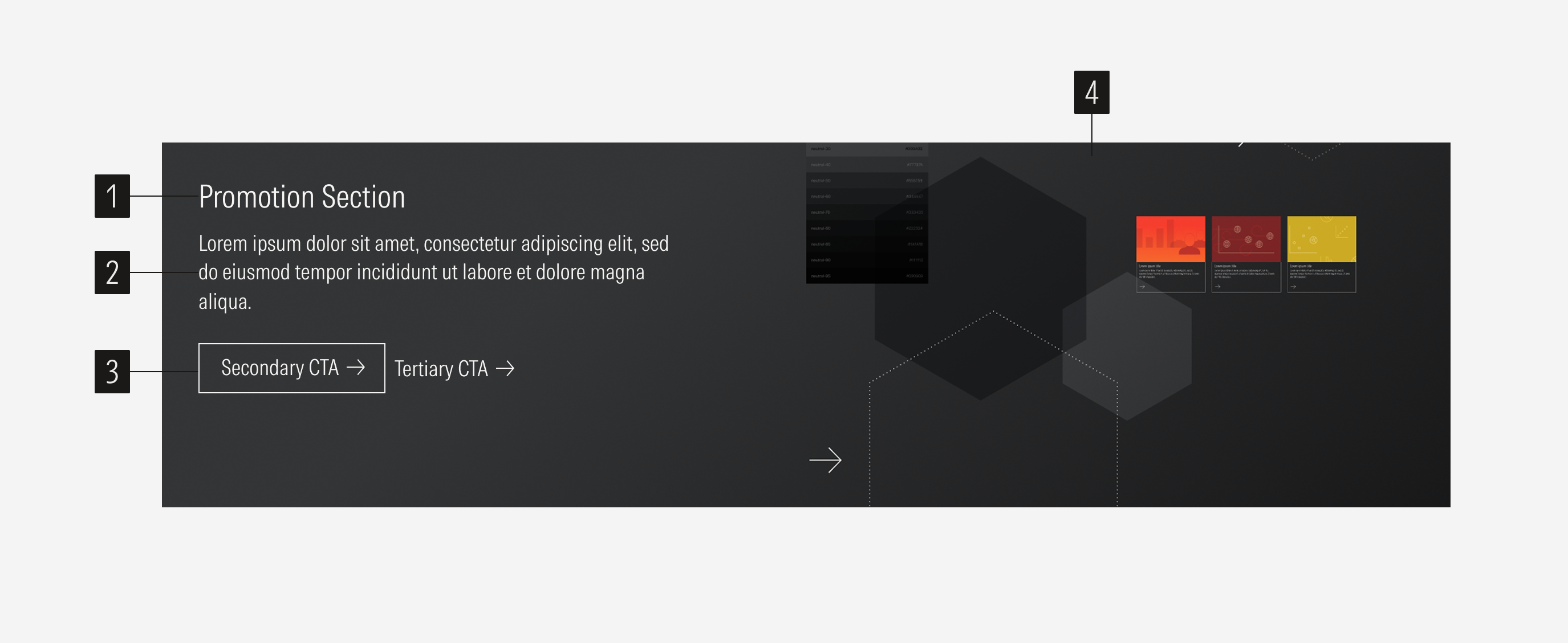
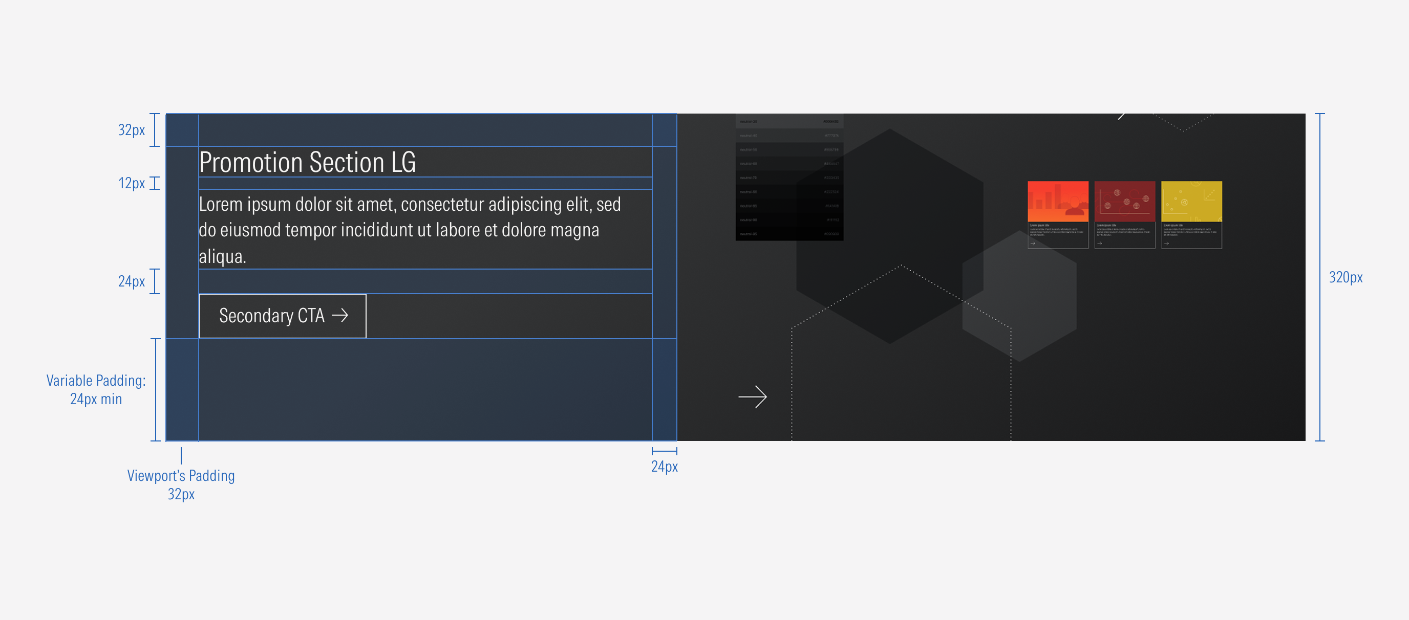
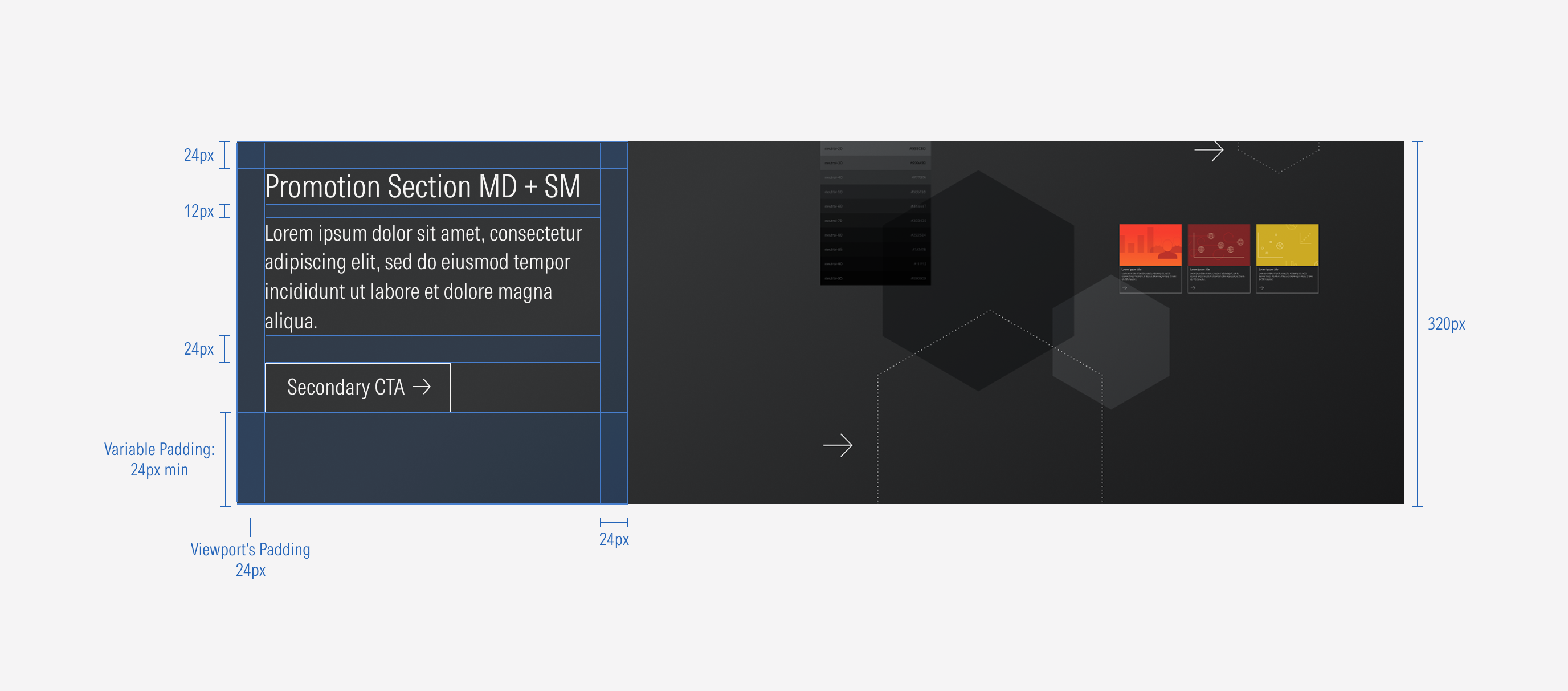
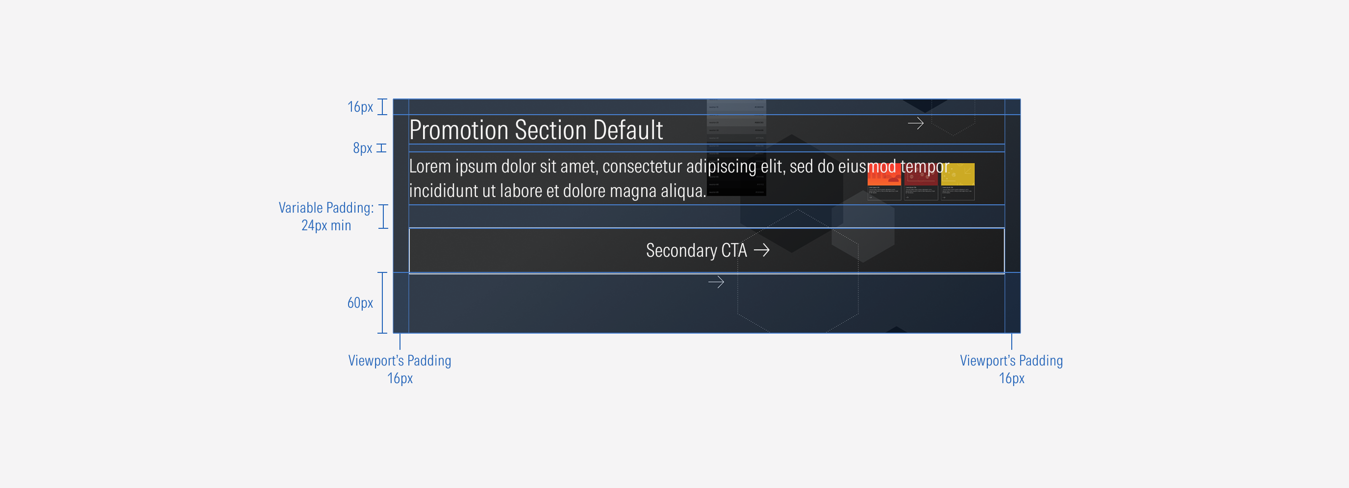
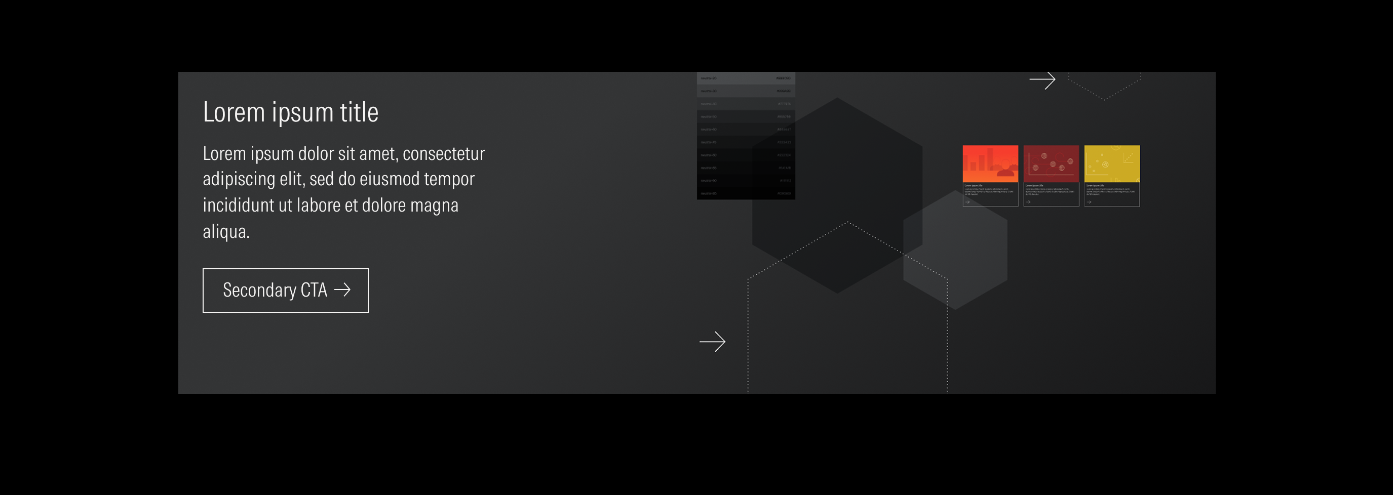
- Title sets the topic for the promotion section.
- Body text gives more context.
- CTAs enforce the desired user action. There could be only a secondary CTA, only a tertiary CTA, or a secondary and a tertiary CTA.
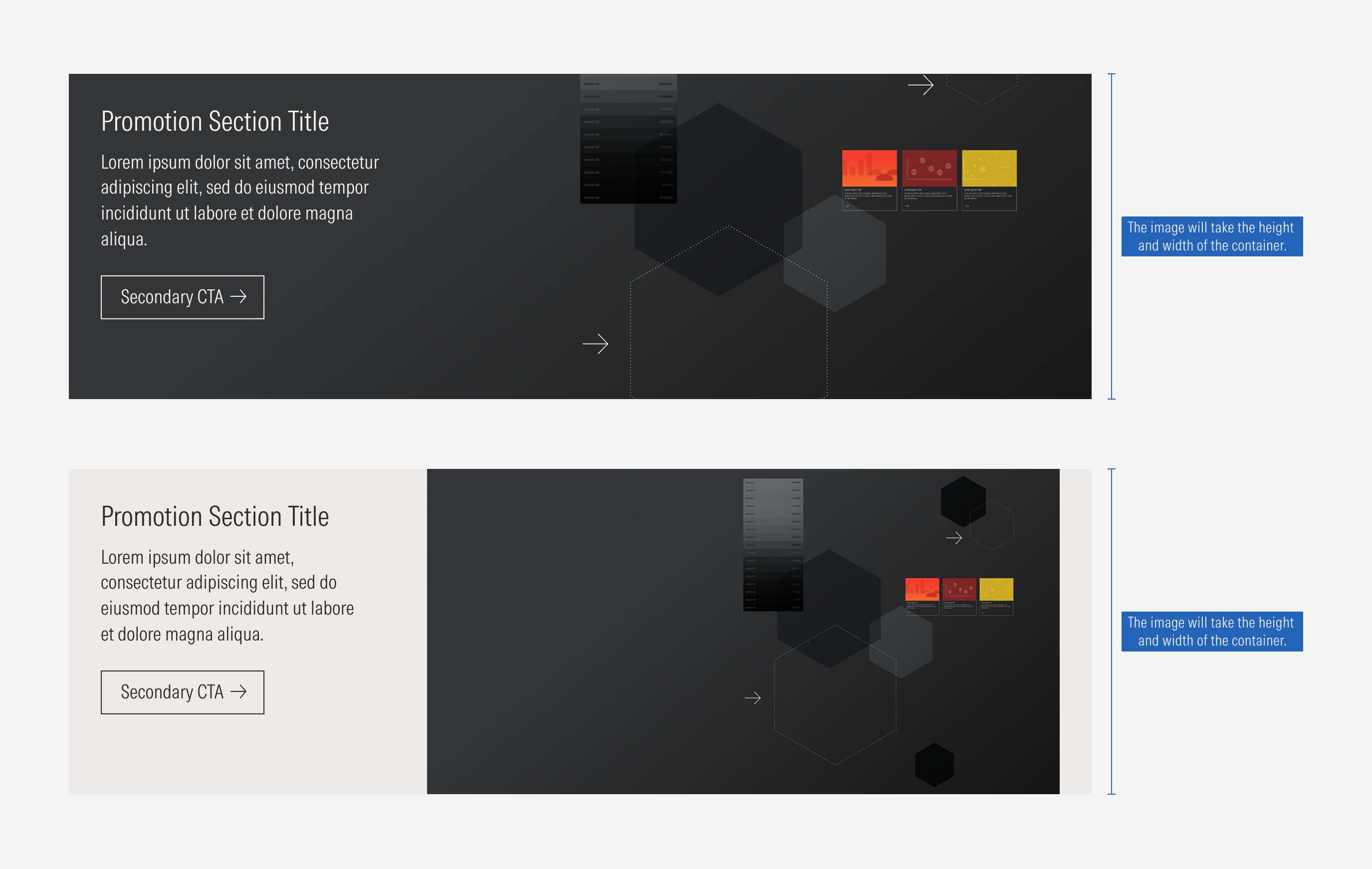
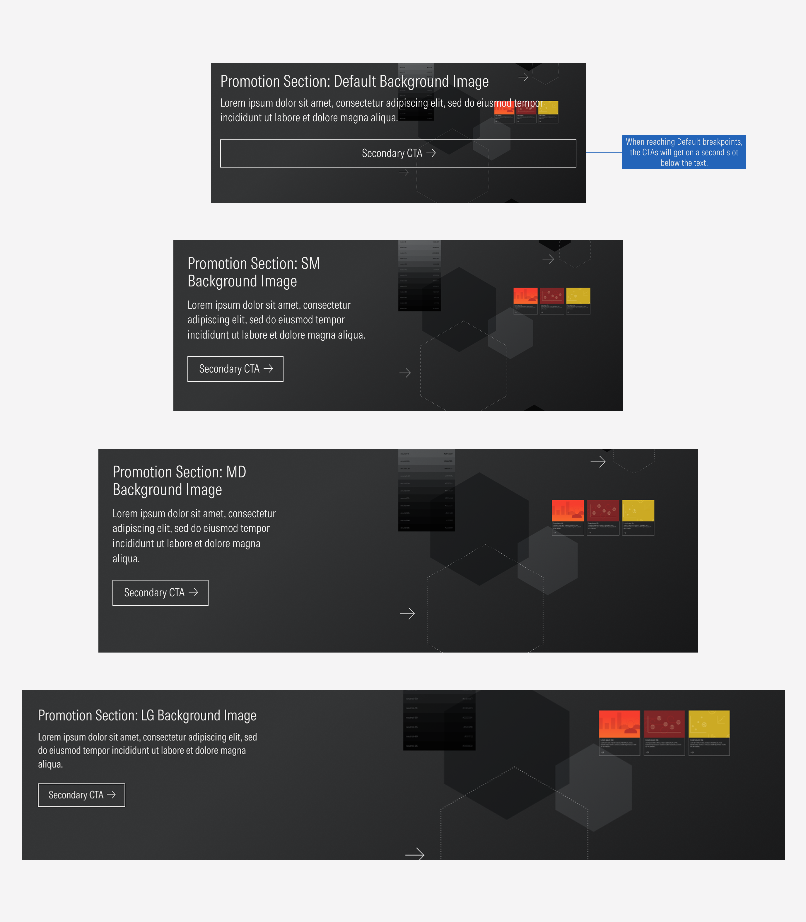
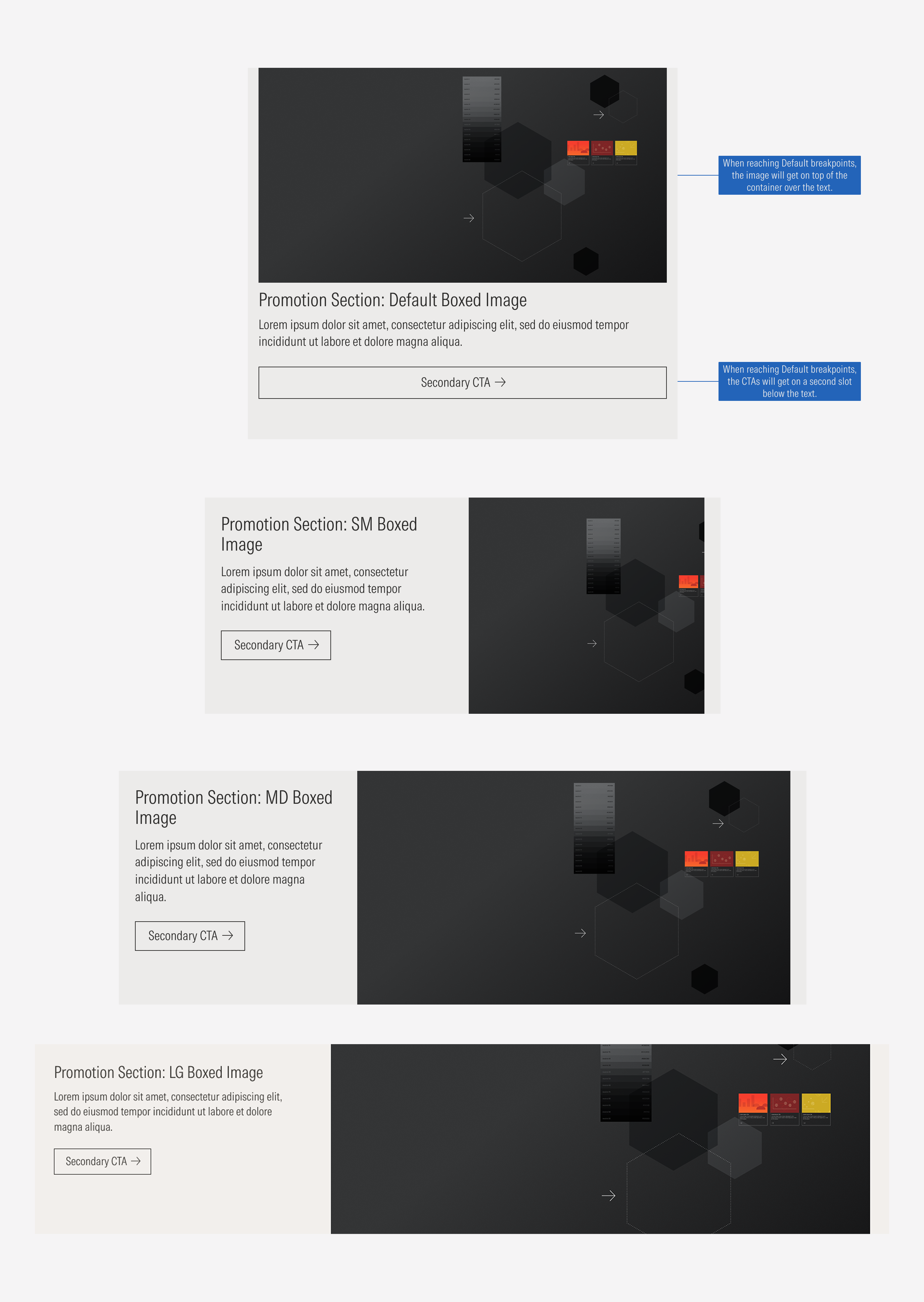
- Image enforces the content of the promotion section. It takes the height of the section. The image can be as a background or boxed at the right.
Usage
When to Use
Use the promotion section as an internal ad to highlight something not specifically related to the content of the page.
When Not to Use
Don’t use the promotion section to promote something strictly related to the content of the page or to highlight a specific action needed from the user. Use a card container or a thrasher instead.
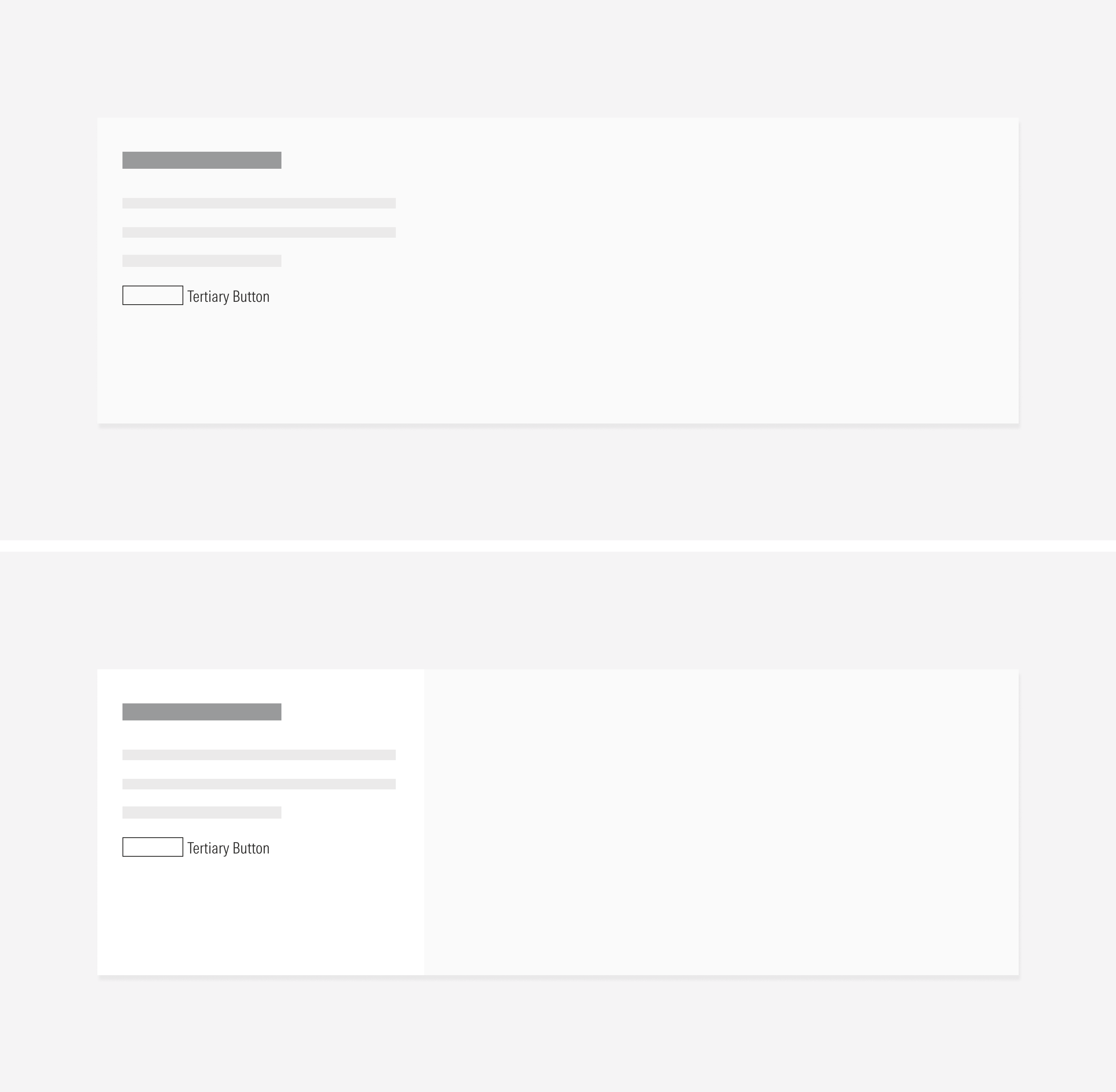
Variation | Purpose | Image | CTA | Background |
|---|---|---|---|---|
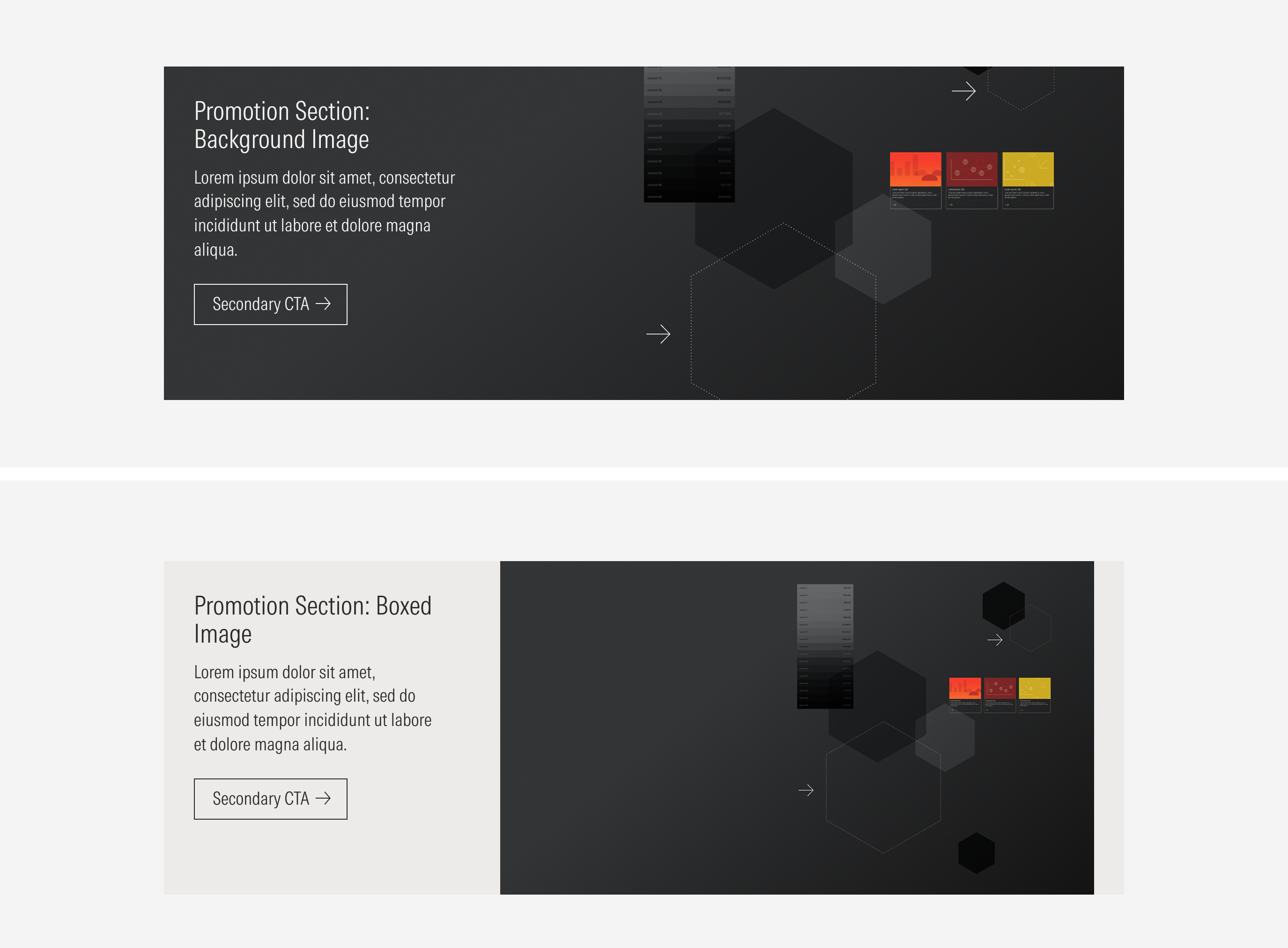
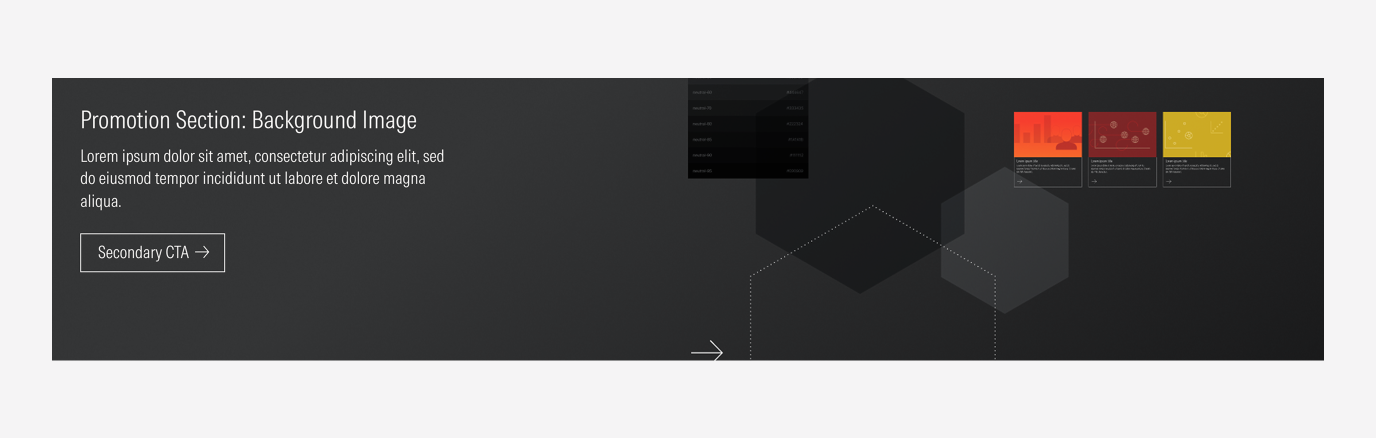
Background image | Use to highlight an action or a short message and to give a more visual hook. | Background | A secondary; a secondary and a tertiary; a tertiary | Full-bleed image |
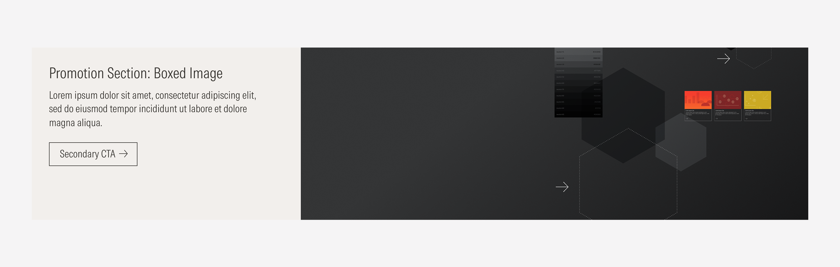
Boxed image | Use to highlight an action or a message. | Boxed | A secondary; a secondary and a tertiary; a tertiary | Solid color |
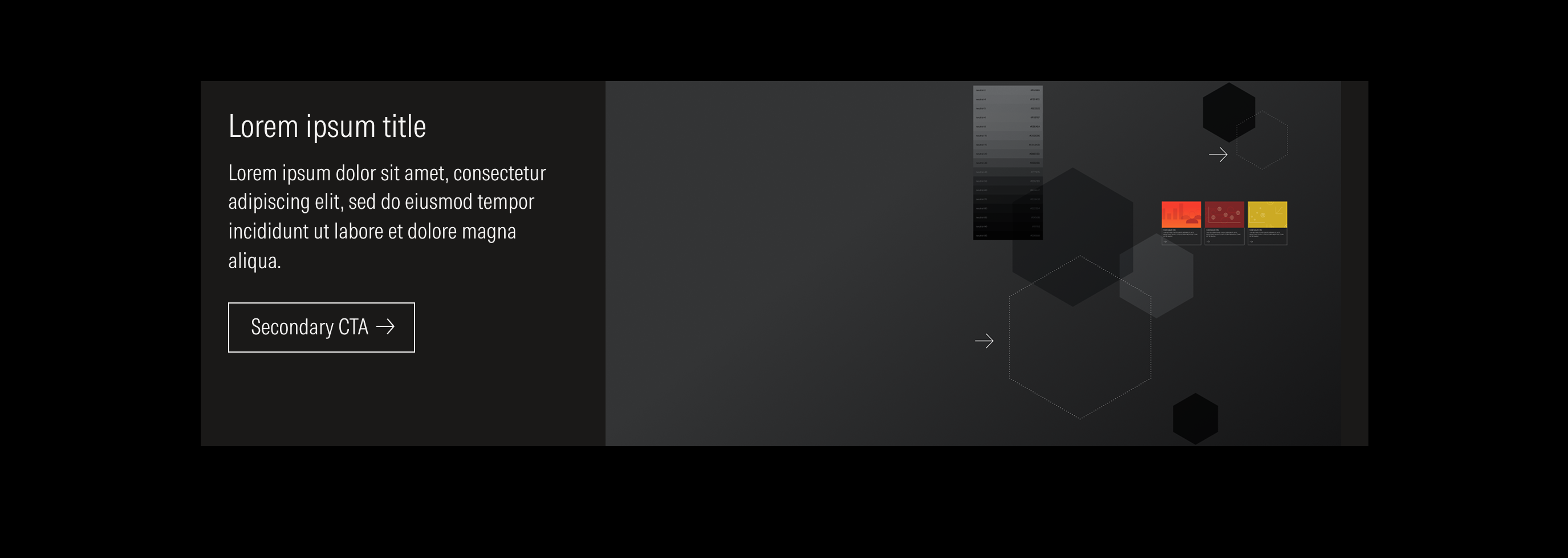
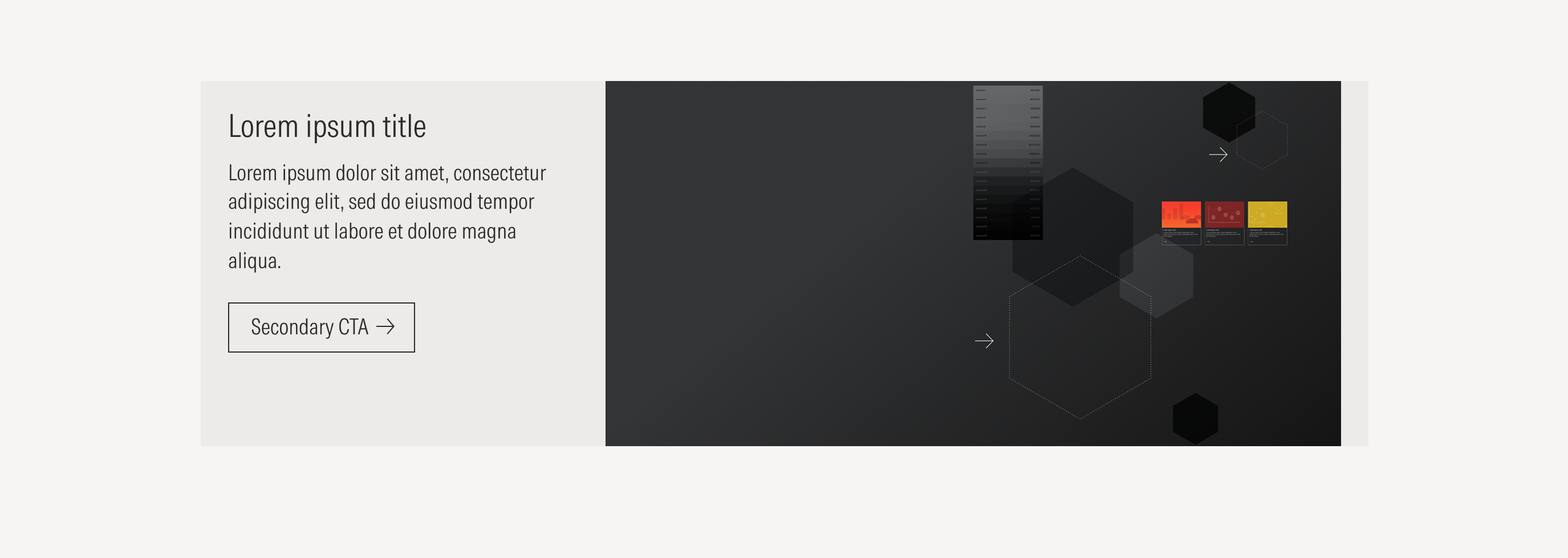
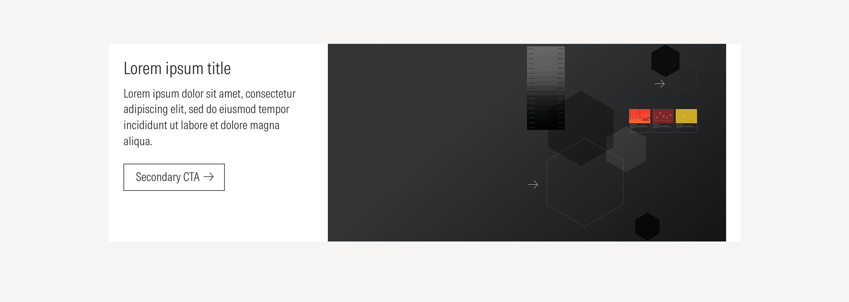
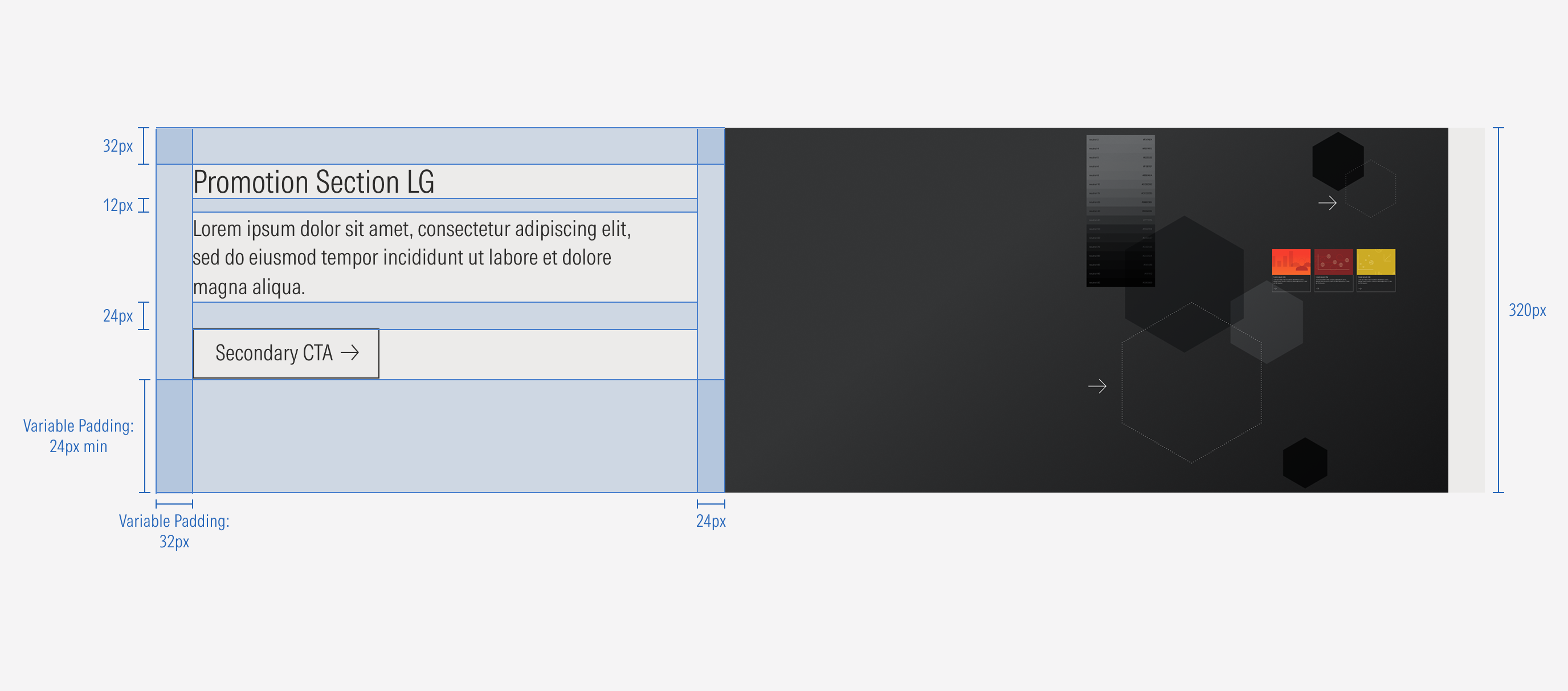
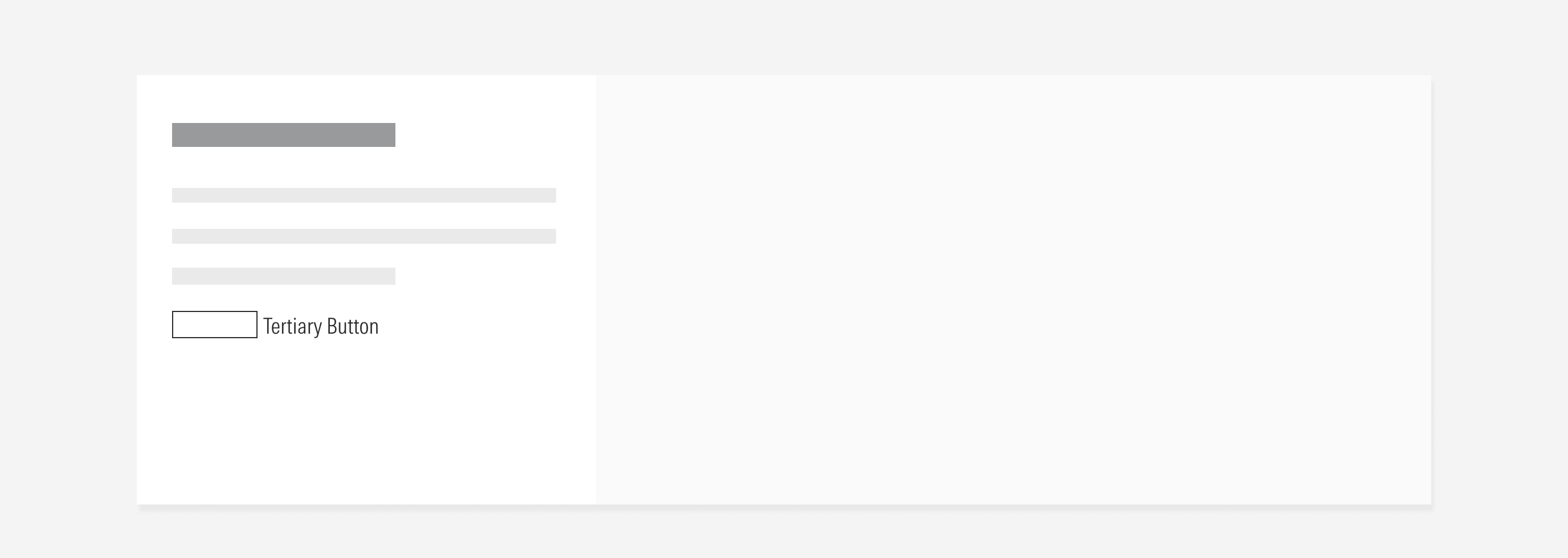
Boxed Image
The dedicated slot at the right for the image can be customized. It takes the height of the container. The left slot of the container will include the text and CTAs, with a solid background color.
Image
The background image and boxed image will take the height of the section at every breakpoint.
Hierarchy
A proper hierarchy must be ensured for the elements that compose the promotion section. The title, with the highest level of importance, needs to give a clear and short idea of the topic of the section. Keep in mind that the CTAs will go below the body text.
Alignment
The alignment of items within the promotion section container or in relation to the content at the same level of the page, should follow a left-justified pattern. The CTAs will take the width of the page for Default viewports.
Do place the CTAs next to the body text with non-variable padding in between.
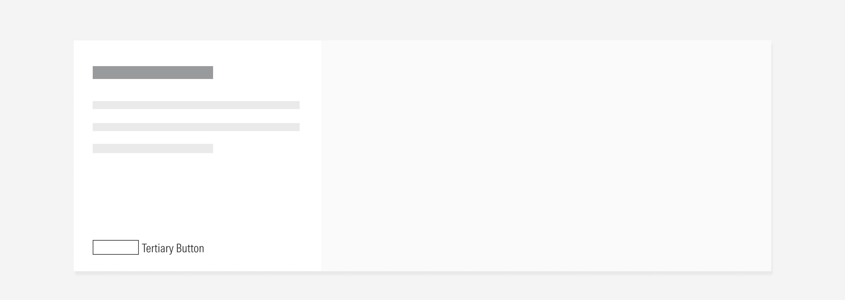
Don’t place the CTAs far from the body text or near the bottom edge with a major padding in between.
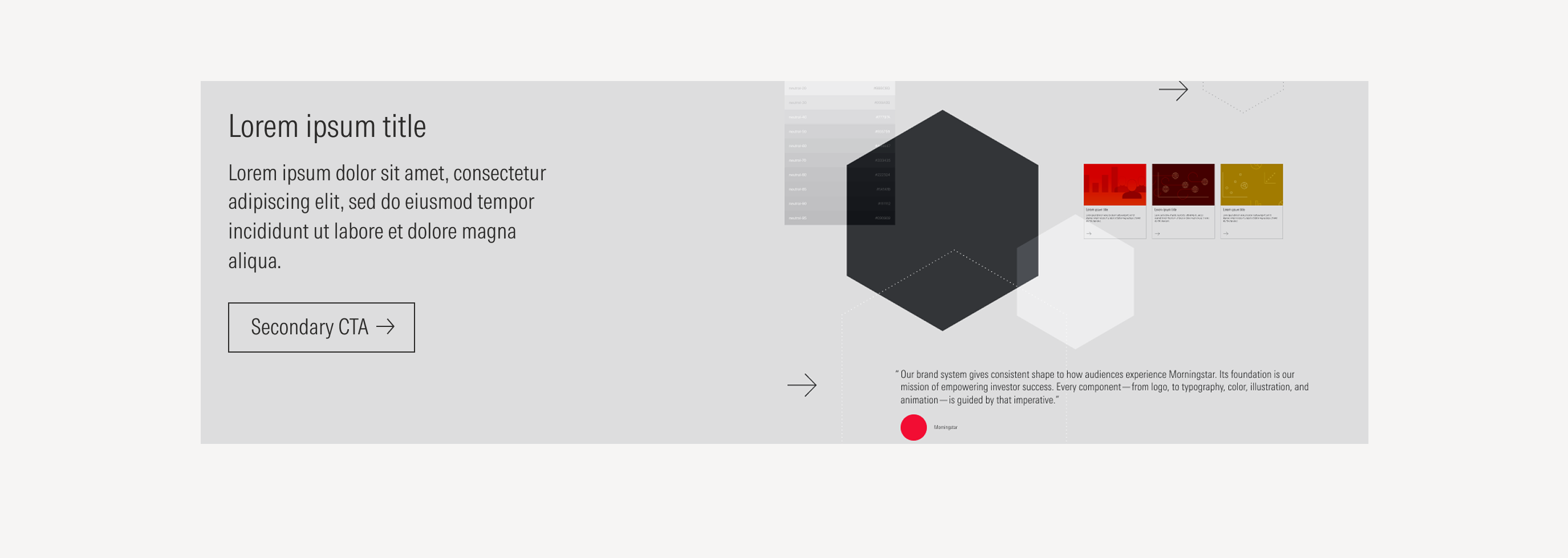
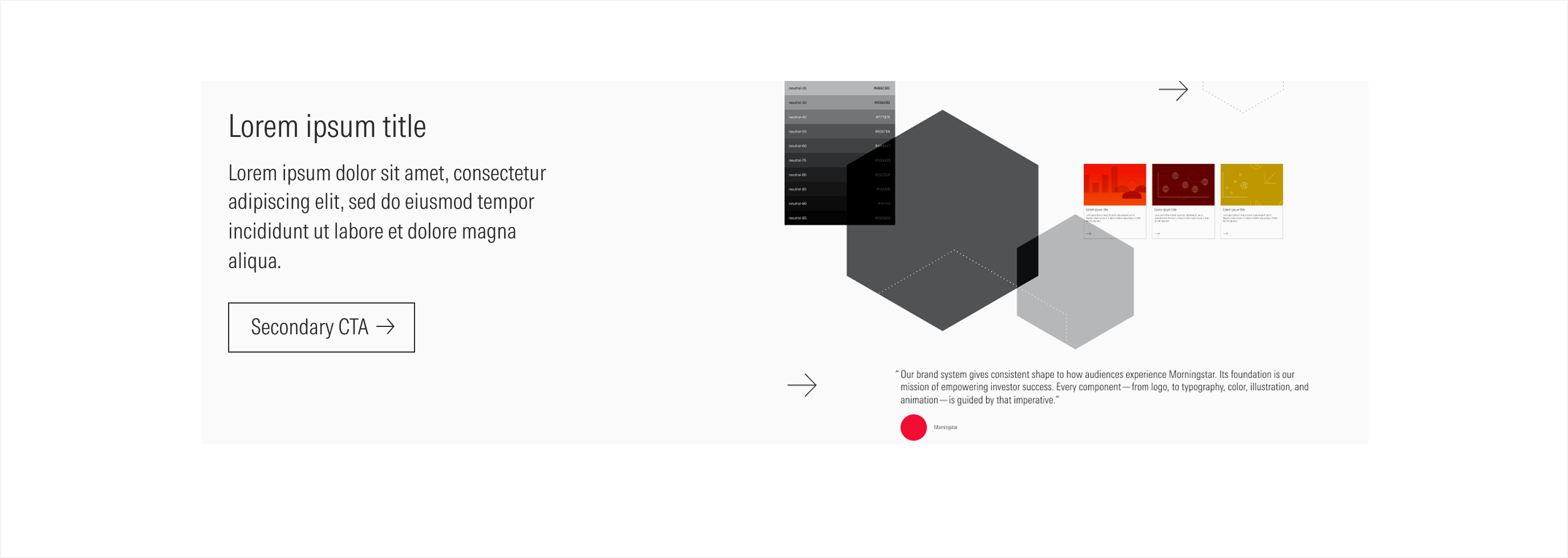
Boxed Image