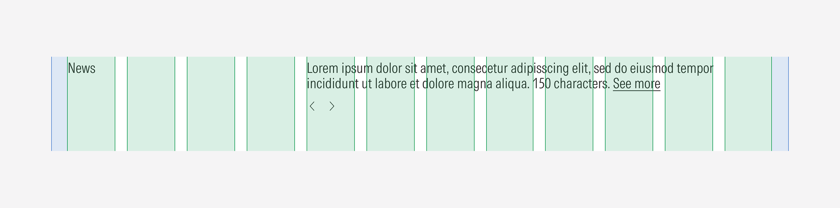
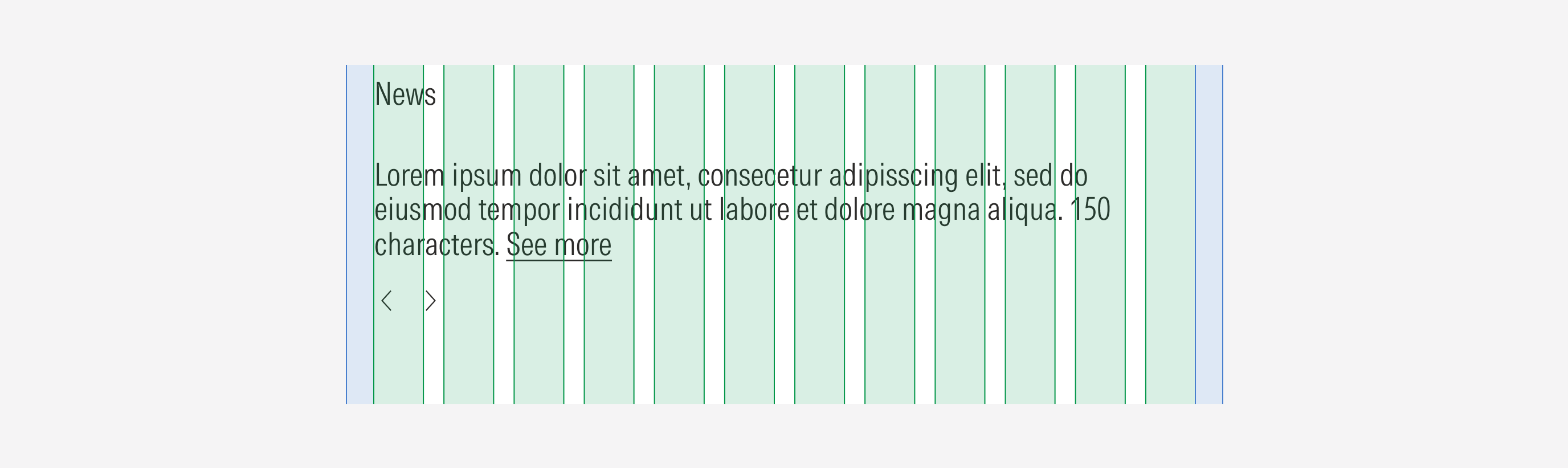
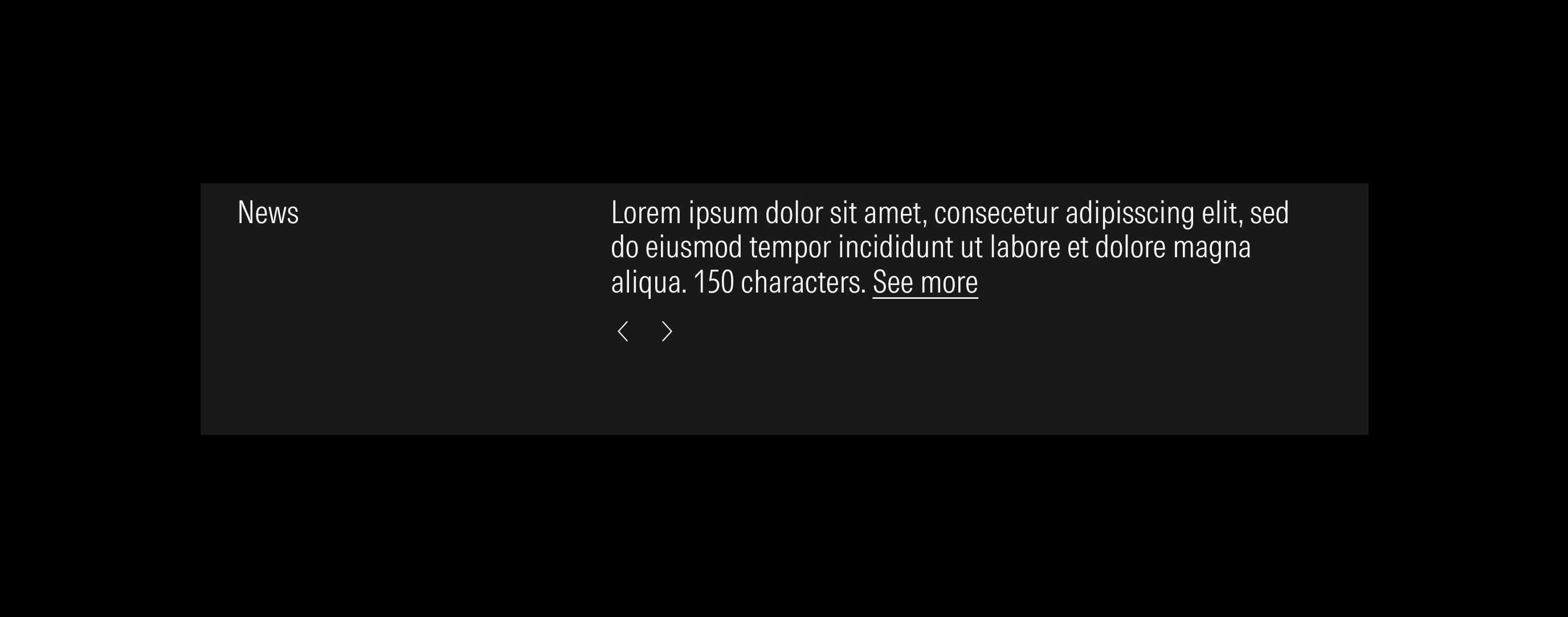
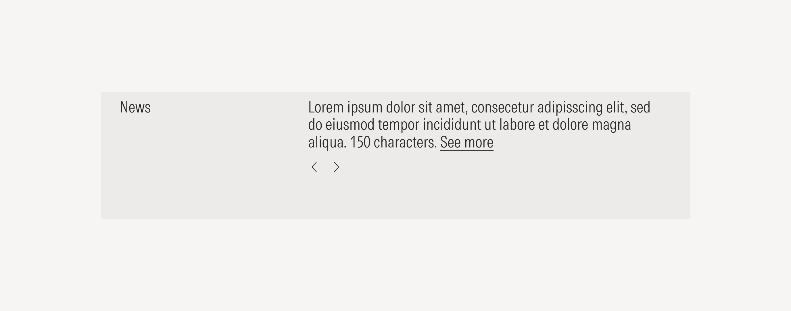
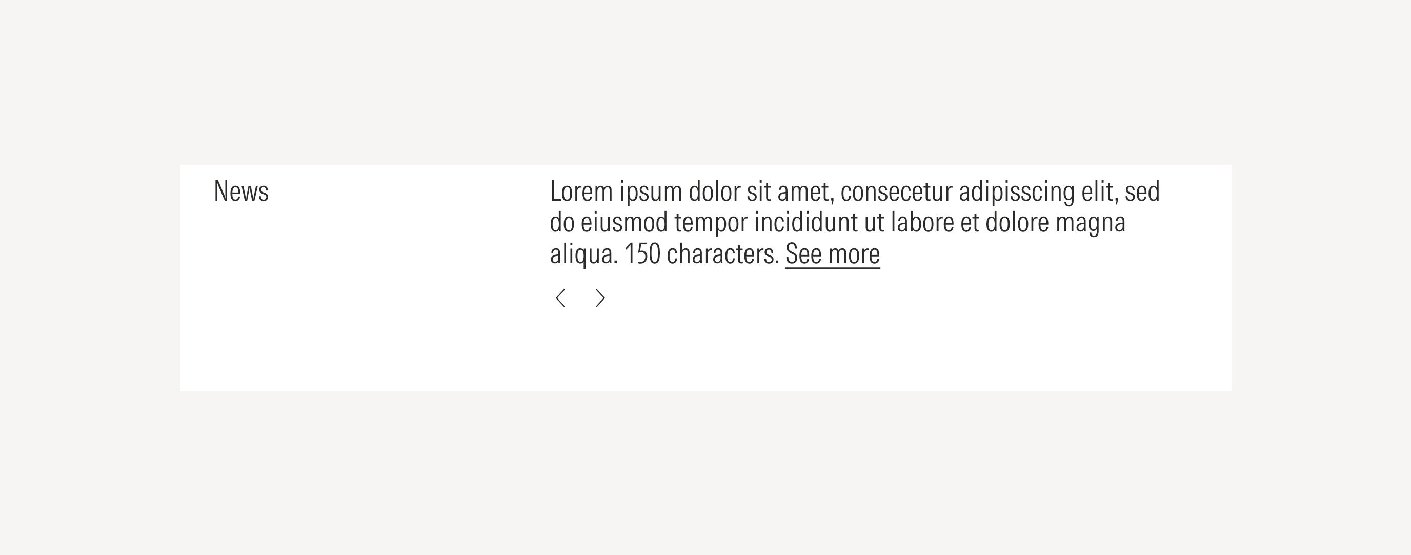
News
The news section is a carousel of rotating news stories, curated by product owners. It will have at least three news stories that will auto rotate between every 15 seconds, or until a user interacts with the carousel. Once a user interacts with the carousel the auto advancement of articles will stop until the page reloads.
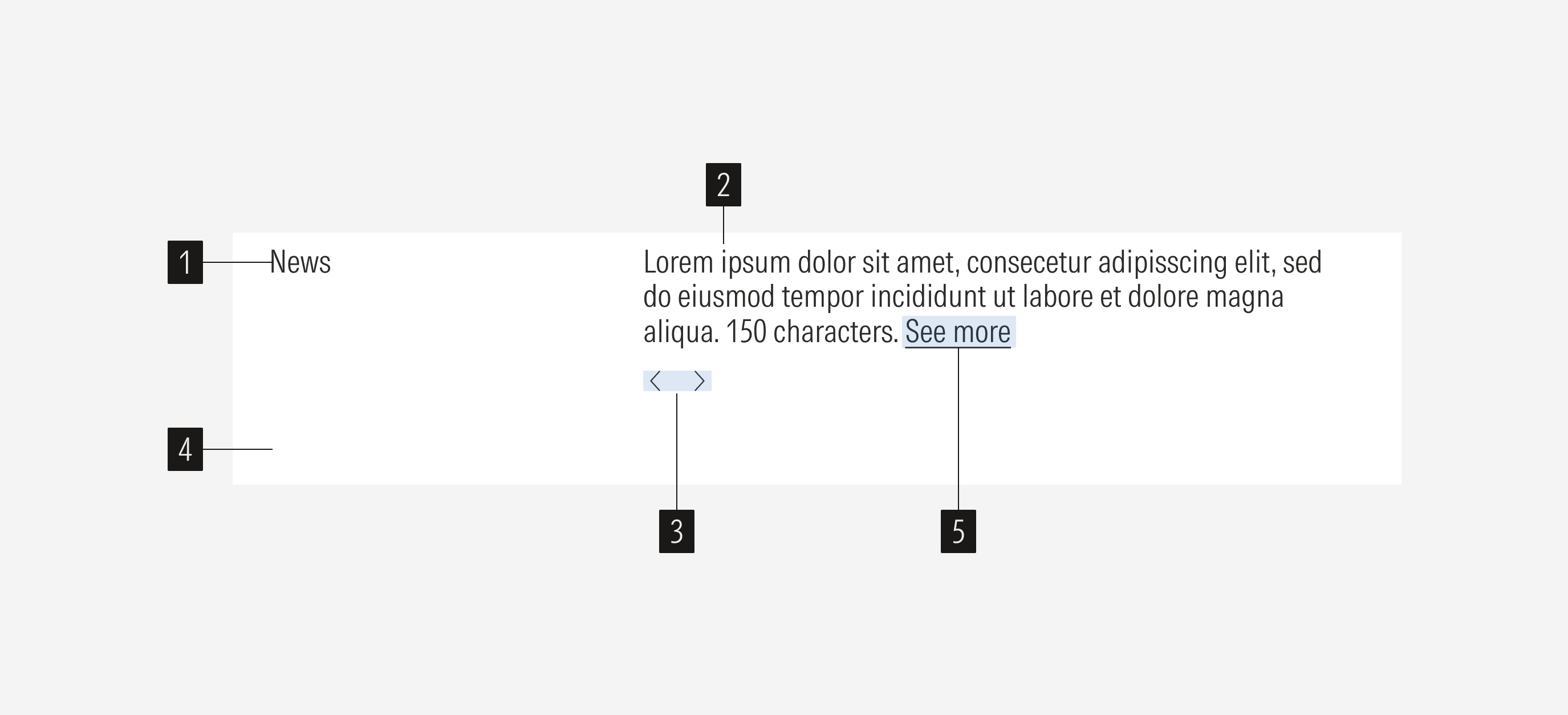
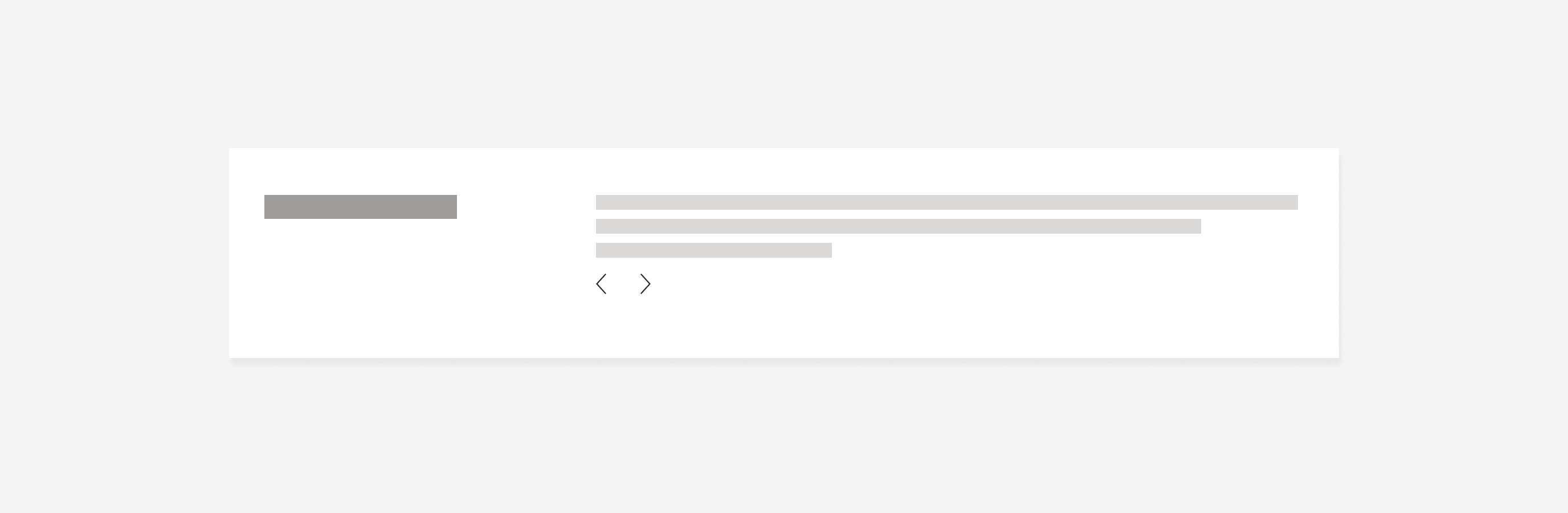
- Title sets the topic for the news section. Has a limit of 50 characters.
- Description gives context of the news. Has a character limit.
- Navigation controls are tertiary icon only buttons that allow control to slide between news blocks (view to the next or the previous block).
- Background defines the space of the news container.
- Inline text link opens a new tab that displays the page where the user can read more about the related news.
Variation | Purpose | Title | Body | CTA | Background |
|---|---|---|---|---|---|
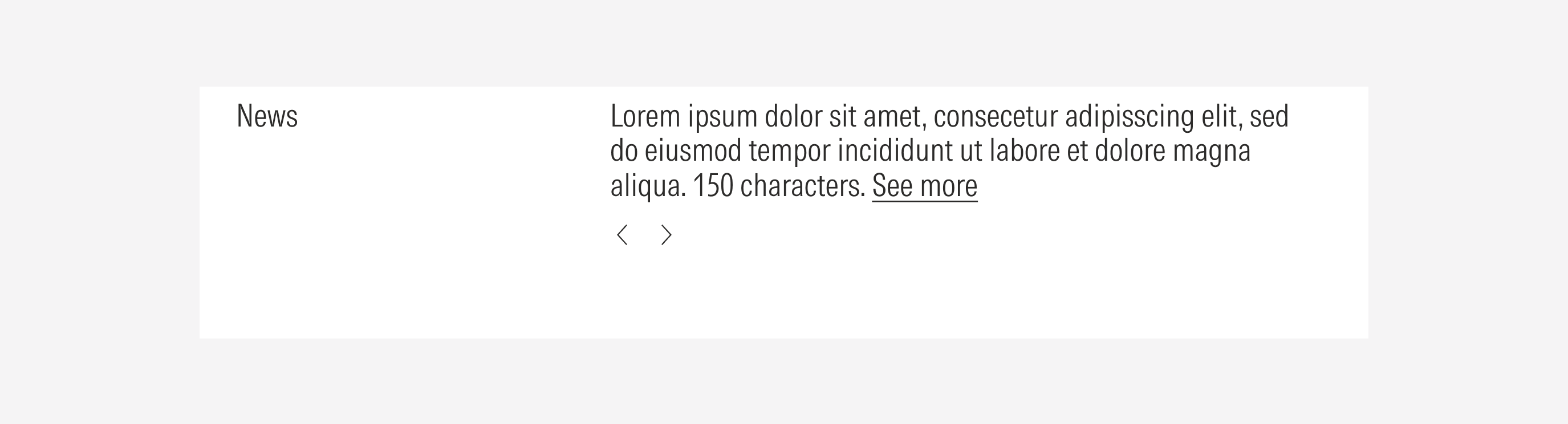
News | Use to display recent news. | With title | With body | No CTA | With background (solid color) |
Container
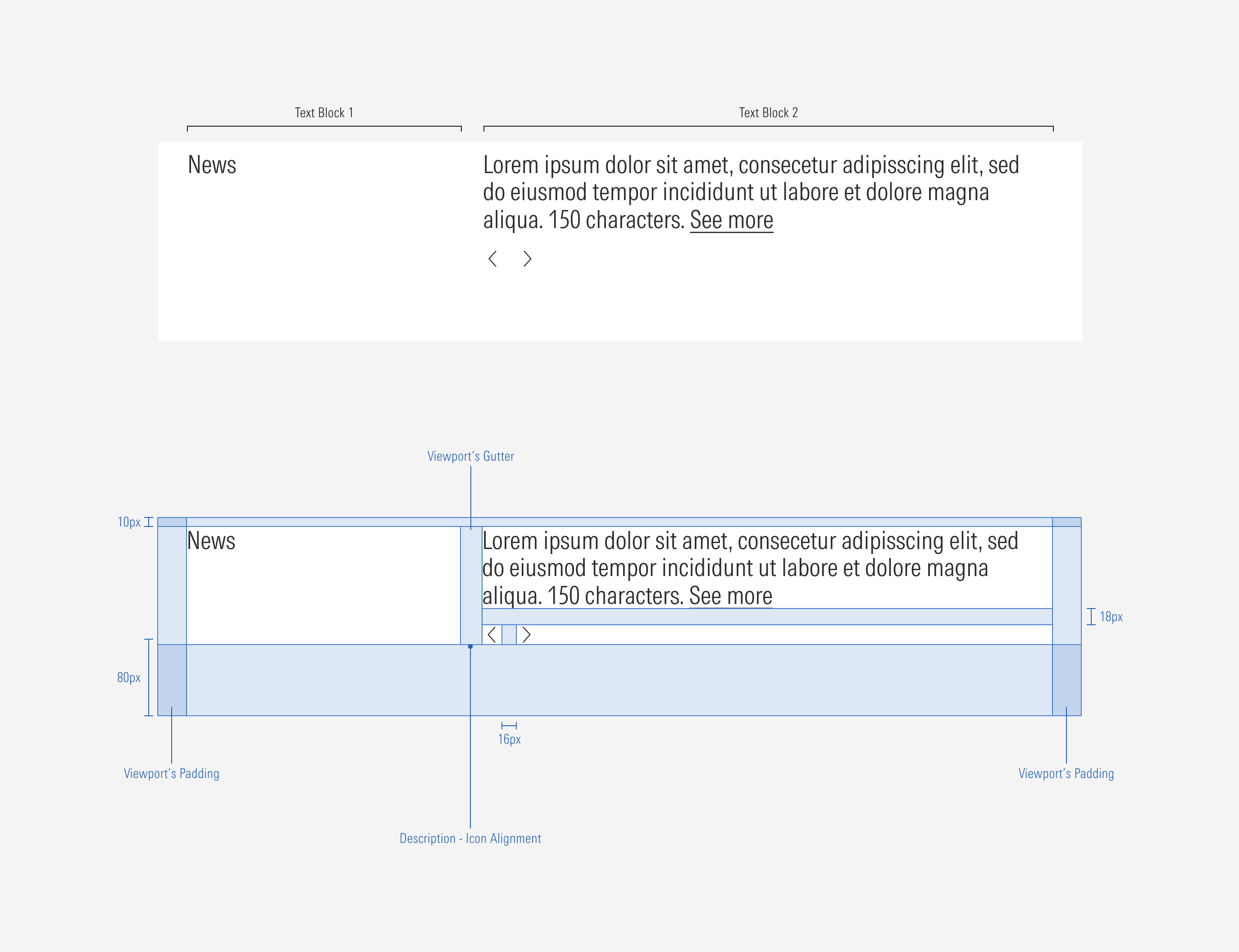
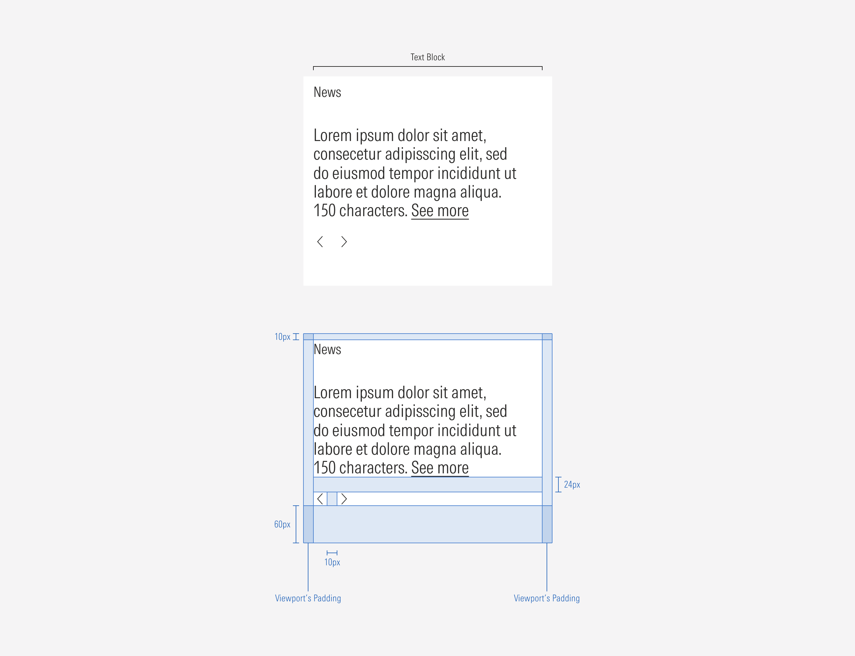
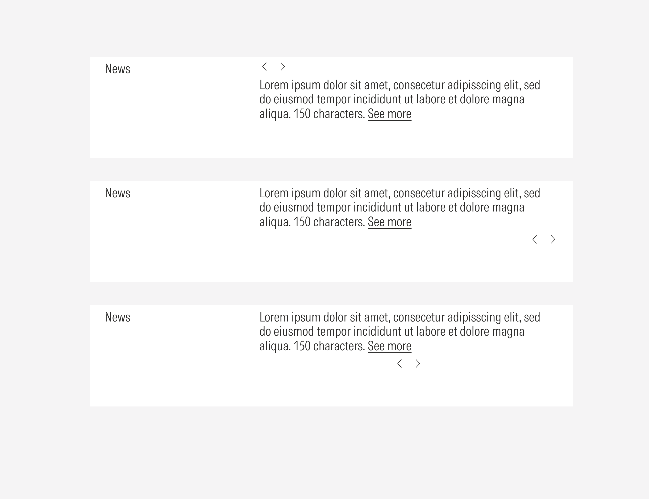
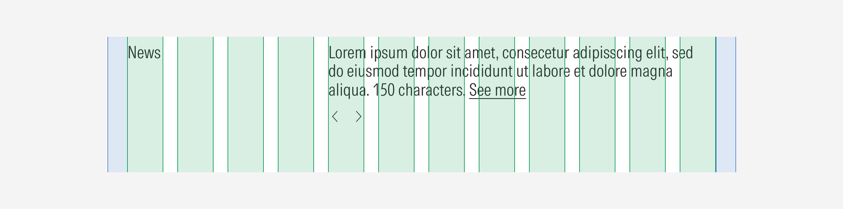
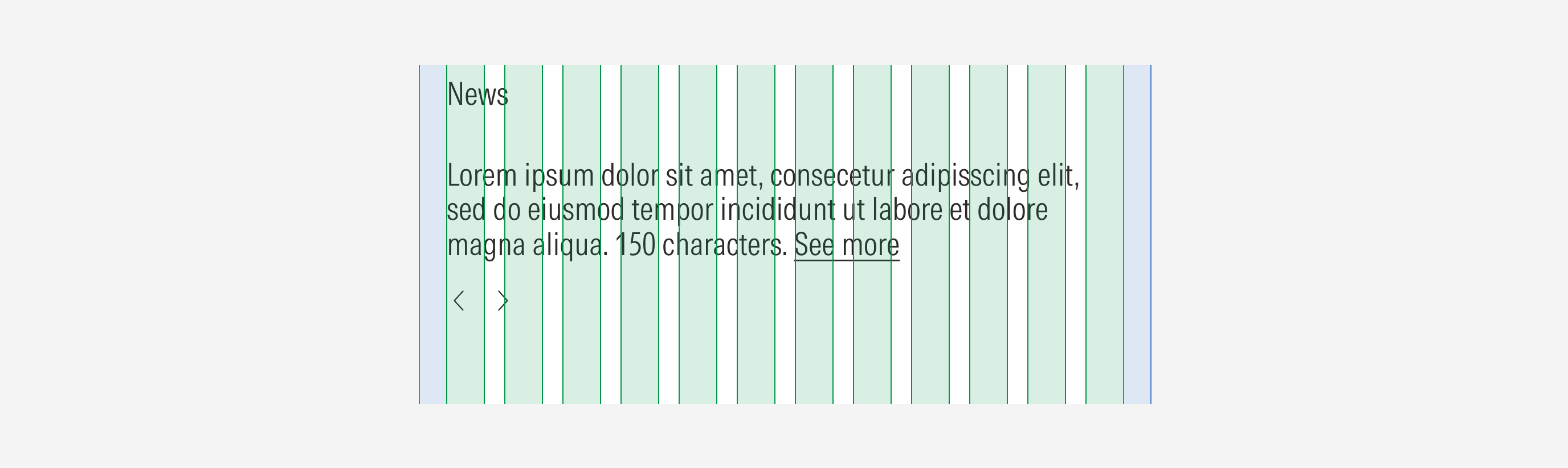
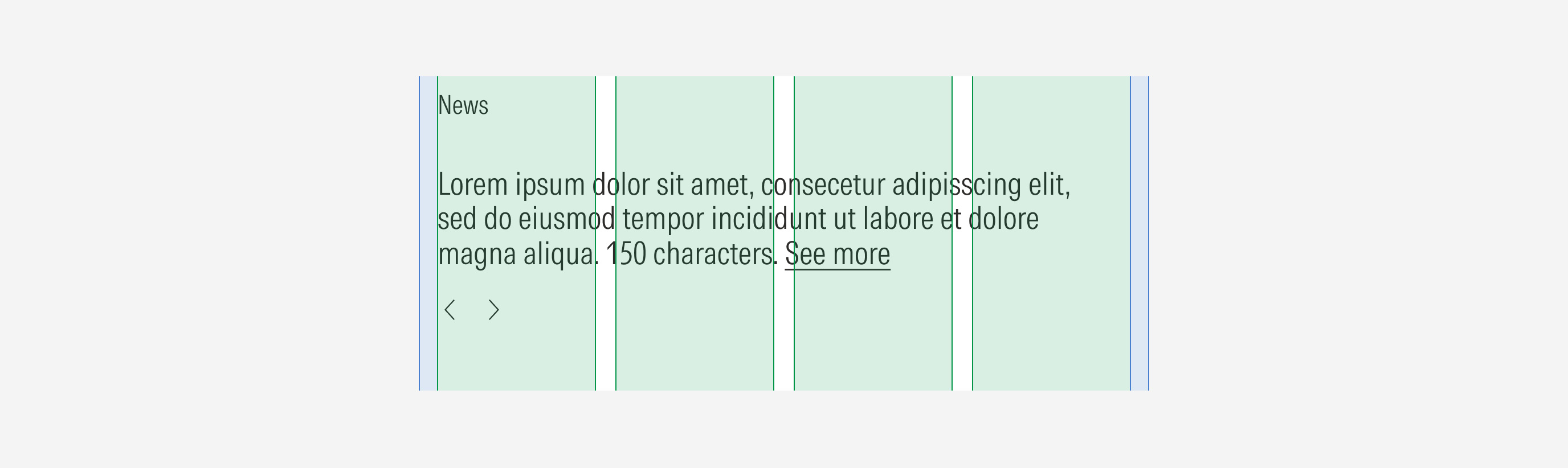
Spacing
Ensure that proper space is given between each item in the container. Besides the horizontal padding and gutter, the carousel has a top and a bottom margin to consider. The vertical spacing between more than one element displayed will take the gutter pixel number of the grid (behavior per viewport).
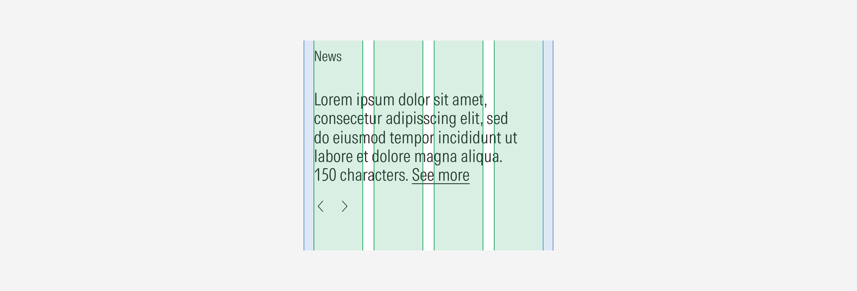
Hierarchy
A proper hierarchy must be ensured for the elements that compose the news. The navigation controls should be at the bottom of the description block. The title (title only) will be placed on the top-left side of the description to present the news.
Alignment
The alignment of the components within the news carousel should be left-aligned. The navigation controls are visually aligned to the left with the news description.
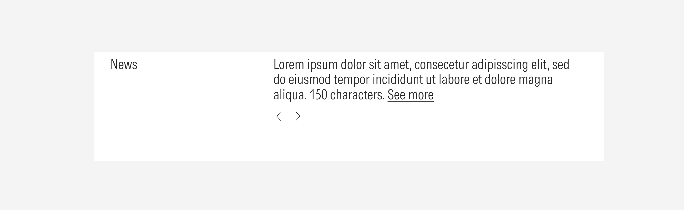
Do place the navigation controls left-aligned, below the description.
Don’t place the navigation controls on the top, right or center aligned to the content block.
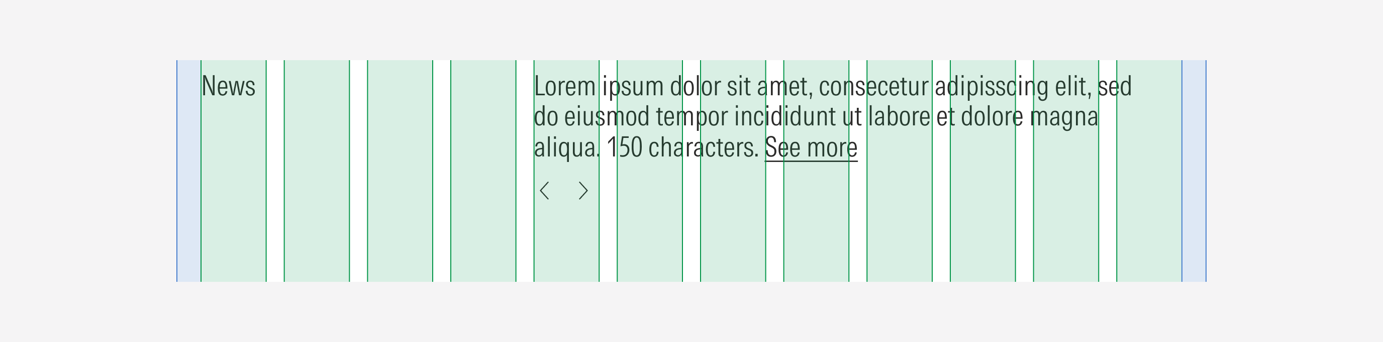
Behavior
Navigation Controls
The navigation controls (left and right icon buttons) allow the user to slide across the news blocks. Both will be active at the same time, except in two scenarios:
1.When the first news block is displayed, the left arrow will be disabled, and the right arrow will be active.
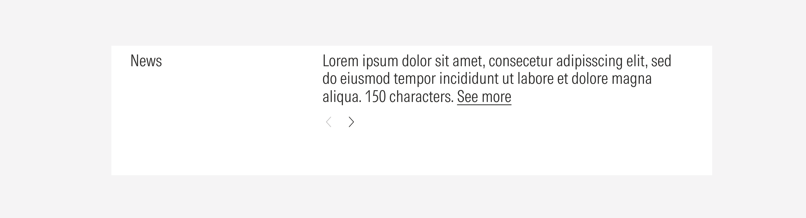
2. When the last content block is displayed, the right arrow will be disabled, and the left arrow will be active.

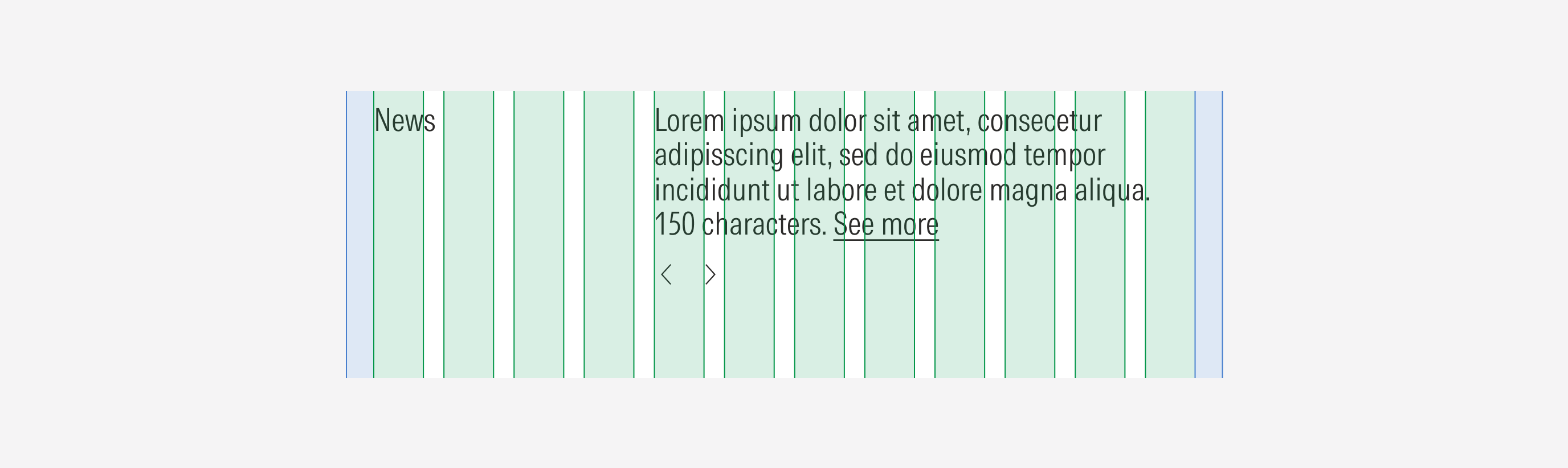
Scale Down Behavior
The way the text blocks are displayed will be closely related to the size of the screen, the news container will adapt to it.