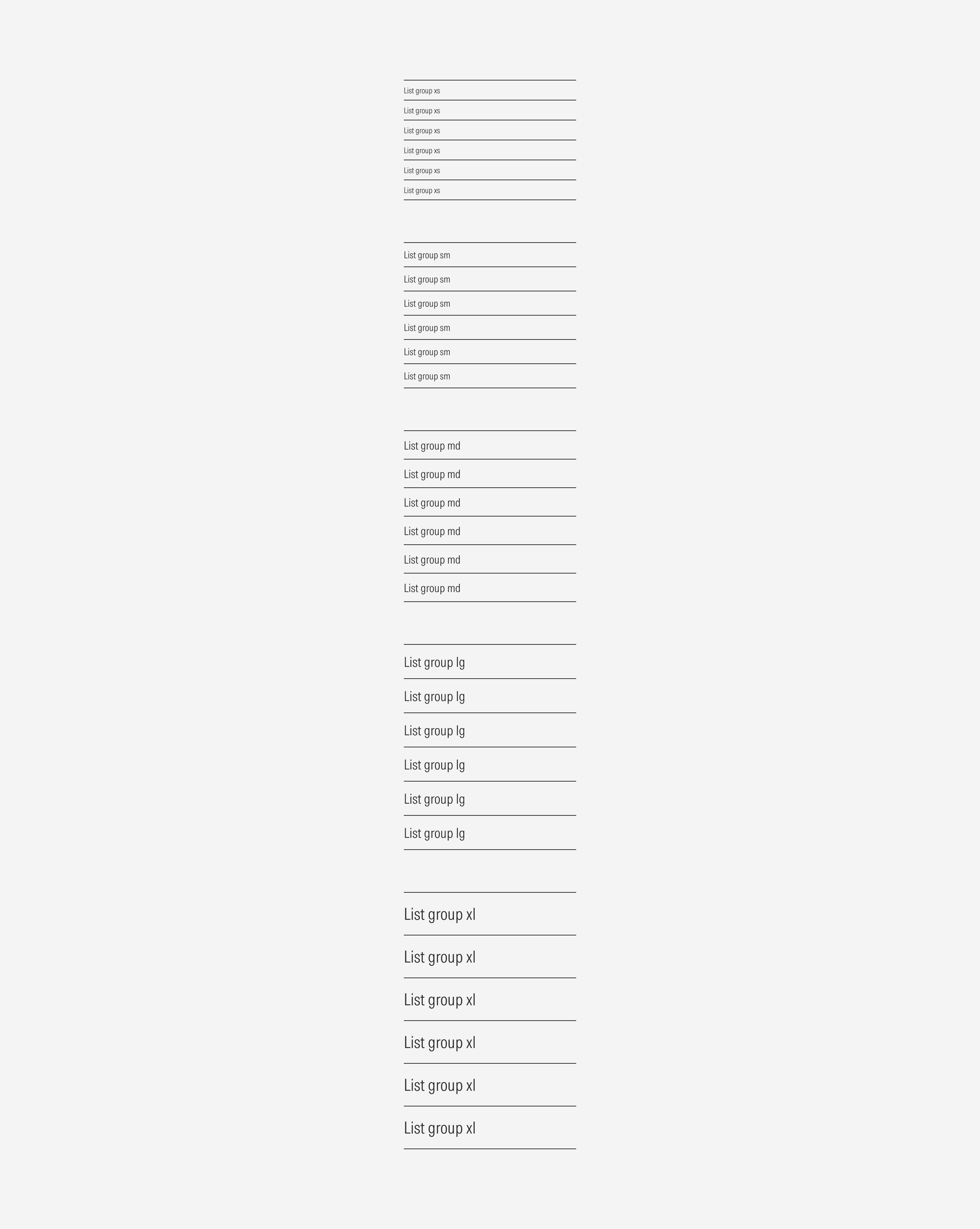
List Group
A list group is a flexible component that displays a series of content. The content can be read-only text or links that take the user to specific content pages.
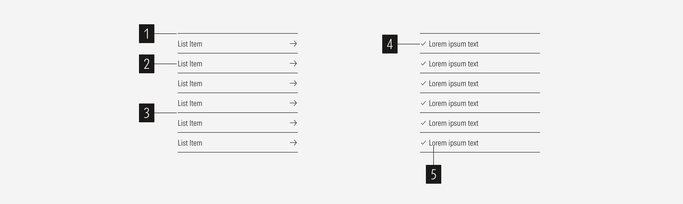
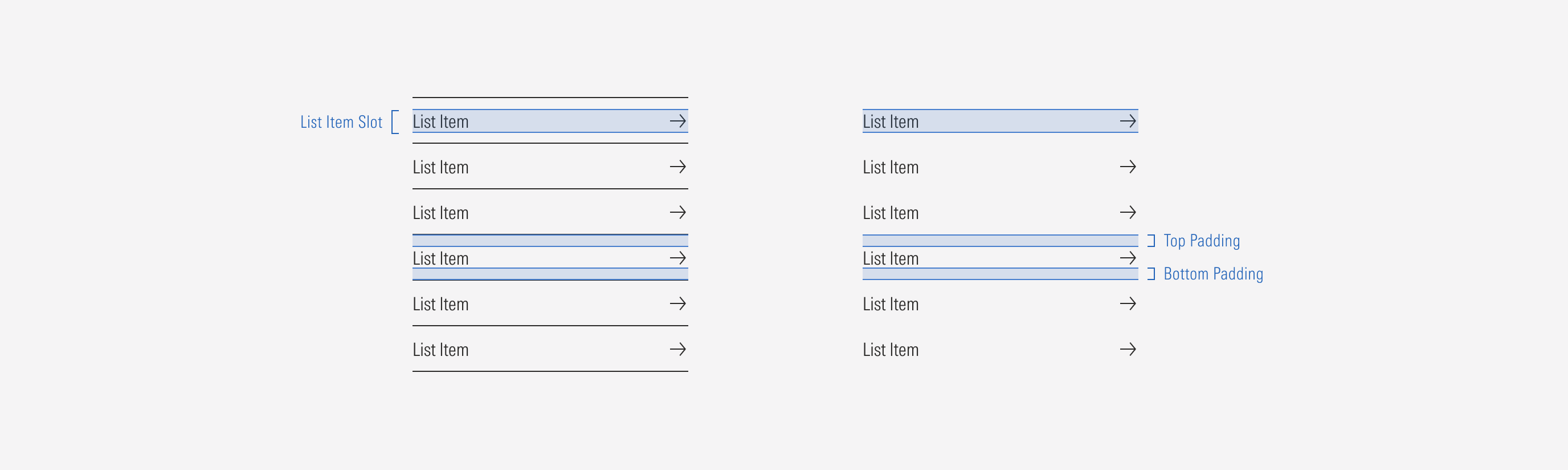
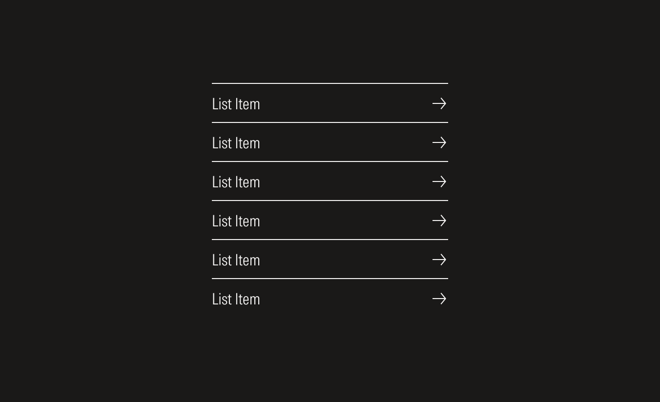
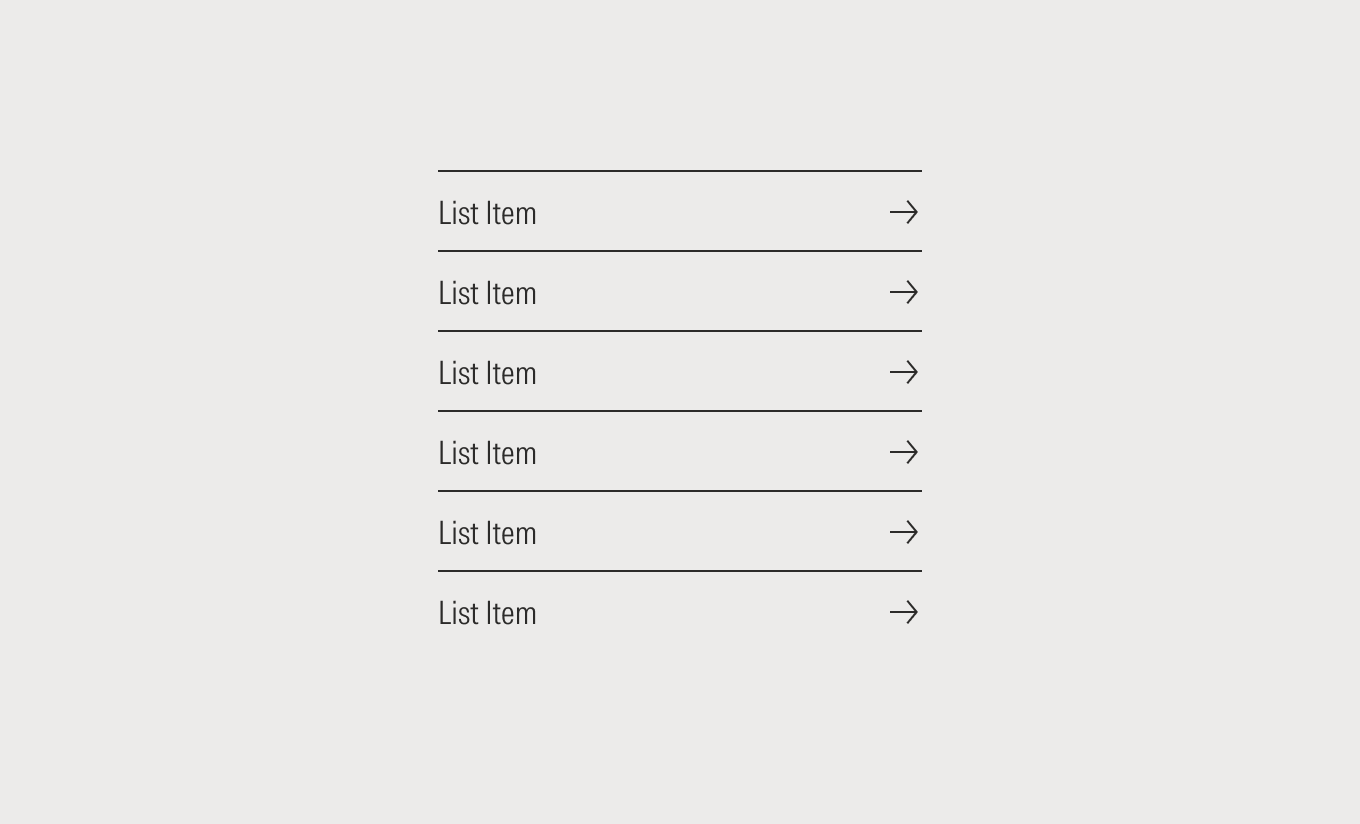
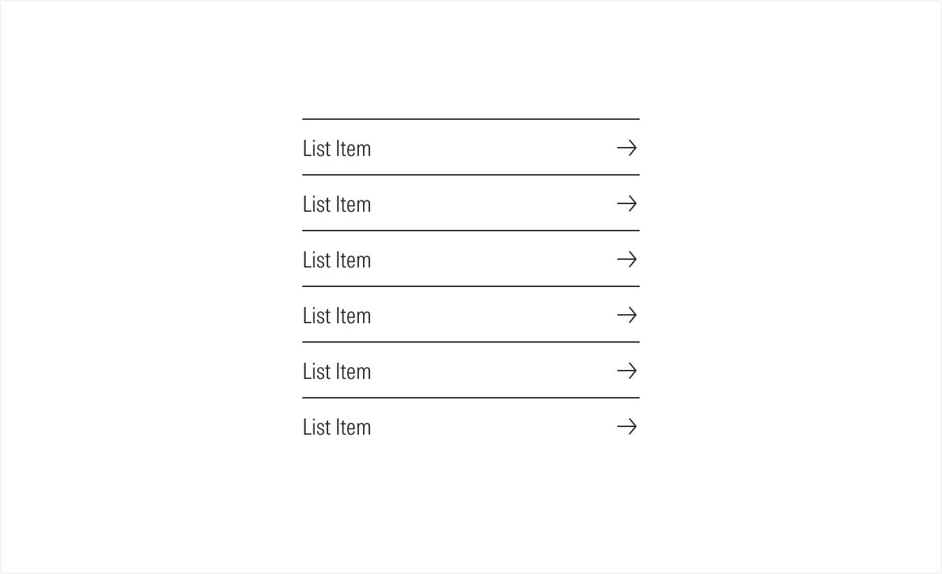
- Overline is an optional top divider of every list item.
- Tertiary button sets the content of the listed item and enforces the behavior of the CTA.
- Underline is an optional bottom divider of every listed item.
- Bullet is an optional symbol to enforce the idea of a read-only list item.
- Text line defines the listed item.
Variation | Purpose | Line | Bullet | Sizes |
|---|---|---|---|---|
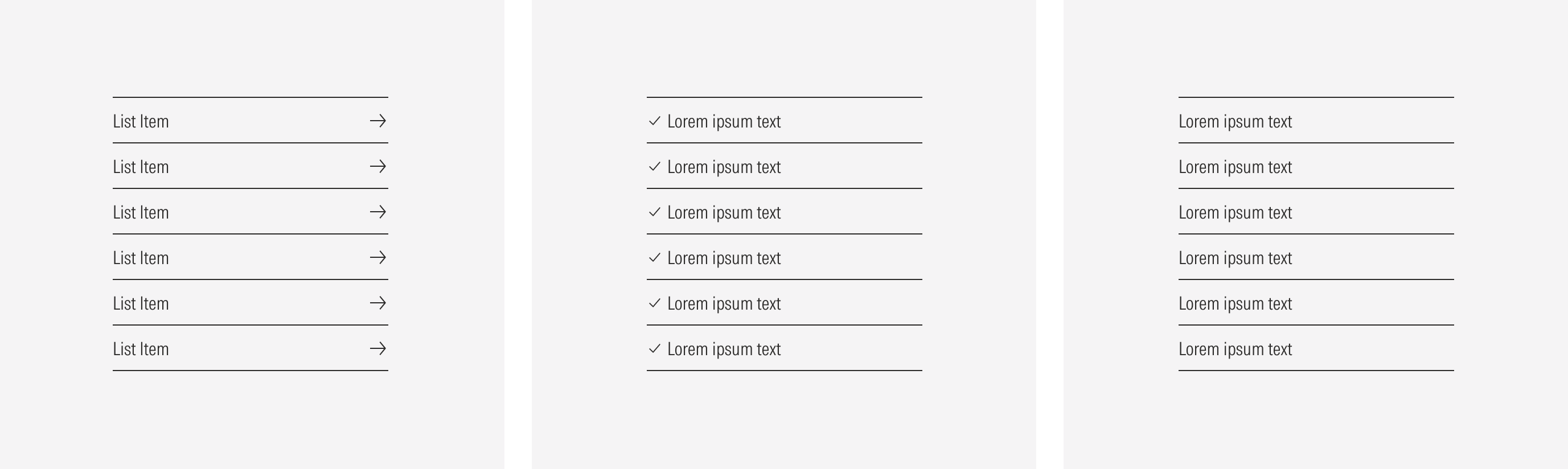
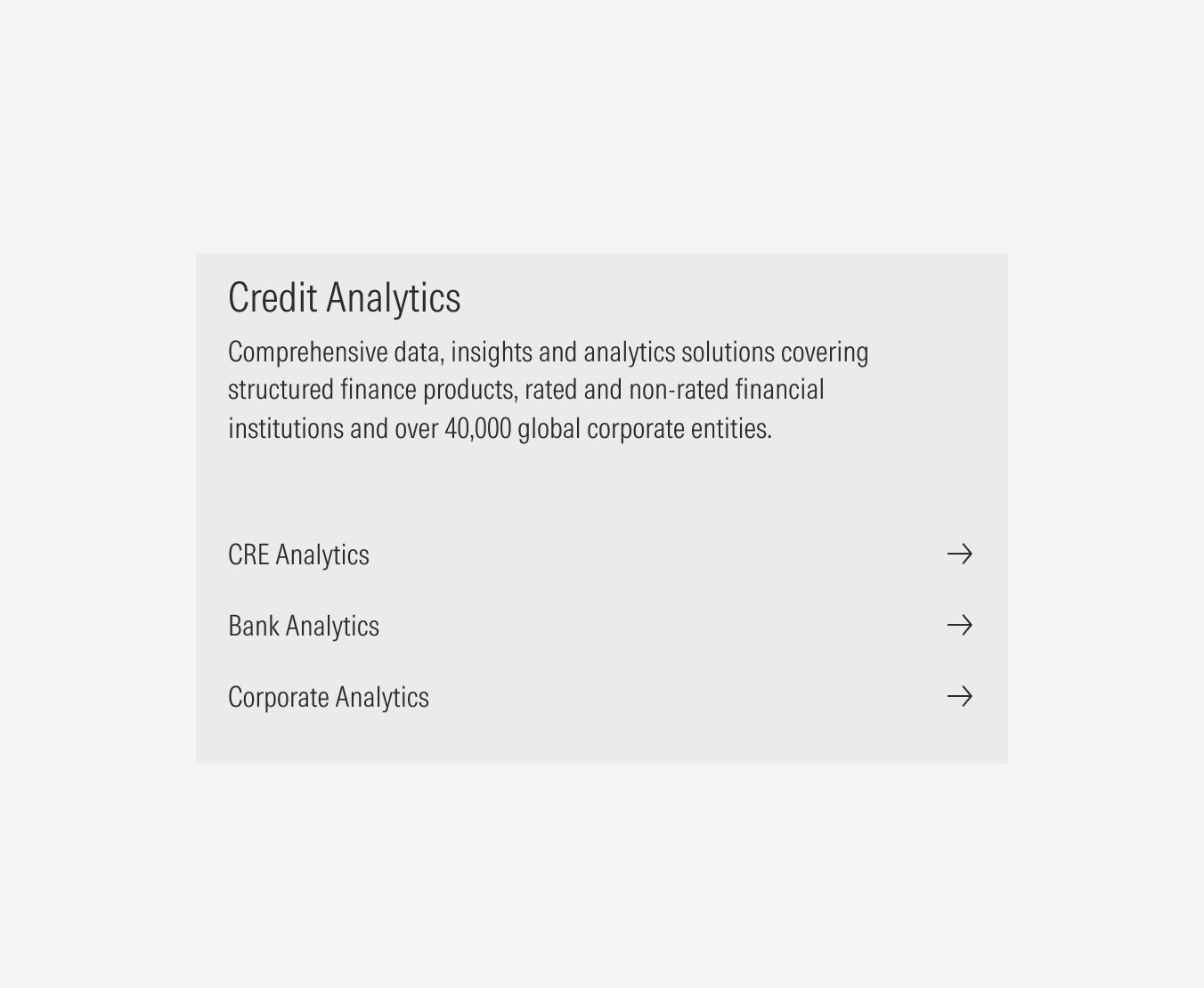
Link list | Use to list clickable items that take users to different content pages. | With overline and with underline, with overline and no underline, no overline and with underline, no overline and no underline | No bullet | SM, MD, LG, XL |
Bullet list | Use to list non actionable items and highlight each item of the list. | With overline and with underline, with overline and no underline, no overline and with underline, no overline and no underline | With bullet | XS, SM, MD, LG, XL |
Text line list | Use to list non actionable items. | With overline and with underline, with overline and no underline, no overline and with underline, no overline and no underline | No bullet | XS, SM, MD, LG, XL |
Types
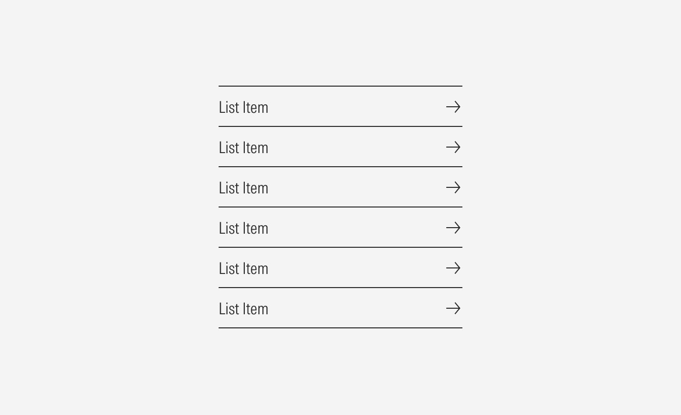
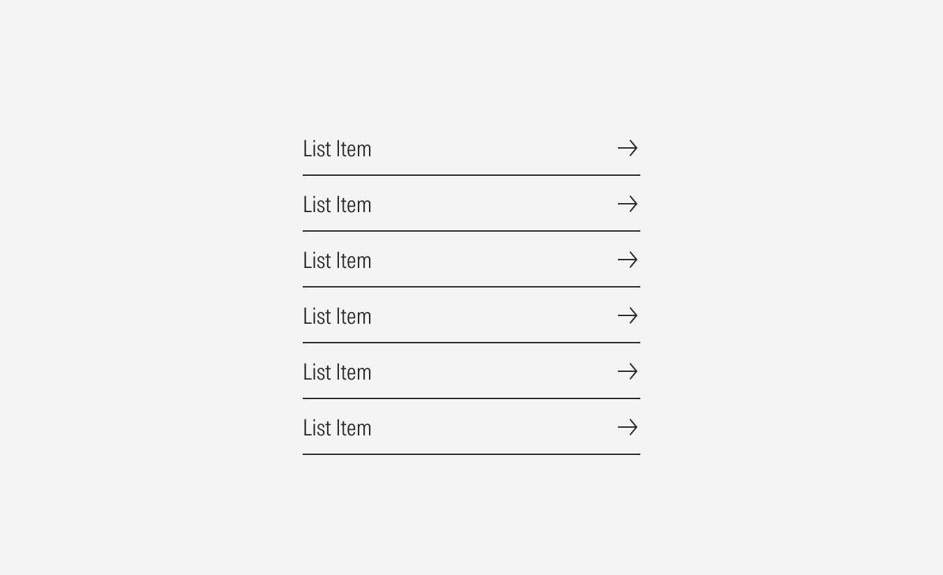
With Overline and With Underline
Use both lines as dividers between list items to mark an obvious separation between them.
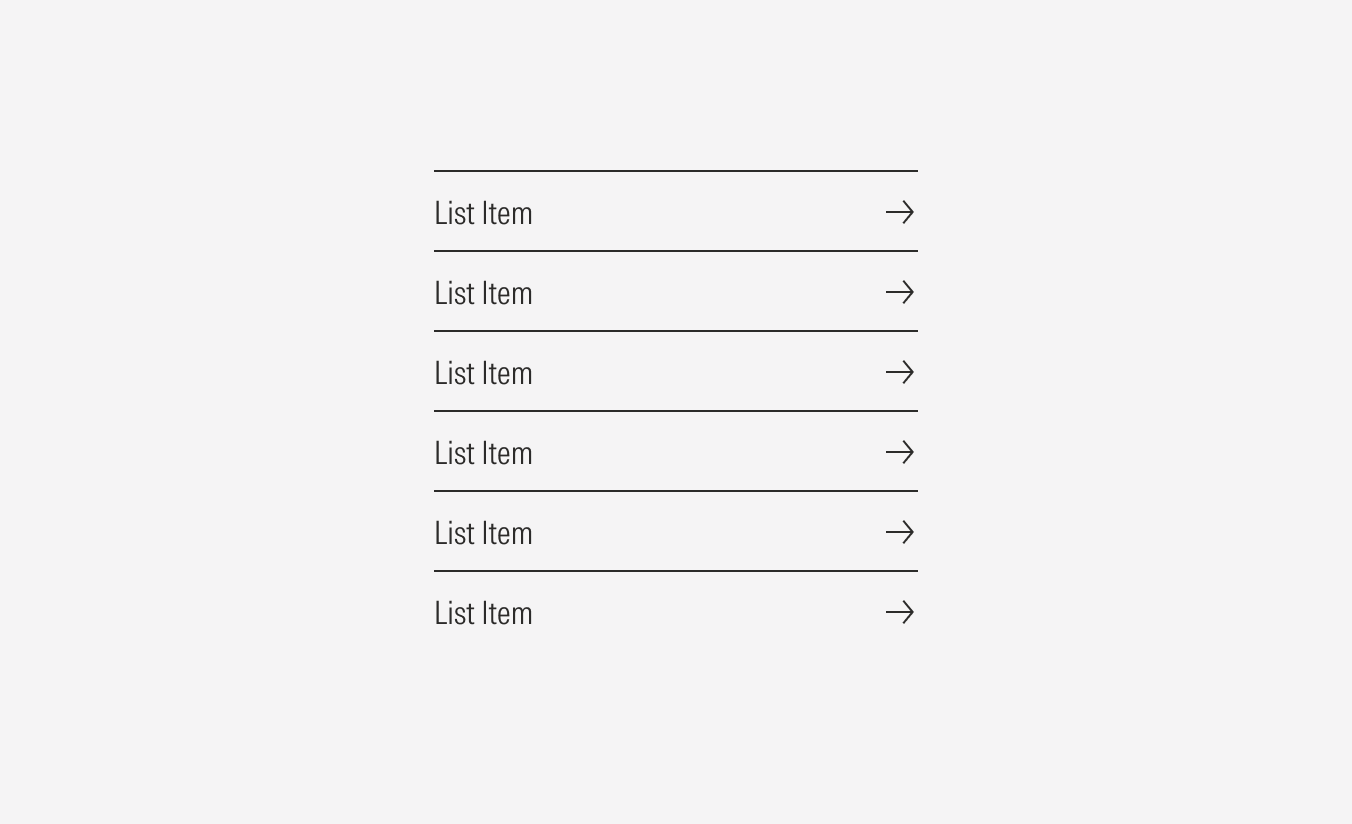
With Overline and No Underline
Use only the overline to divide items. This option is more often used inside cards.
No Overline and With Underline
Use only the underline as a divider between items.
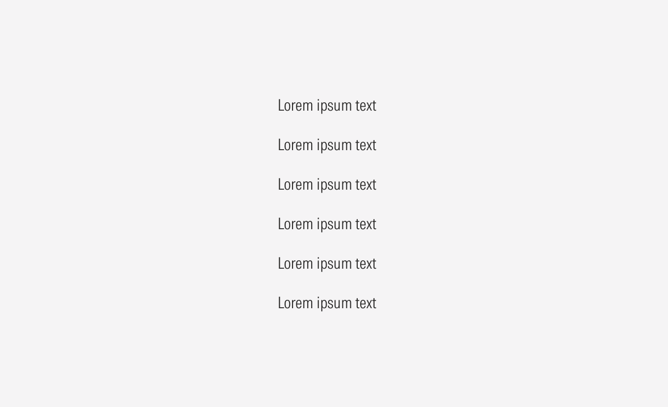
No Overline and No Underline
No use of lines as dividers. This option is more often used in the footer and for simple text.
Alignment
The list items are left-aligned within their group container. The alignment of the whole list group in relation to content at the same level of the page should follow a left-spaced pattern.


Do use overlines or underlines in list groups inside cards.
Don’t use list groups inside cards without overlines or underlines.

Do use bullets or simple text in list groups with text-only content.

Don’t use link list groups with text-only content.