Tag
Button tags are dynamic elements that provide contextualizing information, such as grouping criteria or object metadata. Also they work as clickable components that take the user to a page related to the tag topic. Button tags are primarily used on blog posts.

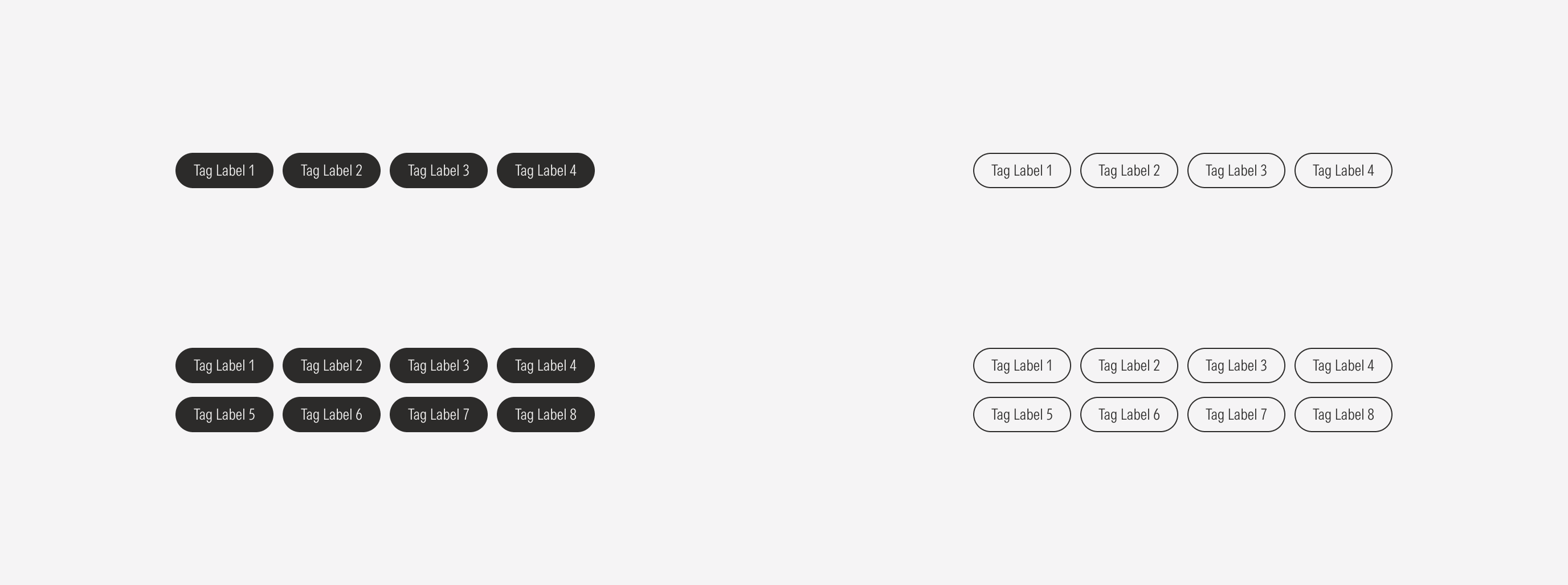
- Label sets the category label of the tags.
Variation | Purpose | Style | Sizes |
|---|---|---|---|
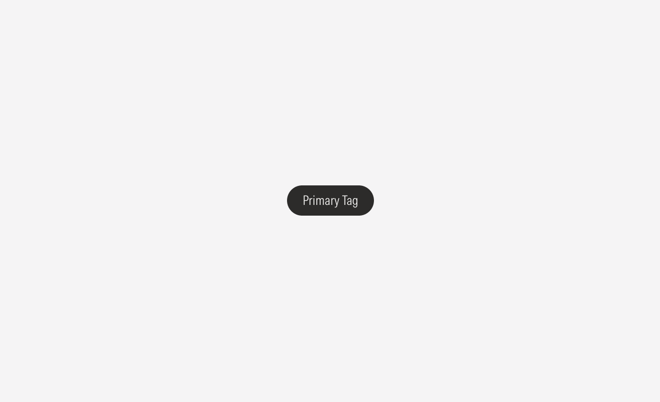
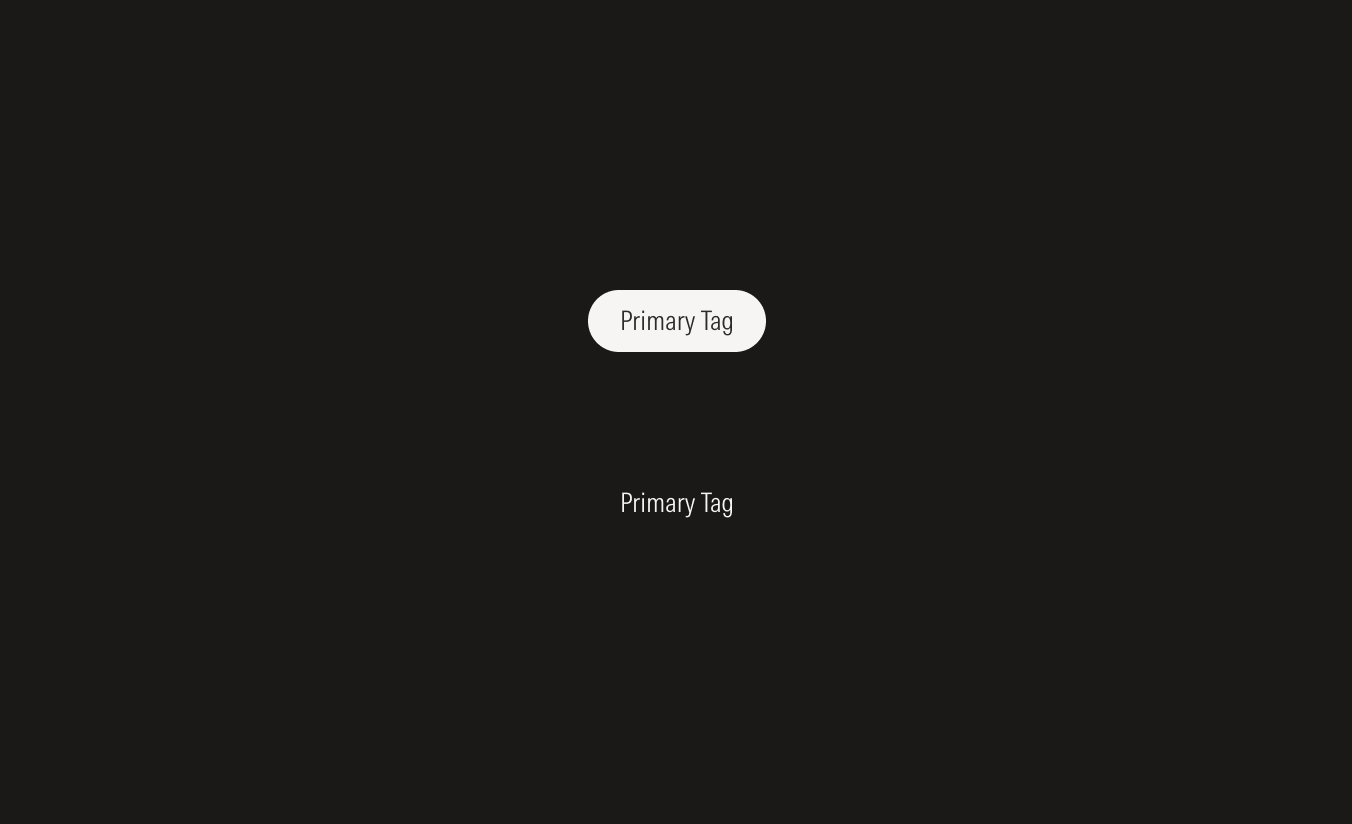
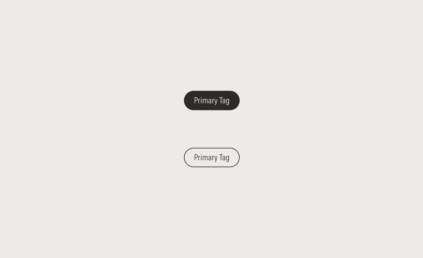
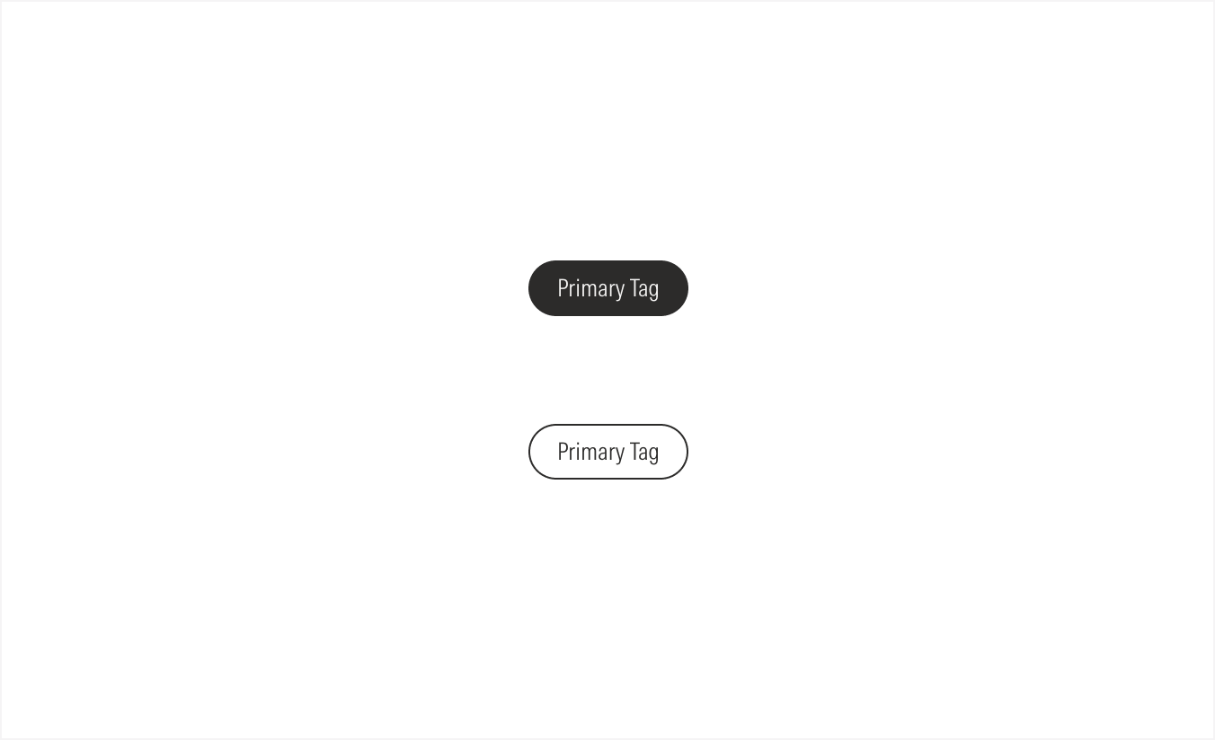
Primary | High emphasis. Use to represent the top level of categories. | Solid | XS, SM |
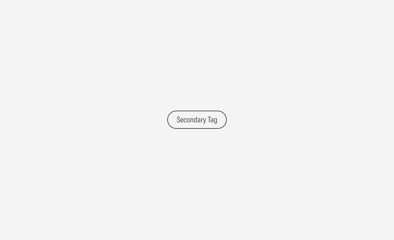
Secondary | Medium emphasis. Use to represent a secondary (extra) level of categories. | Outlined | XS, SM |


Hierarchy
A proper hierarchy must be ensured when using tags. Primary tags should be chosen first. Place them at the top of the page or in a section at a higher level of the hierarchy near the content title. When needed, place the secondary tags below the primary tags.
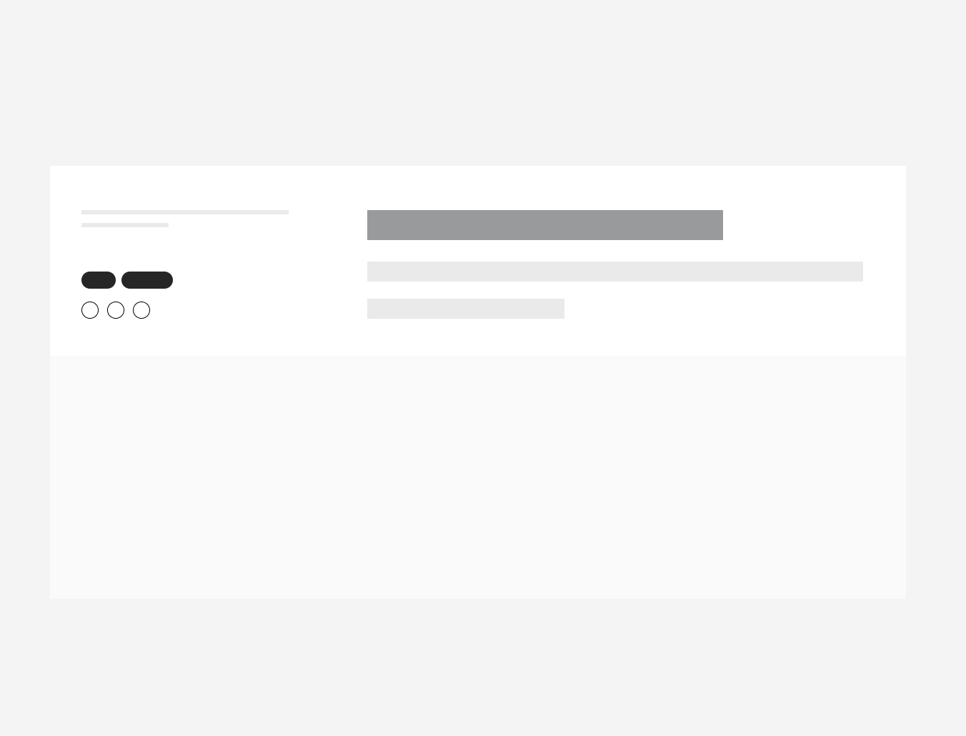
Do place tags on a blog post below the dates and author’s name, in the block to the left of the heading.
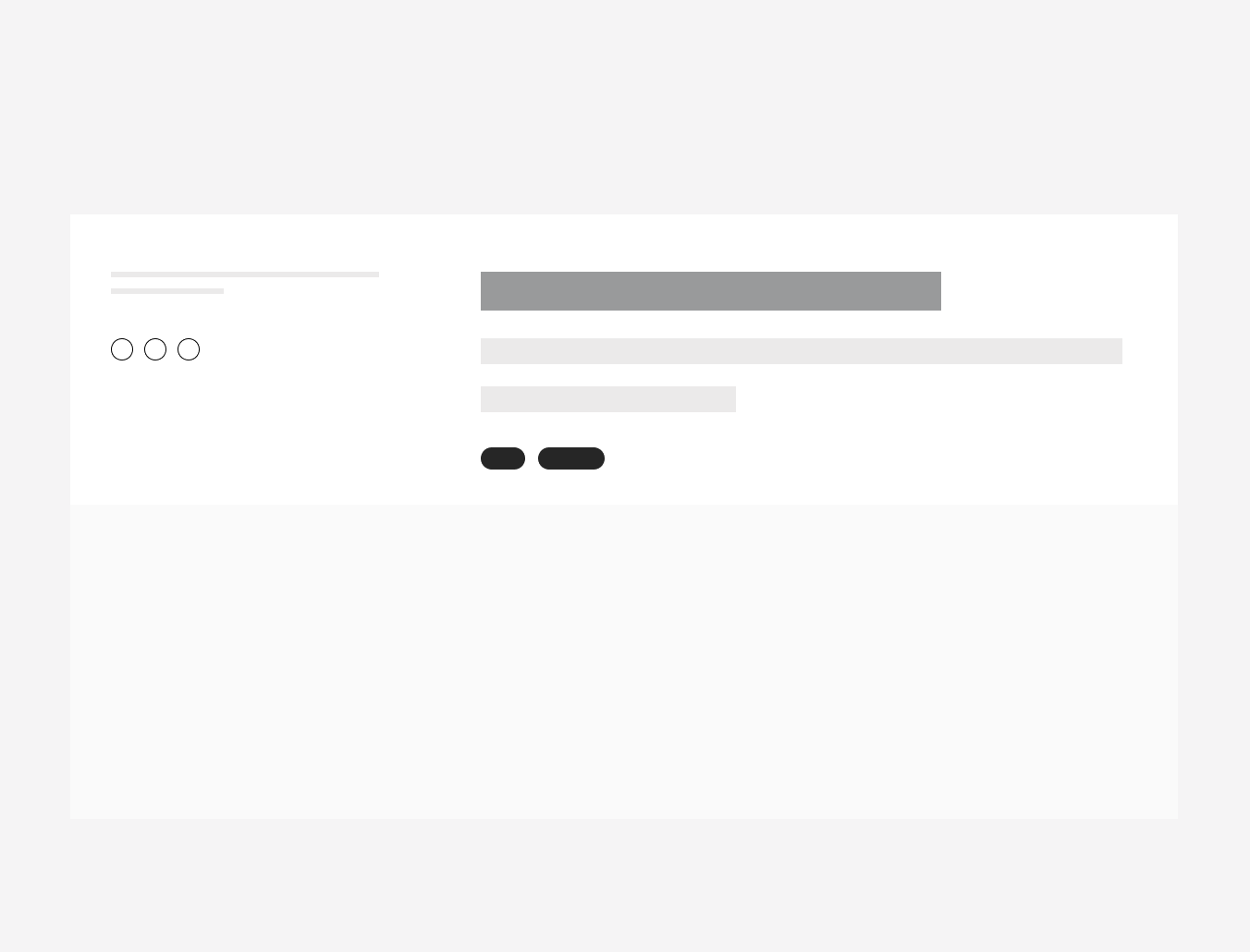
Don’t place tags on a blog post below the description in the block to the right of the heading,far from the title.
Alignment
The alignment of tags with their container or in relation to content at the same level of the page, should follow a left-justified pattern. The primary action should flow to the left-most margin of the content area with the secondary actions following below.
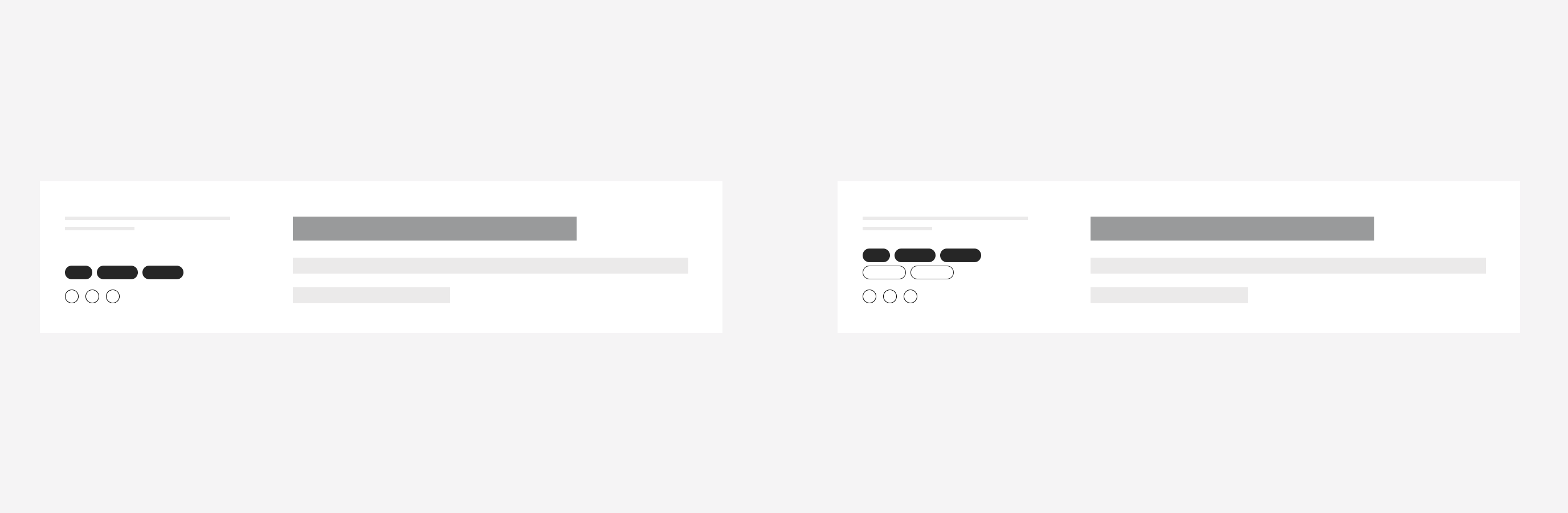
Do left-align a tag group first when grouping them with another CTA. That second group of CTAs will go below the tag group. Also, place the tag group near the content title.
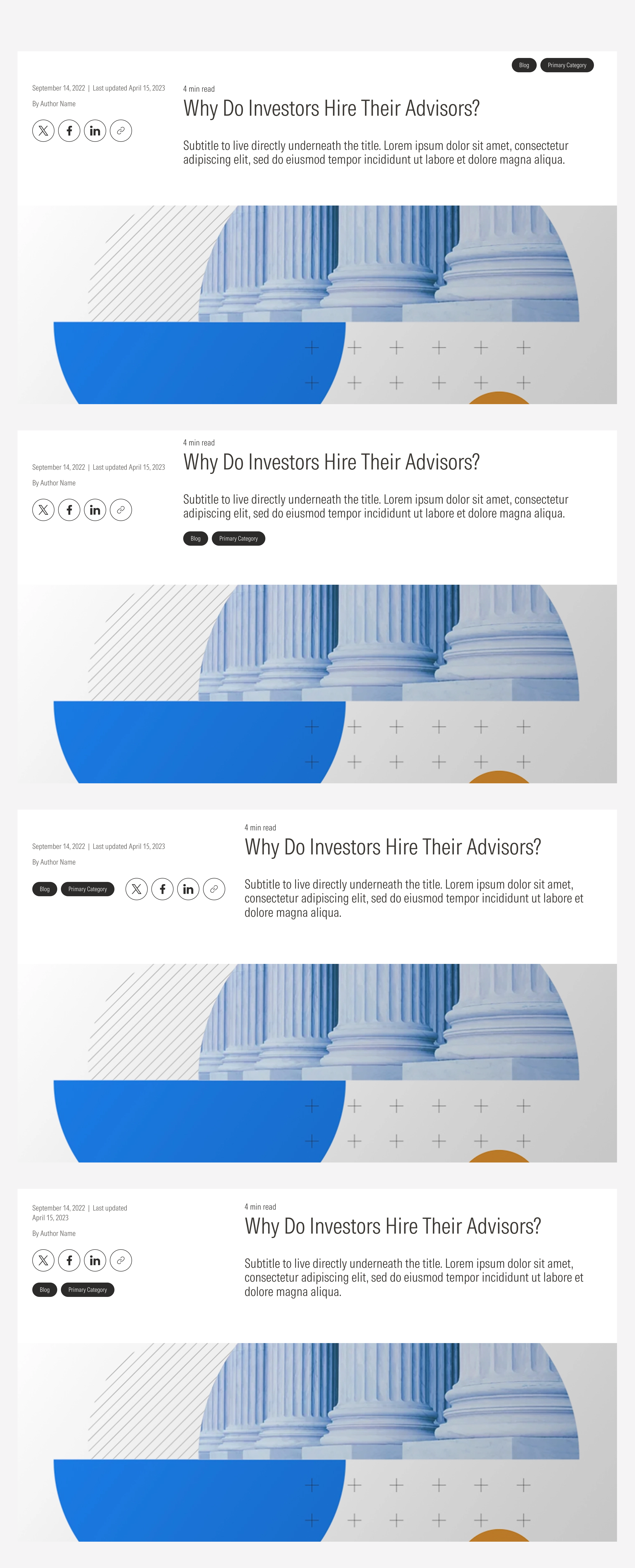
Don’t right-align the tags,and don’t place them after the text description or at the same level as another group of CTAs.
