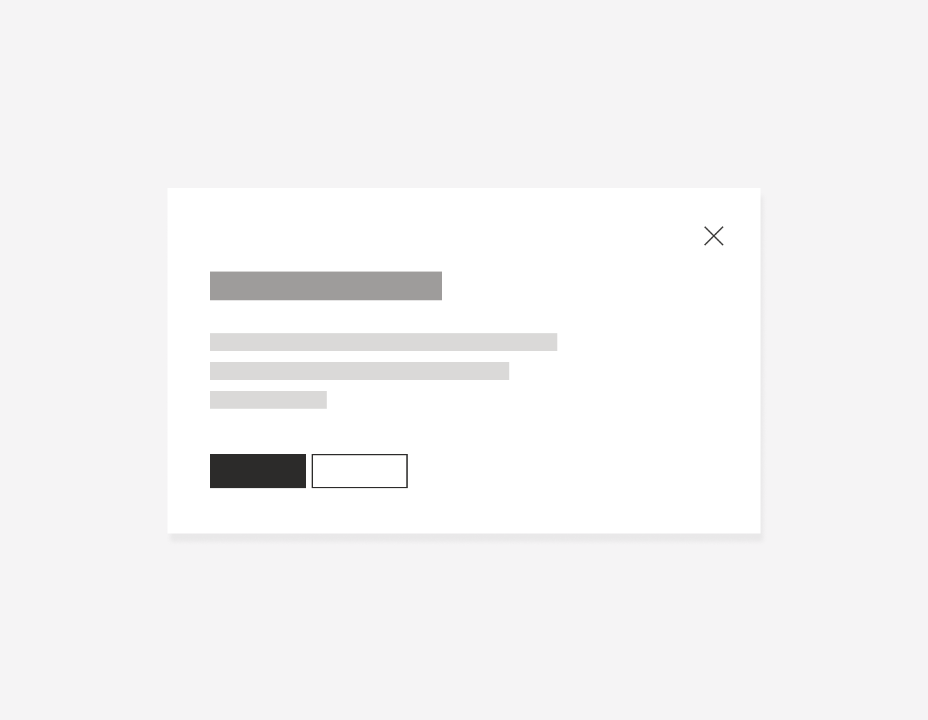
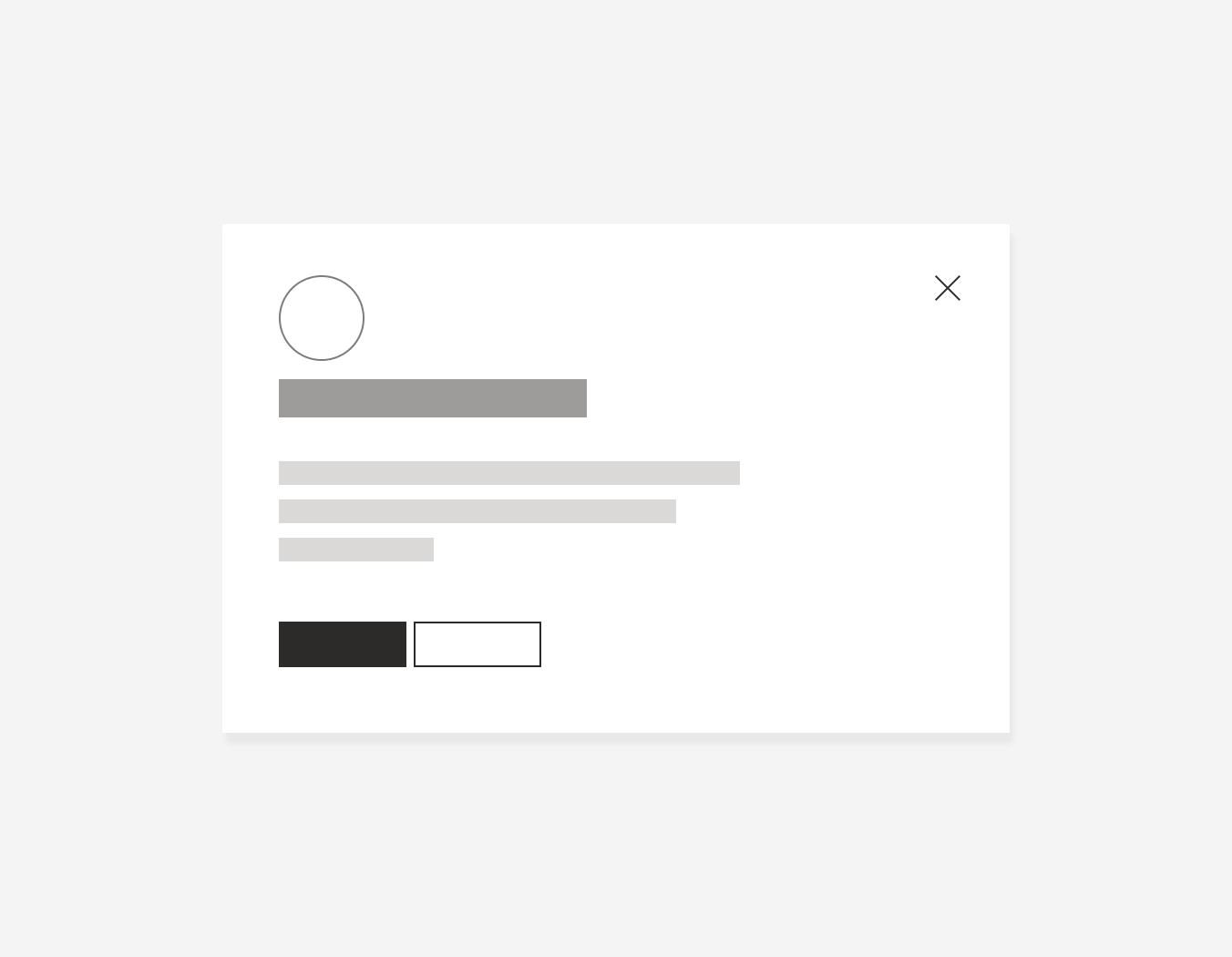
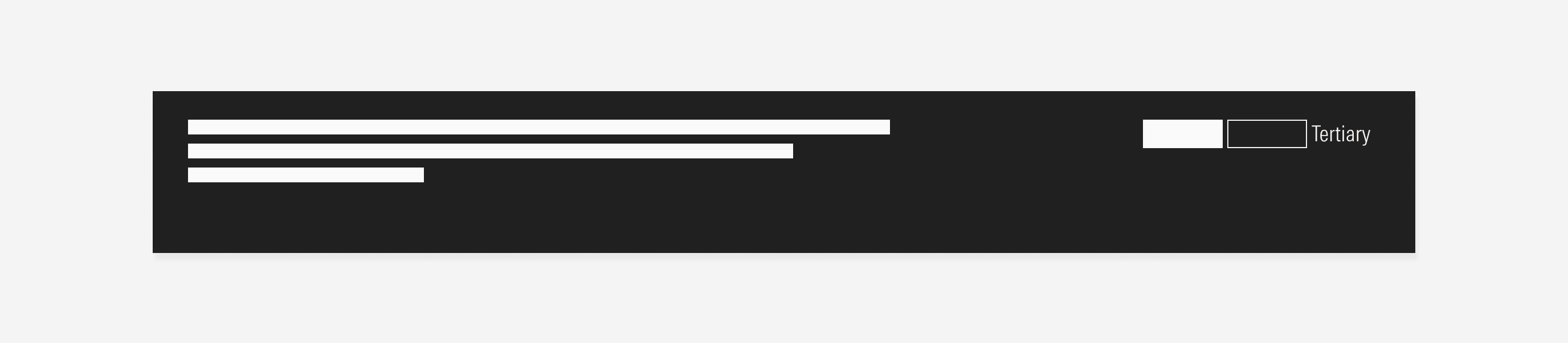
Modal
A modal or dialog is a large UI element that will appear on top of the main window with a transparency layer in between. This component is used to communicate specific information to users or ask them to take a specific action.
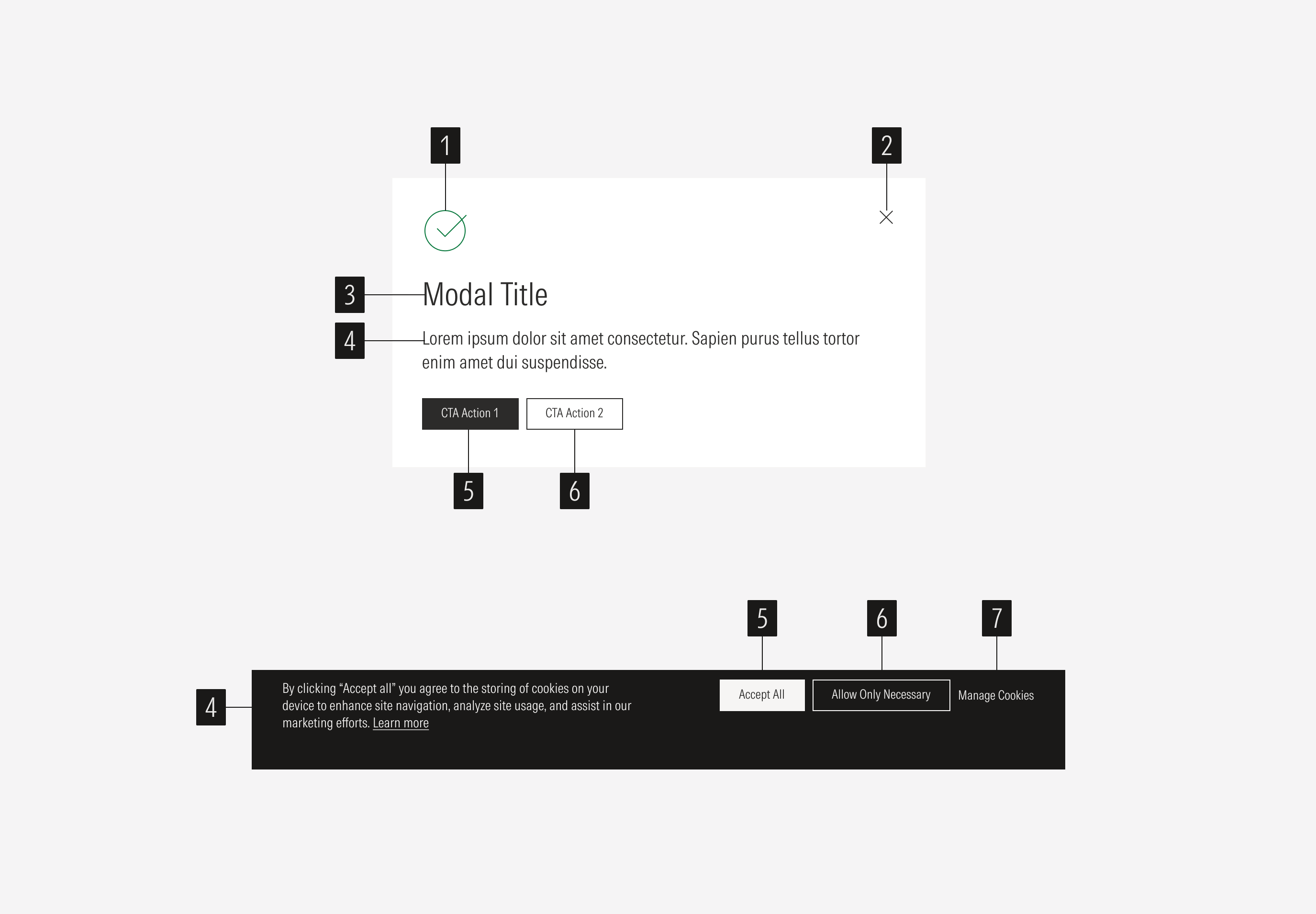
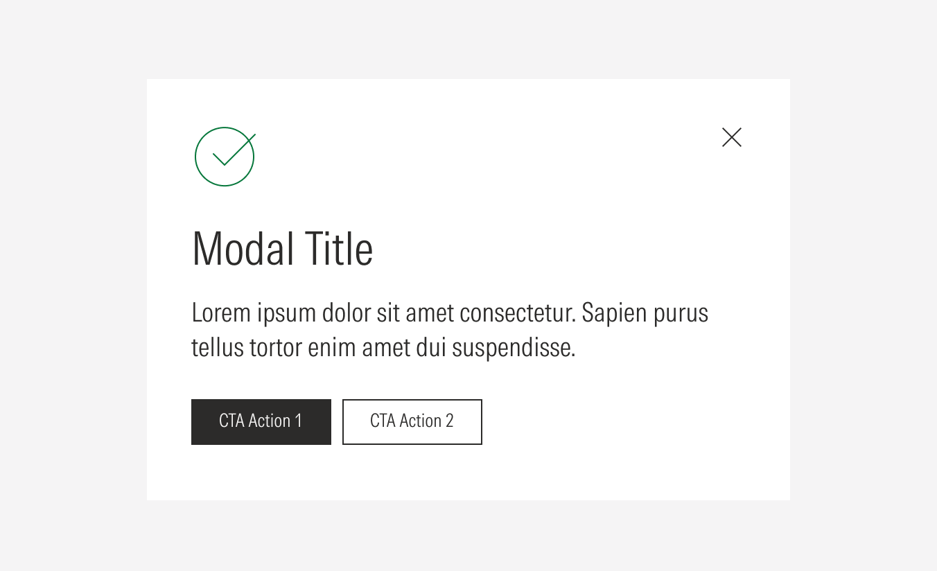
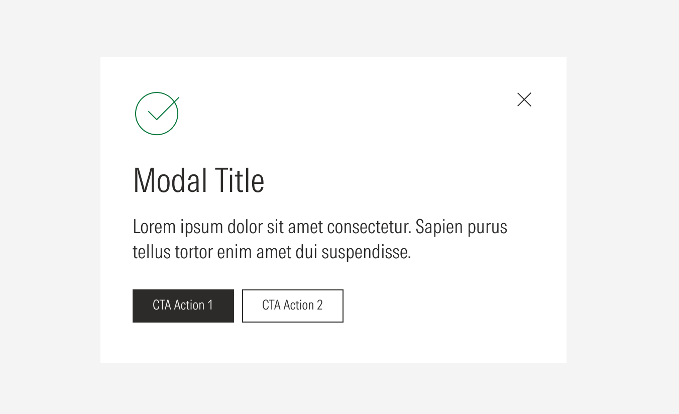
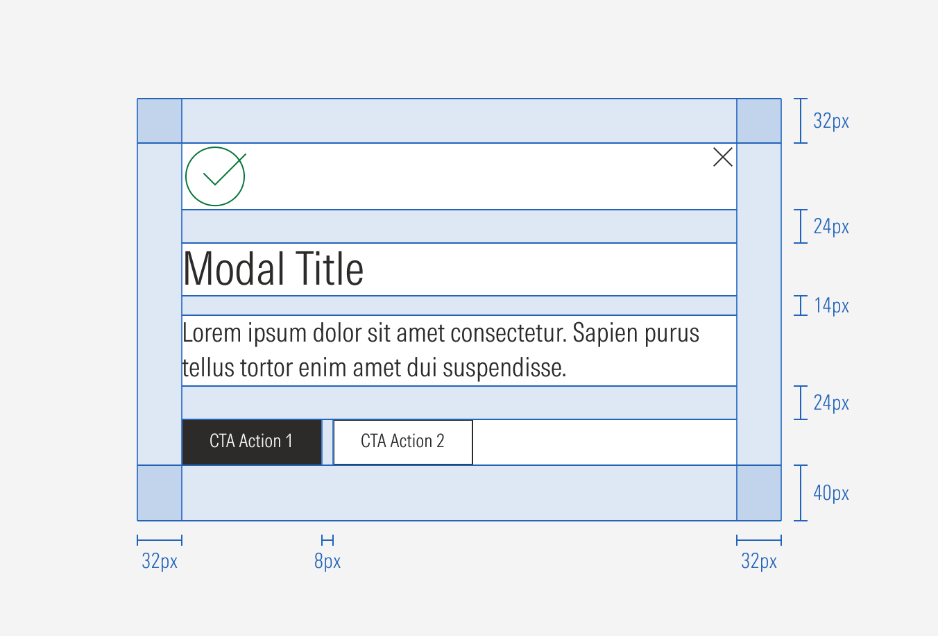
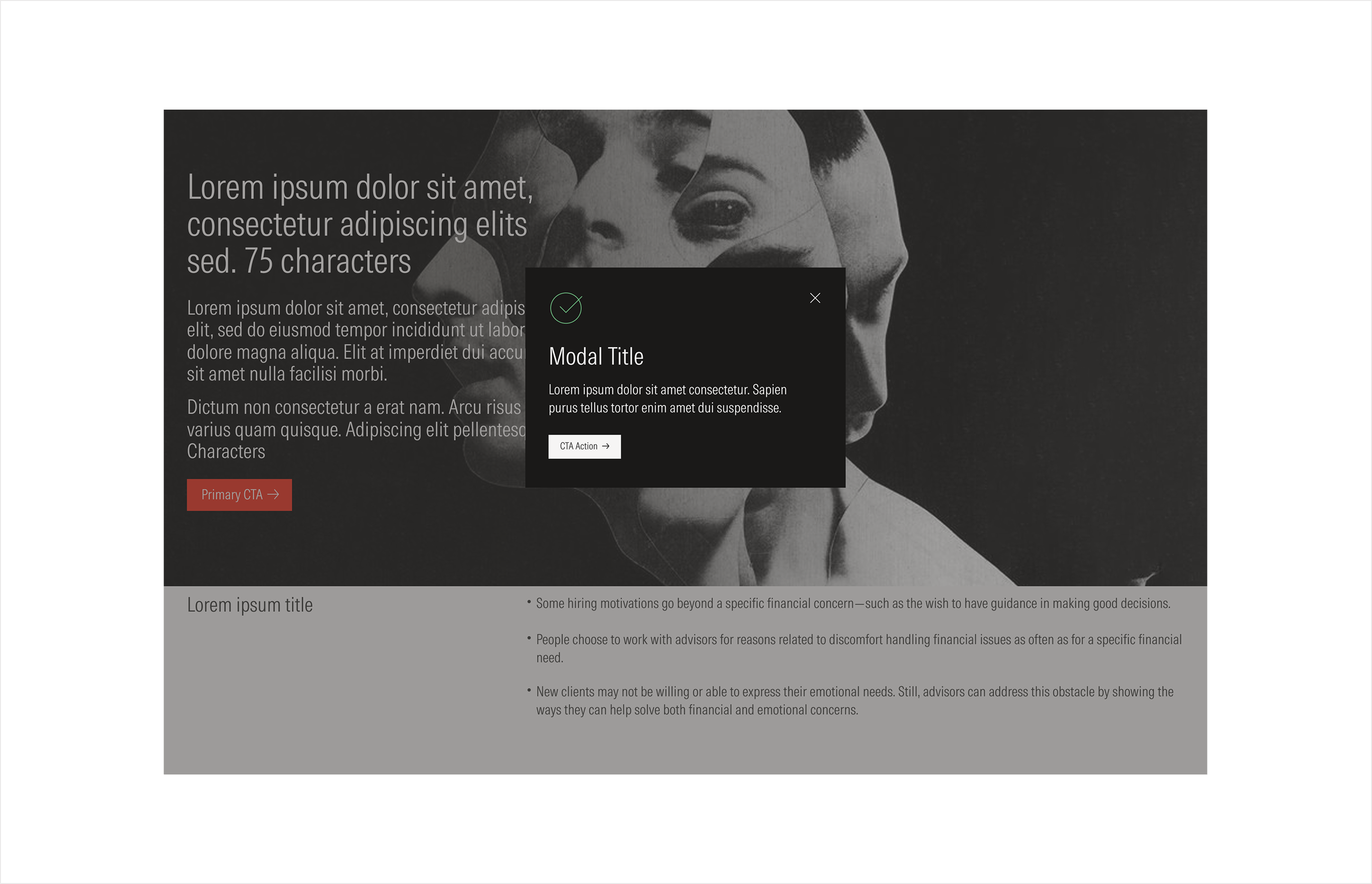
- Brand icon emphasizes the type of message in the modal (e.g., success, warning, error). It is optional.
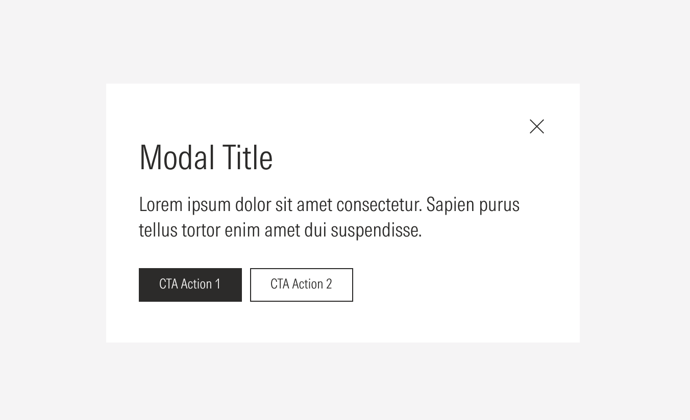
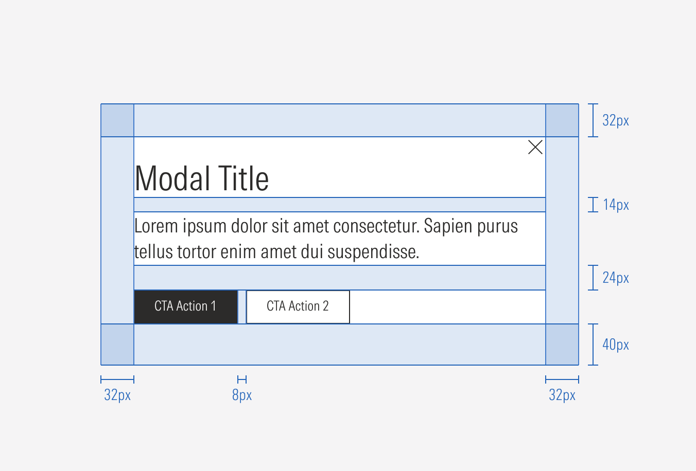
- Close icon button allows the user to close the modal and cancel any actions made in the modal.
- Modal title sets the topic for the modal. It has a character limit.
- Body gives more context and communicates the status, consequences, or progress of an action. It has a character limit.
- Primary button allows the user to acknowledge the message.
- Secondary button allows the user to make a decision and take an action related to the message. It is optional for the general modal.
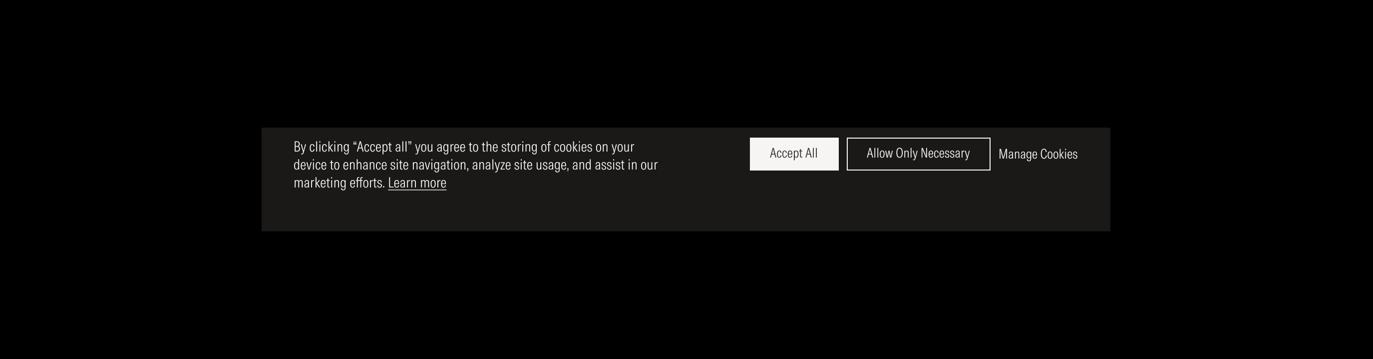
- Tertiary button allows the user to manage cookies. It is only present in the cookies modal.
Usage
When to Use
Use a modal when the user’s attention needs to be directed toward an important message or the user needs to make a decision towards executing an action.
More specifically, use them:
- For important warnings to prevent critical errors.
- To request information to continue a current process.
- To request or confirm an action to continue a current process.
- To break up a complex workflow into simpler steps.
When not to use
Don’t use a modal and a separate page or a snack-bar (notification) when:
- The information is not important and not related to the current page or flow.
- Complex content is difficult to follow and understand inside a modal.
- The amount of content makes the modal a scrollable component (long scroll).
- The user is making a complex decision and need detailed context and additional resources that are not present in the modal.


Variation | Purpose | Icon | CTA |
|---|---|---|---|
General modal | Use to communicate an important message to the user and have their acknowledgment. | No icon | With CTA: a primary; a primary, and a secondary |
General modal with icon | Use to communicate an important message to the user and have their acknowledgment, emphasizing and giving extra context on the message type with a brand icon. | With icon | With CTA: a primary; a primary; and a secondary |
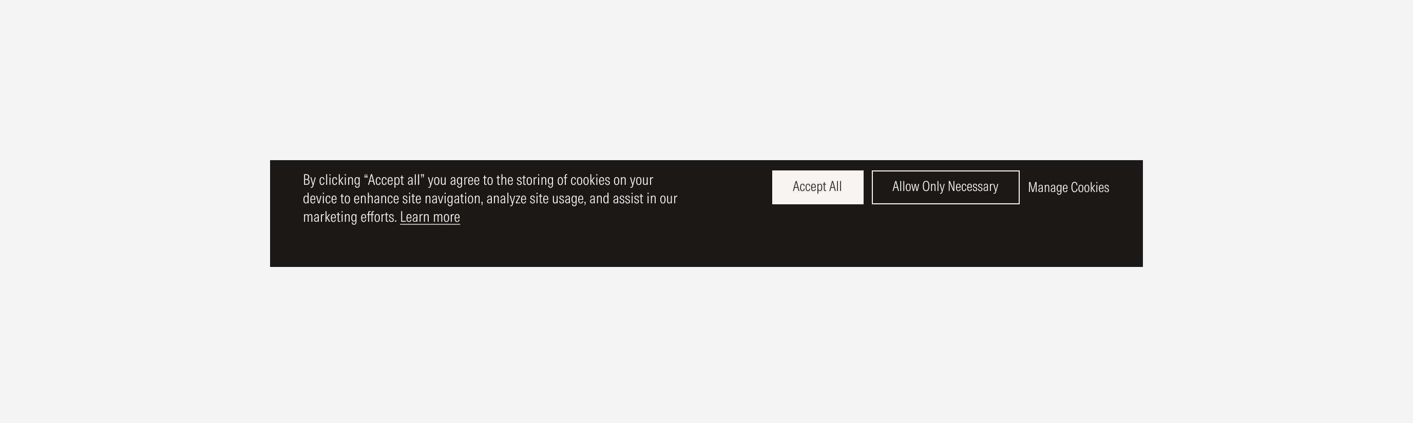
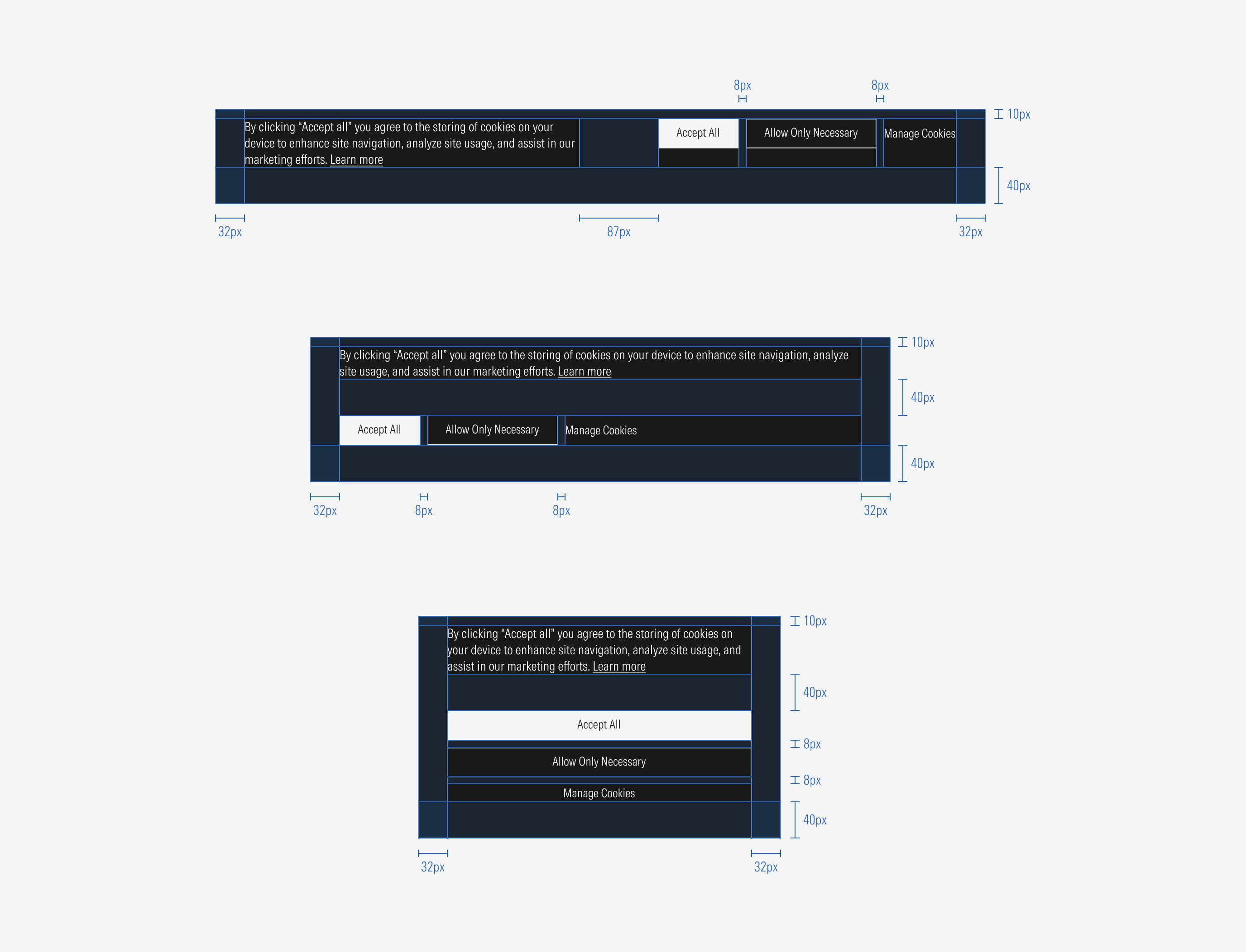
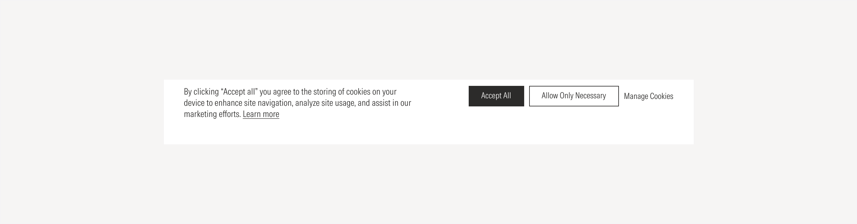
Cookies modal | Use to communicate a message related to cookies, giving the user the chance to decide to accept all or only necessary cookies, as well as to manage them. | No icon | With CTA: a primary; a primary and a secondary; a primary, a secondary, and a tertiary |
Cookies Modal
Use to communicate the cookies policy of the site. Use the primary button for the “Accept All” action, the secondary button for the “Allow Only Necessary” action, and the tertiary button for the “Manage Cookies” action.
Hierarchy
A proper hierarchy must be ensured for the elements that compose the modal. The CTAs of the general modals should be a primary and secondary button at the bottom (secondary button is optional). A brand icon can be used depending on the type of message, placed on top to support or give more context to the textual content. The title, with the highest level of importance, needs to give a clear and short idea of the topic of the modal content.
For the cookies modal, the CTAs should be at the right side of the body text, left-aligned to the modal container; there should be a primary, secondary, and a tertiary button.
Alignment
The alignment of components within the modal depends on the variant. For the general modals (with and without icons), the text, CTAs, and icon are left-aligned.
For the cookies modal the text is left-aligned and the CTAs is right-aligned.
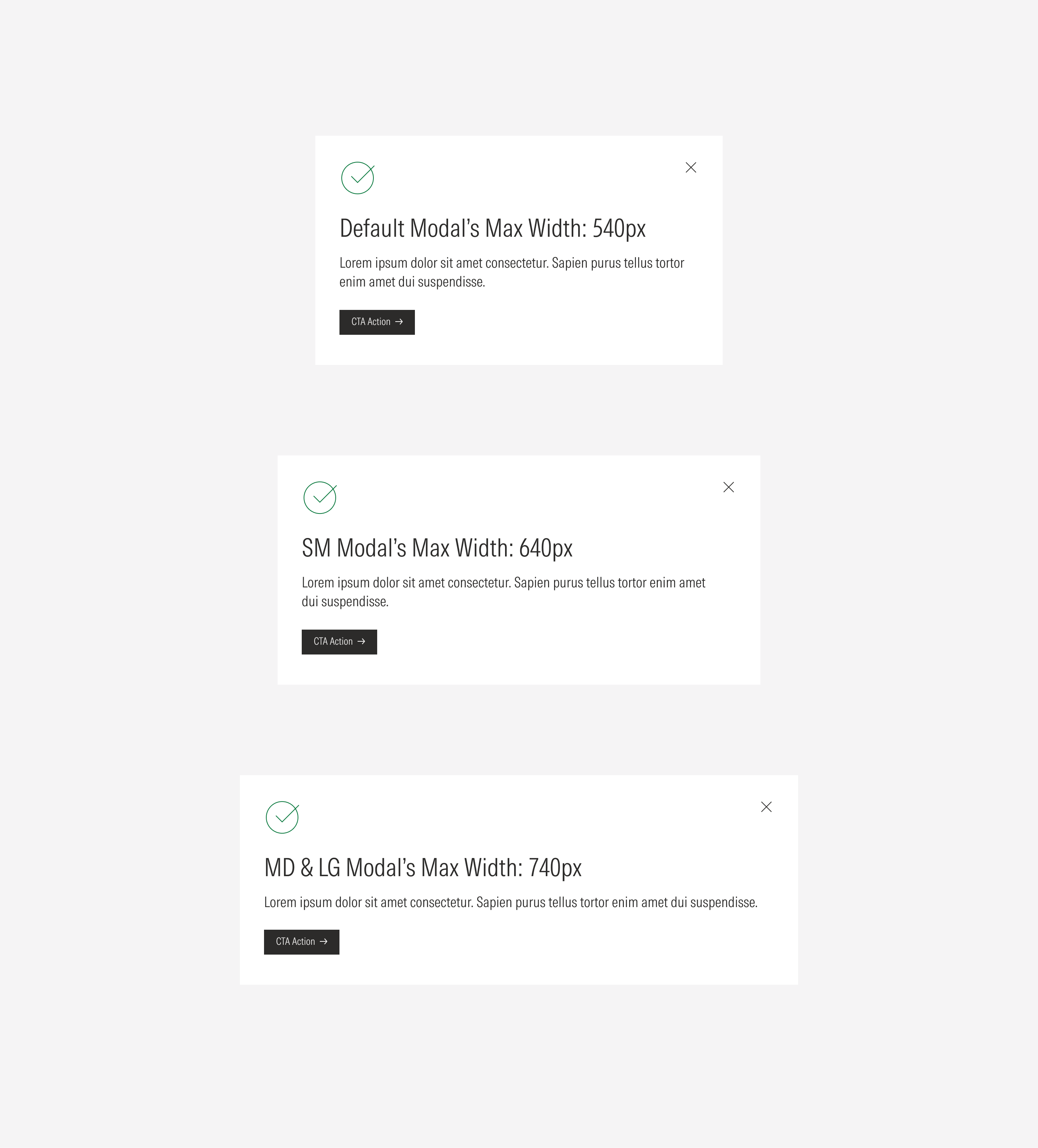
Sizing
The general modal will manage one maximum width for each viewport. The cookies modal will manage two sizes.

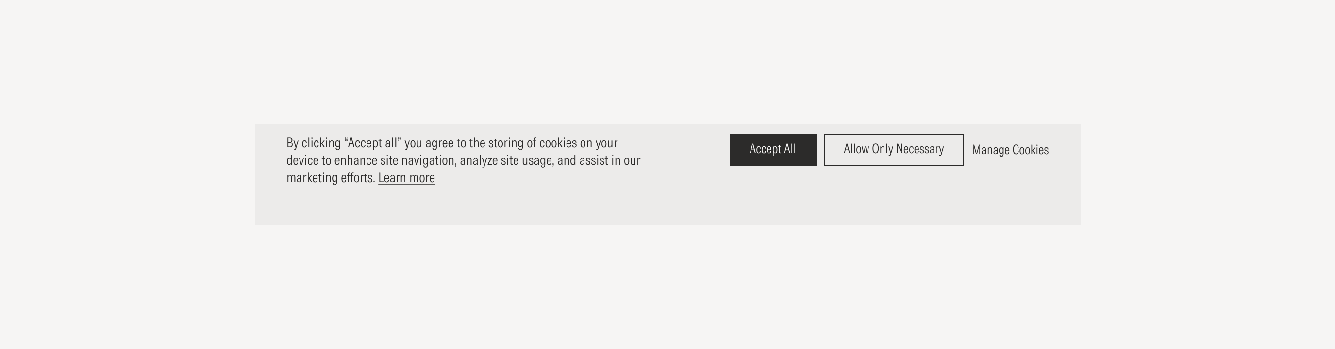
In the case of the cookies modal, the modal becomes a single column of stacked content in the medium and small viewports; the CTAs adjust below the text block.


Cookies Modal