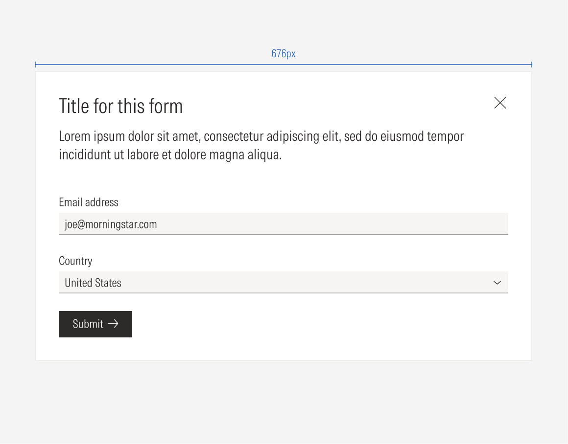
Form
Forms are component patterns that allow people to enter a set of data to be used by the platform for a specific task. They are built using text inputs, select radios, checkboxes, buttons, and text blocks with descriptions or instructions. A form can be used in a page or in a modal.
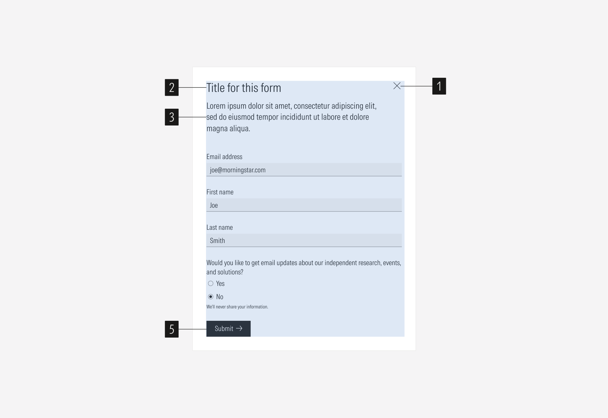
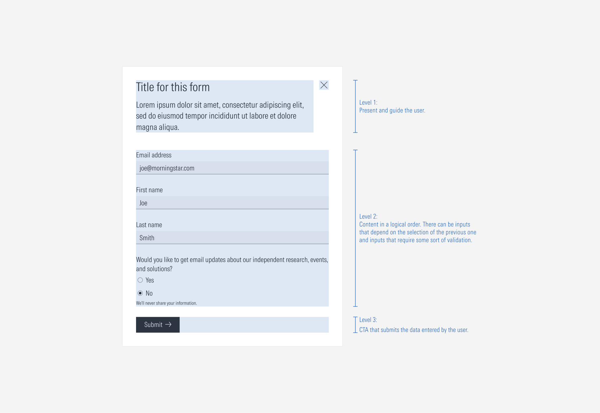
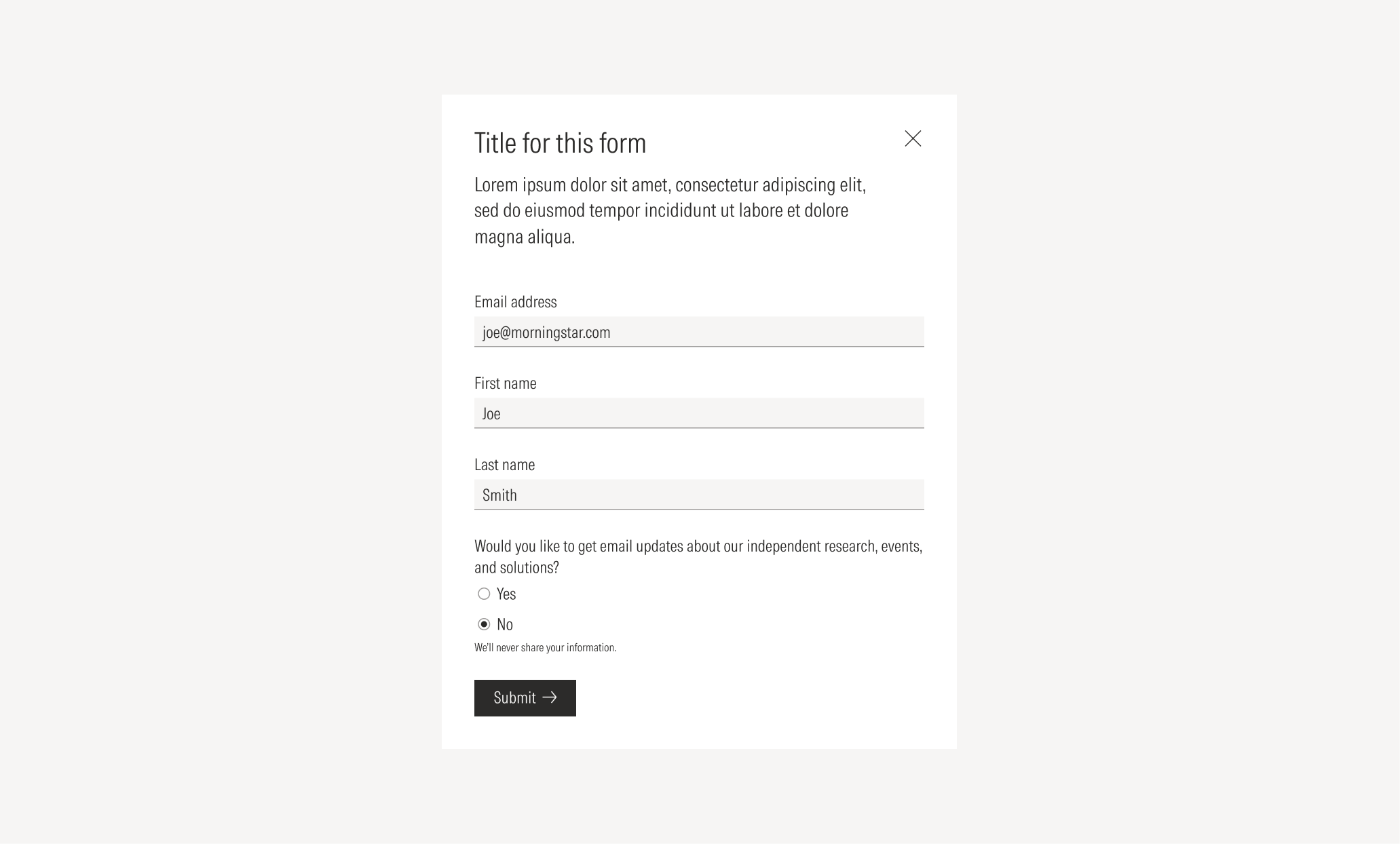
- Close icon button allows the user to close the form when it is in a modal format.
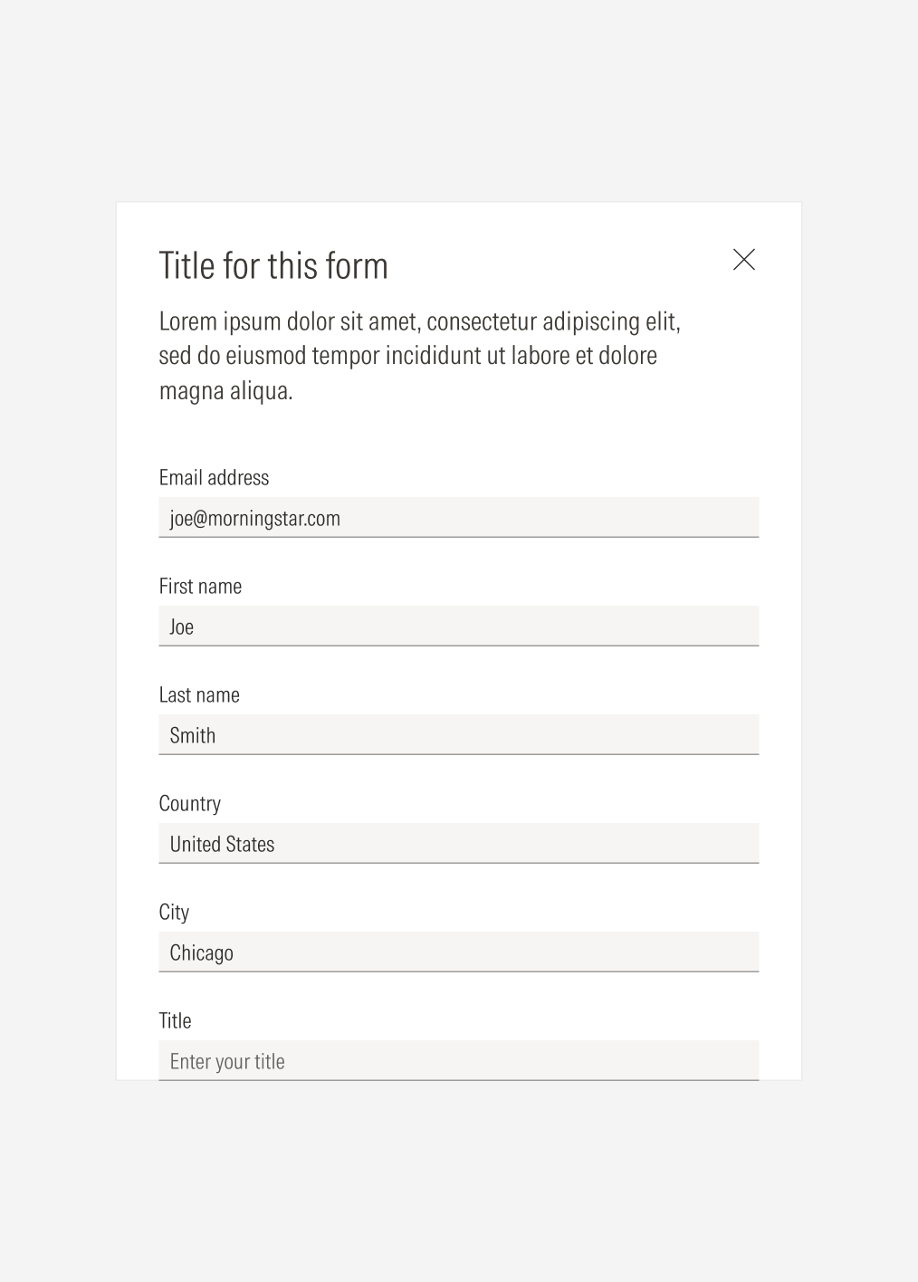
- Title sets the topic for the form. This is optional, depending on the purpose of the form.
- Body gives context on why and what information in the form is needed. This is optional, depending on the purpose of the form.
- Form elements represent the content of the form and the data needed from the user. Text inputs, selects, radios, and checkboxes can be used.
- CTA enforces the desired user action. Users can click the CTA to submit the entered information.
Usage
When to Use
Use a form to gather specific information, when users need to enter data to execute an action.
When Not to Use
Don’t use a form when there is no need to get data from the user and an action can be executed by selecting an option. Use another section with a CTA instead (a modal, card, thrasher, or single input , depending on the action).
Variation | Purpose | Close Icon Button | Form elements | CTA |
|---|---|---|---|---|
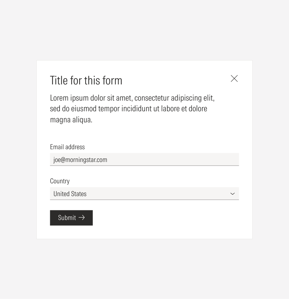
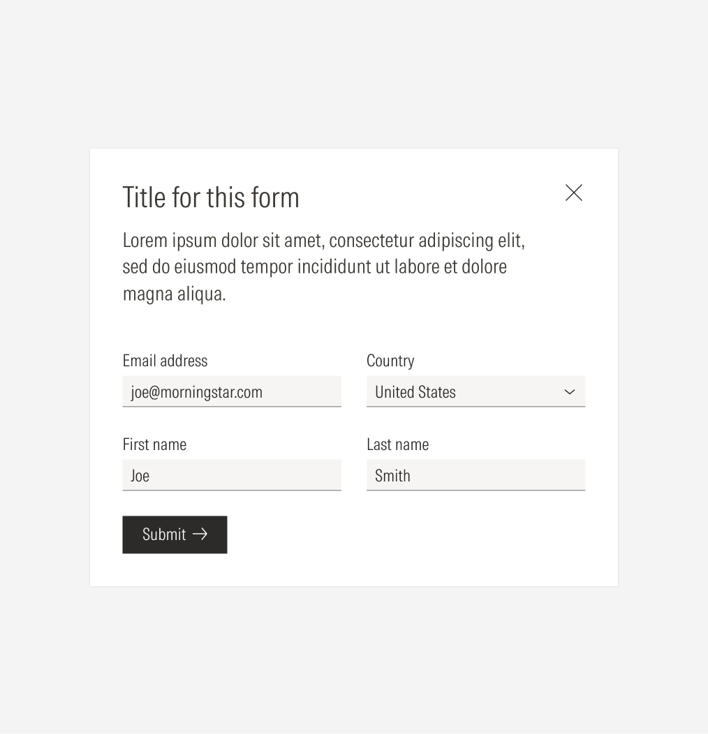
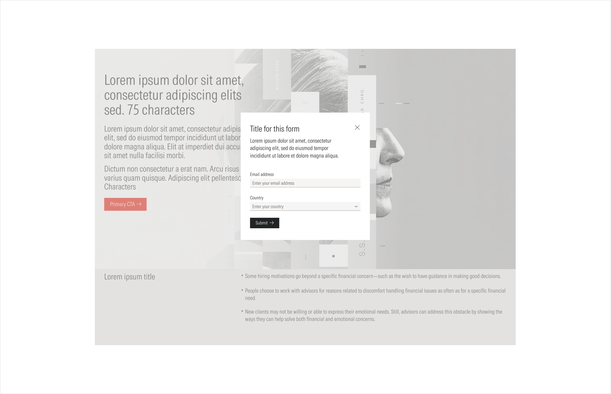
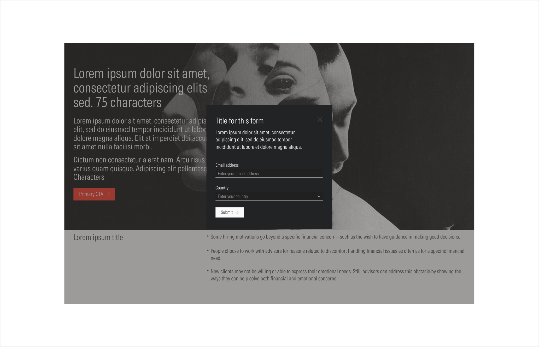
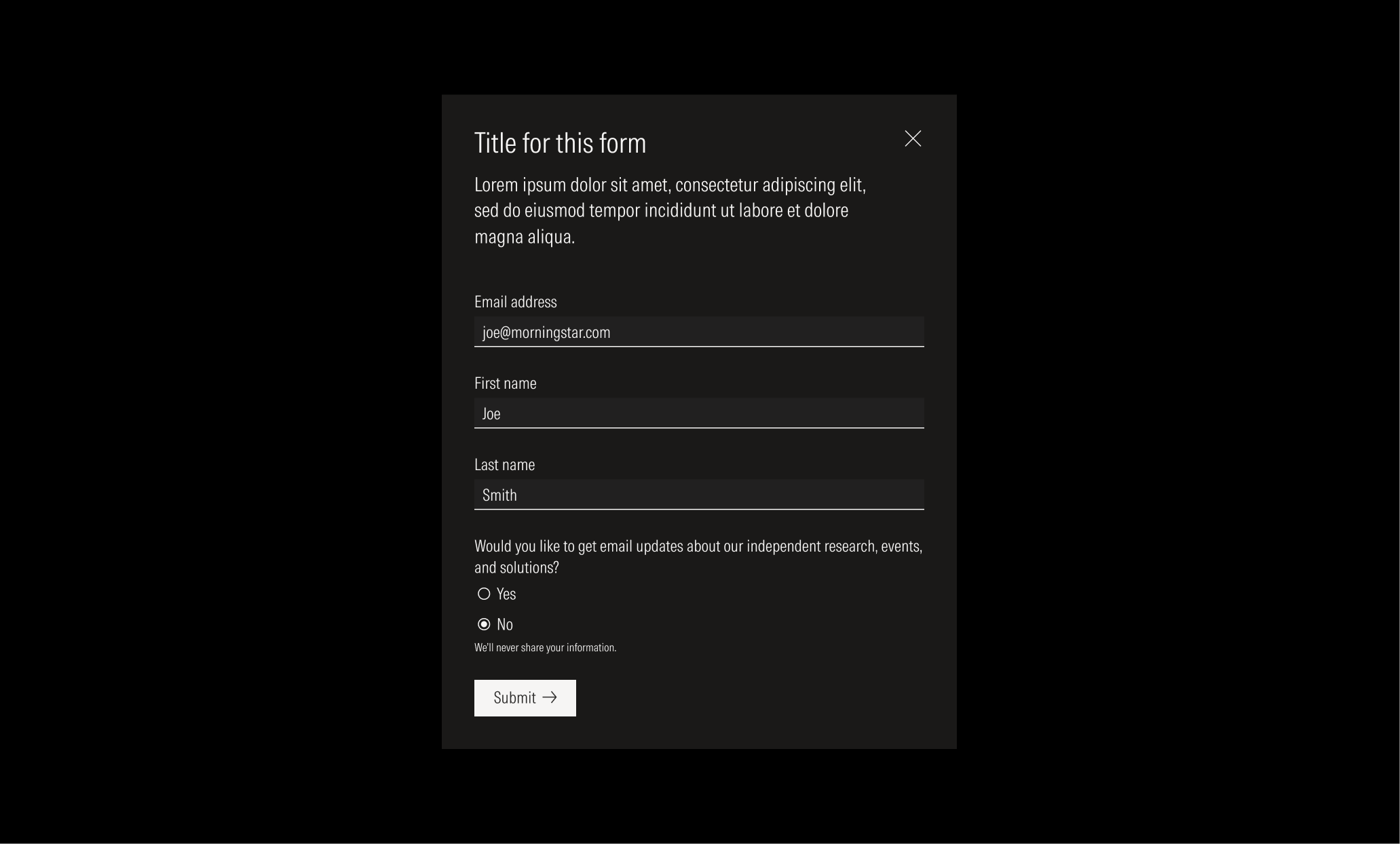
Modal form | Use a form as a modal when you have a short form or when the page is full of content and CTAs, and you want the user to strictly focus on one form. | With close icon button | With form elements (1 to 6) | With a primary CTA |
Fixed form | Use this type of form when the form is closely related to a page section or when you have a longer form. | Without close icon button | With form elements (2 to more than 6) | With a primary CTA |
Compact: SM and Default breakpoints
Extended: MD and LG breakpoints
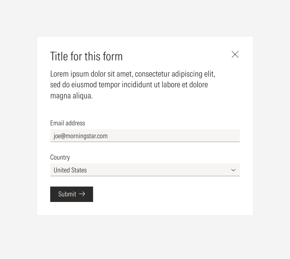
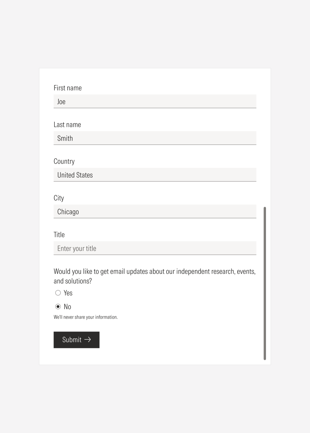
Fixed Form
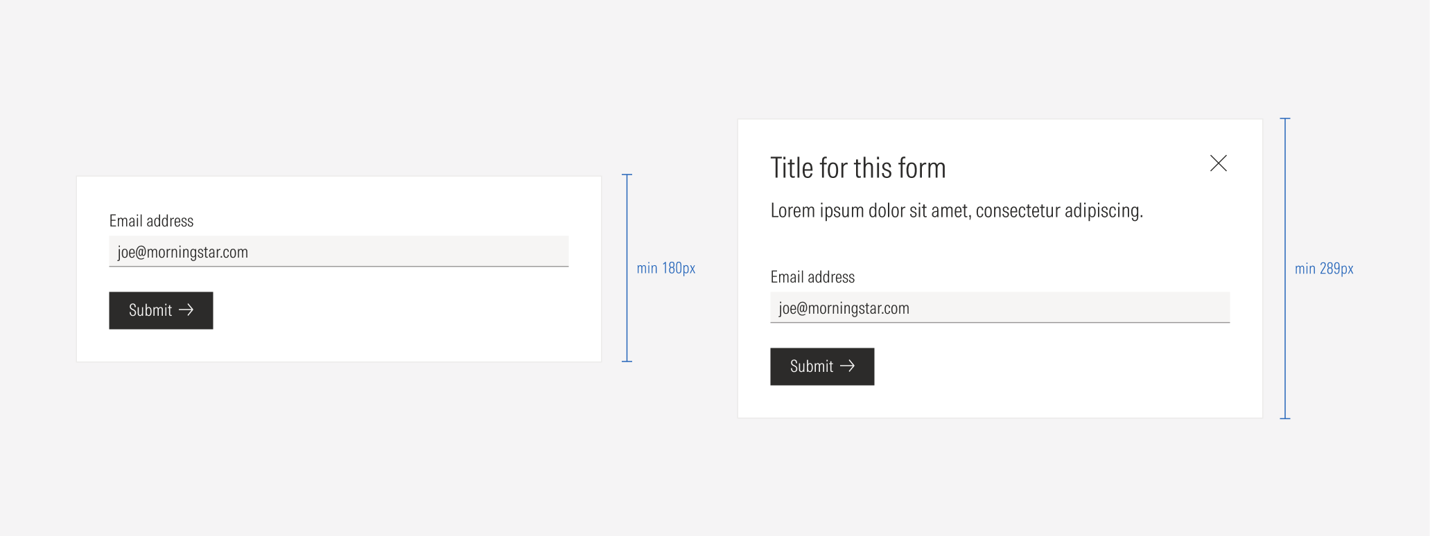
A form can be fixed on a page as part of a section: hero, container section, or page. This type of form will adjust its size depending on the section and view-port.
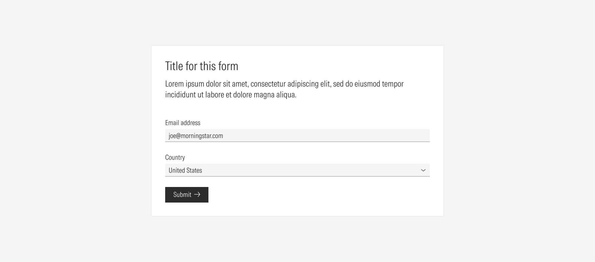
Container
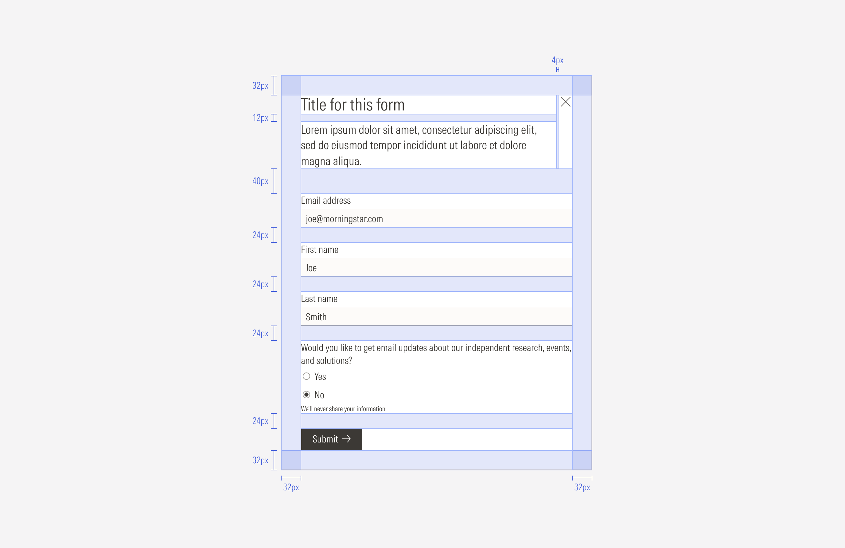
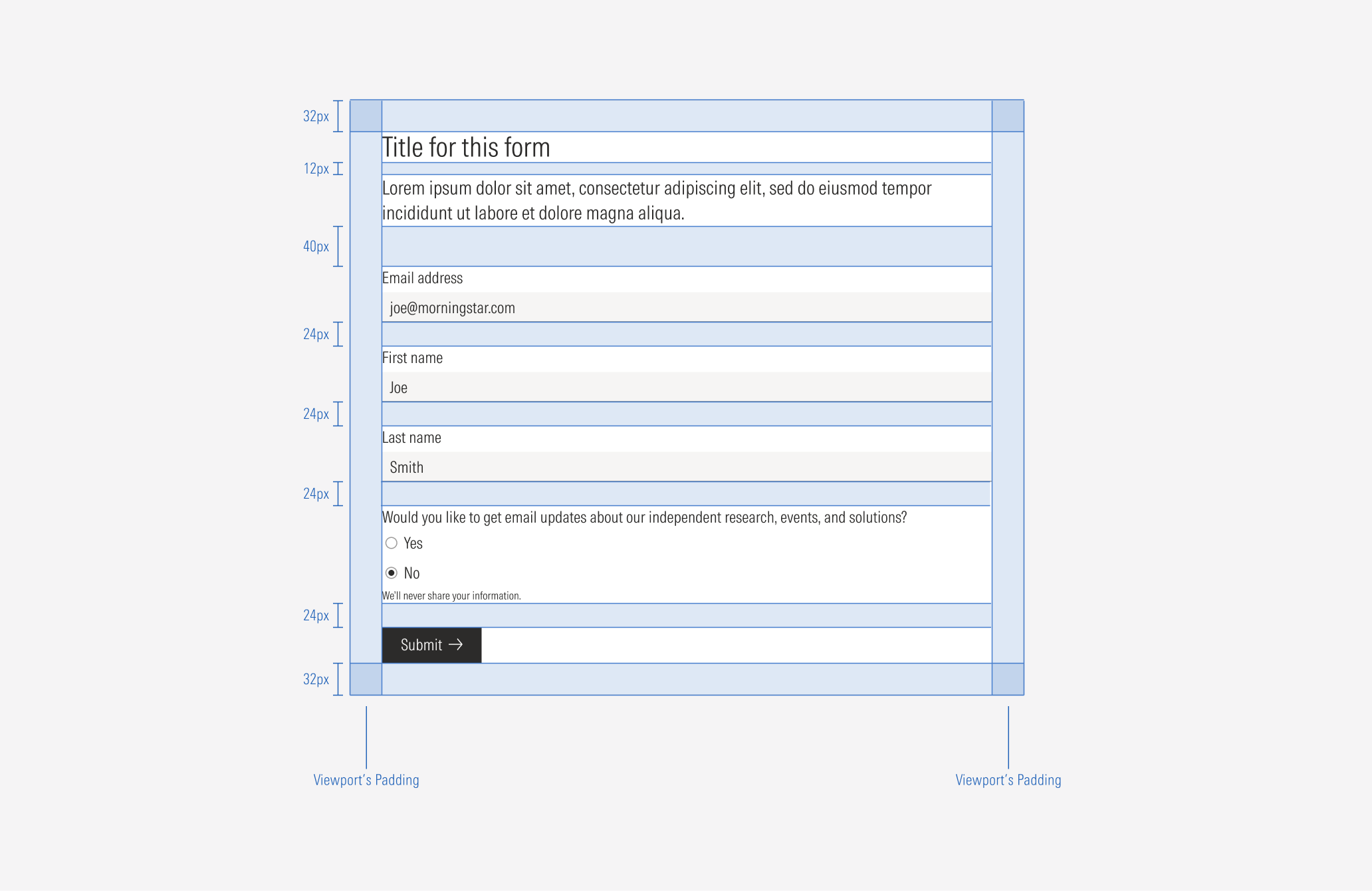
Spacing
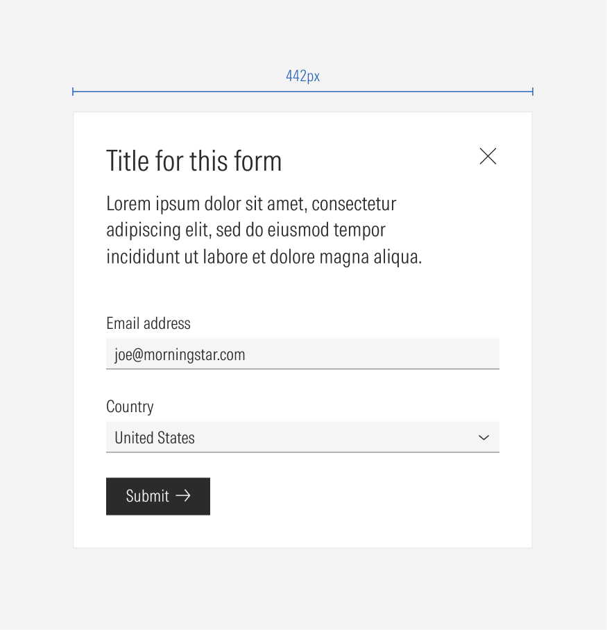
Ensure that proper space is given between each form element. Forms are mainly built using inputs, select elements, text blocks, and background. We maintain consistent spacing between the input-select elements and larger spacing between them and the form instructions. The form elements will be displayed in a single column in the container. The standard vertical distance between each input is 24px.
Hierarchy
A proper hierarchy must be ensured for the elements that compose the form. Forms are composed of several inputs and actionable elements, which is why it's necessary to define the level of importance of each data input, show the relationship between them, and present them in a logical way.
The title, with the highest level of importance, needs to give a clear and short idea of the topic of the form. If extra context or instructions are needed, add body copy below the title, with a secondary level of importance. Form elements should be placed below the title and the body text, using clear labels and listed in a logic order for the user. The CTA should be a primary button (with a label) placed at the bottom of the form.
Alignment
Ensure that proper space is given between each element. All elements will be vertical left-aligned and take the width of the container.
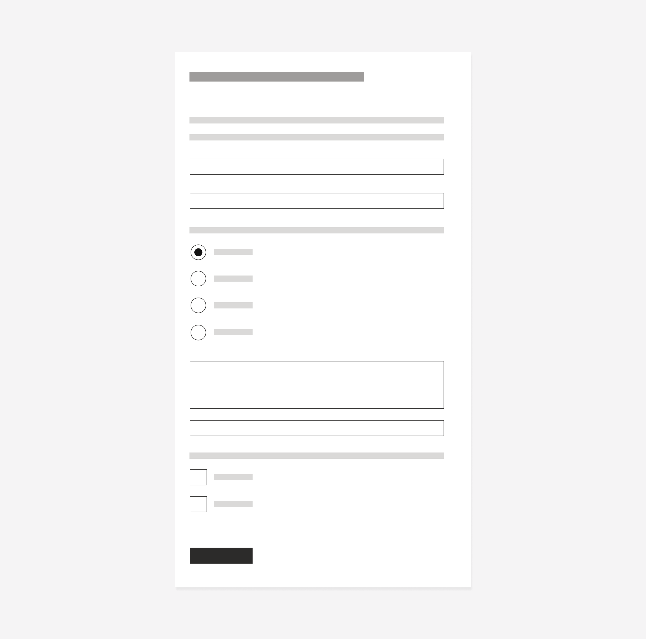
Do organize the form elements in a single column.
Don’t organize the elements in more than one column.
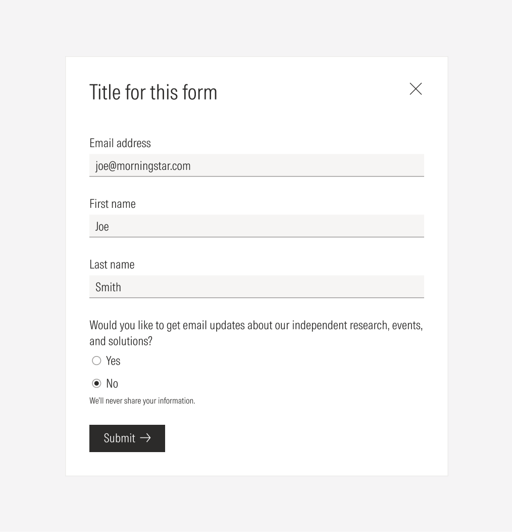
Do left-align the primary button at the bottom of the form.
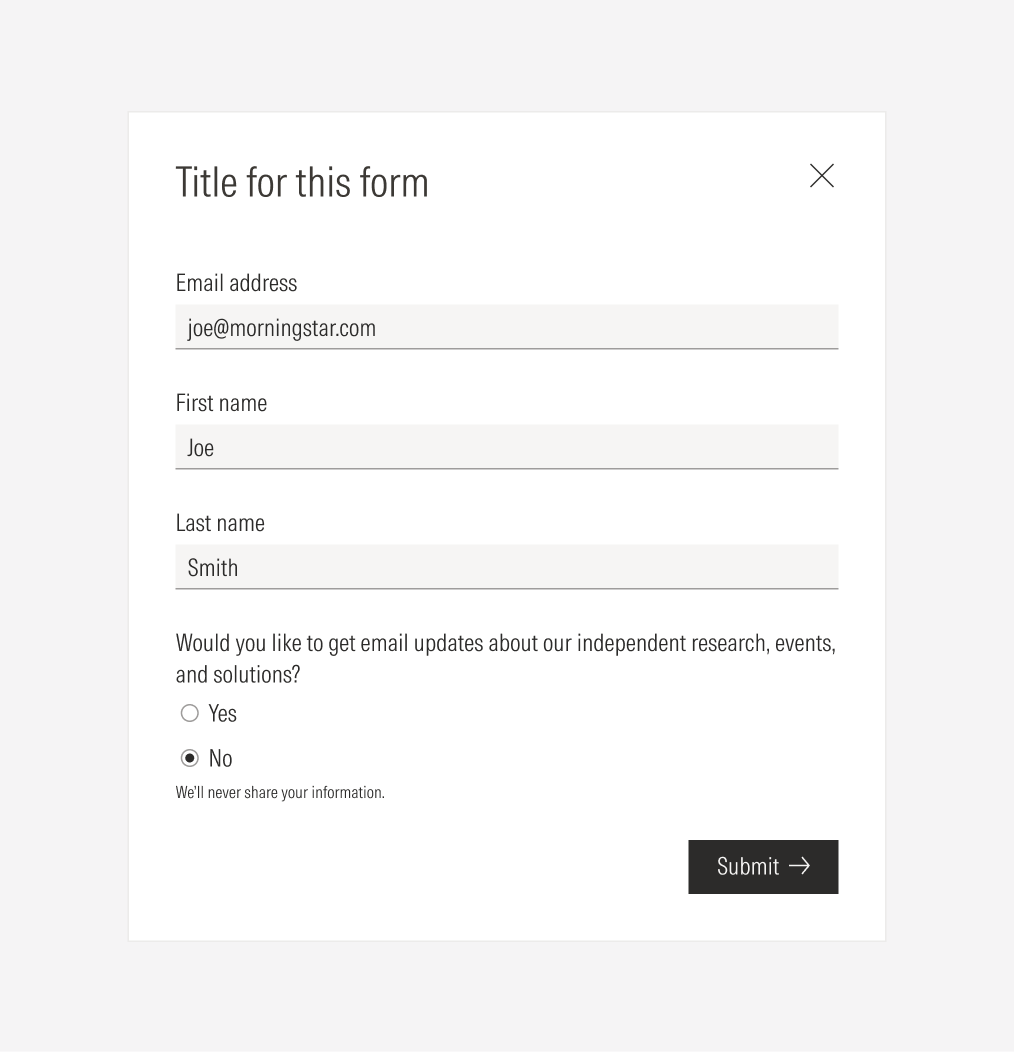
Don’t right-align the primary button.
Default - No Scrolling
Scrolled
Overlay
Modal forms will pop up over the page where prompted over an overlay in Neutral 15 with a transparency of 50% for the light theme, and Neutral 80 with a transparency of 50% for the dark theme.
