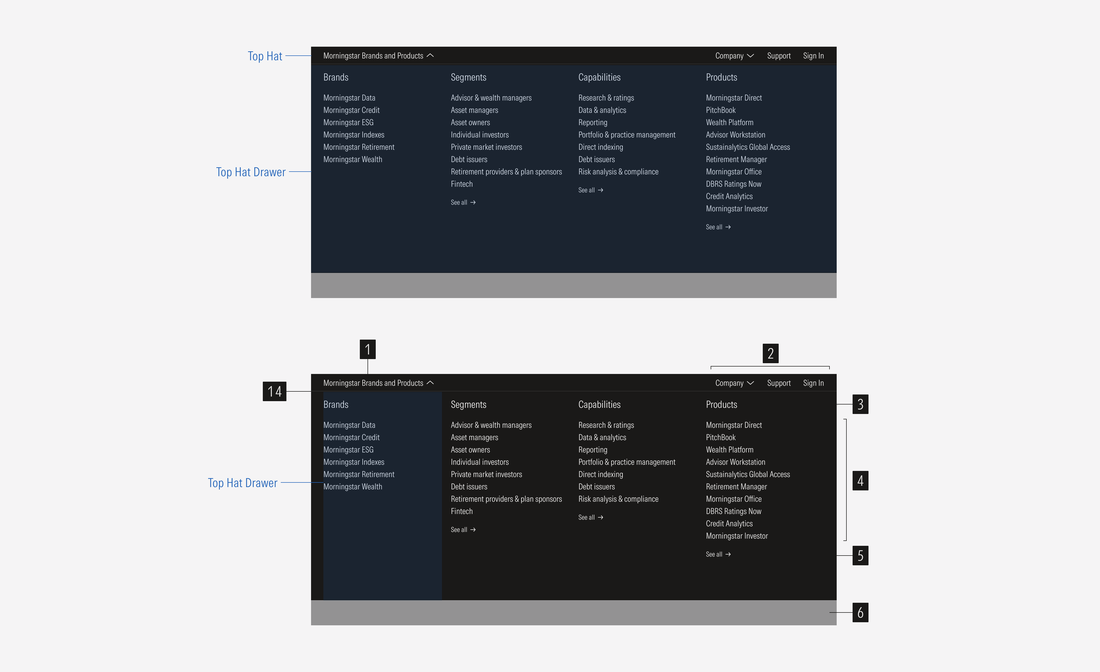
Navigation
This navigation bar is the top most bar in the navigation set. It contains navigation items that are at the highest level of navigation for the site. The bar spans the entire width of the viewport. The top hat will never appear on its own.
SM and Default Breakpoints
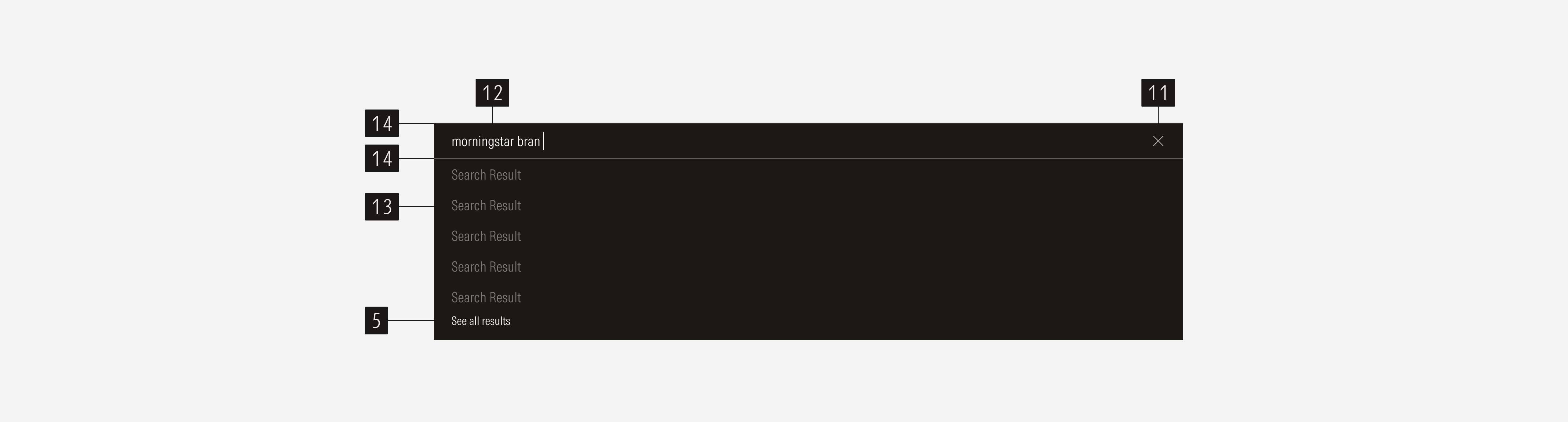
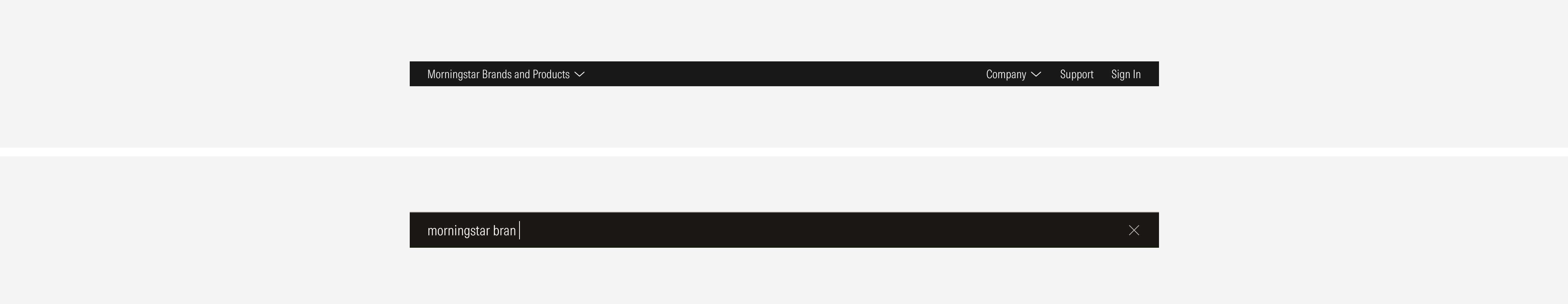
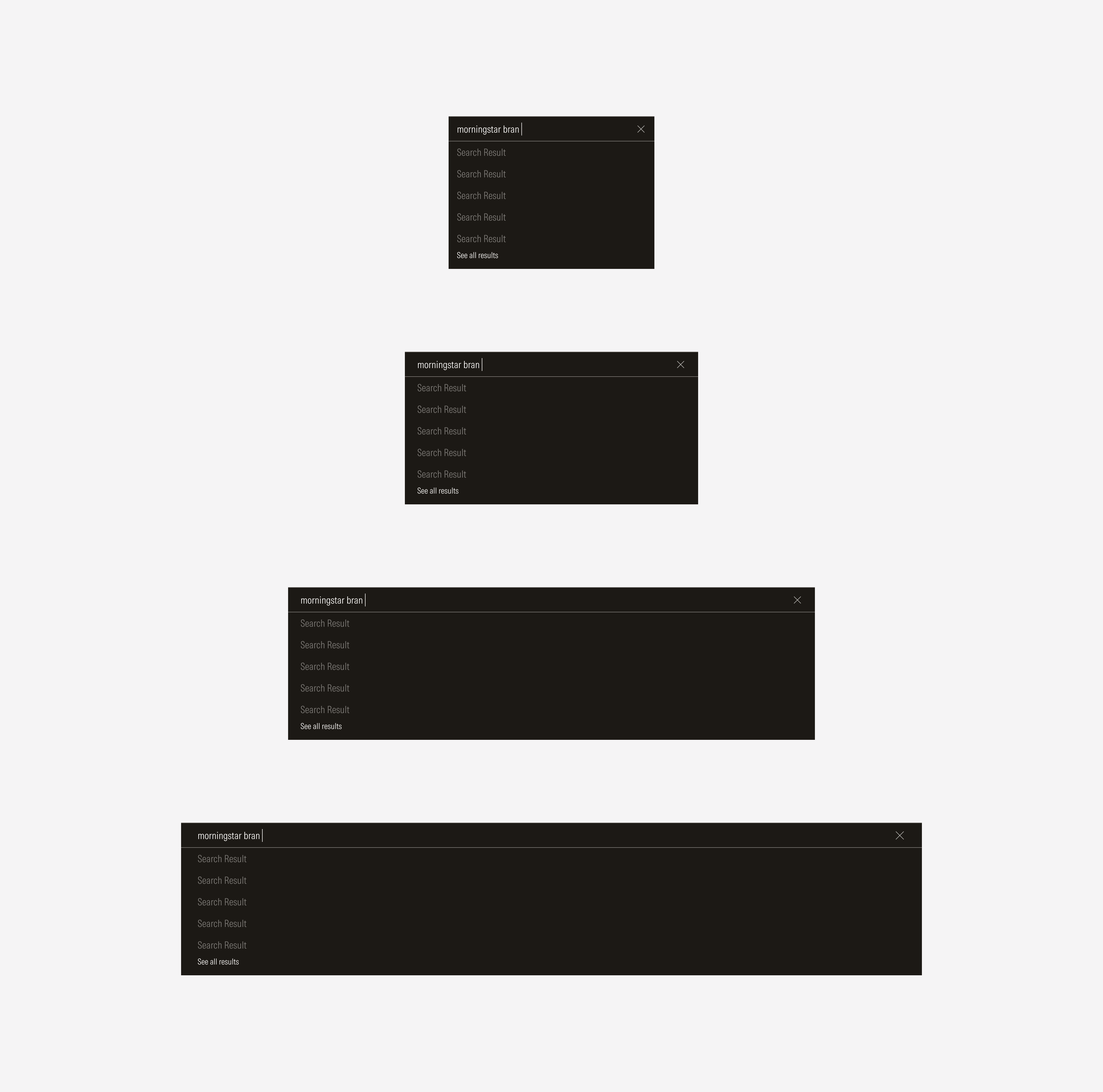
Search Bar
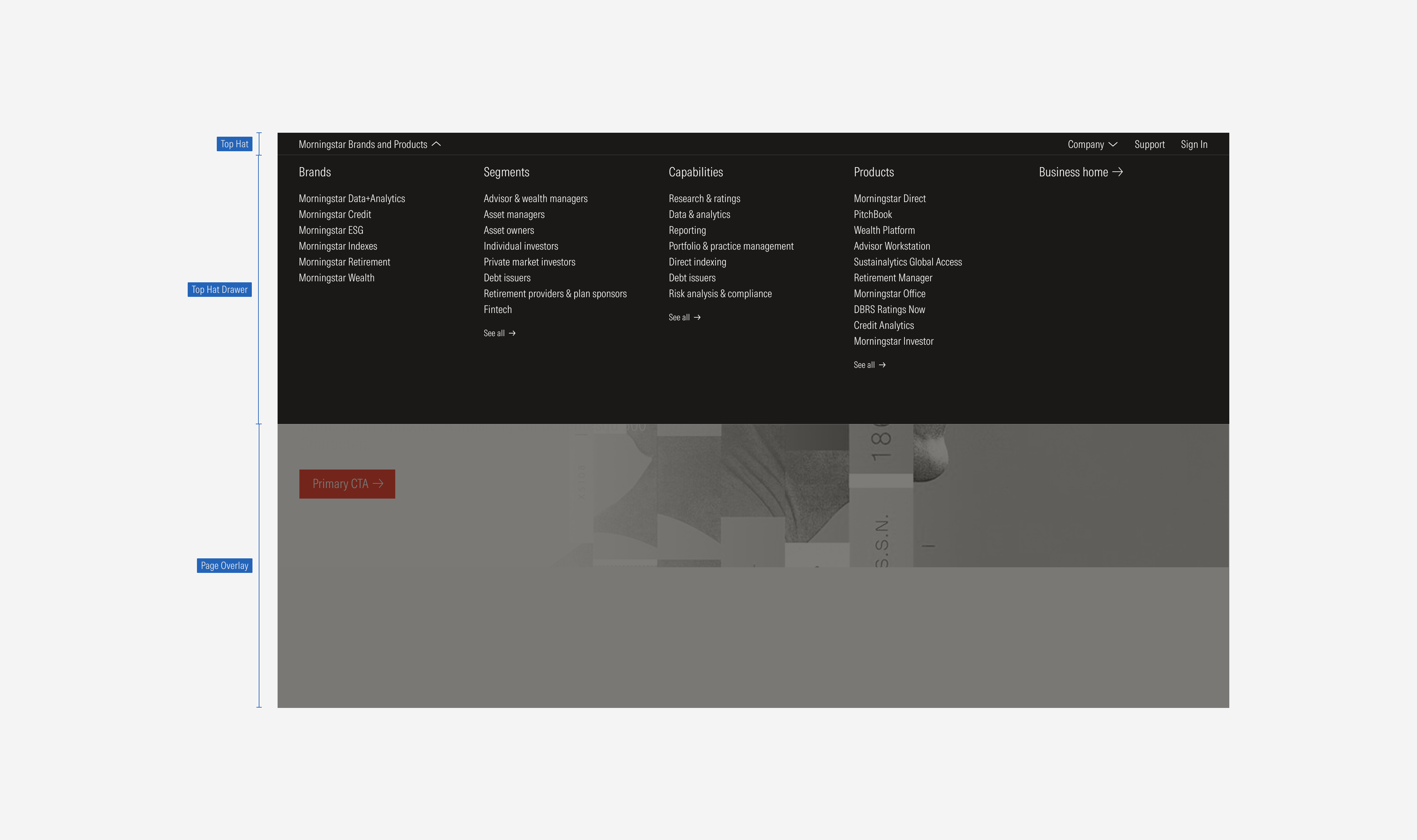
- Main dropdown of navigation items contains the drawer of options. By selecting it, the user can display or collapse the mega menu.
- Secondary nav items are specific first-level actions (single actions or a select).
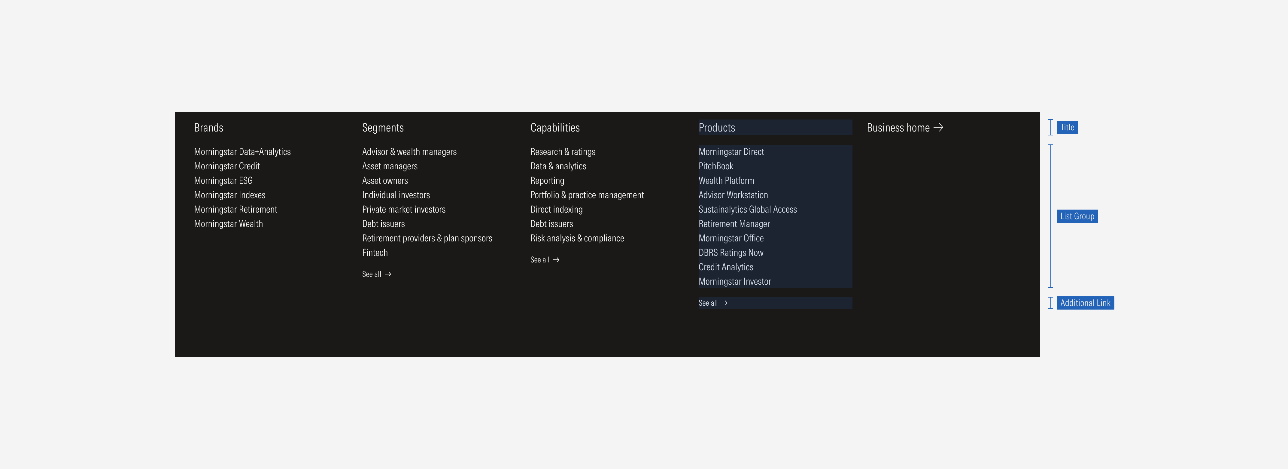
- Category title represents the main section of first-level options.
- Page link is a group of link options that belong to a section or main category.
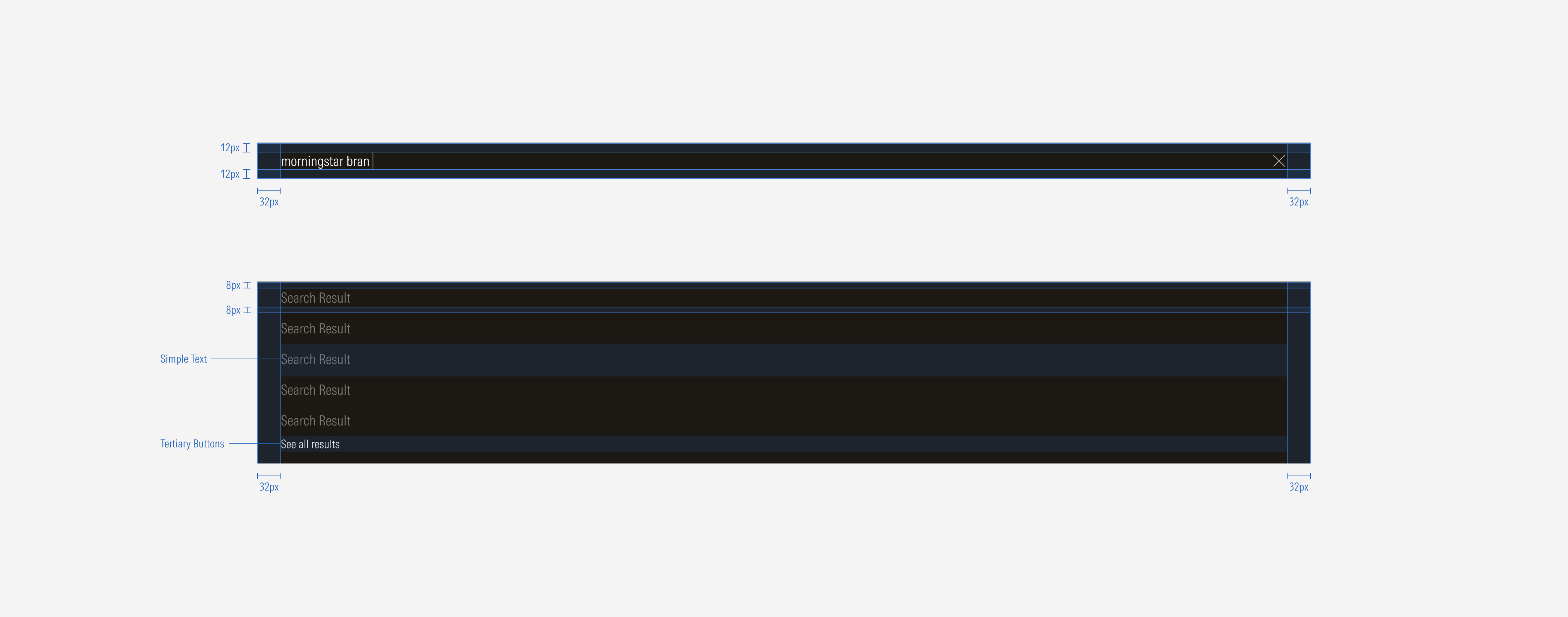
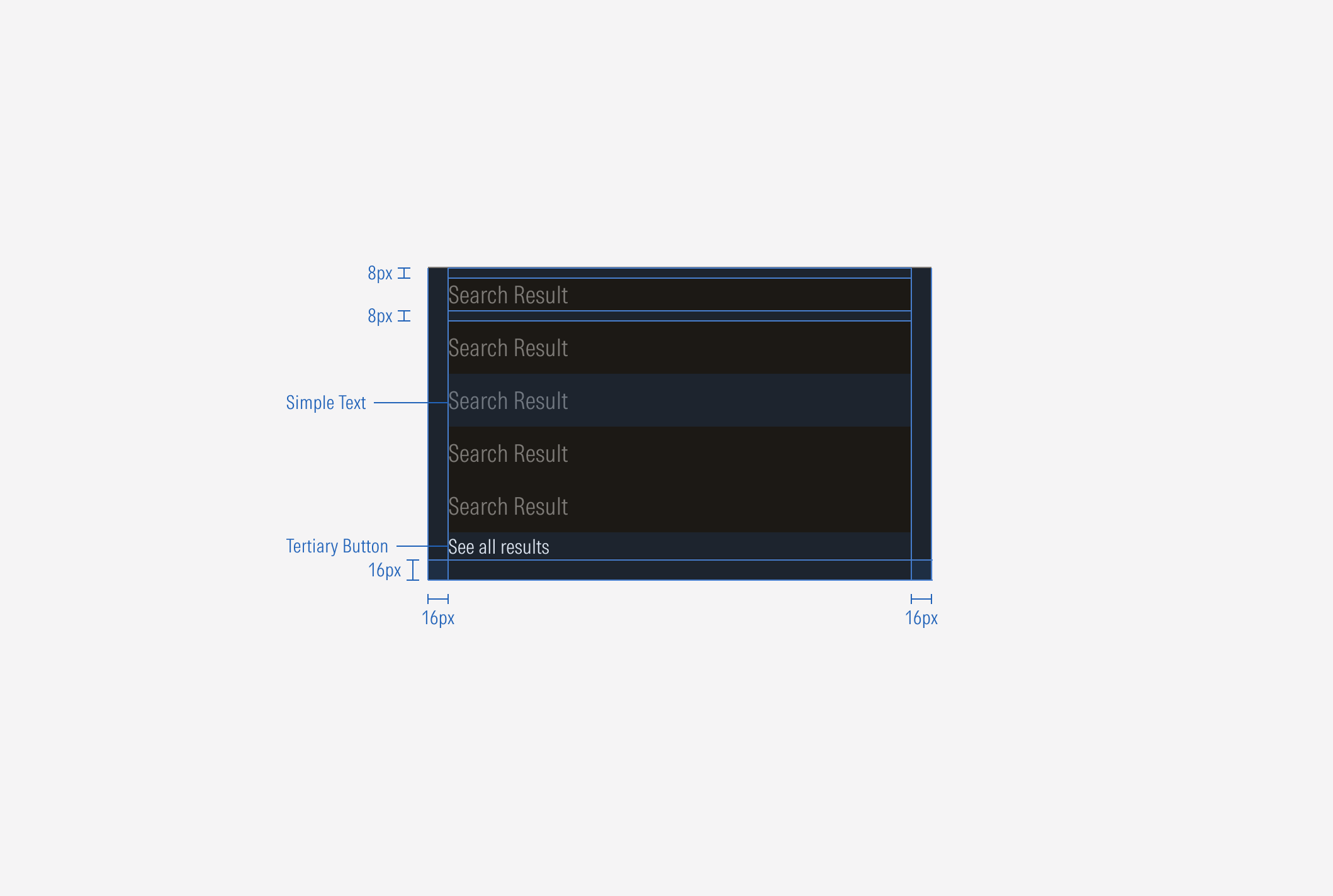
- Additional link is a tertiary button that represents an extra action. When a main category has more than ten options or when there are more than five search results, a “See all” CTA will appear.
- Page overlay appears when the top hat drawer is displayed. It is a page opacity-40 overlay.
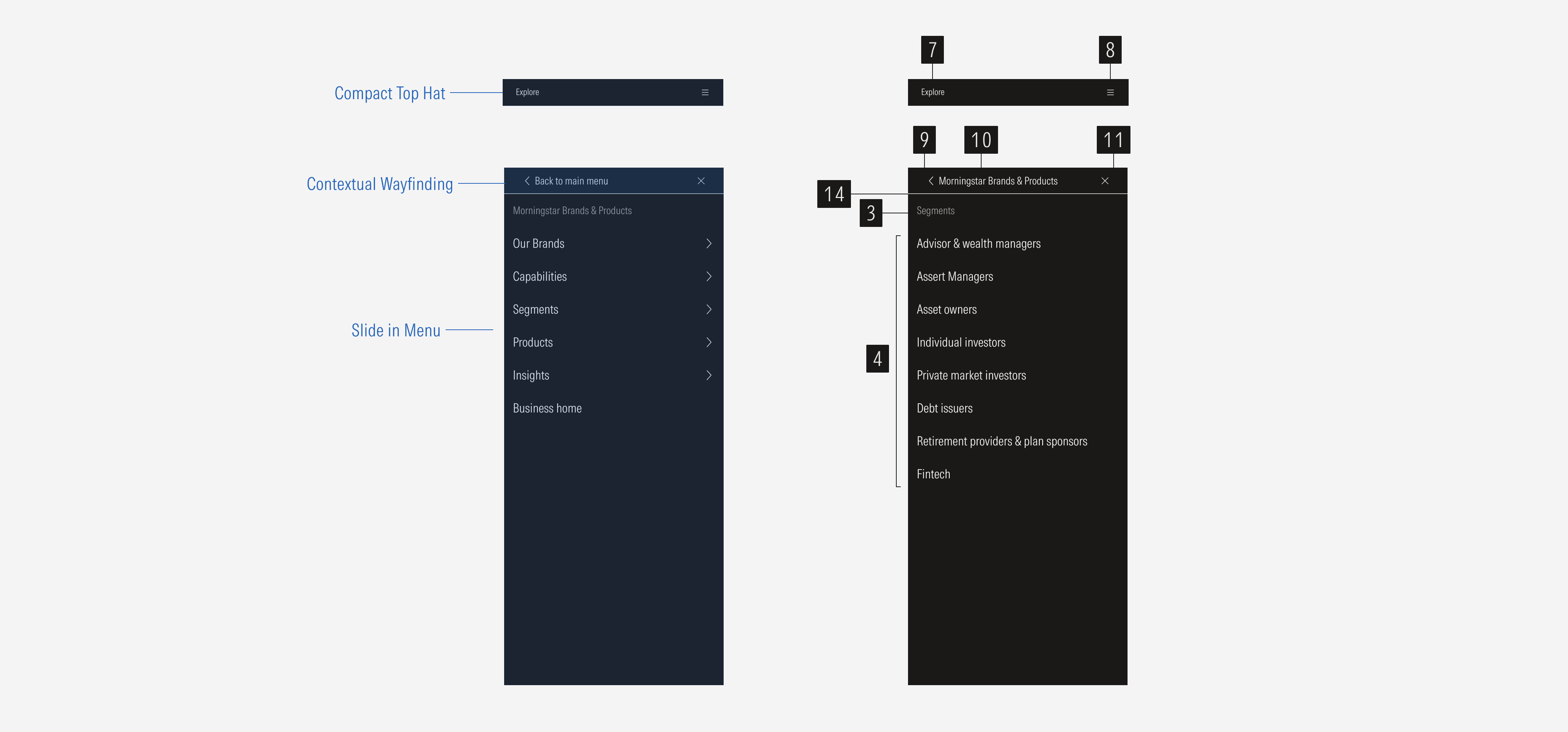
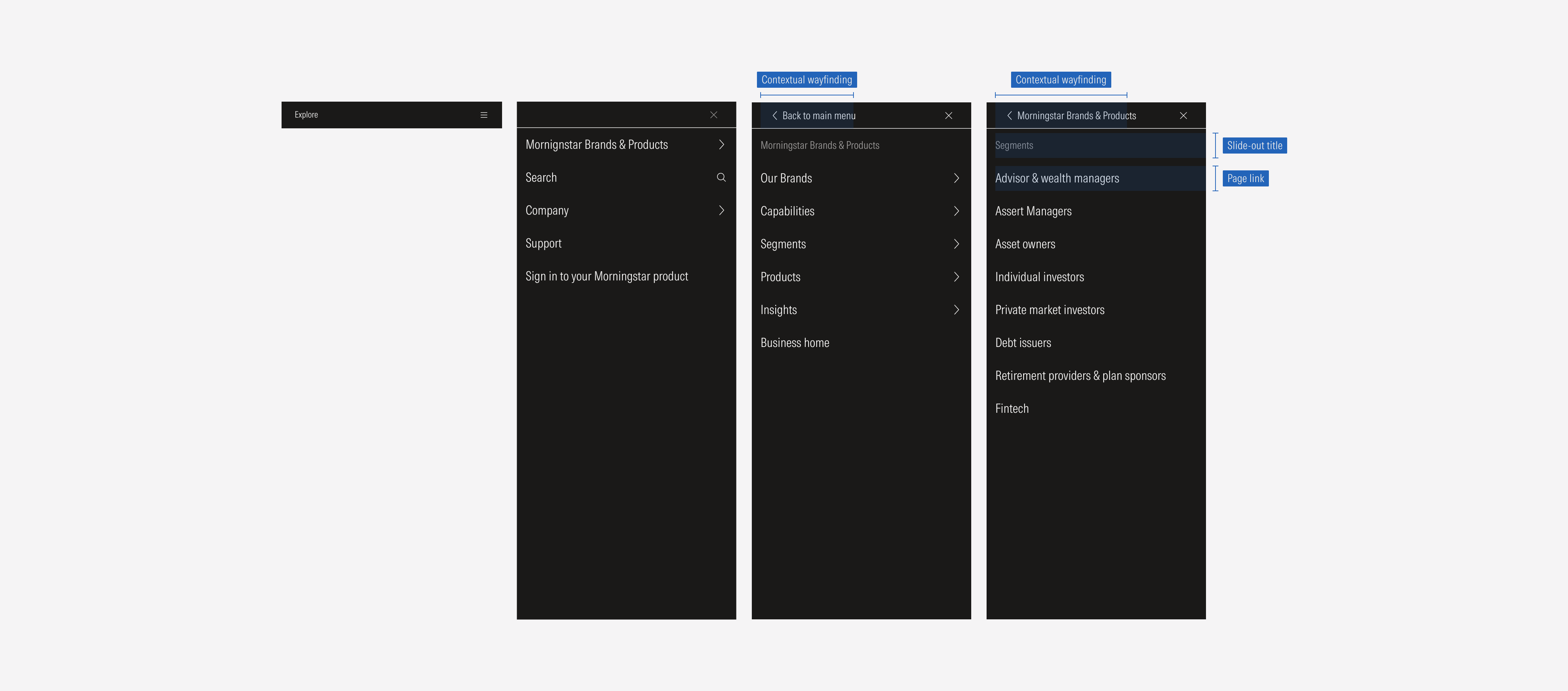
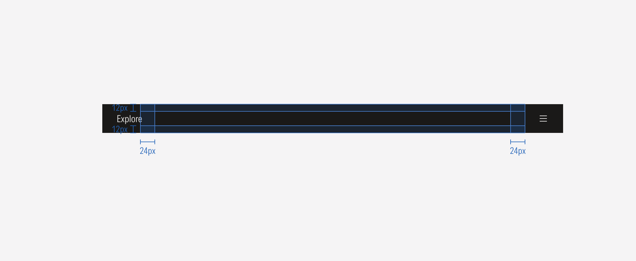
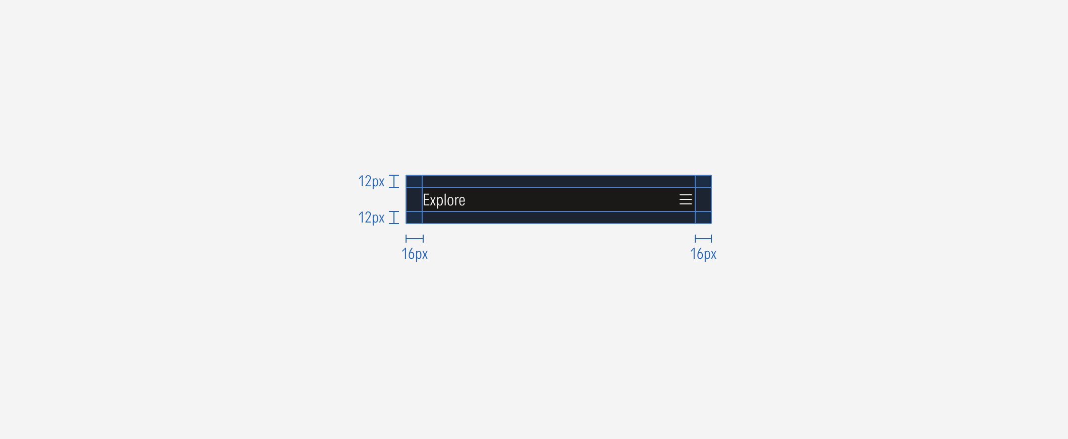
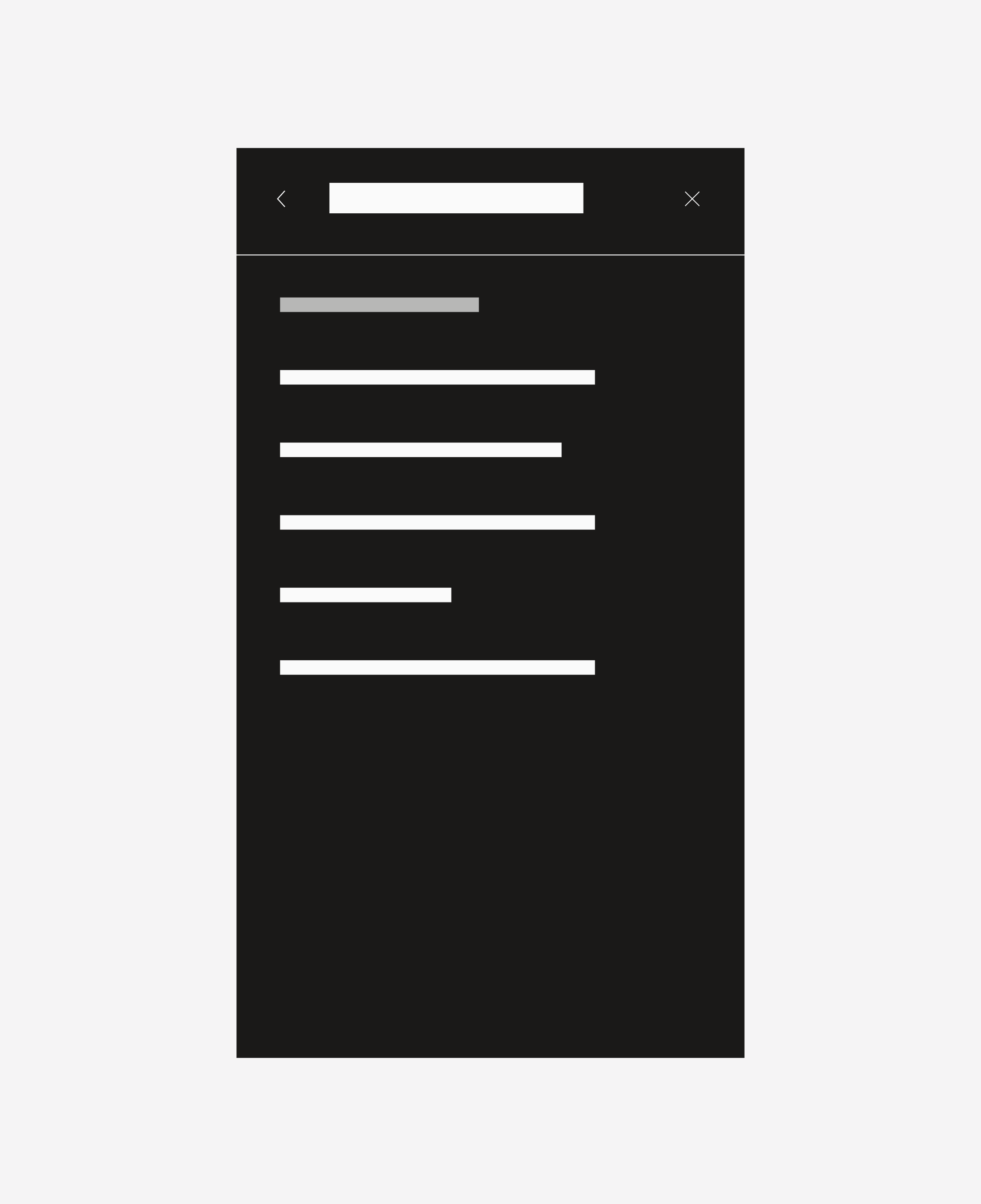
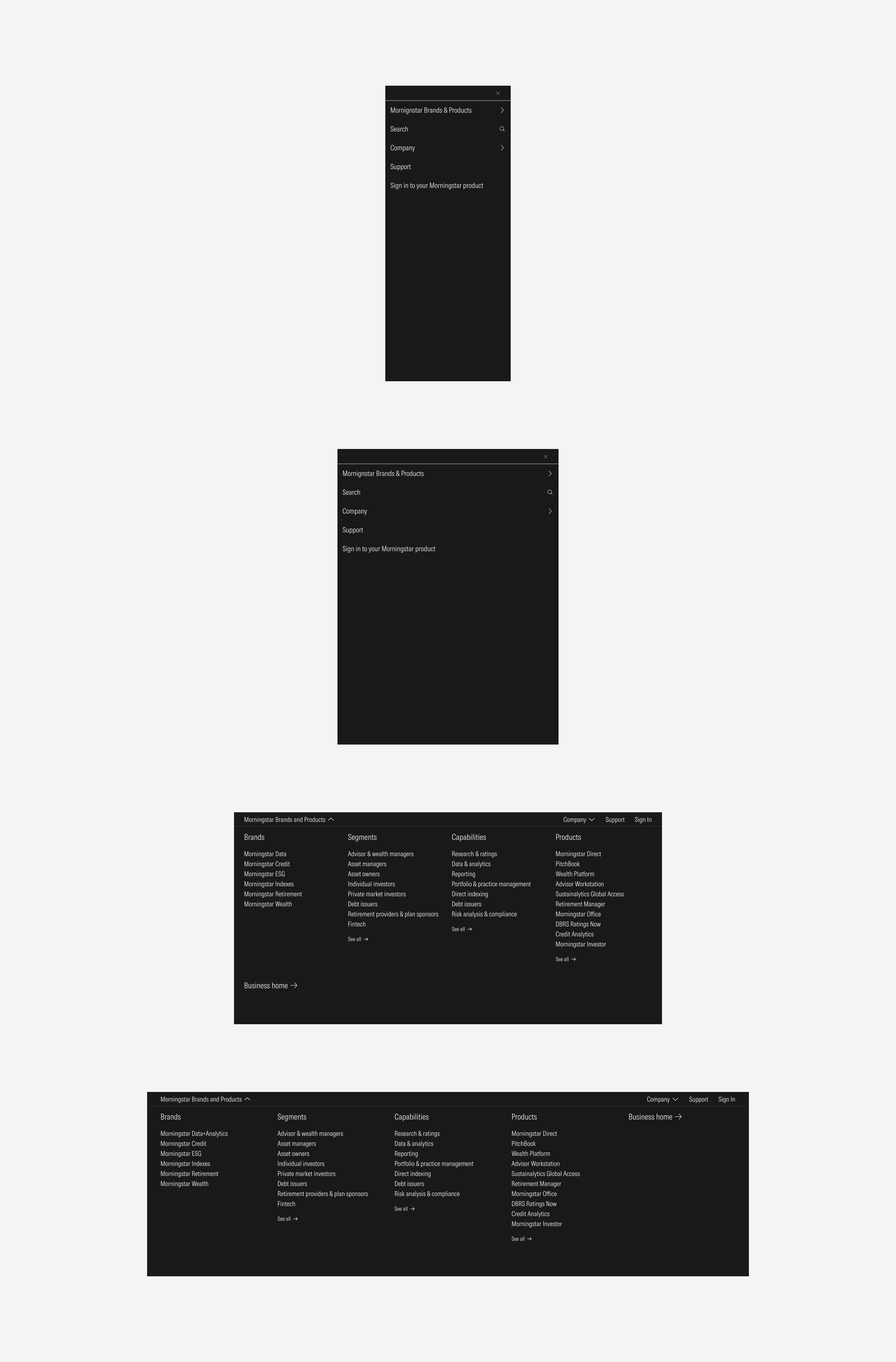
- Compact menu header is a label that creates a hook to explore the slide-in menu in compact view-ports.
- Compact menu is a hamburger menu that contains the navigation in compact view-ports.
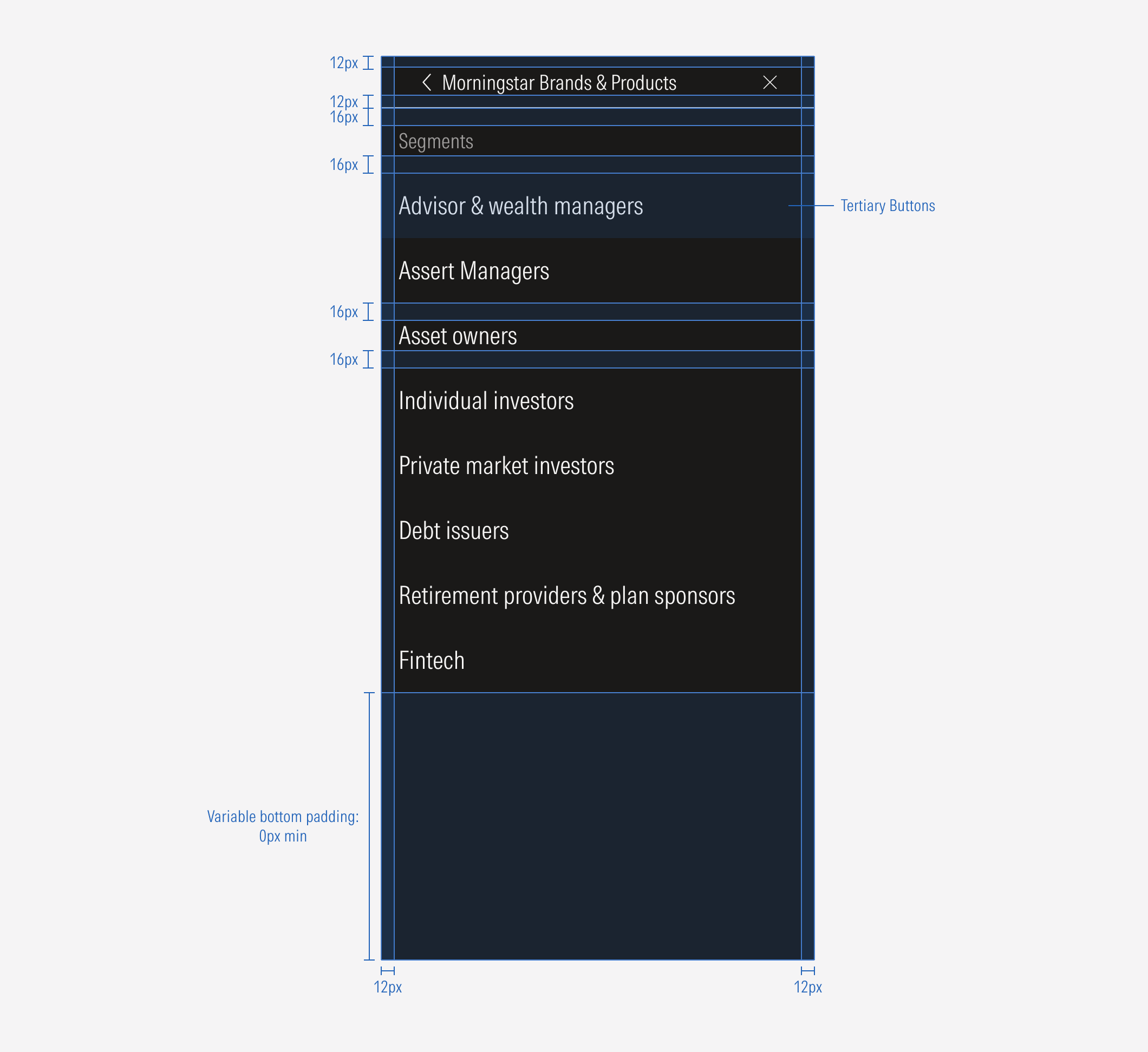
- Back icon button allows users to go back to the previous menu view.
- Contextual wayfinding title gives context on the section options being displayed.
- Close icon button allows users to close the menu. When tapping it, the menu slides out.
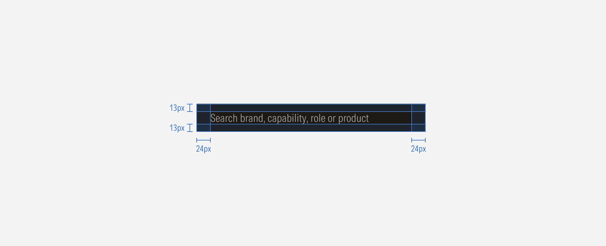
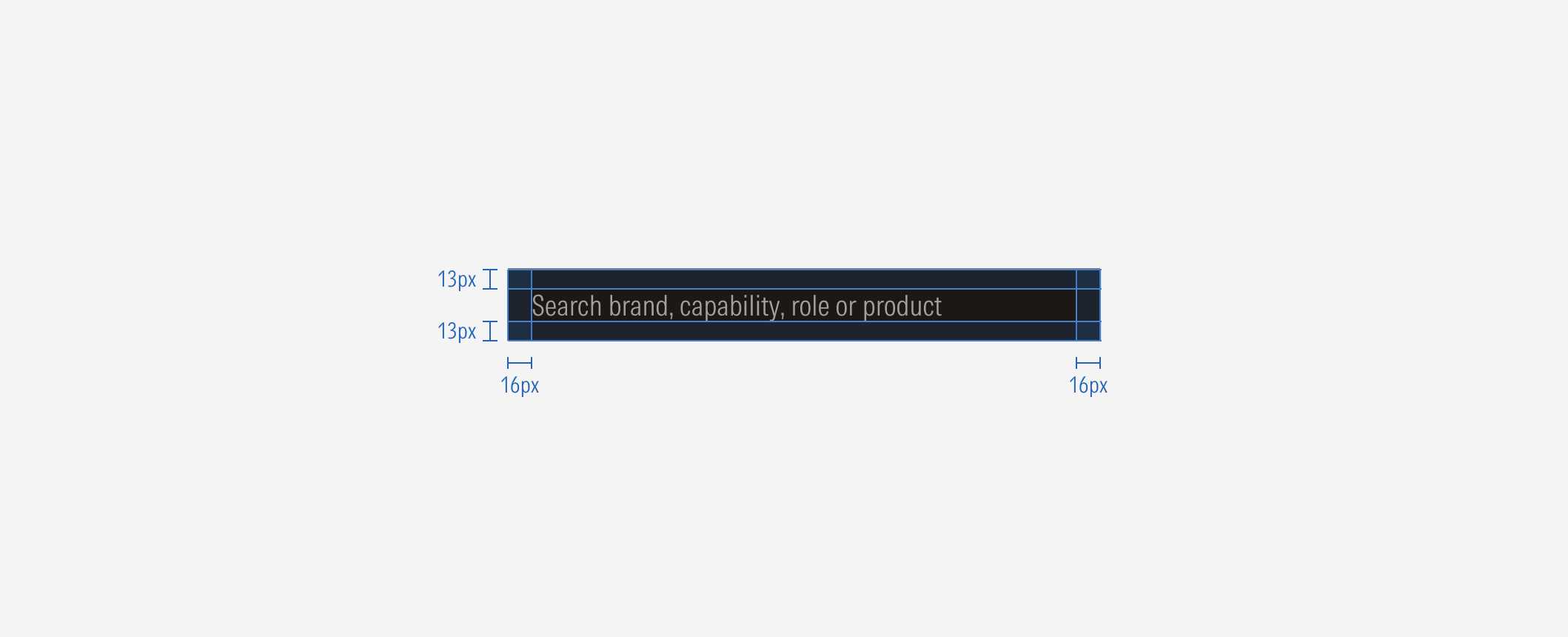
- Search input is the interactive element of the search bar, allowing users to enter data on a single line to search.
- Search results sets the label of each result from the search.
- Upper line defines the separation between top bars and top drawers. It is a 1px line.
Variation | Purpose | Parts on Display | Components | Size |
|---|---|---|---|---|
Top hat | Represents the highest level of the navigation and contains the site options that the user can visit. | Top bar, view drawer, hidden drawer | Navigation button, navigation select | Extended, compact |
Top search bar | Sets a search action on a high level. | Top search bar, results drawer | Search input, close icon button | Extended, compact |


Menu Dropdown
The caret-down items will trigger a full-bleed dropdown. The background page will have an opacity-40 Neutral 80 overlay. The menu animates down from the top. When collapsed, the menu uses the caret-down icon. When the menu dropdown is visible, the menu uses the caret-up icon. Animation guidance can be found the brand site.
Each column of content can have a title, list group of links, and an additional see all link.
Default and SM Slide-In Menu
The menu becomes a slide-in menu that drills down into lower levels. When open, the menu will go edge-to edge. This menu condenses all items under the hamburger menu. The first menu will list those items. The bar will also include a shift in copy-writing to allow more contextual direction for the user. Animation guidance can be found the brand site.
Intentional icon usage shows the user the expected action. Carets show a new slide-in and the direction they will appear from. An X icon is clicked or tapped to close a window. View the interactive prototype.
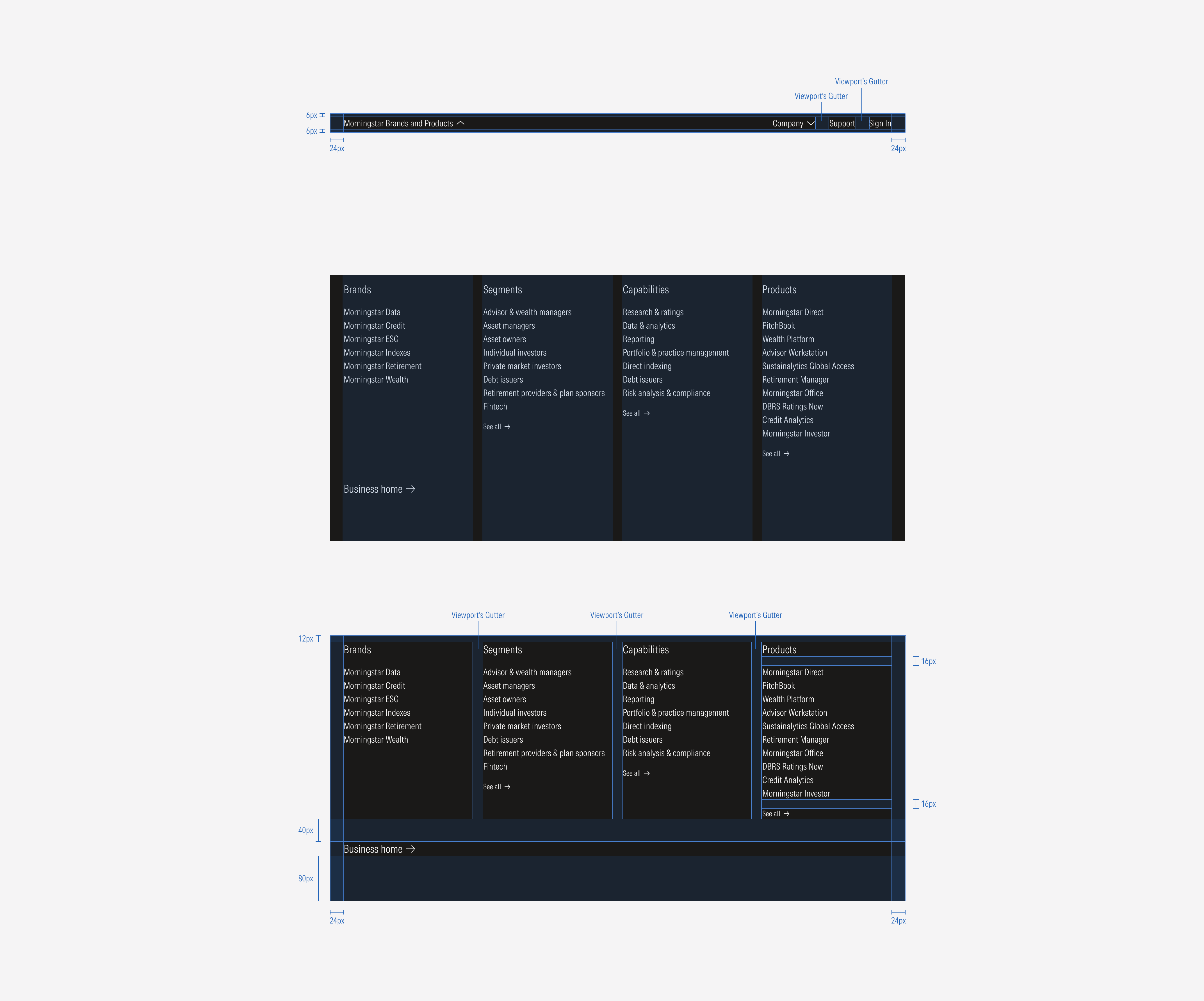
Top hat LG: The menu is split into 6 even columns (2 columns of the 12 total columns of the grid each).
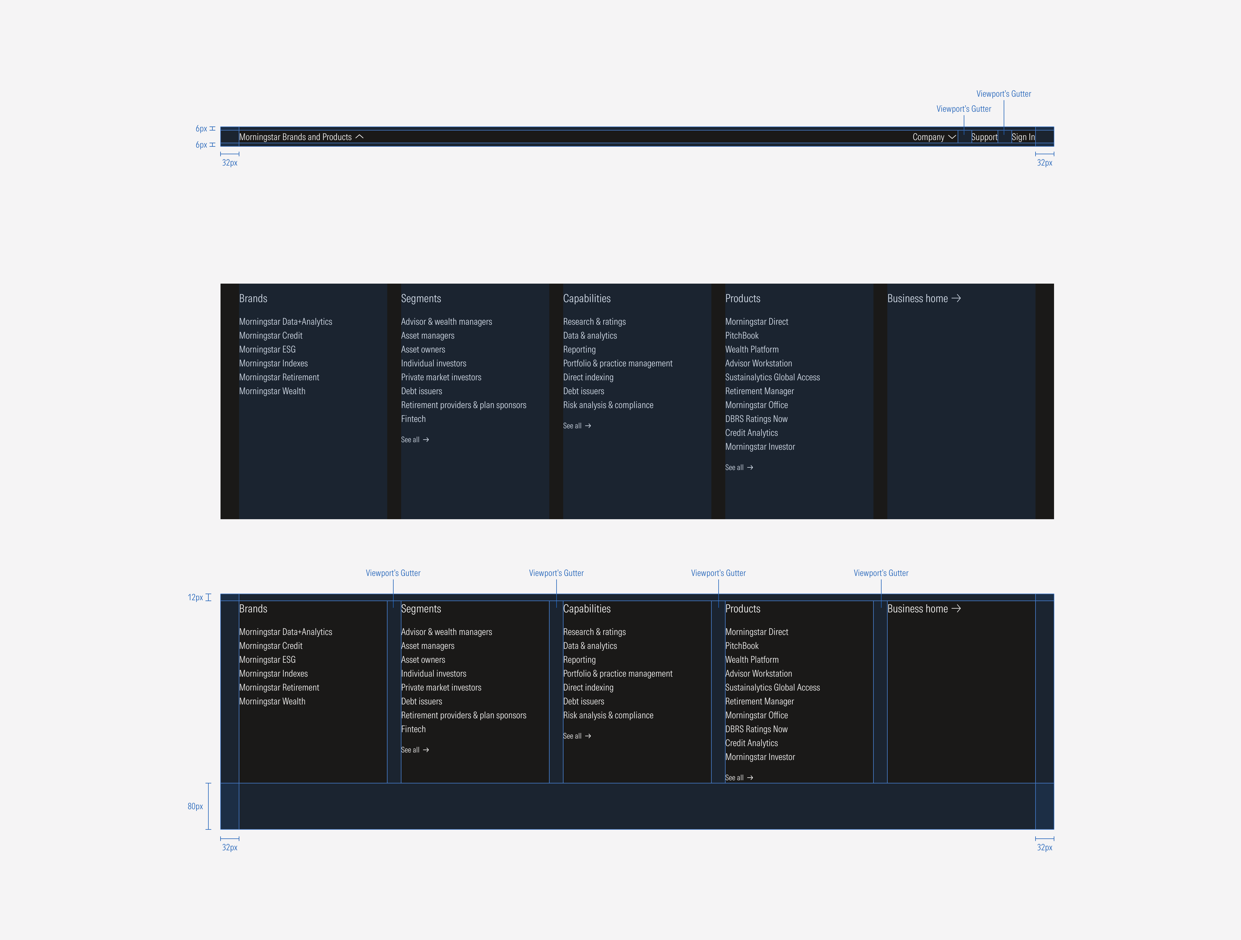
The menu is split into four even columns (three of the twelve total columns of the grid each). Five or more sections of content will flow underneath the top four with a 40px gap between rows.
Top hat SM:
Top hat Default:
Slide-in menu: SM and Default
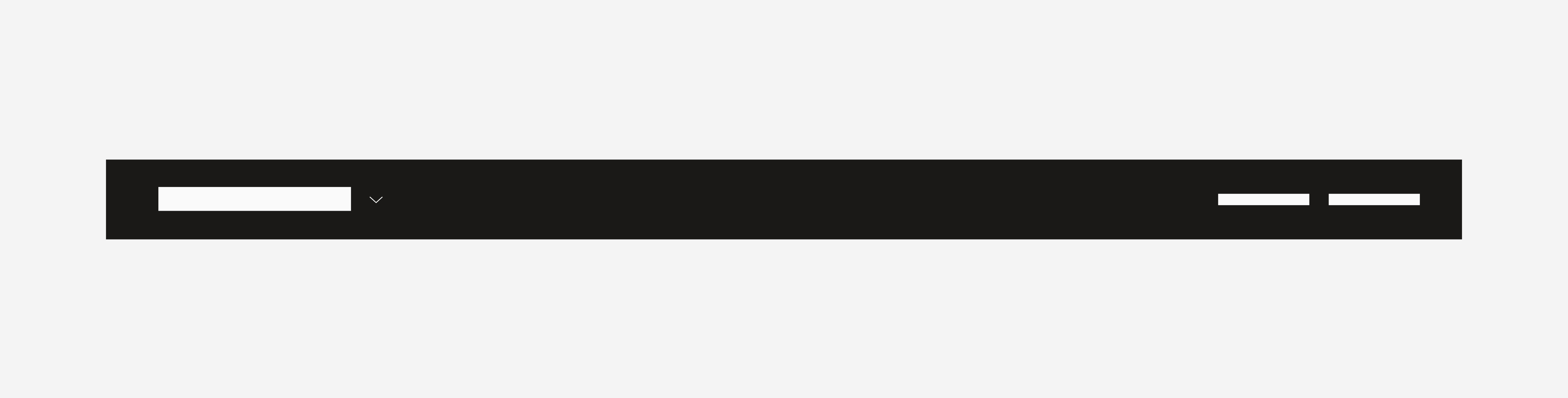
Search bar: LG and MD
Search bar: SM
Search bar: Default
Search bar results: SM
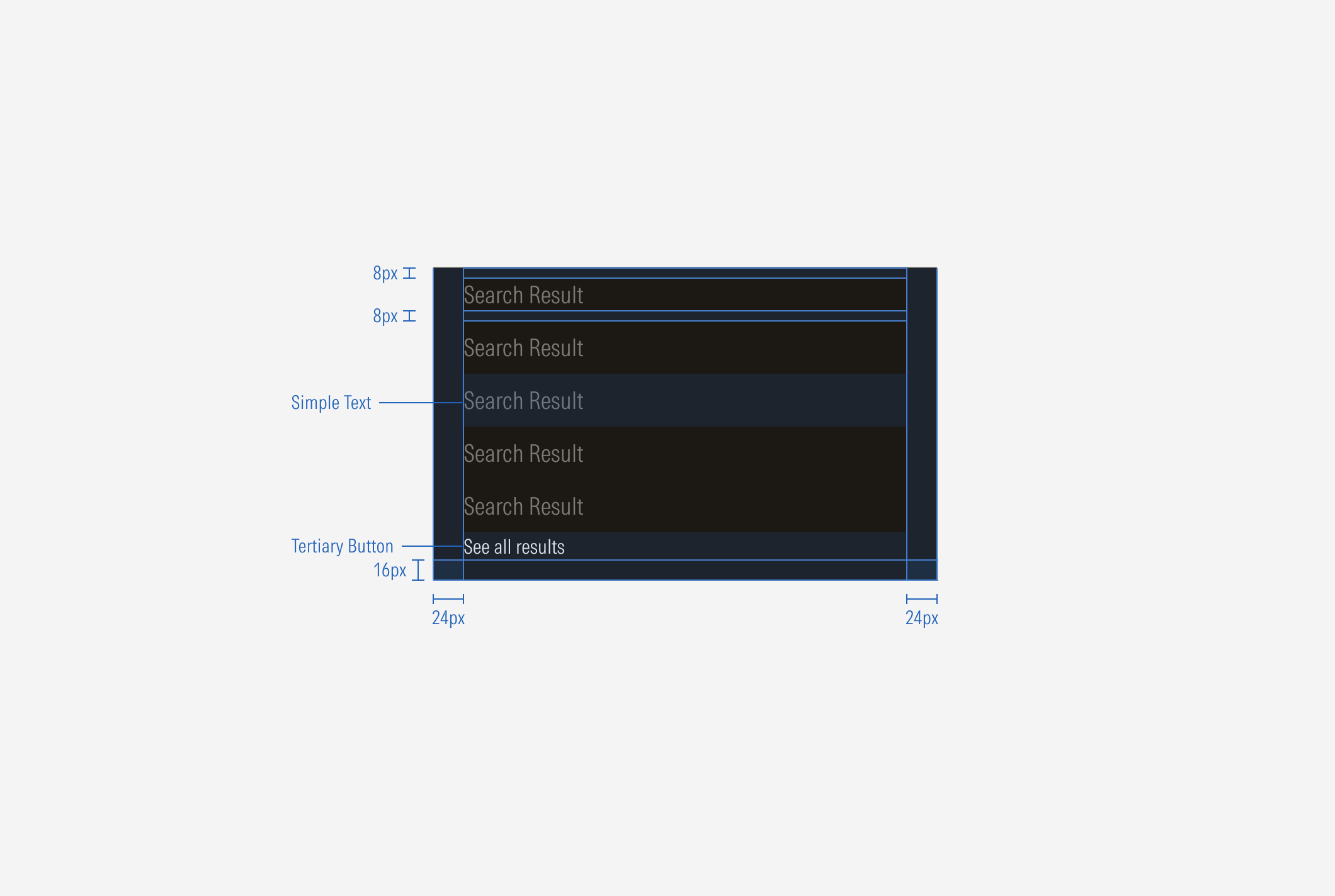
Search bar results: Default
Hierarchy
A proper hierarchy must be ensured for the elements that compose the top hat. The main accordion of the bar should contain the first-level options, where the titles represent each main section. The title, with the highest level of importance, needs to give a clear and short idea of the site it represents, and the options below it represent the pages it contains as a second level of navigation. The “See all” CTA should be a tertiary button placed at the bottom of the container.
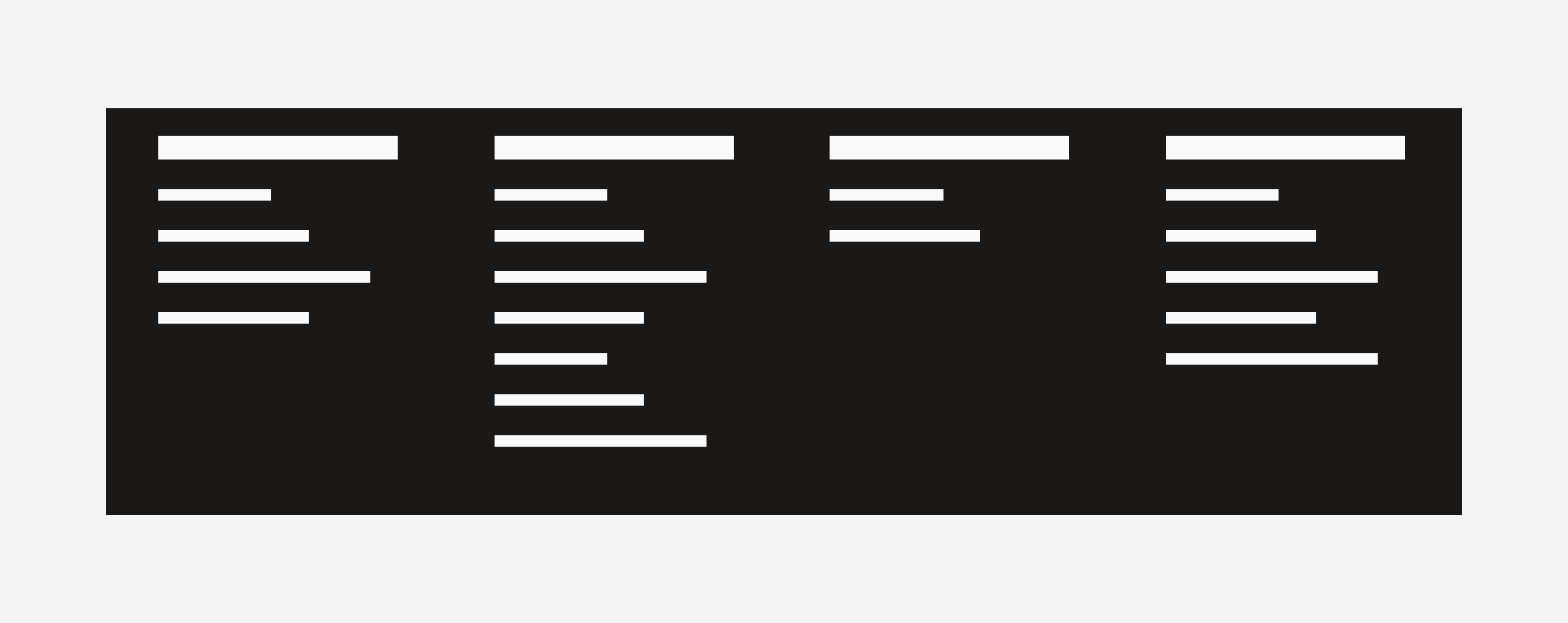
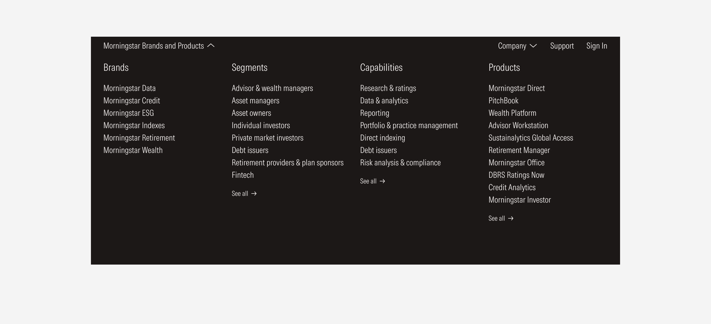
Do left-align the drawer block options.
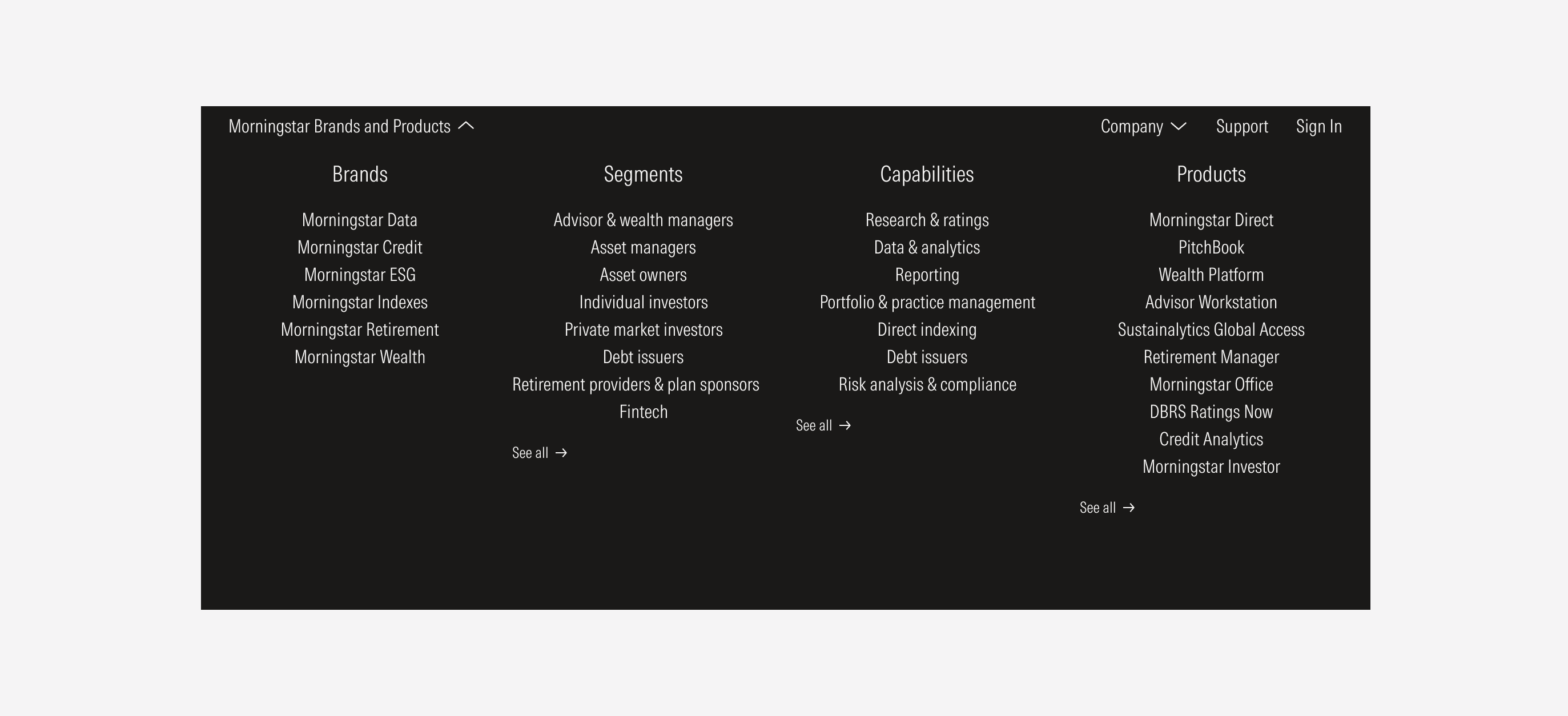
Don’t change the drawer block options to be center or right-aligned.
Search Bar