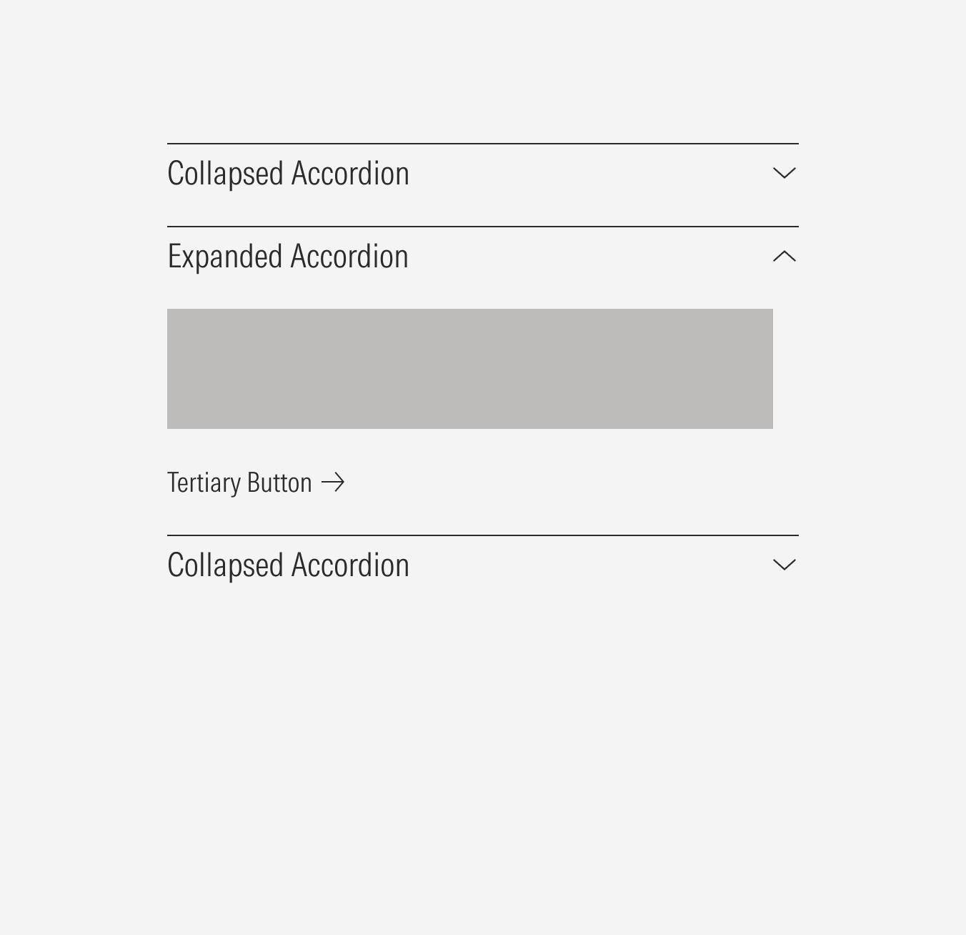
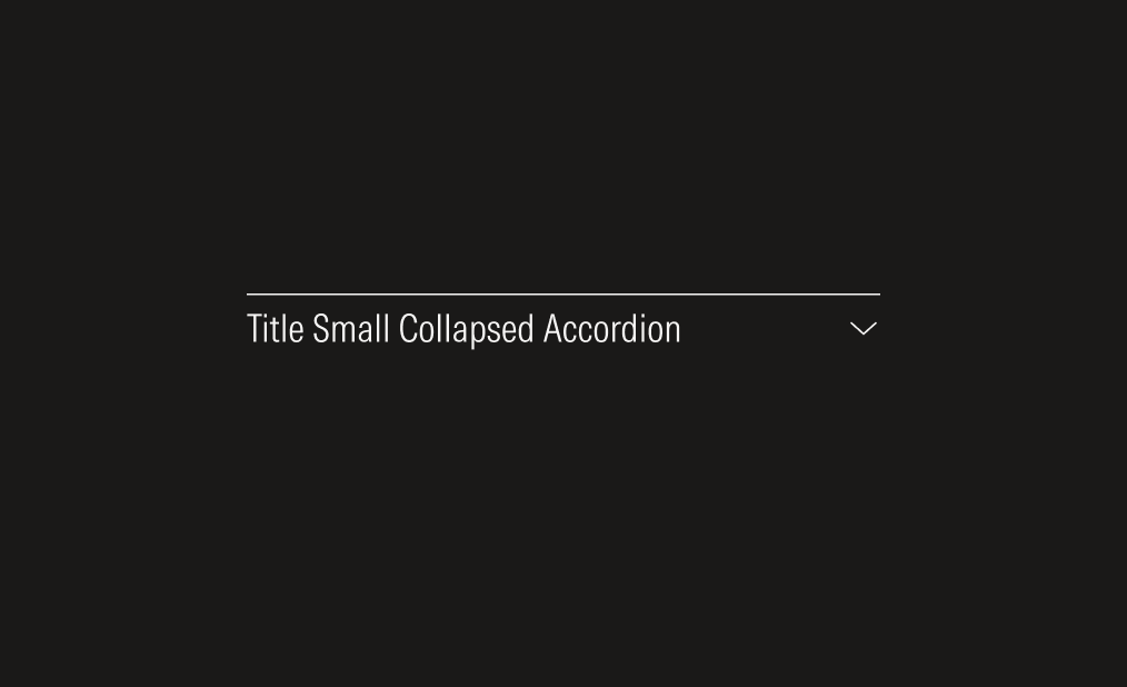
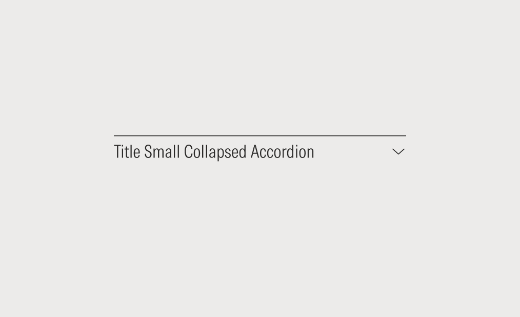
Accordion
The accordion is a component that displays stacked list items. Each list item can collapse (hide) or expand (show) its content when clicked.
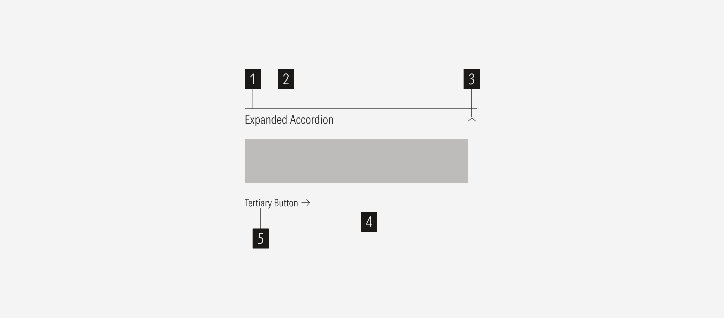
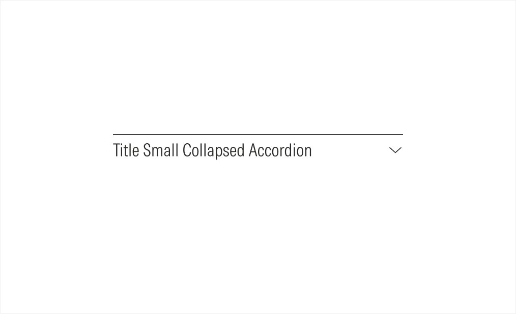
- Overline defines where the accordion starts.
- Accordion title sets the content of the accordion.
- Caret icon enforces the behavior of the accordion. The caret-up icon will be shown in the expanded state; and the caret-down in the collapsed state.
- Content slot is dedicated to the content of the accordion. The content could be body text or a list group.
- Tertiary button is a CTA related to the content.
Usage
When to Use
Use accordions on content-heavy pages so users can easily find key information that may be needed at a specific time. Accordions can be used for FAQs, accommodation detail, or capabilities.
When Not to Use
Don’t use accordions for complex content, when the user needs to access most of the content at once, or when there is little content on the page. Also, avoid using accordions in cases when the content can’t be divided or when doing so interrupts the reading flow.
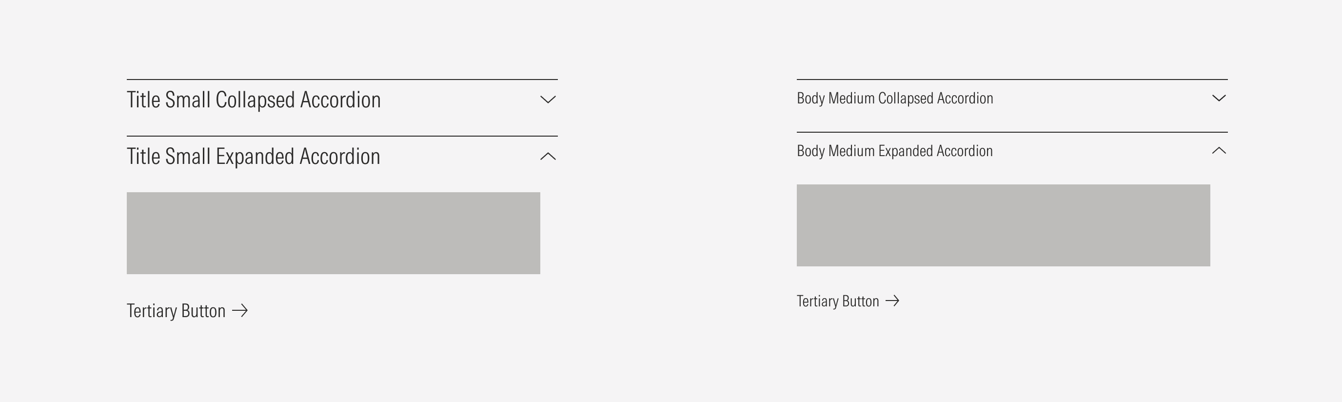
Variation | Purpose | Content | Icon | Sizes |
|---|---|---|---|---|
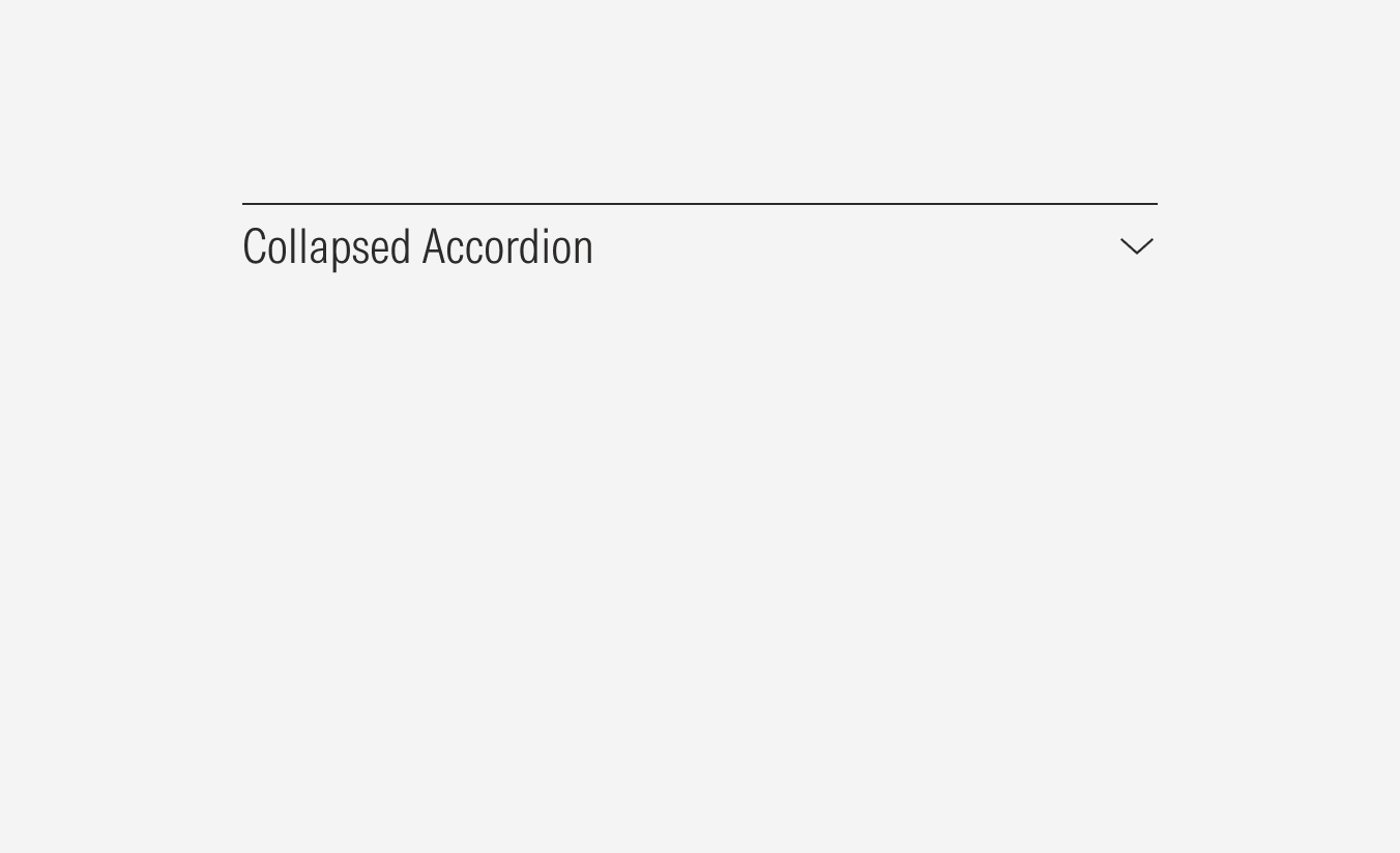
Collapsed | Contains information and keeps it hidden until the user needs to access it. | — | With icon (caret-down) | titleSmall, bodyMedium |
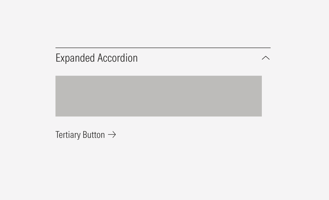
Expanded | Displays the information that the accordion contains. | Body text, list group | With icon (caret-up) | titleSmall, bodyMedium |
Behavior
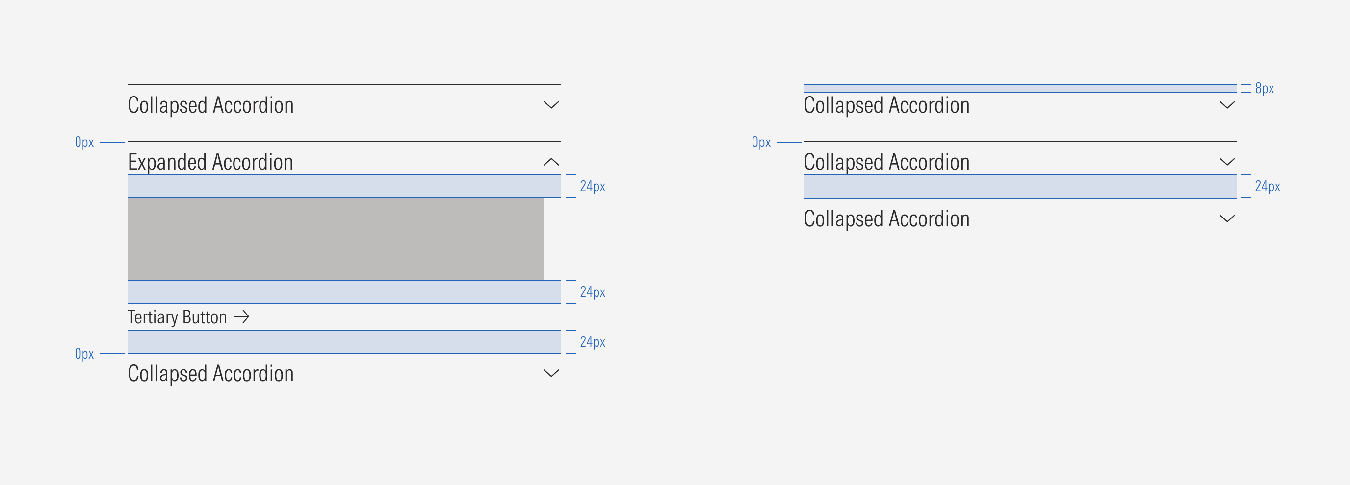
To ensure the accordion is used correctly and fulfills its purpose, only one accordion can be expanded when there are multiple accordions on a page. No more than one accordion should display its content at a time.
Do allow one accordion to be expanded at a time.
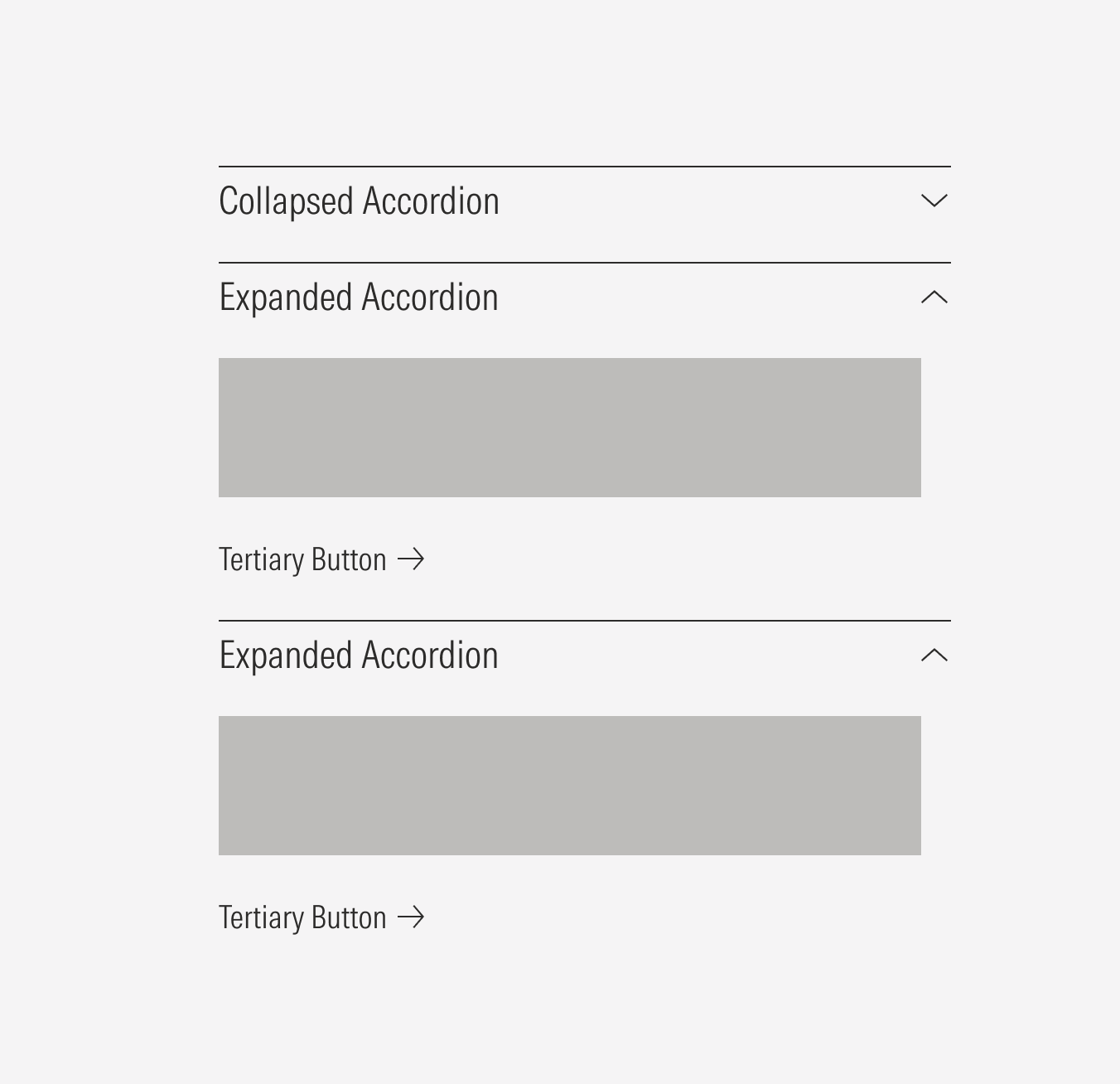
Don’t let more than one accordion be expanded at a time.
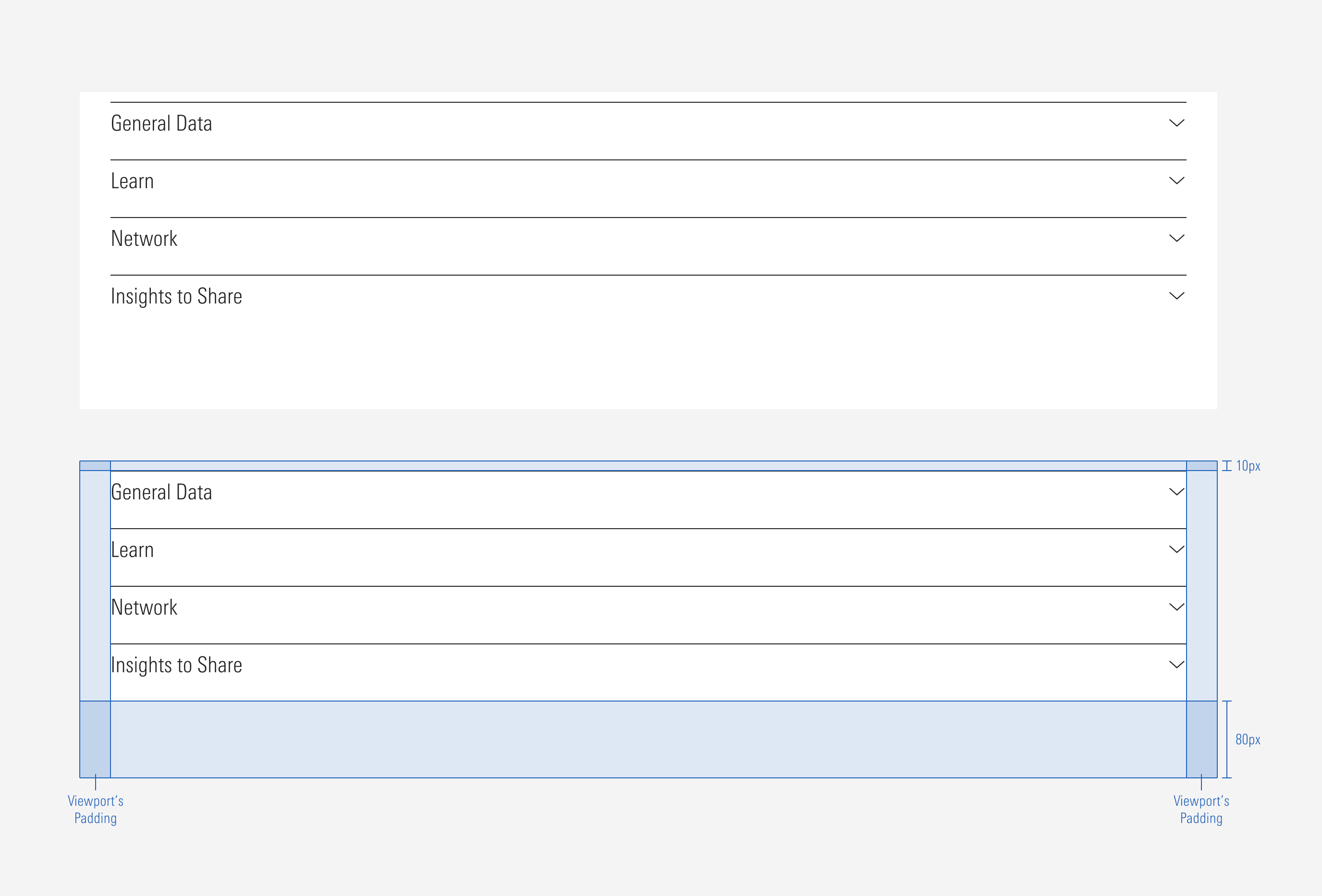
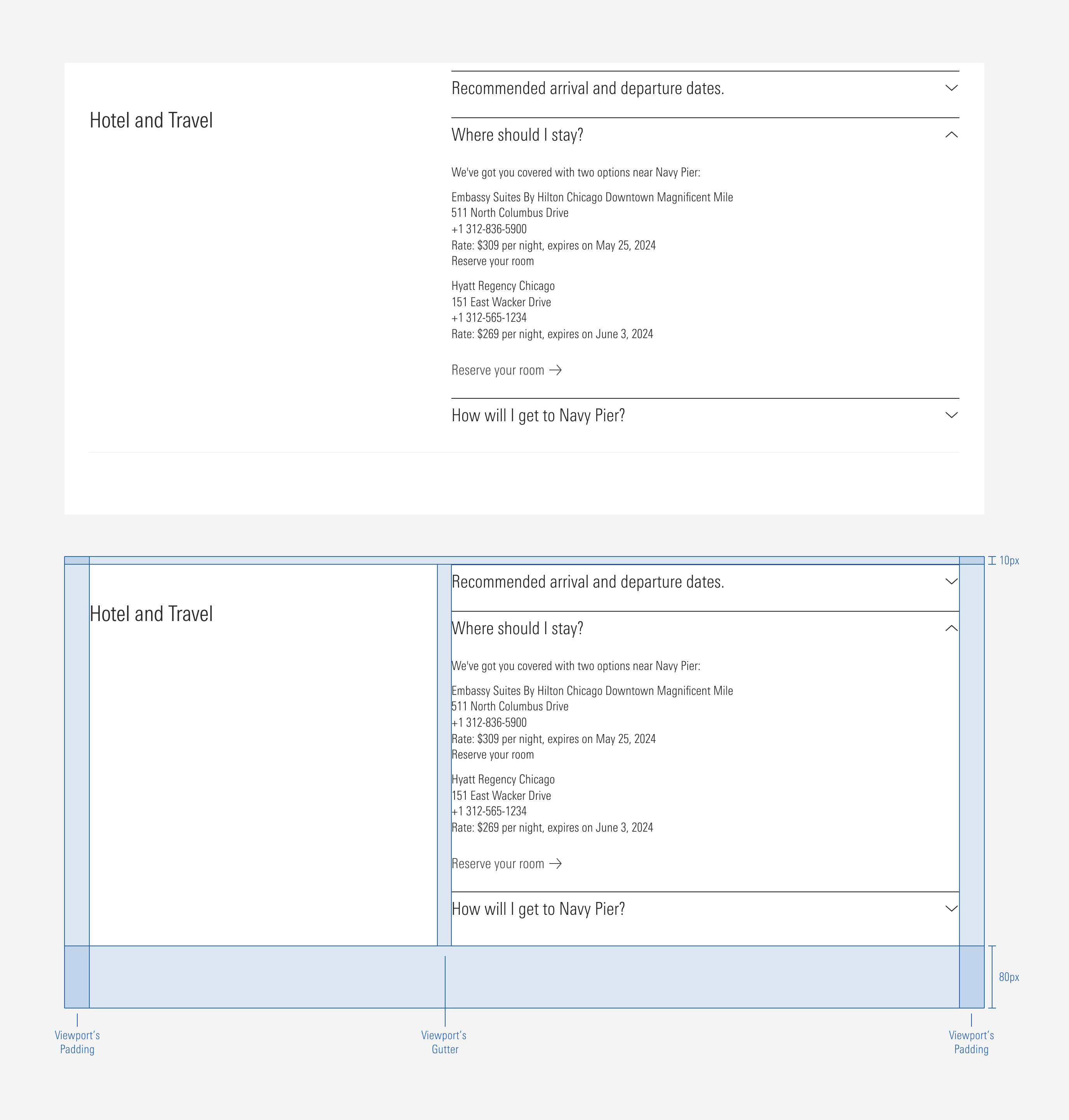
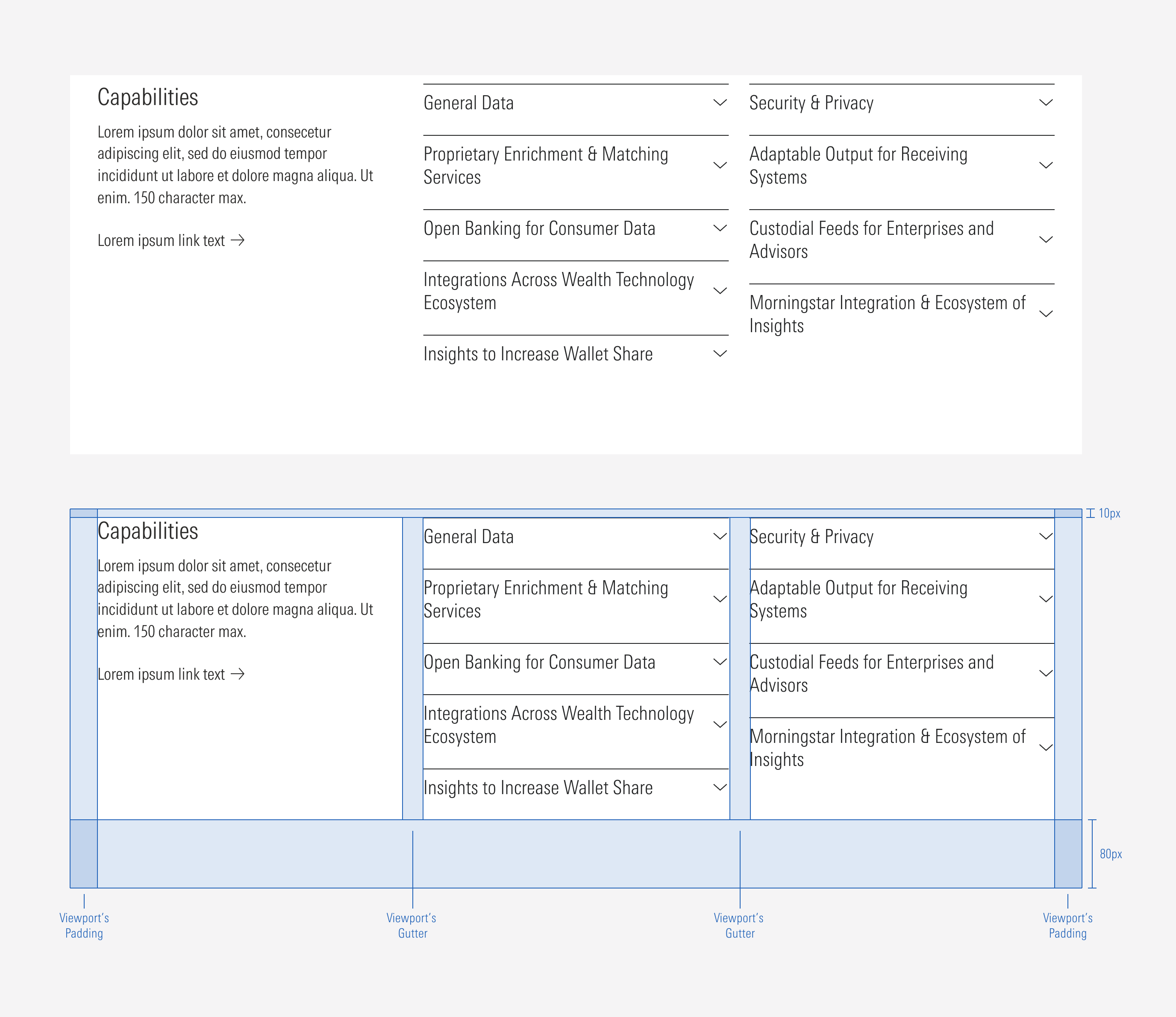
Grouped Accordions
An accordion container can add standard spacing between a group of accordions.The container can have one, two, or three columns. A group of accordions can be accompanied by a text block in the left slot when there are two or three columns.
Ensure that proper space is given between each accordion and group of accordions when placed next to each other. The vertical distance between accordions will be the same as the gutter of the view-port in which they are displayed.
1 Column: Accordions Only
2 Columns: A Text Block and One Accordion Group
3 Columns: Text Block and Two Accordion Groups