Cards
Card layouts are built upon the layout section component and define how multiple cards are arranged within this section.
Here we showcase the available configurations for displaying cards and how they adapt to different viewport sizes. Each layout option ensures consistent spacing, alignment, and visual hierarchy to maintain balance and readability across content types.
Variations
Grid Type
Card Layouts inherit the same two grid types of the layout section. Each grid type defines how cards are distributed within the layout and how they respond across breakpoints.
- 2/3rd: Use to display content with a text block, to give more context. This variation gives the same level of importance to the text block and the content. Also use this option to give “white” space to the layout. Ideal for layouts where a few cards are needed to be displayed.
- Full width: Use to display content with a text block, present them to give more context. This variation gives the text block the primary level of importance and gives the content more space (width) to be displayed. Ideal for layouts that need to display several cards.
Gutter Style
Card layouts support up to four gutter styles that define the horizontal and vertical spacing between cards. Gutters establish rhythm, visual balance, and hierarchy within a layout.
The available styles are:
- Gutter: Default spacing that provides comfortable separation between cards. The gutter’s pixel number between cards, would be the same as the viewport’s grid gutter.
- Tight: Reduced spacing for denser layouts or compact content areas. It has a 2px gutter between cards.
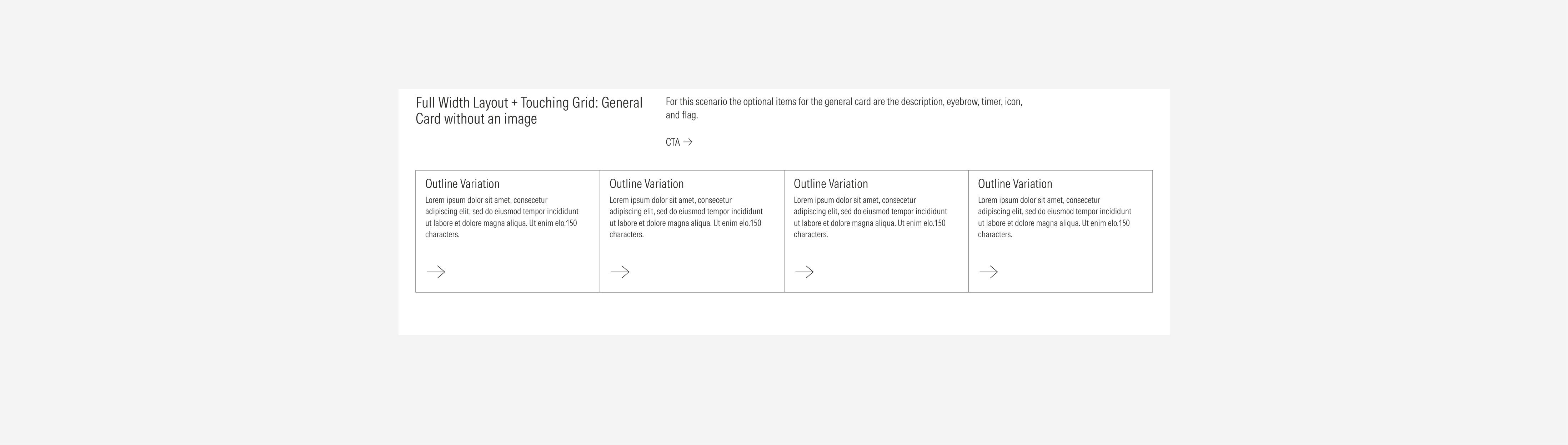
- Touching: Cards sit edge-to-edge with no visible space between them. It has a 0px gutter between cards.
- Divider: Uses a thin dividing line between cards to visually separate content. It has a 0px gutter between cards.
Note all card layouts support every gutter style. The available options depend on the selected grid type and the card type. Each style adapts responsively to maintain consistent alignment and spacing logic across breakpoints.
Card Layout Configurations
The following overview illustrates all available card layout configurations for each grid type, combining the different gutter styles and cards. Use this visual reference to understand the structural possibilities .

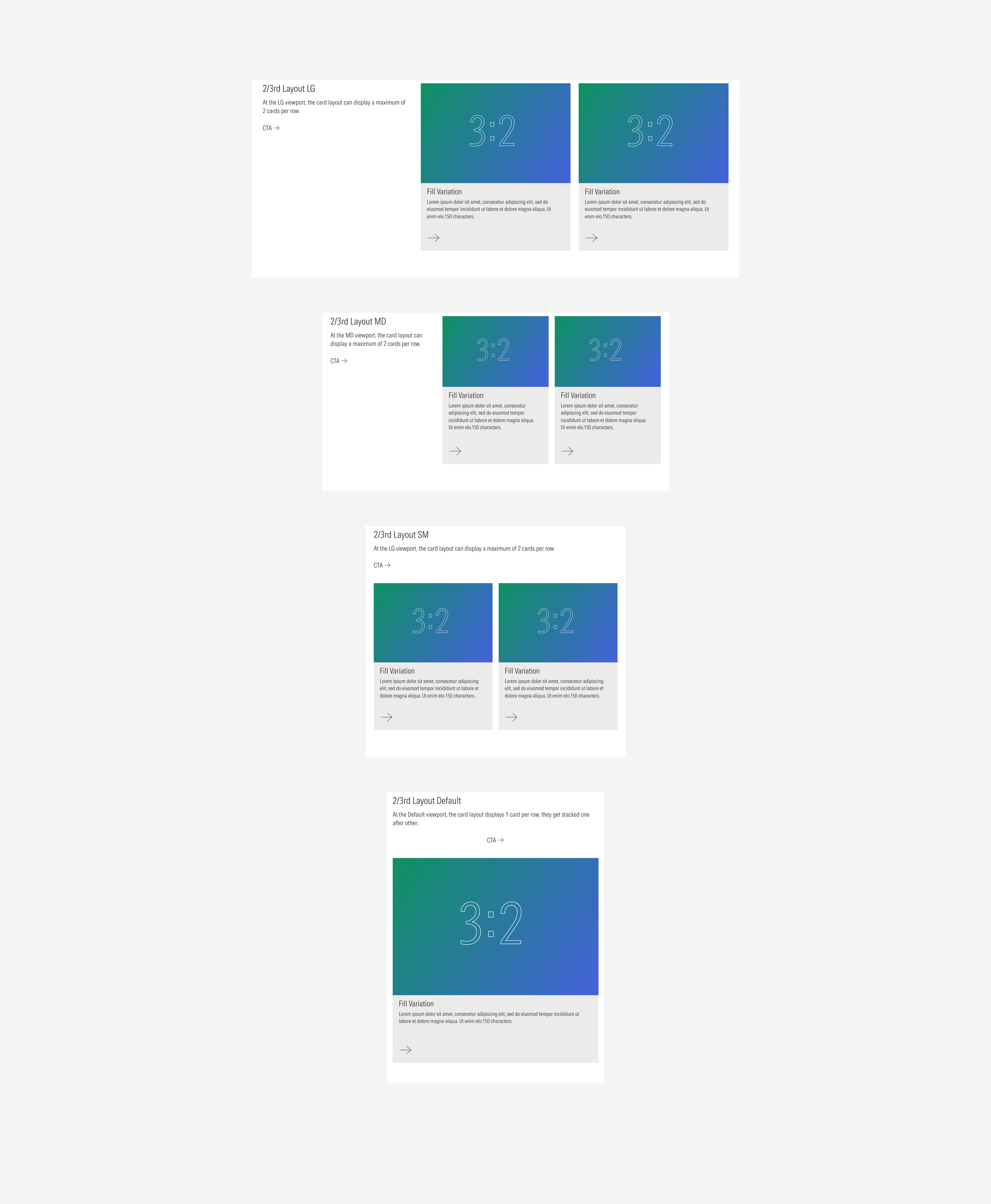
2/3rd Grid Type
The 2/3rd grid type divides the layout into two uneven columns — one occupying two-thirds of the width and the other one-third. In card layouts, this grid type is ideal for showcasing a mix of primary and secondary content, where visual hierarchy and balance are key.
The following examples illustrate the possible card arrangements within the 2/3rd grid type, showing how cards will look on each gutter style.
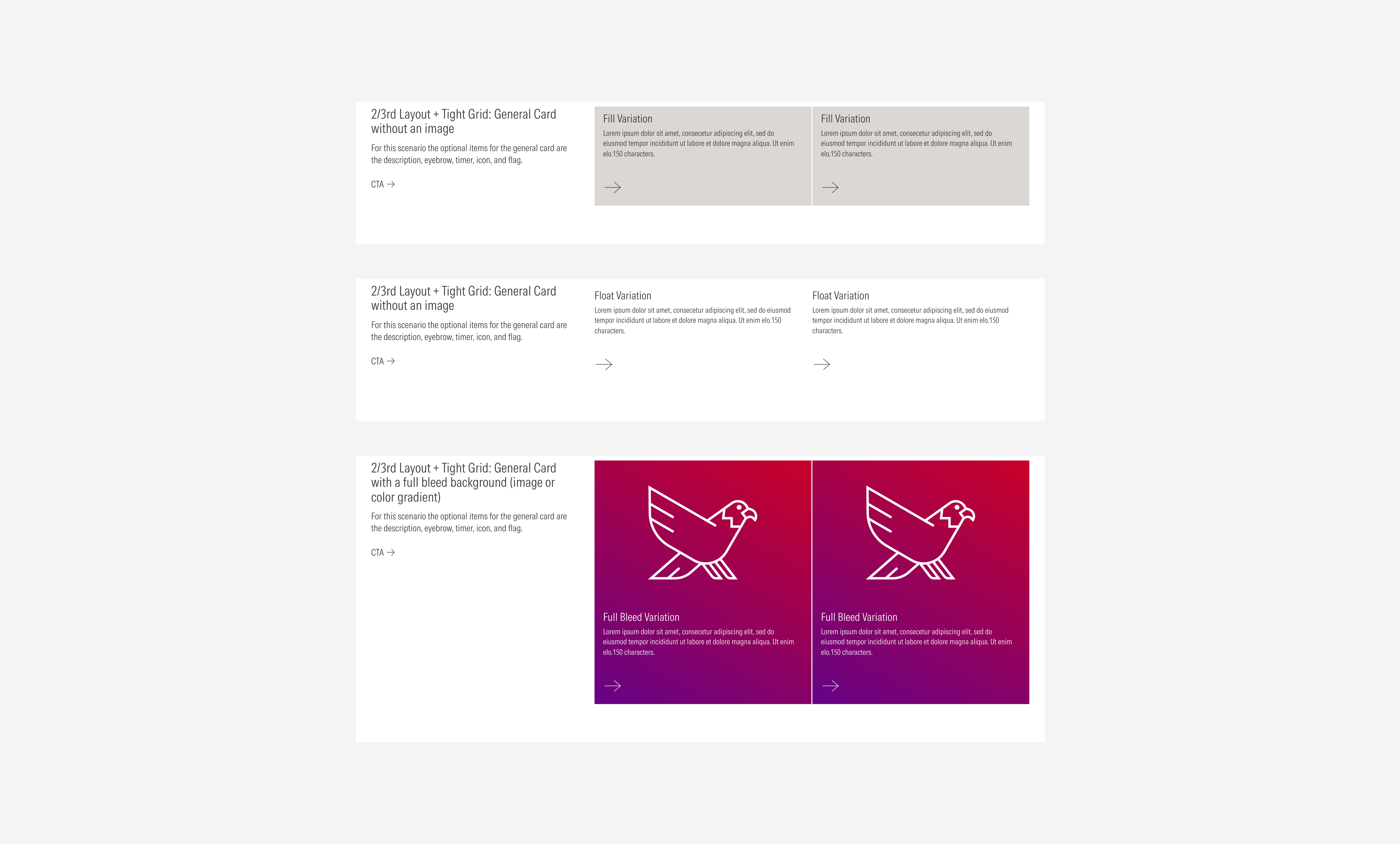
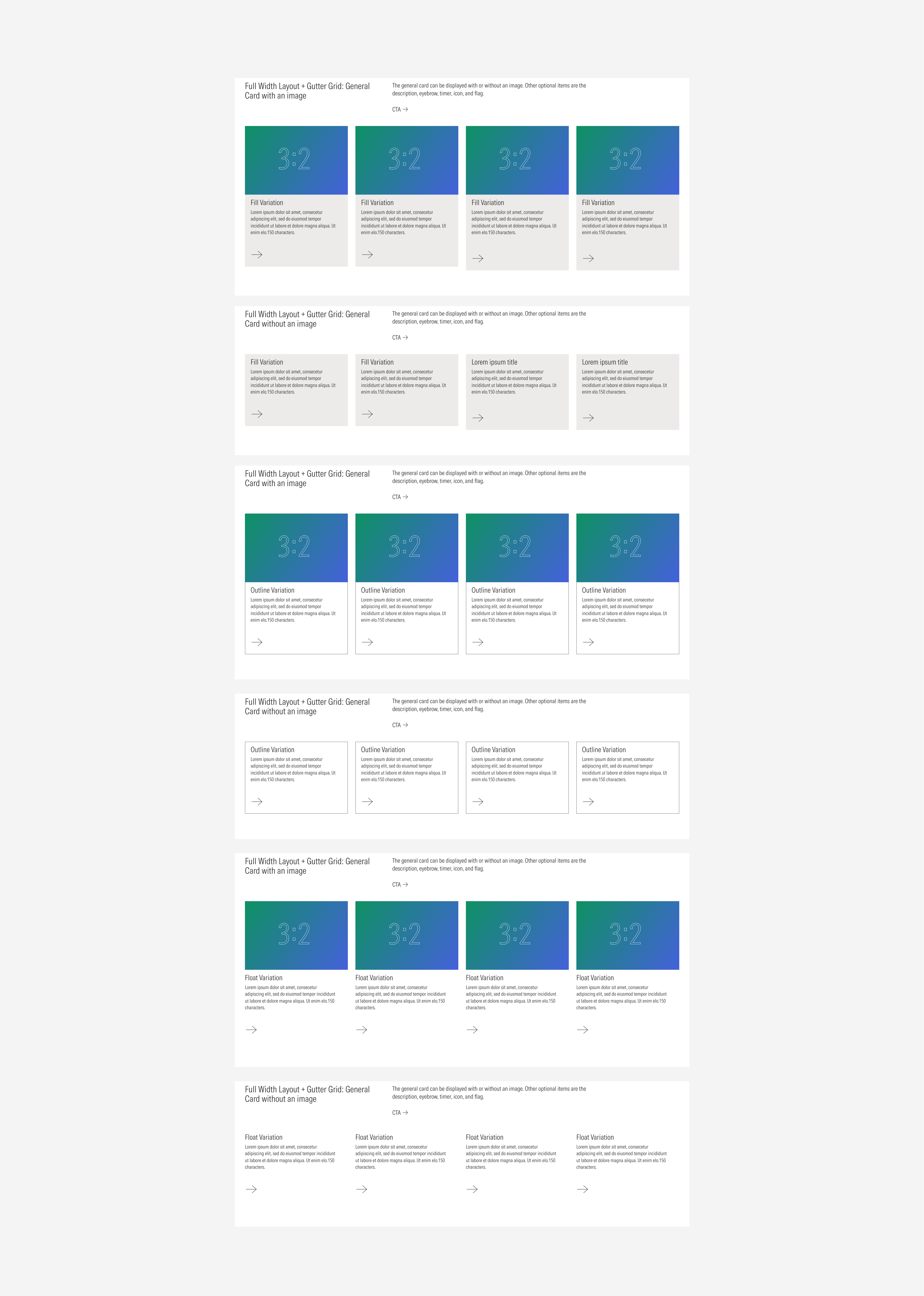
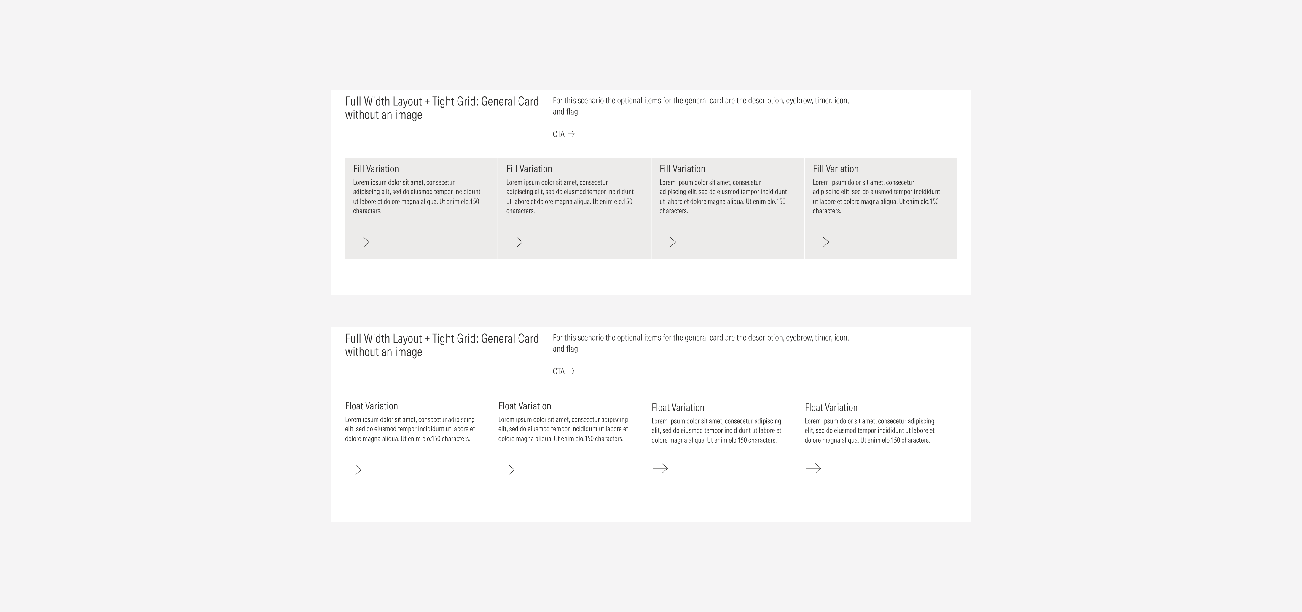
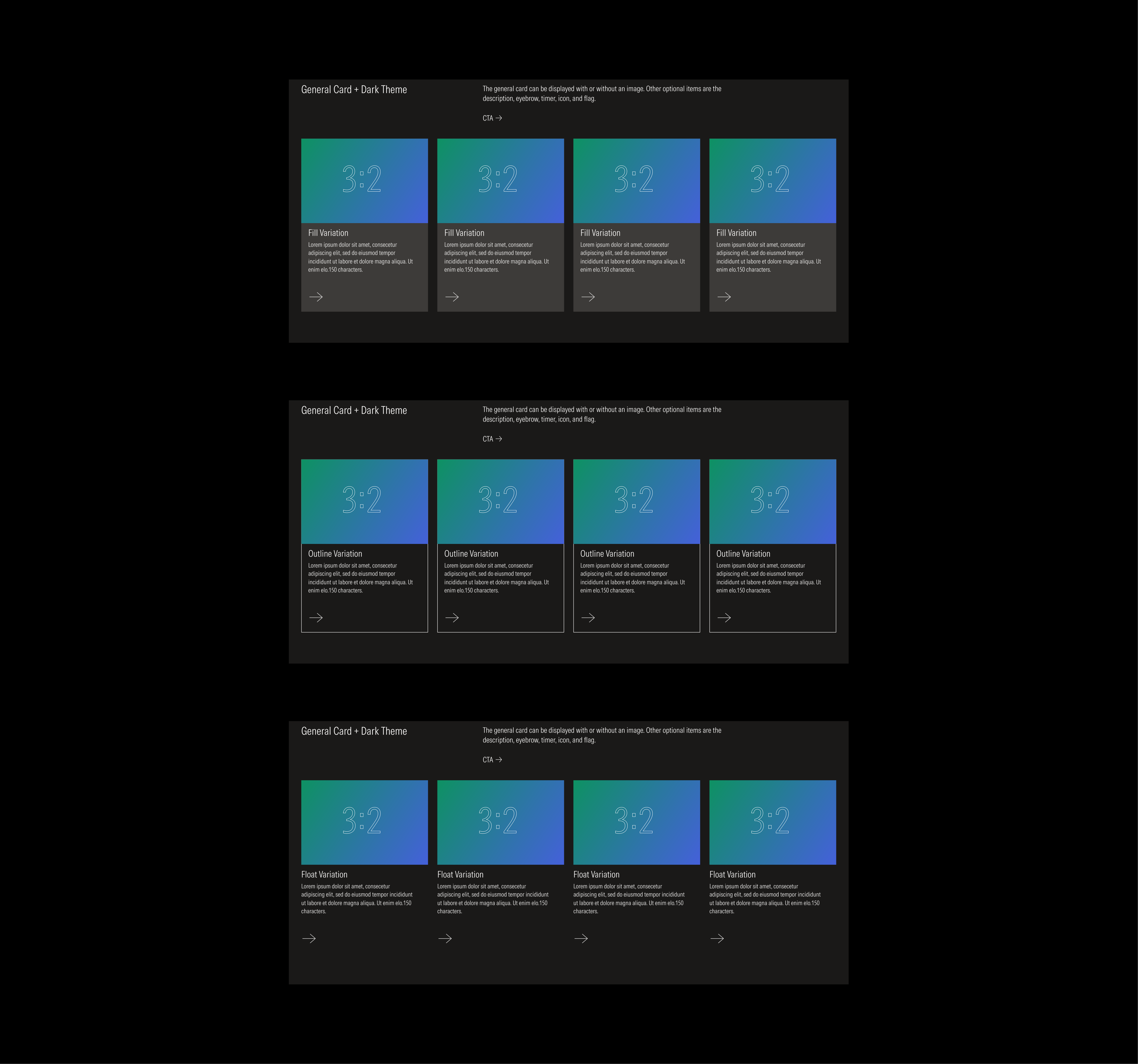
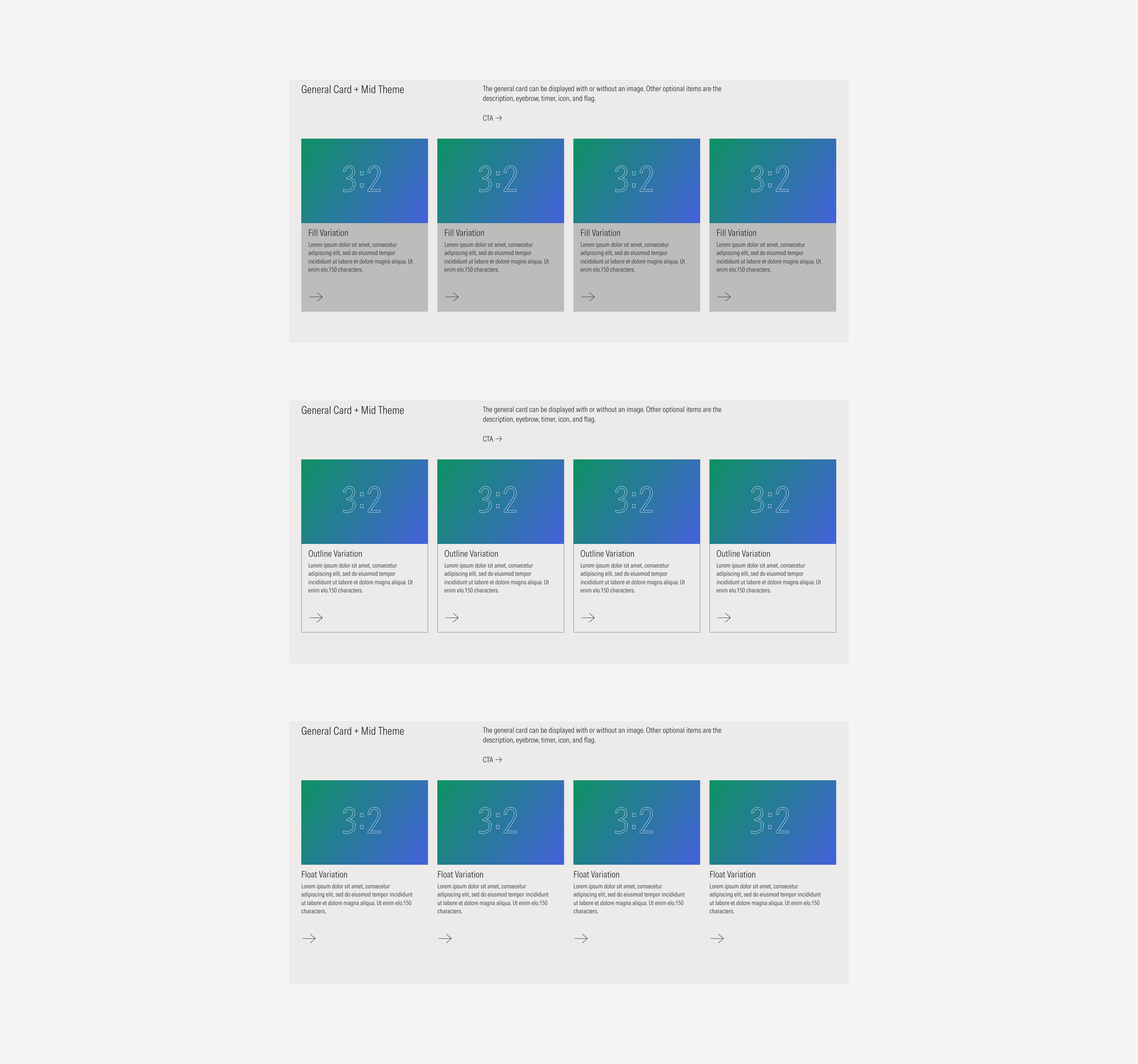
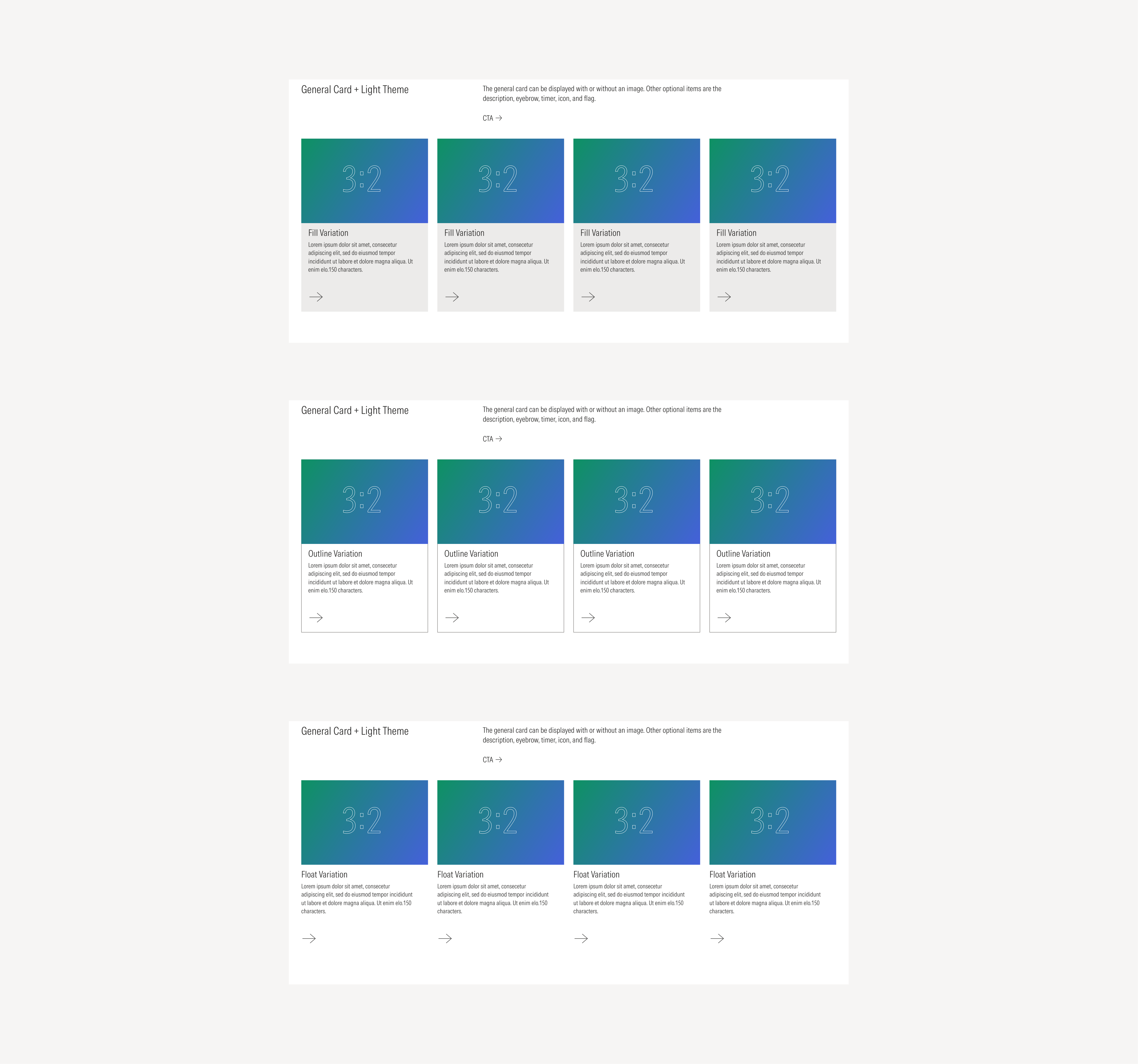
General Cards
General Cards are the foundational card style within the system and can be used across a wide range of layouts. They come in four visual variations that define their structure, elevation, and visual emphasis
- Fill: Uses a solid background color for emphasis and contrast.
- Outline: Displays a bordered container for a lighter, more minimal appearance.
- Float: Sits on a transparent background with no borders or shadows, allowing the layout background to show through.
- Full Bleed: Features a full image or color gradient background while maintaining internal paddings for the text content, ensuring legibility and visual balance.
The first three variations — fill, outline, and float — can optionally include an image that will be at the top of the card’s text block, while full bleed will have it as a background.
Below, we’ll show one example of each variation displayed across all available gutter styles, to illustrate how spacing and structure adapt within different layout configurations.


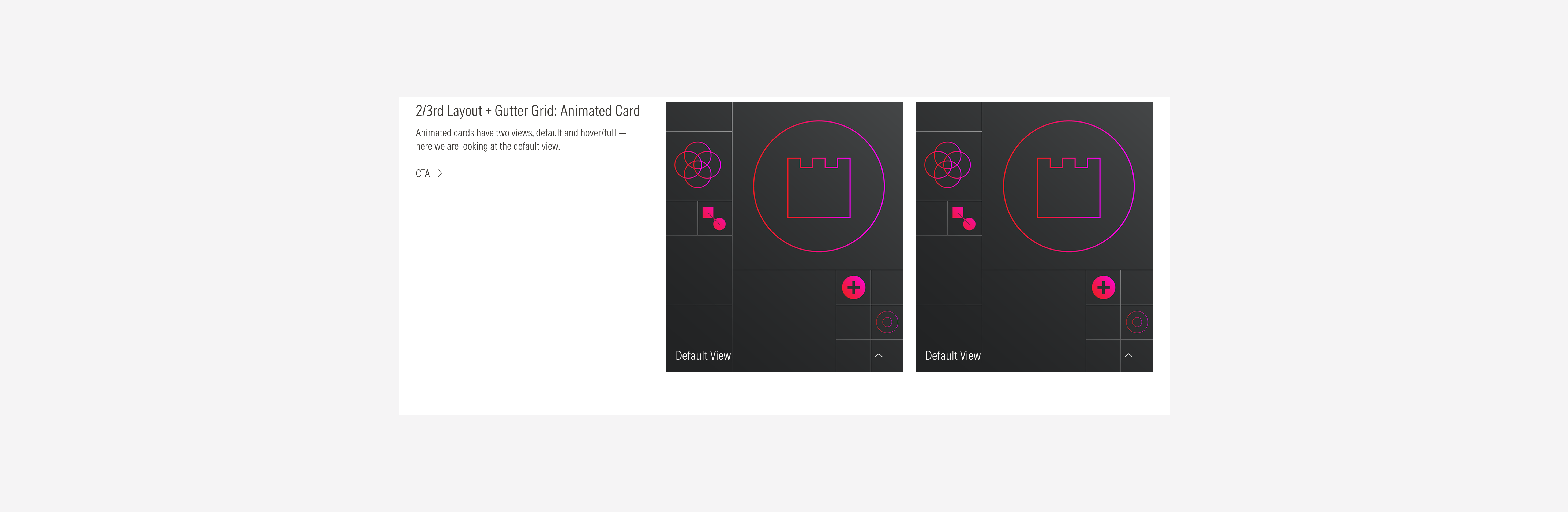
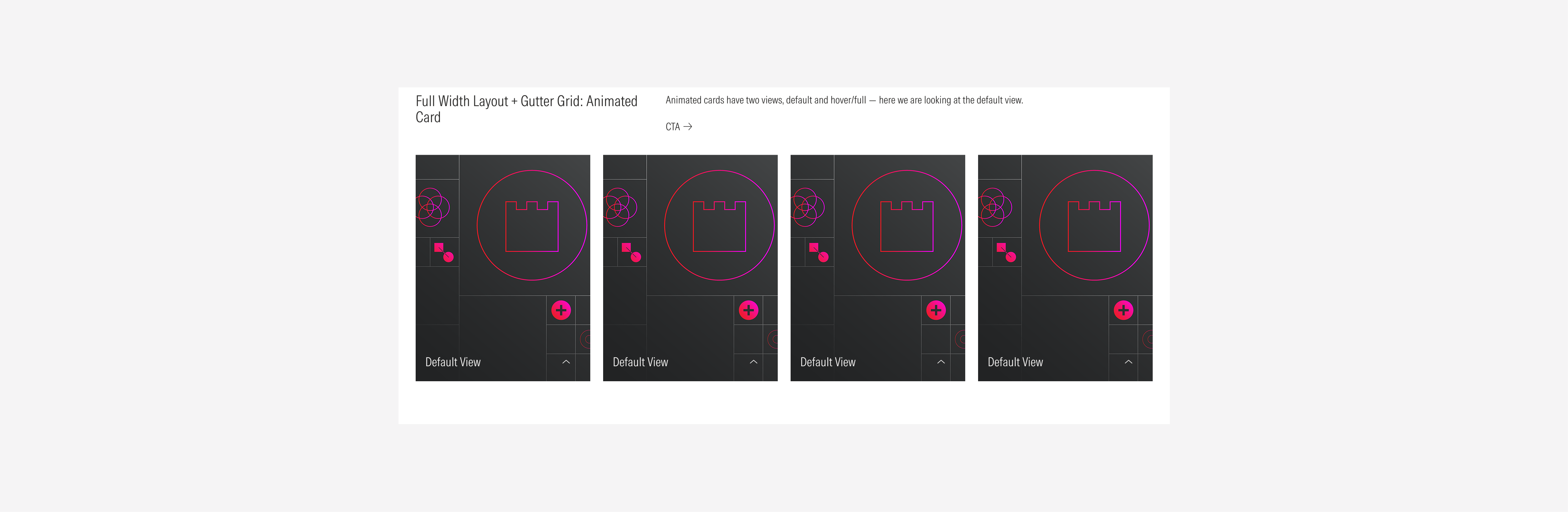
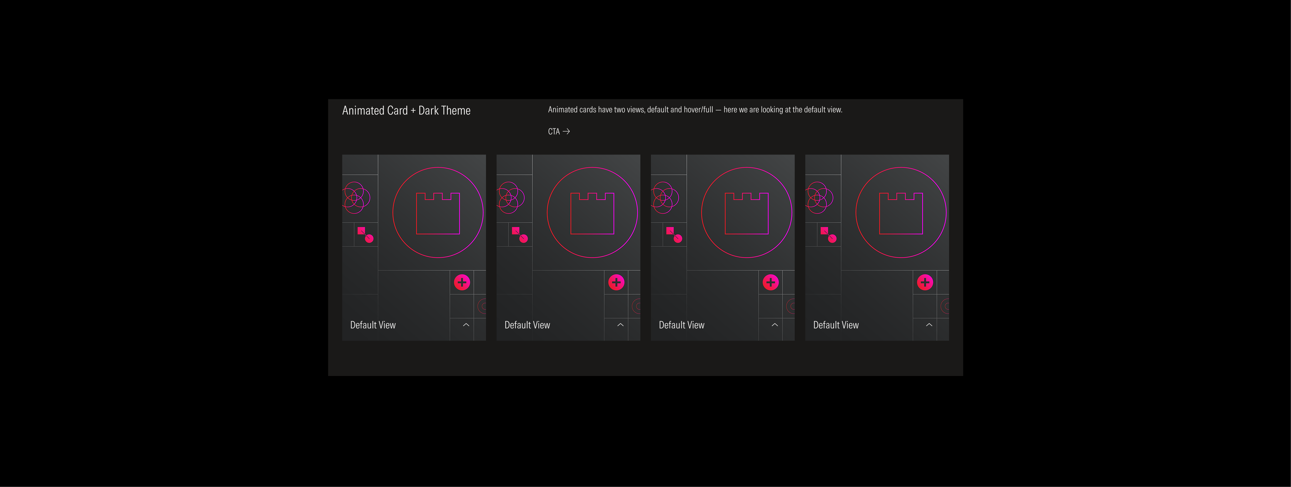
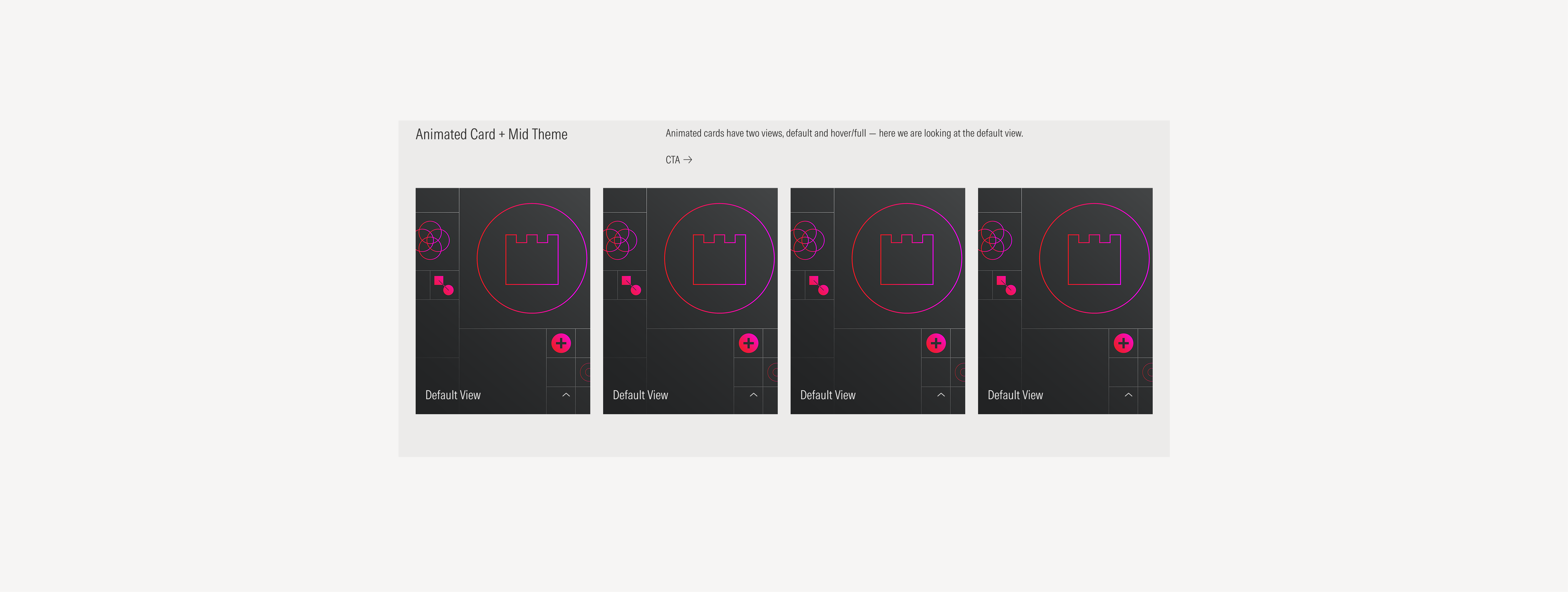
Animated Cards
Animated Cards share the same foundational structure as the full bleed general card, featuring a full background image or gradient with internal paddings that preserve text legibility and balance. Their main characteristic, as the name suggests, is the inclusion of animation — adding motion to enhance visual engagement while maintaining the layout’s consistency and readability.
Due to the nature of this card, it is recommended to be displayed only with the gutter grid style.
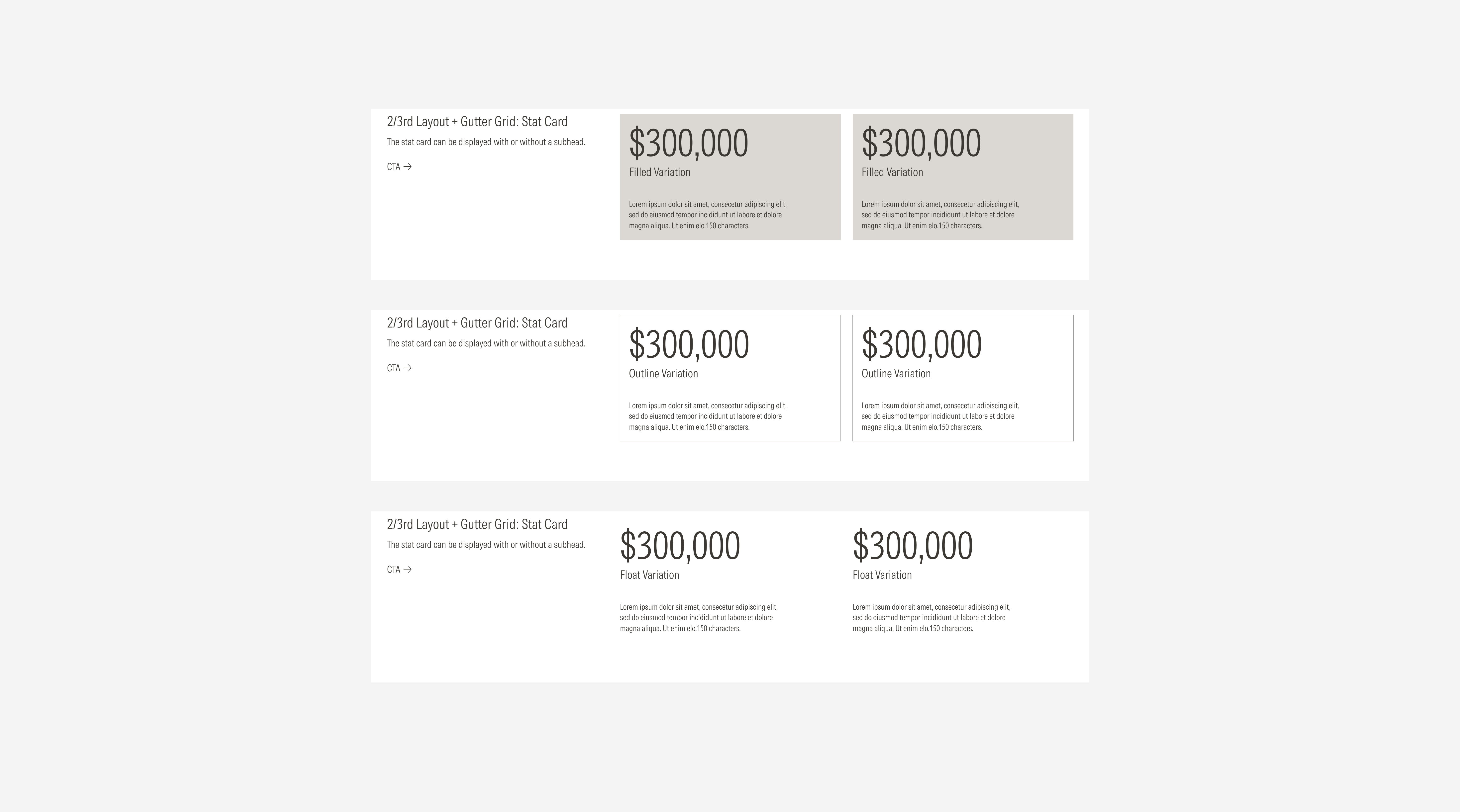
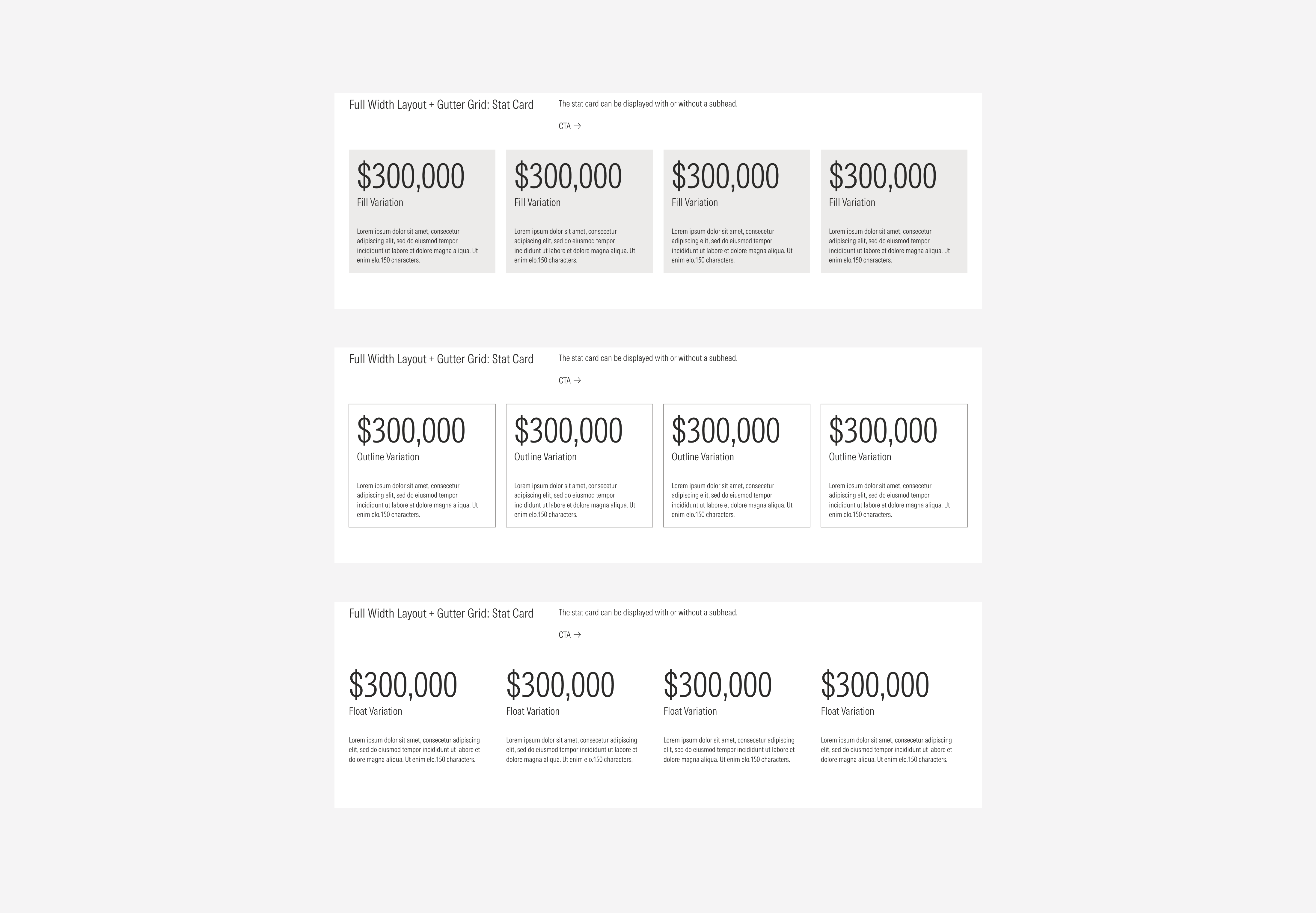
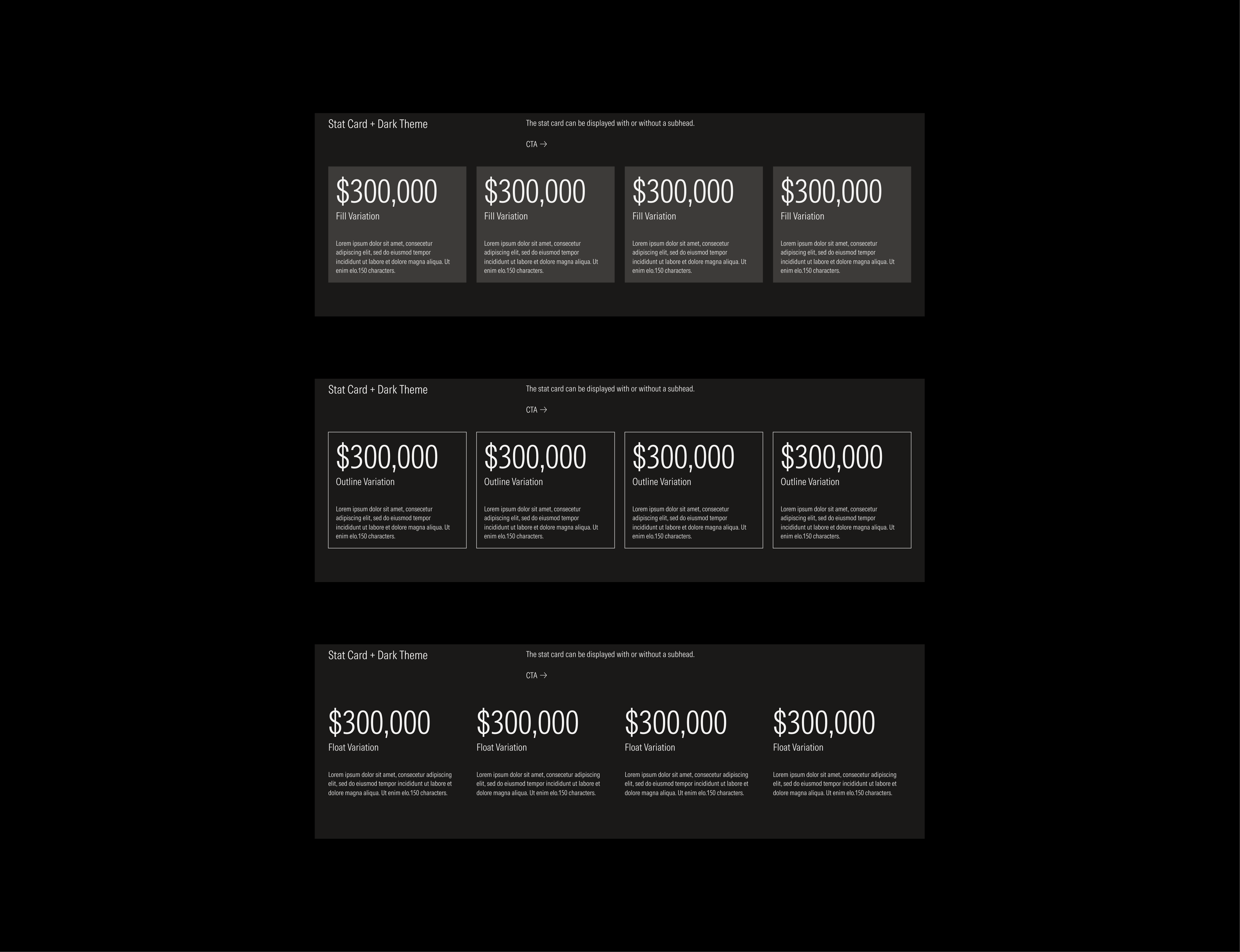
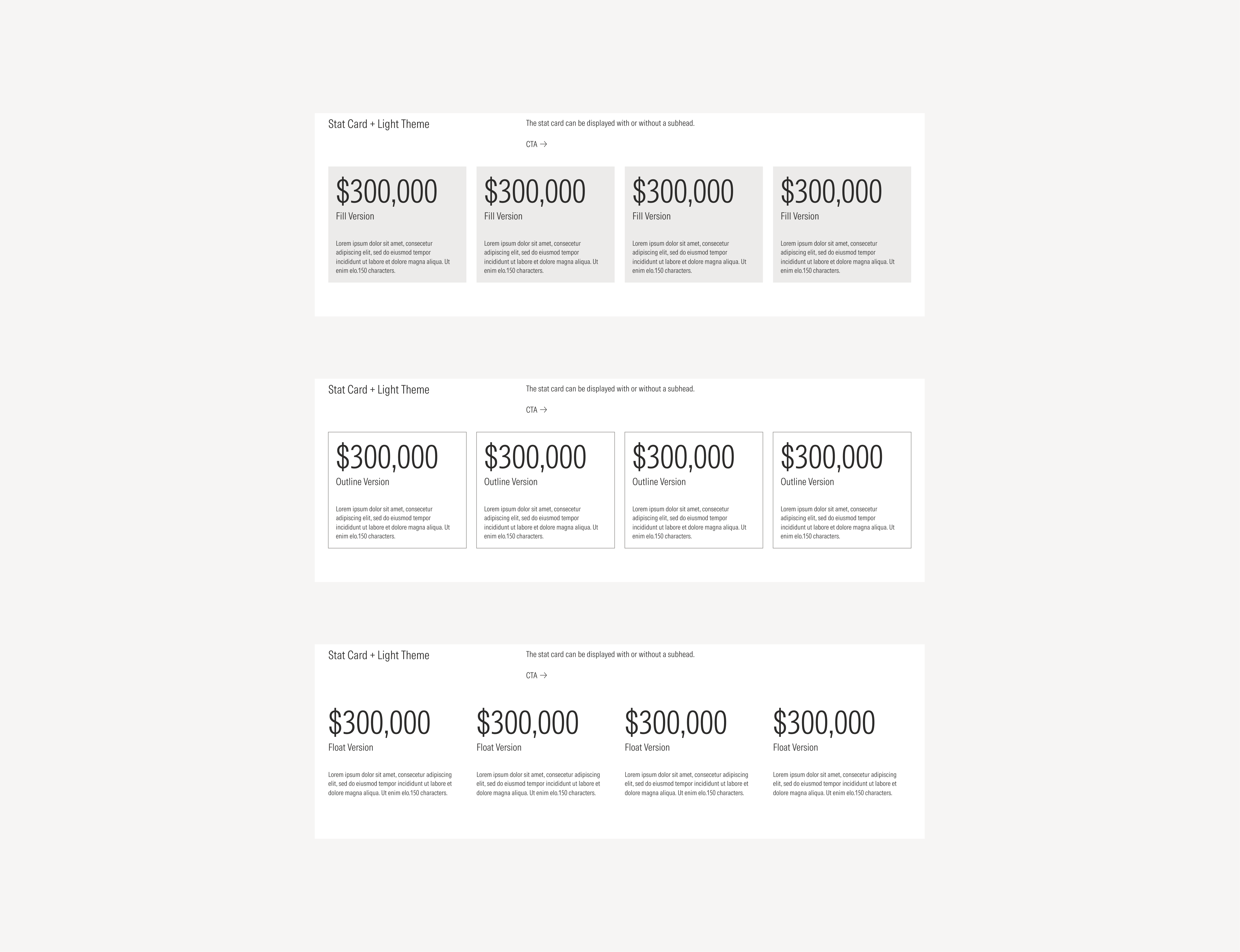
Stat Cards
The stat card component groups related information in a flexible-size container. It is widely used across the Morningstar B2B web experience to display and contextualize data, metrics, or statistics in a clear and consistent way.
Stat Cards share some visual similarities with general cards, they are also available in the fill, outline, and float variations; allowing them to adapt to different visual densities and background contexts. Each variation maintains the same internal spacing and typography hierarchy, ensuring legibility and consistency across layouts.
The following examples show the stat card component displayed across the different card layouts and grid types.


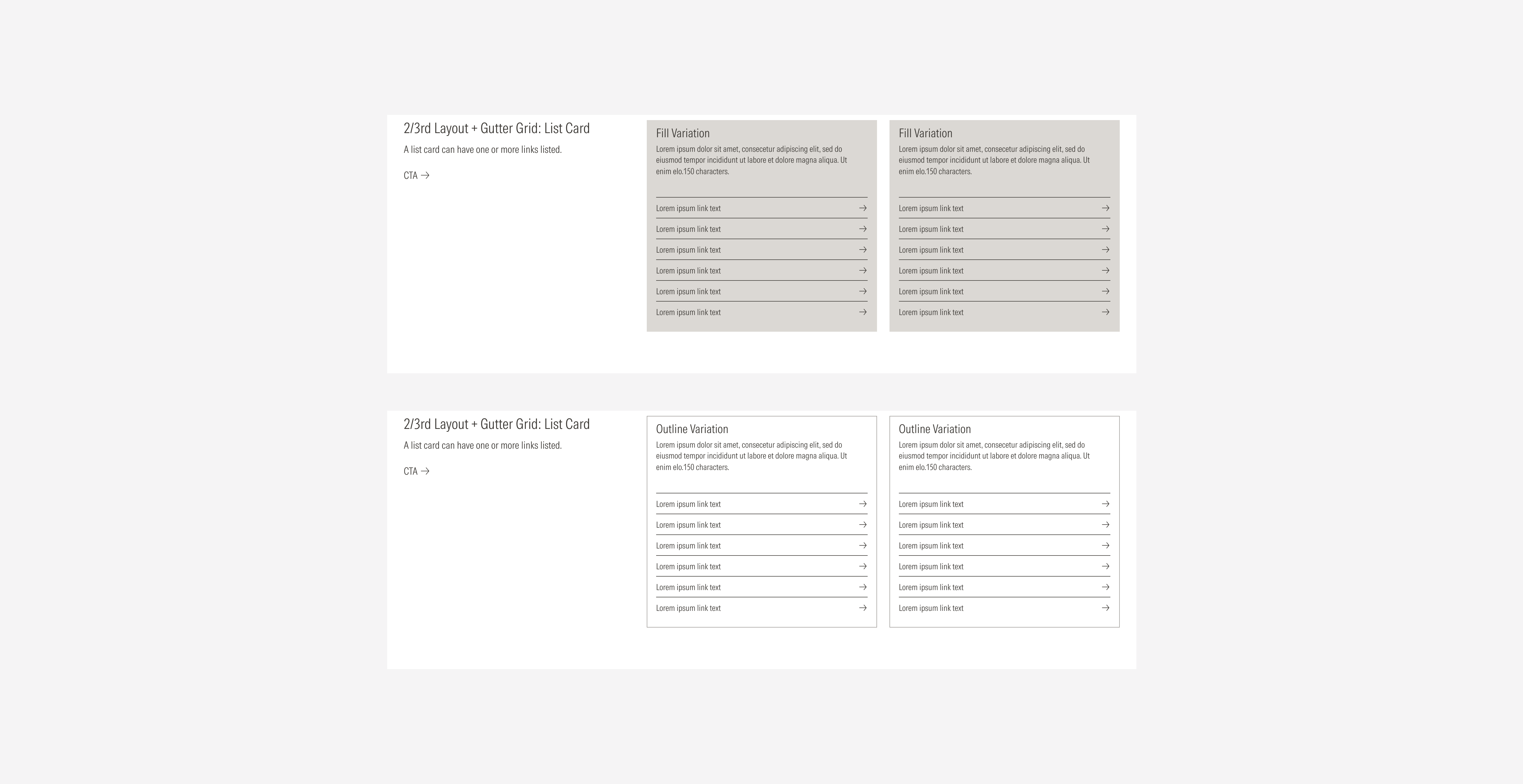
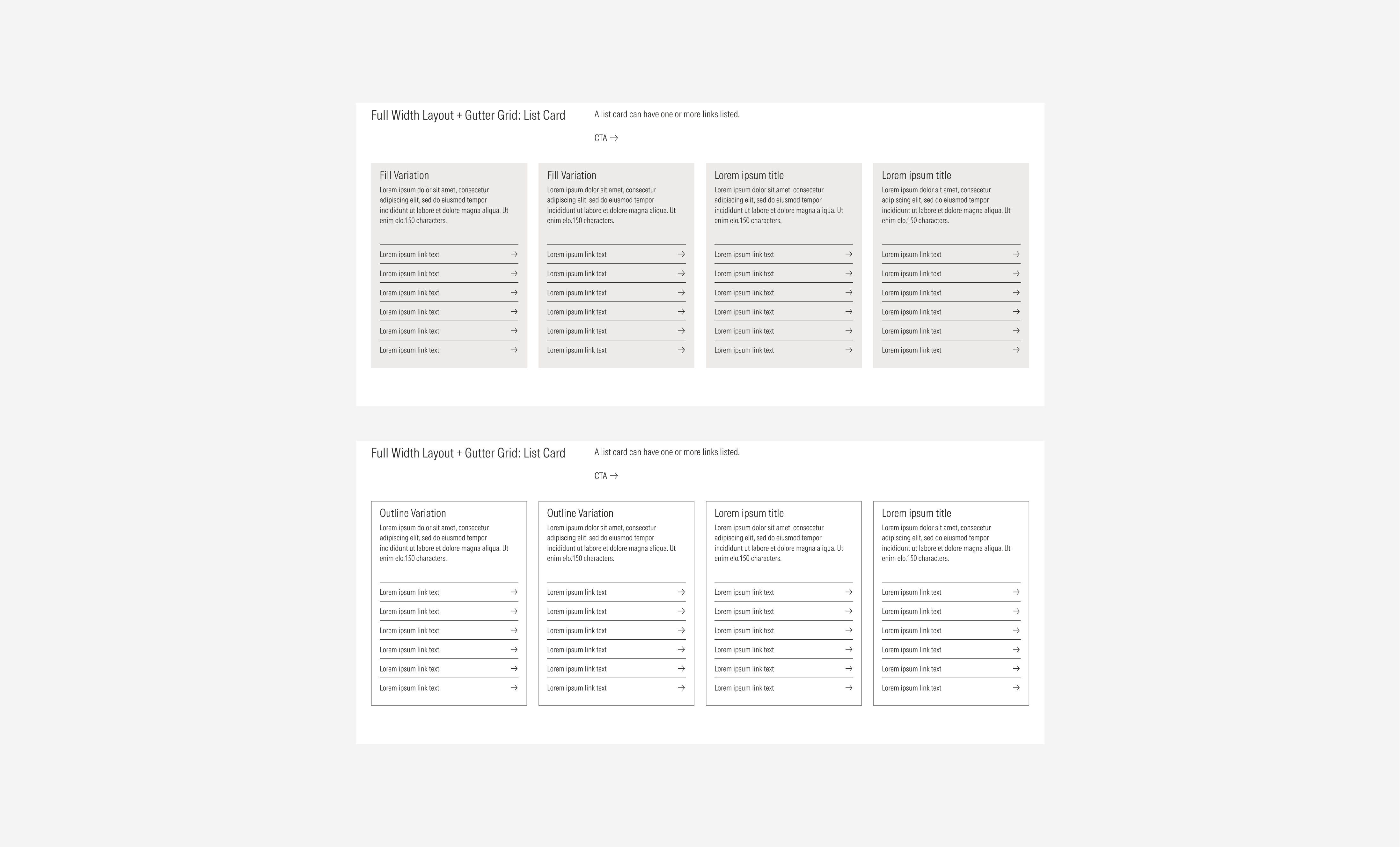
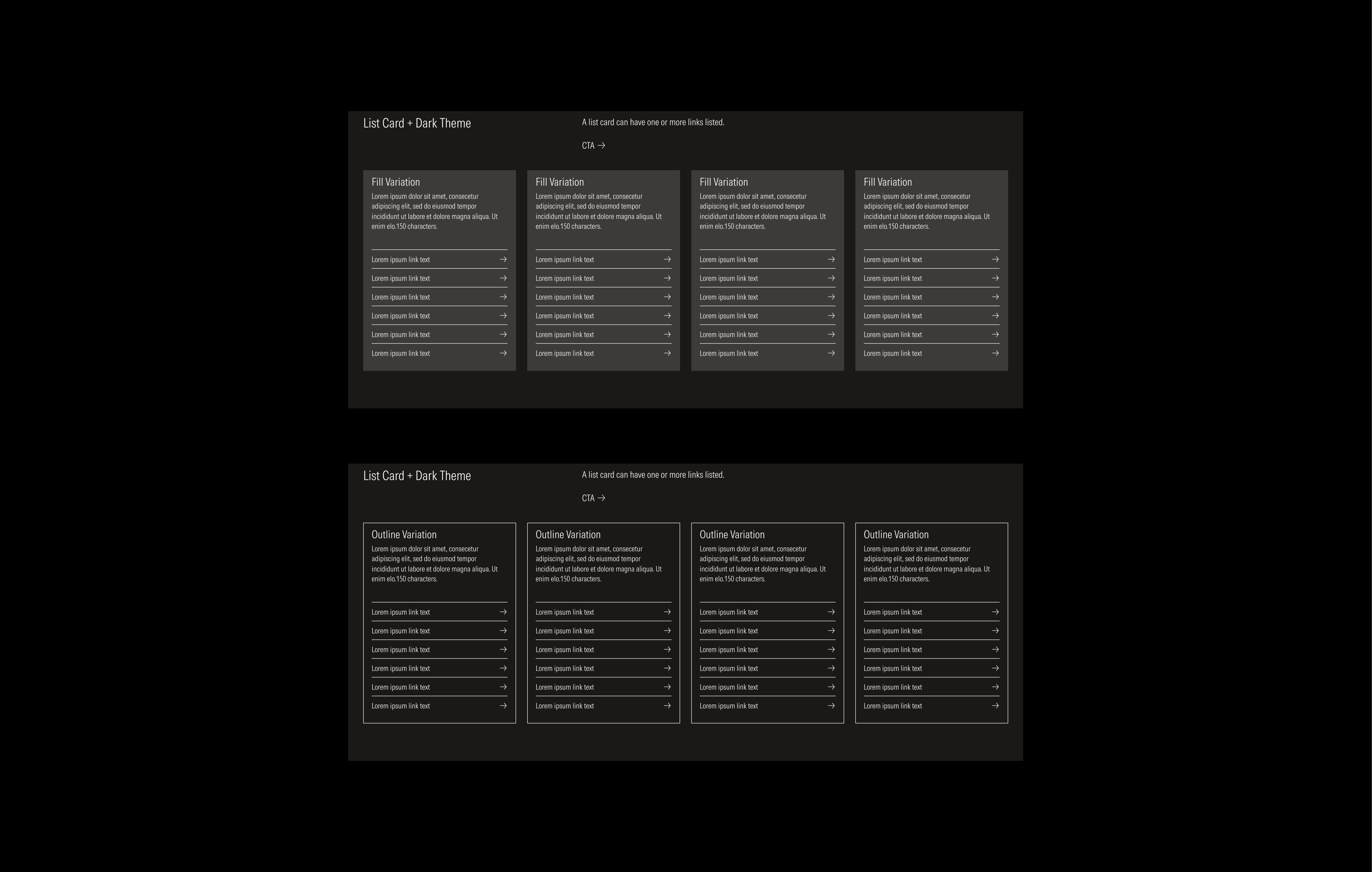
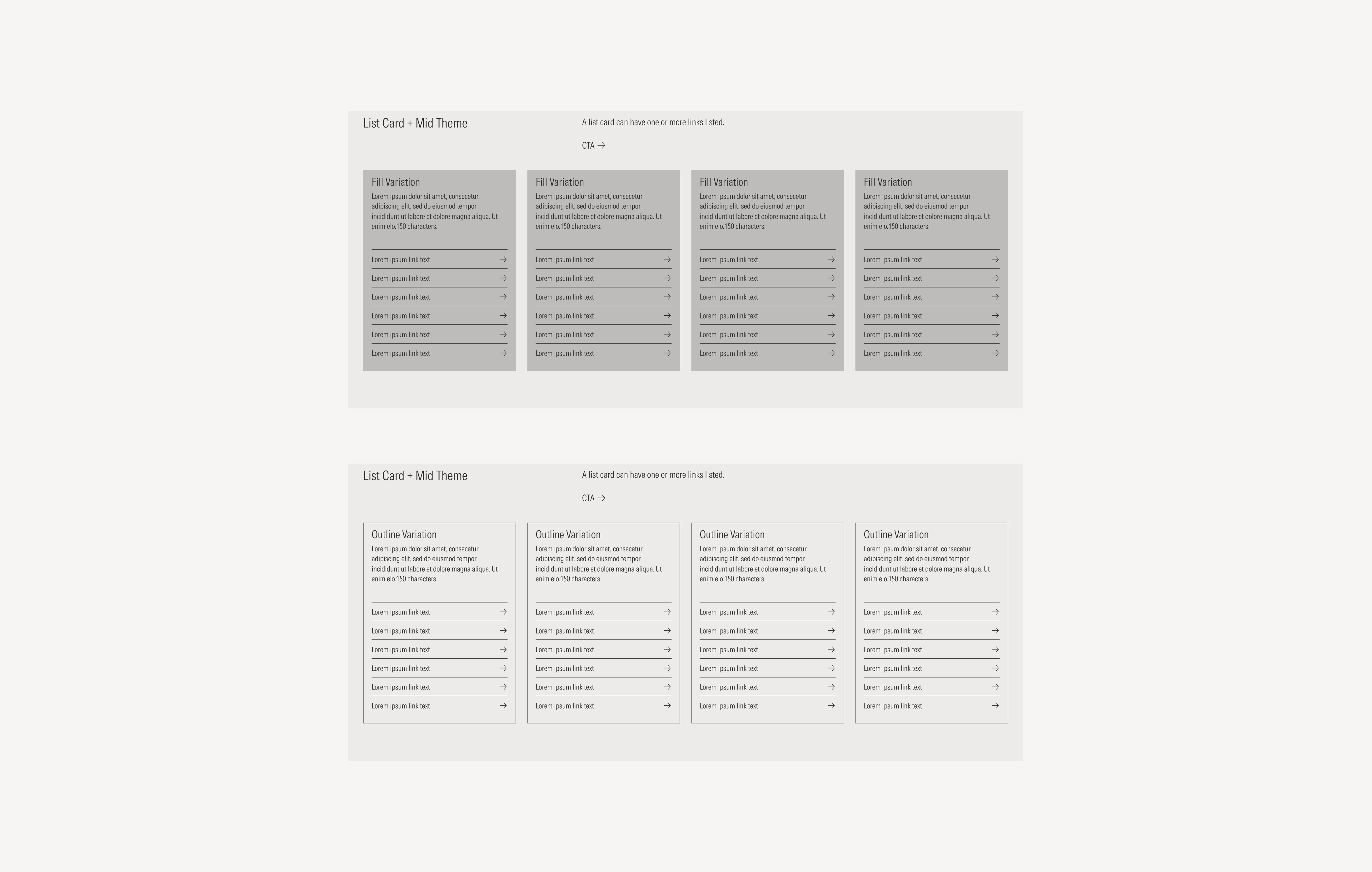
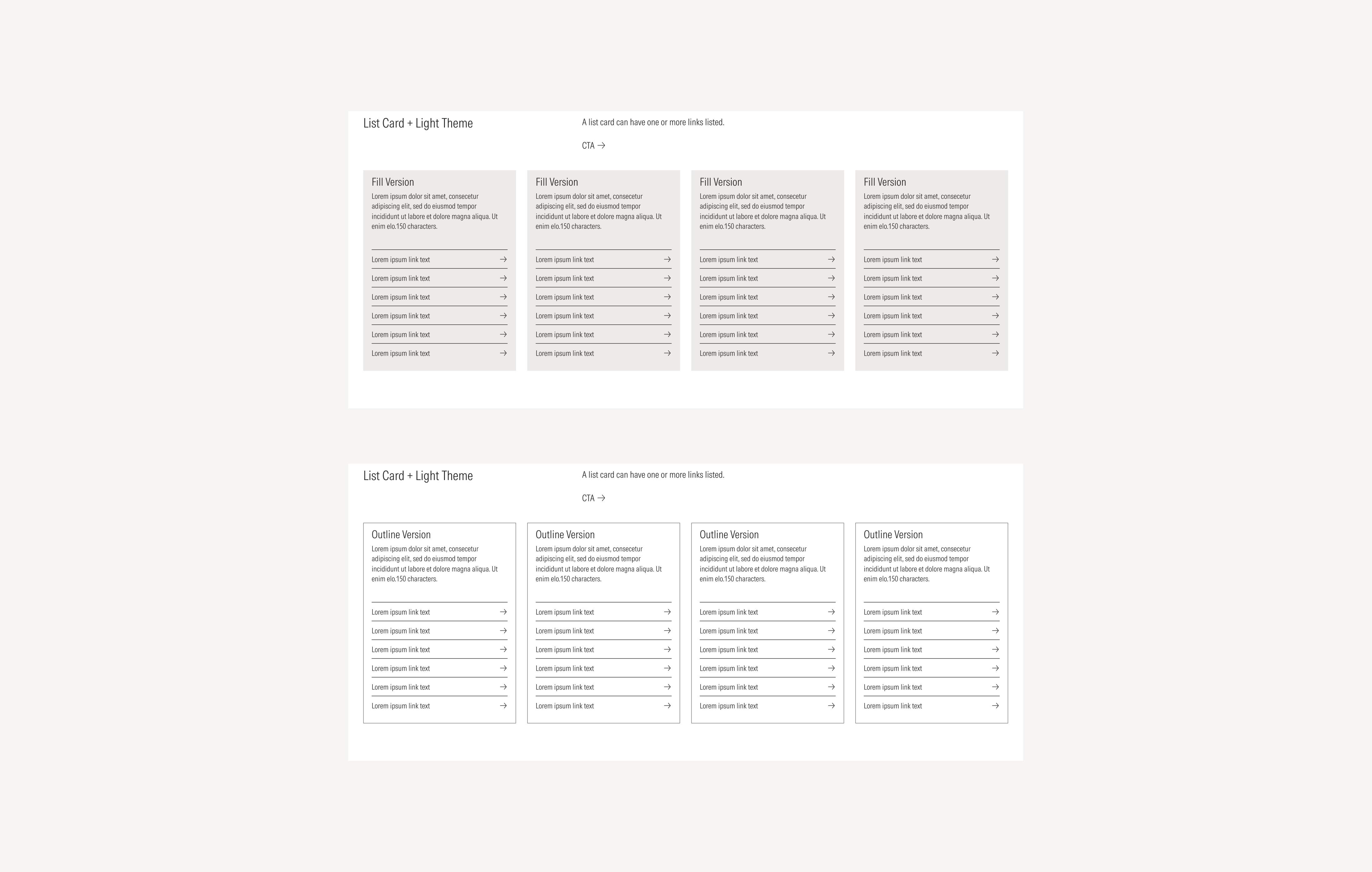
List Cards
List Cards are composed of two main elements: a text block and one or more links. They are designed to present grouped navigational or reference content in a compact, scannable format. A list card can include either a tertiary button or a list group, depending on the use case and interaction needs.
As with other card types, list cards are available in three visual variations: fill, outline, and float, allowing them to adapt seamlessly to different layout densities and background contexts. Each variation maintains consistent spacing, typography, and hierarchy to ensure clarity and usability across all card layouts and grid types.
Due to the nature of this card, it is recommended to be displayed only with the gutter grid style.
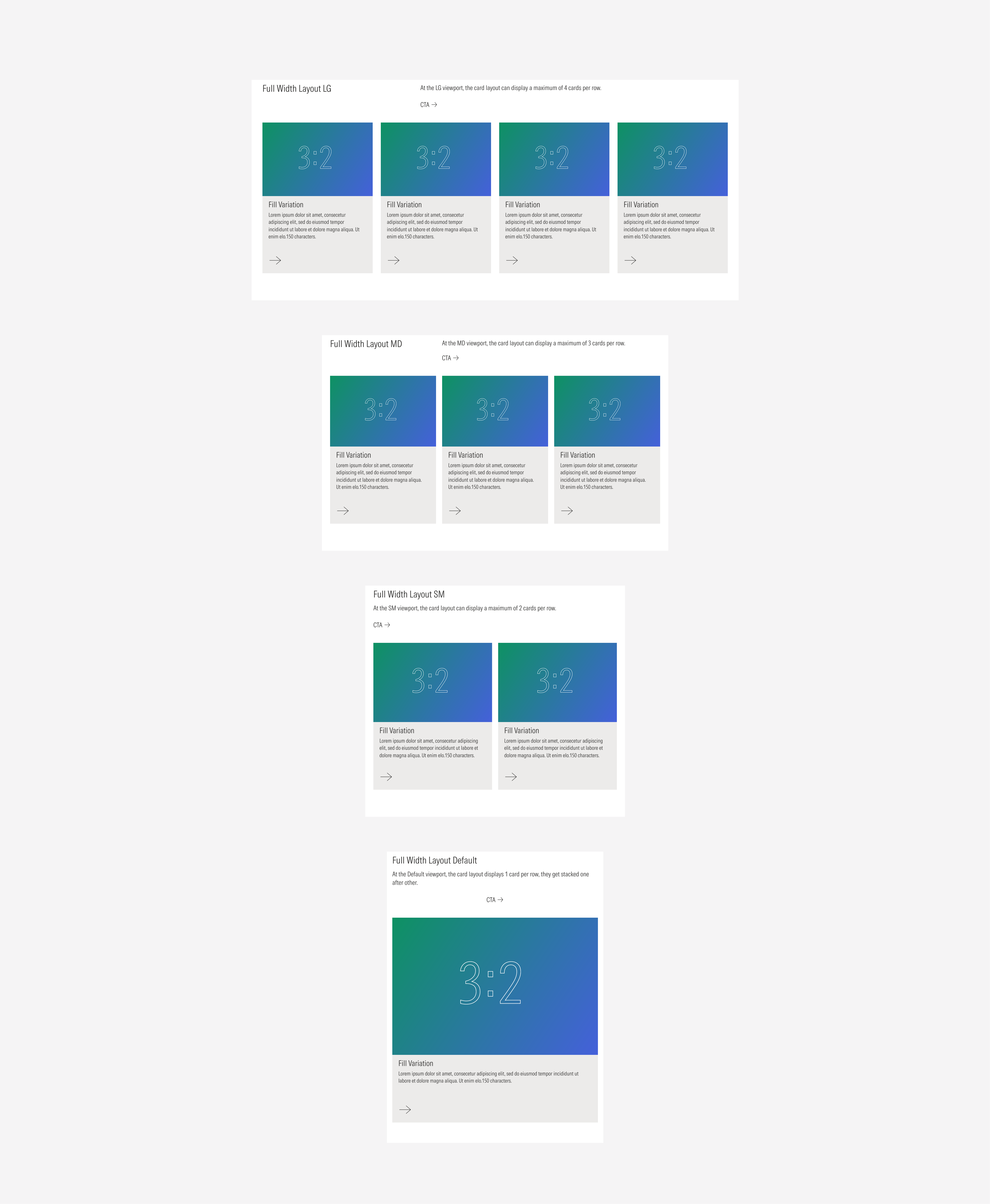
Full Width Grid Type
The full width grid type spans the entire horizontal space of the layout section and combines a horizontal text block with a card area below. Below the text block, cards are arranged in a responsive grid that can display up to four columns on larger viewports. This layout type is ideal for presenting a prominent section introduction followed by supporting content or featured items.
The following examples show how cards appear within the full width layout across the different gutter styles, highlighting how spacing, hierarchy, and alignment adapt across breakpoints.
General Cards
General cards keep their own characteristics as same as for the 2/3 layout. Below, we’ll show one example of each variation displayed across all available gutter styles, to illustrate how spacing and structure adapt within different layout configurations.

Animated Cards
Due to the nature of this card, it is recommended to be displayed only with the gutter grid style.
Stat Cards
The following examples show the stat card component displayed across the different card layouts and grid types.


List Cards
Due to the nature of this card, it is recommended to be displayed only with the gutter grid style.
Sizes
Card layouts are designed to adapt seamlessly across all supported viewports. Depending on the grid layout and the viewport size, both the number of visible columns and the card arrangement will adjust accordingly.
The following examples illustrate how each card section scales and reflows at different breakpoints, maintaining readability, balance, and consistency across devices. Please note that the examples use a single card type for demonstration purposes — all other card types follow the same responsive behavior.
2/3rd Grid Type
Full Width Grid Type
Themes
Card layouts are available in three visual themes — light, mid, and dark — allowing them to adapt to different brand contexts and content environments. Each theme defines its own background, text, and accent color variables while maintaining consistent structure and spacing across all components.
The following examples illustrate how the same card section appears across the three themes. Please note that the examples use a single grid type, and in one of the viewport for demonstration purposes — all others follow the same visual behavior and theme logic.
Dark Theme
Mid Theme
Light Theme
