Navigation
The footer contains an overview at the end of the page.
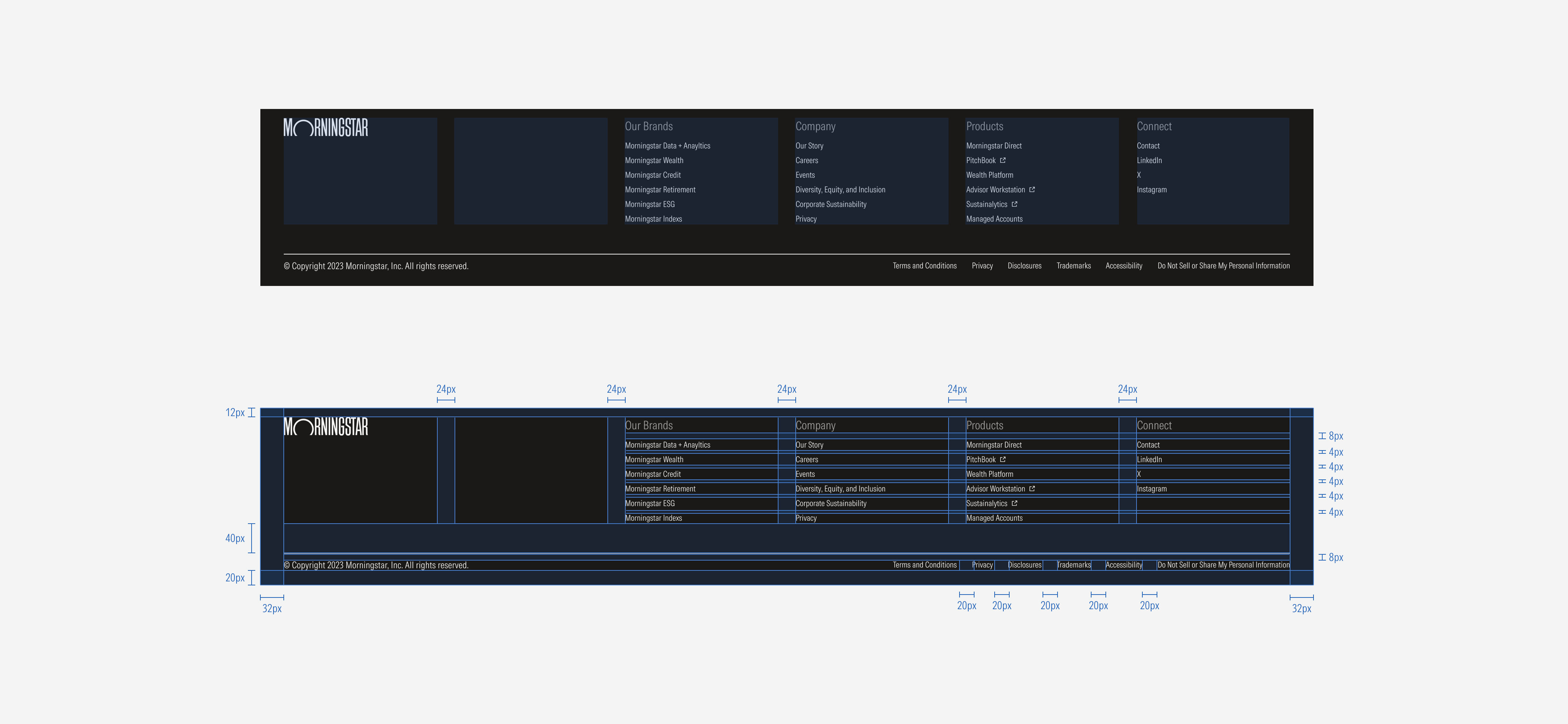
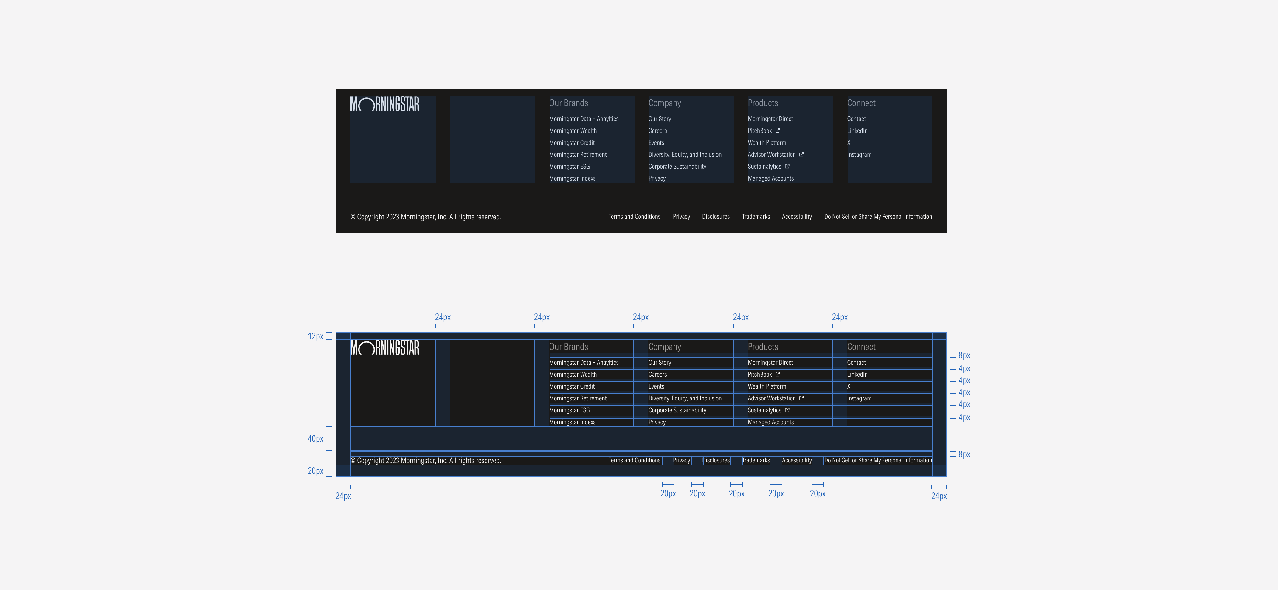
SM and Default Breakpoints
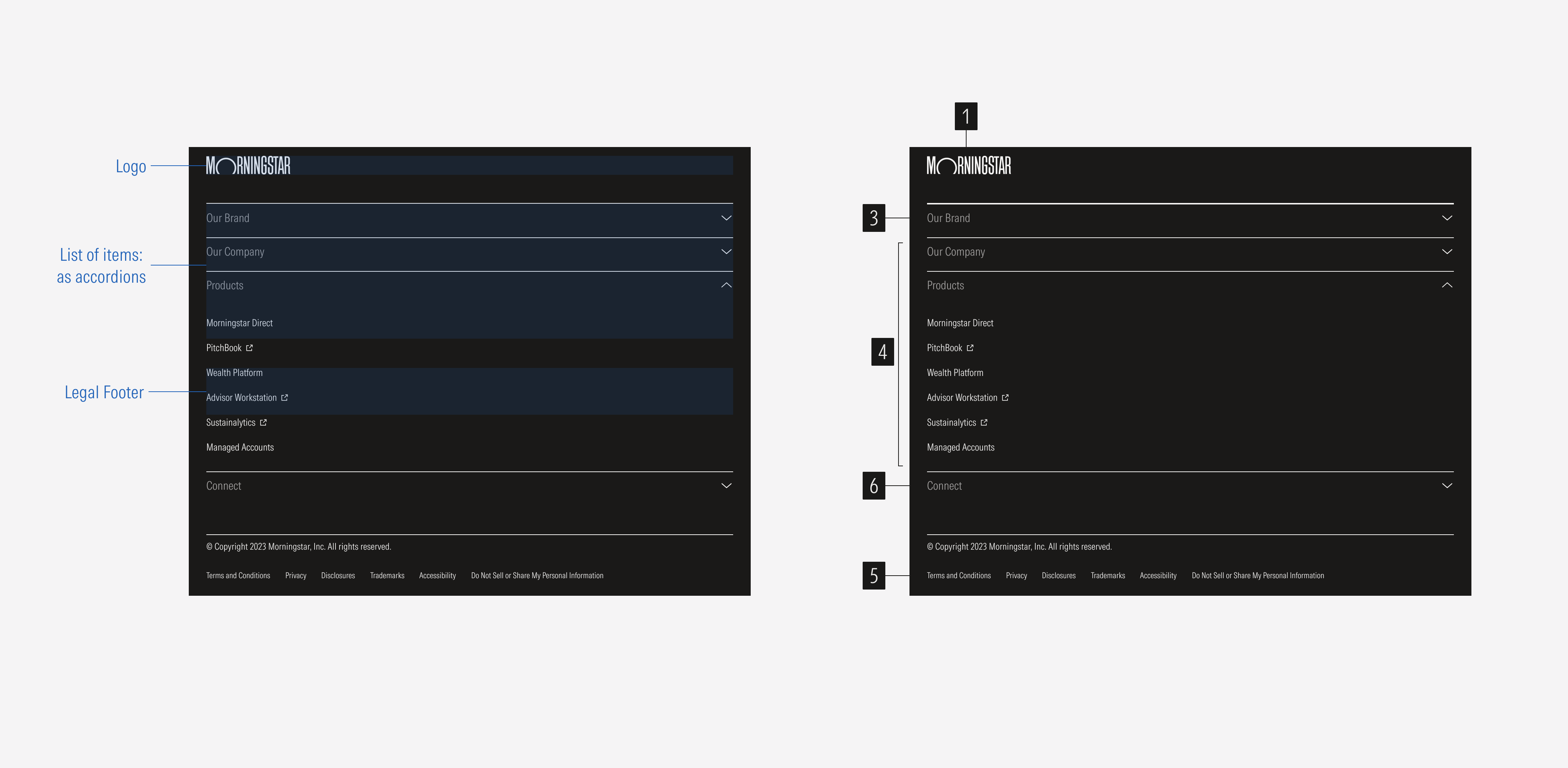
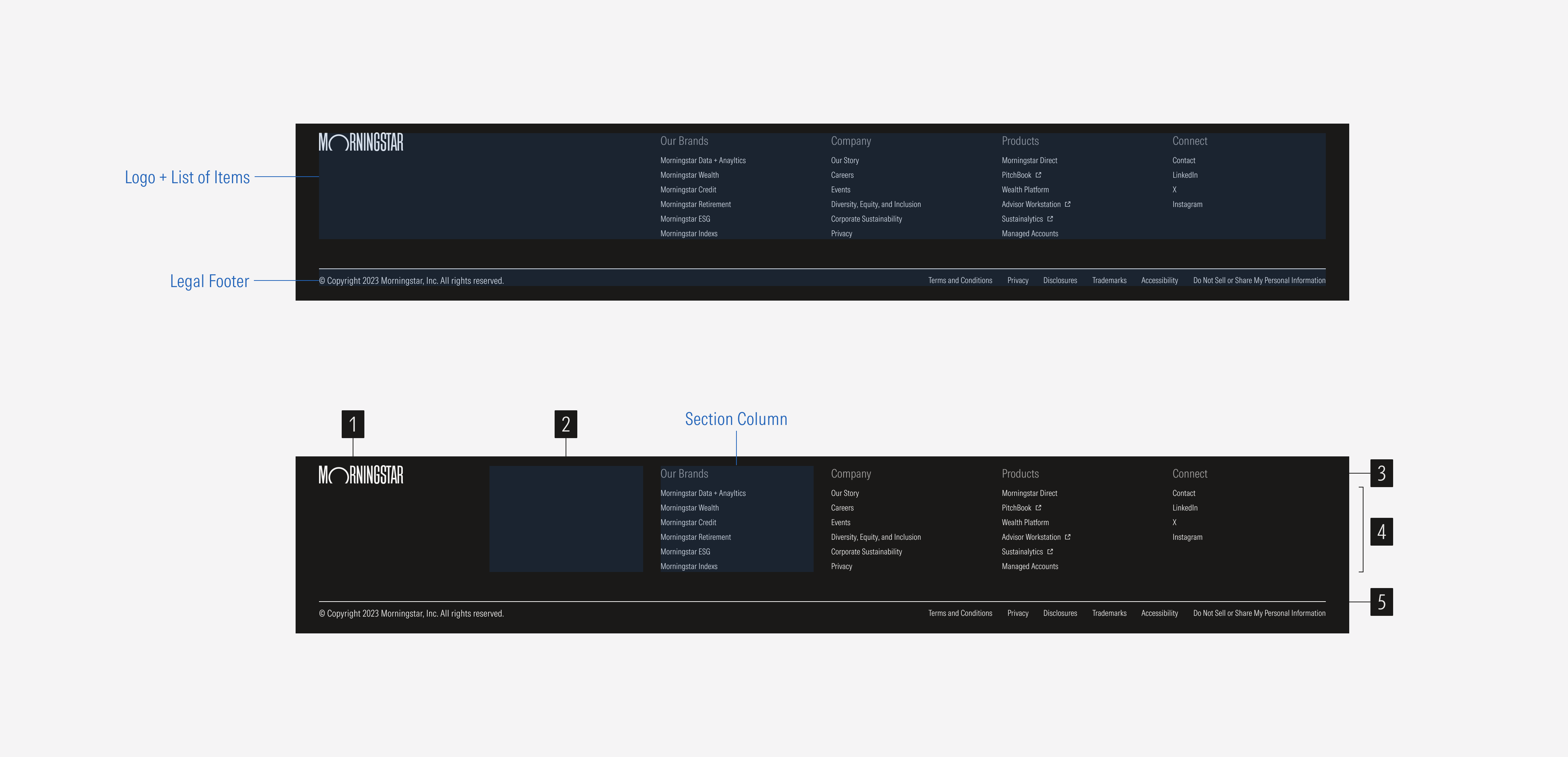
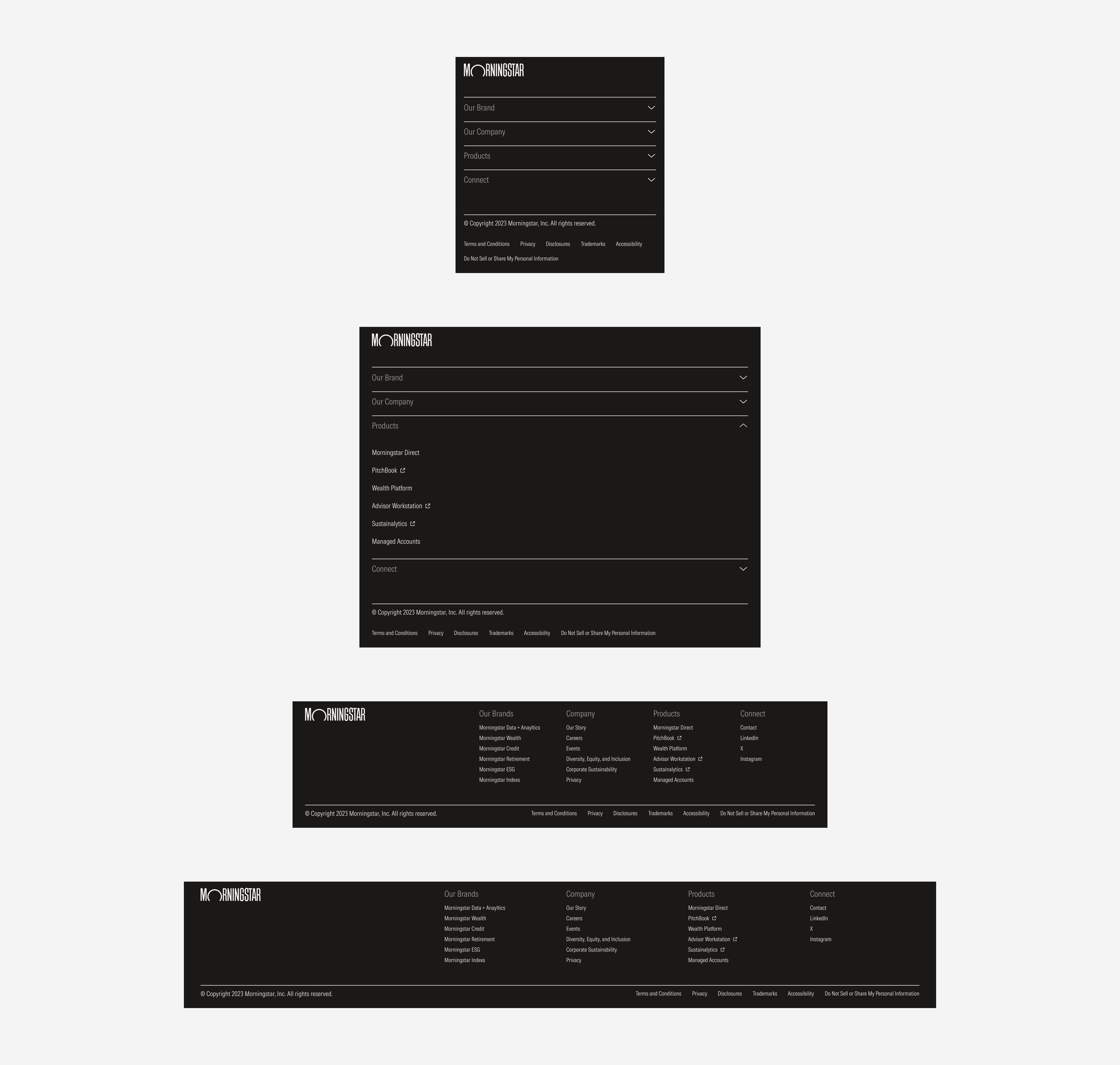
- Logo is a slot where the company logo will be displayed.
- Spacer expands the space between the logo and the lists of items to aid navigation.
- Category title represents a main section of first-level options.
- Page link is a group of link options that belong to a section or main category.
- Divider line separates options within a bar.
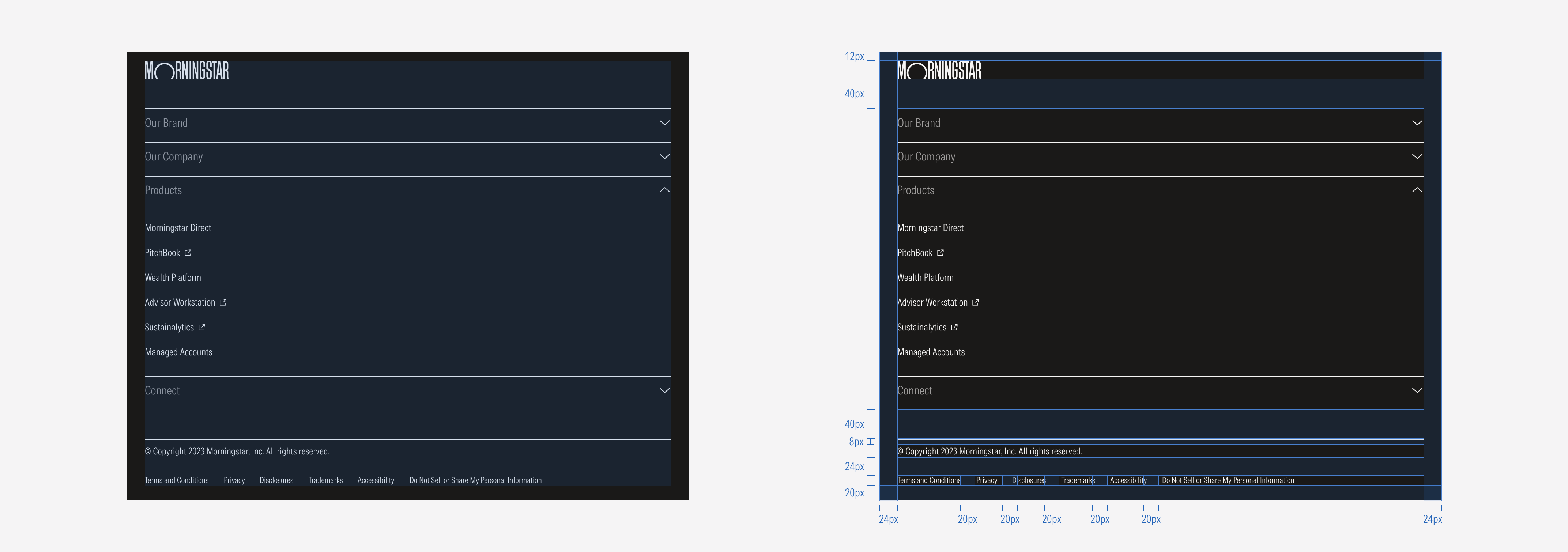
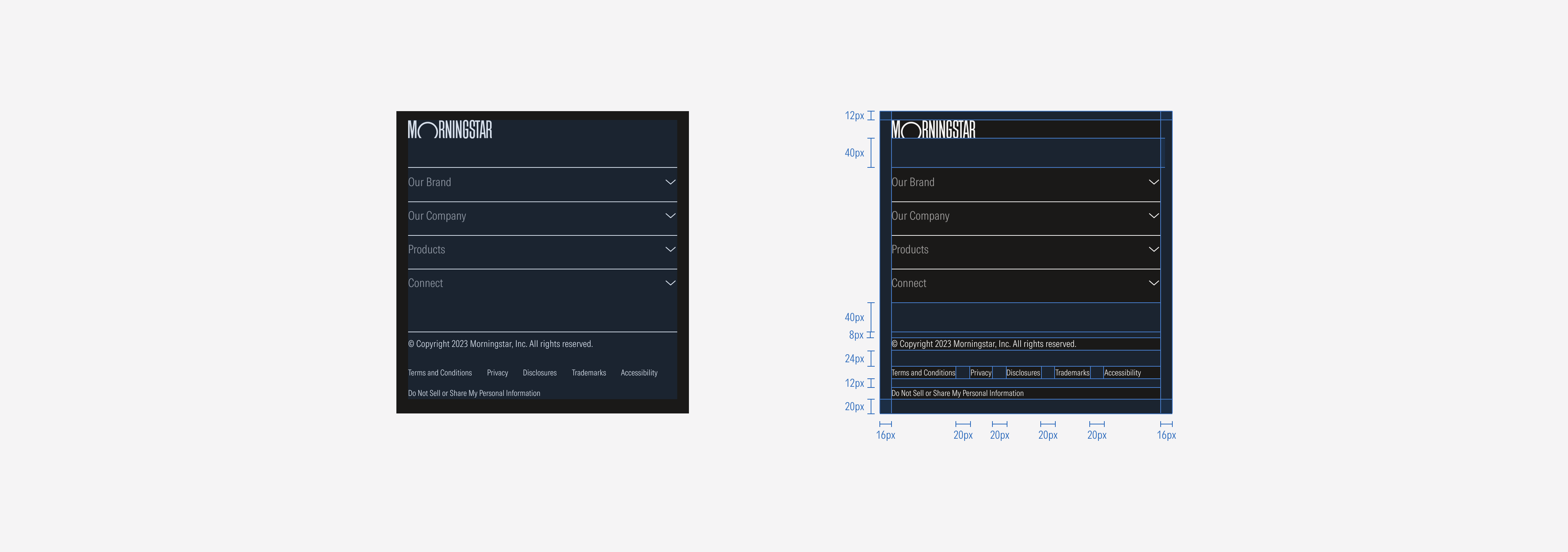
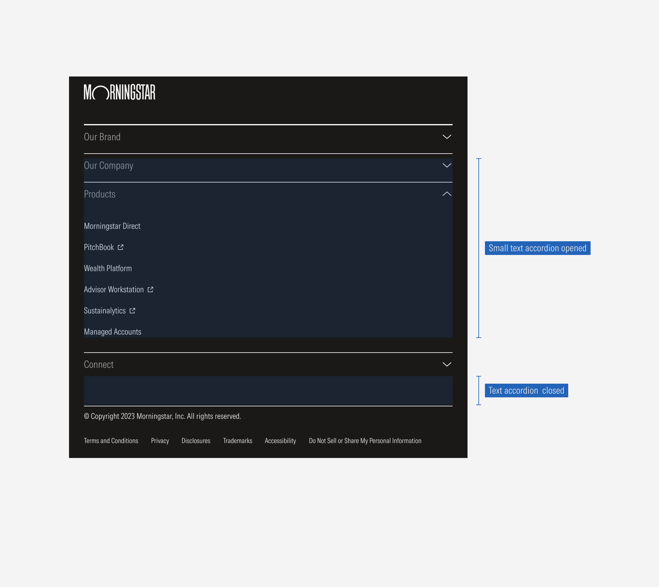
- Accordion contains the items of a section in the compact size of the footer.
Variation | Purpose | Parts on Display | Components | Size |
|---|---|---|---|---|
Footer | Represents the end of the page. Includes a navigation overview and legal information. | Logo, list of items, legal footer | Logo, list groups, accordions | Extended, compact |
Hierarchy
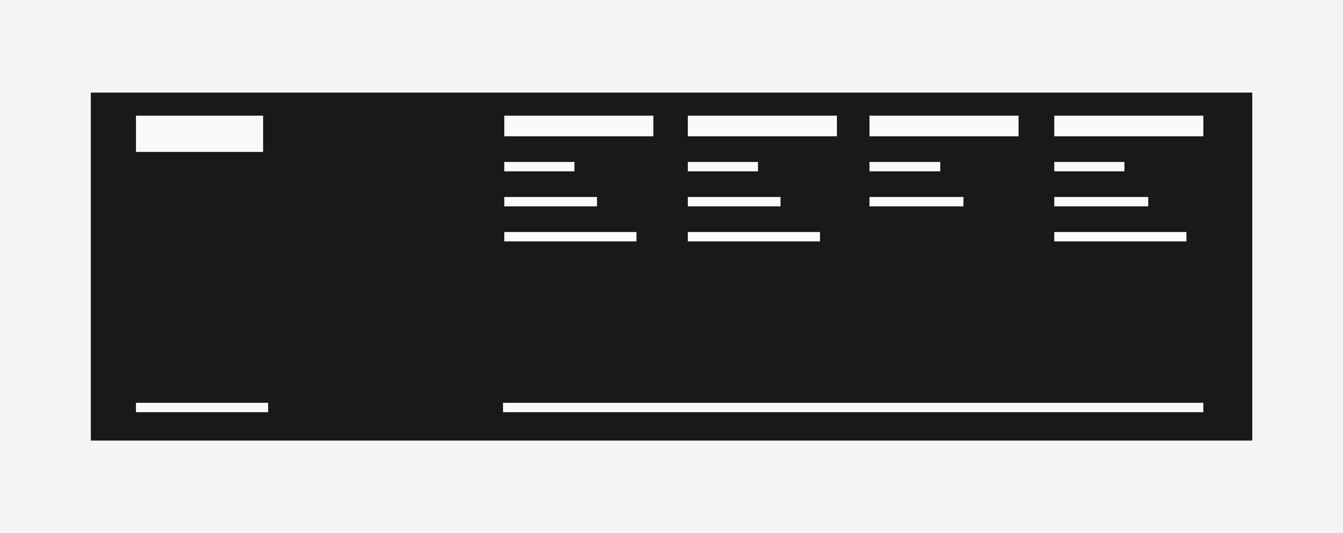
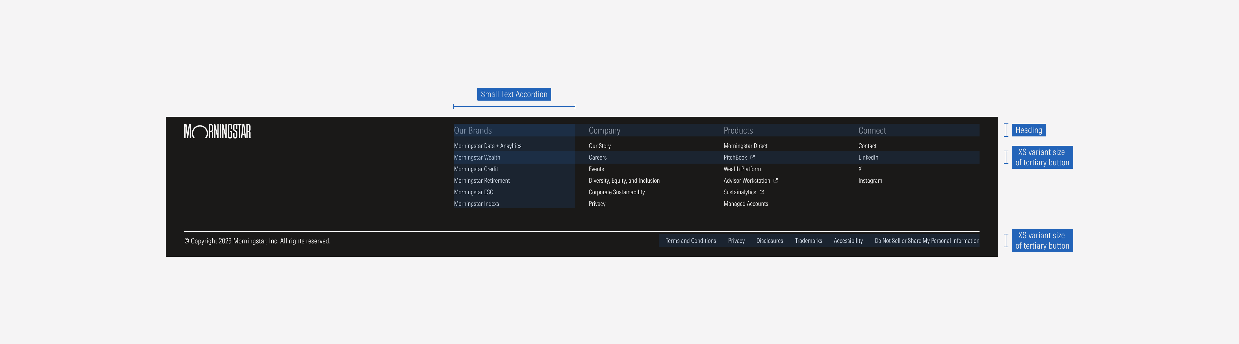
A proper hierarchy must be ensured for the elements that compose the footer. The logo will have the highest level of importance, followed by the list of navigation items. Each column will have a title (secondary level of importance) and a list of link pages (tertiary level of importance). The labels need to give a clear and short idea of what they represent. The legal footer content will represent the lowest level of importance.
Alignment
Components within the container will be left-aligned.
Sizing
The footer will adjust to the viewport size.
Default and SM