Navigation
Unified Navigation
The Unified Nav is the top-of-page, first-level navigation for the Morningstar B2B website. It holds the brand logo, up to five dropdown triggers, a locale switcher, and an optional primary CTA. On the LG and MD breakpoints each trigger opens a dropdown panel of link lists; on the SM and Default breakpoints the whole menu collapses behind a hamburger into a full-width slide-in menu that drills down one level at a time. The bar is always present; which menu it opens depends only on the breakpoint, and both menus render the same section data.
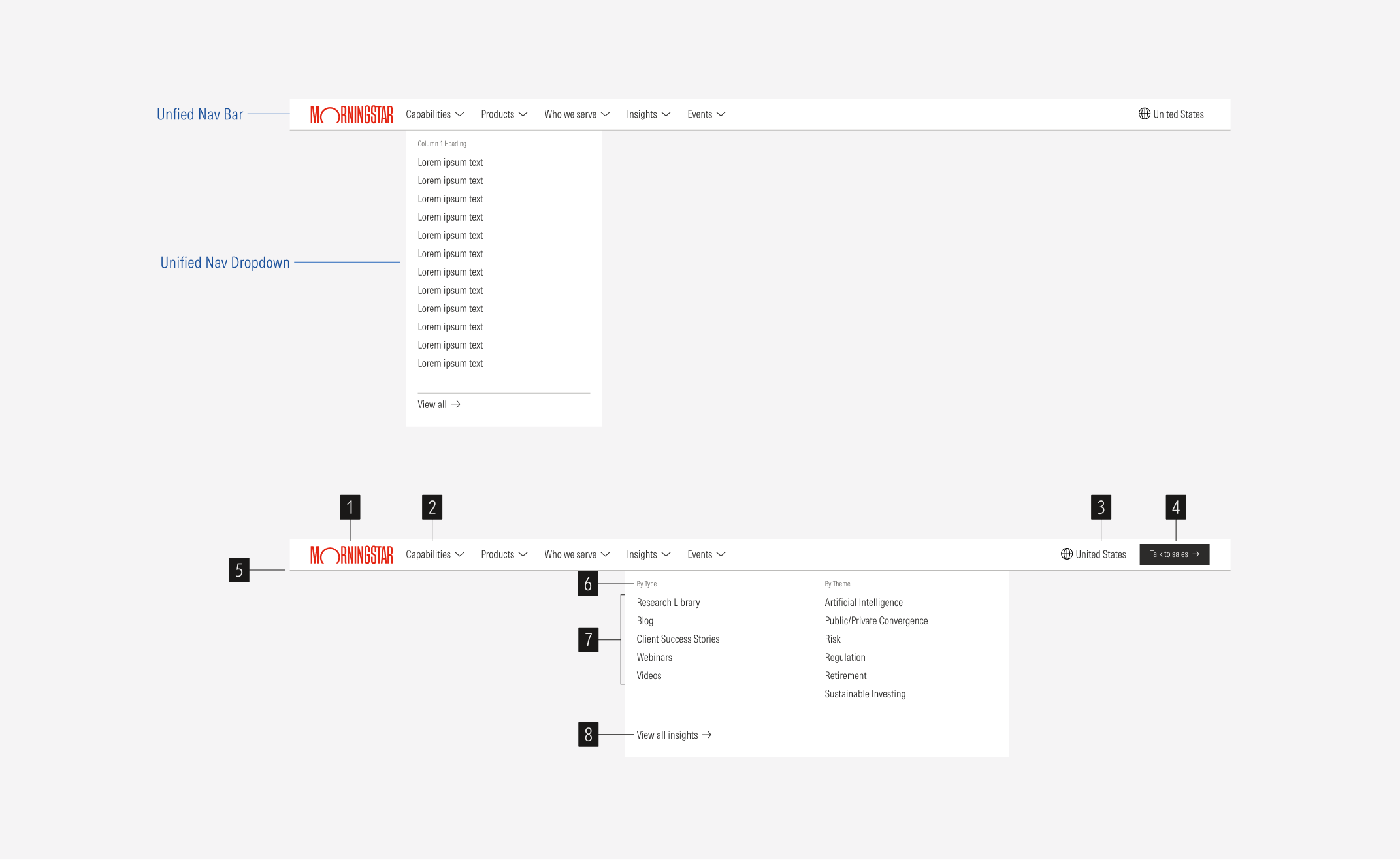
- Brand logo: slot for the Morningstar logo. Links to the home page.
- Dropdown triggers: text + 18px caret-down icon, one per first-level section (Capabilities, Products, Who we serve, Insights, Events). Each opens a dropdown panel.
- Locale switcher: 18px globe icon plus the current locale label ("United States"). The label is hidden at MD.
- Primary CTA: small primary button, dark fill, with a 14px arrow-right icon ("Talk to sales").
- Rule: 1px bottom border in Background/component/navigation/rule (#BDBCBA).
- Column title (optional): Body/xs label in text-subtle, one per column.
- Link list: one list group per column, each row 28px tall, Body/md text.
- View all link (optional): tertiary button with arrow-right, separated from the lists by a 1px top rule.
SM and Default Breakpoints
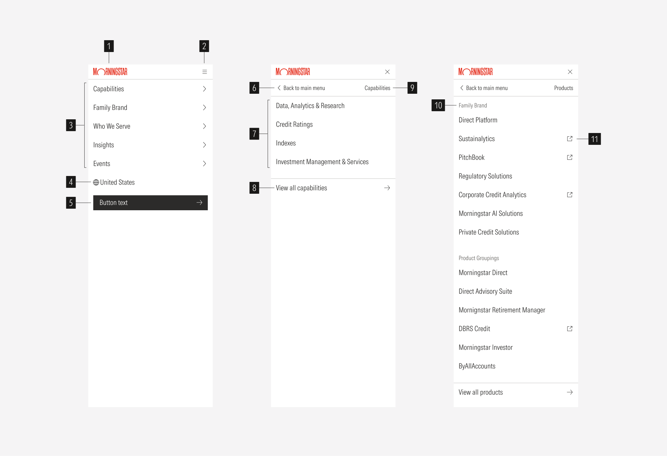
- Brand logo: slot for the Morningstar logo. Links to the home page.
- Menu toggle: 20px hamburger icon on the right; swaps to a 20px close (X) icon while the slide-in menu is open.
- Main view: full-width list of the five first-level sections,
- Locale switcher
- Full-width primary CTA.
- Back header: "Back to main menu" tertiary button with caret-left on the left, the current section name on the right.
- Groupings: 60px rows in Title/sm.
- View all row (optional): full-width tertiary row with arrow-right, separated by a 1px top rule.
- Current menu page title
- Section header (optional): Body/lg heading in nav-heading grey
- Rows that leave the site carry a 22px external-link icon.
