Chip
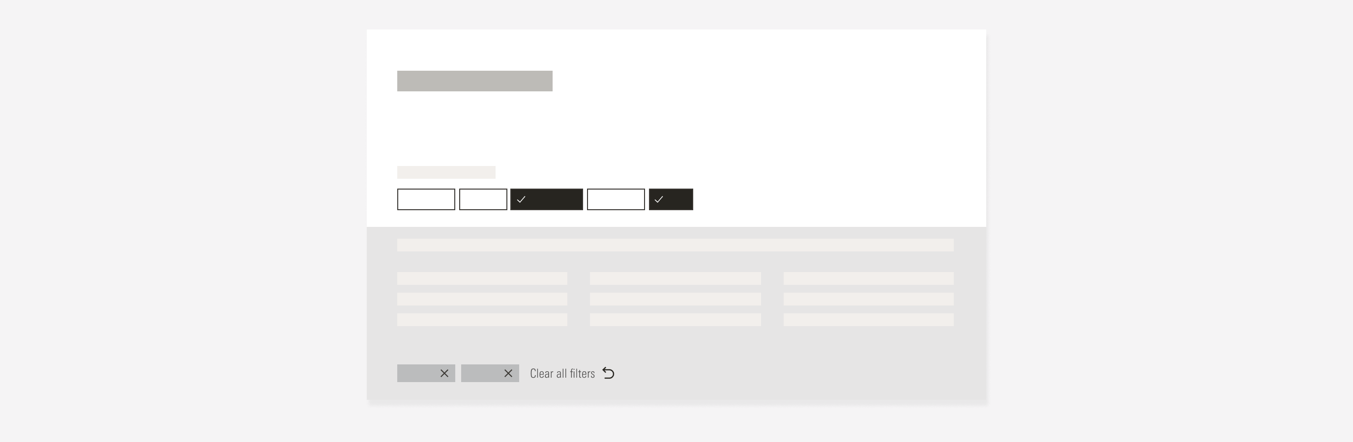
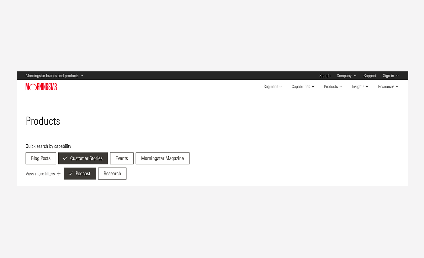
Chips are interactive, dynamic elements that help users filter content. They are mostly used in the filter section. Remember to only use chips for contextual options not major actions.

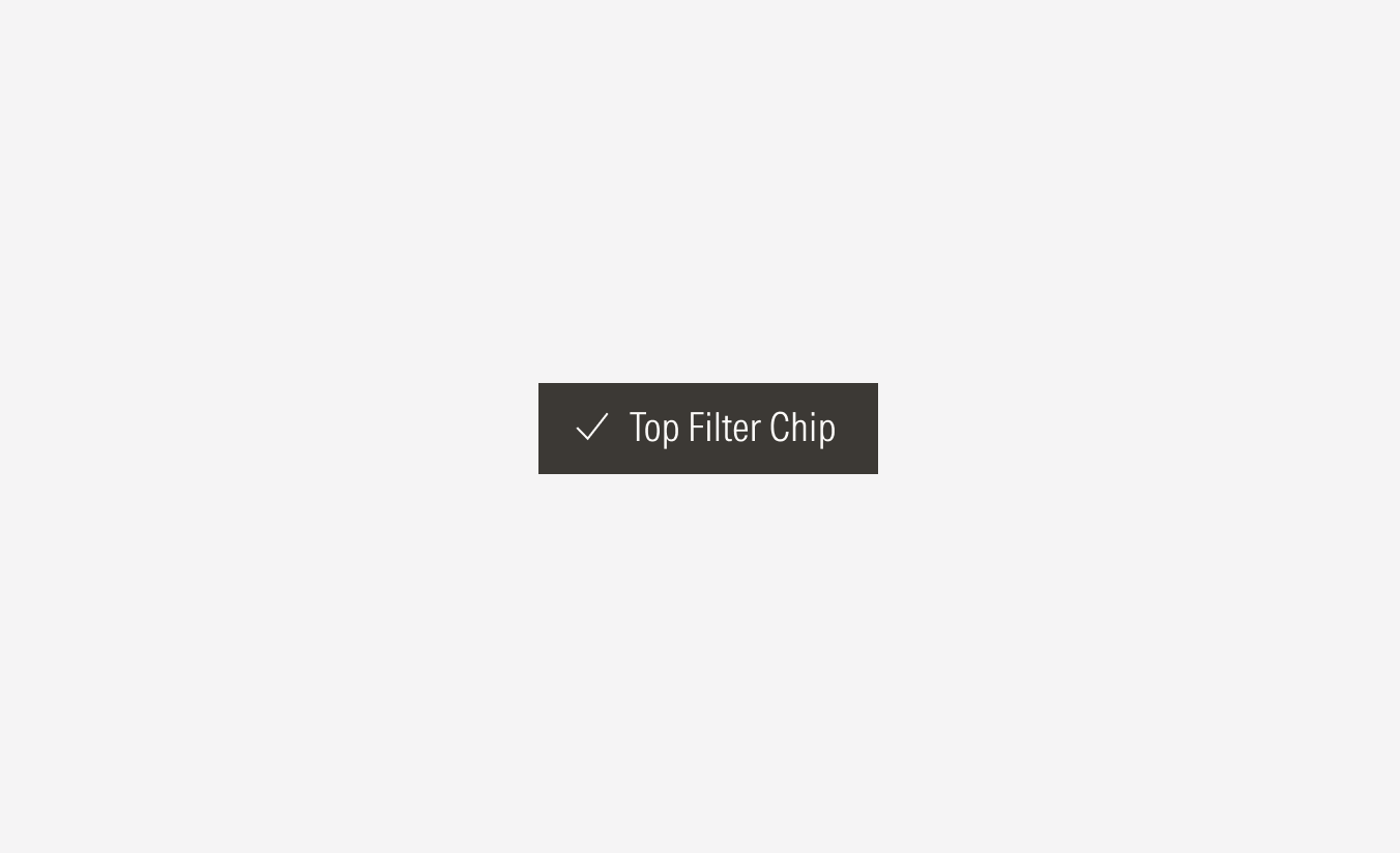
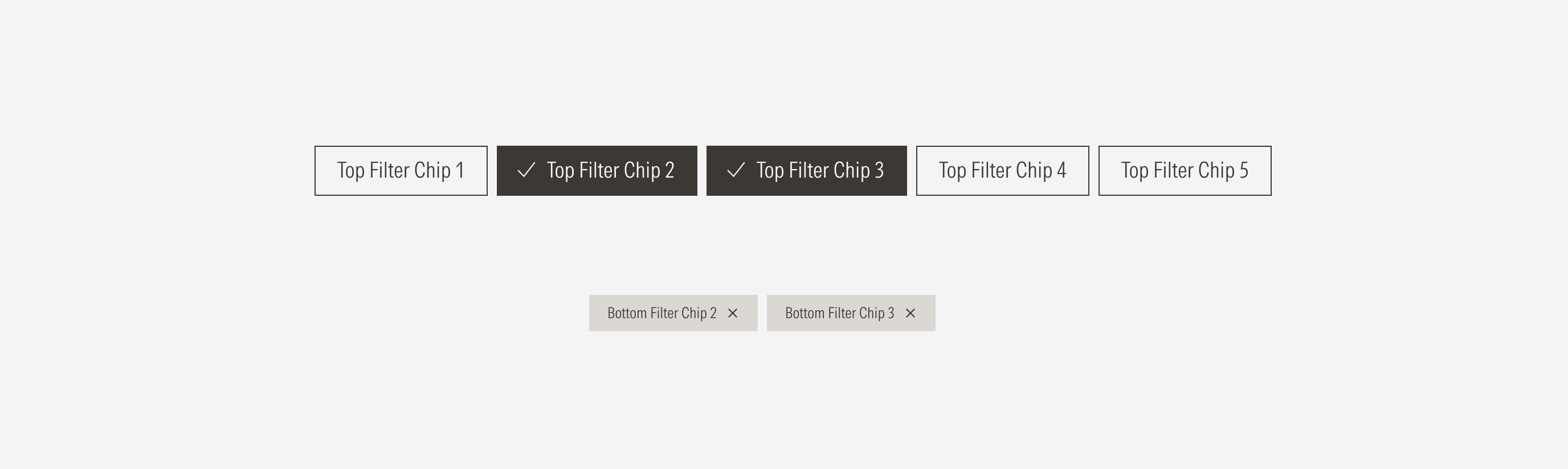
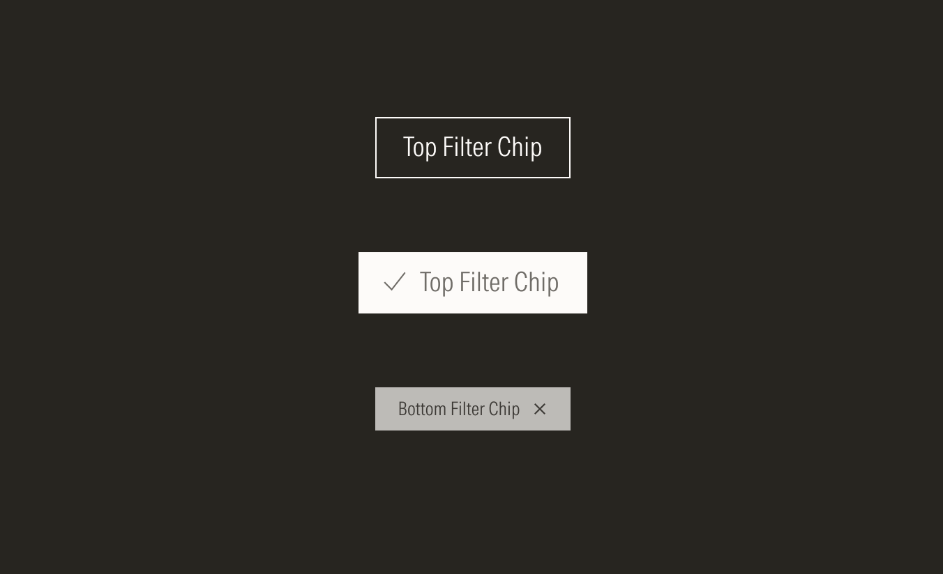
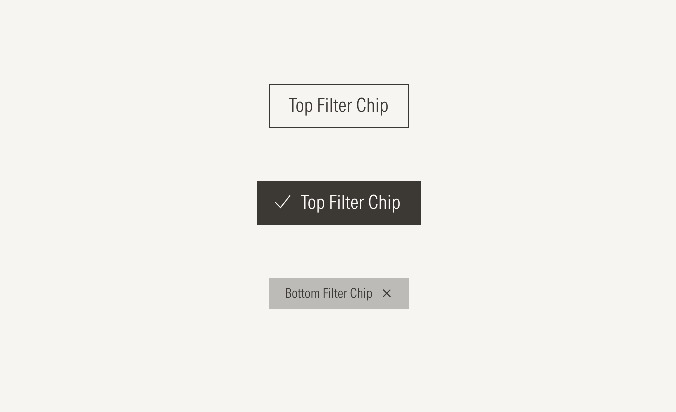
- Active icon enforces the meaning of the selected chip. This icon will only be visible when the chip is in its active state, and only on the top filter chip.
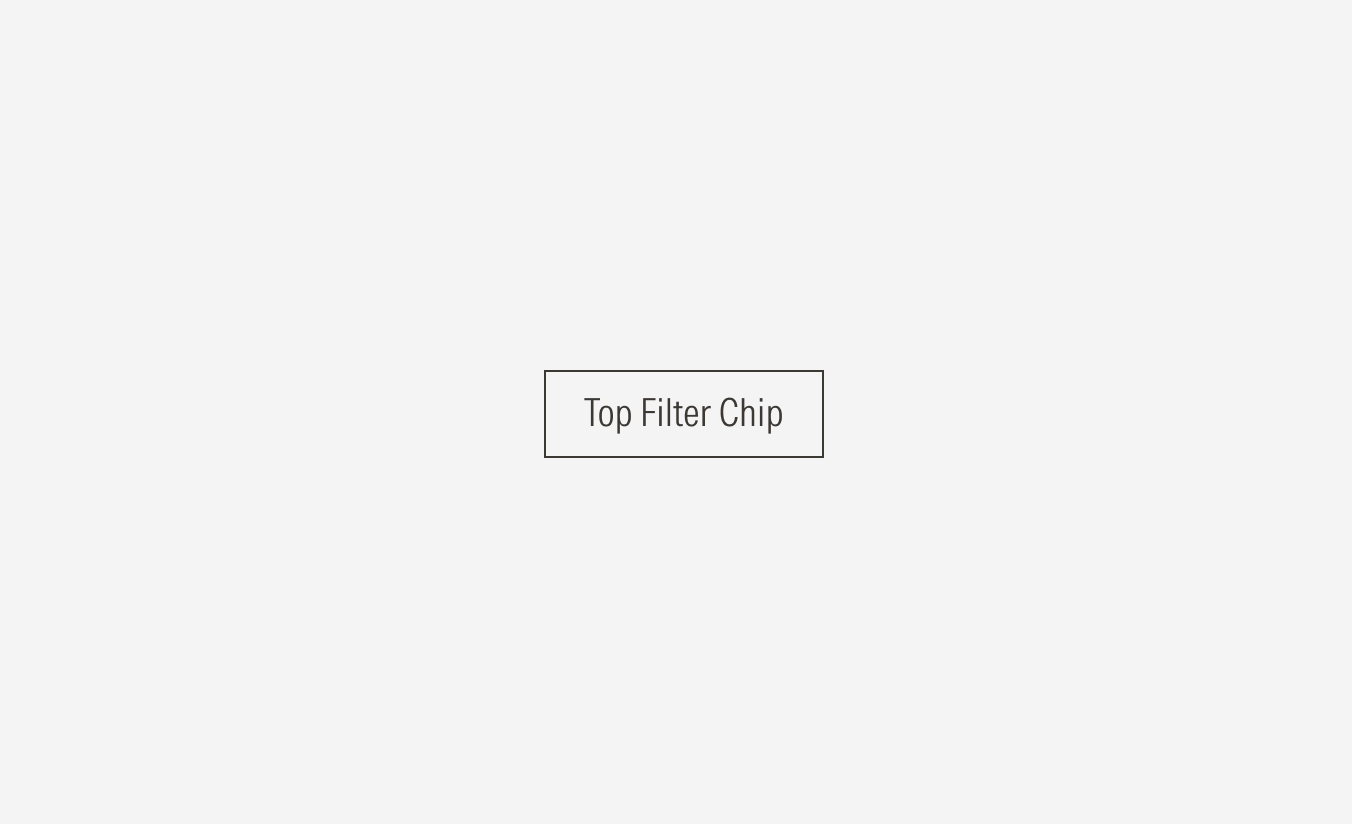
- Label sets the label of the chip. The top and bottom filter chip have the same label.
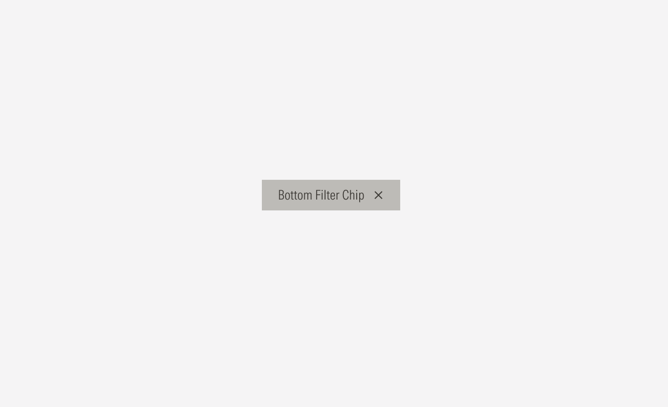
- Remove icon Represents the action of removing that chip (deselecting that category). This icon will only appear on the bottom filter chip.
Variation | Purpose | Icon | Sizes |
|---|---|---|---|
Top filter | Use the top filter as the primary chip to represent a main category or filter that can be selected or deselected at the top of a section. | With icon (activeSelected), no icon (default) | One size only |
Bottom filter | Use the bottom filter as a secondary chip to represent the categories or filters. This chip is only visible when a top filter is selected. | - | One size only |

Alignment and Hierarchy
The alignment of chips with their container or in relation to content at the same level of the page, should follow a left-justified pattern. If the chips are grouped with a button, the chips should flow to the left-most margin of the content area with the button following them to the right.
A proper hierarchy must be ensured for the available user actions. To achieve this, buttons should have the same size as chips.
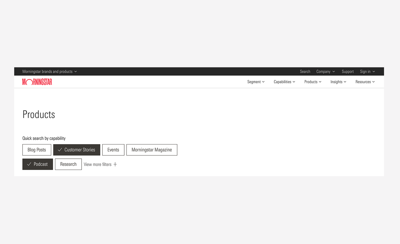
Do place chips first and left aligned, and any button that accompanies the chips to the right.
Don’t place buttons to the left before the chips.
